|
| Group |
Round |
C/R |
Comment |
Date |
Image |
| 78 |
Jul 23 |
Reply |
This is what I was suggesting when I played with it...to just forget reality and have some fun! It feels very "green flash" you get when the sun hits the horizon.
For me, the more I mess around, the more I learn what what works and what doesn't. |
Jul 28th |
| 78 |
Jul 23 |
Reply |
Nice! I think you've made some nice tweaks! |
Jul 25th |
| 78 |
Jul 23 |
Reply |
From your lips to God's Ear! Thanks! |
Jul 25th |
| 78 |
Jul 23 |
Reply |
I appreciate it, Sunil! |
Jul 25th |
| 78 |
Jul 23 |
Reply |
Thanks, much appreciated!
|
Jul 25th |
| 78 |
Jul 23 |
Reply |
See my new version below! Any additional ideas? Thanks! |
Jul 21st |
| 78 |
Jul 23 |
Reply |
See my new version below! Any additional ideas? Thanks! |
Jul 21st |
| 78 |
Jul 23 |
Reply |
See my new version below! Any additional ideas? Thanks! |
Jul 21st |
| 78 |
Jul 23 |
Reply |
See my new version below! Any additional ideas? Thanks! |
Jul 21st |
| 78 |
Jul 23 |
Reply |
See my new version below! Any additional ideas? Thanks! |
Jul 21st |
| 78 |
Jul 23 |
Reply |
Thanks for the crop, Ken! See my new version below! |
Jul 21st |
| 78 |
Jul 23 |
Comment |
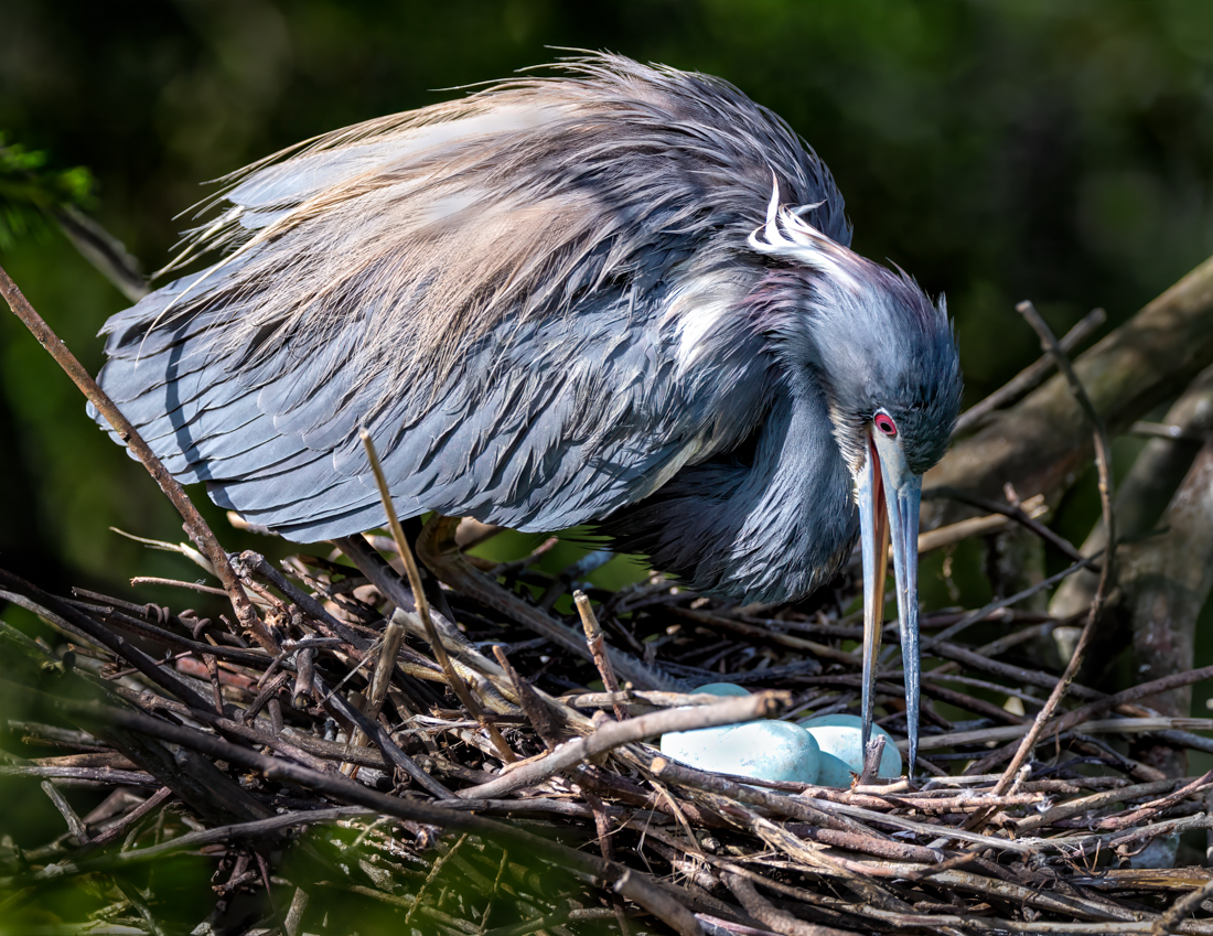
Thanks to everyone for your ideas! Ken's crop saved the day, thanks! As much as I loved Ken's trick on removing the blurred leaves in the foreground, it violates PSA Nature rules, but I'll save that trick for a Color image!
I do agree with Ed that the warm/cool tones on the bird and background make a more interesting image than most still bird shots.
Jim had a fabulous workflow to color the eggs. It worked well, but in the end, I felt it was bending the Nature "show what's there" rule, so I darkened just the tiniest bit and am going to leave the eggs as I found them. But Jim's technique will be useful in many situations where items are blown out and don't color-fill well.
Here's my new version, any additional thoughts? I appreciate the help, as I was struggling with this one!
|
Jul 21st |
 |
| 78 |
Jul 23 |
Reply |
I understand completely. But I also find my camera doesn't see things as I saw. Or it captured the smoke, that wasn't what I was "seeing".
Painting was originally meant to be very accurate, and there was an uproar over Monet, Van Gogh and other impressionists. And then modern art created yet another drama, as they are "just splashes of paint".
I think its great we have a lot of options in photography and room for perfectly accurate and very creative. The great news in PSA is that Nature, PhotoJournalism and Travel can't look different than what it looked like originally. The other categories are much more "loose" in it's rules. |
Jul 19th |
| 78 |
Jul 23 |
Reply |
Thanks, James. I have got to work on trying everyone's ideas and see it will be a great improvement. |
Jul 18th |
| 78 |
Jul 23 |
Reply |
Robert, I think Jim nailed it. Red, green and white look great together. I find the monochrome really dark, except for the background. The second flower could be mistaken for a leaf now. Perhaps more tonal contrast in the subject selection only, if you prefer the monochrome?
BTW, unless you mention that you've added a new image, no one will know unless they happen by. Check out my page and how I ask each member to look at my new image. Some members refuse to get email notices, so they will miss seeing it until I direct everyone to look at final images before submitting new August ones. |
Jul 17th |
| 78 |
Jul 23 |
Reply |
Thanks, Sunil. I agree Ken's crop is great. I'm going to make the eggs a bit more blue, which they naturally were, so I should be well within the rules. |
Jul 10th |
| 78 |
Jul 23 |
Reply |
Oh, good to know. I thought that might have been an issue for you. I have just photographed our police k-9 unit and the SWAT team. But I'm not sure these images would do well in the political climate of police brutality. |
Jul 6th |
| 78 |
Jul 23 |
Reply |
Jim, love your rendition. Great job! |
Jul 6th |
| 78 |
Jul 23 |
Reply |
You have lots more experience than I do, but your sentinel image is really strong with a great diagonal, and very heroic. And I love that its a woman of color. Jim is a Galaxy guy, we'll get his thought on the sentinel image.
Another thought: since most judges are Indian or Asian, is a military photo going to have a poor rating because of subject matter in their culture? This might have hurt your scabbard image also? |
Jul 6th |
| 78 |
Jul 23 |
Reply |
I did not think of the blue color mixer. Big improvement, I'll play with that idea! Thanks, Jim! |
Jul 6th |
| 78 |
Jul 23 |
Reply |
Robert, I used the original, which had not been cropped, and my two images are monochrome. The first has a slight blue tone to have a cold tone. I agree the crop looks more interesting. I agree there is some abberation, which is from working with small jpg files. I was just looking to show some contrast ideas for the flat light. |
Jul 5th |
| 78 |
Jul 23 |
Comment |
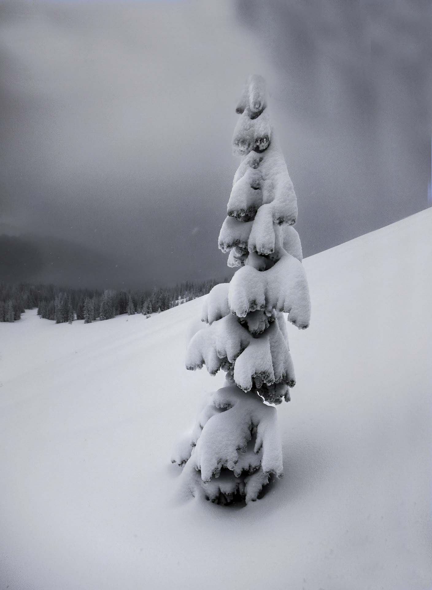
For this version, I used NIK Silver Efx Pro at 50%. I'm not wild about the darker sky on the right in both versions, but that is easy to remove.
I liked the contrast in the white and black of the tree. l feel this feels more like a storm. |
Jul 4th |
 |
| 78 |
Jul 23 |
Comment |
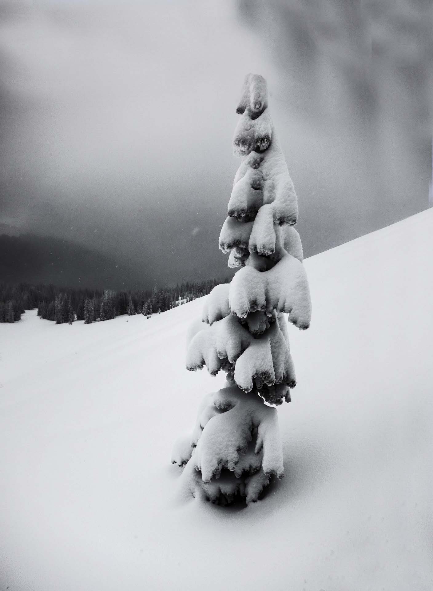
Ed, I've never photographed snow, so I'm just playing with your beautiful image.
In this first version, I used contrast and clarity to assist with the flat light you were fighting. I liked how the pine trees in the background showed up. |
Jul 4th |
 |
| 78 |
Jul 23 |
Reply |
Ken, I didn't think the starburst was "added", I just meant it was a nice "add" to the image.
Bayonets haven't been used since Korea, so no wonder my Vietnam vet didn't recognize the scabbard. He use M16's, which look like AK 15's. I do think the reason its not won for you is that its not easily identifiable and not a powerful weapon.
Your second image of the soldier with a rifle with the bayonet is very powerful, and with his rifle making a very strong diagonal. I imagine its been a real winner for you? |
Jul 4th |
| 78 |
Jul 23 |
Reply |
Ed, I didn't really catch the warm and cool colors. You are right, it does add interest. Glad you enjoyed the image. Thanks for your thoughts! |
Jul 4th |
| 78 |
Jul 23 |
Reply |
Thanks for your thoughts, Robert. I'm looking forward to reworking my image with everyone's feedback! |
Jul 4th |
| 78 |
Jul 23 |
Reply |
Thanks so much, Ken. I love how you cropped to remove the stick, brilliant! I'll try your editing ideas, thanks! |
Jul 4th |
| 78 |
Jul 23 |
Comment |
It is a gorgeous flower! GREAT job blurring the background, you've got it down! I feel your original flower and leaves were a little richer, I might add a tad bit of black to the flowers ("select subject") and that will richen them up.
I'd also be tempted to brush the spirals with some texture and clarity to make your choice of subject apparent.
I'd consider removing the third flower piece completely, and add just a bit more to the bottom crop, so our second flower isn't crowded so much.
Is that a spider on the top flower? It's kind of distracting, you might want to remove it.
Great job thinking through the different ways to shoot this. I do know that flowers always shoot better in shade, even though our eye likes them in sun.
My app says this is a white spotted calla lily, and it does look like the calla lilies I've seen, but I am a novice at flowers. |
Jul 3rd |
| 78 |
Jul 23 |
Comment |
Ken, its a beautiful image, with the scabbard framed between his arm and body. The starburst is a wonderful add.
However, I'm not clear what the scabbard is. It's not for a sword, as nothing hangs below his hand, and it seems too thin to hold a ceremonial sword. I looked up a couple hundred Arlington soldier images, but they only held rifles. Nothing was on their belts.
I showed it to my Vietnam vet husband. He didn't know. He looked up some things and determined it is the new 2022 Army ceremonial uniform (uniforms get updated all the time, who knew?). However, we couldn't find any additions to the belto or scabbard for the pieces to the uniform.
So I think its not placing since we can't determine what he has. Maybe lightening the uniform, so the soldier lines become more of the subject and not solely the scabbard, might help? |
Jul 3rd |
| 78 |
Jul 23 |
Comment |
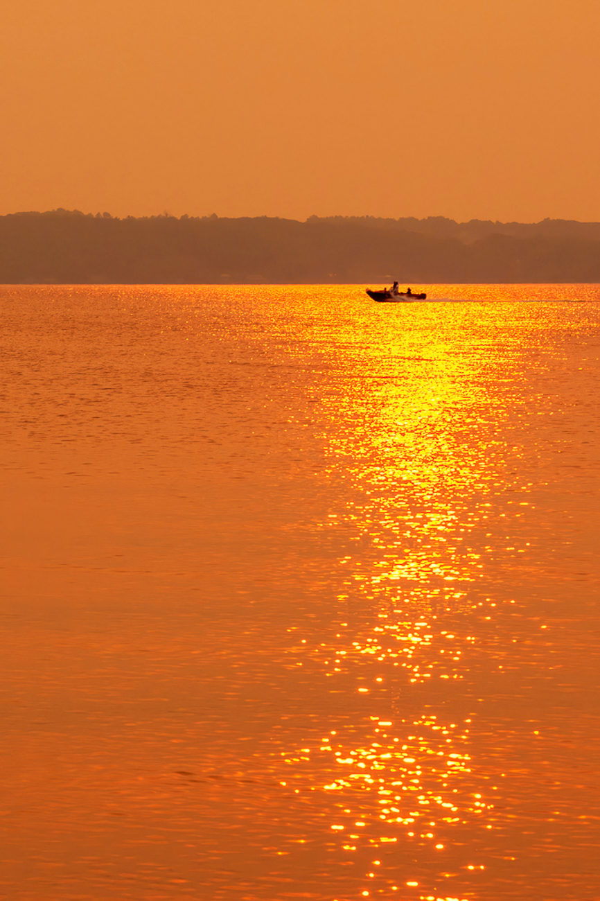
I love the image and what you did to the water. The sky looks still looks off to me. I took it over into NIK Color Efx and chose "Summer". It's way more intense than yours, so I would probably take the layer visibility done.
Another option is to use a linear gradient on the sky to change its color.
I love this and think you can have a lot of fun playing with lots of different options! I don't think it needs to be realistic at all. |
Jul 2nd |
 |
| 78 |
Jul 23 |
Comment |
Nice recovery separating out the art in a very messy scene! I particularly like how you straightened it, since you photographed at a steep angle.
I would consider naming it something different, since we don't know its on a truck, and its about a car show.
Love how bright and vivid it is! |
Jul 2nd |
| 78 |
Jul 23 |
Comment |
Jim, nice recovery of a tough image! I'd consider cropping some of the sidewalk, to take us closer to the tables and sign.
I might lighten the tables area to draw our attention there. The radial gradient in Lightroom or Photoshop/Camera raw would create a nice sun ray to draw our interest.
Vancouver is awesome! We love Stanley Park and the Zoo. |
Jul 2nd |
8 comments - 24 replies for Group 78
|
8 comments - 24 replies Total
|


