|
| Group |
Round |
C/R |
Comment |
Date |
Image |
| 78 |
Jun 23 |
Reply |
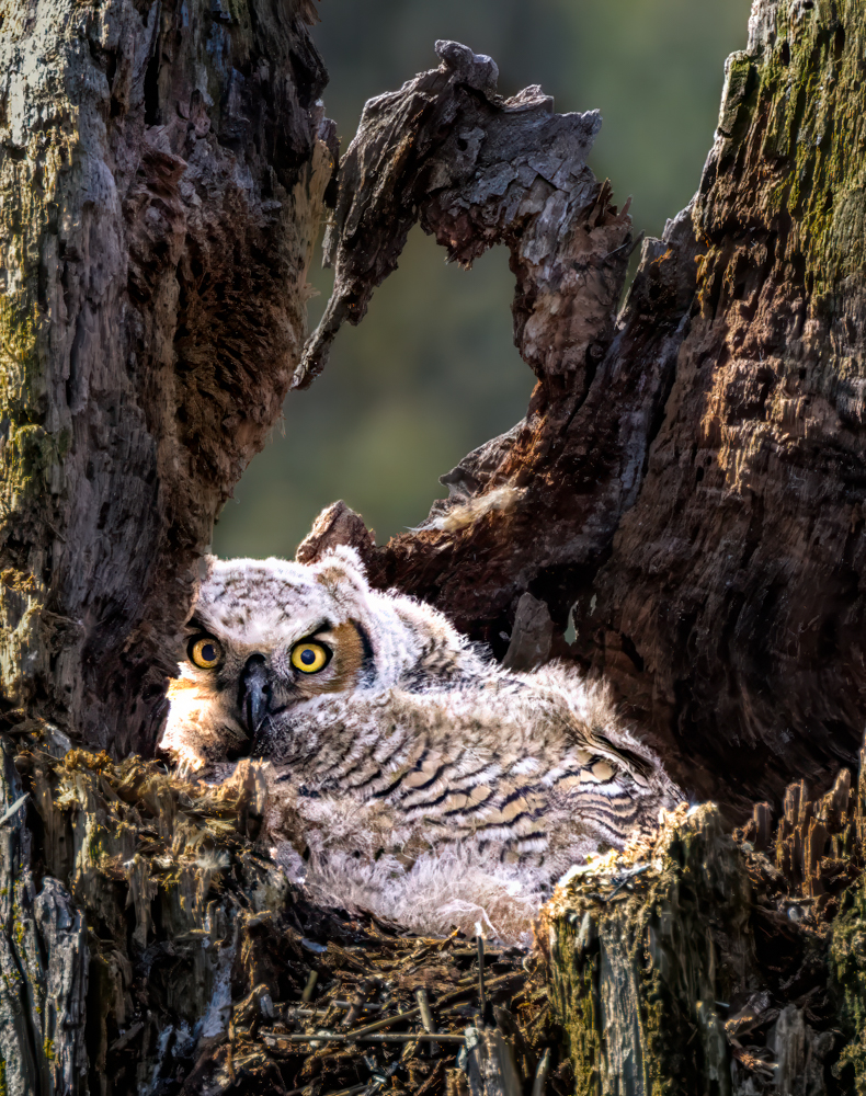
James, take a look at my 6/20 owl. I tried to add more contrast to the tree and bird, but not build noise and not build artifacts. Will you use your eagle eyes and see what you think? Thanks so much!
|
Jun 20th |
| 78 |
Jun 23 |
Reply |
check out my new version from 6/20, using your suggestions. Better? |
Jun 20th |
| 78 |
Jun 23 |
Reply |
Ed, I redid my owl on 6/20 and darkened down the "window" and took out some contrast and "yellow". Better? Thanks! |
Jun 20th |
| 78 |
Jun 23 |
Reply |
Ken, I redid my owl and processed twice for noise. See my 6/20 version below. Does it seem better? Thanks! |
Jun 20th |
| 78 |
Jun 23 |
Reply |
I toned down the image, check out my 6/20 version and tell me if this is what you were thinking of when you suggested it. Thanks!
|
Jun 20th |
| 78 |
Jun 23 |
Reply |
Jim, check out my new version from 6/20, using your suggestions. Better? |
Jun 20th |
| 78 |
Jun 23 |
Comment |
I reworked my owl from the beginning, utilizing everyone's comments about tone, darkening the foreground and noise. I went with a darker bark to give more a "hidden" feel and more "depth" in the tree trunk. I added more contrast to the Great Horned Owlet and lightened the eyes more.
Although there wasn't much noise in the image, my choice of Clarity Bump in NIK added some noise, so I ran it through Photo AI twice to clean up the green background through the tree's "window".
After all that, my husband still likes the first one. Any thoughts about this version and any additional suggestions? |
Jun 20th |
 |
| 78 |
Jun 23 |
Reply |
James, If you want to change out the sky, you can do it in Lightroom or photoshop.
It's surprisingly easy. You can use downloaded other people's skies or you can collect your own (which is what you can use for competitions). I'm happy to show you in a Zoom.
Here's a quick video, but there are thousands of videos.
https://www.youtube.com/watch?v=gCoVKvhGtfQ |
Jun 19th |
| 78 |
Jun 23 |
Reply |
I am glad the group got you to the idea of what you "were going for" and narrow down your focus. That's what we all want to do in every image..."What interests me?" and cut out all the other business from the image. We want to take the viewer into the heart of it. |
Jun 18th |
| 78 |
Jun 23 |
Reply |
I agree with James, Ken's edits are awesome. |
Jun 17th |
| 78 |
Jun 23 |
Reply |
James, nice effort to hear what Robert wanted. I think the tire tracks work for you and lead to the blue hills. |
Jun 17th |
| 78 |
Jun 23 |
Reply |
Thanks, James! I will keep all your comments in mind when I work the image again. |
Jun 17th |
| 78 |
Jun 23 |
Reply |
I love this image! The geometrics of the wood really frames your robin! Very interesting! |
Jun 17th |
| 78 |
Jun 23 |
Reply |
Thanks so much, Sunil. |
Jun 17th |
| 78 |
Jun 23 |
Reply |
I've been thinking about this image all week. I think Ed expressed what I was mulling over. The fence blocks us looking past it. It takes up half the images and its bright white (the eye will settle on the lightest object in an image).
Fences are great as leading lines, leading us to the mountains, if you have that angle.
Foregrounds should lead us in, so lakes or ponds are great, or a flower garden. Definitely getting on the inside of the fence will help. And pick your subject--one big mountain, a lake, etc. I understand you want the pastoral scene and that's great, but we have to have a place our eyes will rest or travel around.
I googled Blue Ridge Mountain images, and there are a plethora of images for you to look through. For example, a rainbow or hot air balloon or sunrise in your scene would hold our attention more.
For me, I have to think, "What is attracting me to this scene?" and then narrow my vision to just that. If I say, "I like everything here", I know that's the wrong answer, at least for a clean and pleasing image. Check out some of these ideas:
https://www.google.com/search?sxsrf=APwXEdex2UCXbo0gjgzXOOEjbizWnO-gRQ:1686168007946&q=blue+ridge+mountains+images&tbm=isch&source=univ&fir=72RvSGELST-pGM%252CxSJzE9kWo1bNcM%252C_%253BW17OReR44IyQ7M%252CtpGk8plGC6SBgM%252C_%253BB0u0Jq3gNQAqjM%252CtpGk8plGC6SBgM%252C_%253B_Dd5qgI4nwMZpM%252C0sb_idDYI5LfBM%252C_%253BcquBczrhrfJlyM%252ChWOK_ZkRsZkmFM%252C_%253BEeNOG4ZiWXGB6M%252C3DpkO4zMtzeC-M%252C_%253BGrFu45qMVBy7wM%252CKE5fGe2fRajeYM%252C_%253BkiiiABgwtuCf-M%252CCER3fDxtlKXW8M%252C_%253BFQ09cV8a4Y-X6M%252CqfvnG-tNuEsc5M%252C_%253Bfi5OpMLErPlftM%252CKE5fGe2fRajeYM%252C_%253BEtu4URMv1_1vWM%252CLAWYsN8fvAjWoM%252C_%253BYHR_bp0W-P178M%252CM6Z7R5sxTmCcsM%252C_&usg=AI4_-kRB9niNH6yUkTNZIcMXIFHtQw3gYQ&sa=X&ved=2ahUKEwj9p5Sp-bH_AhWbkYkEHQaUDcoQ7Al6BAgJEEc&biw=1920&bih=802&dpr=2
|
Jun 7th |
| 78 |
Jun 23 |
Reply |
Thanks for the info on the crystal ball. We are going to make a sleeve for the "wizard" and see how it works. Thanks for the clever idea. Love it! |
Jun 7th |
| 78 |
Jun 23 |
Reply |
Thanks for the darkening-the-tree-hole and background idea, Ed. I'll play with that!
|
Jun 7th |
| 78 |
Jun 23 |
Reply |
The monochrome does bring out the road and cars, which was easily overlooked in the color image. Since the road and cars were a focus Jim was interested in, a mono version may be the answer. Great suggestion, Ed. |
Jun 7th |
| 78 |
Jun 23 |
Reply |
A lot richer looking, good suggestions, Ken! |
Jun 5th |
| 78 |
Jun 23 |
Comment |
Ed, how big is your ball across? I looked a 4.2" ball and think it might be too small? |
Jun 4th |
| 78 |
Jun 23 |
Reply |
Ken, when you are ready to see the new portrait features, here's a quick overview of the CR Portraits (Lightroom and CR act exactly the same
https://mattk.com/lightroom-portrait-masking-deep-dive/
I'll look forward to hearing how Cowboys was, when you are up to it. I don't have your phone number, so you can email it to me when you'd like to chat about it. Thanks so much! |
Jun 4th |
| 78 |
Jun 23 |
Comment |
I think your model has fabulous hands for this, very gnarly and perfect for a magical look.
I like Jim removing the blue cloak, but I agree he overdid the darkening of the robe. I think Robert brings up a good point about the ball bringing the light.
I checked out your link, and that's great you've come up with many different versions of gnarly hands. Personlly, I like this one the best. I think a robe, or just a sleeve, that looks a bit more luxurious, (Harry Potter movie costume) would even enhance this idea even more.
I am going to try this, its a clever idea! |
Jun 4th |
| 78 |
Jun 23 |
Comment |
Robert, I struggled with the same thing Jim did, that the background is scenic, but we have a lot of fields and trees before our eyes rest on the mountains. The mailboxes will be a distraction if you are to rest on the pastoral scene. Do you have a different angle that captures your peaceful scene? |
Jun 4th |
| 78 |
Jun 23 |
Reply |
Thanks, I will play with it when I redo the image with everyone's suggestions. |
Jun 4th |
| 78 |
Jun 23 |
Comment |
I would never have seen this image in your original. Bravo for seeing the value in it! Thanks for sharing your process!
Is there a reason you didn't just Select Subject in PS, and put cowgirl on black layer for background?
I see you used Luminar AI edit for your whiten teeth, etc.
Have you tried the new CR portraits AI feature for this? Wondering how they compare.
Love how you tipped her, that was brilliant. She seems just a tad gold to me. Her earrings and buttons don't seem overly bright to me at all.
I have been interested in Lisa Langell's cowboy workshop, as I love horses and the Old West. I was having cataract surgery, which ruled me out this past January.
I'd love your thoughts on the workshop, getting around and so on, if you'd recommend it.
Thanks for joining the group and I hope your image is a big winner at the PSA Pictorial Print Exhibition! |
Jun 4th |
| 78 |
Jun 23 |
Comment |
James, it took 90 seconds to drop out the background and bring in a sky I had in "My Skies" file. You can see I could have used a sharper line along the car hood.
Happy to Zoom and show you how. Just pick what you'd like as the background. |
Jun 3rd |
 |
| 78 |
Jun 23 |
Comment |
Interesting that the image is almost a split screen with gold on left and blue on the right. I think removing the second boat helped. I like how Jim lightened the people a bit. I think bringing the gold a bit more into the boat so the people are easier to see.
I love how you always find the most interesting images in "nothing". |
Jun 3rd |
| 78 |
Jun 23 |
Comment |
You've got the iconic West Mitten Butte, East Mitten Butte and Merrick Butte. I think the cars add some interest to a snap that has been taken a million times.
I think its really fun that the cars are spaced like kids' Match cars. The cars really lead you through the image. Well done! |
Jun 3rd |
| 78 |
Jun 23 |
Reply |
Thanks, Robert! I'm not sure what "tone down the toning" means? Less contrast? Less saturation? Less texture? Less warm light? I appreciate it! |
Jun 3rd |
| 78 |
Jun 23 |
Reply |
Thanks, Ken! I like your version. I had run Photo AI on it (the update for DeNoise and Sharpen, which Topaz no longer supports), but I do agree it looks better. I will rerun after I've made everyone's suggestions. We appreciate you joining us! |
Jun 3rd |
| 78 |
Jun 23 |
Reply |
Wow, now he's really staring at us! Love it! I hate to loose the "window" in the back of his "apartment", we'll see if the crop is what everyone loves. Thanks! |
Jun 3rd |
| 78 |
Jun 23 |
Reply |
Jim, I think you reposted my pic, as the crop and foreground look the same? Did you have a revision for me? Thanks so much for your suggestions! |
Jun 3rd |
9 comments - 24 replies for Group 78
|
9 comments - 24 replies Total
|


