|
| Group |
Round |
C/R |
Comment |
Date |
Image |
| 78 |
Apr 23 |
Reply |
Great to know! Yes, it's not just a composition, but an identifying flower image! |
Apr 26th |
| 78 |
Apr 23 |
Reply |
Great, thanks so much! |
Apr 26th |
| 78 |
Apr 23 |
Reply |
Robert, thanks and I'll try the head even lighter. |
Apr 24th |
| 78 |
Apr 23 |
Reply |
Oh wow, never have gotten an A++ before!! |
Apr 24th |
| 78 |
Apr 23 |
Comment |
Gotta say, I didn't see the cactus reflection, even after checking back multiple times, as I was entranced by the purplish "spaceship". Bravo to Jim to move it around and give us both. |
Apr 24th |
| 78 |
Apr 23 |
Reply |
Just what this group's about! Get everyone's feedback, give it a try and see if you find you can rework your image to be even happier with it. Personally, I like what Mitch did the center crop, but if you feel it improved for you, then that's great! |
Apr 24th |
| 78 |
Apr 23 |
Comment |
Jim, can't wait to see your revision of this lovely image! |
Apr 24th |
| 78 |
Apr 23 |
Reply |
Hi James, I lightened the head, the top of the fish and a bit of the underbelly, as well as cropped in. Take a peek at my 4/24 post. I'd love your final thoughts to get it ready for competition! Thanks so much for being here! |
Apr 24th |
| 78 |
Apr 23 |
Reply |
I couldn't leave well enough alone...LOL! I lightened the head, the top of the fish and a bit of the underbelly, as well as cropped in. Take a peek at my 4/24 post. I'd love your final thoughts to get it ready for competition! |
Apr 24th |
| 78 |
Apr 23 |
Reply |
Mitch, I lightened the head, the top of the fish and a bit of the underbelly, as well as cropped in. Take a peek at my 4/24 post. I'd love your final thoughts to get it ready for competition! |
Apr 24th |
| 78 |
Apr 23 |
Reply |
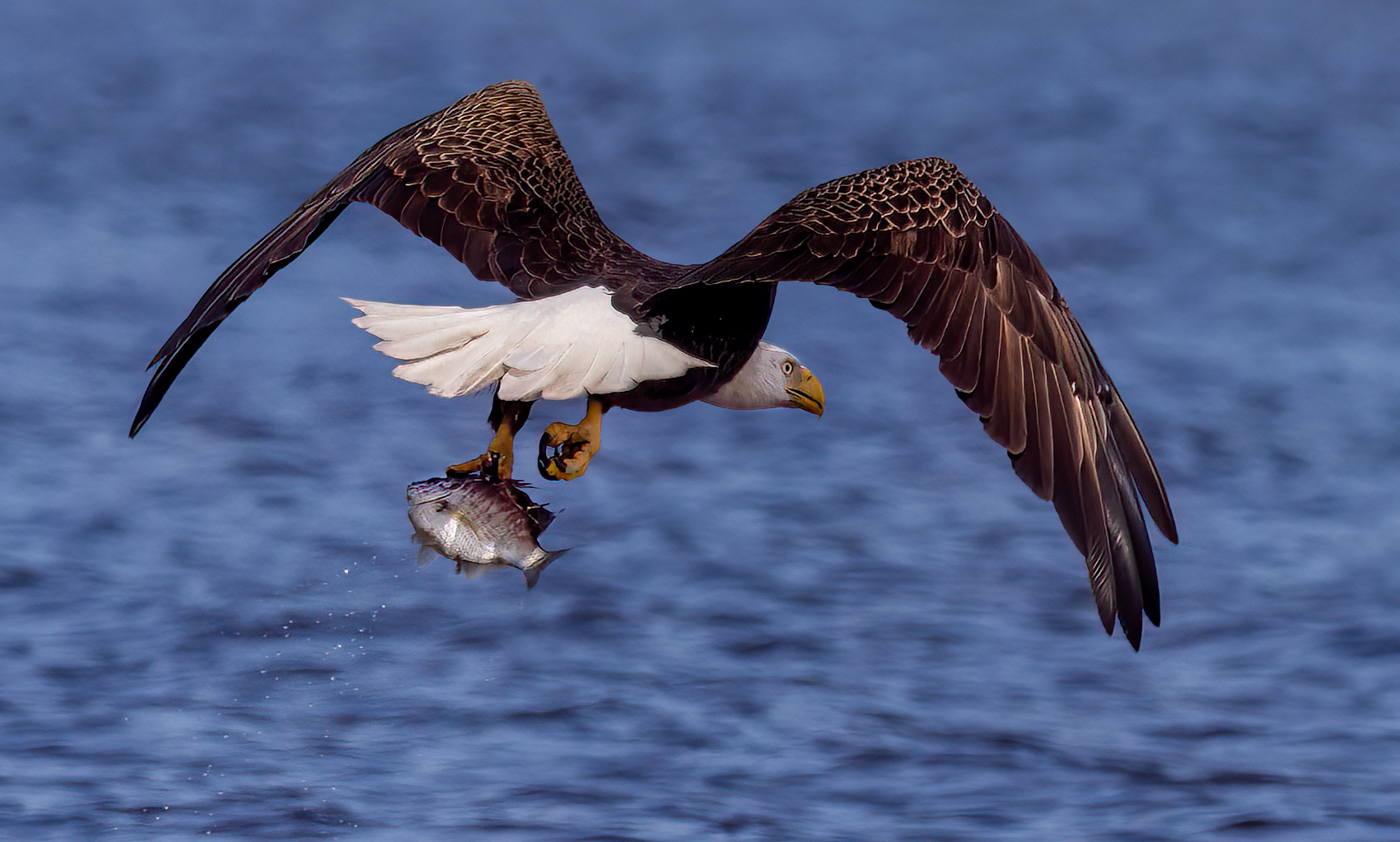
Hi Robert, I did crop the eagle and lighten the top of the fish and the eagle head. I'm not clear on what the liberal eagle comment is? What other changes would you suggest? |
Apr 24th |
| 78 |
Apr 23 |
Reply |
I've cropped in tighter, how does it look to you? I lightened some areas, also. See my 4/24 post. Thanks for the idea! |
Apr 24th |
| 78 |
Apr 23 |
Comment |
Thanks for all the suggestions! Sorry, we were traveling back from Florida and unpacking, so I've not been doing much! I did crop, do you like the new crop that Sunil recommended and I modified a bit?
I used the NEW OBJECT SELECTION in Lightroom or Camera Raw to choose the eagle head and increased exposure. I used object selection for the top of the fish and lightened exposure, and object selection to open shadows just a bit for the belly of the bird. A game changer! So much easier than trying to brush an area. Thanks again! I'd love some more suggestions so I can get it ready for international PSA competition! |
Apr 24th |
 |
| 78 |
Apr 23 |
Comment |
Robert, I am thrilled you are lifting your "self imposed cloning rules" for a moment and experimenting with some creative aspects. I love how you are using cloning, flipping, un-sharpening, and some radical crops to go after your initial subject of "luminosity".
I have found that the more tools I try, the better I get at "seeing" things and more comfortable with our incredibly powerful software.
|
Apr 17th |
| 78 |
Apr 23 |
Reply |
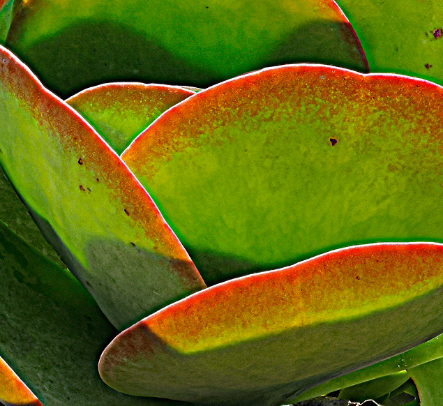
Here's another version. I tried my idea of the plant cut out and put it on a textured layer. I didn't love it. So I instead started with the original and darkened the edges. And I used a brush with green and yellow luminance to brighten the plants.
I don't think its the best, but it was fun to play with it. |
Apr 7th |
 |
| 78 |
Apr 23 |
Reply |
Thanks, Sunil! Valid points. I did want to keep the water falling off the fish, but perhaps it doesn't show up enough? |
Apr 5th |
| 78 |
Apr 23 |
Reply |
I like your edited version, Sunil! Would you consider cloning out the blown out highlights? That is allowed in PSA Mono competition. |
Apr 5th |
| 78 |
Apr 23 |
Comment |
I adore Dale Chihuly! Love your crop and think its really, really fun! It gives me ideas for the zillion Chihuly pix I have that I've not figured out what to do with. My only possible suggestion is to darken the top right corner just a bit to keep us on the lavender reflection.
Hope you get time to get back out with your camera! |
Apr 5th |
| 78 |
Apr 23 |
Reply |
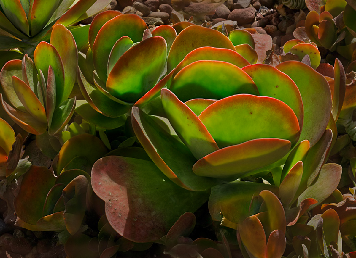
I think reducing the sharpening and clarity will make a nice difference. In addition to darkening the background, you might also reduce the texture, clarity and contrast, which will make it "blur", and make it less of a distraction from your fabulous succulent.
Another idea, instead of cloning--that might or might not meet your "self-imposed" limitations...you could select the petals and create a new canvas and add a green background or less distracting background for your petals. I'm happy to create a version, if it would be something you would like to consider. |
Apr 5th |
| 78 |
Apr 23 |
Comment |
James, so glad you are having a great time with your new lens.
It's a beautiful image. Great color, not overdone. I'd love to see you open just a tiny bit on the very center of the flower that we just see. Maybe just open the shadows on just that area.
The bright area at the bottom of the image are distracting to me. I'd paint the area with reduced highlights. I think you will really have a winning image with a couple these small changes. |
Apr 5th |
| 78 |
Apr 23 |
Comment |
I love the monochrome chrome shine of the ornament. The details are fabulous. The car seems a bit dull compared to the beautiful ornament. I don't have a great idea, maybe darken it? |
Apr 5th |
| 78 |
Apr 23 |
Reply |
Thanks so much, Sunil! Do you really think I can crop in more? Since the eagle is flying, I feel I need to give him room.
Also, I've cropped in a lot from the original, and I feel its pixelating. |
Apr 5th |
| 78 |
Apr 23 |
Comment |
Robert, I understand your frustration having the location closing and fighting with your settings. I agree it has potential. It feels a bit too "crisp" for me, or over-sharpened to my eyes. I'm not sure if that's the stacking or if that's processing after the post processing on your stack.
I find the "glow" interesting, and I find the abstract shapes to be interesting. I think the very bright areas are distracting and there are dead leaves in the back that don't help the pretty green succulents.
Depending what you are going to do with the image, if not competing in PSA Nature, (and it might not be a plant that would meet PSA plant standards), you could add in more "leaves" or clone leaves where the dead stuff is or the bright areas on the right side.
I'm not in love with my solution, but I just cropped in to remove the distractions and focus on the abstract of the gorgeous petals. Looking forward to other suggestions.
|
Apr 4th |
 |
| 78 |
Apr 23 |
Comment |
Jim, I adore this image! I like it so well that we are going to the library when we are going through Des Moines in September.
Everything is great. I like that you didn't bump the colors too much. Compositionally, the lines are great and take us back to the fabulous spiral staircase. Nothing is blown out or too dark.
I am torn about the round window at the top center. I might crop it out, or potentially darken it out.
Well done! |
Apr 3rd |
9 comments - 15 replies for Group 78
|
9 comments - 15 replies Total
|


