|
| Group |
Round |
C/R |
Comment |
Date |
Image |
| 2 |
Mar 23 |
Comment |
Jim,
LOVE the mono version. It's really got great leading lines and a nice abstract. Way more interesting than the color version. Very good choice! |
Mar 22nd |
1 comment - 0 replies for Group 2
|
| 78 |
Mar 23 |
Comment |
I do love your reworks! And I do like the daffodil facing the right. I hope you are happy with the changes, its all about your happiness! |
Mar 25th |
| 78 |
Mar 23 |
Comment |
Jim, your little tweaks elevated this image. Great! |
Mar 22nd |
| 78 |
Mar 23 |
Reply |
Robert, It was a lovely image to begin with, but I think its stronger and more interesting now. Hopefully, you are happier with this version, too! Great job! |
Mar 17th |
| 78 |
Mar 23 |
Reply |
Very different and just as incredible. All those colorful "ants"! |
Mar 12th |
| 78 |
Mar 23 |
Reply |
Thanks for the method! I wouldn't have thought of that! |
Mar 10th |
| 78 |
Mar 23 |
Reply |
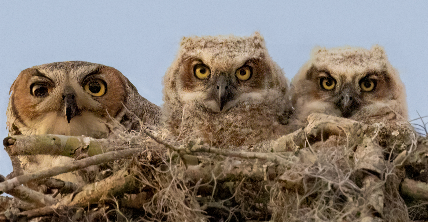
Terry, take a look at my latest version on 3/10. Better? Worse? I'm worried about changing the nest darker, as that would definitely not be how it was. Thoughts? Thanks! |
Mar 10th |
| 78 |
Mar 23 |
Reply |
Jim, I brightened the owls and gave them a lighter sky to appear more natural. Thoughts? See my 3/10 update. Thanks! |
Mar 10th |
| 78 |
Mar 23 |
Reply |
I have added a reworked version below on 3/10. Better? Worse? Thanks! |
Mar 10th |
| 78 |
Mar 23 |
Reply |
Robert, I made a lighter sky and increased the gold on the birds. See below. Do you like it better or do you think your horizon lighter idea is a good way to go? How did you create that? |
Mar 10th |
| 78 |
Mar 23 |
Reply |
James, I've added a new version below, if you'd like to weigh in and see if you like it better. Thanks! |
Mar 10th |
| 78 |
Mar 23 |
Comment |
Thanks to everyone for the ideas to help my owl family. I had just seen the PSA Nature workshop with Rick Cloran (highly recommend to anyone entering PSA Club or international competitions, it will be in PSA workshop library soon, second park is March 30). Rick said to make sure the light matched--that judges hate gold animals and dark blue sky--and so I did go with golden owls, but only added a bit of color to the sky. That way, it made sense that the sun was still out.
I did use the tighter crop, but this takes it out of nature since its a "portrait" and not "environmental". So it would be better entered in PID-color and not Nature.
Reworking it a couple of different ways, I think I just had too much noise ISO 5000 and cropping in so much from the original image-- even with messing with several methods in Topaz Denoise.
Had some great title suggestions--which you like best--"Are You Prey" (punctuation not allowed) OR "The Eyes Have It" OR "I've got my eyes on you". Thanks to Terry and Robert for their title suggestions! |
Mar 10th |
 |
| 78 |
Mar 23 |
Reply |
Sunil, your screen shot was very helpful for me as I begin competing more in Monochrome. Thanks for giving us your expertise! |
Mar 8th |
| 78 |
Mar 23 |
Comment |
I am loving Jim's version. It looks very artistic with Jim's crop.
|
Mar 8th |
| 78 |
Mar 23 |
Reply |
Good thoughts, Terry! And a great title!! I will rework it! |
Mar 8th |
| 78 |
Mar 23 |
Reply |
Great ideas, Jim. I'll rework it!
|
Mar 8th |
| 78 |
Mar 23 |
Reply |
Marge, thanks so much for stopping by! I very much appreciate your compliments! It was such an honor of being chosen for the Member's Showcase. Have a picture-perfect month!
|
Mar 6th |
| 78 |
Mar 23 |
Reply |
Impressive that you speak and read German. I love the Wall site, thanks for the link. |
Mar 3rd |
| 78 |
Mar 23 |
Comment |
Good eye to see all those repeating lines!
If you go with Sunil's crop, I'd recommend darkening the background and hiding that house, as those leaves are light lemon and drew my eye immediately. What I love about Sunil's suggestion is that we don't have the trees on the left "splitting the image into two or three pieces" and breaking out the competition.
I'm distracted by the low bush in the left corner, those bright yellow leaves pull my eyes. I didn't see the bush near the steps until I read your information. It is much less bothersome, but I do think it could blend in with the same color leaves and wouldn't even be noticed.
I might consider a light radial gradient in the center steps with a hint of yellow + exposure to bring us to the center. It could be tilted like a shaft of light.
|
Mar 3rd |
| 78 |
Mar 23 |
Reply |
Thanks for the translation! You speak German? Do tell! Can you guess at why the Batman logo is on the far left date? |
Mar 3rd |
| 78 |
Mar 23 |
Comment |
Sorry for missing the color original in the upload! Great catch, James!
Terry, the wall came down in 1989. When did you photograph it? I was in Berlin and two weeks in Poland traveling for the Rockefeller Foundation teaching Strategic Management to Polish college students in January, 1991, just 14 months after the Wall came down. An extraordinary time.
Like Robert, I feel the color is powerful and hopeful. And I also noticed the shawl matching the wall drawing.
Did you catch the "Batman" logo at the bottom of the far left wall? I wonder how that ties in?
Beautifully rendered, no suggestions for the composition!
|
Mar 3rd |
| 78 |
Mar 23 |
Comment |
James, I like your Hope Daffodil (like the Hope Diamond). I agree with Robert that its nicely cropped, nice bokeh and the background darkening was a good move. It has a nice happy vibe, almost painterly. Looks like the new lens is paying off!
What post processing did you choose, if any, besides darkening the highlights in the corner?
At first, I found the dark yellow "egg yolk" color in the background a bit too much and overpowering the daffy. But after looking at it 2-3 times, I do think it works. However, the top left corner has a white dot, and I'd suggest darkening that corner, so we don't get pulled off the page looking at the brightest spot in the composition.
A couple other things to consider: the center of the daffy is much darker than the petals, and the transparent center seems to be the subject. I don't know if a little radiant gradient with yellow + exposure would bring more attention to it?
I'm a little perplexed by the yellow lines of the stem? Not sure what they are or how important they are you your flower.
Very hopeful and restorative, for sure!
|
Mar 3rd |
| 78 |
Mar 23 |
Reply |
First to the critiques! Good on you!
|
Mar 3rd |
| 78 |
Mar 23 |
Comment |
Sunil, Great job. You are our Mono Master.
I do prefer your straightened version suggested by James and I do prefer the latest contrasted images by you and Robert, but the original mono entry is also very strong.
The lone person adds perspective on size, which is helpful. It's almost like a sculpture, my eye goes around and around the swoops and lines. It holds attention for a long time. |
Mar 3rd |
| 78 |
Mar 23 |
Reply |
I liked this immediately. Lots of singers have their eyes closed or look silly singing, so this is delightful in those respects.
I didn't notice the straightness issue James mentioned. My only suggestion would be to consider darkening the sidewalk a bit, as its another horizontal line to lead us off the page. The white daisy weeds on the left of the sidewalk are also eye catching, but I'd probably leave them and not try to darken them.
Crisp, emotive, tells a story of history, nice textures. Well done!
|
Mar 3rd |
| 78 |
Mar 23 |
Reply |
Thanks, Sunil. Lots of owls here, we are so fortunate! I appreciate you comments. |
Mar 3rd |
| 78 |
Mar 23 |
Reply |
Robert, thanks so much for your rework! I love "prey?", but no punctuation is allowed in competition titles. Do you think, "Are You Prey" with no question marks might work? |
Mar 3rd |
| 78 |
Mar 23 |
Reply |
Thanks so much, James! I appreciate it! |
Mar 3rd |
8 comments - 19 replies for Group 78
|
9 comments - 19 replies Total
|


