|
| Group |
Round |
C/R |
Comment |
Date |
Image |
| 78 |
Feb 23 |
Reply |
Thanks a million, Mervyn! Very kind of you to stop by! Hope life is "picture-perfect" for you! |
Feb 23rd |
| 78 |
Feb 23 |
Reply |
Thanks, Robert! I'm glad you felt I made some improvements. Ultimately, I don't think it is competitive quality, but that's the idea of the group..."Can this image be saved?" LOL! |
Feb 19th |
| 78 |
Feb 23 |
Reply |
UV filter just came off. Will report back! |
Feb 18th |
| 78 |
Feb 23 |
Reply |
I do like your changes, all subtle and well executed. I still find the white dots in her left ear and the white dots along her left neck in the black hair or paint to be distracting. It looks like glitter, and and of course, that would not be on a "corpse".
What did you come up with for a title? Best of luck! What is your competition theme?
(If you are looking for group feedback, its best to put a "reply" after each person's comments--that way they will get an email saying someone replied. An option is how I attempt to garner responses..."thanks and check out my new version below" Otherwise, they will probably see your new version at the end of the month looking for final comments on their own images). |
Feb 18th |
| 78 |
Feb 23 |
Reply |
Thanks, I am glad you found my version helpful. |
Feb 16th |
| 78 |
Feb 23 |
Reply |
Thanks so much, James! I appreciate you taking a look at my reworked image! |
Feb 16th |
| 78 |
Feb 23 |
Reply |
Thanks so much! I appreciate your opinion on my update! |
Feb 16th |
| 78 |
Feb 23 |
Reply |
James, I understand you aren't a fan of 1:1, but I have to say your square image is breathtaking to me.
And I spent a zillion dollars on my UV lens,but appreciate that the huge hood on my 100-500 "should" protect it. And I do pay for insurance. So I'm going to try going "naked", too! |
Feb 16th |
| 78 |
Feb 23 |
Reply |
Wow, removing the metal shed did really help it feel "alone". I think the color version would work, too. You had a lot of great colors with the wood, grass, sand and sky.
Great re-work! |
Feb 13th |
| 78 |
Feb 23 |
Reply |
Jim, I went with a square crop in my latest version below. I did keep the tree leaning, but not as much. I think it adds some dynamic feeling to the static image. What changes would you like to see? Thanks so much! |
Feb 12th |
| 78 |
Feb 23 |
Reply |
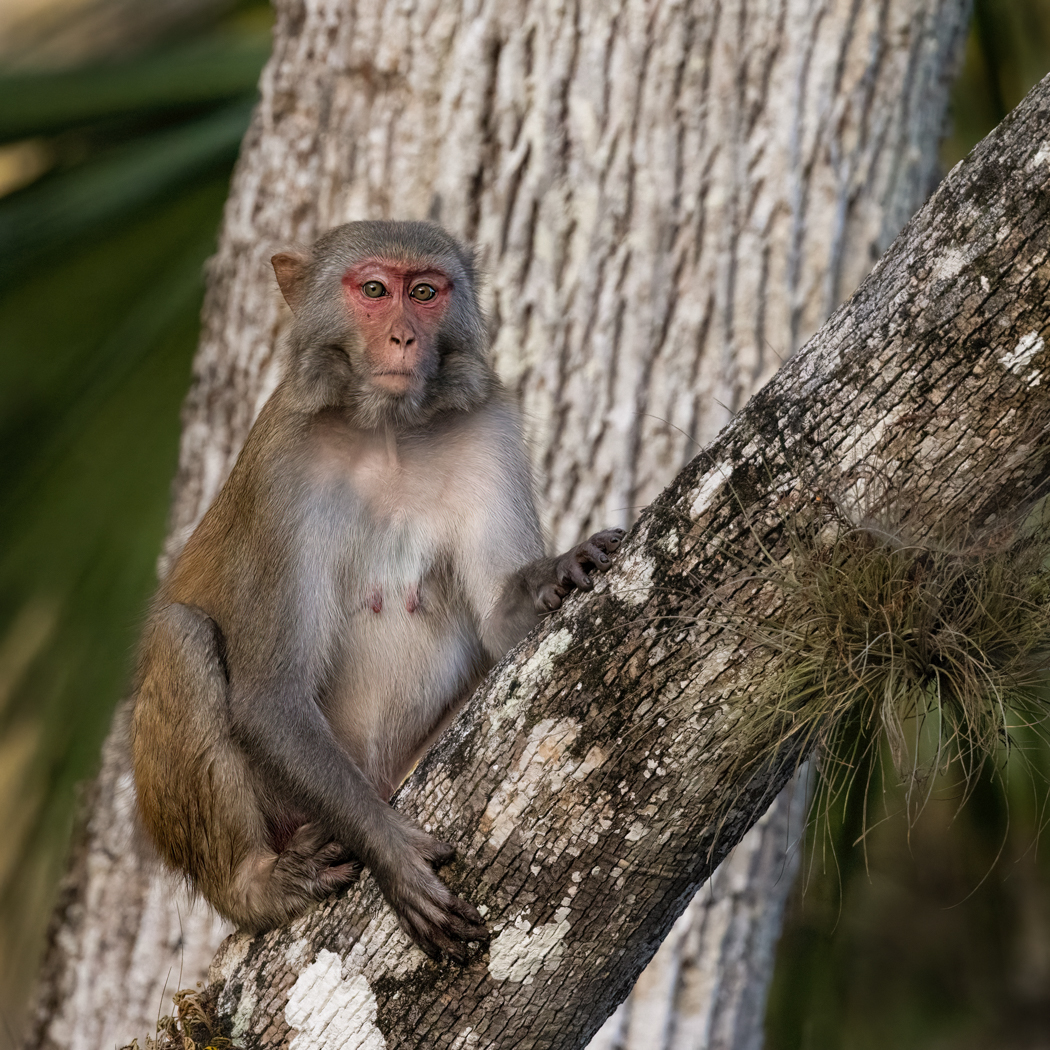
Terry, take a look at my reworked image and my notes on the changes I made. I did darken the white tree...too much? Thank for your help on this guy! |
Feb 12th |
| 78 |
Feb 23 |
Reply |
Based on your comments, I went back to my original and started over. The front branch is plenty sharp on its own, so I sharpened on the monkey and I think he looks better. Do you? I darkened the tree behind and cropped in a square. Any additional feedback? Too dark now? Thanks again! |
Feb 12th |
| 78 |
Feb 23 |
Reply |
James, I went in closer on my monkey, as you suggested, but left some of the environment and kept the tree from going out of the frame in the corners as you suggested.
An improvement? Thanks! |
Feb 12th |
| 78 |
Feb 23 |
Reply |
I split the difference on the tree and kept it out of the corners (going out of frame) below. Better? Like the new processing or the former? Thanks! |
Feb 12th |
| 78 |
Feb 23 |
Reply |
I added a new crop below, bringing the monkey closer and in a square crop. Thoughts? |
Feb 12th |
| 78 |
Feb 23 |
Comment |
Thanks for all the great feedback! I started back in raw. I chose the Vivid Profile (not preset) and then used DeNoise and Sharpen (just the monkey, not the front branch, as it was already crisp).
I cropped as a square and I think that gave me a good amount of environment, without the tree in corners and a good close up of the now sharper macaque.
I did darken the white tree down (too dark or too yellow?) and the yellow on the outsides as kind of a vignette. I brighten the monkey's eyes.
Any feedback on the newer version? Thanks! |
Feb 12th |
 |
| 78 |
Feb 23 |
Comment |
Love this, Mitch! I don't know that anyone would get the "books" reference, so you might want to come up with a different title? "Looking Up" is always an easy one.
I absolutely understand if you want it to look as it did. But if not, Jim's version with contrast is great and really gives depth to it.
Why are we lugging around $10K worth of gear when this was in your pocket?!
Did you use LR Mobile on your phone or bring the image onto your computer? |
Feb 7th |
| 78 |
Feb 23 |
Comment |
Wow, this is fantastic. I just went to my first orchid auction and I could easily get addicted. What are your areas of interest in Biology? (Guys, check out Robert's bio!).
If you have an info sheet on how you focus stack, you can add it under "Bulletin Board" at the top of our page. Any articles, extra pix, etc can be posted there that are "off topic".
Back to your amazing orchid and composition--I think your background was great and worked well with the yellow of the orchid. However, in your desaturated version, the orchid does pop a lot more! I note it was suggested you desaturate the green, but the green seems the same and it looks like the background yellow was brought down?
Bringing back the stem was a great idea from Terry (he does a LOT of international competition!) and I like Jim's idea of brightening the center of the orchid.
And I loved your humor about your "high end camera" giving you crappy photos in your hands. I also have an R5 and I have had a year of sending it back and paying to go out with experts to get the menus set up correctly for my wildlife shoots. Yep, crappy photos in my hands!
I'm thrilled to have you in the group and I'm sure we will earn a lot more biology from you and a lot more about focus stacking. I don't think I've seen a focus stacked image posted here, except I do some HDR landscapes...nothing at all to this level. |
Feb 7th |
| 78 |
Feb 23 |
Comment |
You have the most creative shots! Sunil nailed it on suggestions. I might whiten the whites of her eyes a bit...new filter in "portraits" choice in LR that makes that easy.
This looks just like Hillary Swank, the actress.
Title suggestion--"The Two Sides of My Wife", regardless of whether its your wife.
There are some white spots in her hair that caught my eye on her "bad" side that you might want to remove or darken. Can't wait to see what you decide for your rework! |
Feb 7th |
| 78 |
Feb 23 |
Comment |
James, you certainly got a lot of suggestions and new directions to take your fabulous image!
For me, the bottom of your image is spectacular! But the blue mountain looks overdone. I'd suggest the mountains much closer to your SOOC with just the little blue tint would look more believable.
I find the replaced sky to be very busy, as well as not feeling "right" with the scenery below.
So far, I like Jim's rendition the most, although it may be a bit heavy on the orange.
I do think there is a great full image with the sky and blue mountain supporting the trees and road. Can't wait to see what your rework looks like. Great capture! |
Feb 7th |
| 78 |
Feb 23 |
Reply |
Wowsa! Love the crop and that surprised me! Nice changes, Jim! |
Feb 7th |
| 78 |
Feb 23 |
Reply |
Thanks, Jim. I like your ideas and will rework by this weekend. |
Feb 7th |
| 78 |
Feb 23 |
Reply |
All great ideas and the titles are cute! He does have a "What have I sat on" expression! I will rework later this week! |
Feb 7th |
| 78 |
Feb 23 |
Reply |
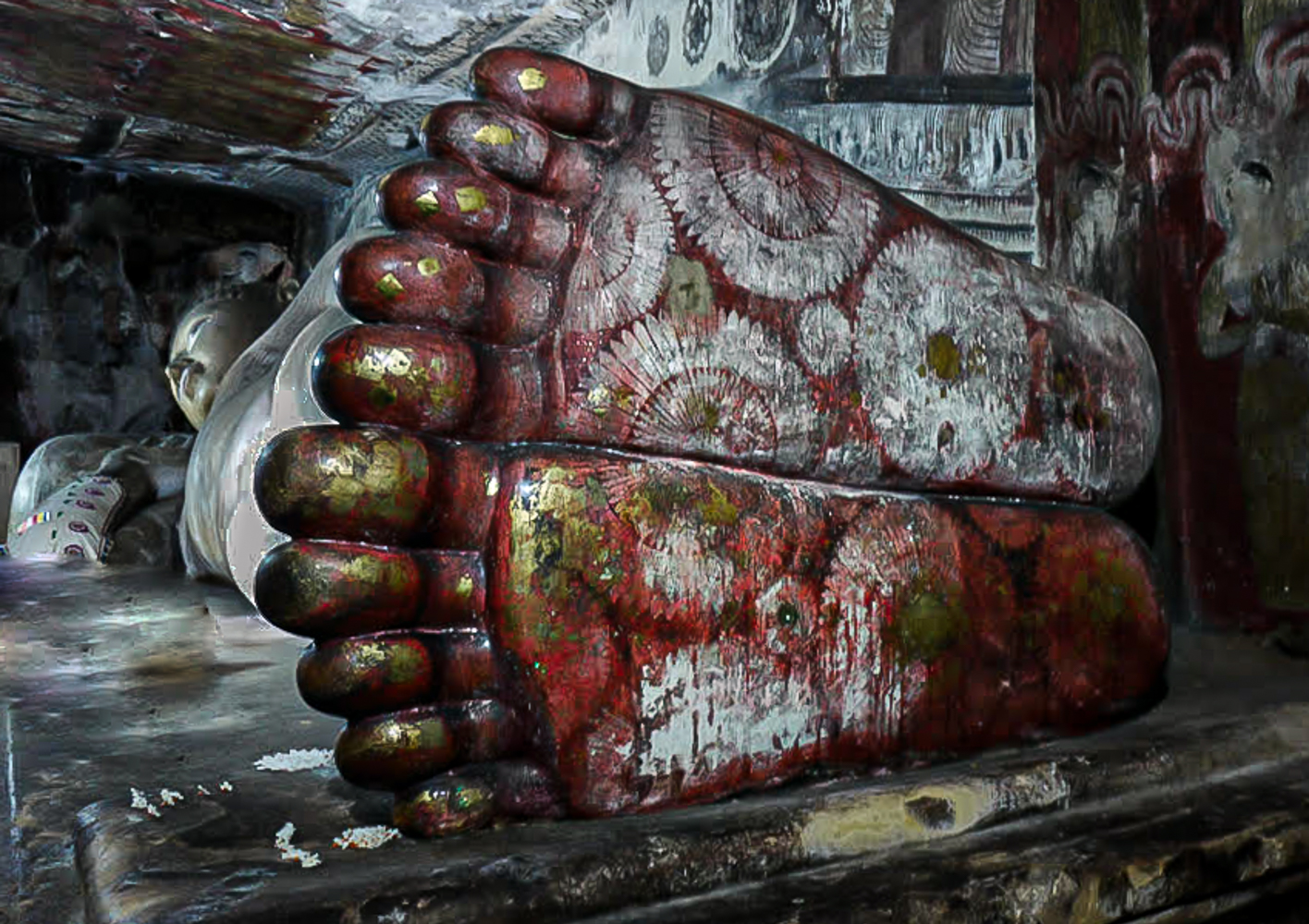
Robert, I like your idea of lightening of the surrounding "building" and body. Great clean up of the area, Sunil. The vivid feet still bother me, but they are an attention grabber and lead us into the "rest of the story".
|
Feb 7th |
| 78 |
Feb 23 |
Comment |
I love this image. I love the idea of a sacred statue being in place for centuries in a war-torn country, and pilgrimages are still made.
I kept more of the surroundings to show he's not in a museum or church, and I kept his feet in a deeper red tone that shows in the original.
I did a quick darkening of his belly with a brush in LR dropping exposure and shadows. I added a radial filter on his face with a hint of yellow like the daylight was coming in there, and I added a radial filter on his feet with exposure, white, clarity and texture.
I did remove the stuff in front of him. If it was mine, I'd probably drop in more flowers around.
Thanks for bringing such a wonderful challenge. It looks like everyone saw value and had some ideas for you. |
Feb 7th |
 |
| 78 |
Feb 23 |
Comment |
Sunil, in your original, the foot color seems to be more a deep red/rust. Buddha's feet seem to have a henna design on them, which would fit the deep red color. The magenta/pink-red seems jarring, with my limited knowledge of Buddha statues. Since its very old, would the more desaturated look fit this ancientness of the time better? I am going to try a couple options when time allows tonight or tomorrow and see what you think. |
Feb 5th |
| 78 |
Feb 23 |
Reply |
James, I love how you kept the Buddha in the image, making all of him our subject, and a few toes. Great crop suggestion!
|
Feb 5th |
| 78 |
Feb 23 |
Comment |
Wow, lots of great ideas already!
A couple of thoughts that have not been mentioned--
1) I feel I'm a little too close to the home, and the house is on a bit of an interesting slope, so it might be nice to leave the grass in the front that you had in the SOOC image.
Robert mentioned it feeling like a house portrait, and I think this is why I'm thinking of more "front yard" to make it feel like it is very remote.
2) In the right lower sky, there seems to be some darker blue painting? It even ran into the bushes? A clone tool instead of a brush, will let you clone the proper color. But in this case, I would probably use a separate layer in Photoshop and then use Blur>Gaussian Blur to fade the edges better.
I love the whole scene and hope to find some scenes like this on our month-long drive out west. Wonderful!
Thanks for the discussion on Raw v JPG, that was very instructional. I shoot only in raw, knowing it gives me more data, but would have failed the pixel question.
|
Feb 5th |
| 78 |
Feb 23 |
Reply |
Robert, thanks for your thoughts! I did count the front tree in my sharpening, since it was on the same plane as the monkey. I did like the textures there, but I do now see what you see, it looks like I focused on the tree and not the monkey.
I think I'll go back to my raw image and start over, sharpening only the monkey and not the tree in front, as well as try a couple of the crops suggested. I appreciate the ideas! |
Feb 5th |
| 78 |
Feb 23 |
Reply |
James, thanks so much for your work on my troubled monkey. Although I agree with your workshop tenants, in competitive PSA Nature, there is a tendency to show an "environmental portrait", so we know it was taken in the wild and we can't use vignettes.
However, this is a PSA Color image, and "anything goes (almost)", so I can make all the changes you recommended.
Hard to call a monkey "beautiful", but I'll try a rework using the premise that it is the key subject. ;-) |
Feb 5th |
| 78 |
Feb 23 |
Reply |
Thanks for the idea of the crop edit, Sunil! |
Feb 5th |
8 comments - 23 replies for Group 78
|
8 comments - 23 replies Total
|


