|
| Group |
Round |
C/R |
Comment |
Date |
Image |
| 78 |
Jan 23 |
Reply |
Thanks so much for your "Thumbs up"! Woot! |
Jan 20th |
| 78 |
Jan 23 |
Reply |
Sunil, I tried out your suggestions and crop on the version posted 1/20. Like it better? Any other suggestions? |
Jan 20th |
| 78 |
Jan 23 |
Reply |
James, How cool you and your daughter know the area. I tried out your suggestions, what do you think? |
Jan 20th |
| 78 |
Jan 23 |
Reply |
Jim, I did drop the brightness and I did try a new crop...take a look at the image at the bottom and let me know what you think. Thanks! |
Jan 20th |
| 78 |
Jan 23 |
Reply |
I've tried a vertical crop and taken down the bright white cypress stumps. Like it better? Thanks for the brilliant idea in entering it in a NO Nature offered competition! |
Jan 20th |
| 78 |
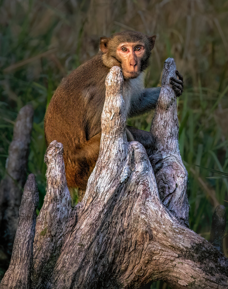
Jan 23 |
Comment |
Thanks to everyone for all the help on my first primate!
The consensus was to take down the whites/highlights to remove the stark white out of the cypress "knees" and Macaque face. Done. Look okay?
Sunil suggested a vertical crop, done, what do you think?
James (our newest member) and his daughter know the area and recommended I lighten his hand a bit. I added a little yellow and exposure to his hand, so the hand was not so black.
Any additional suggestions before I enter him in PSA Color? Sunil tried his magic to turn him into a monochrome, and, as I suspected, this will not be a good image for the mono category. |
Jan 20th |
 |
| 78 |
Jan 23 |
Reply |
Thanks, Sunil! I do like your crop! I tried monochrome and it didn't work for me. You are the b/w genius, so if you didn't have any luck, I know its supposed to be in color. I am going to try dropping the front wood brightness also. Great help, thanks! |
Jan 15th |
| 78 |
Jan 23 |
Reply |
Interesting version, James. Somehow it reminds me of summer storms on the Connecticut coast. The sky would get a similar color and the houses would all be lit up. It does seem a bit more inviting than the b/w. |
Jan 15th |
| 78 |
Jan 23 |
Reply |
Terry, My recently found (on Ancestry) cousin is visiting in the area, and we are sharing pix of our respective Italian relatives, circa 1900.
I mention this, as your image now feels like the images that my cousin and I have been studying. The real tools, the fancy dress (even if you were a laborer), the immigrant brickwork. Personally, I think the track is very helpful for the story and tools, and it does give a great horizonal with all those strong verticals. I do like the full door choice, also. By jove, I think you've got it! Ready for competition! |
Jan 15th |
| 78 |
Jan 23 |
Reply |
Yep, I agree, as the yellow wasn't helping you. I think that's because the image is really in the cool colors. It's a great trick with something warmer, like my monkey image.
I do think the swan shows up nicely now! |
Jan 15th |
| 78 |
Jan 23 |
Reply |
James, In my opinion, its too much yellow, but the exposure increase works. Perhaps making the radial filter bigger, with less yellow, so it takes on the look of some of the lighter reflections in the water. And double check you have feathering at 100%, so the lighting trick is almost invisible. |
Jan 15th |
| 78 |
Jan 23 |
Reply |
James, wow, I like your changes and brings out the stars and the green brilliance! |
Jan 15th |
| 78 |
Jan 23 |
Reply |
James, Great job! The tower looks magical to me now. I really like your rework! I have one more tiny suggestion. The swan is a bit difficult to see in the darkened water. I suggest the radial gradient (its round) and put it over the swan with full feathering, and increase exposure just a tiny bit and add just a bit of yellow and it will look like a bit of sun lightening him up. This is just a tiny amount, that no one will notice but you. But the swan will show up a bit more.
Is there a Greenville Facebook page you could share this on? I think its a unique view of the town's icon.
I'm going to email you the link for Matt K's video on using the selection tool. It's free, its short and it has some tips on adding/subtracting subjects when selecting the subject, background or sky. You may already know all the selections tricks, but I still find things that I have forgotten when I review it. |
Jan 15th |
| 78 |
Jan 23 |
Reply |
Great ideas, James! I wasn't paying attention to the monkey's hands, and they could use some work. |
Jan 14th |
| 78 |
Jan 23 |
Reply |
James, LOVE the sepia! It really makes the story come alive and hides some of the "fakeness in the costumes. Great solution! |
Jan 14th |
| 78 |
Jan 23 |
Reply |
Great ideas, Jim, I'll play with that. I don't want the whole thing to go dark, I'll see what I can create. Thanks! |
Jan 14th |
| 78 |
Jan 23 |
Comment |
Welcome, James!
I really love the swan sailing into the tower, it adds so much. And the reflection is fabulous, too! My goddaughter graduated from Furman, and so I have fond memories of our proud moment with her!
It's a great composition and I have some thoughts for you. On my screen the sky seems too cyan. You might consider backing down the blues. I would consider darkening the car area and the dirt of the higher building.
My final thought is that the bell tower with more selective sharpening would really jump off the page. Several of us are in love with Topaz Sharpen/DeNoise/Photo AI and it does give a great result. An alternative is to use the Masking tool in Lightroom and "Select Subject" and add Clarity and Sharpening to the subject (it "should" pick just the building). |
Jan 9th |
| 78 |
Jan 23 |
Reply |
Try the Patch tool. You circle the area you want to move, and slide it over. Circle a little wider than the red spot, and hopefully it will be gone. Also, make sure that you are set at a low pixel on clone tool or patch tool, or it will "blend" and make that red smeared forever. Road out is great. Also, you can use Content Aware Fill and it will figure it out most of the time. |
Jan 7th |
| 78 |
Jan 23 |
Reply |
Mitch, it was the craziest scene, hundreds of monkeys leaping above us and the monkeys all screaming and fighting each other. Monkeys swimming across the river, it was the most bizarre hour I've ever experienced! Thanks for the wonderful compliments! |
Jan 7th |
| 78 |
Jan 23 |
Reply |
I agree that feral horses that haven't been domesticated for a century should be Nature, and the same for these monkeys, who do not rely on people. But, as you said, those are rules.
Thanks for the tip about picking just a Color competition and no Nature...good idea! |
Jan 7th |
| 78 |
Jan 23 |
Reply |
I really like your second image! Nicely reworked! |
Jan 7th |
| 78 |
Jan 23 |
Reply |
Good catch, Mitch! |
Jan 7th |
| 78 |
Jan 23 |
Reply |
Oh, good idea, Terry! I like "You Are Late"! You can't use punctuation if you enter it in PSA, so maybe "Never on Time" would read better!
Brenda |
Jan 2nd |
| 78 |
Jan 23 |
Comment |
Soooo excited you got to see the Aurora Borealis and get the images you had spent so much effort to get!
I think you did a pretty good job removing the tower, but if you start over with the clone tool, you'll be happier. It won't leave a light red blob. Happy to Zoom with you for a few minutes and assist, if you would like.
Did you try some DeHaze to remove the haze? Saturation might also help. And did you try DeNoise, as its a bit snowy (or was it snowing? or are those stars?) as DeNoise might help to bring out the perfect moment.
You also might increase the saturation on Green and see what that gives you.
The lower right corner has a funny grass road? I would probably darken that or clone snow to not have it distract from your wonderful auras.
I'm sure the others would agree that we would LOVE to have been there with you and gotten this shot! Yay for you!
|
Jan 1st |
| 78 |
Jan 23 |
Comment |
So very exciting to get a good "story" like this!
There is a bright white spot by the heel of the sitting gentleman that I would darken or remove.
On my screen, there are a few areas that look too bright and take my eye away from the wonderful interaction between the gentlemen--the yellow pants and their faces, a bag? on the right hand ground and the far left wall.
This seems like a perfect b/w or sepia to help create the timelessness. Sunil might give us a great version in monochrome.
|
Jan 1st |
| 78 |
Jan 23 |
Comment |
Wow, I can't believe how you transformed your discard (I would have discarded it, too!) into the beautiful piece you created!
It does seem a bit dark. I'd be tempted to lighten the houses just a bit. Or maybe add some highlights into the white streaks in the clouds.
I think you could crop a bit from the top, since not much is happening in the clouds right now.
You are the Monochrome Master! |
Jan 1st |
| 78 |
Jan 23 |
Comment |
What an interesting story! I didn't see it as a reflecting pond, but as a tray at the airport security. And airport travel would explain her nasty expression and the young gentleman would be checking out her situation.
I like how the stitching in her purse matches her hair and his shirt, tying the composition together well.
The green works well, too. Top of wall, purse, and green on guy.
I think darkening the blue on the guy's backpack straps is a consideration, if that wouldn't violate whatever rules in competition you'd be entering.
Since its not an easy guess, I keep looking at it trying to figure out her snarky look and his eagerness. Really fun an crisp in all the right places. |
Jan 1st |
6 comments - 21 replies for Group 78
|
6 comments - 21 replies Total
|


