|
| Group |
Round |
C/R |
Comment |
Date |
Image |
| 69 |
Dec 22 |
Reply |
Thanks so much, Mervyn! I appreciate it! Thanks for all you do for the group and PSA! |
Dec 27th |
| 69 |
Dec 22 |
Reply |
Awww...thanks! It would be a blast to shoot with you!
I've enjoyed your photography and wish you the best of luck with your images. This is my last month in DD 69. |
Dec 21st |
| 69 |
Dec 22 |
Reply |
I so appreciate it, Jacob!
I've enjoyed your photography and wish you the best of luck with your images. This is my last month in DD 69. |
Dec 21st |
| 69 |
Dec 22 |
Reply |
Thanks a million, Mervyn! I appreciate all that you've done to support my photography. Wishing you a great holiday season! |
Dec 21st |
| 69 |
Dec 22 |
Reply |
Thanks so much for your thoughts!
I've enjoyed your photography and feedback for years! I wish you the best of luck with your images. This is my last month in DD 69. |
Dec 21st |
| 69 |
Dec 22 |
Reply |
Thanks, Cindy. we pay big money for the lowest f/stop we can get. My lens at 500 mm and so f/7.1 is the lowest I can go. Disappointing that is foot is fuzzy, but his eyes and wings are pretty good.
I've enjoyed your photography and wish you the best of luck with your images. This is my last month in DD 69. |
Dec 21st |
| 69 |
Dec 22 |
Reply |
Cindy, I'd use content aware fill and Patch tool for the quickest blending. If you know Photoshop, you can cut a chunk of leaves and make a separate layer, then move it around to fill in spaces.
PSA Nature rules do not allow any cloning, etc., if you are entering PSA rules. However, PSA Mono allows all changes if they are yours, so I'd turn it to mono and make changes.
If its for you or non-PSA contests, I'd make the changes to have a dynamic fabulous image with no white spots!
|
Dec 13th |
| 69 |
Dec 22 |
Comment |
The squirrel kill is awesome! Darn, that blown out background. If you flip to monochrome, you could clone some leaves block that harsh light.
Great job on the catchlight!
|
Dec 12th |
| 69 |
Dec 22 |
Reply |
Thanks for the updated version! |
Dec 6th |
| 69 |
Dec 22 |
Comment |
Interesting! We call this an anhinga, and its a common shore bird in Florida. Often drying its wings, as pictured in your image. I looked up "darter" and its in the same family as anhinga.
I like the diagonal and the trunk dissecting that diagonal. Her eye is clearly visible, and its a nice display of her wing and tail feathers with no distracting background.
I couldn't find a darter with orange on its wing feathers, our anhinga is only white and black on the wing feathers. The female has the brown neck, the male is black or chocolate brown.
I am wondering if you increased the orange, as the tree stump and her wings, beak, and the water all have a lot of orange? Or is that your environment and darters do have orange in their wings sometimes? You didn't include your original, so I can't tell. Can't wait to hear about this fascinating cousin of our local birds here in Florida. |
Dec 6th |
| 69 |
Dec 22 |
Comment |
Jacob, glad to see you are working with more editing tools, which will give you much more creativity and power.
Check out videos on Snapseed, I recommend Rad Drew's videos, a great instructor and award winning cell phone photographer.
The good news is that the bird is on a diagonal, which adds interest, and he has a frond in his mouth, which adds interest.
Sadly, we don't don't see the bird's eye or eyes, which is considered a poor composition, as we aren't interacting with the subject. It would have been stronger if you had laid in the grass and gotten him at eye level for a stronger perspective.
But this was a great practice image for you on removing distracting elements. It looks like you removed in too big of a clump, as we can see the area very easily where the grass was, as the stones are kind of smeared when looking on my large screen. Smaller changes bit by bit will allow the software to make better decisions on replacements.
My Google Pixel phone has an "eraser" and automatically picks up distractions like telephone wires, trash cans and such and removes them automatically. I can also rub my finger on the item to remove and its gone instantly. I imagine your newer iphone has similar technology without even going to Snapseed.
If you decide to move to a camera and use Lightroom/Photoshop, you'll have great resources for this kind of fix.
Good first effort! |
Dec 6th |
| 69 |
Dec 22 |
Comment |
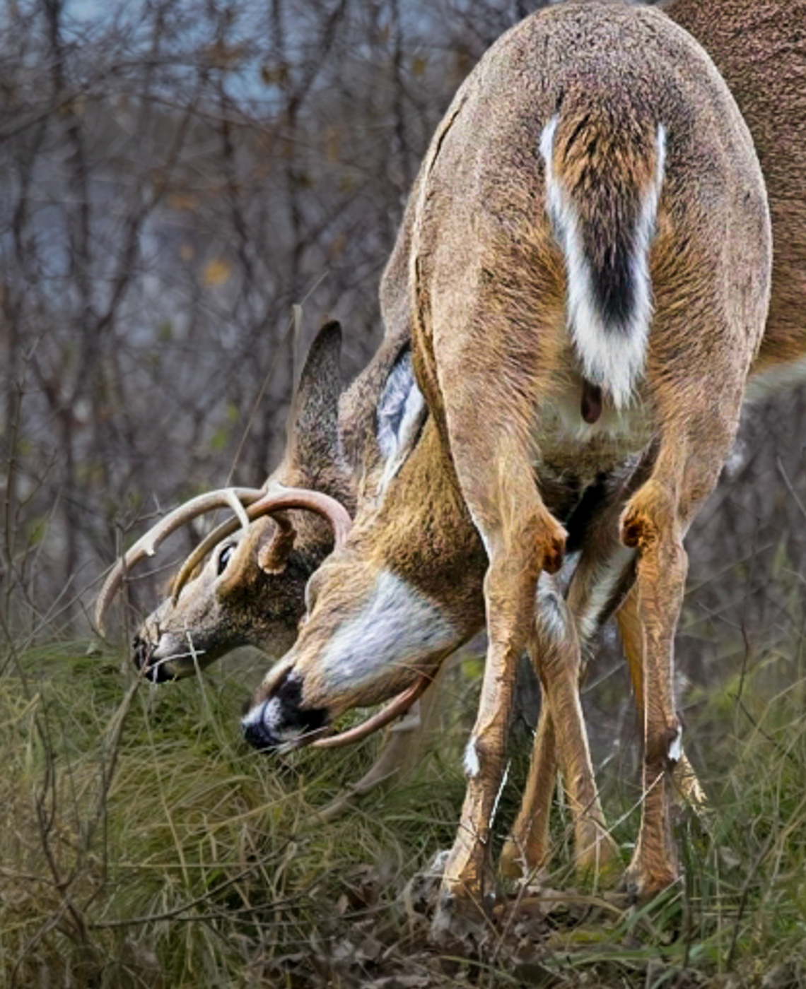
Wow, lucky you, to see two fighting white tails! You don't say where you were?
What is on the right lower side watching them? A hawk? Its very distracting and I can't figure it out! Maybe a log with missing bark? Anyway, I'd look to crop it out or darken it.
You have a great subject, the two heads interlocked. The busy foreground and background hurt you. You don't say if you used overall sharpening on ON1, but you'll see in my image, I only sharpened the subject and decreased contrast in the background (not allowed in PSA Competitions--just so you know).
To bring us into the action, I cropped. I selected subject and added contrast, texture and clarity in Lightroom. I then selected the inverse and decreased exposure, texture and clarity on the grass/trees, so we aren't looking at all the busy grasses and trees. I used the radial gradient to add contrast to the eye. I brushed the back legs to decrease exposure and hopefully take our eye to the fight. Of course, we are looking at a deer's butt, which is not ideal. Hopefully, my quick re-work will give you some ideas on what might be possible with a different crop and focus.
|
Dec 6th |
 |
| 69 |
Dec 22 |
Comment |
I love the diagonal, and the stem that crosses the stems end. It's almost a sepia image, and then this RED leaf. Very powerful.
I would recommend sharpening just the red leaf, as everything is a tad soft.
I'd also use a very soft brush in Light room and add just a touch of darker exposure to the edges where there is something bright, like the stone at the top left. Not a vignette (not allowed in PSA Nature competitions), but just a light touch of darker exposure here and there to keep our eyes inside the image.
Glad you got to enjoy the Canadian woods! |
Dec 6th |
| 69 |
Dec 22 |
Comment |
Wow, great shot! At 200mm, you were close to that capuchin monkey! Great expression with his tongue out, I've never seen that, and I was a docent at an animal park where we had capuchins.
I really like the "Y" of the tree and its on a diagonal, which adds. And I like his tail ing around the trunk.
The face seems a tad soft, it looks like your camera grabbed the tree for a focus. If you'd like to bring the monkey more into focus, try "Select Subject" in LR and increase "Clarity", "Texture" and "Sharpen". I'd use a radial gradient on each eye and add sharpen and exposure there, also. If you have Topaz Sharpen, it will do a great job, but choose "Select Subject" or it will sharpen the background, too.
With a bit of selective sharpening, this is a good composition and a strong competitive image and it will do well in PSA Nature (if you took it in the wild and its not feral). Great job! |
Dec 6th |
6 comments - 8 replies for Group 69
|
| 78 |
Dec 22 |
Reply |
Great ideas, thanks so much, Terry!
|
Dec 30th |
| 78 |
Dec 22 |
Reply |
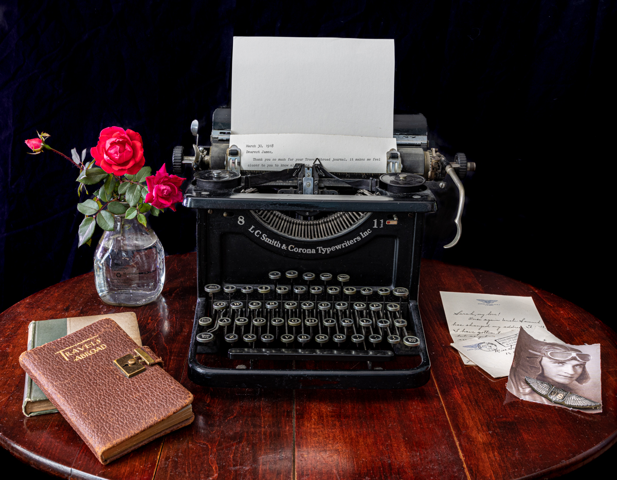
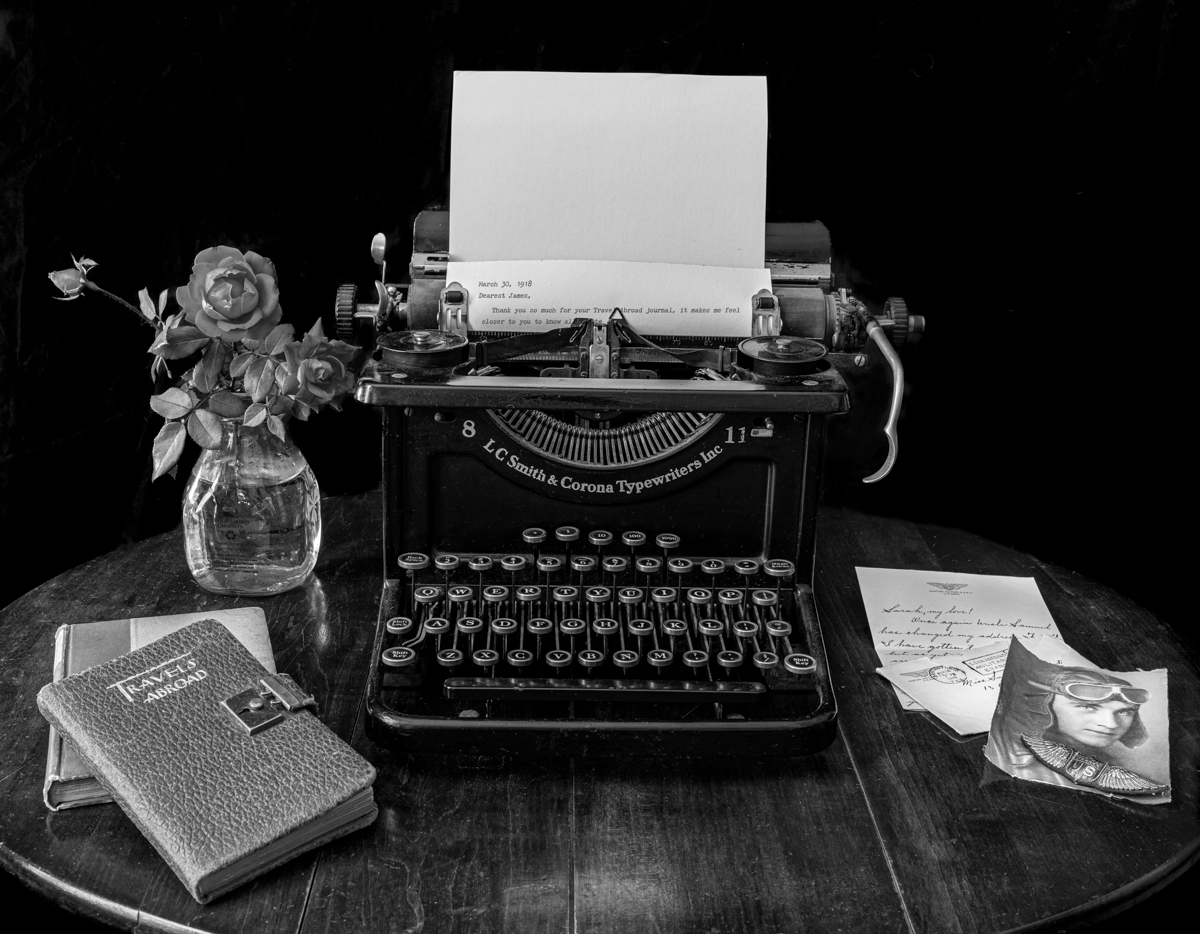
Mitch, I've added a mono and color image below, what do you think? I added text to the typewriter to explain the Travels Abroad journal. I cropped in tighter to remove the carpet line. Thoughts? Thanks so much! |
Dec 27th |
| 78 |
Dec 22 |
Reply |
Terry, You were right, sepia is allowed! I've posted two new versions today, what do you think? I added text in the typewriter and a blurred background and a tighter crop to minimize the rounded table. Thanks so much! |
Dec 27th |
| 78 |
Dec 22 |
Reply |
Jim, check out my two new versions below in color and mono and with your blurred background idea. I also added some typewriter text. What do you think? Thanks! |
Dec 27th |
| 78 |
Dec 22 |
Reply |
Helen,
So sorry to see you go, and Jason is leaving, too! I'd love your thoughts on my two new versions posted below. Black background, some text in the typewriter. A mono and color to choose from.
Stop by and see us from time to time! Best always! |
Dec 27th |
| 78 |
Dec 22 |
Reply |
Jason, thanks for your ideas. I've posted two new versions below. I have gone in tight to show off the letter and photo, and I've added some text in the typewriter to explain the journal. Thoughts? Like the color or the mono? Any other thoughts given this setup? Thanks!
We'll miss you and stop in sometime to say hello and lend your suggestions! Best always! |
Dec 27th |
| 78 |
Dec 22 |
Reply |
Sunil, I've posted a different version of this shoot in color and monochrome. I'd love your thoughts, as I followed your advice and I added some text to explain the Travels Abroad book. Thanks! |
Dec 27th |
| 78 |
Dec 22 |
Comment |
Here's the color version |
Dec 27th |
 |
| 78 |
Dec 22 |
Comment |
Thanks so much for your feedback. Since I am in Florida and can't immediately recreate the scene, I took another image shot at the same time and made some alterations.
1)Blurred black background
2) cropped table to minimize roundness
3) added an antique font letter started
4) My typing mentions the Travels Abroad journal being from James, to explain it a bit more and tie it in.
Do you like B/W or color versions? Any other thoughts, given that I can reshoot for a few more months? Thanks! |
Dec 27th |
 |
| 78 |
Dec 22 |
Reply |
Terry, thanks for the definition--I have asked PSA directly to clarify, as I was told only grayscale. I'll let you know what I learn!
Thanks for the ideas on alternative ideas. I do like the blurred background and would be especially nice in sepia, if allowed. |
Dec 17th |
| 78 |
Dec 22 |
Comment |
Helen, I think you got a lot of great feedback on this! We will miss you and wish you and your family the best! Keep in touch! |
Dec 17th |
| 78 |
Dec 22 |
Reply |
Nice changes! Glad everyone could lead you to your best composition! Are you thinking PSA Color? |
Dec 15th |
| 78 |
Dec 22 |
Reply |
Thanks so much, I am gonna try it!~ |
Dec 14th |
| 78 |
Dec 22 |
Reply |
Thanks for the GWR info and your investigations in to the buckets! |
Dec 13th |
| 78 |
Dec 22 |
Reply |
Thanks so much for dropping in, Stephen! Great info, as always! |
Dec 13th |
| 78 |
Dec 22 |
Reply |
Great idea, thanks!
|
Dec 12th |
| 78 |
Dec 22 |
Reply |
Glad you like the monochrome. Any ideas of what I could do to make it more powerful? |
Dec 10th |
| 78 |
Dec 22 |
Reply |
Thanks, Mitch. I appreciate your thoughts! |
Dec 10th |
| 78 |
Dec 22 |
Reply |
We'd love to post your reworked photo here, Helen! Then we can give further suggestions for you to consider. Can't wait! |
Dec 10th |
| 78 |
Dec 22 |
Reply |
Thanks a million! |
Dec 8th |
| 78 |
Dec 22 |
Reply |
Sunil, to me, this looks much easier to look at, much more pleasing. We'll see what everyone else thinks. and I agree the b/w didn't work, and if you can't make it work, it can't be done! Thrilled you found my comments helpful! |
Dec 6th |
| 78 |
Dec 22 |
Comment |
I'm not a people photographer or a street photographer, so I don't have much to offer.
I do feel the cigarette makes the image, and you've shown it nicely here. His face does show up well, you did a good job on bringing him into the image.
The blurred street lights add an odd component--almost Christmas-y against a young man who looks tough. But I think they add additional interest and frame him nicely.
I would never have guessed this was Greece!
|
Dec 6th |
| 78 |
Dec 22 |
Comment |
Wow! Wow! I like Jason's crop, as all I want to see are the bears, and Jason's crop makes it clear that there is nothing but tundra in all directions. I love the bear's fierceness, as we don't normally see that in images.
The bears look really nicely processed, I like that the ice is bluish, which gives us a warm tone yellowish bear against the harsh cool tone gray/blue and we can clearly see the bear detail.
Congrats on another bucket list item crossed off! |
Dec 6th |
| 78 |
Dec 22 |
Comment |
Great eye to see this, I would have passed by the opportunity!
I think Sunil nailed it--distractions out of the window, objects out of the right or cropped tighter, not so many tracks showing brings us closer to the "little train" and buckets.
Very fun! The lines on the shed give us a good vertical feel and then the white rail with strong tracks give us a strong horizontal and the super red buckets pull us back in again and again.
|
Dec 6th |
| 78 |
Dec 22 |
Comment |
Helen, how amazing! I can't wait to see more of your Vietnam images!
My first impression was the color was overpowering, and I liked what Jason suggested for color. His crop also lets us see what is going on in the boat a bit better, but your crop is also wonderful.
|
Dec 6th |
| 78 |
Dec 22 |
Comment |
Wow, Sunil. In my several visits to NY, I've never heard or seen this as a photo op. And its a great one! I immediately knew the story of the old/new, but would not have guessed 1886!
It feels a tad over-sharpened (or too much clarity/texture?) to me. Because our eye has to deal with all the lines in the buildings, I don't think you need as much as most images call for.
On my screen, the blue sky seems a bit artificial, I might reduce it a bit, since its the most "color" in the image, it really draws my eye.
One other thought--perhaps darken the building edges on the right and left to keep our eye from going off the page. I wouldn't use a vignette, but just a very light brush to take off the brightness a bit.
You always have fantastic b/w images, it seems like this one would lend itself. Is there a reason you felt color helped your image more that b/w? I am asking for myself, since I am starting to enter mono and your selection process would be most helpful. |
Dec 6th |
| 78 |
Dec 22 |
Comment |
Jim, we gotta get together since I am in Indiana half the year and you are in Ohio, wanna do the Magee Marsh for warblers in May? https://www.mageemarsh.org/
What a fun "window grab" image, and how unusual to see a woman walk oxen. That's a very small cart for two big oxen! To make your image feel more authentic, I think this is a perfect image for b/w conversion. I would also considering removing the monument right behind the oxen's horn. B/W would also hide the asphalt road which would help it look more authentic. Sadly, you lose the fall leaves, but they would also show up as "colored" in the conversion.
|
Dec 6th |
| 78 |
Dec 22 |
Reply |
Jason, thanks for your Dearest Sarah title, I think that works!
I like your wider angle, but the new carpet showing is definitely not 1918. And the table legs show it really isn't a table you could type on. I'll throw it in competition and see how it does.
In PSA, you can only have b/w, no sepia or cyanotype allowed (although I love yours!). So what would you recommend for me to change on my b/w conversion, or does it look okay? Thanks for all your help to me and the group! |
Dec 6th |
| 78 |
Dec 22 |
Reply |
Sunil, I agree text would look good, but its an antique typewriter and no ink is on the ribbon. Maybe we could try to use an old font on a computer and print it out and use that.
I do have some images shot lower, but then the photo and letter didn't show, and they are the story. Tricky choices, for sure.
You are the best at b/w. Would you change anything in my conversion? |
Dec 6th |
9 comments - 20 replies for Group 78
|
15 comments - 28 replies Total
|


