|
| Group |
Round |
C/R |
Comment |
Date |
Image |
| 69 |
Dec 21 |
Comment |
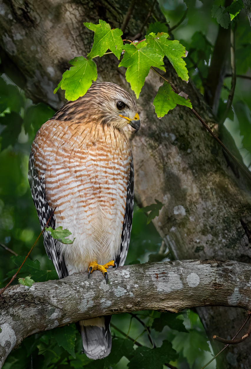
Thanks for all the feedback! I did darken the tree and light coming in between the leaves, and a little more saturation on the bird. Do you feel it looks better? I'm not happy with the bark and leaves, the Gaussian blur I used lost the texture. Thoughts? |
Dec 21st |
 |
| 69 |
Dec 21 |
Comment |
Candy, I just went to Butterfly World, hoping for a butterfly like this...and no luck whatsoever! Where did you find him? |
Dec 21st |
| 69 |
Dec 21 |
Reply |
Yes, that's a great suggestion Mervyn. It has us moving even faster into the rocks/water...lol! |
Dec 21st |
| 69 |
Dec 21 |
Reply |
Thanks so much, Mervyn! I will get rid of the bright spot and darken the tree. My hawk pal came back, see below. |
Dec 10th |
| 69 |
Dec 21 |
Reply |
Thanks, Geoff. He did come back, see below. |
Dec 10th |
| 69 |
Dec 21 |
Reply |
See below. He came back! |
Dec 10th |
| 69 |
Dec 21 |
Comment |
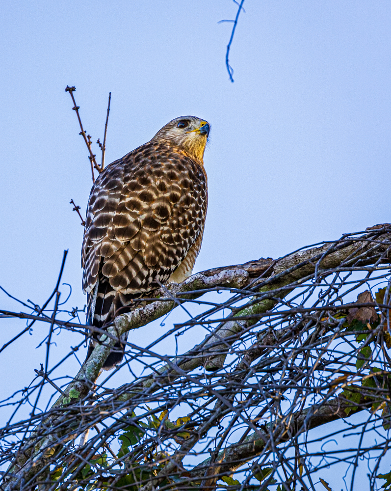
My hawk did come back at dawn, and went to a different branch in the same tree. |
Dec 10th |
 |
| 69 |
Dec 21 |
Comment |
WHAT!!! I'd love to have this shot!! Is it a golden eagle??! I've been practicing shooting birds in flight and its tough. You've done an amazing job! I hope you enter this in a PSA Nature competition.
Love the blood, too! No suggestions! |
Dec 10th |
| 69 |
Dec 21 |
Comment |
Jacob, It's great to see you photographing early in the day and trying a new subject. It's great you got low to get the mushrooms.
I agree with Mervyn that the cluster of mushrooms, grass and flower is distracting and its a little difficult to determine what to look at. I do like Mervyn's idea of the single mushroom on the right. Why don't you try it and post below?
|
Dec 10th |
| 69 |
Dec 21 |
Comment |
What an amazing butterfly and how awesome that the colors worked so well together. I don't see the antennae, if that's important to you. Really perfect. And in Christmas colors! |
Dec 10th |
| 69 |
Dec 21 |
Comment |
This is absolutely my favorite by you! I actually love the reeds, as its a great vertical. I do agree with Candy that the real deer needs to be a bit more standout and the reflection is darker. What a wonderful find! |
Dec 10th |
| 69 |
Dec 21 |
Comment |
|
Dec 5th |
| 69 |
Dec 21 |
Comment |
Wow, I thought the mid-ground were waves! I saw it was in Dead Horse, and I knew there was no water there. So I looked again and again, and finally realized it was rock. Great leading lines in your foreground and middle ground. No suggestions, its great! |
Dec 5th |
| 69 |
Dec 21 |
Comment |
I love this, it seems quite art-y. I love his wing up and his foot up! Beautifully done! |
Dec 5th |
| 69 |
Dec 21 |
Reply |
Thanks, Dean. I kind of liked his halo of leaves. But my husband had some big loppers and cut all the leaves down so my shot wouldn't be blocked if he returns.
|
Dec 4th |
| 69 |
Dec 21 |
Reply |
Thanks for the tips, Candy!
|
Dec 4th |
| 69 |
Dec 21 |
Reply |
Thanks, Candy! That means a LOT coming from you! You'd suggest I add contrast just on the red shouldered hawk? Do you think I should darken the tree behind his head to separate him a bit more? |
Dec 4th |
10 comments - 7 replies for Group 69
|
| 78 |
Dec 21 |
Reply |
Love the group improvements, Sunil! |
Dec 28th |
| 78 |
Dec 21 |
Reply |
Thanks, Helen! Happy New Year! |
Dec 28th |
| 78 |
Dec 21 |
Reply |
Thanks, Helen! Happy New Year! |
Dec 28th |
| 78 |
Dec 21 |
Reply |
Thanks, Sunil! |
Dec 28th |
| 78 |
Dec 21 |
Reply |
Thanks, Sunil! |
Dec 28th |
| 78 |
Dec 21 |
Reply |
Thanks so much, Terry! I do like the "slim Jim" version, too. |
Dec 28th |
| 78 |
Dec 21 |
Reply |
Thanks so much, Terry! I do like the "slim Jim" version, too. |
Dec 28th |
| 78 |
Dec 21 |
Comment |
If you do a lot of birding and faraway photos (and how can you not in amazing Australia!),then Topaz Gigapixel really helps on the tight crops. Their DeNoise and Sharpen come in the package and are amazing! |
Dec 28th |
| 78 |
Dec 21 |
Comment |
Loved this version, too! Boy, it would be great to watch you create someday! |
Dec 28th |
| 78 |
Dec 21 |
Reply |
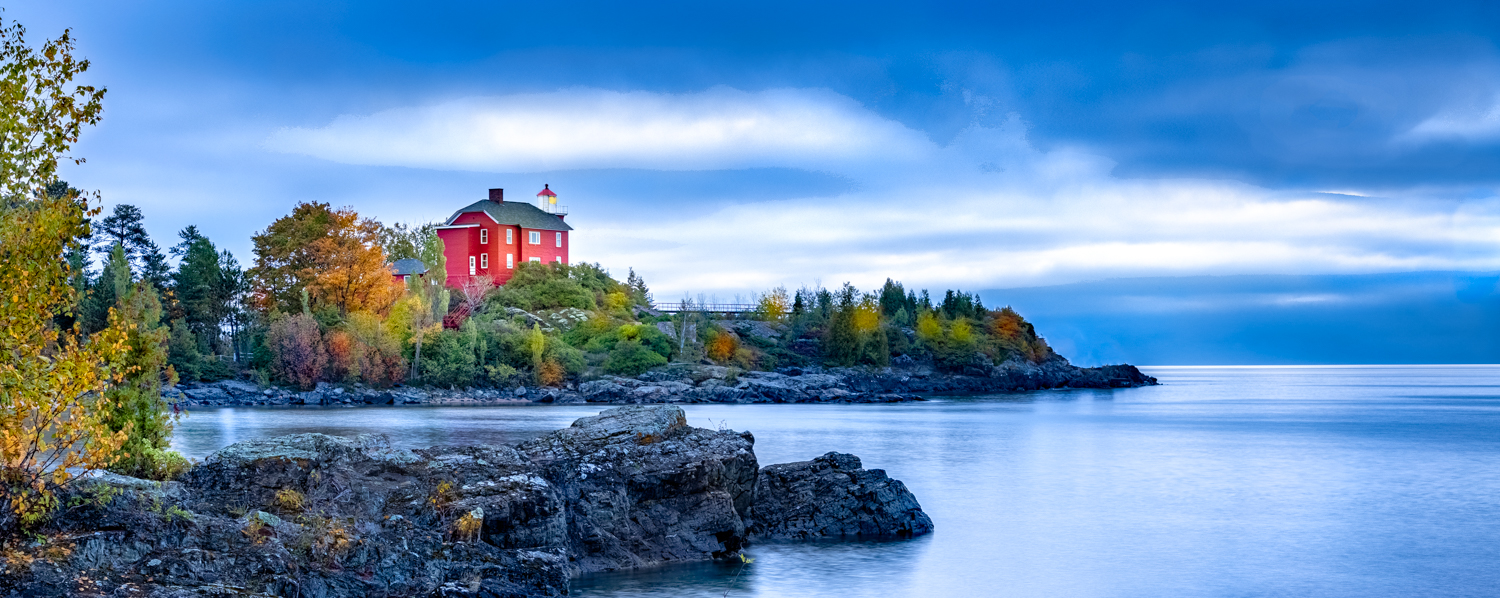
Terry, you weren't late! I think its great for everyone to come in at different times and see the other feedback, it lends to very different suggestions. Check out my newest rendition below and my comments. Am I on the right track?
|
Dec 21st |
| 78 |
Dec 21 |
Reply |
Jason, love the creativity! Check out my comments and new version below and see what you think. Thanks so much! |
Dec 21st |
| 78 |
Dec 21 |
Reply |
Jim, check out my changes and comments below...you were a BIG help this month! |
Dec 21st |
| 78 |
Dec 21 |
Reply |
Mitch, thanks for the thumbs up! Of course, I could not leave "well enough" alone, check out my changes the others suggested and see if you like it better? Have a great New Year! |
Dec 21st |
| 78 |
Dec 21 |
Reply |
Helen, check out my post from today below and see if I've incorporated your idea. Lots of other changes...improved? |
Dec 21st |
| 78 |
Dec 21 |
Comment |
Helen, take a look at my tree and see if you think I've improved it.
Jim, the PSA judge that judged this in our photo club recommended I make it a "slim jim" (pano), as the rocks in front took too much away from the lighthouse. (And I spent all that time trying to get a nice foreground...LOL! It is now on the rule of thirds, and I was able to keep more of my "ocean" feel to the right.
Terry, I did keep the tree on the left, but cropped some off of it. Still look okay?
Jason, thanks for the idea colors. I did play with them--crazy how they change everything--but decided to stay with my original, as I really like the interplay of blue with orange trees and red with green (complementary colors on the color wheel).
I did add some more color to my trees, and a dab of gold on the lighthouse, since it is much more the center of attention with losing the bottom half of the photo. Believable?
I did darken the remaining rock in the foreground, but rocks might be too bright?
Thanks everyone! I really like the pano look! Do you? |
Dec 21st |
 |
| 78 |
Dec 21 |
Reply |
Mitch, thanks a million! That means a lot! We'll see what the rest of the group thinks! |
Dec 5th |
| 78 |
Dec 21 |
Reply |
Thanks, Helen! My thought on the leaves was to make a bit of a border. I had a vignette on them. So you'd recommend taking the little leaves out? |
Dec 5th |
| 78 |
Dec 21 |
Comment |
Wow, fabulous hummer! It's a costa, correct? My R5 is in the shop--the autofocus never worked well. Can't wait to get it back and try some of your action! Woot! Great, light, great color, nice texture on the bird.
If you bought Gigapixel, its perfect for this type of photo and gives you all the pixels to go in even closer and then print big.
I would love to have captured this. No suggestions. |
Dec 5th |
| 78 |
Dec 21 |
Comment |
How cool you were out for a celebration in Belgium. Personally, I like the original a bit more because the highlights are not as bright and the colors are more saturated. I get that its a "look" that chose to look like the past, which I understand. But to me, it seems less rich. |
Dec 5th |
| 78 |
Dec 21 |
Comment |
So creative and fun! I agree she is the perfect model. I also agree with Mitch that the thigh showing is a distraction, I was wondering what I was looking at (whoo-hoo). So proud of you to come up with this! Entering in Color? Or a special category? |
Dec 5th |
| 78 |
Dec 21 |
Reply |
Mitch, you can sharpen in Nature, and you can also use Gigapixel to add more pixels on a super tight crop or a jpg photo. The main idea is not to remove or add anything to make it not look like the scene. You can darken/lighten just like you could in a dark room. |
Dec 5th |
| 78 |
Dec 21 |
Comment |
I LOVW "RED HOT" as a title, Helen! I think the title would be stronger with Mitch's suggestion. |
Dec 5th |
| 78 |
Dec 21 |
Comment |
I'd kill for this photo! I think the expression on the cockatoo is priceless. Some of the wing does seem a tad bright. And perhaps you could darken a tad more under the wing, but I think it all works. I can't wait to hear what everyone else thinks. Burning and dodging both work in Nature. |
Dec 2nd |
| 78 |
Dec 21 |
Comment |
What a great street scene with the couple next to the car! Great colors and energy. I think everything works and how clever you saw the scene from a moving car. |
Dec 2nd |
| 78 |
Dec 21 |
Comment |
Hilarious and such a fun idea. Bravo for giving it a try! I've never done a composite, so take my suggestions with a grain of salt. It seems the line (of the stage?) through your family is a bit distracting. I think if you removed it, it would "read" a bit better. The speaker seems a bit blown out and might be stronger if he had more detail. There's an odd piece on the far right woman's cheek (maybe the flowers sticking through?) and I'd be tempted to remove it. I think your composite is has great potential and can't wait to see what the rest of the group suggests.
|
Dec 2nd |
10 comments - 15 replies for Group 78
|
20 comments - 22 replies Total
|


