|
| Group |
Round |
C/R |
Comment |
Date |
Image |
| 69 |
May 21 |
Reply |
Thanks for your white bird suggestions, Candy!
|
May 29th |
| 69 |
May 21 |
Reply |
Pierre, thanks for your advice! I followed it and put my revision below on 5/19. What do you suggest for additional changes? Thank you! |
May 19th |
| 69 |
May 21 |
Reply |
Thanks so much, Jacob! Check out my 5/19 revision--improved? |
May 19th |
| 69 |
May 21 |
Reply |
Candy, thanks for the tip about the bird head standing alone! I've made some revisions, would you check out my 5/19 changes and offer your expertise? Love your bird advice! |
May 19th |
| 69 |
May 21 |
Reply |
Thanks, Dean! Check out my 5/19 revision. Any suggestions to get it competition ready? |
May 19th |
| 69 |
May 21 |
Reply |
Mervyn, I gotta watch some You Tubes on the History brush, you always have very cool suggestions on how to use it. Check out my 5/19 revision. What should I do next? |
May 19th |
| 69 |
May 21 |
Reply |
Thanks for your thoughts! PSA Nature is very strict and they ask for raw files if there is any question, so I'd rather be safe than sorry. I'd love your thoughts on my 5/19 revision! Thanks! |
May 19th |
| 69 |
May 21 |
Reply |
Geoff, I've taken your advice and my revision is entered at 5/19 with comments. Any additional changes you would suggest? |
May 19th |
| 69 |
May 21 |
Comment |
Thanks for all the feedback! I was very surprised to hear everyone say the bird was too bright, as I used my histogram to make sure it wasn't blown out. But it was very bright out (April in Florida), so I used Pierre's technique of dropping whites and highlights and painting. I did use the radial filter to lighten the eye. Is my bird too dark now? Still too light?
I appreciate all the bird expertise in the group!
|
May 19th |
 |
| 69 |
May 21 |
Comment |
Geoff, its gorgeous! I've not been to Western Australia--fabulous! I love the history, thanks. A couple of thoughts--I've always been taught not to place any lines like sticks, paths, etc, going off one of the 4 corners, as it does lead our eye off the frame. My eye did run off the frame at the bottom road. What do our more experienced photographers think about this?
I find the deep blue/aqua of the sky and water in the very top of the frame a bit distracting, is it overdone or is this your amazing view!
Where are you to get this view? Mountain? Helicopter? Drone?
I might consider selective brushing a bit of contrast and increasing orange on the right side of the photo, as the left side is so powerful and the right side of the photo much less so.
|
May 9th |
| 69 |
May 21 |
Comment |
Hi Jacob, I agree with Geoff that you have too bright a pic and bringing down exposure will help. I would ask yourself, what is the subject? And I think the answer is the 2-3 blooms in the top right corner. Whatever you choose, crop in on them to remove the million distracting flowers on the left. Then you can add your clarity and vibrance and don't forget your vignette. They are certainly pretty enough to warrant some extra work and wow us! |
May 9th |
| 69 |
May 21 |
Comment |
Phenomenal work, Candy! I particularly like how you filled in the background. I see that it already had "wavy lines". Did you clone? You don't mention adding a texture. Or did you simply darken using a sample of green from your screen. Fab catch!
What is he unraveling? It looks manmade?
Only you could make "a bird on a stick" an interesting masterpiece!
|
May 9th |
| 69 |
May 21 |
Comment |
Cuteness overload! Beautiful job on capturing the gosling and the catchlight in his eye! I'm not sure why, but the mom's leg is bother me a bit, maybe too bright? I might darken the little green grasses on the left. Other than that, I think a light vignette could keep our eye on the cutest fluff ball.
GREAT shot for being very far away (1120!!). Are you loving the R5 and that lens? You sold your house and car to get it, right? I'm considering it... |
May 7th |
| 69 |
May 21 |
Comment |
Dean, lovely shot. What a restful place! The water and dark grasses take up 2/3 of the photo, so I'd love to see a bit more in the grasses. Maybe open the shadows and selectively add vibrance or some color/hue? The sky seems a bit bright, so maybe a ND filter in Lightroom to drop exposure and show some of those gorgeous sky colors.
Enjoy your new camera, it sounds aweseome! |
May 7th |
| 69 |
May 21 |
Comment |
Awesome capture, Mervyn! I love the shot and I didn't know Egrets fed other chicks to their chicks! the reflection is fabulous.
The stems behind the bird's tail are a bit blurred, perhaps darken them a bit? I might add a bit of a vignette.
I think this is my favorite Mervyn photo! Excellent. |
May 7th |
7 comments - 8 replies for Group 69
|
| 78 |
May 21 |
Comment |
Terry, what did you think about your feedback? Are you thinking of making any changes? |
May 20th |
| 78 |
May 21 |
Comment |
Helen, what ideas did you like best? Lots of great feedback! I'd love to see your reworked photo! |
May 20th |
| 78 |
May 21 |
Reply |
All great points, thanks, Stephen! |
May 19th |
| 78 |
May 21 |
Reply |
Stephen, I love when you stop by! I made some changes--see my 5/19 comments and tighter crop. I think its more powerful--do you? Thanks for all your help! |
May 19th |
| 78 |
May 21 |
Reply |
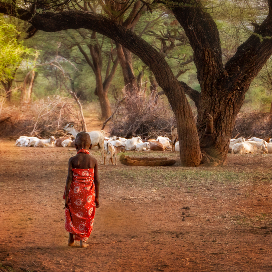
Hi Jason, Check out my 5/19 crop and comments--I've sharpened the alert goat and baby a bit, even though its split by the child's head. Am I still too high on the left? Thanks for all the great feedback! |
May 19th |
| 78 |
May 21 |
Reply |
Jim, I think I've mimicked your crop with my 5/19 edit and comments. Please check it over and see what else I might need to do. |
May 19th |
| 78 |
May 21 |
Reply |
Helen, I used your suggestions and everyone else's. See my 5/19 comments and pic. is it still too high on the left? Is it getting better? |
May 19th |
| 78 |
May 21 |
Reply |
You told me not to change it, but I did! Check out my 5/19 comments and photo and see if you think its improving. Thanks! |
May 19th |
| 78 |
May 21 |
Reply |
Terry, check out my new crop from 5/19. Do you think its an improvement? Thanks for your thoughts on it being good for Travel! Very helpful! |
May 19th |
| 78 |
May 21 |
Comment |
|
May 19th |
 |
| 78 |
May 21 |
Comment |
I incorporated everyone's comments--goat behind head is sharpened, bushes on left straightened, tilt removed (I hope...terrible at seeing things "straight", and I went to a 1:1 square to put the child on a 1/3 line. I've solved the problem of the donkey, The tree nicely frames at the top, the tree has three branches, which I think adds to the harmony. Any other suggestions? Thanks so much, everyone! |
May 19th |
| 78 |
May 21 |
Reply |
In all PSA "rigid" categories, I can crop, darken and lighten. I just can't change the feel of a place adding unicorns and sunbeams ;-). I did soften the background, which would be allowed. I'm adding a new crop, let me know your thoughts. |
May 19th |
| 78 |
May 21 |
Reply |
Hi Jason, thanks for your thoughts! I'm going to post some changes tonight or tomorrow, but I wanted to answer your PSA Travel question. PSA Travel does not allow the photo to be altered that would show the location to be better. We've all seen those travel brochures that are not realistic and PSA does not allow us to create "fantasy" travel photos. In my photo, there was a donkey, but I had photographed it without a head (see original), so I removed the donkey, and that would not be allowed. However, a slightly tighter version of Jim's crop or use Terry's crop and I could compete. PSA also doesn't allow changes in Photojournalism and Nature...no removing annoying twigs in front of your bird, making the blazing building look more dramatic in Photojournalism, etc.
|
May 17th |
| 78 |
May 21 |
Comment |
This has been on my computer for a month (Mitch sent it in early) and I can't tell you how many times I've ogled it! It's really stunning. I prefer Terry's crop, but yours is also wonderful. Bravo! |
May 7th |
| 78 |
May 21 |
Comment |
Oh, I would love to have this shot! I do like Jim painting the bright white door. I think I like Terry's version without the purple, but that is just personal preference. Great shot! |
May 7th |
| 78 |
May 21 |
Comment |
Terry, I think its a fun shot, fab that you got it without a prolonged shoot! I agree with Helen that the wall and door seem too bright and washed out. I'd love to see them pulled down a bit.
A few years ago I went to a Steampunk wedding. The cake had gears all over it and the guys all looked like this. The marriage lasted a couple of years. So much for fad weddings. |
May 7th |
| 78 |
May 21 |
Comment |
Helen, I LOVE this!! I really like Terry's and Jim's crop. Jim's seems to be too saturated on my monitor. Why don't you try a version or two between your original and Jim's and see if any appeal. Your best pic yet, Ms. Canoe! |
May 7th |
| 78 |
May 21 |
Comment |
Great discussion! I am definitely leaning towards the interesting crop Jim presents. I like him moving into the frame and moves him off center. |
May 7th |
| 78 |
May 21 |
Comment |
Jim, Love this! I think Terry's removal of the A board and the softening of the skyline were good changes. I agree that the fenceline shadows are the best part, really incredible. Unique and well done!
|
May 7th |
| 78 |
May 21 |
Comment |
Jim, I love your crop! I don't think I could enter in Travel since there is a donkey (with cropped off head) in the original on the right. I do like the crop at the top and right. It might make a vertical if I use the right crop on Terry's suggestion. Thanks! |
May 7th |
| 78 |
May 21 |
Reply |
Love the crop, Terry, and it solves my issue of the removed donkey and it meets the PSA Travel competition perimeters. The frame works really well with the tree crop. |
May 7th |
| 78 |
May 21 |
Reply |
Two great suggestions, Helen. Will do! |
May 7th |
| 78 |
May 21 |
Reply |
Glad you like it, Mitch! Much appreciated!
|
May 7th |
11 comments - 12 replies for Group 78
|
18 comments - 20 replies Total
|


