|
| Group |
Round |
C/R |
Comment |
Date |
Image |
| 69 |
Oct 20 |
Comment |
We saw an elephant's trail in the dust in Kenya and he was dragging a leg badly. I encouraged our driver to track the elephant to see how it was wounded. The driver was very reluctant. Of course, it turned out that the bull was dragging his penis, leaving a trail as wide as a leg limp. The driver was mortified to have us see this, but nature is fascinating. |
Oct 27th |
| 69 |
Oct 20 |
Reply |
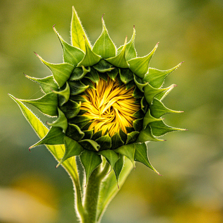
Jacob, thanks! I did increase contrast, as you suggested. See below for three options I just posted. Hope all is well at Purdue. |
Oct 24th |
| 69 |
Oct 20 |
Reply |
Candy, I think you are right on every point. I did play around with some new versions below, even though they won't pass muster for a competition. Always appreciate your advice! |
Oct 24th |
| 69 |
Oct 20 |
Reply |
Geoffrey, taking into account the feedback from the group, I added more contrast. Do you like any of my new versions below? |
Oct 24th |
| 69 |
Oct 20 |
Reply |
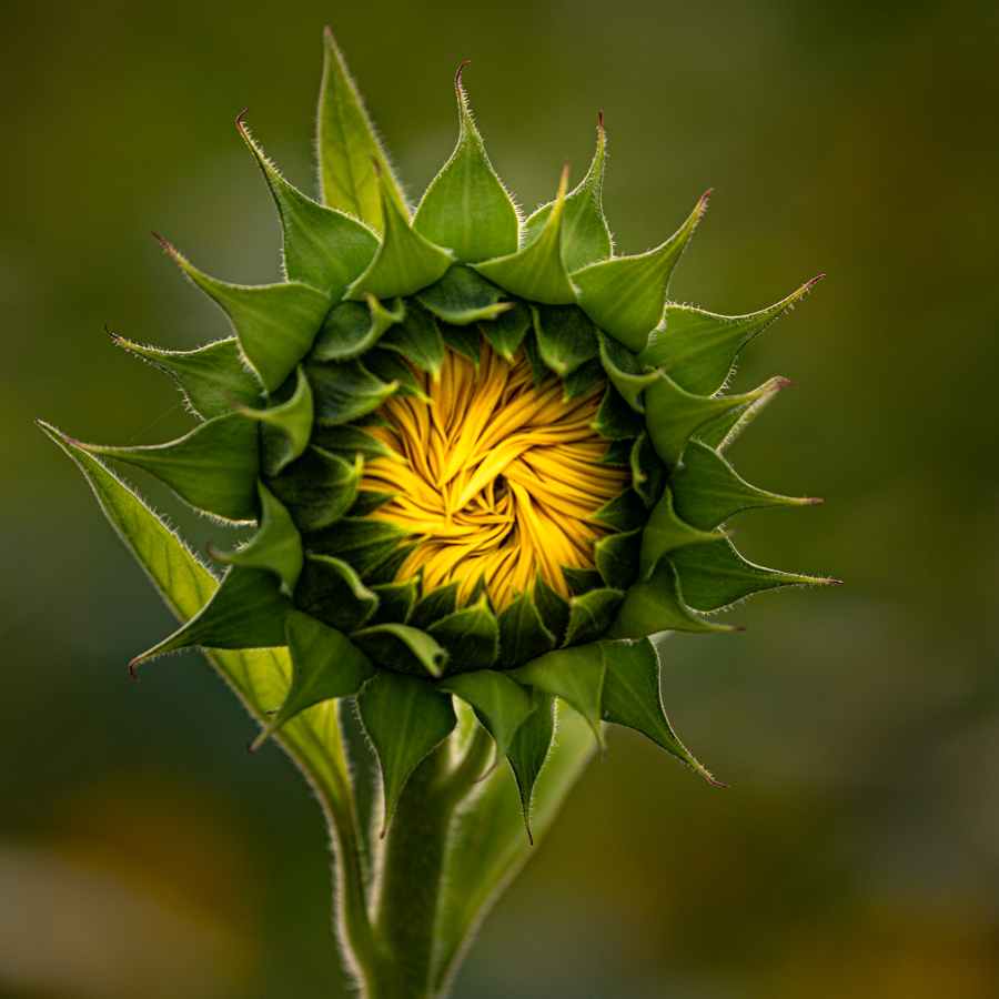
I went with the square crop after Candy said the leaves should not have been cropped off on the vertical. Do you like any of the new versions below--I took down the highlights on the stem, as you suggested. |
Oct 24th |
| 69 |
Oct 20 |
Reply |
Mervyn, I made some changes using your suggestions. Do you like any of my alternatives below? Thanks! |
Oct 24th |
| 69 |
Oct 20 |
Reply |
Dean, love the square crop idea and more contrast. Check out my three changes below and see if you like any of them. |
Oct 24th |
| 69 |
Oct 20 |
Comment |
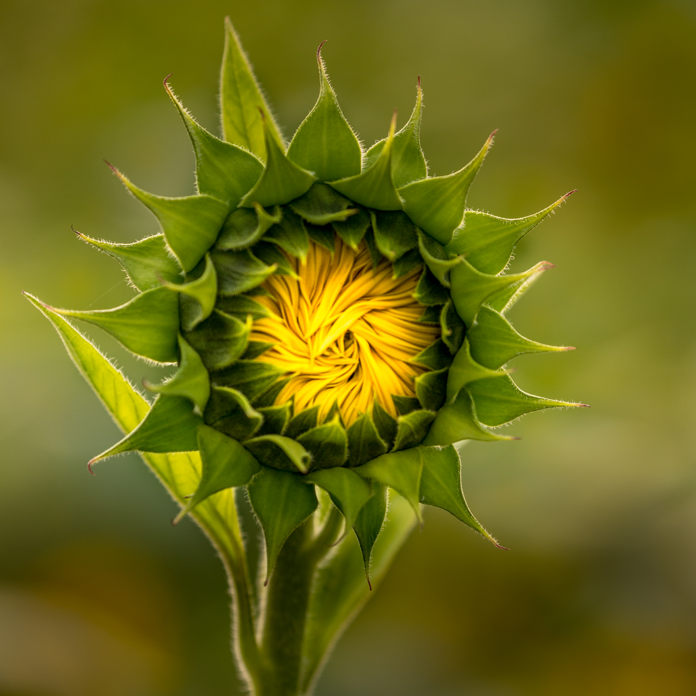
Revision THREE |
Oct 24th |
 |
| 69 |
Oct 20 |
Comment |
revision TWO |
Oct 24th |
 |
| 69 |
Oct 20 |
Comment |
Thanks for all the feedback! That's what makes this group so wonderful. I do agree that this won't work in PSA Nature and that it is too soft to be a winner. And I did love the square crop idea! I did play with the contrast and have 3 options to get your thoughts on--just for practice. Revision ONE |
Oct 24th |
 |
| 69 |
Oct 20 |
Comment |
I love your bird, and so sad about the fires. Can you do anything to bring out his eye detail? The rest of him is super sharp and gorgeous. I like your bokeh blurred background, but I agree with Dean that you would need to very lightly take done the right side so our eye doesn't take off the page. Love this! |
Oct 5th |
| 69 |
Oct 20 |
Reply |
Thanks, Dean. I like your version. What changes did you make other than the square crop? |
Oct 5th |
| 69 |
Oct 20 |
Comment |
Jacob, good for you to keep working on your b/w. It seems that there are some heavy brushstrokes on the white flowers that aren't on the original. I would lighten your flowers up. Dean makes a good point, so you might add back in your little bloom to create a triangle (always good in photography) and give you a threesome. |
Oct 5th |
| 69 |
Oct 20 |
Comment |
Wow, he looks huge in this photo! It's really beautiful. Was there a reason you stayed with black background instead of an overlying texture so it didn't feel so heavy? Or did you feel the darkness added strength and focus? |
Oct 5th |
| 69 |
Oct 20 |
Comment |
Wow, super sharp, Pierre! You've caught the bird well with its food. Its a little distracting to have the grass all in focus, so perhaps blurring it or burning it down will keep our attention on the bird and less busy feeling. I think that is what Dean is responding to, the grass really makes the pic very bright. Nice catchlight in his eye! Candy is our expert, can't wait to see what she will do with your gorgeous capture. |
Oct 5th |
| 69 |
Oct 20 |
Comment |
Lovely, Dean! What great colors and lines. The only thing that I'm not sure about is if you want the horizon line in the middle or at 1/3 or 2/3. I'd love to hear about what everyone thinks about the horizon line. Very artful! |
Oct 5th |
| 69 |
Oct 20 |
Comment |
What a lovely capture. I agree with Dean, its all about the lines and curves. And his choice of unusual, impossible posture! Nice and sharp with good depth. The vignette seems a tad overdone to me. It seems like just a little tilted? I might lighten his eye just a tad. |
Oct 5th |
10 comments - 7 replies for Group 69
|
| 78 |
Oct 20 |
Reply |
Oh, love the changes! Congrats! Thanks for showing us your latest! |
Oct 30th |
| 78 |
Oct 20 |
Reply |
Thanks for your vote of confidence! I so appreciate it! |
Oct 27th |
| 78 |
Oct 20 |
Reply |
Thanks for the catch! I think I'll make the guy on the left disappear! I appreciate the help, Terry!
|
Oct 27th |
| 78 |
Oct 20 |
Reply |
I am going to make the guy on the left disappear! Thanks for your help! You are so important to the group! |
Oct 27th |
| 78 |
Oct 20 |
Reply |
Terry, thanks for your feedback! It's invaluable! Can you take a look at my two latest posts and see if you like them? |
Oct 24th |
| 78 |
Oct 20 |
Reply |
Thanks, Stephen! Take a look at my updates below and let me know your thoughts. LOVE LOVE LOVE you dropping in our group! Please come by all the time! |
Oct 24th |
| 78 |
Oct 20 |
Reply |
I made changes to both versions below, can you take a look? So appreciate your feedback! |
Oct 24th |
| 78 |
Oct 20 |
Reply |
Sunil, check out my two updated versions below, and see if I've fixed the issues that you pointed out. Thanks! |
Oct 24th |
| 78 |
Oct 20 |
Comment |
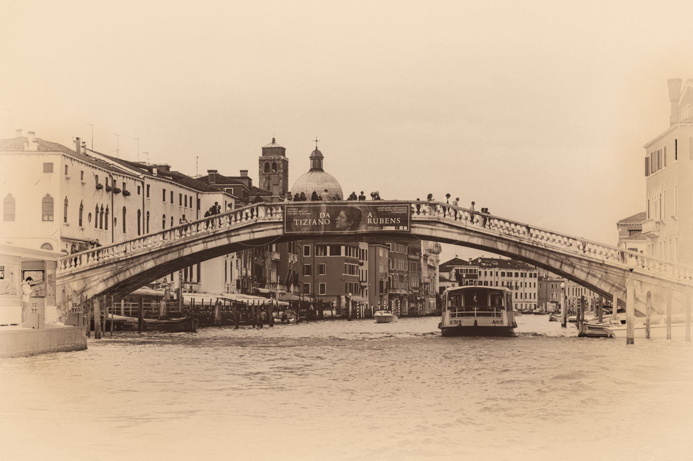
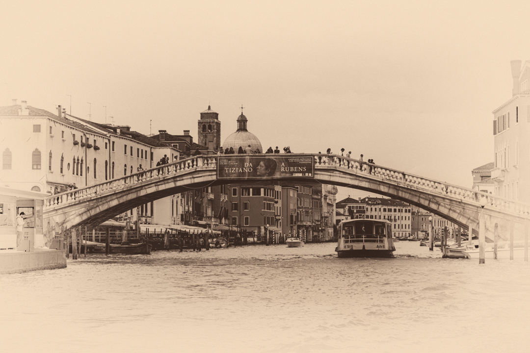
I also worked on my "vintage postcard". I've removed some of the high key effect (thanks, Stephen!) and I think its straighter (thanks, Sunil!). I've also added contrast to add back in some detail (thanks, Terry!). Any additional thoughts? I really like both versions, but they are highly personal to me. Do you see them as strong enough for competition? |
Oct 24th |
 |
| 78 |
Oct 20 |
Comment |
Thanks, everyone! I have made several changes to my dramatic b/w conversion from your suggestions. I have used "skew" to straighten the buildings (thanks, Stephen!). I've used Gaussian blur to take down the noise in the sky (thanks, Terry!). And I've spent a zillion hours figuring out the clone tool and selections to clone out the dreaded halos around the buildings (thanks, Jason!). I've lightened the vignette, but is it still too dark? Changes to my high key "postcard" is below, also. |
Oct 24th |
 |
| 78 |
Oct 20 |
Reply |
Ugh, those halos. Hate them. Tried several techniques to get rid of them and then started over, with very little luck. So I went a different direction. Do you like my high key version ? I'm working on fixing the halos--one more video to watch on Kelby that I hope will fix it. I will post improved version soon. Thanks! |
Oct 11th |
| 78 |
Oct 20 |
Reply |
Thanks, Sunil. I did like your suggestion of a different tone, do you like my different version below? I'm working on removing the halos on the contrasty version and will lighten the vignette, as you suggested. |
Oct 11th |
| 78 |
Oct 20 |
Reply |
Hi Helen, thanks for the catch on my straightness. I think "skew" fixed it. Check my creamy version below and see if it looks straighter to you. |
Oct 11th |
| 78 |
Oct 20 |
Reply |
Thanks, Stephen. I didn't catch the skew issue and fixed it for this version below and when I get the "fix" right on the contrasty version. Do you like the new version I posted below? |
Oct 11th |
| 78 |
Oct 20 |
Comment |
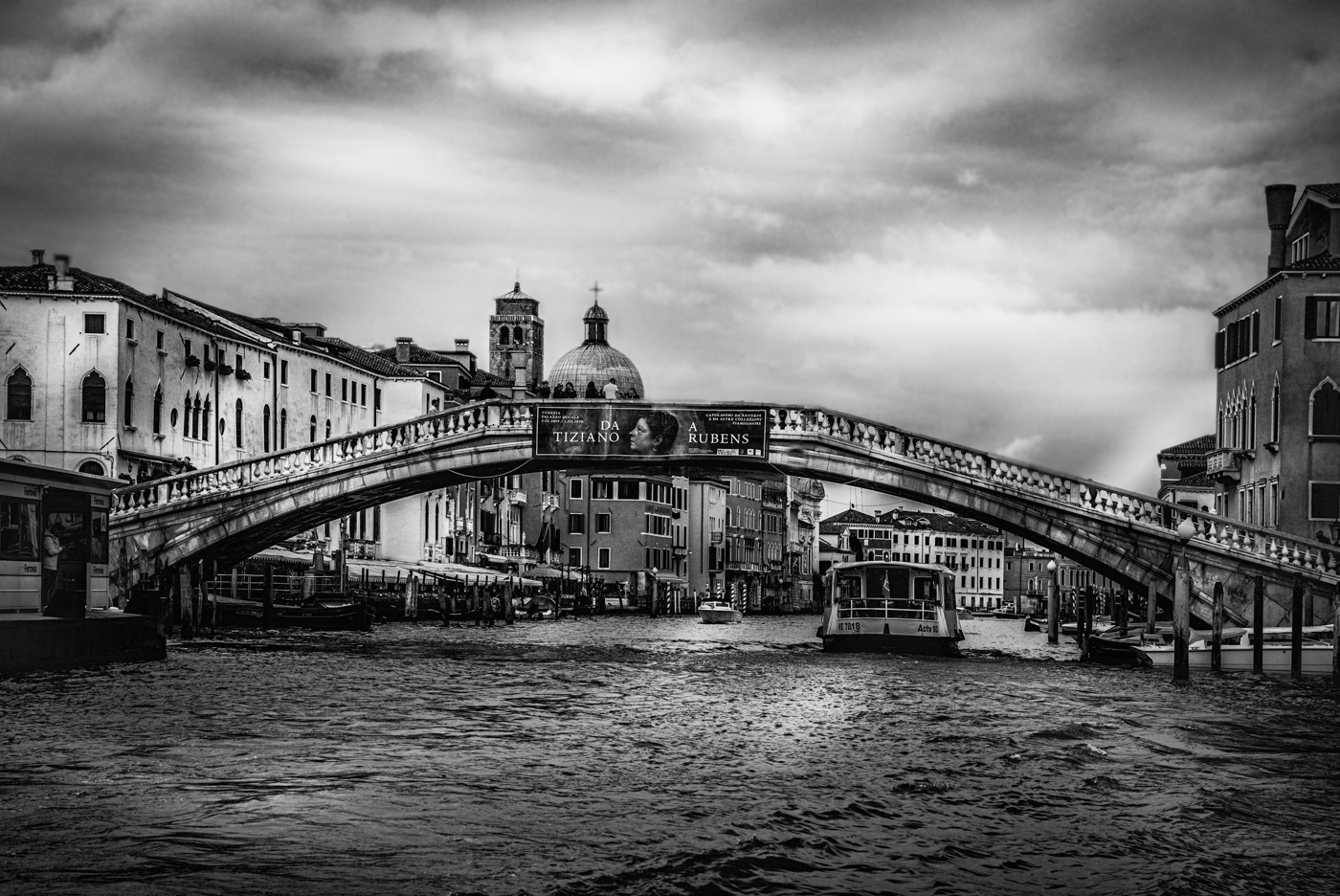
Once I saw the halos on the buildings that Jason mentioned, I didn't like the photo any more. I'm working at getting rid of the halos, but I lose a lot of the interesting lighting in the sky. I also liked Sunil's idea of a different color tone. I also skewed, to straighten the buildings that Helen and Stephen mentioned. I went a different direction with this, and it reminds me of photos my grandparents have of Venice (they are Italian immigrants). What do you think of this version, as I work on removing halos from my contrasty version? |
Oct 11th |
 |
| 78 |
Oct 20 |
Comment |
Really beautiful. I might lighten the eyes just a touch, but it is perfect! |
Oct 5th |
| 78 |
Oct 20 |
Comment |
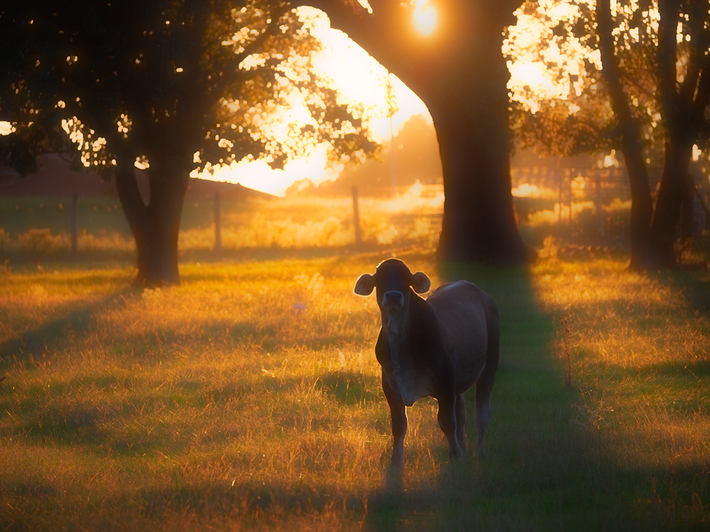
I went with a more dreamy, more golden look for your cow. It was fun! |
Oct 5th |
 |
| 78 |
Oct 20 |
Comment |
|
Oct 5th |
| 78 |
Oct 20 |
Comment |
Terry, I love how edgy you shoot. It's a cool concept shot. I agree with Helen's comment about straightening some outside lines. It feels like its low contrast and a little flat to me. Perhaps if you did tint it and added some contrast? I personally like the color as the floor matches her dress. Maybe a tint like an old yellowed newspaper? |
Oct 5th |
| 78 |
Oct 20 |
Comment |
Helen, I think this would do well in competition--why don't you try it in the PSA Facebook Competition, you can enter daily, its free and anything goes. I think its really interesting and fun.
https://www.facebook.com/search/top?q=psa%20facebook%20image%20competition
I agree with Jason that you could desaturate the red a bit. I would also clean up the red dot above her head, and the white blown-out dot by her bag and a little orange part peaking through of her bag. |
Oct 5th |
| 78 |
Oct 20 |
Comment |
Jim, I just listened to a landscape podcast that talked about simplifying. I wonder if cropping the background out and focusing in on the car would make this stronger? The landscape doesn't seem to add to the truck's condition. Texture in Lightroom could really make the truck look great. I agree, we would love to see the original and hear about your processing. |
Oct 5th |
| 78 |
Oct 20 |
Comment |
Sunil,
What vision to see this in your original. I like yours, the square that Helen suggests and Jason's options. All are wonderful, it is your choice No suggestions. |
Oct 5th |
10 comments - 12 replies for Group 78
|
20 comments - 19 replies Total
|


