|
| Group |
Round |
C/R |
Comment |
Date |
Image |
| 69 |
Sep 20 |
Reply |
Pierre, I posted an updated version today, 9/25, do you like the latest changes I incorporated? |
Sep 25th |
| 69 |
Sep 20 |
Reply |
Jacob, check out my 9/25 post and see what you think about my suggested title? |
Sep 25th |
| 69 |
Sep 20 |
Reply |
Hi Candy, I did open the shadows and darkened the yellow. What are your thoughts on my 9/25 version? |
Sep 25th |
| 69 |
Sep 20 |
Reply |
Mervyn, check out my latest post today on 9/25 and let me know what you think about my title and revisions. Thanks! |
Sep 25th |
| 69 |
Sep 20 |
Reply |
Brilliantly done! Check out my revised pic and see if you think its ready for competition or have some additional suggestions? |
Sep 25th |
| 69 |
Sep 20 |
Reply |
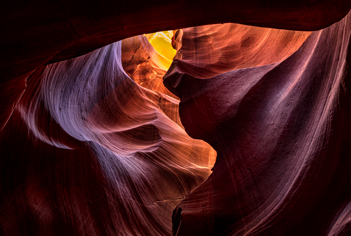
Several pointed out the face profile in this, Stephen. Do you like "Rock-Face" for a title? |
Sep 25th |
| 69 |
Sep 20 |
Comment |
Using everyone's comments, I've dodged the darker areas and burned down the yellow brightness, still staying within PSA Nature rules. Better? What about "Rock-Face" for a title, since this is a famous "face" in Upper Antelope Canyon? |
Sep 25th |
 |
| 69 |
Sep 20 |
Reply |
The black and white is much stronger than the color, in my opinion. Both would be better if lightened a little. Flowers look better appearing fragile and delicate. So proud of your improvements. |
Sep 20th |
| 69 |
Sep 20 |
Comment |
Dean, Sorry I missed this! I like it a lot, but I agree with Pierre that a bit more sky would help. I also like Geoffrey's idea of opening up the shadow on the top portion a bit. Beautiful place! |
Sep 20th |
| 69 |
Sep 20 |
Reply |
When I enlarge this, the eyes seem a bit too bright, given the scene. Maybe split the difference. I do light the slightly tighter crop. |
Sep 20th |
| 69 |
Sep 20 |
Reply |
Dean, gotta try that with an Antelope with more sky showing! How did you bring in the moonlight? Love it! |
Sep 6th |
| 69 |
Sep 20 |
Comment |
What type of eagle is this? Is that blood on his beak and talons? I don't see any changes between the original and the finished, are they the same? Your eagle is super sharp and well exposed, especially for hand-held! If you have just a little more room for him to move into (look into), that would be great. The sky seems like you've added a vignette, but it doesn't look quite right on an all blue sky. Fabulous capture. Where is the Birdsville Track?
|
Sep 3rd |
| 69 |
Sep 20 |
Comment |
Your photography is improving every month! Your eye really did well to se this black and white from the colorful capture. Personally, and this is just my personal taste, I'd like to see the flowers lightened up, which I think will make them ore delicate and pleasing. I think you are really coming into your own! Your best yet! |
Sep 3rd |
| 69 |
Sep 20 |
Comment |
Fantastic image, Candy. I can't wait to visit the Alligator Farm. Great diagonal and such beauty and action. I don't have anything to suggest, but hoping to someday have you show me how to shoot something so beautiful. |
Sep 3rd |
| 69 |
Sep 20 |
Comment |
I'm not a bug girl, but I do like your very nice diagonal with her wings. I would maybe crop in a bit from the right to accentuate the diagonal. Perhaps darkening the top left corner so our eye isn't drawn there and stays on your dragonfly. The dragonfly is dissected by a light stem. If you can darken that down, it will keep us on your bug. |
Sep 3rd |
| 69 |
Sep 20 |
Comment |
Mervyn, we are all addicted to your Africa captures! The ducks are lovely, super sharp, and the water had interesting lines that add. The adult duck facing us could benefit from the Matt K video on its eyes.
I'm not sure if a tiny crop up from the bottom would bring them closer to us and perhaps not be so much circled "framed" by empty water. |
Sep 3rd |
| 69 |
Sep 20 |
Reply |
Larry, as soon as I saw the duck facing us, I thought of that video, as I had just watched it today. i was going to offer the link ;-). |
Sep 3rd |
| 69 |
Sep 20 |
Reply |
Oh! I love that title, Stephen! You always have the best advice! |
Sep 2nd |
7 comments - 11 replies for Group 69
|
| 78 |
Sep 20 |
Reply |
Yes, Helen, I think your idea of gentle, soft processing is a good one.
|
Sep 27th |
| 78 |
Sep 20 |
Reply |
Helen, no need to create a document! Head up to the top of the page--you'll see "Helpful Links" and "Bulletin Board". Anything that is helpful, you can copy and past it in the Bulletin Board. Or if you have a good link, post in the "Helpful Links" with an explanation, so we can all use the references for years to come! Enjoy! Hope mom is okay! |
Sep 27th |
| 78 |
Sep 20 |
Comment |
Terry, I am just so inspired by your big project here! |
Sep 22nd |
| 78 |
Sep 20 |
Comment |
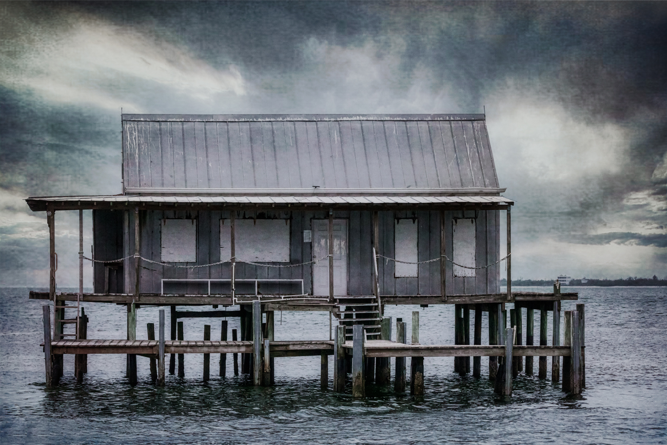
I still prefer the vertical, as it feels very "Hobbit House" to me--trying to figure out what it is. I do love the idea of some blue light on both sides. |
Sep 20th |
| 78 |
Sep 20 |
Reply |
Really love what you did with it, Terry! |
Sep 20th |
| 78 |
Sep 20 |
Reply |
Jason, great idea about creating a PSD. I always wondered if that would help. Good to know that it does! |
Sep 20th |
| 78 |
Sep 20 |
Reply |
Thanks so much, Abdo! |
Sep 20th |
| 78 |
Sep 20 |
Reply |
Very kind of you, Jason! |
Sep 20th |
| 78 |
Sep 20 |
Reply |
Jason, clever of you to flip this, and has the keeper walking into the frame. I am not in love with the darker version, but again, it is a completely different version than where Sunil started. |
Sep 20th |
| 78 |
Sep 20 |
Comment |
I really enjoy Terry's and Jason's renditions. If you aren't wild about them, I think just a bit of darkening on your image would also enhance it even more. Huge change from your original! |
Sep 20th |
| 78 |
Sep 20 |
Reply |
Wow, Her hair is incredible, and so is her bust line! LOVE this pic! |
Sep 13th |
| 78 |
Sep 20 |
Reply |
Terry, you are right, the hut was flat. I like what both you and Jason added. I tried a new version, posted below on 9/13. Do you like it, or do I have more work ahead of me? |
Sep 13th |
| 78 |
Sep 20 |
Reply |
Jason, I love what you did with my pic, its much more substantial. Do you like my 9/13 version, or am I still off track? Thanks! |
Sep 13th |
| 78 |
Sep 20 |
Reply |
Kind of you, Jim! Take a look at my latest version below and see if you like the grungy, contrasty look better. Thanks! |
Sep 13th |
| 78 |
Sep 20 |
Comment |
Based on Terry's and Jason's suggestions, I played around with their techniques and then played with Nik, Luminar 4 and Topaz. Here's a Topaz filter. Too much? It looked a bit silly when I lowered it on the sky and got a silky sky and a grungy building. If you don't care for this version, I can back it down, or I think I'll move towards Jason's monochrome contrasty version. |
Sep 13th |
 |
| 78 |
Sep 20 |
Reply |
Oh, Sunil, the square b/w version is also beautiful and his reflection is very clear, event with the roof and some sky. I think there is more of the leading sidewalk, and that creates a more powerful leading line. I really like both versions. You should be so proud of both of them. A perfect moment, it gives me chills. |
Sep 4th |
| 78 |
Sep 20 |
Comment |
Abdo, what a sweet shot! Can you talked about how you created a dreamy look? |
Sep 2nd |
| 78 |
Sep 20 |
Comment |
What an odd bridge! I do like the white "hat" tower and the gold light. I really didn't see the blue hour for the first 3-5 glances! I find the gate at the end of the pathway to be bothersome, as it ruins our eye stopping after some marvelous leading lines. I'd remove the gate, and we go out to infinity. Very interesting shot, glad you found it! |
Sep 2nd |
| 78 |
Sep 20 |
Comment |
Love your creativity! Can you discuss how you set it up? Pour a bag on her head and then she flips her hair? How did you light? The hair, milky way and her body are fabulous, but it feels that her legs and arms are cropped. Maybe remove her legs, so we feel she is standing? Perhaps keep all of her and darken the base a lot so our interest drops off? Have you tried it with her standing up? Can't wait to mess up some area with this idea! |
Sep 2nd |
| 78 |
Sep 20 |
Comment |
What a wonderful capture, it kept me busy trying to figure what way was up and how the last was laid out. My thinking is I'd like to see it brighter and more vibrant, and maybe this would be gorgeous in B/W. I'll look forward to everyone's suggestions and then give it a try. What a beautiful place. |
Sep 2nd |
| 78 |
Sep 20 |
Comment |
Sunil, what a wonderful "slice of life" in a mosque. I love the keeper's contemplative walk and his reflection is fabulous. I love the decorative roofline and the trees, I wonder if a slice of sky would help me not feel so hemmed in? But I do think this crop keeps my eye on the keeper and his reflection. I wonder if a title like "Walking Reflection" wouldn't work well. It clearly isn't an "abandoned" mosque. Perhaps "Ancient Mosque"? |
Sep 2nd |
| 78 |
Sep 20 |
Comment |
Jim, I love this image! Having grown up (and still living) in rural Indiana, this represents "home". I'm interested in why you shot as fast as 1/640 and didn't increase your f/stop number more?
Can you speak to what filter you used to warm it up and give it a dreamy, canvas Painterly feel? |
Sep 2nd |
10 comments - 12 replies for Group 78
|
17 comments - 23 replies Total
|


