|
| Group |
Round |
C/R |
Comment |
Date |
Image |
| 69 |
Aug 20 |
Reply |
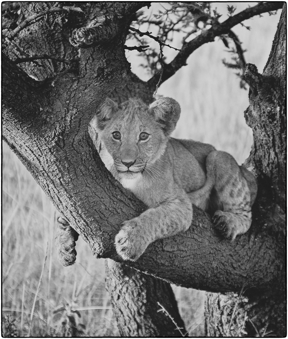
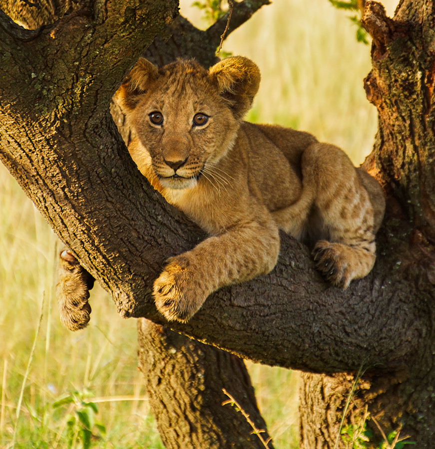
Thanks, Mervyn! I really cropped in on the tree, which I think helped the too bright background. I added some curves and burn/dodge to make the tree and cub richer. Like it better or too much? He's a tricky guy--can't get him right. |
Aug 23rd |
| 69 |
Aug 20 |
Reply |
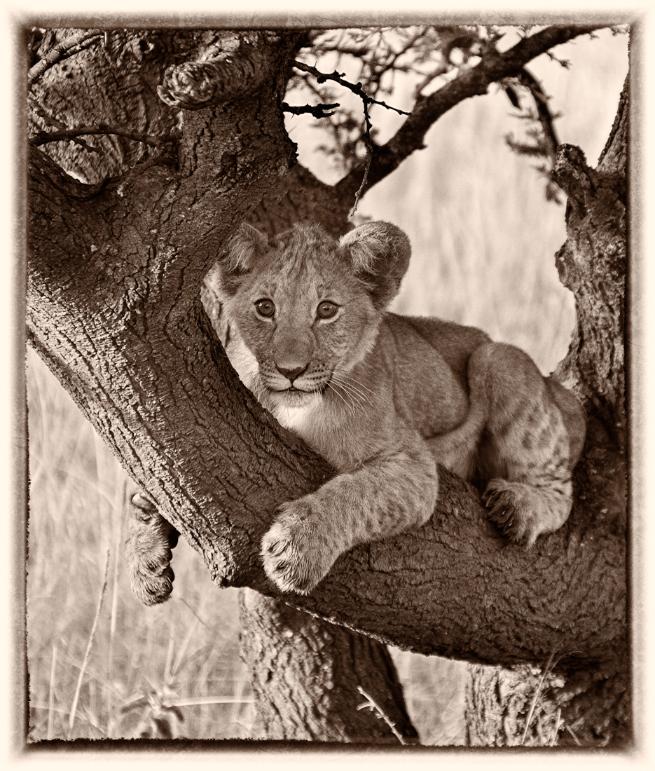
Another version added tonight. What do you think? |
Aug 23rd |
| 69 |
Aug 20 |
Reply |
Candy, Tonight I posted yet another version. I took down his bright chin, and then got carried away for a richer tree and cub. Better? Worse? I also burned the background a bit. |
Aug 23rd |
| 69 |
Aug 20 |
Reply |
I made another version below tonight. I wanted to darken his chin as Candy suggested, and then I added some richness to the cub and the tree and tried to take the background down a bit more. Too much? |
Aug 23rd |
| 69 |
Aug 20 |
Reply |
Thanks, Jacob! Do you like my much darker cub below? Or is he too dark? |
Aug 23rd |
| 69 |
Aug 20 |
Comment |
One more shot at this-I tried a tighter crop tighter to move out some of the bright background and simplify the story. I darkened his bright chin that Candy mentions, which shows up the blood on his far side chin. I did use curves and dodge/burn to lighten his face, and enrich the tree and his coat. I burned down the background a bit. Any additional thoughts? Getting better or worse...I'm not sure. Thanks for all of the ideas! |
Aug 23rd |
 |
| 69 |
Aug 20 |
Reply |
Thanks so much, Candy! I did like the softer light, as it framed the lion cub, but I realize it was too lemony and too bright. I put three new versions below. Still too light in the background? I appreciate the feedback! |
Aug 12th |
| 69 |
Aug 20 |
Reply |
I have got to get smarter about the history brush tool! I added 3 new versions below. Do you still find the background distracting? |
Aug 12th |
| 69 |
Aug 20 |
Reply |
Thanks, Pierre! Check out my 3 latest versions below and see if the background still needs to be darkened. |
Aug 12th |
| 69 |
Aug 20 |
Comment |
|
Aug 12th |
 |
| 69 |
Aug 20 |
Comment |
|
Aug 12th |
 |
| 69 |
Aug 20 |
Comment |
I've reworked my cubbie, taking into account everyone's thoughts that the background was distracting. I tried a 50% gray layer blended, but didn't care for it. I did darken the background and Gaussian blur it. Then I desaturated the yellows. I also experimented with NIK Silver Efx, and felt these two options showed the lion well and tamed the background. Thoughts on my new versions?
|
Aug 12th |
 |
| 69 |
Aug 20 |
Reply |
Thanks, Candy. I appreciate your expert view.
|
Aug 6th |
| 69 |
Aug 20 |
Comment |
I would love to see your original, Geoffrey. I really like it. I would suggest cropping down on your sky. It will create more tension on your white clay and more tension of orange to blue--two complementary colors.
Thanks for the jewelry lesson--love opals! |
Aug 5th |
| 69 |
Aug 20 |
Comment |
Wow, your best yet, Jacob! Very nicely done in Snapseed. I wouldn't have guessed harsh light in your finished pic. Nice recovery in your light flower. Other than darkening the top right white flower so it doesn't distract, I think you have an awesome pic. |
Aug 5th |
| 69 |
Aug 20 |
Comment |
Candy, so fabulous. I thought you put a texture behind it, but its just the green algae, isn't it? Great recovery on bringing back the birds and taking down the bright background. I am surprised you didn't flip, to have them walking to the right. Can you explain? I see a lot of limpkins where we are in south central Florida, I will have to look for their apple snails! |
Aug 5th |
| 69 |
Aug 20 |
Comment |
Pierre, I'm glad you were able to play with focus stacking. I haven't tried macro or focus stacking, so good on you! It seems a bit soft to me, perhaps brush it with a bit of clarity and texture, dehaze and sharpening in Lightroom? I did a quick job on it.
My eye zooms off the page because of the very strong vertical. I put in on a diagonal, which makes it too short. But it might look good if you had more room to make the diagonal work.
|
Aug 5th |
 |
| 69 |
Aug 20 |
Comment |
Wow, so impressive--especially when I would have probably tossed your original. I have a lot of those boring zebra pix and I am going to have to revisit after seeing how nicely you turned this into an awesome composition.
Being very picky, there is a white fluff on the forehead of the far zebra I'd think about taking down. I was also distracted by the dark plant in the low left grass, maybe burn that corner down a bit. Lovely work! |
Aug 5th |
9 comments - 9 replies for Group 69
|
| 78 |
Aug 20 |
Reply |
I am not sure I solved the background problem, Helen. Let me know what you think of my new version posted tonight. |
Aug 23rd |
| 78 |
Aug 20 |
Reply |
Thanks, Sunil. I worked on the color version to make it richer. See my latest entry below and let me know if you like it. |
Aug 23rd |
| 78 |
Aug 20 |
Reply |
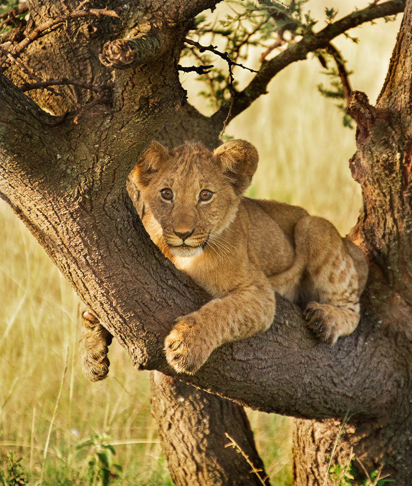
Jason, thanks so much, I added another rendition today below. I wanted it to look like yours, maybe not quite as gold, but perhaps he's too dark? Did the crop help him? |
Aug 23rd |
| 78 |
Aug 20 |
Reply |
Terry, check out my latest version. I do like the richness of Jason's, did I go too brown, as opposed to gold? |
Aug 23rd |
| 78 |
Aug 20 |
Reply |
Thanks, Jim! See below--I just added another rendition. I liked your crop idea and went in even tighter. I couldn't replace the tree with grass, due to PSA Nature rules. I was going for the richness Jason had, perhaps I need to lighten the cub a bit? |
Aug 23rd |
| 78 |
Aug 20 |
Comment |
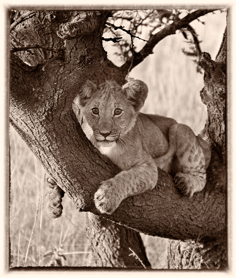
One more shot at this--I liked the idea to crop tighter to move out some of the bright background and simplify the story. I darkened his bright chin, which shows up the blood on his far side chin. I did use curves and dodge/burn to lighten his face, and enrich the tree and his coat. I took down the background a bit. Any additional thoughts? |
Aug 23rd |
 |
| 78 |
Aug 20 |
Reply |
Thanks, Stephen. Look great and I think it adds a fun dimension. |
Aug 20th |
| 78 |
Aug 20 |
Reply |
Thanks, Stephen! I printed it for myself and going to see if I can copy into our Photo Tips Board! Awesome info! |
Aug 20th |
| 78 |
Aug 20 |
Reply |
Thanks for stopping by! We definitely love Terry's really fresh view on things! Check out our Bulletin Board where Terry explains (a bit) about how he got his jet shot! |
Aug 20th |
| 78 |
Aug 20 |
Reply |
Sunil, I think the bushes look much better and don't detract from the birthday party and that ominous sky! What a wild birthday and how fun of you to have come up with the plan! |
Aug 19th |
| 78 |
Aug 20 |
Reply |
Stephen, That's such an interesting take! Can you explain how you made that work so well? |
Aug 18th |
| 78 |
Aug 20 |
Reply |
Terry, you are too kind! Take a look at the 3 new cubbie pix I posted and see if I have doctored the background to be dark enough for your taste. Thanks! |
Aug 12th |
| 78 |
Aug 20 |
Reply |
Jason, take a look at the three new versions I've added trying your techniques. Should I take the background darker still? |
Aug 12th |
| 78 |
Aug 20 |
Reply |
I've worked on the background, Helen. Take a peek below and see if you think its an improvement. Thanks in advance! |
Aug 12th |
| 78 |
Aug 20 |
Reply |
I've posted three new versions below. Do you think I made useful improvements? |
Aug 12th |
| 78 |
Aug 20 |
Comment |
|
Aug 12th |
 |
| 78 |
Aug 20 |
Comment |
|
Aug 12th |
 |
| 78 |
Aug 20 |
Comment |
I've reworked my cubbie, taking into account everyone's thoughts that the background was too bright and distracting. I tried a 50% gray layer blended, but didn't care for it. I did darken the background with black and Gaussian blur it. Then I desaturated the yellows. I also experimented with NIK Silver Efx, and felt these two options showed the lion well and tamed the light background. Thoughts on my new versions? |
Aug 12th |
 |
| 78 |
Aug 20 |
Reply |
Terry, did you mean to attach your version? |
Aug 11th |
| 78 |
Aug 20 |
Comment |
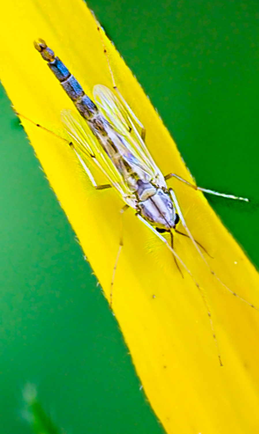
Oh, my goodness! Your dragonfly is SO crisp, so much detail. What animal? grass? is it on? Can you talk about how you processed his "white" wings to be gossamer and see-through? |
Aug 4th |
| 78 |
Aug 20 |
Comment |
Good job on a beautiful moon (handheld!!), and such a contrast to the ugly ape. I am shocked you shot at f4.5, and only 382 nm that you still kept that moon from blowing out and the ape still in focus. I was sure it was a merge or a composite when I saw the pic, awesome you pulled it off.
I'd like to see the ape sharper, but I'm sure you've already worked it.
It's a fun, interesting shot.
I am useless at moon photography. Some show up nicely and some suck, with no rhyme or reason. Maybe its a great topic for our new Bulletin Board. Do we have anyone who knows moon photography? |
Aug 4th |
| 78 |
Aug 20 |
Comment |
What an interesting concept, Terry. What was a bit confusing was the black woman in the poster. I think Terry's idea of cropping out the poster makes it a quicker "read". Perhaps look at it in color (as in Jason's, which feels high fashion) and in your monochrome version, too.
A+ for creativity, you really get me to think outside the box. |
Aug 4th |
| 78 |
Aug 20 |
Comment |
Helen, I am so interested in this pic, as I have a similar photo of a Kenyan woman cleaning her gourd in front of her hut, and like you, didn't have enough time to set up properly. And she's wearing a lot of color that distracts from the action. I never thought of black and white, but now I'm thinking sepia might be more "African" feeling, more National Geographic for your pic? |
Aug 4th |
| 78 |
Aug 20 |
Reply |
What great suggestions, Jason. I am going to try Your burn/dodge technique. And I think the Gaussian blur layer is a great idea, as there is a lot going on in this image.
What do you think about desaturating some of the bright colors in the color photo, so it can stay colored? The new HSL sliders "point" in Lightroom? If you think it is worthwhile, I'll give it a shot. |
Aug 4th |
| 78 |
Aug 20 |
Comment |
Sunil, such an interesting shot! What a great location, the rock to put out the table and set up your special moment for your wife. You've certainly made the sky fierce, but it looks realistic. The bushes look a tad bright, but I love your idea and how your pic turned out for your sweet wife. |
Aug 4th |
| 78 |
Aug 20 |
Reply |
Thanks so much, Jason. I usually burn and dodge with soft light and used a lemon color from the pic. But will try your way. I wouldn't have thought to desaturate, do you feel its too gold? |
Aug 4th |
| 78 |
Aug 20 |
Reply |
Thanks, Helen. We'll see what everyone thinks. |
Aug 4th |
| 78 |
Aug 20 |
Reply |
Thanks so much, Sunil. Any suggestions? |
Aug 4th |
| 78 |
Aug 20 |
Comment |
Jim, I love everything about this pic; with one tiny thing--the arch at the top crop. Do you have the entire arch? We'd love to see the original. |
Aug 1st |
10 comments - 19 replies for Group 78
|
19 comments - 28 replies Total
|


