|
| Group |
Round |
C/R |
Comment |
Date |
Image |
| 78 |
Mar 20 |
Reply |
Jim, A nice catch on the dark trees. I like your edit a lot. |
Mar 22nd |
| 78 |
Mar 20 |
Reply |
Wow, Jason, great catch about the floor sink and tripod shutter speed. Well appreciated. |
Mar 22nd |
| 78 |
Mar 20 |
Reply |
Jim, I think your improvements were spot-on. Good job! |
Mar 22nd |
| 78 |
Mar 20 |
Reply |
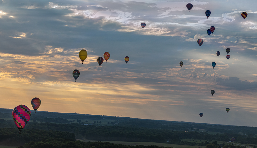
Jason, thanks so much for your comprehensive thoughts, as always! I used Richard's Dutch tilt idea and the idea suggested of not lightening the back balloons, and went to the original sky colors so that it didn't look over-saturated or over-sharpened in the landscape. No Topaz used to avoid artifacts. I did use the gradient in Lightroom, and I did paint local edits to tone down the overly bright sky and to add interest. Thoughts on this very different version? |
Mar 22nd |
 |
| 78 |
Mar 20 |
Reply |
Beverly, thanks for the idea, I think it works very well. I tried staying with the Dutch tilt and staying with the original sky color. It's not in panorama, but what do you think? |
Mar 22nd |
|
| 78 |
Mar 20 |
Reply |
Thanks for suggesting the Dutch tilt. I've redone the photo from scratch, and staying with the gold and blue light instead of changing to lavender to go in my bedroom. I've left the balloons darker. What would you suggest from here? |
Mar 22nd |
 |
| 78 |
Mar 20 |
Reply |
Thanks for your response, Sunil! Obviously, you have a well thought out photo plan. I appreciate you considering my suggestions. |
Mar 15th |
| 78 |
Mar 20 |
Reply |
Sunil, What an accomplishment! I am so excited for you! I do love the colors in the print! Bravo! |
Mar 15th |
| 78 |
Mar 20 |
Comment |
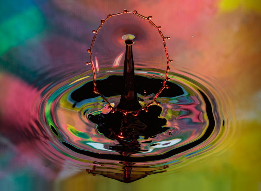
Abdo, its super fun to play with splashes, isn't it? I've found the trick is to have something behind to cast some interest (a watercolor in my case) and to shoot down, so the container doesn't show (my container was much bigger and very shallow to get a big splash). I also used a much deeper depth of field.
Yours might make a fun vertical, to focus tight on the super interesting drop and then tall milk tower. |
Mar 5th |
 |
| 78 |
Mar 20 |
Comment |
I love color, so this fills the bill. The lips add interest and keep us asking what is going on, however, I would like them complete. I agree its very tightly cropped and took a while to figure out what was going on...that is Vegas! Do you have more of the original for us to take a look at? |
Mar 5th |
| 78 |
Mar 20 |
Comment |
What interesting leading lines with the dock to the circular bridge! The staircase takes me straight down...to nothing. And I have to work my way through a 1/3 of the composition to get to the really beautiful part.
I realize you were locked out and couldn't get the scene Jason and I are suggesting. I do think that the color version works better, as the bright green grass leads us through the dead grass to the pier and bridge. And the staircase does not seem so stark. its a nice sky, and as Jason says, a lot of nice things are in the water.
If you want to stay in monochrome, I'd come up with a way to make the path lighter(?) through the grass to lead us easily to the water scene. |
Mar 5th |
| 78 |
Mar 20 |
Comment |
First of all, I'm so jealous! I'd love to photograph the race and I've always wanted a sled dog ride--just the cold and snow keeps me away! LOL! Bravo for braving the elements and facing those terrifying dogs! Your 1X pix are both much more powerful than this photo, primarily because we lost two dogs. There isn't really a way to fix that. The driver and the front dogs are breathtaking! I notice your dog eyes are "glowing", did you not want to fix that?
I really think your whites and blacks are great, I think the background is great. It's just missing doggie heads and not much you can do about that.
The pix on 1X are awesome! |
Mar 5th |
| 78 |
Mar 20 |
Comment |
Sunil,
Bravo for getting up early to shoot! I'm not good at showing up for dawn photography. I love your composition, but it does seem dark to me and I would love to see more of the body of the truck. I'm distracted by the very bright sun on the right, as it seems bigger than it would normally be?
I do agree with Terry that the green windows seem off.
What a beautiful truck and a fun pic with the sign behind it. |
Mar 5th |
| 78 |
Mar 20 |
Comment |
Hi Jim,
Nice capture! You've nicely captured the flavor of an old home. I'm surprised you had much noise, given you used 800 ISO. What camera were you using? What did you use for your noise reduction? Usually, if you set your "protect detail", you can reduce noise and keep detail.
You didn't mention what software you used for post-processing. In Lightroom, you can choose your lens and it will automatically correct the lens distortion (or almost all).
On my screen, there are a few distracting bright areas in the lace and a bit on the table. The lace also seems a bit blue, that you might want to be more white, or in the warmer tones like the rest of your room.
|
Mar 5th |
| 78 |
Mar 20 |
Reply |
|
Mar 5th |
 |
| 78 |
Mar 20 |
Reply |
Sunil, thank you Any other suggestions? |
Mar 5th |
| 78 |
Mar 20 |
Reply |
Thanks, Terry! Good catch on the top being too light, Terry! I completely missed that. And I'll remove the moon, as it is awkward. |
Mar 5th |
| 78 |
Mar 20 |
Reply |
Thanks, Stephen! I do hope to go up again this summer, it was really a fun experience and allowed for some rare photo ops. Legally, balloons can't fly until dawn, so the sky is already blown out by the time they rise--but I'll work on trying to be the first balloon up.
I will certainly remember your suggestions and also look at some other pix I caught at the same time that might be less "landscape" and more close up. It was the moon, but I agree its a bit awkward and will remove it.
Always appreciate you stopping by and offering assistance!
Brenda |
Mar 5th |
6 comments - 12 replies for Group 78
|
6 comments - 12 replies Total
|


