|
| Group |
Round |
C/R |
Comment |
Date |
Image |
| 69 |
Dec 19 |
Reply |
Yes, I agree it was a group project, which is the whole idea of Digital Dialogue. Thanks for your thoughts and look forward to seeing you soon! |
Dec 25th |
| 69 |
Dec 19 |
Reply |
Thanks, Geoffrey! I think both ideas are great, I'll wait to see if anyone else chimes in with more ideas for my final edit. Thanks for taking another look! |
Dec 25th |
| 69 |
Dec 19 |
Reply |
Thanks for letting me know about how you did (or didn't do ;-)) the ear feathers. Thanks for the stroke notes! Somehow, I thought stroke was outlining items IN the picture (this has a different name, can't think of it) to make them stand out. I didn't realize it was adding a very thin border to define the pic. So nice of you! |
Dec 25th |
| 69 |
Dec 19 |
Reply |
Nice crop, Isaac! Thanks for stopping by, we love having you! |
Dec 25th |
| 69 |
Dec 19 |
Comment |
Sorry to come on so late! It must of posted after I made my round of comments. It's an amazing bird! Love the color and the sweep of the wings! I'd love to have taken this, but do agree with the other comments. |
Dec 25th |
| 69 |
Dec 19 |
Reply |
I'd love it if you'd check out my new crop below. The tree is cropped on the left, and I moved my horizon line. Thoughts? Thanks in advance! |
Dec 25th |
| 69 |
Dec 19 |
Reply |
Thanks so much! I'd love it if you'd take a look at my new crop and see if you think I've improved it. |
Dec 25th |
| 69 |
Dec 19 |
Reply |
Thanks for all the input! Below--I've now added the stroke that Candy suggested (thanks for the directions, Candy! Is it too light a color? It doesn't really show up on the light gray background here). I've added the crop Larry suggested, as well as cropping my tree down to move my horizon off the center. I've not changed the tone--Larry suggested deepening the colors more. Do you think that's my next step? I think its vastly improved! |
Dec 25th |
| 69 |
Dec 19 |
Reply |
Thanks for all the input! Below--I've now added the stroke that Candy suggested. I've added the crop you suggested, as well as cropping my tree down to move my horizon off the center. I've not changed the tone--you had suggested deepening the colors more. Do you think that's my next step? I think its vastly improved! Thanks again! |
Dec 25th |
| 69 |
Dec 19 |
Comment |
Thanks for all the input! I've now added the stroke that Candy suggested (thanks for the directions, Candy! Is it too light a color?). I've added the crop Larry suggested, as well as cropping my tree down to move my horizon off the center. I've not changed the tone--Larry suggested deepening the colors more. Do you think that's my next step? I think its vastly improved! |
Dec 25th |
 |
| 69 |
Dec 19 |
Reply |
Thanks, Mervyn! I wasn't sure how to handle the tree situation, and now I know! |
Dec 10th |
| 69 |
Dec 19 |
Comment |
How's it look with the crop, Larry? I will pay attention to my foregrounds, although I've learned I can bring wild animals closer by cropping out the foreground. My email is BrendaFishbaugh@gmail.com. I look forward to your thoughts on my snow leopard. |
Dec 2nd |
 |
| 69 |
Dec 19 |
Reply |
|
Dec 2nd |
| 69 |
Dec 19 |
Comment |
Geoffrey, I always enjoy your nature lessons about the amazing wildlife in Australia!
Now that I am in Florida for six months (we are new Snowbirds), I look forward to learning how to catch birds in flight, as my rare experiences have not turned into much! So, bravo!
The face seems a bit soft, but the close wing is crisp. I will wait for our bird experts, but I think this could have been improved with a higher f/8 number. You don't say what post-processing you used. You might be able to run some selective sharpening on just him to help his face.
The photo seems a bit grainy with noise and keeps pulling my eye off your gannet. Did you run noise reduction to smooth out your sky?
A nest out of seaweed! What a wild concept I have never heard about! |
Dec 1st |
| 69 |
Dec 19 |
Reply |
I think your tree crop idea is a good one. I went back and forth on that and think I made a poor decision trying to keep it more a wider landscape. Thanks for stopping by! We love visitors!! |
Dec 1st |
| 69 |
Dec 19 |
Comment |
Hi Jacob! Can you post your original so we can see what you started with? I think the butterfly looks okay. I'd start by dropping the Exposure on this, it seems very bright on my monitor. This will give you a richer, deeper color.
Unfortunately, there is no separation from the subject and the flowers--ideally, we'd like to see the flowers out of focus so they don't compete with the subject. In this situation, you can darken them by using your brush on Soft Light Blend mode and then start at a very low opacity and soft brush to darken everything but your butterfly. This will make the butterfly be the lightest thing and "pop" out at us. In the future, use a much lower f/stop number (or your f/stop wide open) and that will fade out the background.
You also might want to add a slight vignette--that is darken the corners with a very soft brush painting black on the edges, this will subtly draw your eye to the subject.
Do you have your EXIF data? ISO, speed, etc? That will allow us to give you some advice on how to get a sharper butterfly next time (look at Candy's owl for the level of detail).
Finally, I'd love to see your butterfly not so tight and centered. Perhaps your original allows for us to see more of his environment?
Nice use of diagonals--his body and antennae lead our eye across the composition.
|
Dec 1st |
| 69 |
Dec 19 |
Comment |
Wow, what a transformation from a ho-hum photo to a fabulous portrait!
I've got to use Content Aware Fill and textures more!
Can't wait for your notes on Stroke. Did you have to do anything to bring in the tiny ear feathers?
|
Dec 1st |
| 69 |
Dec 19 |
Comment |
Pierre, You are a hardy soul to be out photographing in late November in Buffalo! You nailed a catch light in his eye, which is quite the trick in winter! I like the colors, and have no issue with the cardinal and sumac colors. However, everything seems a bit soft--that's a lot of lens to hand hold! Have you tried to selectively sharpen your bird?
There are some darker blue blotches throughout--for example, the large triangle in the top right. Were you trying to darken down or is it part of the original?
think there is a less busy crop in there, but I'm not sure where it is. I look forward to our bird experts' comments! |
Dec 1st |
| 69 |
Dec 19 |
Comment |
Merwyn, Unfortunately, I think your stilt is a little too soft in the head and legs. And, sadly, we aren't getting a great view of his eye, which is important. But I will defer to the 'birders' in the group that know much more than me! Did you try selective sharpening on him?
I really like the diagonal you created and the tiny creature in his mouth. And his reflection adds interest, although I'd give the bottom a tad more room, if you have it.
You were close! I hope we can photograph again soon! I'm living in Sebring FL until late April, so name a date and place! BrendaFishbaugh@gmail.com |
Dec 1st |
8 comments - 11 replies for Group 69
|
| 72 |
Dec 19 |
Comment |
Holy Moly! I stopped by at your invitation and get to feast my eyes on this! SWEET! |
Dec 25th |
1 comment - 0 replies for Group 72
|
| 78 |
Dec 19 |
Reply |
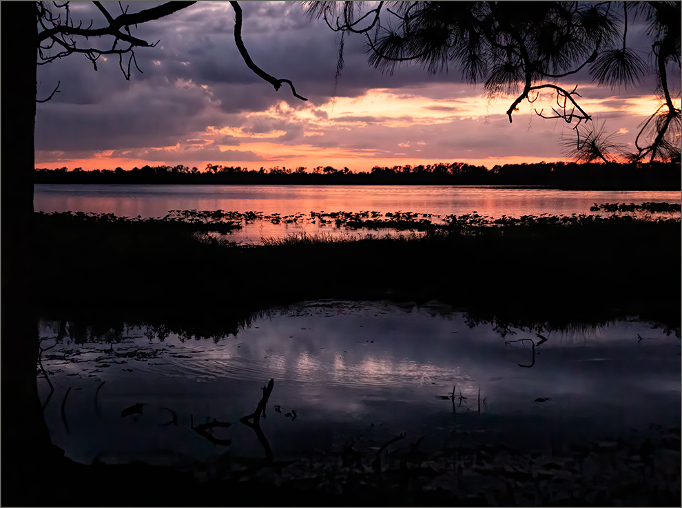
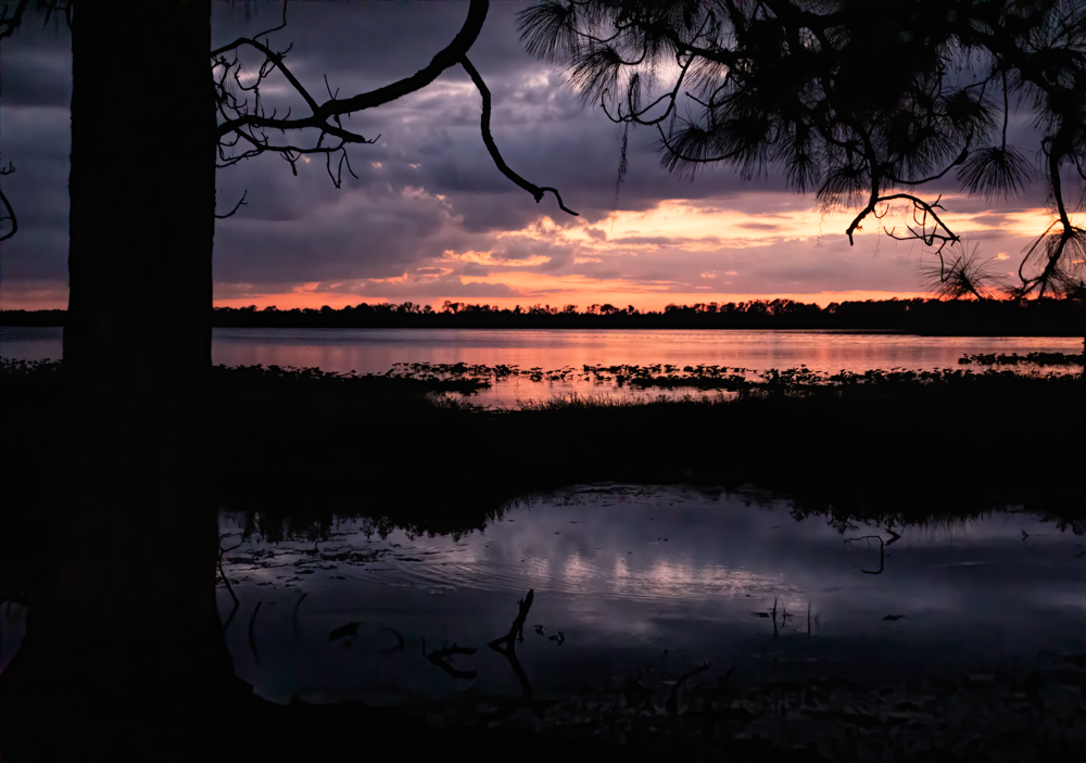
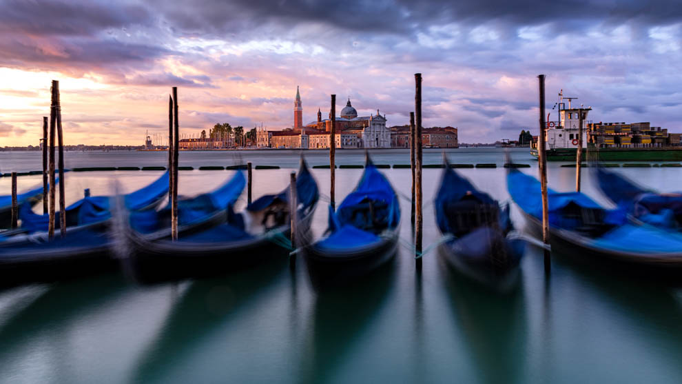
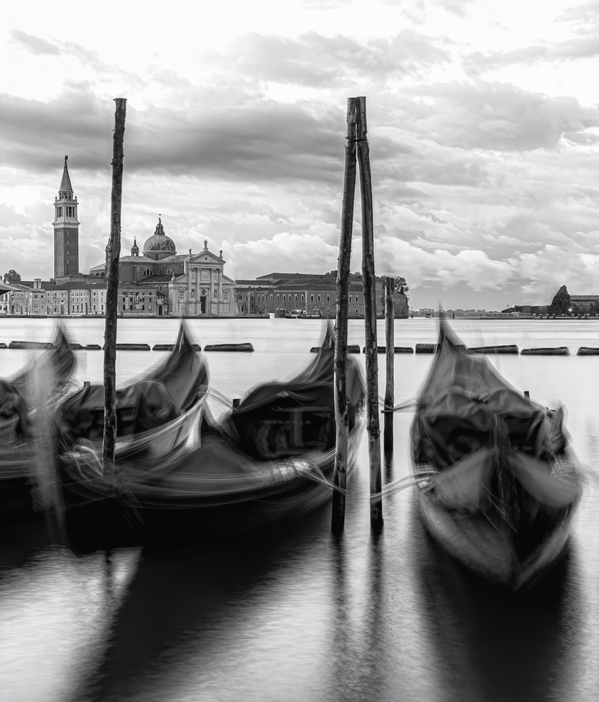
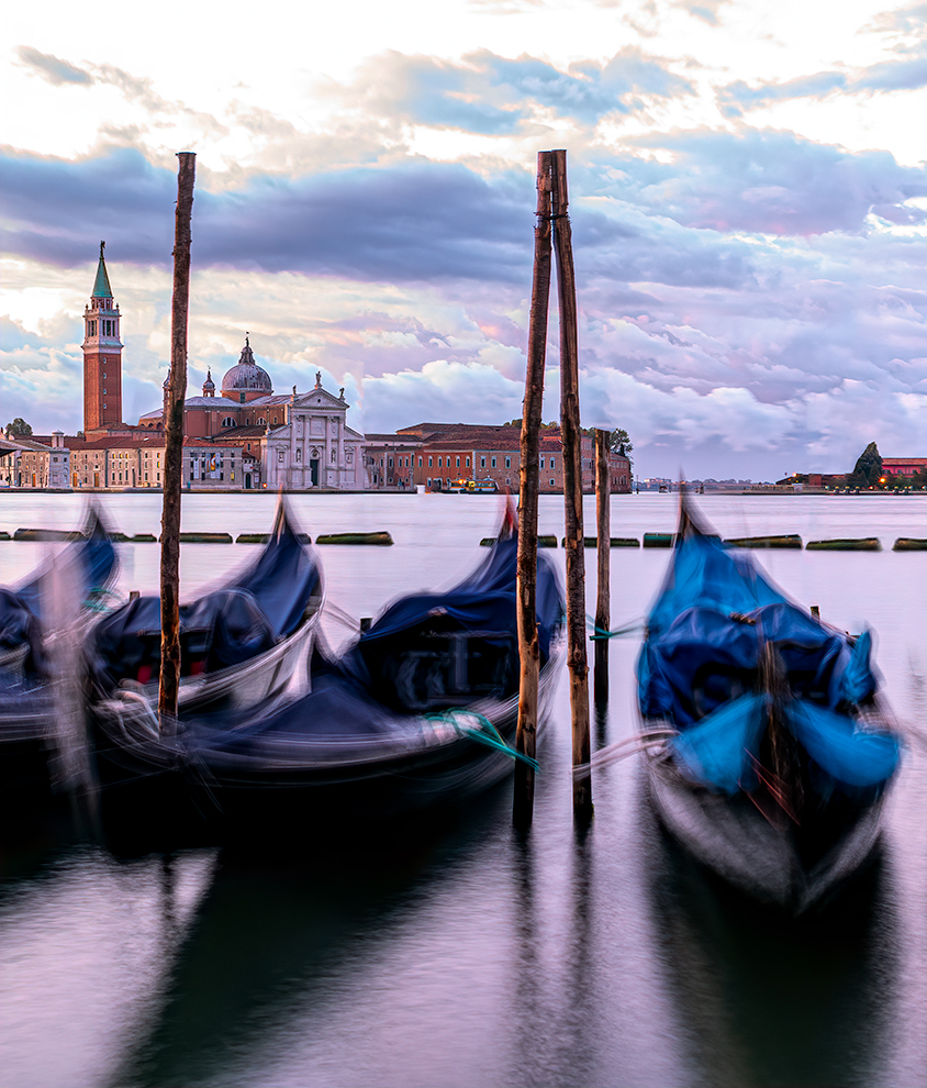
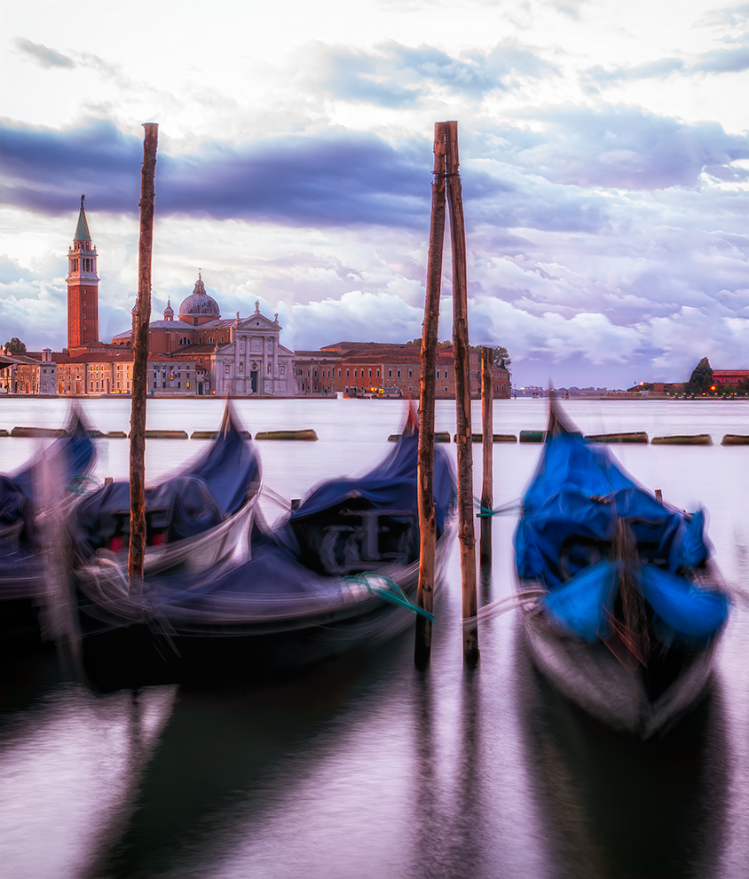
Terry, thanks for the tower add--I've never done that. Check out my latest post at the bottom of the thread and tell me if its believable. I've removed some poles. I've gone to a 16:9--would you chose more sky and lose water? I chose this crop to keep the horizon out of the middle and make the blur more of the subject. |
Dec 27th |
| 78 |
Dec 19 |
Reply |
Jason--check out my latest post--a 16:9--do you think I should have cropped water and left sky? And I've added Terry's tower (my first add--it is believable?). And I've removed a bunch of poles. Thanks for hanging with me on this! |
Dec 27th |
| 78 |
Dec 19 |
Reply |
Larry, thanks for your thoughts on my vertical. If you head to the very bottom of this thread, I've gone back to the horizontal, turned it to a 16:9, copied the tower from the vertical (my first time, is it believable?) and I've removed some poles to increase the church view. What do you think of my latest version? Thanks again for your expertise! |
Dec 27th |
| 78 |
Dec 19 |
Reply |
Sunil, head down to the very bottom--I've added the tower to the 16:9 crop. Thoughts? Thanks so much! I appreciate your expertise and experienced eye! |
Dec 27th |
| 78 |
Dec 19 |
Comment |
Here's my next edit--its a 16:9--do you like where I've chosen to leave more water and remove sky or should I reverse? Trying to keep horizon out of center--is that critical in this photo?
I've added the tower--thanks, Terry! Does it look believable? And I've removed some poles to increase the view. Thoughts? Thanks a million, guys! |
Dec 27th |
 |
| 78 |
Dec 19 |
Reply |
Jason, love having you in this group! I agree the pole through the tower is a fatal flaw--I couldn't see the problem with the poles bobbing in the dark. I chose a different view and then removed a lot of the poles. I'd love for you to take a look at the three photos I posted at the very end of this thread and see if you think they have more promise. do you think I need to crop to remove the horizon out of the middle? Thanks a million! |
Dec 25th |
| 78 |
Dec 19 |
Reply |
Terry, thanks so much for your comments. I used a different photo, cropped in so it was more focused, as you suggested. I removed a lot of poles. I do have the horizon line in the center. Should I lose sky or water? Do you like the three new versions I posted at the bottom of the post? Thanks for taking a look! |
Dec 25th |
| 78 |
Dec 19 |
Reply |
Larry, thanks so much! I just got a new computer, then travel, then a cold...so sorry to take so long to respond about this and the clouded leopard suggestions you made.
All the way at the end of the comments, I have added a different view with the moving gondolas and removed most of the poles. Three different examples are below. What are your thoughts? I am so appreciative! |
Dec 25th |
| 78 |
Dec 19 |
Reply |
Richard, Thanks SO MUCH for your notes. I finally had some time to work the pix and chose a different view and used the "content aware fill" that Abdo taught me last month and removed a lot of distractions--and the tower doesn't have a pole through it. I have posted three photos in a new post, let me know your thoughts on them. It is a single image, and I could blur the boats more if you feel they are not blurry enough. |
Dec 25th |
| 78 |
Dec 19 |
Reply |
Sunil, In a new post all the way at the bottom, I tried a different view with the moving gondolas and removed most of the poles. Three different examples are below. What are your thoughts? I appreciate your expertise! |
Dec 25th |
| 78 |
Dec 19 |
Comment |
|
Dec 25th |
 |
| 78 |
Dec 19 |
Comment |
|
Dec 25th |
 |
| 78 |
Dec 19 |
Comment |
I took in everyone's thoughts on my experiment, and pulled another photo, where I was able to remove most of the poles. I cropped it into a vertical, which I think made the church more of a focus. Here are three renditions of the idea to see if this is better. Thanks so much! |
Dec 25th |
 |
| 78 |
Dec 19 |
Reply |
Jason, Thanks so much for your crop. Do you have an article on when to use what crop? You always have interesting crop suggestions for me. I do have another couple of views of this scene I am going to work and post and see if I can incorporate everyone's suggestions. |
Dec 10th |
| 78 |
Dec 19 |
Reply |
I didn't catch I had put my horizon line in the middle! Will try some different crops! Will post in the next couple of days. Thanks! |
Dec 10th |
| 78 |
Dec 19 |
Reply |
Great ideas, Larry! I have more pix that are more blurred, so I'll try those up here in the next few days. And I have a pic from another angle, I will post those also. Yes, it was a big stretch to post a blurred pic...just trying to do something different. The water was rough and choppy, its the ocean, coming straight into a city. The post and tower is completely my fault, as the poles bob around and I didn't catch it moving into the tower. I was trying for a wide landscape, but I think your idea of cropping tight and minimizing poles and bringing attention to the background helps my composition. Thanks! |
Dec 10th |
| 78 |
Dec 19 |
Reply |
Thanks for your thoughts! I have more pix that are more blurred, so I'll try those up here in the next few days. And I have a pic from another angle, I will post those also. Yes, it was a big stretch to post a blurred pic...just trying to do something different. The water was rough and choppy, its the ocean, coming straight into a city. The post and tower is completely my fault, as the poles bob around and I didn't catch it moving into the tower. |
Dec 10th |
| 78 |
Dec 19 |
Reply |
I'd love to see your version of B/W, Jason! |
Dec 8th |
| 78 |
Dec 19 |
Reply |
Thanks, Isaac, that's interesting info.
|
Dec 8th |
| 78 |
Dec 19 |
Comment |
Abdo, good job on your bird photography! I am hoping to learn how to get good bird shots while living in Florida for six months.
It's crisp, great colors, nice lines with the branches and faded out background. And a catchlight in his eye! |
Dec 6th |
| 78 |
Dec 19 |
Comment |
Richard's crop really brings our attention to your subjects.
Are you able to lighten the buffalo face a tad?
Very one-of-a-kind!
Also, thanks for your juxtaposition article, I read it after the month ended. Really wonderful with all the photos you included to make each point. |
Dec 6th |
| 78 |
Dec 19 |
Comment |
I think the black and white makes this. What leading lines and it certainly carries the stark mood you wanted to convey.
I don't think I'd know it was a German concentration camp, but we definitely aren't welcome.
|
Dec 6th |
| 78 |
Dec 19 |
Comment |
Wonderful leading lines! The water takes us to the tree and the tree branch takes us into the water again. Of course, we are looking at a smaller rendition, but the trees don't seem soft to me at all. |
Dec 6th |
| 78 |
Dec 19 |
Reply |
Sunil, first--thanks so much for your Content Aware Fill trick you gave me on my November pic! Works like a charm! I've always been taught to use the spot healing brush, but the lasso worked perfectly!
I love the square crop and thanks for pointing out the leaves on the pavement and telling me about yet another time where you have captured folks unawares and they add interest to your photo. And your lens is amazing!!! I didn't know you could have a multi-prime lens. |
Dec 2nd |
| 78 |
Dec 19 |
Comment |
Sunil, what was interesting about your Leica lens?
Wow, slow exposure, were you on a tripod?
I love the trees arching and your processing--very subtle.
On my monitor, the couple and the fountain are a bit hard to make out, but the trees are superb.
I'm curious, did you just run into the couple, or were you with them?
I am not in love with the title, as there really aren't fall colors--isn't that just red dirt? And the grass on the outer sides is bright green. Perhaps-- Arching into Love? Path to True Love? |
Dec 1st |
| 78 |
Dec 19 |
Comment |
Alan, I love Valley of Fire State Park! I didn't see any critters there! Did you run your Topaz Clarity or Topaz Detail on him? If you have Light Room, the new Texture slider is amazing and will really add detail those red rocks. I think that would really help him come to life.
You got a catch light in his eye, which is critical in animal shots. Do you have a pic with his full body? I think he needs be in his entirety. Other than his missing body, I think this shot has potential and him looking back at us is sweet. Nice title, too!
|
Dec 1st |
| 78 |
Dec 19 |
Reply |
Thanks, Alan. I wanted it to be out of focus enough you knew it was on purpose, but still could make out what you were seeing. Did you recognize them as gondolas? Or were they not identifiable? |
Dec 1st |
10 comments - 17 replies for Group 78
|
19 comments - 28 replies Total
|


