|
| Group |
Round |
C/R |
Comment |
Date |
Image |
| 69 |
Nov 19 |
Reply |
I agree, Mervyn. I also liked the additional vertical lines of the reeds. We'll see what others think. |
Nov 30th |
| 69 |
Nov 19 |
Reply |
Thanks so much, Candy! |
Nov 30th |
| 69 |
Nov 19 |
Reply |
I finally tried a stroke, watching a You Tube. I'd love any advice you have using it! I can see adding this a LOT! My email is BrendaFishbaugh@gmail.com, if you don't want to post it here. Check out my changes below. Thanks for your help! |
Nov 29th |
| 69 |
Nov 19 |
Reply |
Thanks, Jacob! I did make some changes and posted it below. I'd love for you to take a look and see which you like better! |
Nov 29th |
| 69 |
Nov 19 |
Reply |
Dean, Thanks! I burned down the lily pads and the stem along the bottom and posted below. Is this what you envisioned, or darker? |
Nov 29th |
| 69 |
Nov 19 |
Reply |
Thanks for your comments! I did make the changes folks suggested. Do you like my latest pic below any better? |
Nov 29th |
| 69 |
Nov 19 |
Reply |
Take a look at my post below from today, and see if you think it is an improvement. Thanks!
|
Nov 29th |
| 69 |
Nov 19 |
Reply |
I've added a new crop with darkened lily pads and a stroke around the purple flowers below. I like your crop also. Do you have a preference? Thanks so much! |
Nov 29th |
| 69 |
Nov 19 |
Comment |
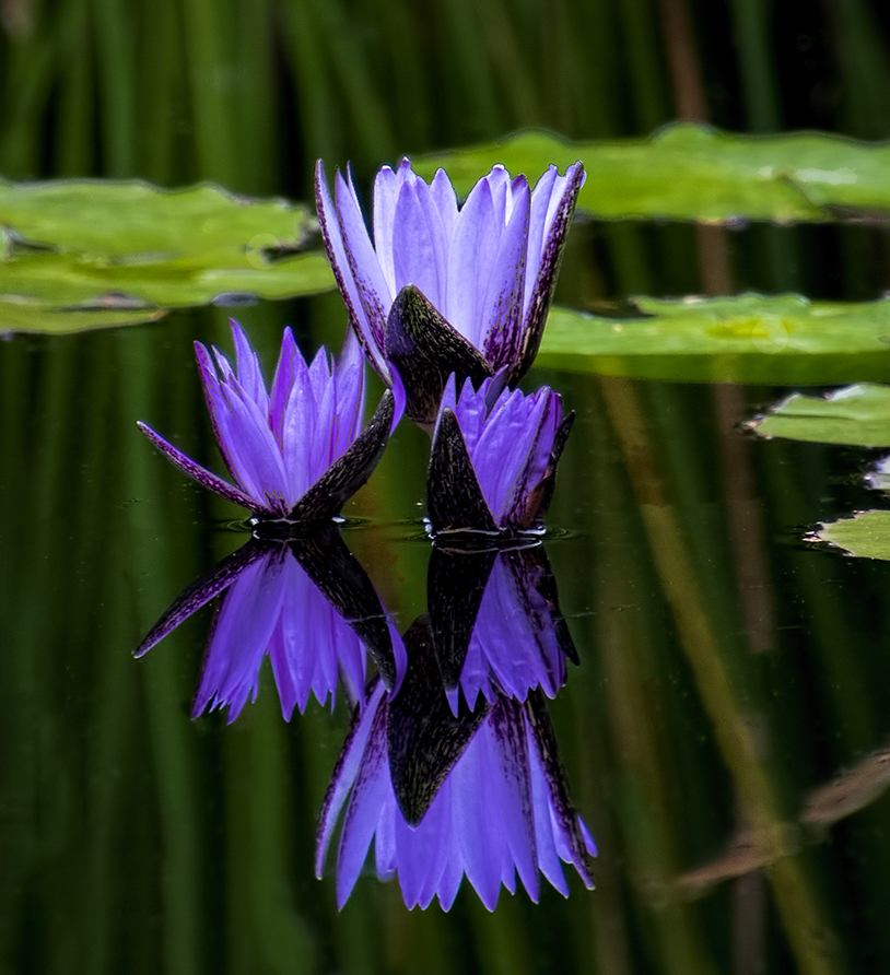
I took everyone's comments into account. I did not have more room on the photo to work with to change the cropping as suggested (lots of garbage lily pads that were too difficult to work with. So-- 1) cropped in from top and right, darkened the lily pads using the magic wand and curves, which was new for me. Improved?
And I watched a You Tube video on how to use "Stroke", which Candy had suggested. I used medium gray and a 2 pixel tolerance to stroke the purple flowers, but not their reflection. Did it enhance the flowers and have them stand out from the background more?
I also like Pierre's crop. Does everyone like that better than this? |
Nov 29th |
 |
| 69 |
Nov 19 |
Comment |
Wow, a great shot, Geoffrey! I think you did an awesome job. Were you using a tripod or panning? I'm trying to learn how to get bird pix, now that I am in Florida.
What camera are you shooting with? A lot of cameras have really low nice and the noise reduction software available now can take noise out of a really high ISO pic.
The bird seems a bit centered...I would want to maybe crop a bit behind him so it creates more space for him to fly into. I will look forward to our bird experts opinions. |
Nov 2nd |
| 69 |
Nov 19 |
Comment |
I like the crop--that was smart on your part. It strengthened your composition a lot. Unfortunately, it make a small jpg file even smaller. Is the pic straight? It feels like I am going uphill as we move towards the back of the photo.
I think you did a lot with what you had. The two least believable parts are the very green/lime tree on the far right and the red leaves on the ground close to us, the trees are not red. With those changes, it would be more believable. What are you using for your processing?
Can't wait to see what you do with your camera! What camera do you have? Lenses? |
Nov 2nd |
| 69 |
Nov 19 |
Comment |
So adorable! Really a wonderful "awwwww..." moment. I really like both your version and Pierre's version. If you wanted a bit more room, perhaps a few closest to the top could be removed. Really fabulous. |
Nov 2nd |
| 69 |
Nov 19 |
Comment |
So beautiful, Mervyn! Where did you photograph this? You were quite close. Beautiful composition with beaks as leading lines. On my monitor, the top of her wing looks a little blue? Really a beautiful moment.
I've not shot birds on a tripod. Do you use a gimbal head? I would have thought you wouldn't need that much shutter speed and might want more depth of field? Or is it a choice to keep a fairly shallow depth of field to blur the background and stop any action? Thanks for filling me in! |
Nov 2nd |
| 69 |
Nov 19 |
Reply |
Thanks so much, Pierre! So you would crop from the right and center it? |
Nov 2nd |
5 comments - 9 replies for Group 69
|
| 78 |
Nov 19 |
Reply |
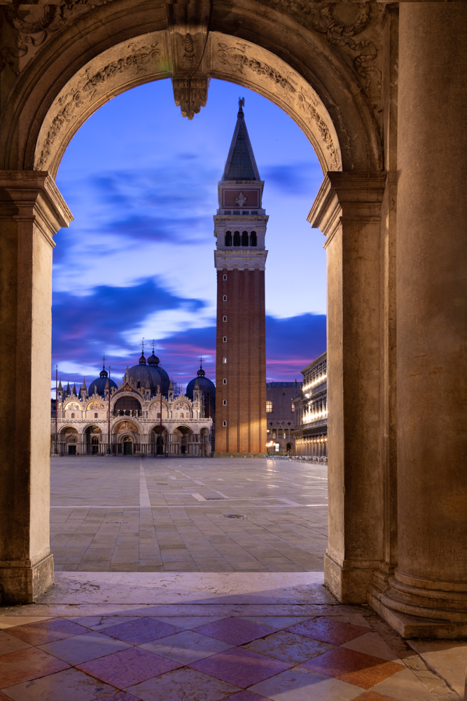
Wow, it took a lot to remove it and not mess up the tower, great job, Abdo! Does my version below look realistic? I am not sure my clouds look right. |
Nov 29th |
| 78 |
Nov 19 |
Reply |
Richard, I took out the light below, is this what you envisioned? Would you explain about cropping the floor and why that would improve the photo? I'm not sure I understand how that would make it more balanced? Thanks for your expertise! Also, how in the world did you shrink the tower? That's a useful technique! |
Nov 29th |
| 78 |
Nov 19 |
Reply |
Thanks, Terry! Do you like the version below with the lamp removed? |
Nov 29th |
| 78 |
Nov 19 |
Reply |
Sunil, I took out the light below. Do you like it? I'm not sure why taking out the floor would make it look balanced? Can you show me a quick version of what you have in mind? Thanks so much! |
Nov 29th |
| 78 |
Nov 19 |
Reply |
I appreciate it, Alan! |
Nov 29th |
| 78 |
Nov 19 |
Reply |
Thanks, Stephen! Do you like my version without a light posted below? |
Nov 29th |
| 78 |
Nov 19 |
Comment |
Thanks, everyone! I removed the light, which was difficult since it was so close to the tower, and then filled in some clouds...is it believable? I don't know how Abdo did it so easily in his example!
I tried and tried to use an ai file from Adobe Stock and convert to PNG and drop in a stock art moon, but I could not make it work and could not find a useful You Tube video--everything wanted me to use Illustrator or similar program. Any guidance?
Thanks for all the discussion!
|
Nov 29th |
 |
| 78 |
Nov 19 |
Comment |
Love Terry's crop, as the leaf was a bit too powerful for such a delicate subject and background. I tried converting to b/w to remove the vibrant green, but the grasshopper disappears in a monochrome. I do think taking down the greens a bit will keep our eye on your creature!
It looks like you were hand-holding? Where did you find him? |
Nov 3rd |
| 78 |
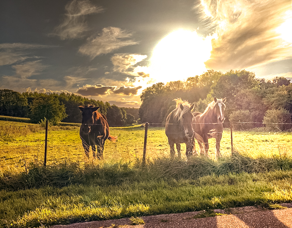
Nov 19 |
Comment |
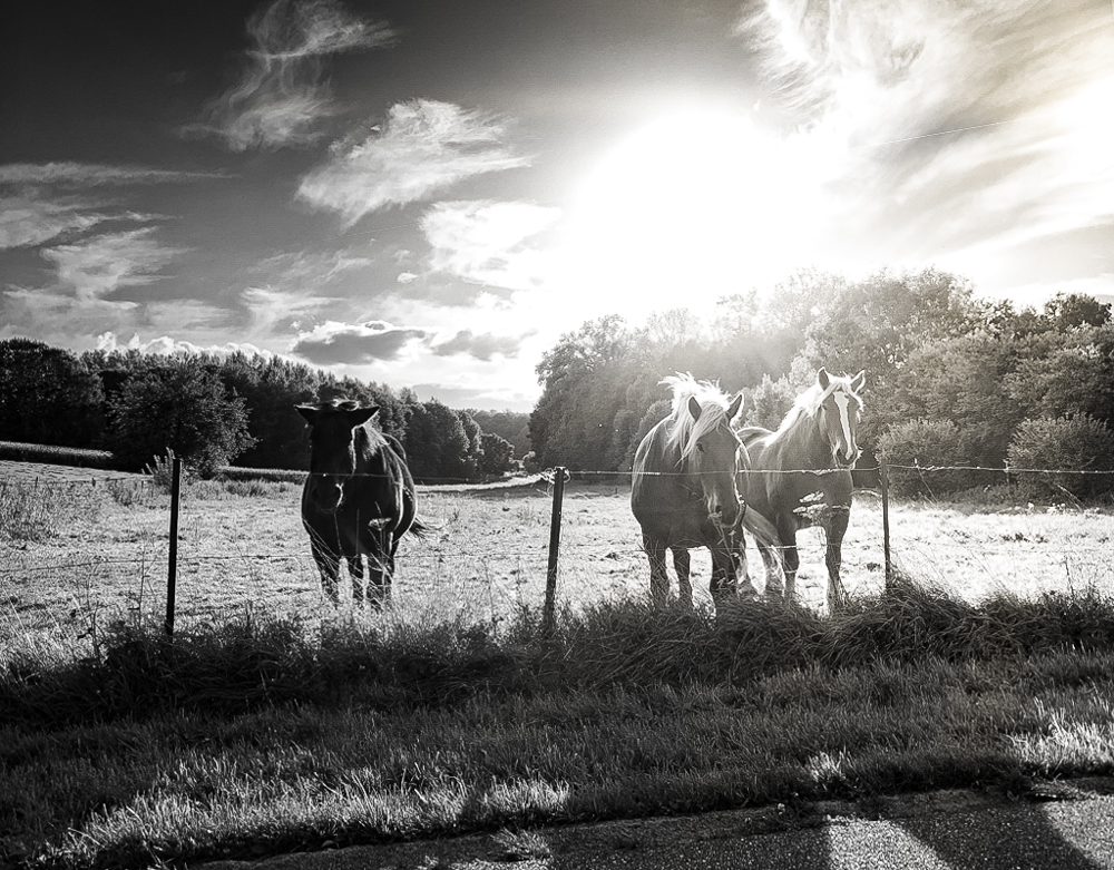
And a lighter b/w version, showing up the horses...again from Scott Kelby. |
Nov 3rd |
 |
| 78 |
Nov 19 |
Comment |
My main goal was to get the horses to be more clear, since they are our subject and they were very hazy in the original. |
Nov 3rd |
 |
| 78 |
Nov 19 |
Comment |
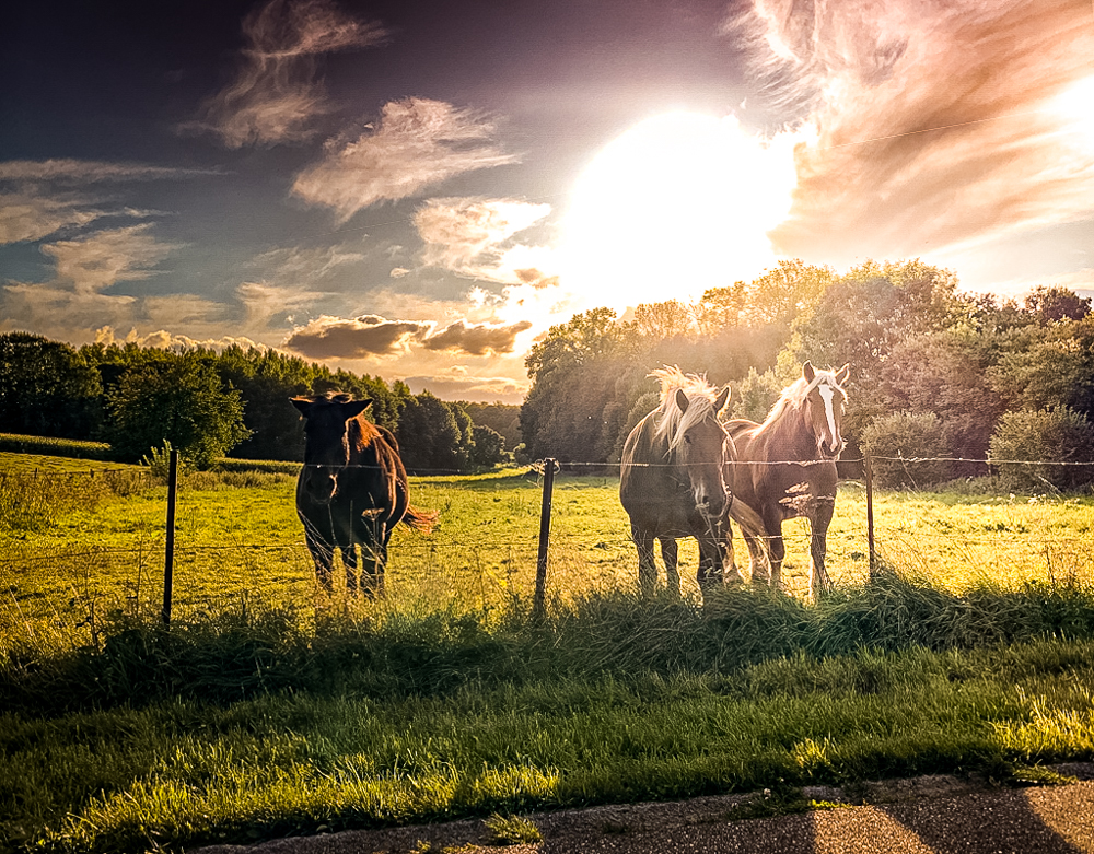
Sunil did a great b/w, so I did a few LightRoom adjustments (Auto tone, then dehaze, texture, open shadows, drop higlights) and then I applied one of Scott Kelby's free presets for LightRoom that I've attached. I will add a second Scott Kelby preset as a second option. They are quite stylized and may not appeal to you. But it was fun playing with it! |
Nov 3rd |
 |
| 78 |
Nov 19 |
Comment |
Great composition! I love how you kept to the Rule of Thirds and have complementary colors and leading lines...checked all the boxes! The shadow falling across adds additional dimension.
I would be tempted to take the blues down a bit to make the blue richer (add more black?). The blue looks a bit overly bright on my screen.
Excellent example of a great subject that keeps you engaged. My eyes keep going up and down looking for a place to rest. |
Nov 3rd |
| 78 |
Nov 19 |
Comment |
What an extraordinary pic, Richard! Fantastic leading lines taking us through the composition and a bit mysterious with the dark building. Great texture on the front bricks. I don't see much noise, so good work on that!
Nice job hand-holding, although that forced you to keep your f/stop from being high enough to "star" your lights. What was your f/stop? Everything is nicely in focus.
What did you use for your b/w conversion?
|
Nov 3rd |
| 78 |
Nov 19 |
Comment |
Sunil, what a recovery from -3 stops! Wow! Your black and white conversion is beautiful, as always.
I do agree with Terry that the black top doesn't match the light sky by the man. Perhaps just cropping before the grass at the top? Or lightening the black top corners? |
Nov 3rd |
| 78 |
Nov 19 |
Comment |
Hi Alan,
Is there a reason why you didn't shoot the art straight on? Terry points out an important point--that architecture distort shot at an angle. You might use some of your transform, distort and skew tools to see if you can bring her to face us more straight on and not be so distorted.
I like your work, but if you look at it, you'll see the saint is awkward. |
Nov 3rd |
9 comments - 6 replies for Group 78
|
14 comments - 15 replies Total
|


