|
| Group |
Round |
C/R |
Comment |
Date |
Image |
| 69 |
Oct 18 |
Comment |
Thanks for the feedback on my Siberian lynx. I cropped in on him, as everyone suggested--and I think he gets too soft. It was a high ISO shot and hand held and my first time in manual, so I was not very stable.
I do like the crop, though. Thoughts?
|
Oct 16th |
| 69 |
Oct 18 |
Comment |
Thanks for photographing endangered birds, especially 2 ages. Pierre's version fixed the problem of the lost beak. I also think the brighter blue is more compelling.
I agree with Donna that the highlights could come down.
I'd be tempted to trim a tad off the top and keep our eyes on the interesting bird participation. |
Oct 12th |
| 69 |
Oct 18 |
Comment |
The title of "Kissing Cousins" come to mind. I love the colorful composition and the strong vertical, the center loop the caterpillars create and the rich textured yellow flowered background. Wonderfully in focus and beautifully processed. |
Oct 12th |
| 69 |
Oct 18 |
Comment |
I prefer the vertical rendition you posted. The plant veins echo the diagonal leaf lines. I just heard a lecture on Homer Winslow and he became famous for strong vertical compositions. I also like Stephen's b/w version.
The bottom leaf with the "cup" reminds me of a Bird of Paradise. Graceful and beautiful.
|
Oct 12th |
| 69 |
Oct 18 |
Comment |
Hi Pierre, I'm wondering why you shot with such a long lens? It is a nice, delicate photo. I am bothered at the bottom of the photo, where the leaf and bud are cut off. Do you have just a bit more stem to add to the crop? I think it would make an almost perfect shot!
I think you could crop a tad from the top of the pic, if you wanted. |
Oct 12th |
| 69 |
Oct 18 |
Comment |
Dean, your green version is definitely nicer than the "blue" one. However, it does seem to be a bit heavy green, especially on the low rocks. Perhaps selectively desaturate the green in some areas.
Were the stone walls leaning in like that? You have 4.1 mm, do you mean 41 mm? Just wondering if a lens correction would keep the walls from leaning in on the wide angle shot?
|
Oct 12th |
| 69 |
Oct 18 |
Comment |
Nice capture, Mervyn! I also like the water texture, it adds a lot to the reflection. Nice clean eye and reflection. |
Oct 12th |
| 69 |
Oct 18 |
Comment |
Thanks for the cropping ideas and need for more vignetting! |
Oct 12th |
8 comments - 0 replies for Group 69
|
| 78 |
Oct 18 |
Comment |
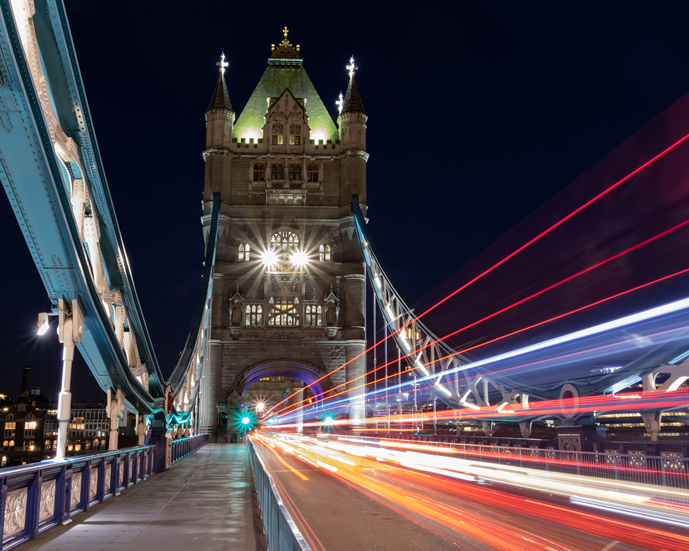
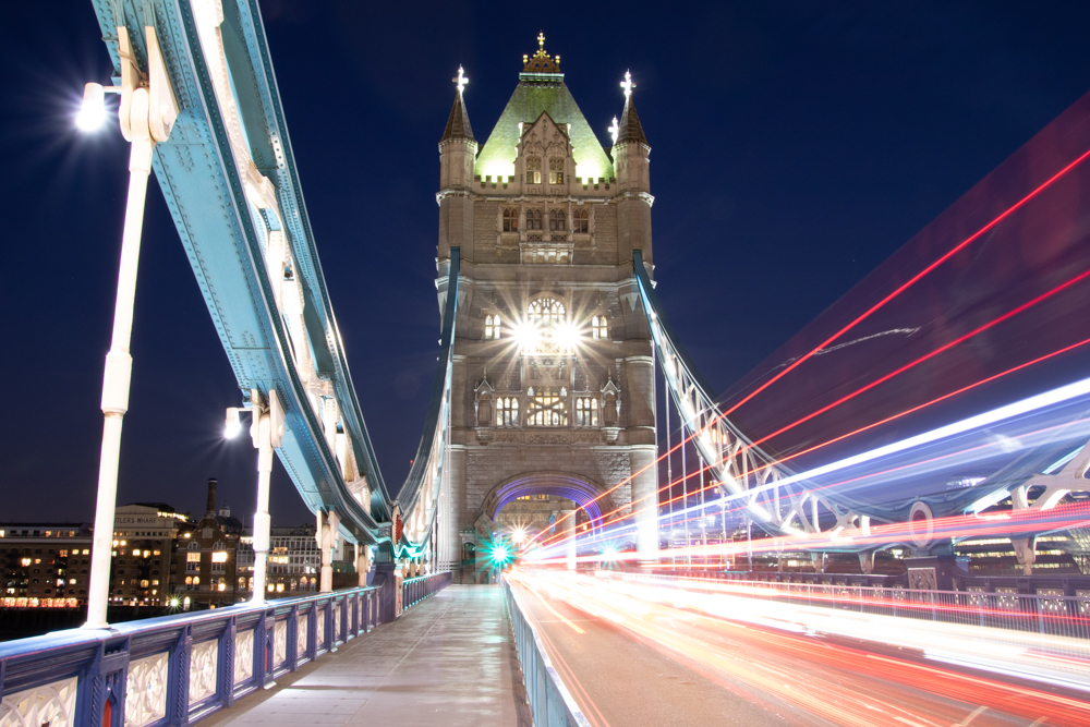
I've straightened the Tower--its tricky, as the swooping bridge makes it look crooked. Is this better, David?
I switched to a 5:4 crop, thanks Jason. I did not extend the left most yellow streak on the road. It bothered David, does anyone else notice it?
Doe you feel the new crop makes the town on the left less distracting? |
Oct 16th |
 |
| 78 |
Oct 18 |
Comment |
Sunil, here is the SOC photo. |
Oct 13th |
 |
| 78 |
Oct 18 |
Comment |
Thanks for all the comments, a lot of good ideas! I'm going to work on your suggestions this weekend and will post my new version. |
Oct 12th |
| 78 |
Oct 18 |
Reply |
I love your title suggestions, thanks! |
Oct 12th |
| 78 |
Oct 18 |
Comment |
Jason,this is a fun and creative pic. And very timely! I do agree we want the tobacco to cover the bottom and a vignette or fog are good options to play with. I'll look forward to seeing your new version. Kudos for going outside the box! |
Oct 12th |
| 78 |
Oct 18 |
Comment |
Once again, you took an ordinary subject and made it unusual. Really a sign of a top photographer. I think the eye sharpening helped the photo. I love the lines the wings make and keep our eyes on the bird fight. Great perspective! |
Oct 12th |
| 78 |
Oct 18 |
Comment |
Abdo, This is a spectacular sunset! Wonderful leading lines with the picket fence above and the shore and rock lines.
It seems like it might be a bit over-sharpened? There seems to be a white outline around the buildings, which usually appears with too much clarity or over-sharpening.
I'd love to see the distant buildings a bit better. Maybe the selectively opening the shadows would help. I'd also be tempted to bring up the purple or yellow so that the gold and purple rays show up more.
What a beautiful view of Tunisia! |
Oct 12th |
| 78 |
Oct 18 |
Comment |
I don't have a strong skill set for portraits. I do like the portrait, but agree it does need brightening (except for the bright version that shows up in Jason's Photoshop version, which looks great). I'd also like to suggest selectively (and carefully) sharpening her eyes. If you have a tiny bit more room at the top for a bit more hair clearance, I'd like to see that.
I think its an interesting photo, and you did a nice job capturing her. |
Oct 12th |
| 78 |
Oct 18 |
Comment |
Sunil, I think its a fun and interesting composition. I like the last version you did. I do like the shadow ending in the photo, and I do enjoy the color pic, as the golden sand is really beautiful. Stephen's b/w is also nice, but sunset on the beach is wonderful.
I think everyone had great suggestions, so I don't have much to add.
Subject ideas "Heading home" "After a long day"
|
Oct 12th |
| 78 |
Oct 18 |
Comment |
Hi Alan, I think you've made great progress as you have explored photography. I do agree that the HDR is a bit overdone, which is a common novice mistake. It would be great if you tried another version with less HDR so that you diminish the white shadow around the brick edge and sky.
I actually like the photo as a stand-alone. The blue/green/brick work well together. Of course, the history adds more to the impact. |
Oct 12th |
| 78 |
Oct 18 |
Comment |
Dear Group--For some odd reason, I did not receive Abdo's photo entry, and he made two attempts to send it to me. I do not have any of his photo details. When I receive them, I will add them here. |
Oct 10th |
10 comments - 1 reply for Group 78
|
18 comments - 1 reply Total
|


