|
| Group |
Round |
C/R |
Comment |
Date |
Image |
| 69 |
Sep 18 |
Comment |
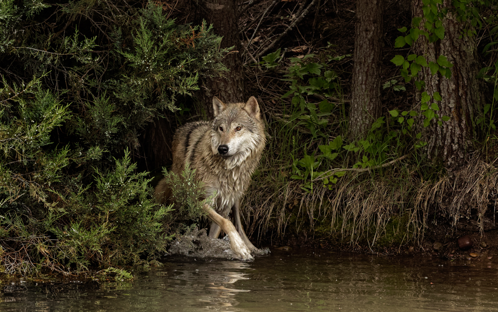
I've made a few changes to the original--I've darkened down the bush on the left to add mystery. I've followed Candy's advice and sharpened him and lightened his eyes.
Thoughts? I'm thinking too much sharpness? |
Sep 16th |
 |
| 69 |
Sep 18 |
Comment |
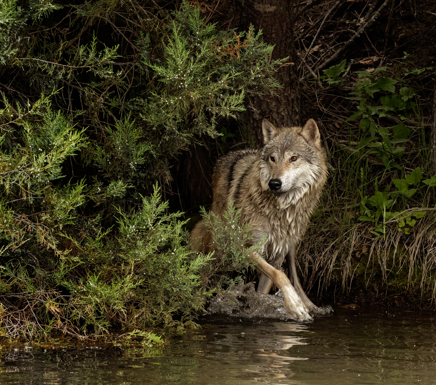
Cropped off the right to move him into Rule of Thirds |
Sep 8th |
 |
| 69 |
Sep 18 |
Comment |
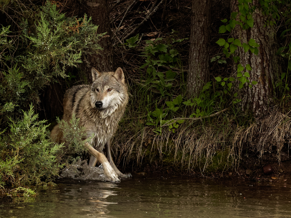
I've re-cropped the wolf using your suggestion to give him more room to move into. I entered him in a local photo contest, and the judge suggested cropping him from the left and get rid of the big juniper. I've attached both for your additional thoughts. |
Sep 8th |
 |
| 69 |
Sep 18 |
Reply |
Great idea, Donna. |
Sep 8th |
| 69 |
Sep 18 |
Comment |
I am so in love with this pic. Great bird iridescence, wonderful bend of the head and sharp beak and eye. The branches and tiny, tiny leaves add so much. I've learned so much about different types of birds from this group. |
Sep 1st |
| 69 |
Sep 18 |
Comment |
Donna, nice capture shooting a bird from above and getting him so crisply throughout with a just an f/5. I'm surprised you didn't add a bit of vignette? |
Sep 1st |
| 69 |
Sep 18 |
Comment |
Candy, I so appreciate how you explain your process in such detail. I have never heard of adding a B & W layer at low opacity to remove color--great idea. I love the rich textures throughout your capture. I am surprised that the lighter warm colored mushrooms on the darker trees still work and are very believable.
Kudos for taking something simple and turning it into a work of art. |
Sep 1st |
| 69 |
Sep 18 |
Comment |
Pierre, lucky shot to get mountain goats not way up the mountain! I like the white coats against the green bushes. I'd be tempted to selectively sharpen just the goats, as they seem just a tad soft.
Also, if you have just a bit more room for the goats to walk into, I think that would be helpful. |
Sep 1st |
| 69 |
Sep 18 |
Comment |
I am fascinated by the frogs'mouth, is it a light green and white, or is that just the water reflection? The lily pads seem a tad over-saturated on my computer. The perspective is a bit odd, it feels the frogs might slide off the lily pad?
The stem lines are very strong, so you might think of burning them down so they don't pull our eyes so quickly from the frogs.
Donna is a frog expert, so I'll stop babbling about your pretty shot and let the others jump in.
|
Sep 1st |
| 69 |
Sep 18 |
Comment |
Fun capture, I like the lines that the two necks form. The male is in great focus, both birds have catch lights in the eyes and the wood box has wonderful texture.
I will let our bird experts decide how to work with the female to sharpen her, but I would love to see her more sharp with selective sharpening or even the movement blur filter in Photoshop might help her. I'm not sure what is allowed in your competitions.
Other than the soft female, I think its a lovely moment in time. |
Sep 1st |
9 comments - 1 reply for Group 69
|
| 78 |
Sep 18 |
Comment |
Have a great vacay, Abdo. Nice ideas, Jason. Especially if Abdo has a wider canvas, your cropping could improve an already fabulous pic. |
Sep 6th |
| 78 |
Sep 18 |
Comment |
I am thrilled how this pic is progressing! I love Richard's processing and Dave's additional comments. And Jason, I like the narratives. I think it would be useful for me to think of narratives and what the back story of my photos are as I plan them. |
Sep 6th |
| 78 |
Sep 18 |
Comment |
Dave, thanks for the explanation on your cropping theory. It's very helpful, especially to hear how you did it "my way" for yourself and then changed it to the current way. I appreciate the lesson! |
Sep 6th |
| 78 |
Sep 18 |
Comment |
Jason, nice call on the tighter crop! It's really moved it into a spectacular pic. Well done, Sunil! |
Sep 6th |
| 78 |
Sep 18 |
Comment |
Alan, you did a great job taking down the highlights. Do try the Content Aware Fill, as that's a great trick to be aware of, even if it doesn't fix things completely.
I agree with Dave on always shooting wider than what I want. I have a terrible time keeping things straight, so I need the extra room to straighten in post-processing.
Keep playing, its the only way to improve! |
Sep 6th |
| 78 |
Sep 18 |
Comment |
Thanks for all the great comments, Group! I'm happy to report it won 1st in our little Photo Club in the Advanced division with just 15 entries with an almost perfect score 9,9,8=26 (27 is perfect).
I debated on removing the cute water drop or adding more, and stayed with just the one. But I can see the merits of both choices.
Several of you asked how it was done--I cheated! I attended a photography workshop in Michigan, and this was set up for us. It uses a very special machine to drop something into the water. We were on tripods in a pitch black room and told our settings. We had a trigger on our camera added, so when I took the shot, the item dropped and the timing worked out. The tray was very small and maybe had motor oil in it? And behind the tray was a canvas painting with the colors you see. I was able to shoot 3 photos, and all look similar, so there wasn't a lot of choice. Speeds ranged between 2.8 sec and 3.3 sec, so all were quite slow for what you would expect would be a fast shutter speed.
I had worked with my cousin to get a water drop shot several months ago, and it was difficult trying to not have the tray edge show, have the water splash up high enough to capture it and we were using food dyes for colored water. We were not nearly as successful as this, but I would not be able to duplicate my effort above on my own. |
Sep 6th |
| 78 |
Sep 18 |
Comment |
Richard, Please tell us more about 1X. I am thrilled I was able to give you a title for last month's print. I found the vignette to be darker than needed,but it did add to the mystery.
I do agree with Dave that the Dutch tilt doesn't help you in this very linear pic. Your photo does create such empathy for these people and carrying such weight on their head and necks cannot be good for their health. |
Sep 6th |
| 78 |
Sep 18 |
Comment |
Abdo, this is an amazing capture--and its a single shot, not a HDR? Would love to see this city!
Great depth of field, focus, sharpness, wonderful colors and not overdone.
The reflection on your thin building really makes it extraordinary! My only concern is the thin building is perfectly center. I don't see an easy way to move it, we'll see if anyone else has an idea. |
Sep 1st |
| 78 |
Sep 18 |
Comment |
Fun capture with the fun-loving girls and then contrasted with wilderness.
I still feel the girls are still bit blown out and the trees seem a bit dull and flat. Perhaps a bit of a boost on your greens or increase your midtones? I think Alan's idea of removing the cell towers is smart. And consider removing cars on the road for a more wilderness feel?
I'd also consider darkening your sky, it seems a bit pale.
I think this shows a great eye, and a bit more post-processing will have it in wonderful shape. |
Sep 1st |
| 78 |
Sep 18 |
Comment |
Another pic where you've taken something ordinary into the extraordinary! Great lines, great focus, a wonderful monochrome.
Dave, I'm surprised that you cropped your tree on the right and changed the photo balance. What was your thinking? I'm sure you made that a conscious decision. |
Sep 1st |
| 78 |
Sep 18 |
Comment |
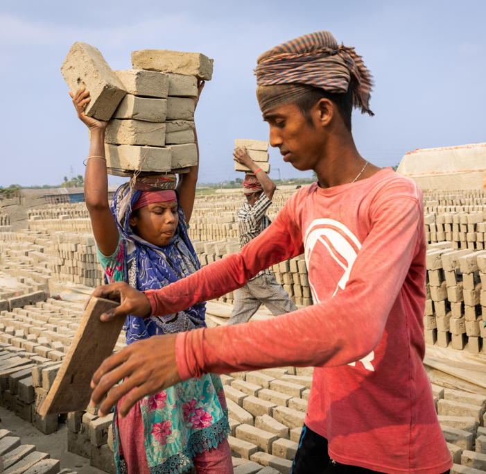
It is an interesting capture and you've made an improvement by removing bricks going into the man's head. I'm troubled with two people walking OUT of the frame. I think that Alan's crop does bring our attention to the woman with so many bricks--in contrast to red shirt guy with a single piece! Or loading her up more! Consider a vertical option, where she is our focus. |
Sep 1st |
 |
| 78 |
Sep 18 |
Comment |
I do think you made a large improvement over the original pic. I do light the white balance change, and your leading lines taking us through the pic, only stopping at your lone visitor.
Have you considered more contrast to make the "ribs" even more prominent? |
Sep 1st |
| 78 |
Sep 18 |
Comment |
Alan, nice effort! I see what you were going for with the twisty tree against rock and pine. Its all in focus, the white balance is good and you have a foreground, mid-ground and a background.
I think its a bit tightly cropped at the top, bottom and right--strong branches are almost going off the page. If you have the original and email it to me at BrendaFishbaugh@gmail.com, I'll put it up with a gentler crop.
The sky seems a bit over-saturated. It's deep blue and then very light at the horizon. |
Sep 1st |
13 comments - 0 replies for Group 78
|
22 comments - 1 reply Total
|


