|
| Group |
Round |
C/R |
Comment |
Date |
Image |
| 69 |
Aug 18 |
Comment |
Somehow I missed this pic! So sorry! Love the bird and his iridescent colors! Since the bird buries himself in this brush, I am fine with the brush. I would like more room for the feet, so I know they are in there. I also find the blue sky to look a tad fake. Perhaps you have great deep blue skies there...our Indiana skies are very pale blue. |
Aug 19th |
| 69 |
Aug 18 |
Reply |
Candy and group, do you think my crop (posted 8/5) is a bit too tight and Pierre's version on 8/6 is better? I think I like Pierre's better. Do you like the foreground grass left in, as left by Pierre's crop? I like the grass, but since its out of focus, I am thinking I'll keep it out in the final version? |
Aug 19th |
| 69 |
Aug 18 |
Comment |
I agree with everyone on Mervyn's crop. It's a really beautiful capture and astounding to make a warty frog look so beautiful in pastel colors. Thanks for your explanation on how you sometimes move the "subjects" to get such a perfect setting. |
Aug 19th |
| 69 |
Aug 18 |
Comment |
Oh, I really like the last image, Candy. I also like your 8/5 pic and I understand about the small sized pix we are putting in here not showing all detail. |
Aug 19th |
| 69 |
Aug 18 |
Comment |
Yes, I think the darkened background and Candy's work shows off the great moment very well! |
Aug 19th |
| 69 |
Aug 18 |
Comment |
Candy, I like your texture. I do agree that the extra room for the head that several of you suggested was the right choice. |
Aug 19th |
| 69 |
Aug 18 |
Reply |
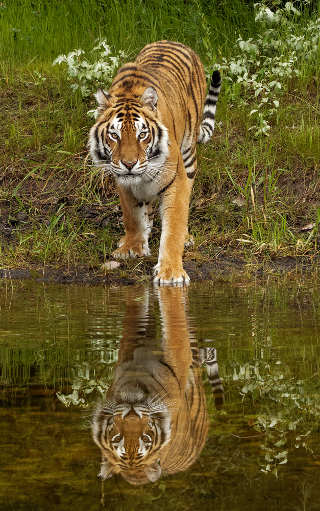
Mervyn, This was shot in the Montana wilds, where the tiger has acres and acres to roam. No fences anywhere me. This is why I showed the tiger with so much background. I was worried that a close crop would make this look like a zoo tiger. As always, thanks for your thoughts. |
Aug 6th |
| 69 |
Aug 18 |
Comment |
Candy, the textures are great, the water is cotton candy and the red rock adds interest. It seems a tad dark overall on my monitor, but you may have wanted the mystical look it has.
Can you speak to how you used the sponge tool for enhancing colors in the rocks? I'm not familiar with that. |
Aug 5th |
| 69 |
Aug 18 |
Comment |
I made some changes and cropped in. Should I darken the background further? I did not blur it, do you feel that is needed at this tight a crop? I lightened the reflection so it didn't compete with the tiger. Thanks for the additional feedback! |
Aug 5th |
 |
| 69 |
Aug 18 |
Comment |
Dean and Donna, thanks for your comments. I am going to work on a new crop and the darkened and blurred background. I'll post tomorrow and get your new thoughts. Thanks! |
Aug 4th |
| 69 |
Aug 18 |
Comment |
Donna, I have been enjoying all your frog pix on Facebook--all beautifully lit and softly focused and pastel colors. Tack sharp on the tree frog's eye, and much of his main flower. His body texture is just incredible. I love the green, white and gold colors. Did you use a green backdrop behind him or is that a blur from your macro? How were you able to keep your frog from blending into the same colored background?
I am a bit distracted by the out of focus horizontal line in the right bottom. I would crop that out, but I know you spend a lot of times getting your crops where you want them. Can you explain why you left that in?
Are the frogs naturally in the park flowers, or do you move them to create these beautiful scenes?
Exquisite, as always! |
Aug 2nd |
| 69 |
Aug 18 |
Comment |
Pierre, I really love the unusual bird position, making this a diagonal composition! The birdhouse, his very crisp talons and the golden water are all beautiful.
I think the night heron is a bit dark, especially his head and eye. I know you've already opened your shadows, so I will look forward to hear what our bird experts in the group would suggest to best show him off. Perhaps you can do a completely backlit silhouette against the gold water, as an exciting alternative shot. |
Aug 2nd |
| 69 |
Aug 18 |
Comment |
Dean, isn't Ludington gorgeous? I bet you have a lot of great pix from the town and the lighthouse. There are a couple of amazing photographers there--Brad and Todd Reed. Check them out on Facebook, if you missed their store.
I find the seagull (oops! gull) flying away to lessen my interest in him, but I see him as the subject, not the standing gull. And the flying gull's face is covered by his wings, which lessens interest. Perhaps you have another capture where we see him coming into the frame or more visible? Or where the surfing gull is surfing and not facing away from us?
My favorite part of the pix is your stop-action waves, with the repeating bands of green/blue and white foam.
Everything is nicely exposed and in focus, if we could just see Johnathan Livingston Seagull and his friend! |
Aug 2nd |
| 69 |
Aug 18 |
Comment |
Mervyn, I like your cropped version better (good to know the PSA rule,though!). I like that he is looking into the photo and that the stick and his head turn keep us in the frame.
Is his head and eye a tad soft? The sharpest focus seems to be his legs and branch? Perhaps you can sharpen his head a tad.
Also, the sky seems to have some noise in it, even though you shot at ISO 400. You might try noise reduction or one of Candy's amazing background textures. I'll look forward to seeing what our bird experts say, as bird shots are incredibly difficult.
Your shots from Namibia have added it to my Wish List!
|
Aug 2nd |
12 comments - 2 replies for Group 69
|
| 78 |
Aug 18 |
Comment |
Jason, now that everyone has weighed in, did you like Dave's version best? I definitely did. Or are you still going for a different look? |
Aug 19th |
| 78 |
Aug 18 |
Comment |
Richard, we would love to see your pic with some of the changes that have been suggested, if you find any of them worth consideration. |
Aug 19th |
| 78 |
Aug 18 |
Reply |
Ha ha! Shows you what a great eye you are developing, Alan! I think your second crop is interesting, also. On my screen the blue looks a bit too cyan. In your first pic, you'll find the sky is a more hazy blue, and seems more believable. Glad you are playing with it! |
Aug 19th |
| 78 |
Aug 18 |
Reply |
Beverly, Thanks so much for visiting our group and for cropping my tiger. I like your version a lot and thanks for the compliments! |
Aug 19th |
| 78 |
Aug 18 |
Reply |
Alan, I hope you are feeling much better! I appreciate your feedback! |
Aug 19th |
| 78 |
Aug 18 |
Reply |
Thanks so much, Richard! I appreciate your thoughts, all good ideas!
|
Aug 19th |
| 78 |
Aug 18 |
Reply |
Alan, its definitely a photo with a lot of complexity! I agree there is a lot going on. |
Aug 11th |
| 78 |
Aug 18 |
Reply |
Under your Comments--you'll see Choose File, and then you Choose your changed file and it will upload. It needs to be under 1 mb. If its not loading, its too big. You can send to me and I can alter for you. BrendaFishbaugh@gmail.com and I'll post for you. Hope you are feeling a lot better! |
Aug 11th |
| 78 |
Aug 18 |
Reply |
Thanks, Stephen! I am torn as to how to crop this to compete with it, so I appreciate your thoughts! And thanks for visiting and commenting on our new group! |
Aug 10th |
| 78 |
Aug 18 |
Comment |
Sunil, love the tire added. I really like your black sky building and the vibrant color version. Wonderful photo. |
Aug 9th |
| 78 |
Aug 18 |
Reply |
I hadn't noticed the fire escape before, so I like Oliver's idea of giving it a little more light. And I hadn't seen the steam before...this is a really a pic with so much interesting areas. |
Aug 8th |
| 78 |
Aug 18 |
Comment |
I think the scratches add texture and interest. I don't think you can blur the train with our passengers so crisp and in focus. Thanks for looking up the language. It's really interesting with a heart in the characters. |
Aug 8th |
| 78 |
Aug 18 |
Reply |
Sunil, we'd love to see some of the ideas suggested and see if you like any of your new versions better. I am very fond of the color version you added in your comments. It really keeps me interested. |
Aug 8th |
| 78 |
Aug 18 |
Reply |
Jason, would you be willing to add a pic that shows your thoughts on a possible crop? |
Aug 8th |
| 78 |
Aug 18 |
Reply |
I would not have thought of this, and like the idea of burning the foreground to focus us on the larger rocks. |
Aug 8th |
| 78 |
Aug 18 |
Reply |
Dave, I'd love to see your suggestion for cropping this. I'm really torn on how to best frame my tiger. I do like the idea of grass in the foreground as Richard suggests, but the grass in the original photo is a bit of a mess, as Richard also points out. |
Aug 8th |
| 78 |
Aug 18 |
Comment |
I do think David's version is the best yet! Any other thoughts from the rest of our group? |
Aug 8th |
| 78 |
Aug 18 |
Reply |
Thanks for joining us! We appreciate you coming by!
|
Aug 5th |
| 78 |
Aug 18 |
Comment |
What do you think with the implemented changes the group suggested? Cropped in, darkened background and did not make the reflection quite so obvious. I don't want the reflection fighting with the actual tiger. Although it does not show a lot of environment to feel like it is in the wild...it does not look like a zoo (which I wanted to avoid). |
Aug 5th |
 |
| 78 |
Aug 18 |
Comment |
Jason, I like the latest version above best. Have you ever expanded a canvas? You could expand the lower canvas and then copy and paste your lowest grass areas. The pattern tool is helpful for this. I'm not well versed in this, but perhaps one of our experts can suggest the best framing for this and if giving the kestrel more room at the bottom of the frame would be best. |
Aug 4th |
| 78 |
Aug 18 |
Reply |
Thanks for your very different impressions on the same pic with two different crops--crazy how much a crop can change things. I'm working on a copy with a tighter crop and a burned in background using everyone's suggestions, but still hoping to show a wildlife scene. I'll post tomorrow. |
Aug 4th |
| 78 |
Aug 18 |
Comment |
Sunil, thanks so much for your idea of using the Quick selection tool on the dark side of the building and then lighten it. I would not have thought of that, and its a simple and wonderful solution. Can't wait to find something to try it on! |
Aug 4th |
| 78 |
Aug 18 |
Comment |
I really like the yellow lines, leading us through the composition. I will defer to our experts, but I think they "underline" our subject and would keep them as is. They help frame our subject and match the writing above our passengers. What language is the writing?
"Long ride to Nowhere" reflects Jason's comments as a possible topic. |
Aug 4th |
| 78 |
Aug 18 |
Comment |
Abdo, I love the pic. Do you think it would be different if you shot during the day? Maybe you would lose the long clouds? I think we are all fascinated that your night shot looks like a day shot. |
Aug 4th |
| 78 |
Aug 18 |
Reply |
Richard, I think all of your comments are valid, and I agree with all of them.
However, I do want it to look like a natural setting (jungle) and not a zoo, so I left a lot of the scenery to rule out a tight zoo crop. Perhaps the crop is somewhere between mine and yours, but with more burning and blurring to keep us from being distracted. I'll be interested to see if others think the general background is distracting (even since it is in focus), or whether the tiger is such a dominant subject that the background doesn't stand a chance against the orange and the eyes. Thanks so much for your comments! |
Aug 2nd |
| 78 |
Aug 18 |
Comment |
Abdo, its delightful to have a member from halfway around the world--and such a beautiful part of the world! We look forward to amazing scenes from Egypt!
If I ignore your description, as if I saw this pic in competition, I would say it was beautifully framed, well focused, good depth of field and the foreground wall had a lot of texture. The blue sky/gold rock and building contrasting colors work well together.
This is a perfect example of a good foreground, middle ground (fallen rock) and background (our tower, the subject).
I'm fascinated that this was shot at night when it was very dark? You light-painted it with a torch (flashlight), but wouldn't that give us a dark sky and very little light on the tower? Did you replace the sky with blue sky? Could you please post the original dark photo below? This will be a great discussion photo!
|
Aug 2nd |
| 78 |
Aug 18 |
Comment |
Hi Jason, Glad you are in our group! You get an "A" for effort for several reiterations trying to get it right!
Ideally, I believe I would have shot at a faster shutter speed to stop the action, particularly with such a big lens handheld. Even in the original shot, the crow and kestral are a little soft. But we've all been surprised and not had a moment to change our settings.
I definitely like the birds flying into the frame, as we read from left to right. In your "final" pic, they are on the left, flying out of the frame to the left, so the remaining 2/3 of the pic is wasted. I'll be interested in the other group opinions, but I think your middle shot, with a bit more room on the right for the "birds to fly into" is your better choice.
I think your instinct to blur the fence is smart, but I would selectively sharpen the birds in Photoshop and definitely not have any blur or Gaussian blur on the birds (you may not have blurred them, it may be the way they were shot on a low resolution camera). We want them sharp and everything else to disappear. You could also burn down the background (darken), or use a medium vignette, to keep our eyes on the big fight.
This is the perfect kind of photo problem to enter into our Digital Dialogue, and will make for a great discussion on how to best work with the capture.
|
Aug 2nd |
| 78 |
Aug 18 |
Comment |
Dave, its great to have you in the group! I'm sure we will benefit from your vast experience!
If you had shown me your original shot, I would have told you it was a photo with no merit and to discard it! Amazing post-processing to turn it into a wonderful composition with such a mosaic feel and lines that keep us going around and around the capture! Can you discuss in more depth what you did to "grunge it up a bit"? Did you use any plug-ins?
Was this shot in Chicago? We have members from all over, so I think it will be helpful if we are all clear on where we photographed our entries.
Thanks for such an interesting photo, that you shot when you were bored! |
Aug 2nd |
| 78 |
Aug 18 |
Comment |
Sunil,
Lovely to have a longtime expert among us! I think its an interesting choice to turn colorful graffiti into a black and white, although it works well, with great contrast.
Everything is sharp (despite your concern) and your settings are great for this type of landscape.
Question--I am not sure of this, but I think you could extend your canvas just a bit at the bottom and recapture your car tire, which would help.
I do find the heavy power wires distracting. Did you attempt to remove them using the healing brush in Photoshop, or do you seem them as "lines" to lead our eye through the photo? |
Aug 2nd |
| 78 |
Aug 18 |
Comment |
Welcome, Alan!
Good for you to look for changes in colors and textures in the amazing Red Rocks.
Because you are at the lowest ISO, your high speed can be used to get you a greater depth of field for more of the pic being in focus and more detailed, as Abdo explained.
Did you happen to shoot this mid-day? Mid day light tends to flatten a subject and make it look less three dimensional. Your best light will always be near sunrise or sunset, unless there is a lot of cloud cover.
Are you familiar with the Dehaze slider in Light Room? That will give you a deeper blue on your background rocks and remove some of the haze. You might also add some Clarity and Vibrance, or the new Vivid Profile in Lightroom cc. Be careful not to overdo your adjustments, because less is really best. If you aren't familiar with these, I can send you a couple of links to videos that will explain them.
I see you are living in Las Vegas. Photoshop World is held there this August, that will really step up your photography! I may even be coming to Vegas to attend, but I'm hoping to catch the May Photoshop World in Orlando (for my first time).
|
Aug 2nd |
| 78 |
Aug 18 |
Comment |
Welcome, Richard! Very interesting street photography! What a fascinating look on the man with the mask, which so clearly defines your subject.
I'm interested in what your title for this pic is, and what your goal was when you saw this man in the train--to show his fear and concern?
If the train was moving, then the high ISO and high shutter speed make sense, to stop the movement. I'm interested in your choice of f/3.2, which seems a very narrow depth of field. However, it worked beautifully, we really don't see into the train or see anything blur into a background.
Normally, I wouldn't place my subject dead center in a composition, but I think it works well here.
I think its a fascinating capture and well-executed. Well done! |
Aug 2nd |
16 comments - 15 replies for Group 78
|
28 comments - 17 replies Total
|


