|
| Group |
Round |
C/R |
Comment |
Date |
Image |
| 2 |
Aug 23 |
Reply |
Indeed it is a very smaLL WORLD. I lived in NW Chicago - Portage Park and then Oriole Park. I LOVED the Museum of Science and Industry or "The Rosenwald" as we called it back then. KY IS BEAUTIFUL. I know Versailles well - I can even pronounce it as a Kentuckian. I moved to Wilmington DE when I retired to be near family. I love DE too. Have a creative trip to WI and the Nature Workshop. |
Aug 16th |
| 2 |
Aug 23 |
Comment |
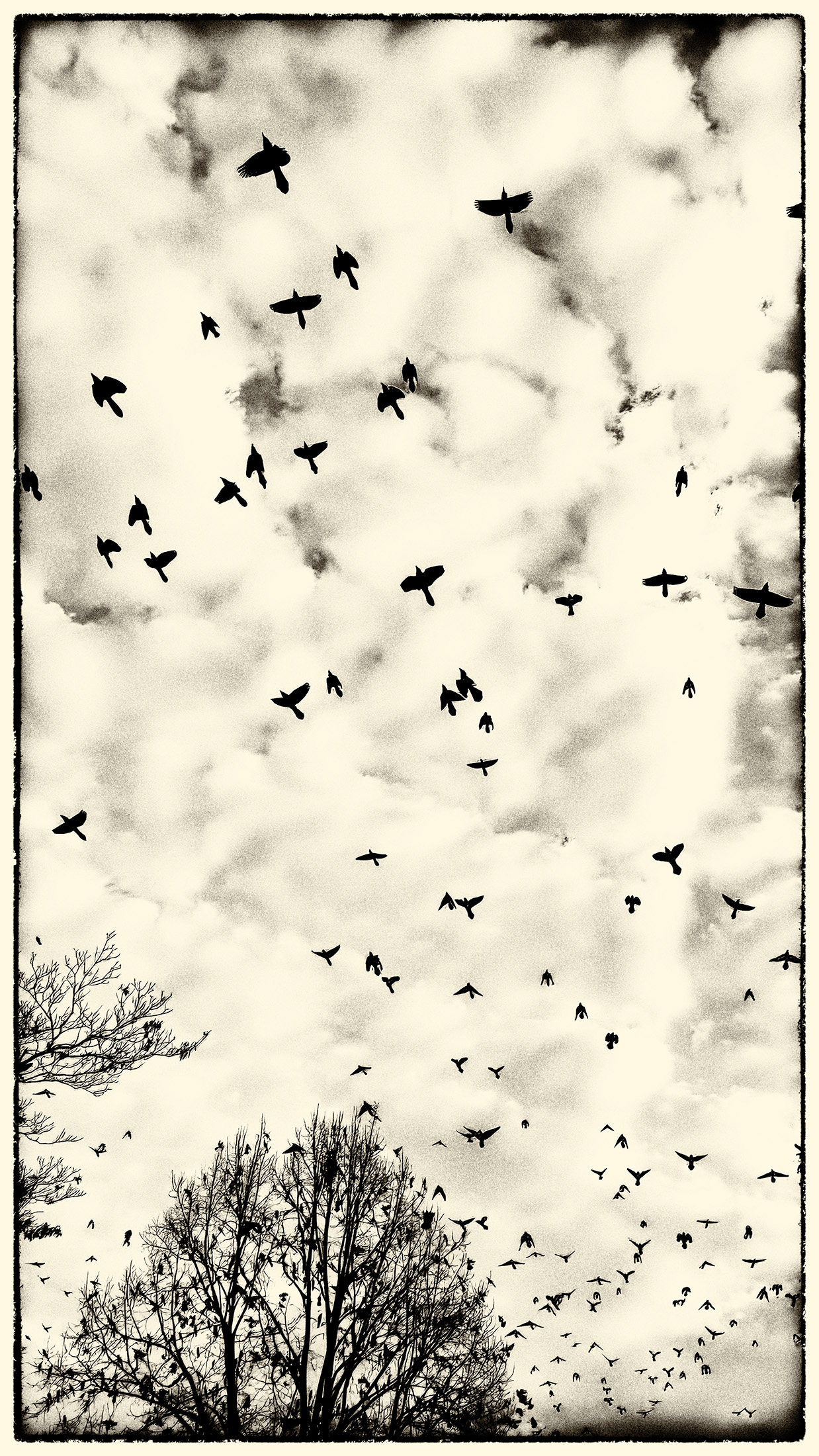
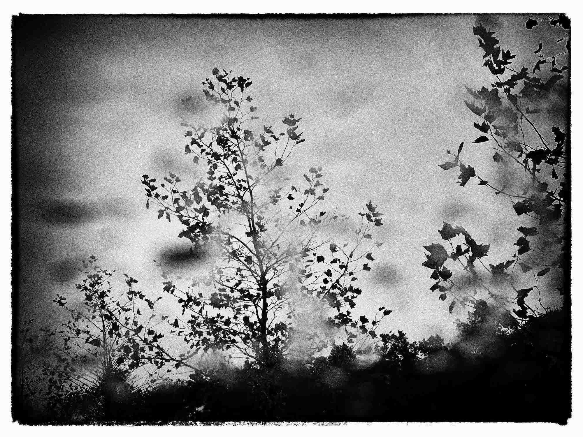
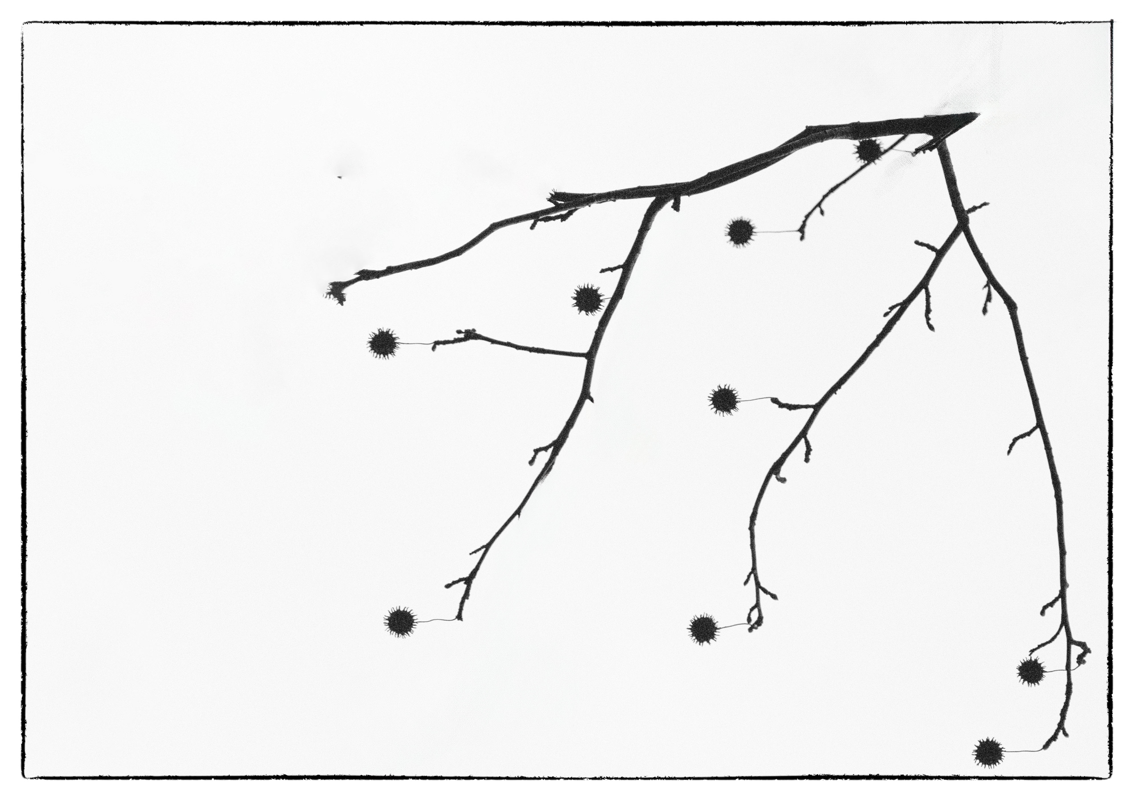
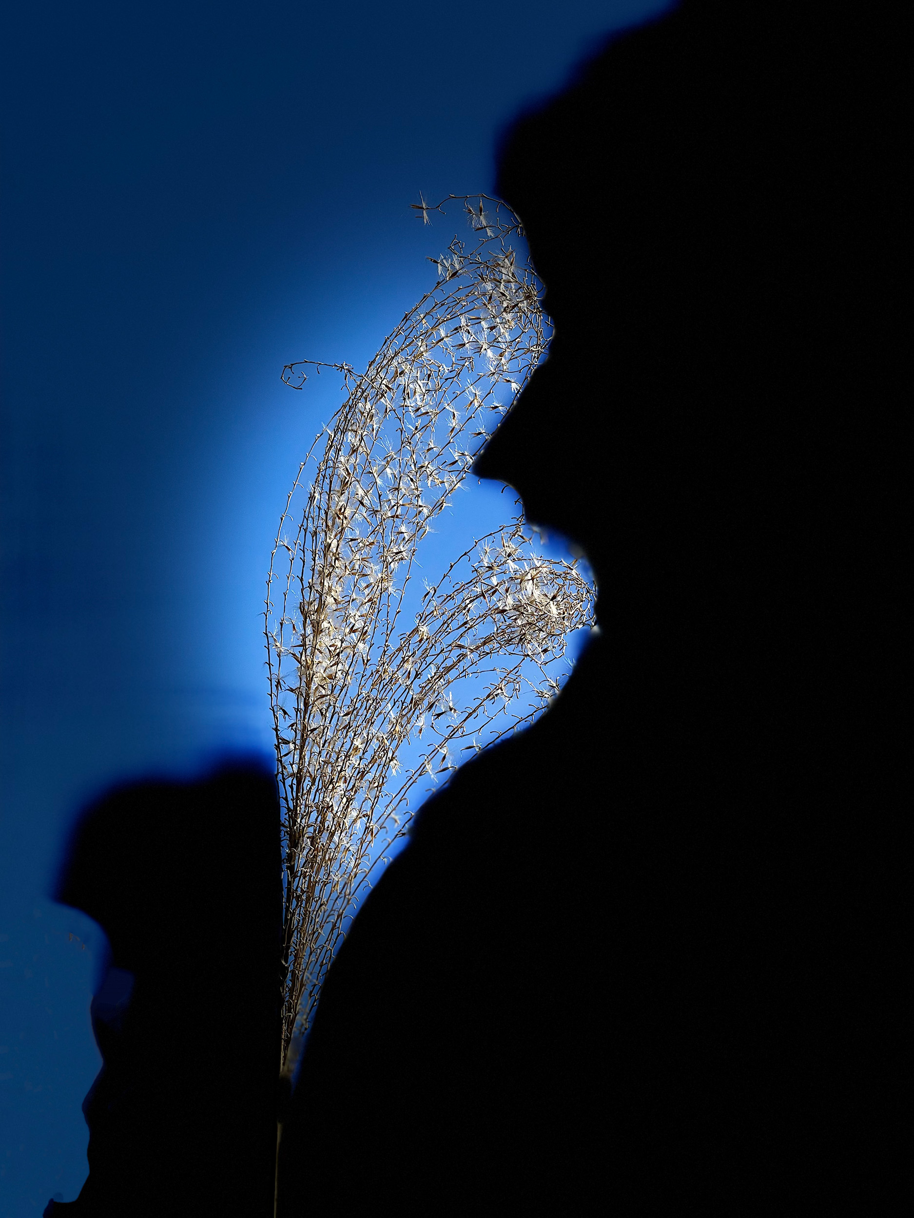
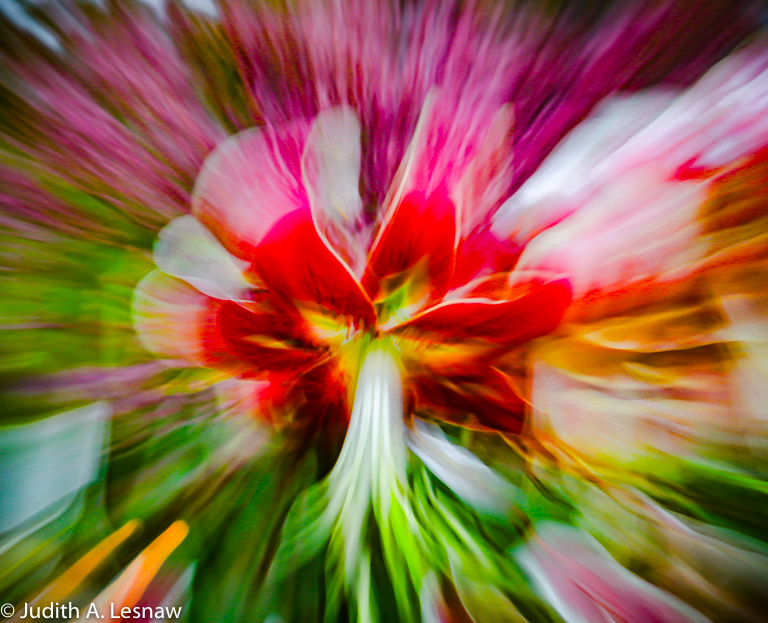
Jim, I am visiting from groups 79 and 52. I grew up in Chicago and took courses from the University of Illinois at Navy Pier in the good old days when it was a college campus of sorts. Your image is wonderful! The composition is excellent and the complementary colors are very pleasing. The sharp focus gives a line drawing effect that I love. I actually prefer the original high key image. While that blue cloud-streaked sky is lovely, the elements and colors of your composition really jump out of that smoggy sky. Also, you will want to remember those conditions and the way you overcame them to have a good time. How special to have your grandchildren in the image. |
Aug 16th |
1 comment - 1 reply for Group 2
|
| 52 |
Aug 23 |
Reply |
Thanks Mike! |
Aug 17th |
| 52 |
Aug 23 |
Reply |
Thank you so very much for your kind comments. I share your love of seeing things differently. That Art of Nature-- workshop sounds wonderful. I cant wait to see your interpretations of nature. |
Aug 16th |
| 52 |
Aug 23 |
Reply |
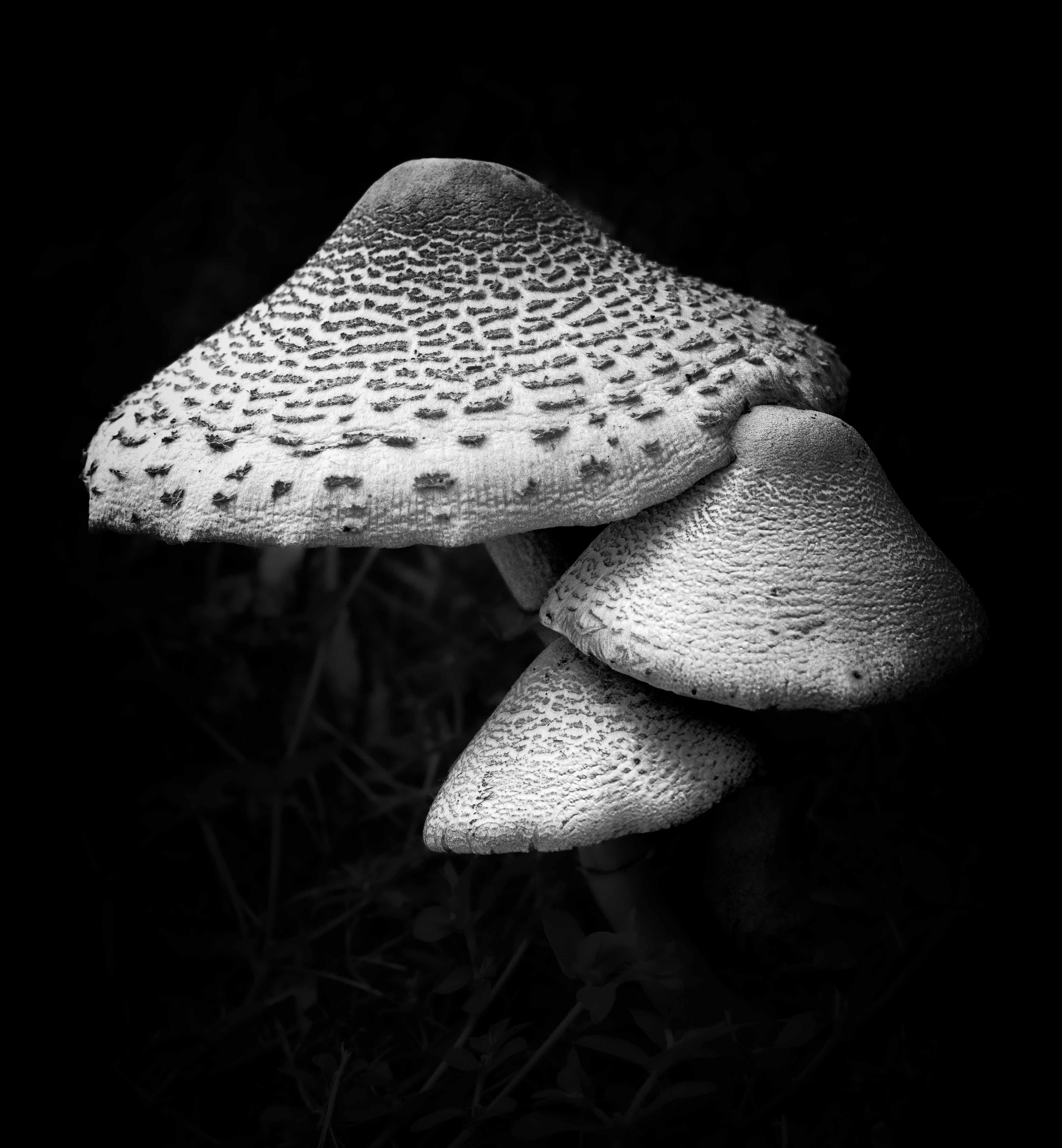
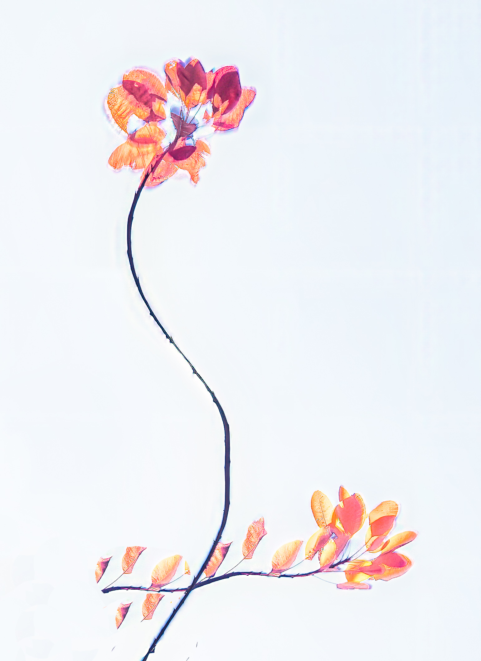
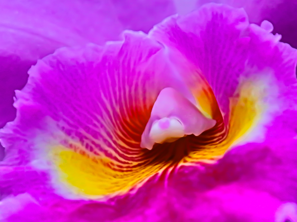
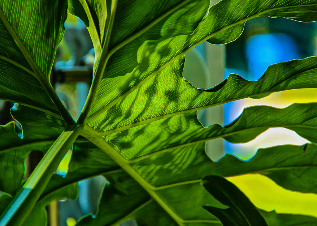
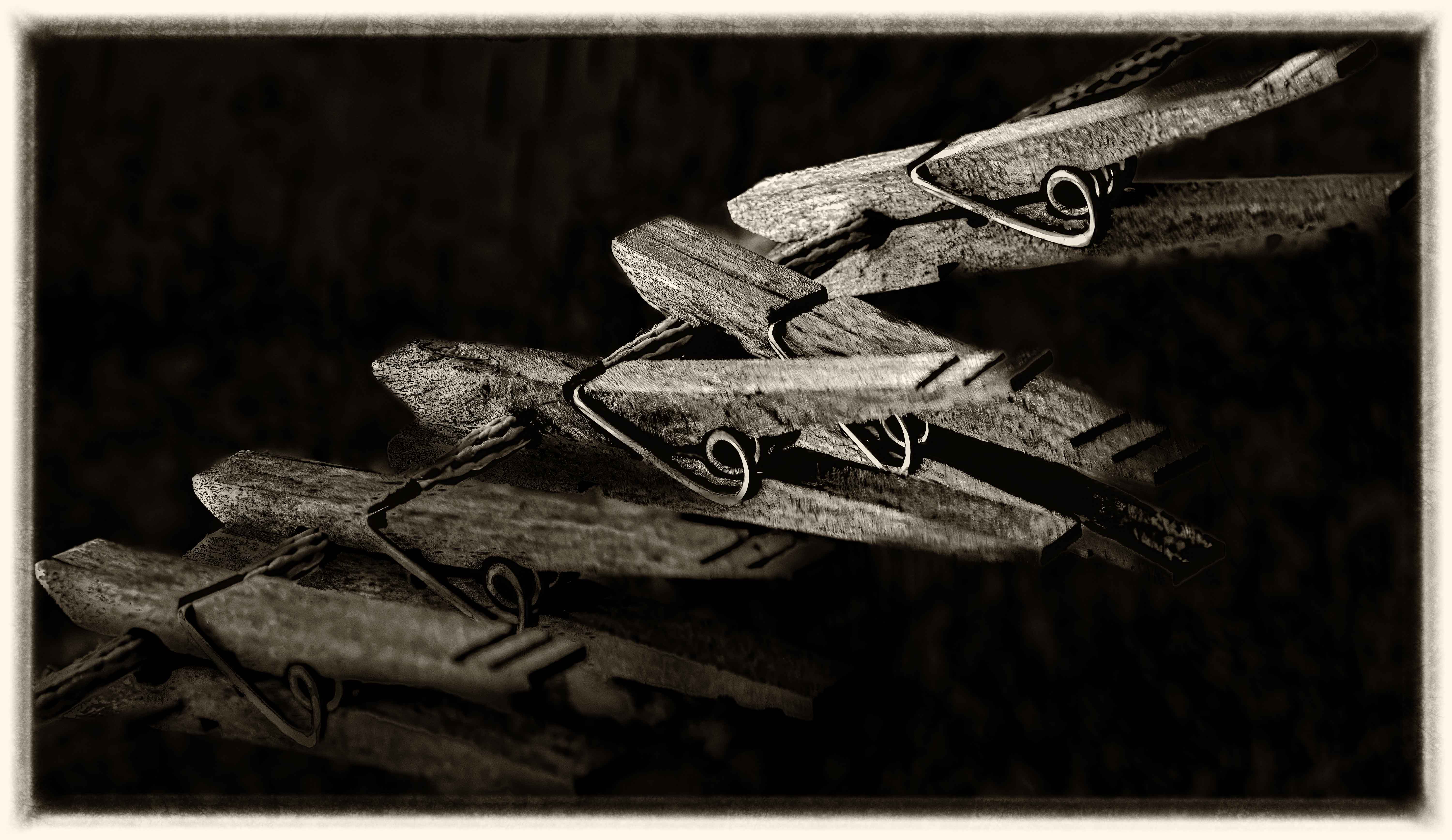
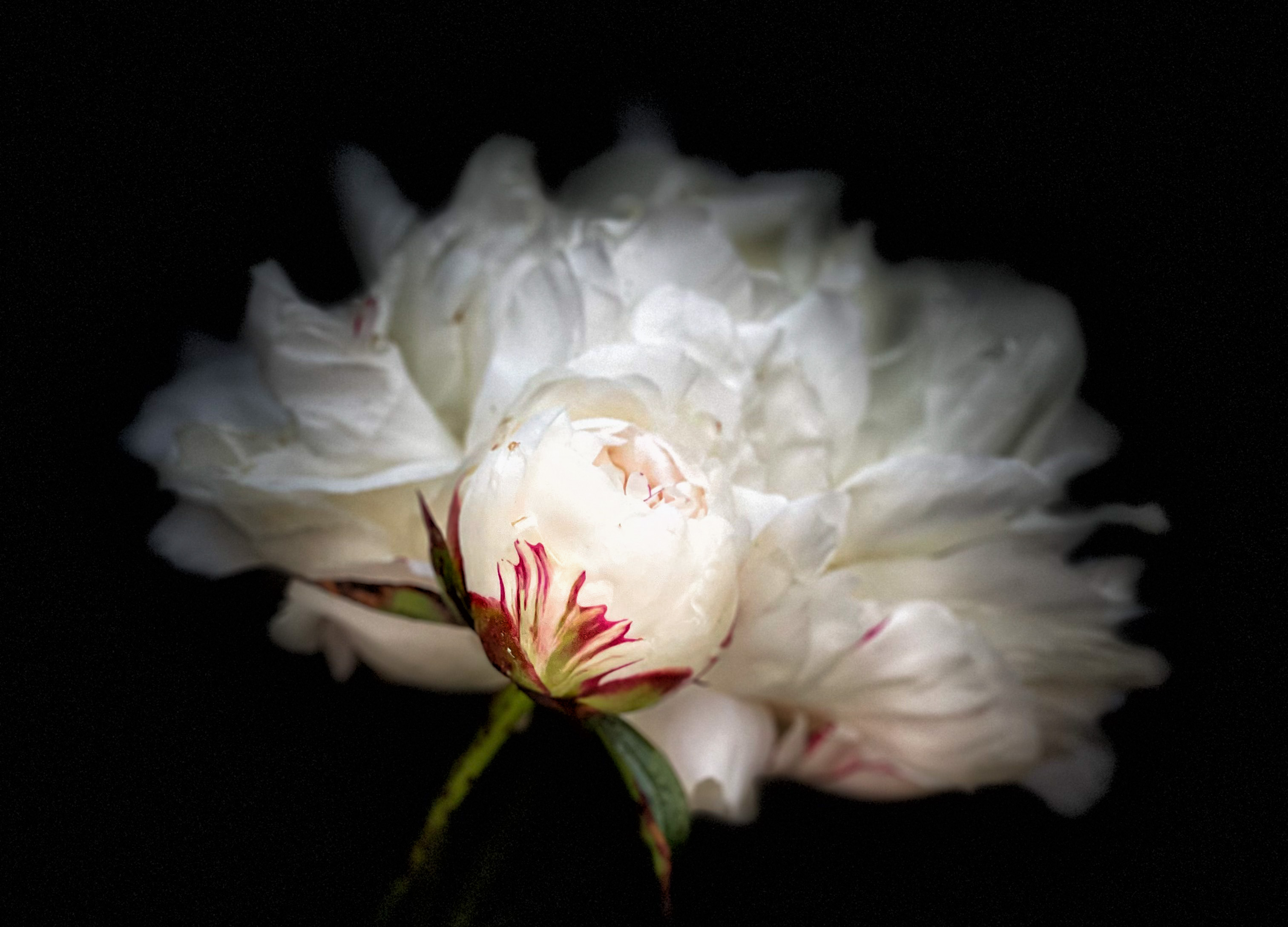
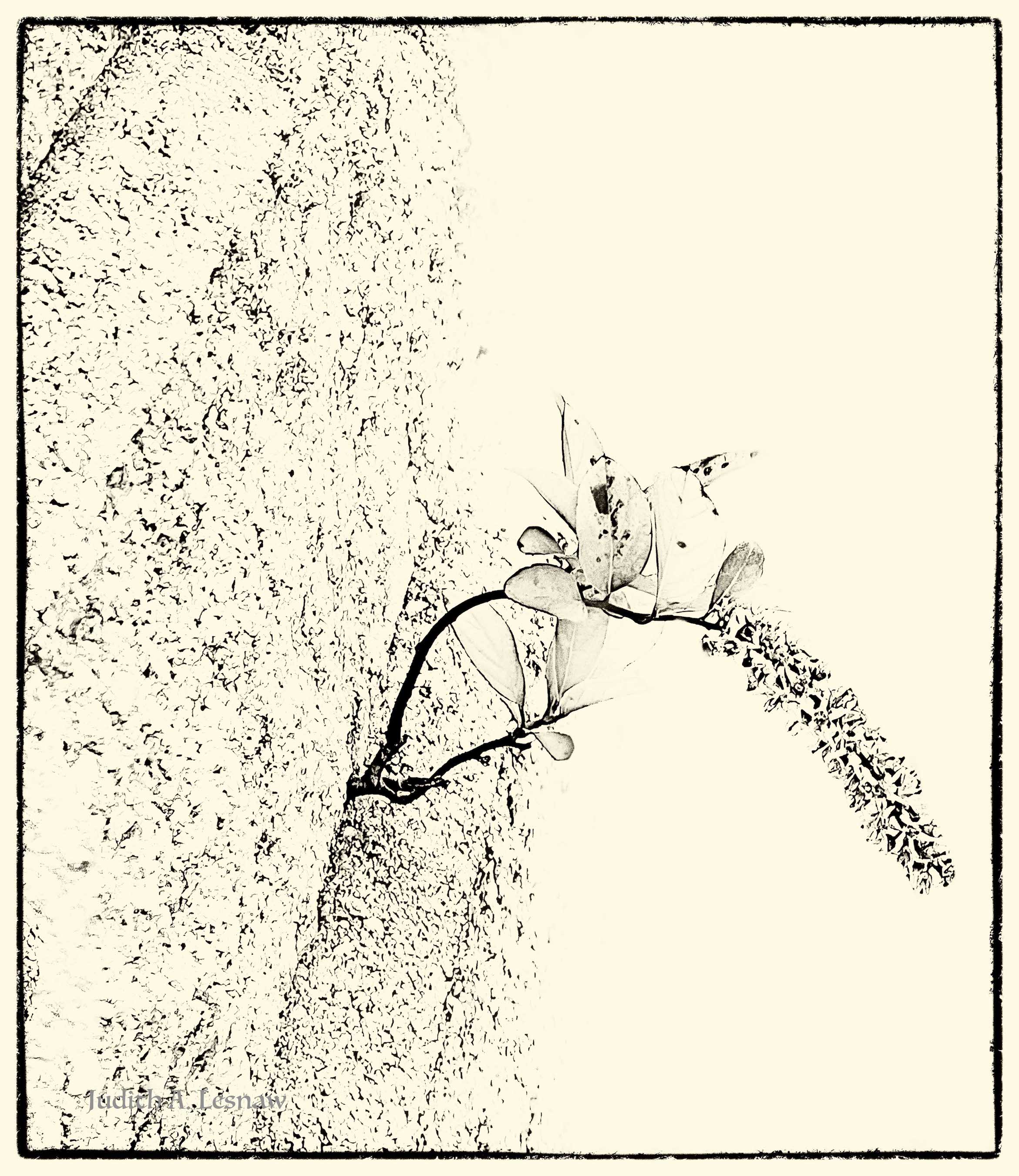
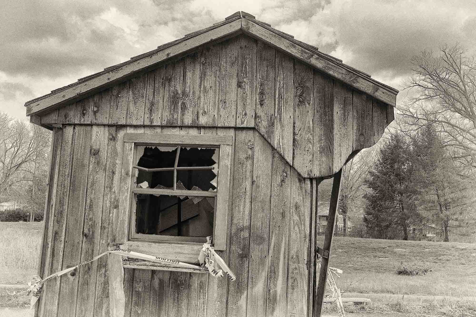
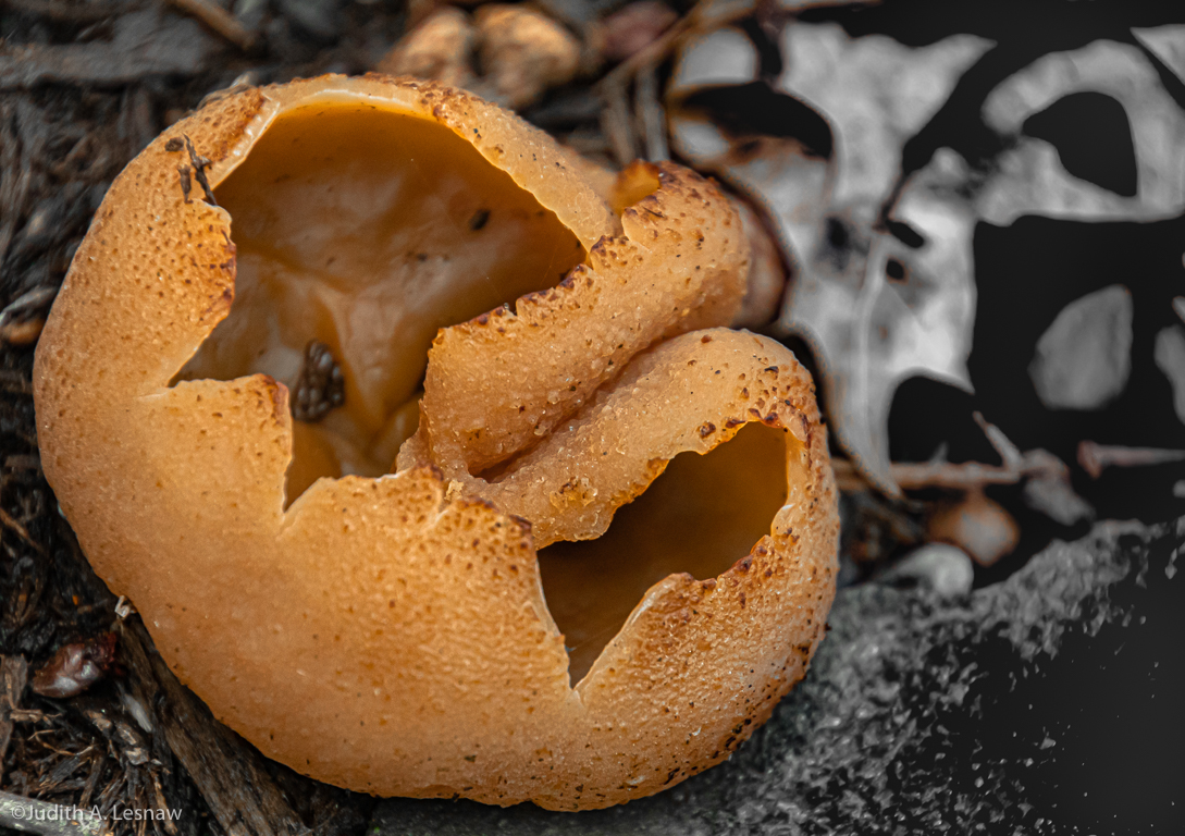
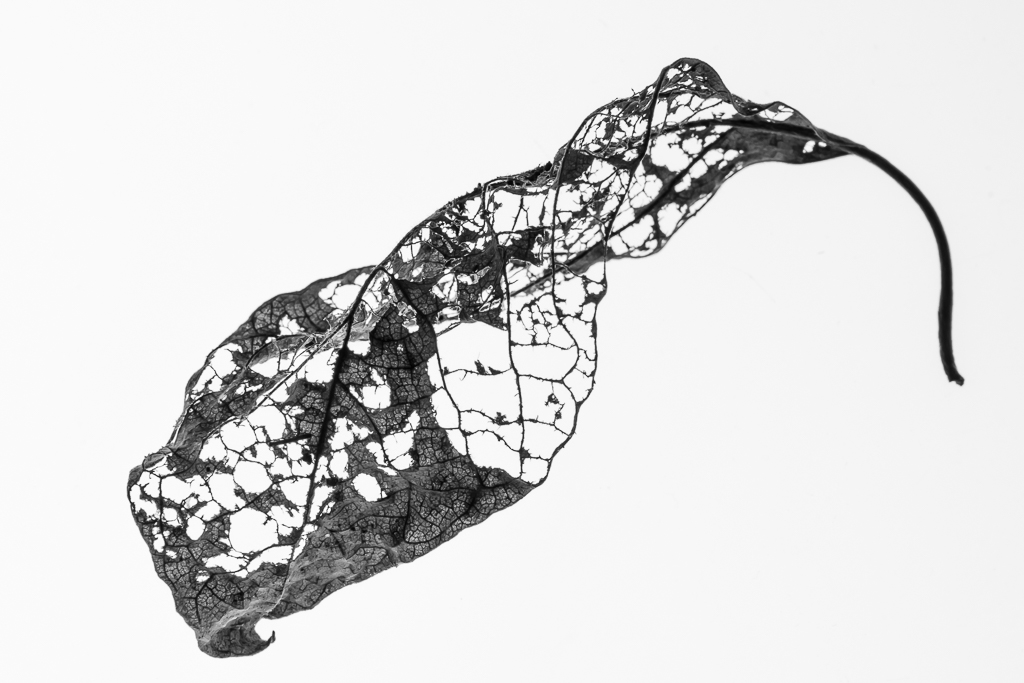
Pamela, thank you so much for your comments and suggestions. Viewer's reactions to the three versions are so fascinating to me. I love the color AND B&W AND also the sepia version as it reminds me of an ancient Japanese wood block print. I am thinking about displaying the three versions as a triptych. What do you think? I totally missed that blob of foliage and will remove it immediately. I like your idea of adding a thin white boarder. How do you do this? |
Aug 16th |
| 52 |
Aug 23 |
Reply |
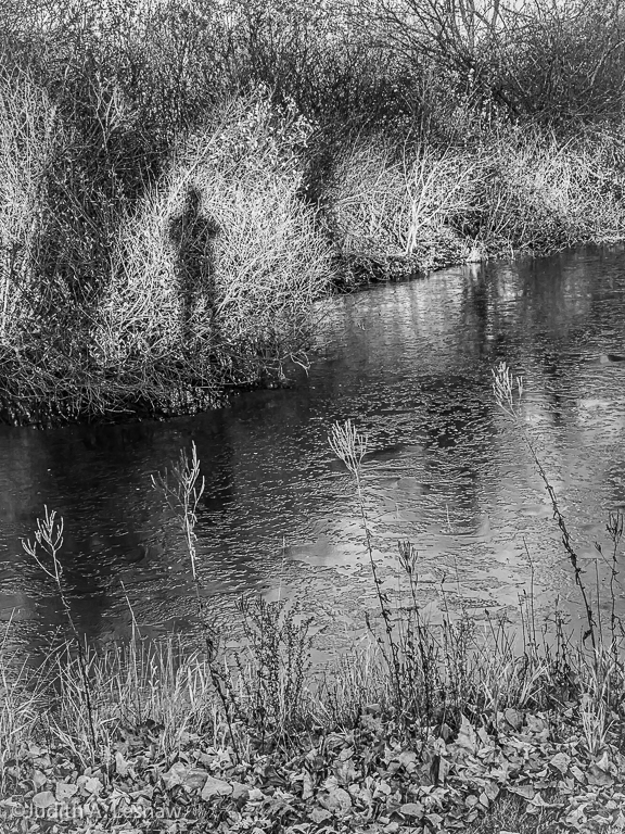
Sharon, thank you so very much for your comments on this image and its affect. I am thrilled that you see a spiritual element. |
Aug 16th |
| 52 |
Aug 23 |
Comment |
Many thanks Ally!! It is interesting to me that there is no consensus about which version is favored. I myself cannot make up my mind. |
Aug 10th |
| 52 |
Aug 23 |
Reply |
Many thanks Mike!! |
Aug 10th |
| 52 |
Aug 23 |
Comment |
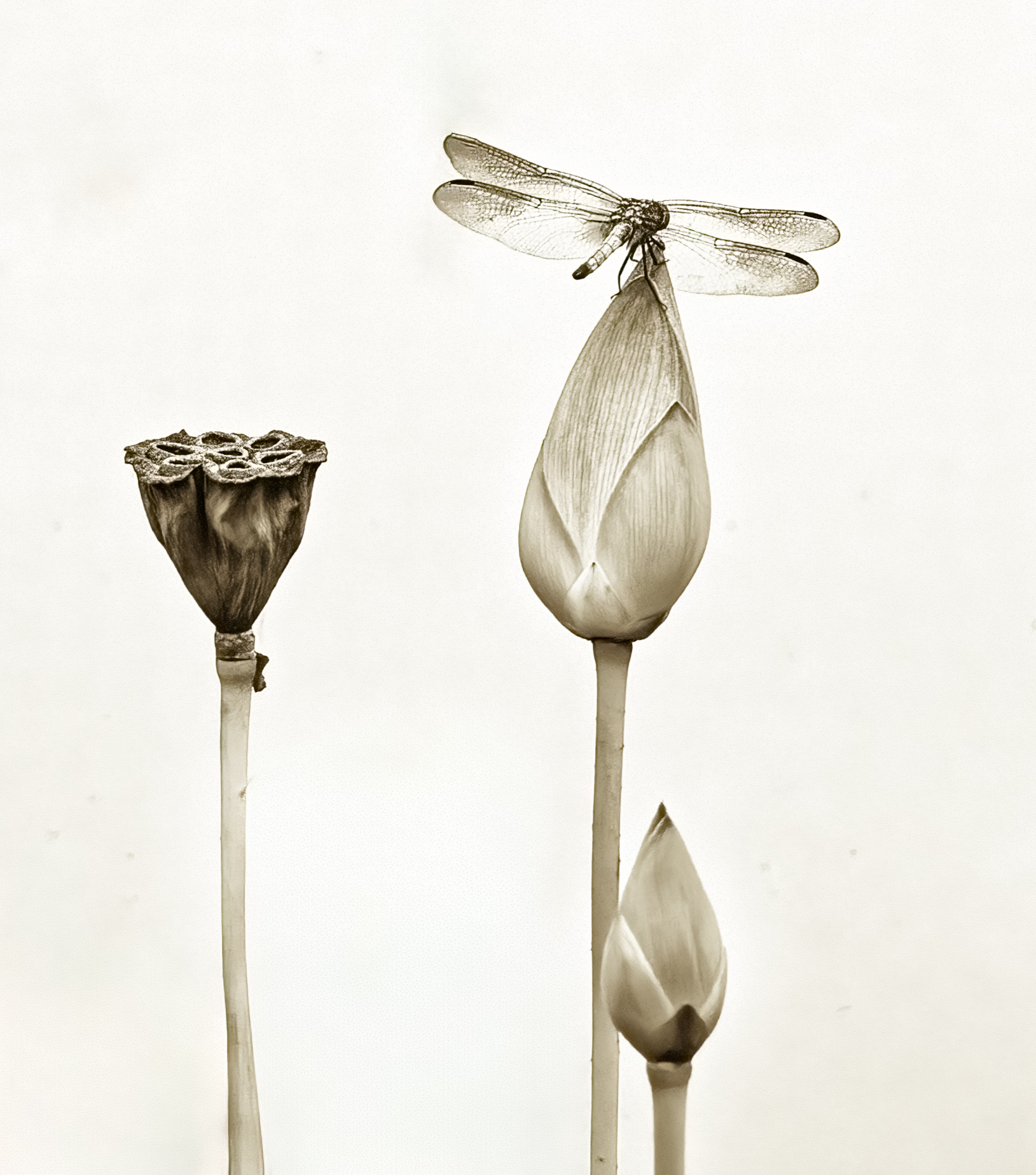
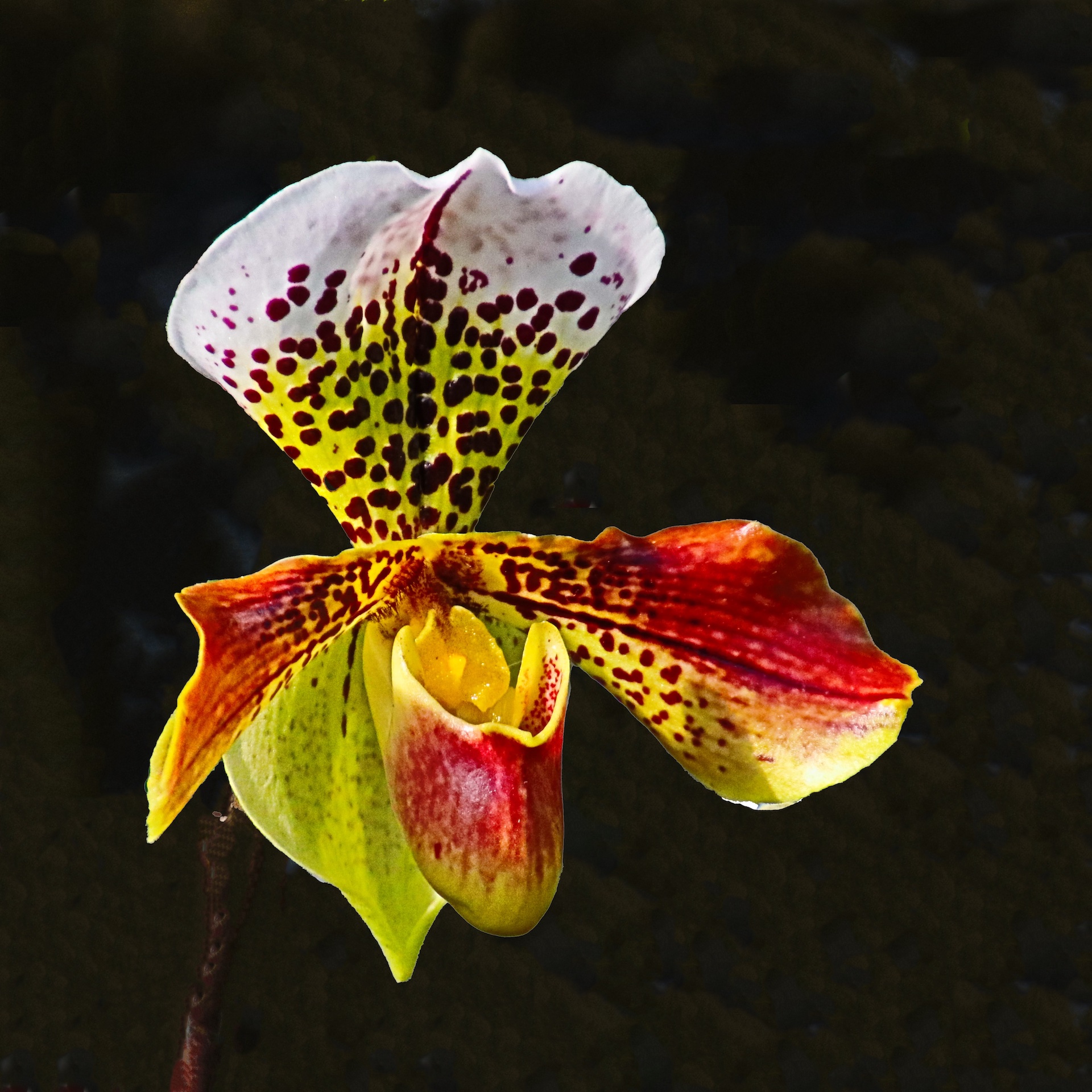
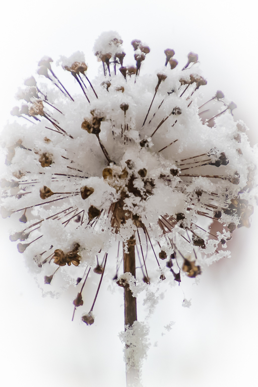
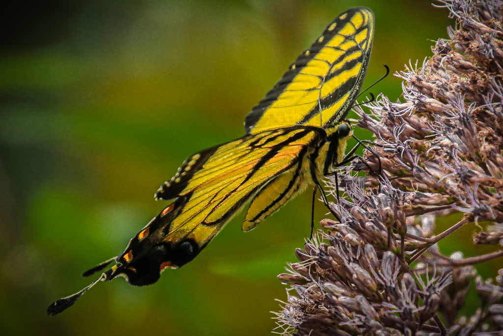
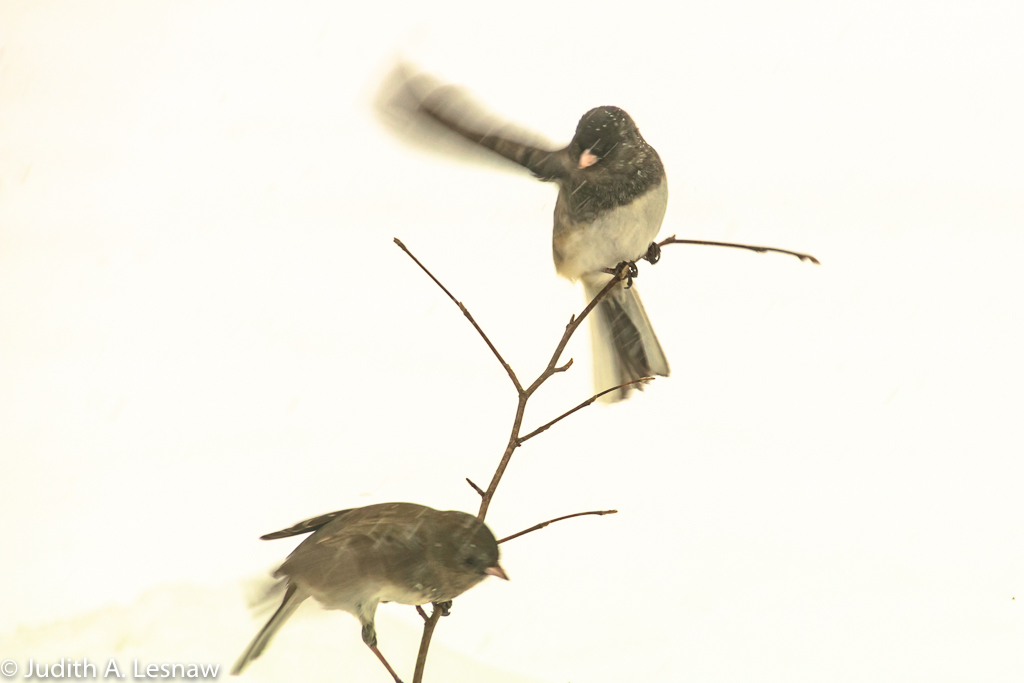
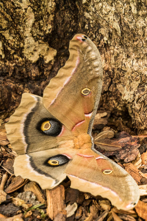
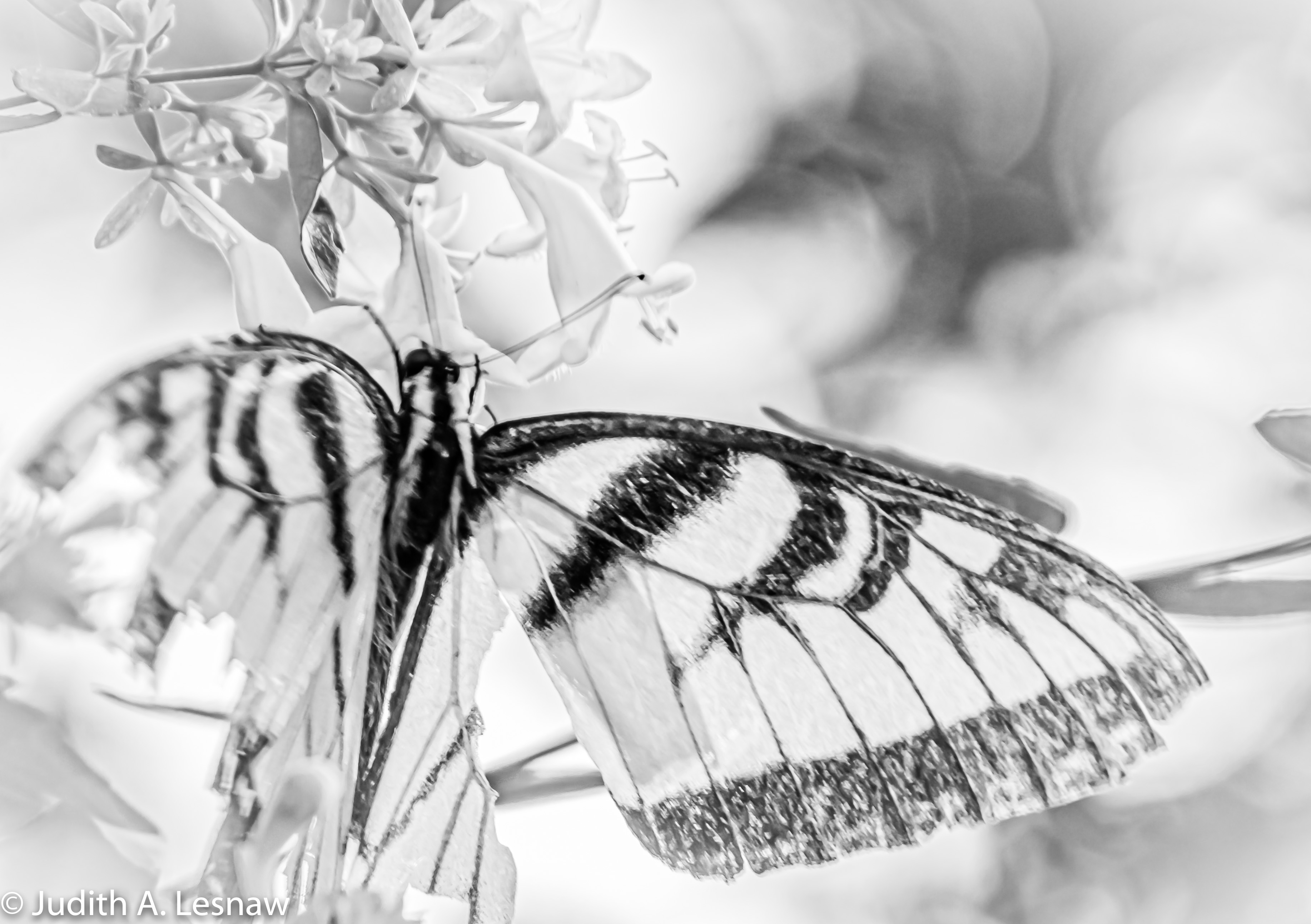
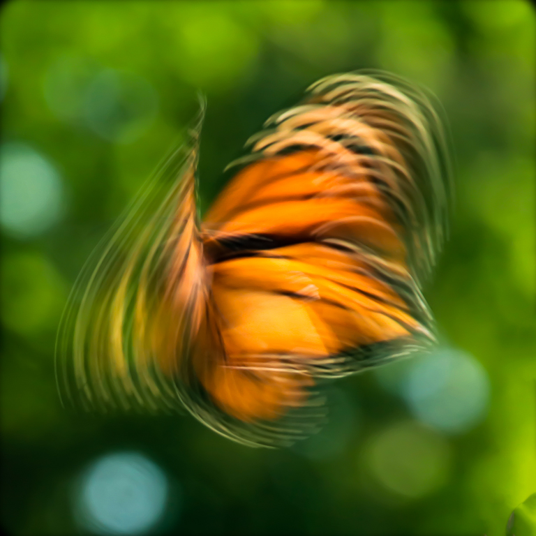
WOW- I really like this image too. Its the flair of the wings and tail feathers against that stark white background that make this image so striking. I would keep the "target leaves". They add color, nice detail, and interest. I would not change anything. |
Aug 5th |
| 52 |
Aug 23 |
Comment |
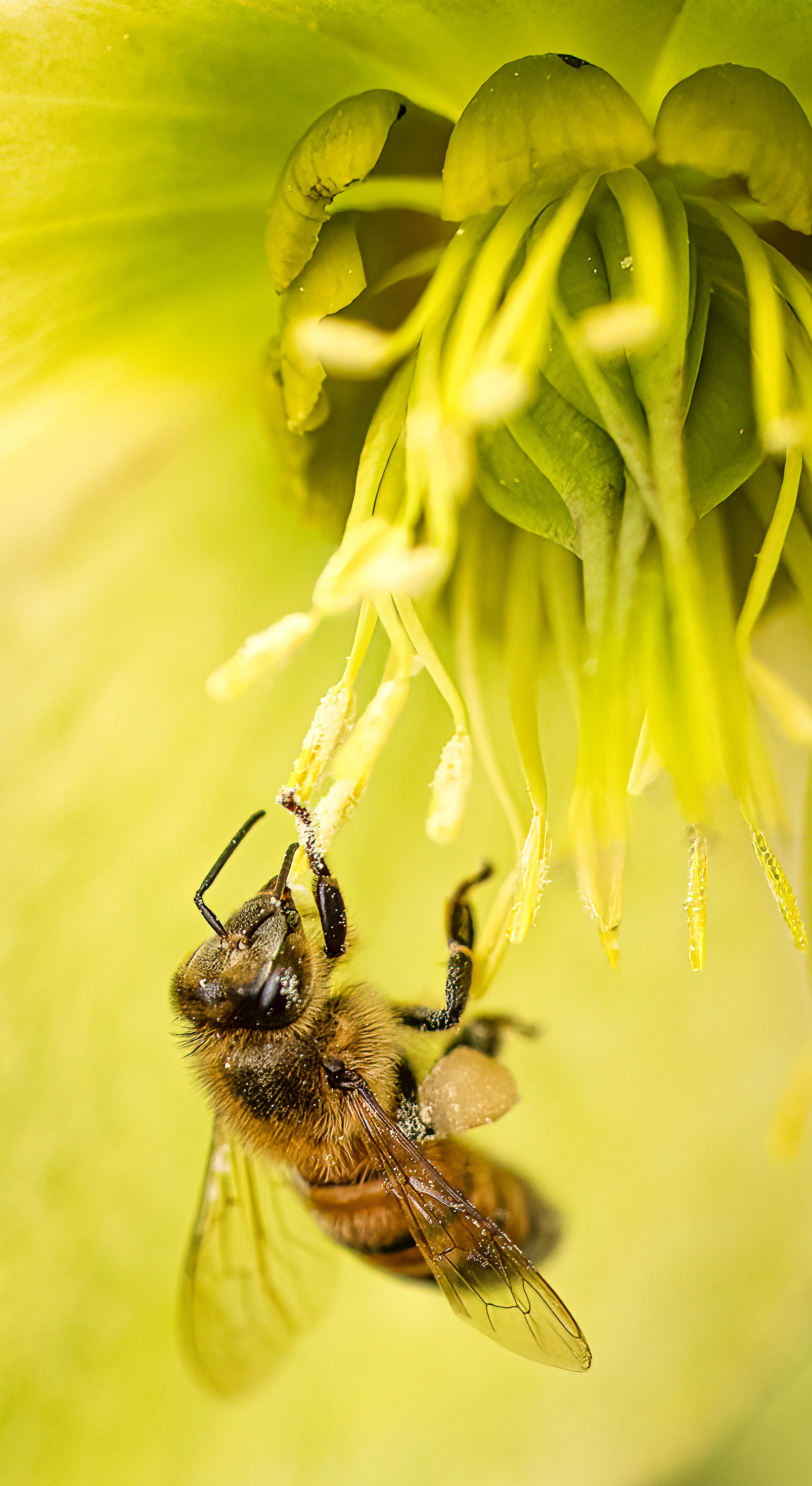
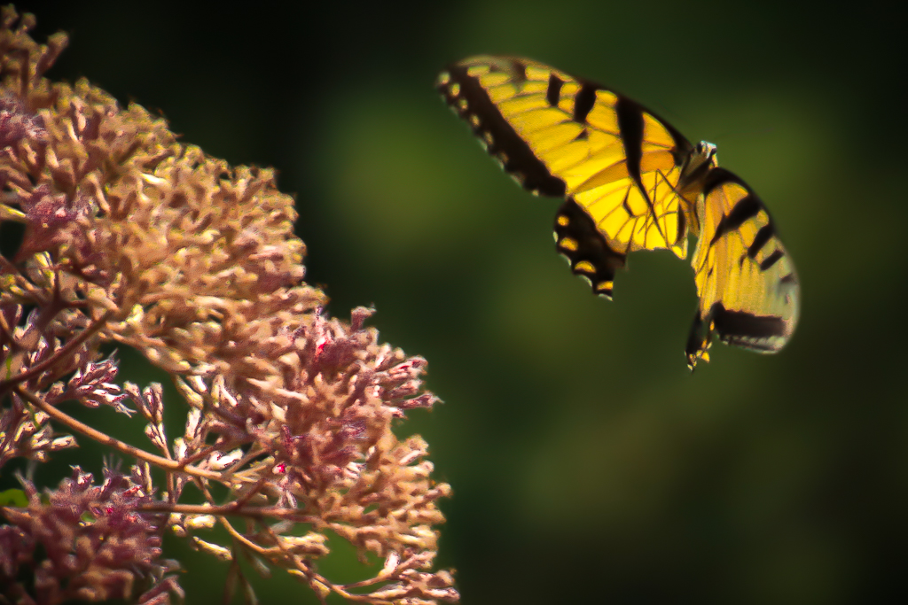
I love everything about this image. There is great detail in the butterfly and flower. Both pop against the black background. This is an excellent minimalist low key image. I would not change a thing. |
Aug 5th |
| 52 |
Aug 23 |
Comment |
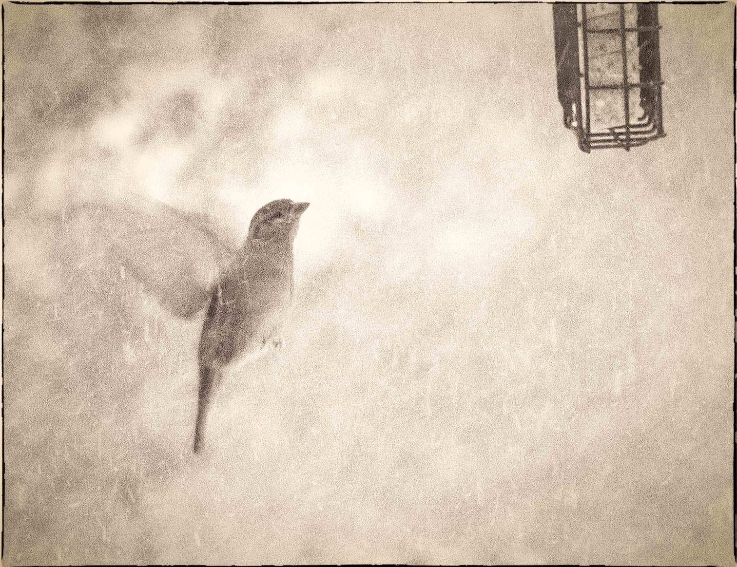
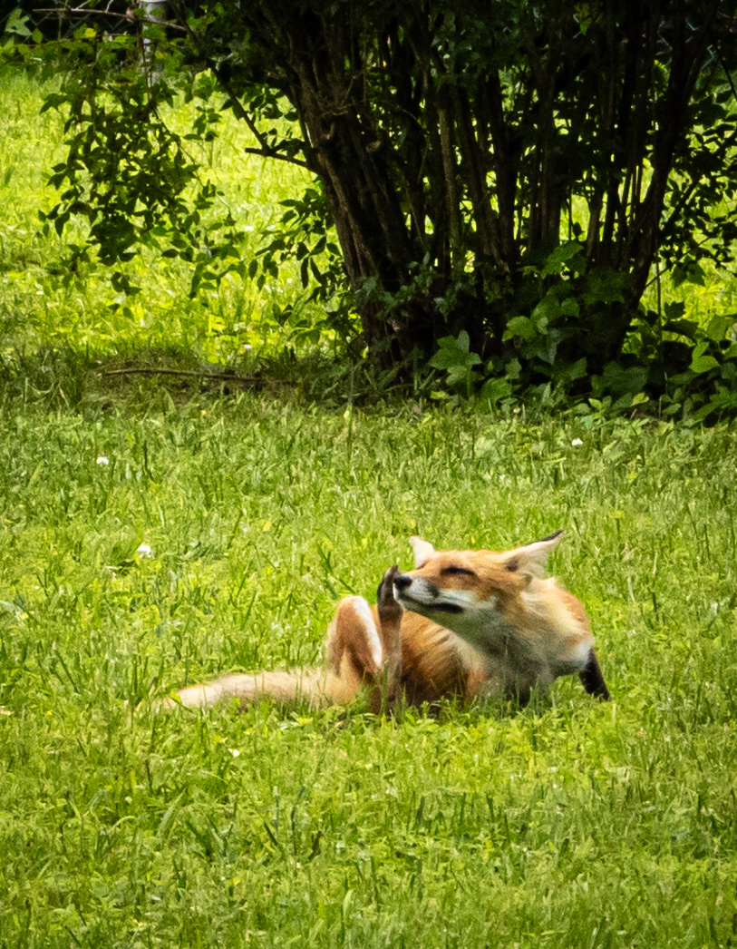
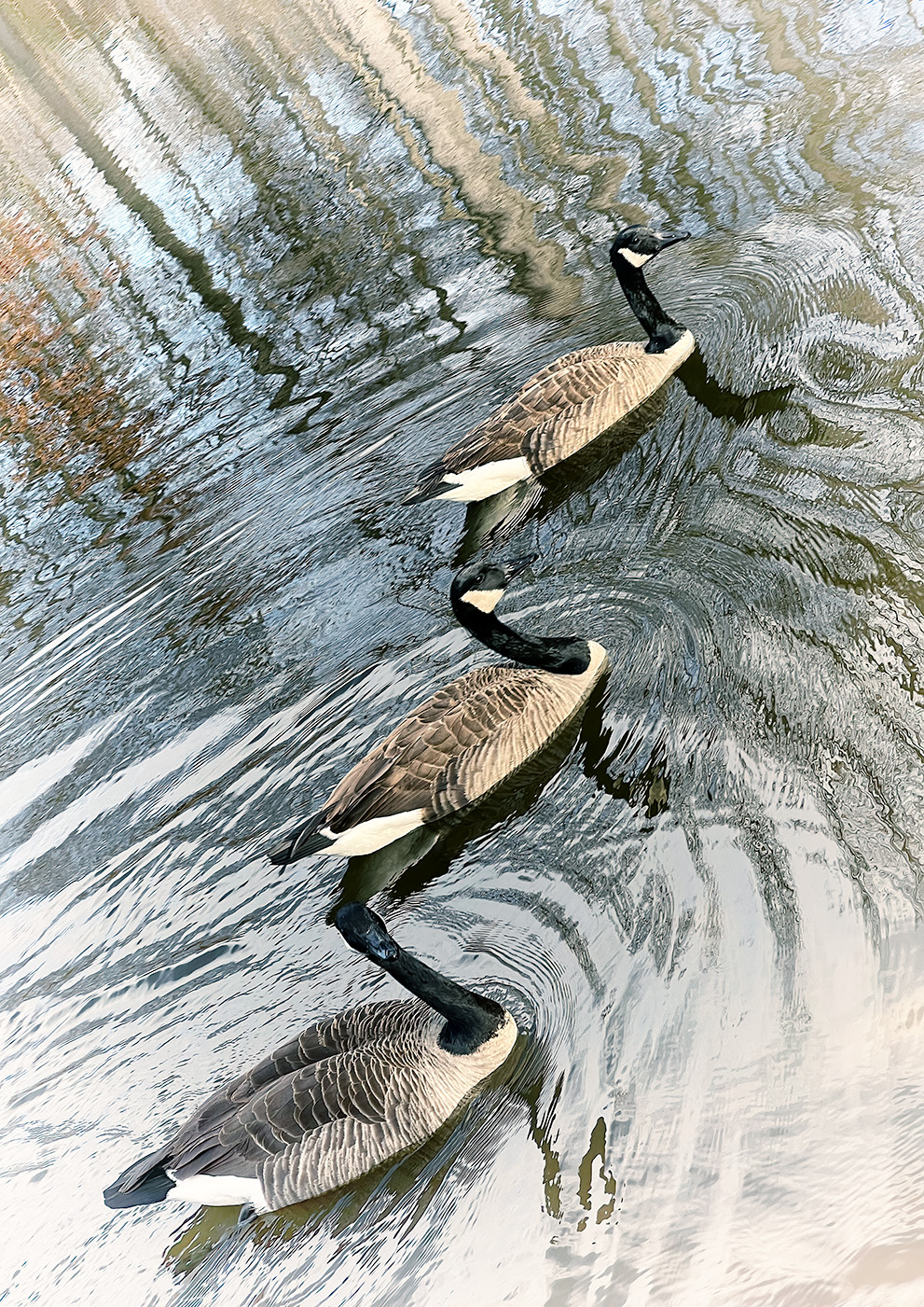
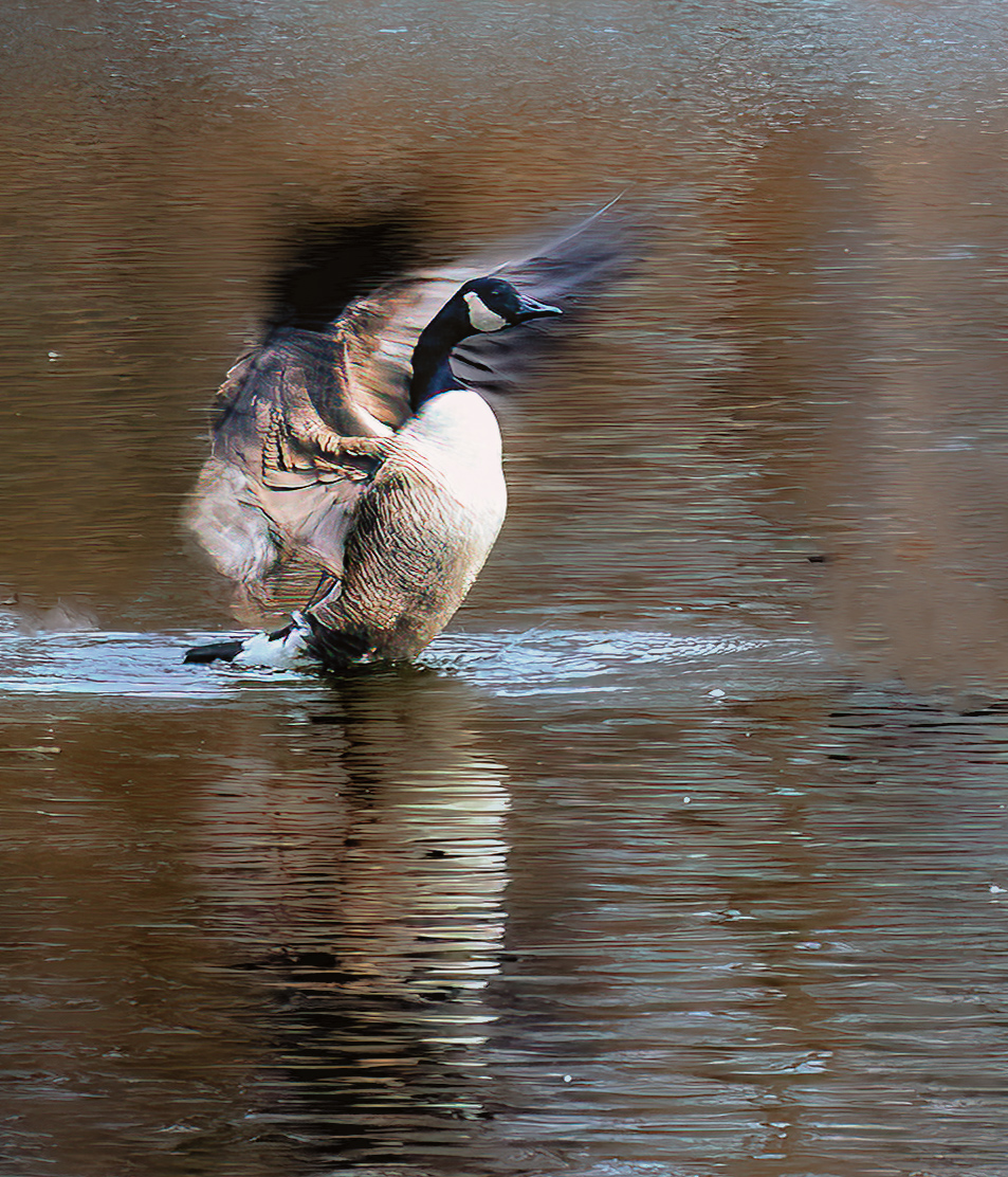
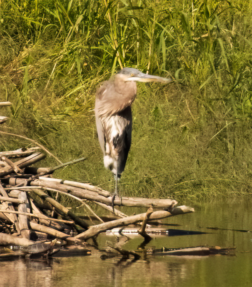
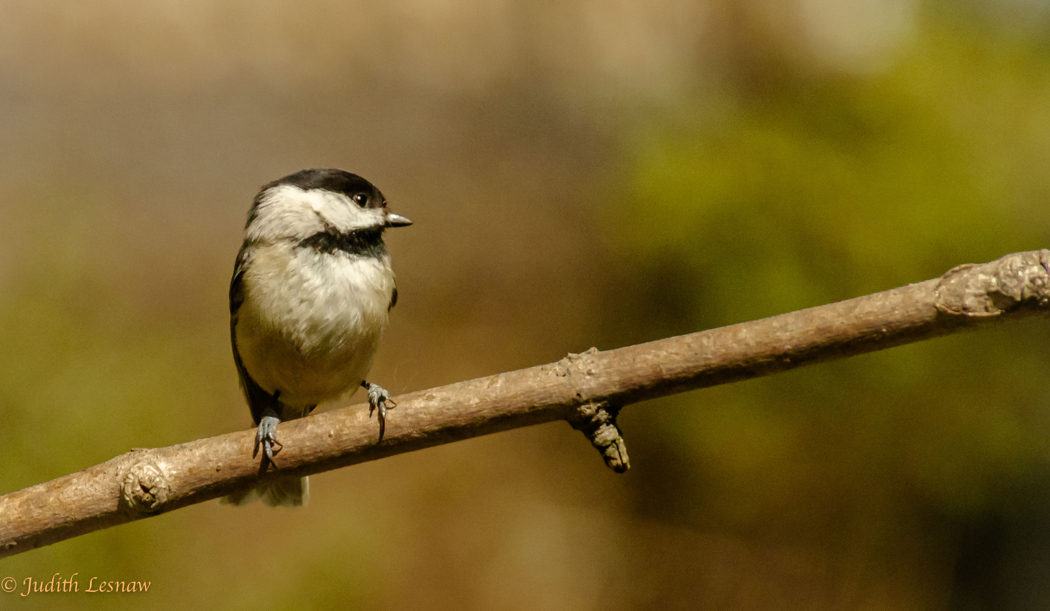
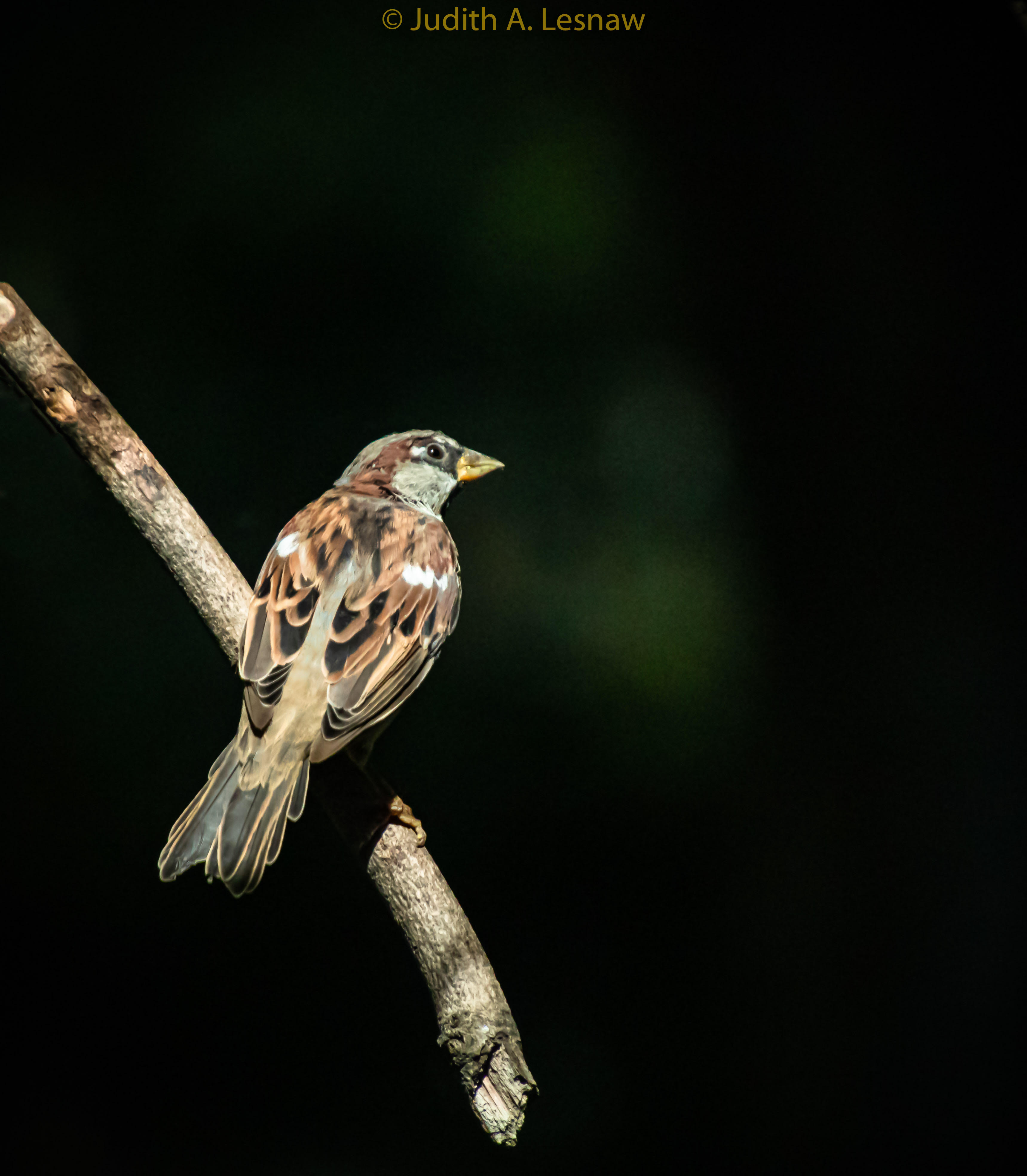
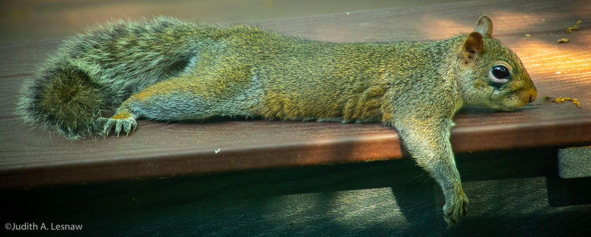
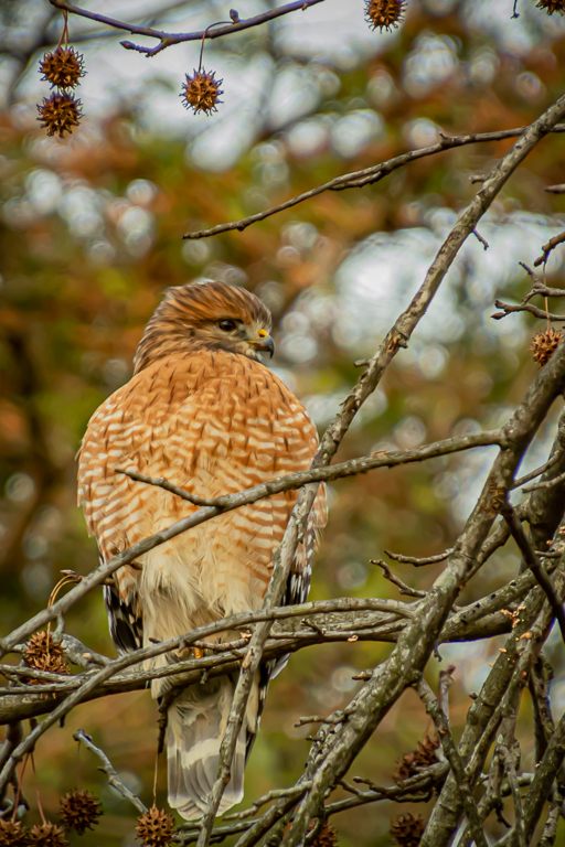
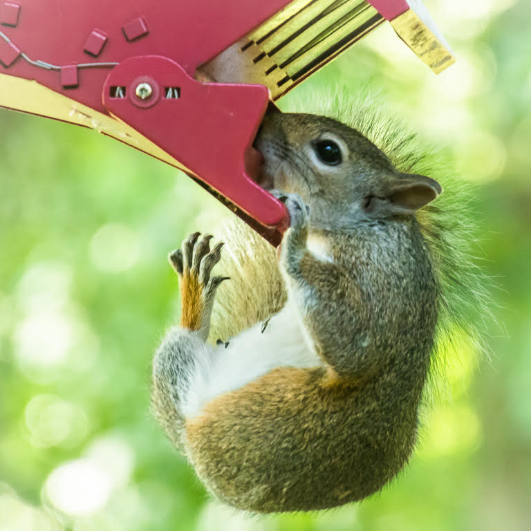
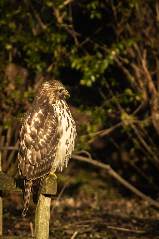
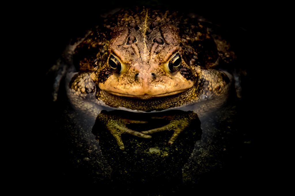
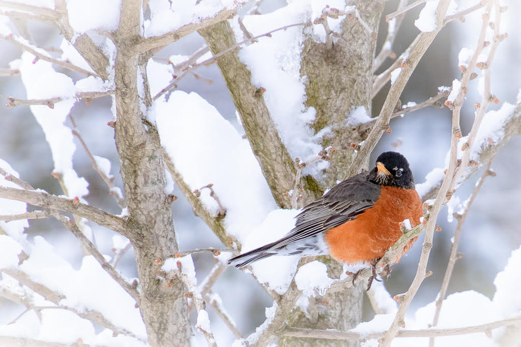
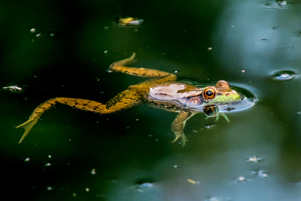
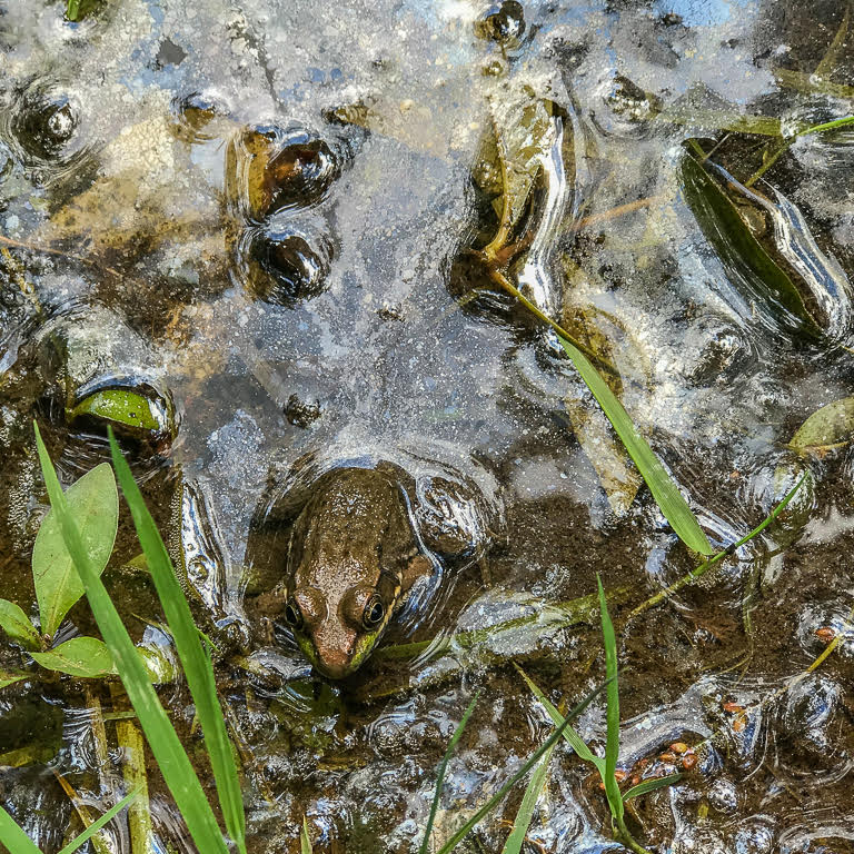
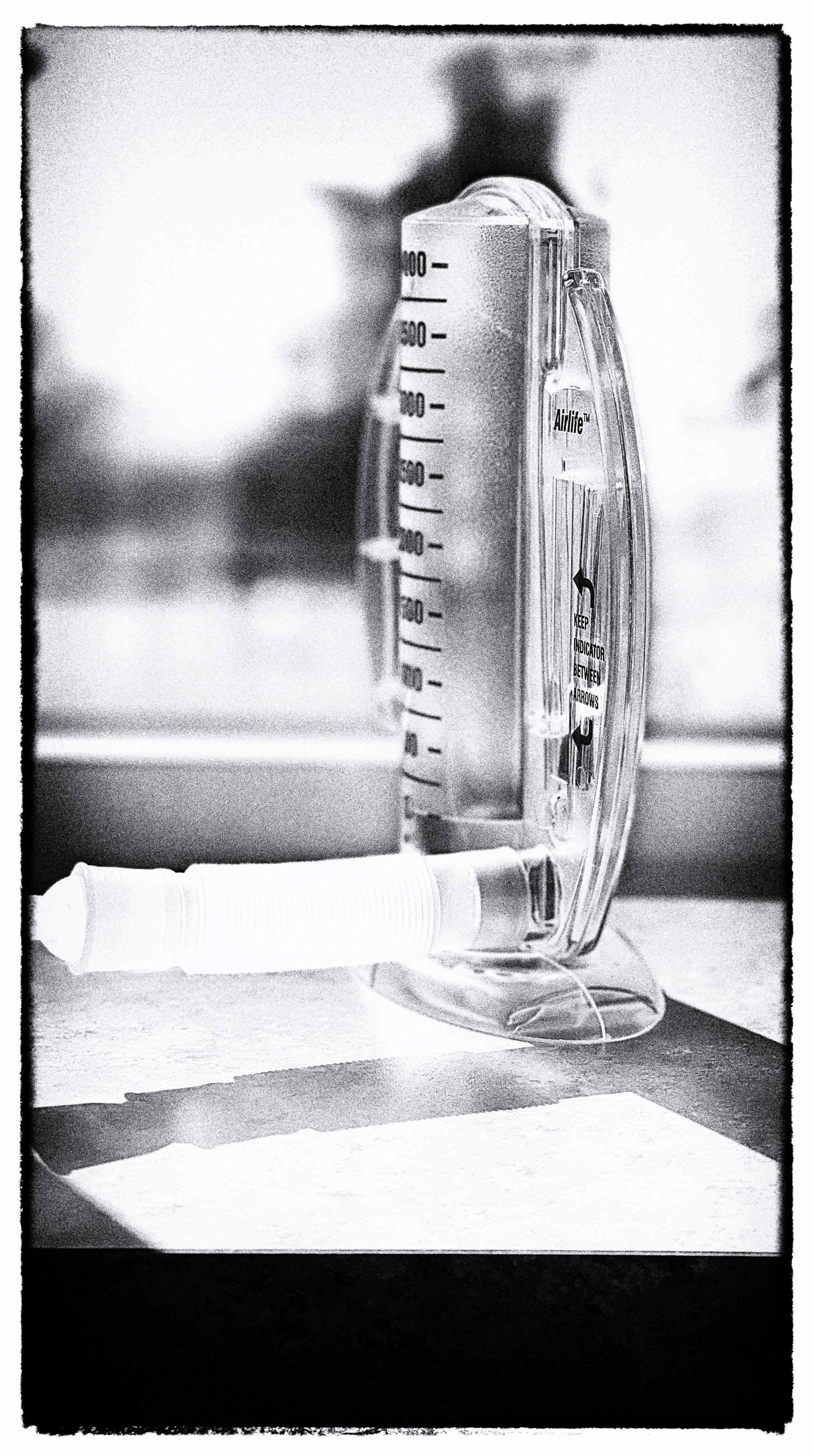
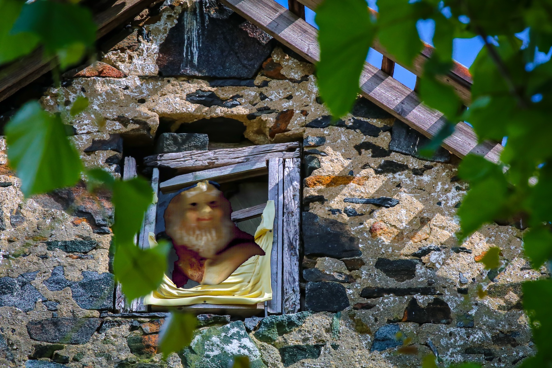
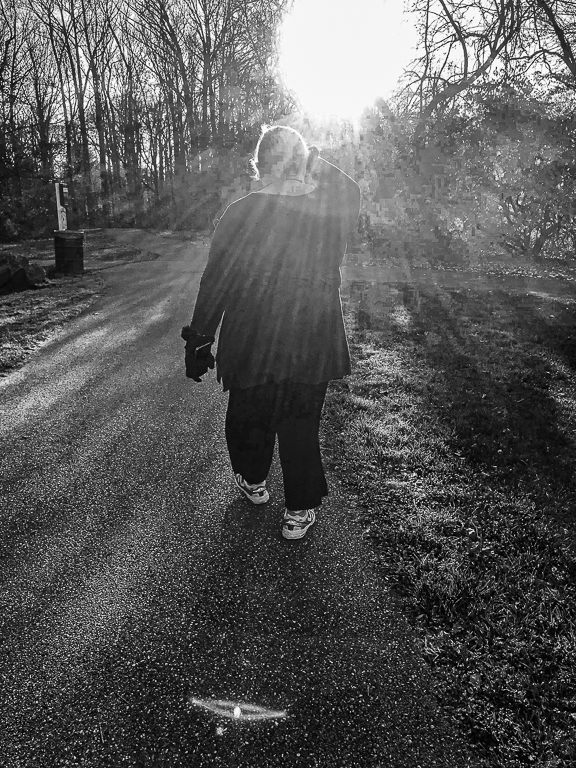
Congrats for your new R 5. I love mine, but indeed it takes some getting used to. You found a lovely family scene. I love the way she keeps watch. You got most of the white blob above the mother's head, but there is a bit left. I would try to lighten her head and neck a bit, and bring out the catch light in her eye. I like the drop of water hanging from her beak. The highlights in the water are somewhat distracting. I would tone them down, and perhaps add some dehaze and clarity to the water. Next time I would try a polarizing filter. |
Aug 5th |
| 52 |
Aug 23 |
Comment |
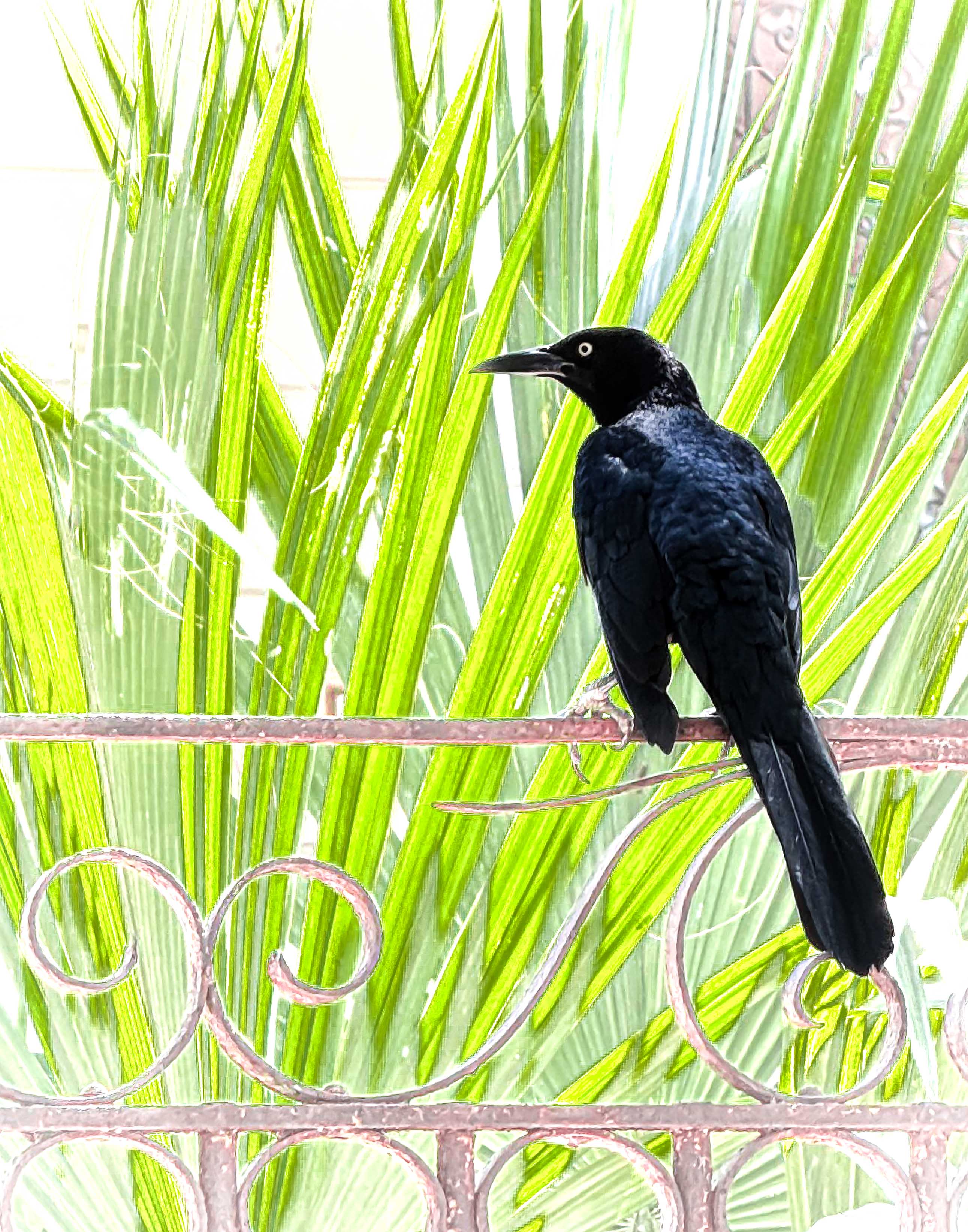
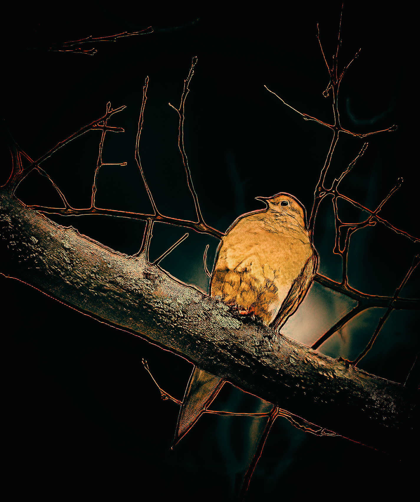
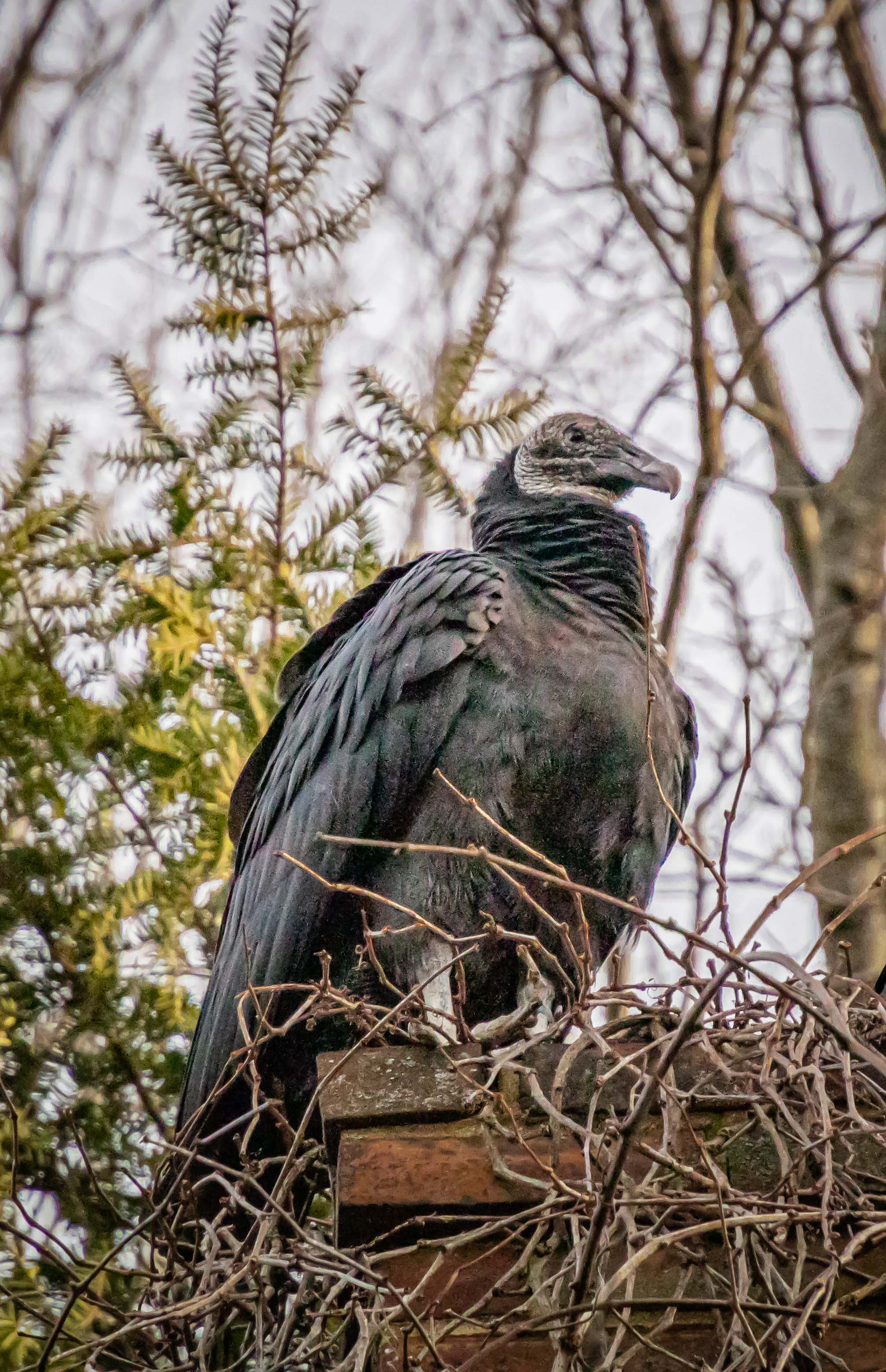
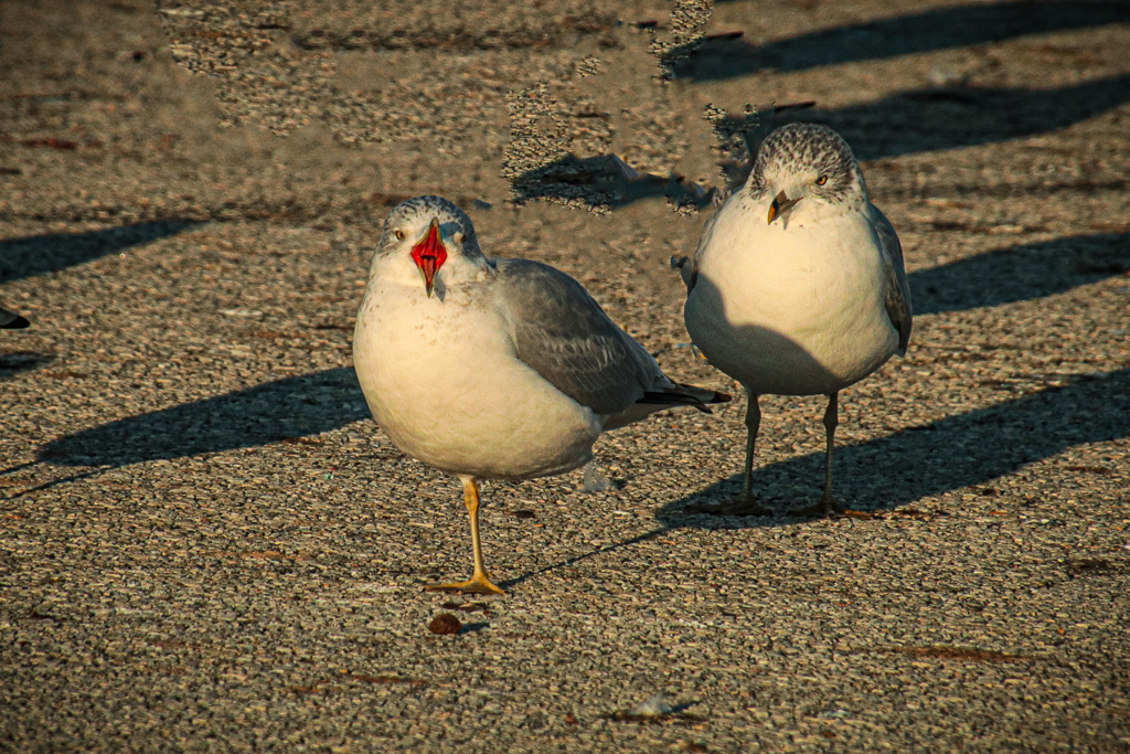
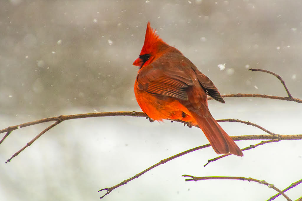
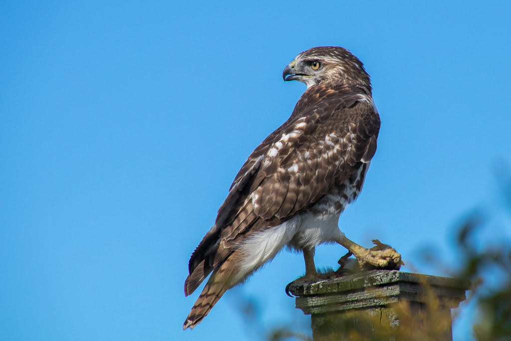
Striking composition. That intense staring eye adds mystery. In the original the bird feathers look much bluer than the processed version, and the sky has some texture. The stark white background creates drama, however the bird does look a bit over processed. Long breast feathers seen in the original have been sheared off, and the bird looks slightly harsh. I would try to back off some of the contrast/sharpening while retaining the nice high key treatment. |
Aug 5th |
| 52 |
Aug 23 |
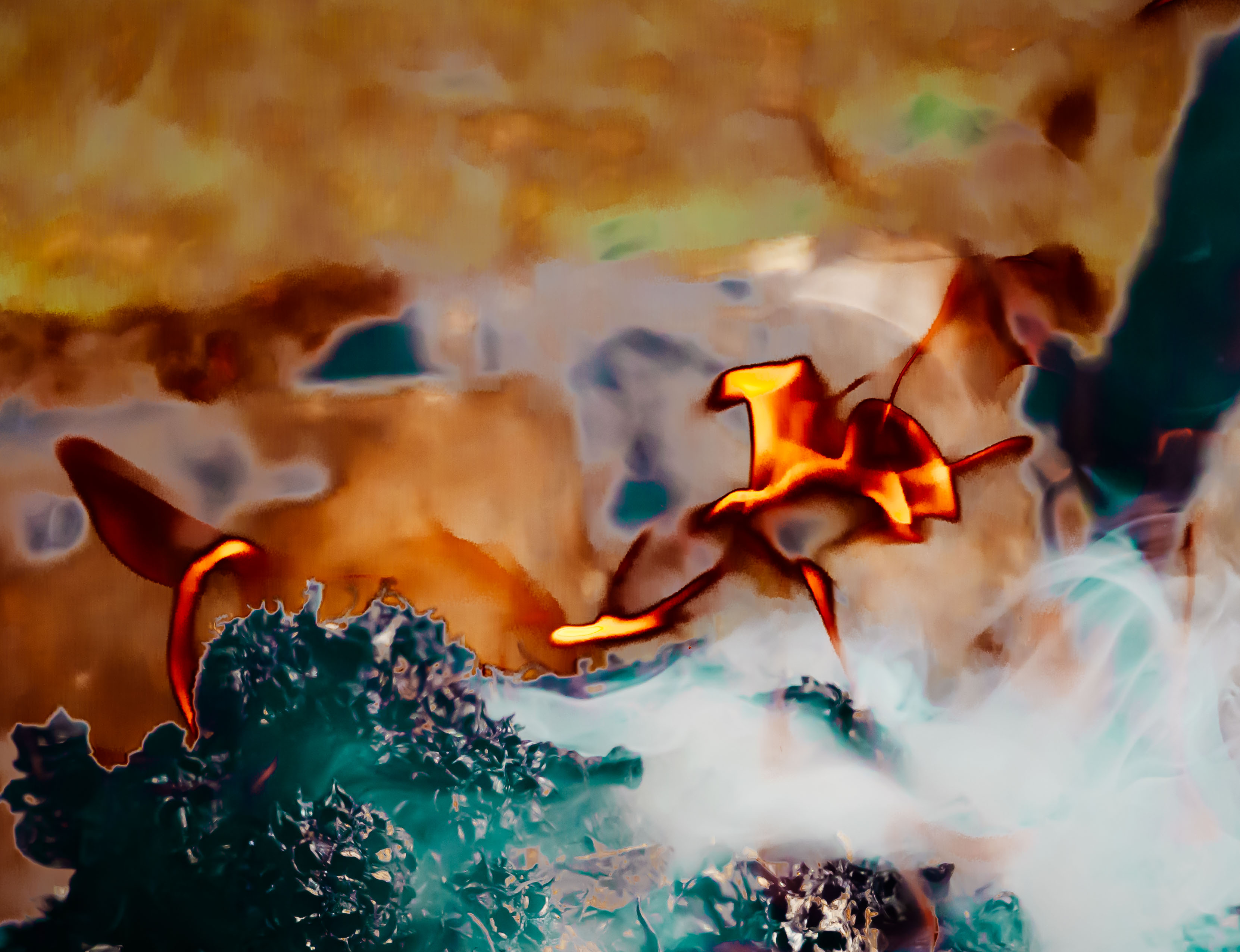
Comment |
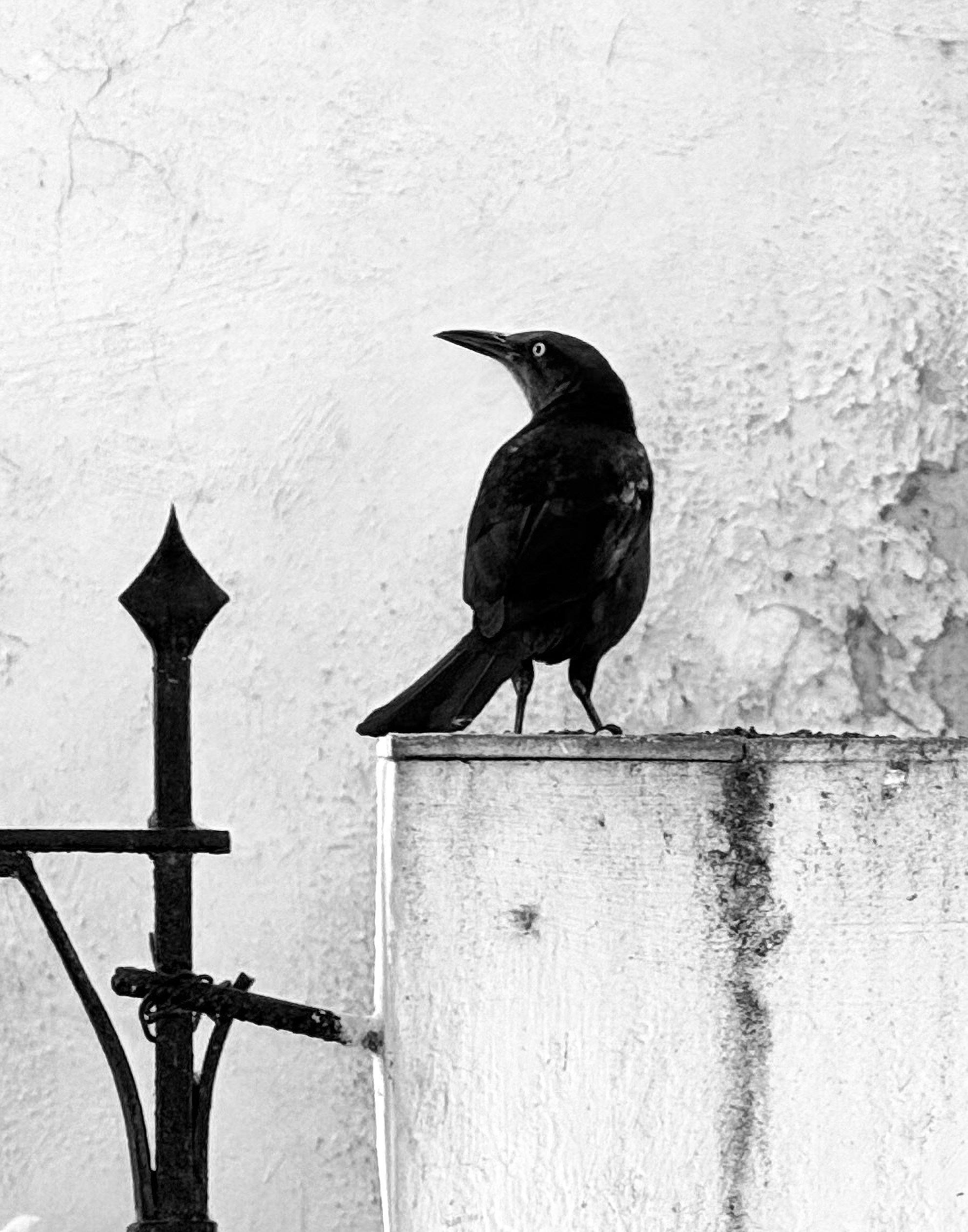
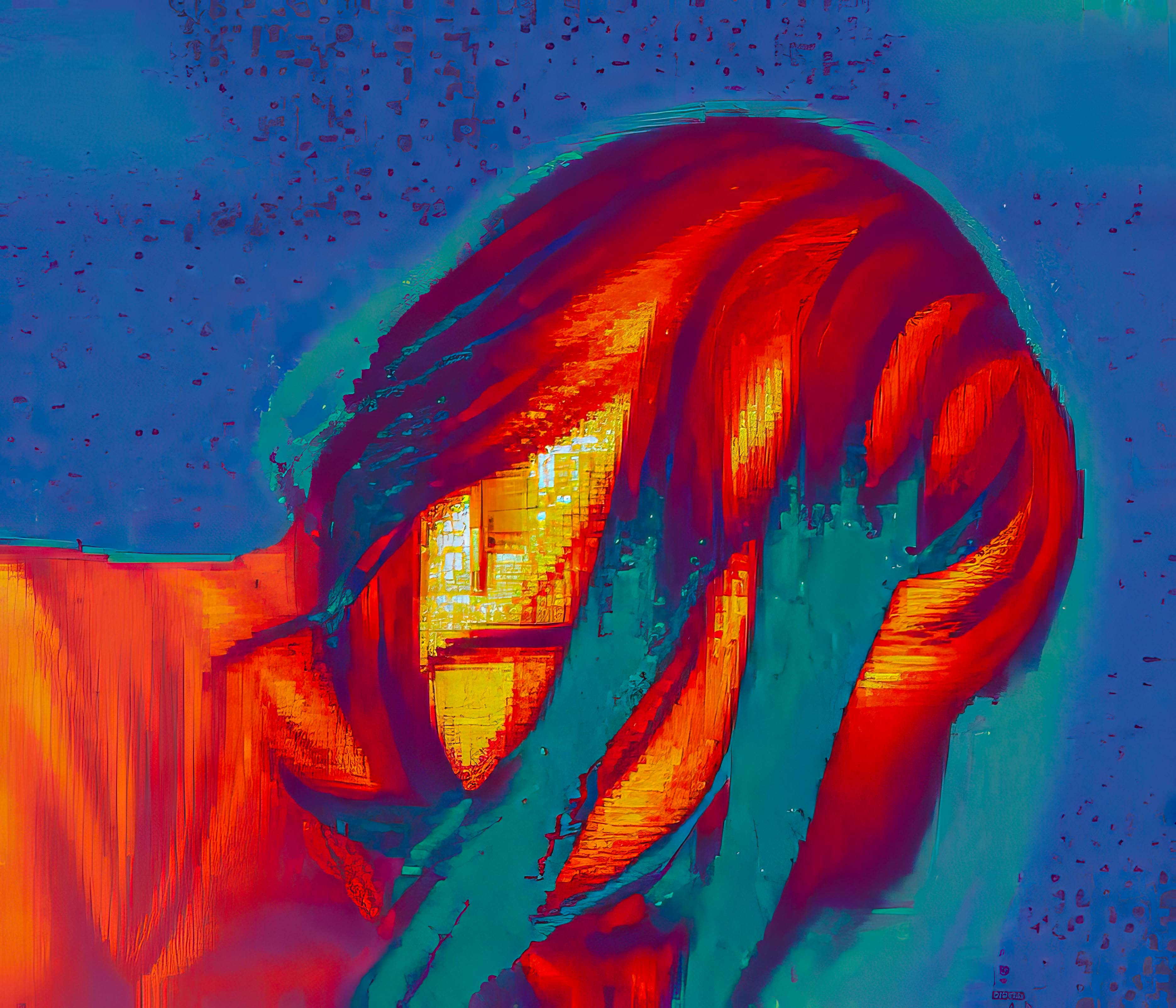
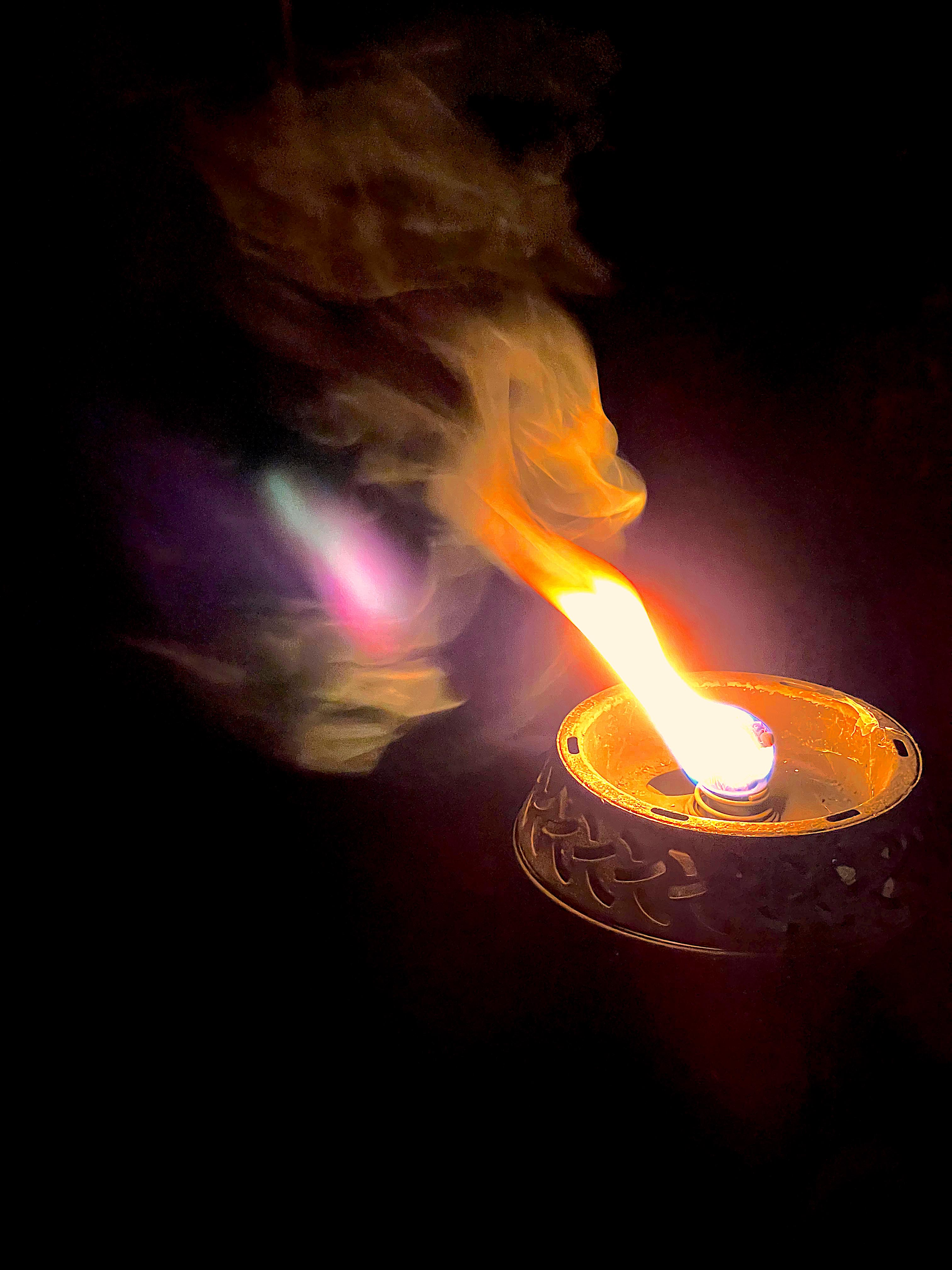
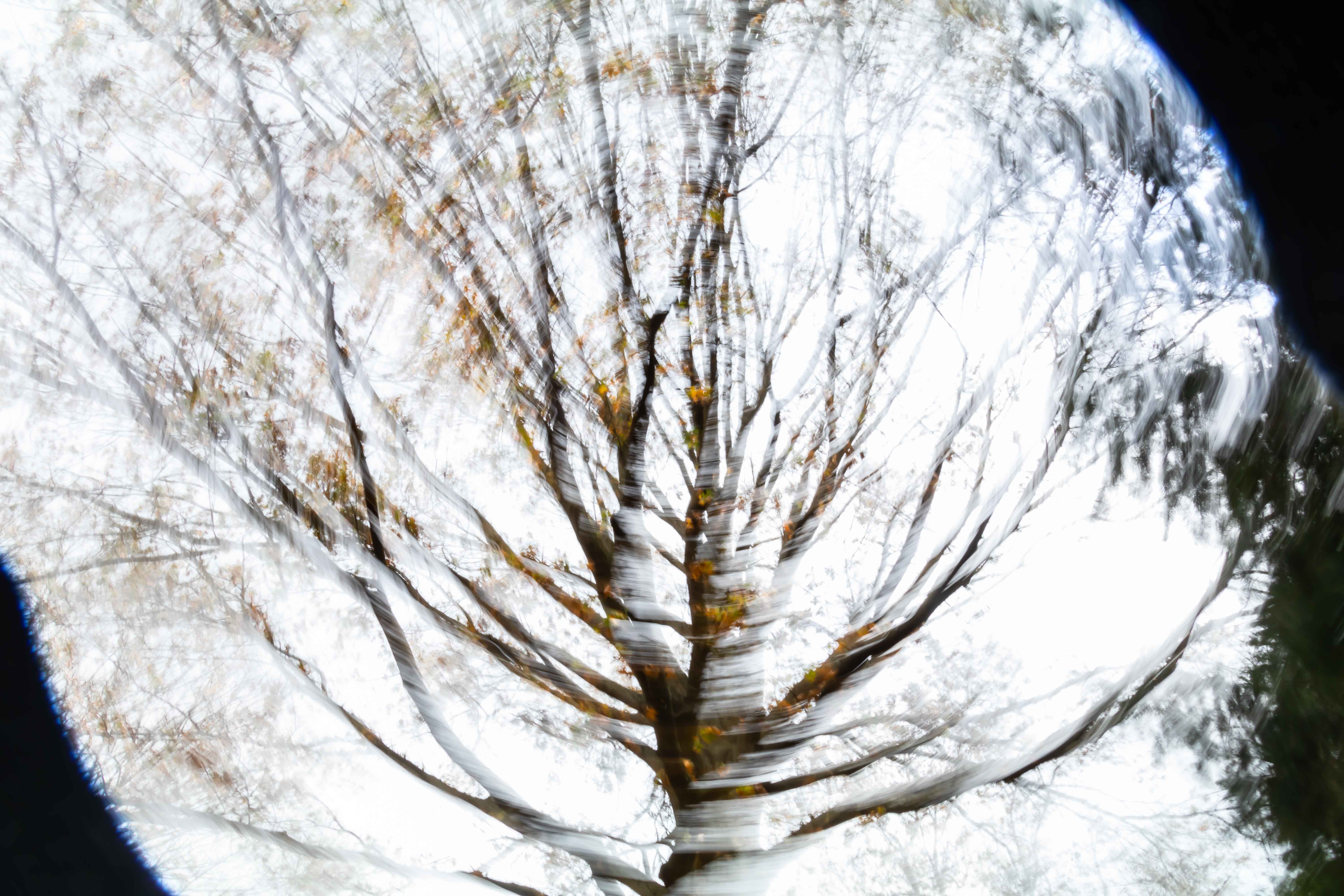
What a terrifying scene. How close were you to this fire? The original looks monochrome. Did the smoke obscure the green of the pine trees? Your processing really did enhance the steam and provide contrast with the forest. The line of trees on the right leads diagonally right up into the smoke that dwarfs them. I think a second fascinating image could be created by cropping out the dark forest altogether, and focusing attention on those trees and the steam/smoke. |
Aug 5th |
| 52 |
Aug 23 |
Comment |
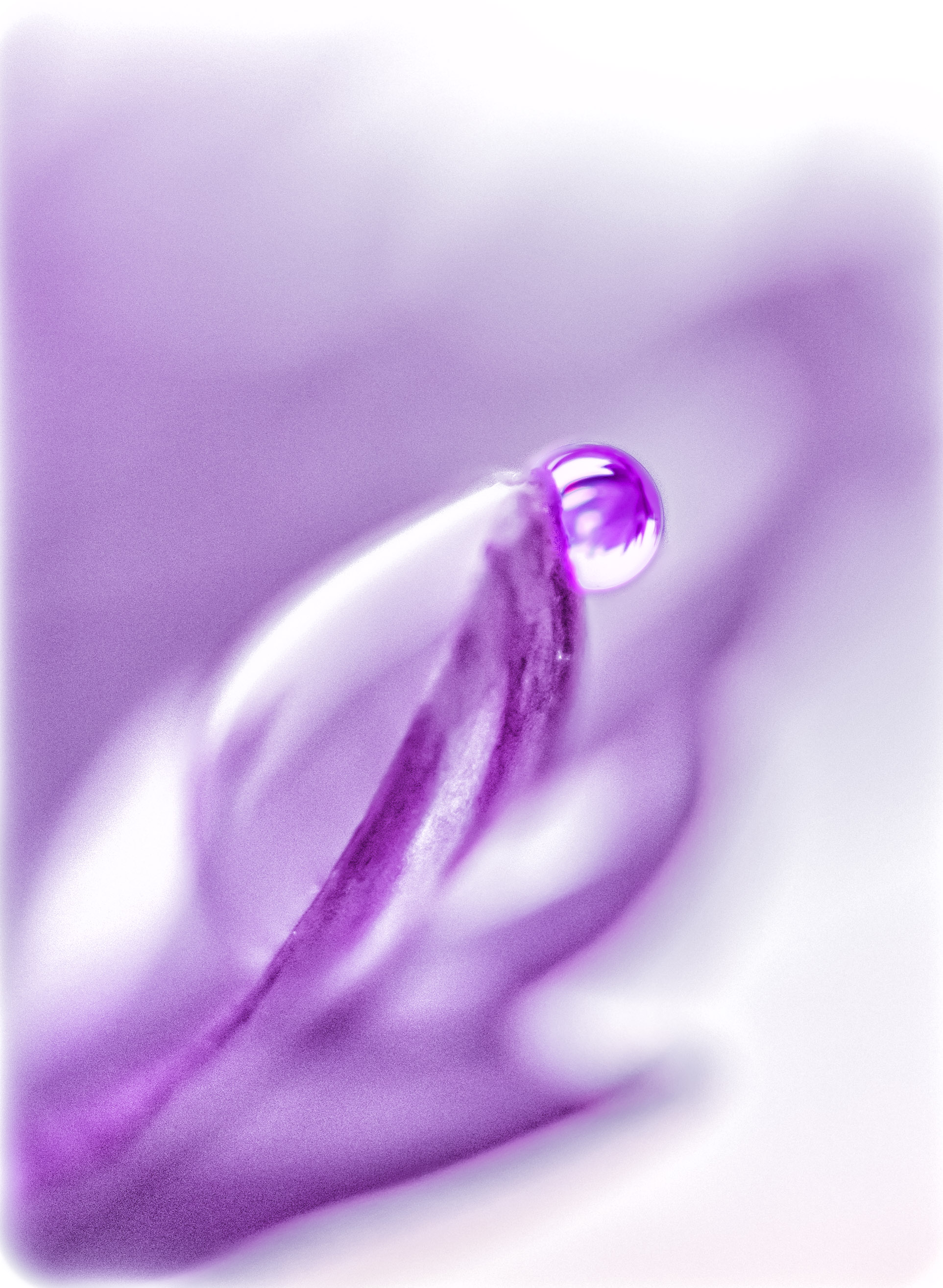
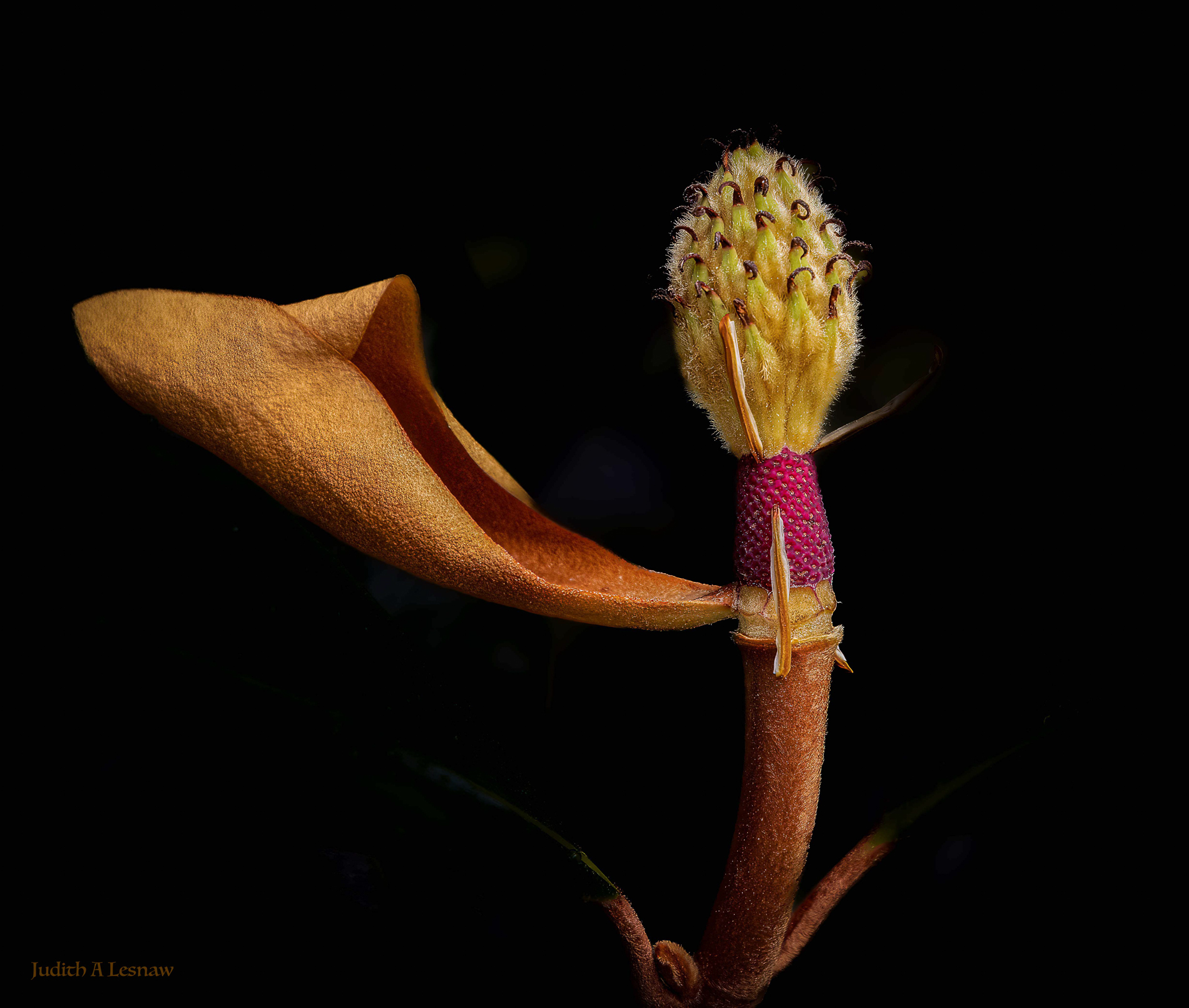
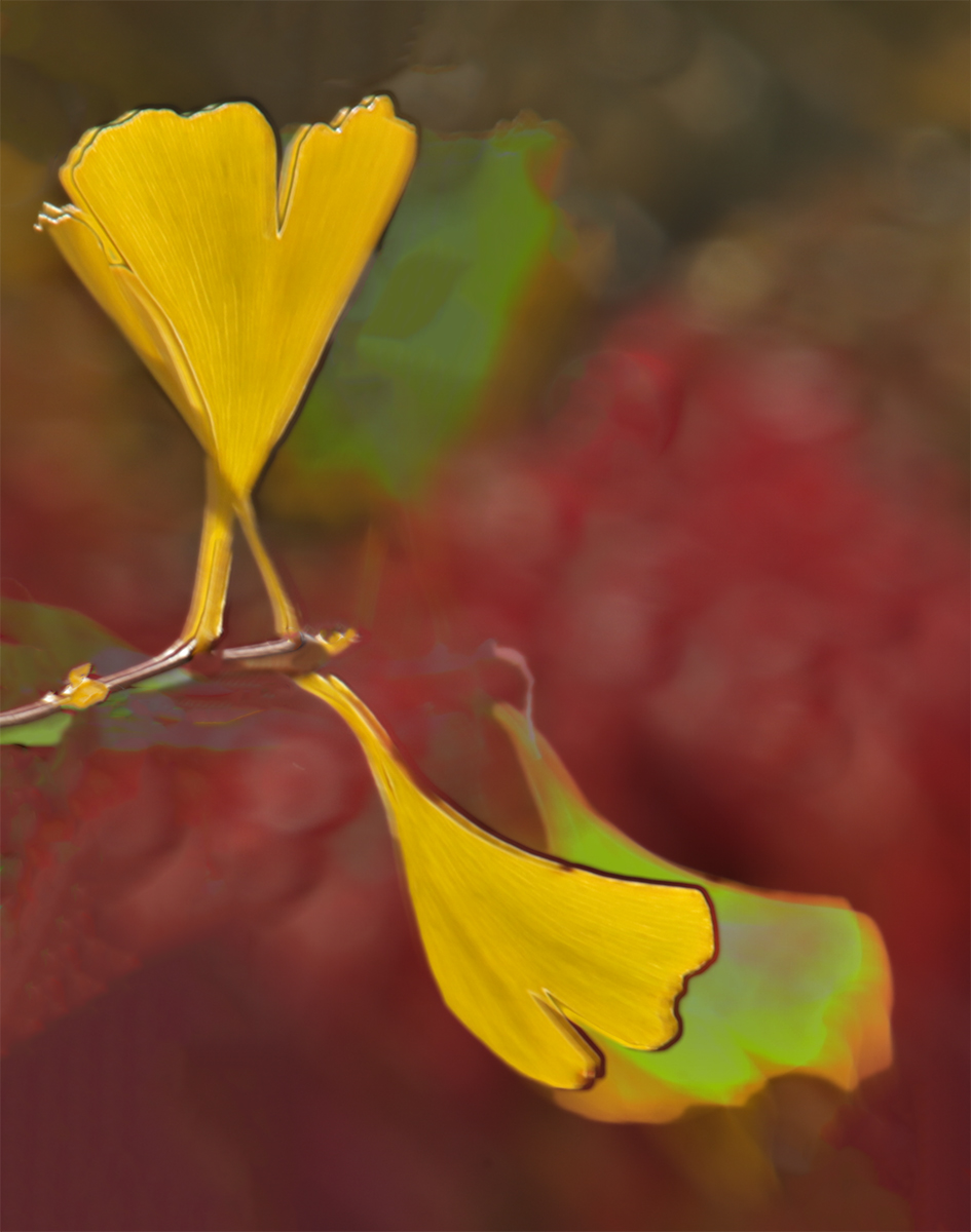
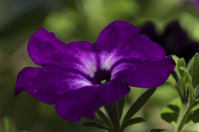
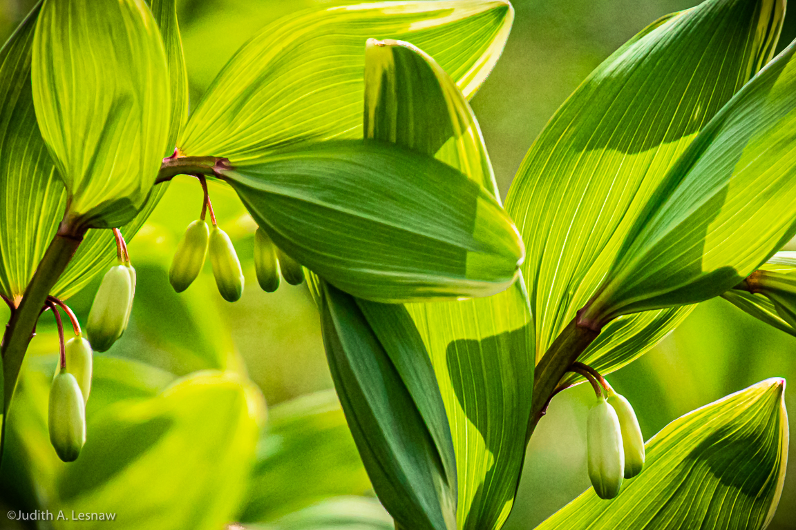
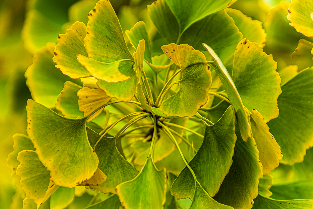
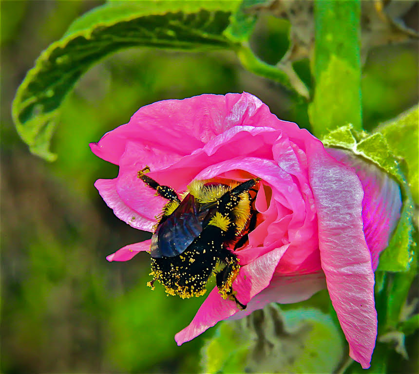
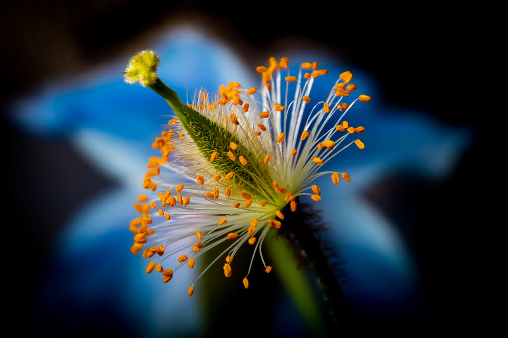
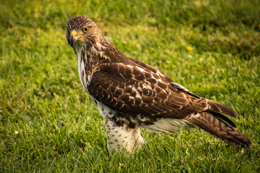
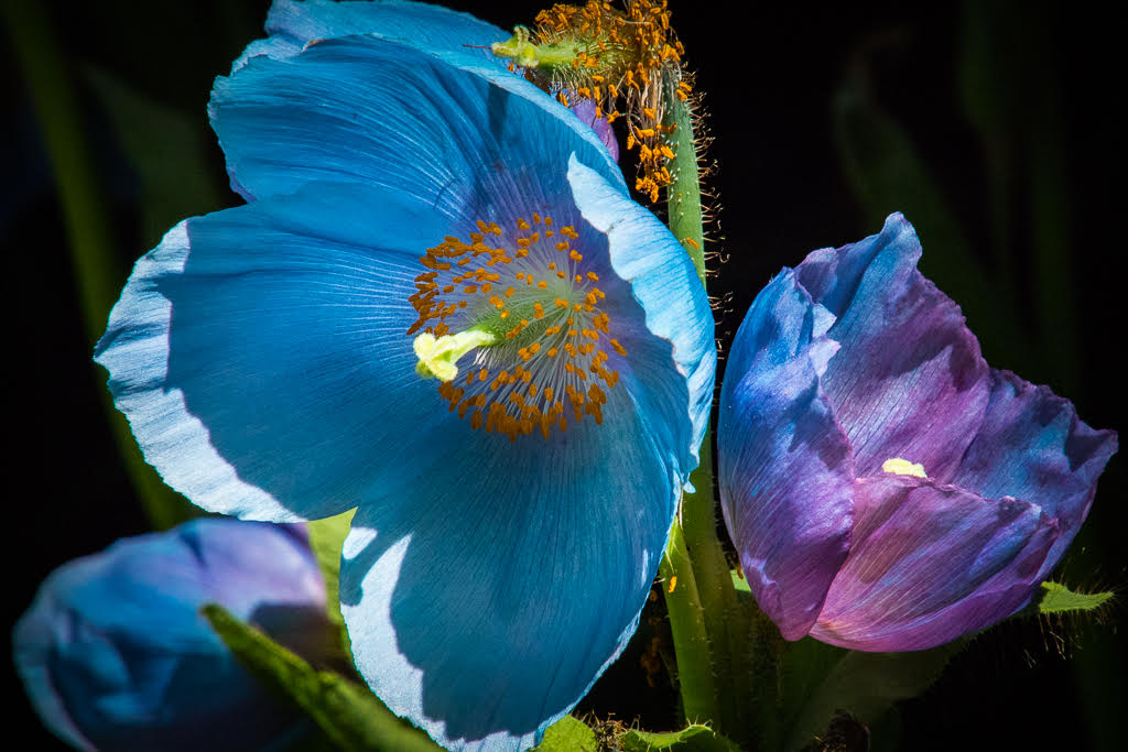
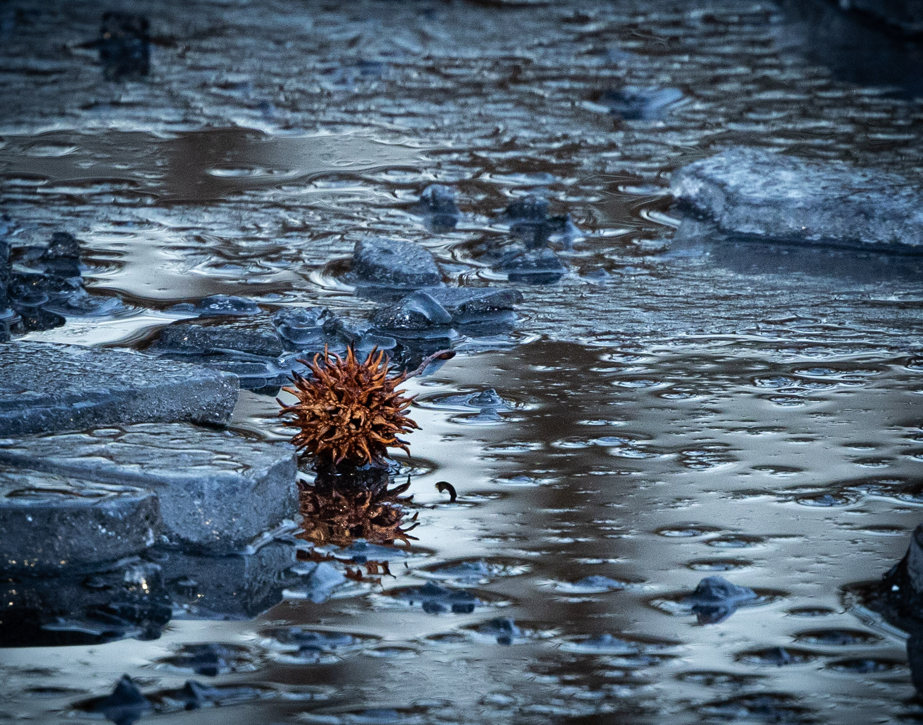
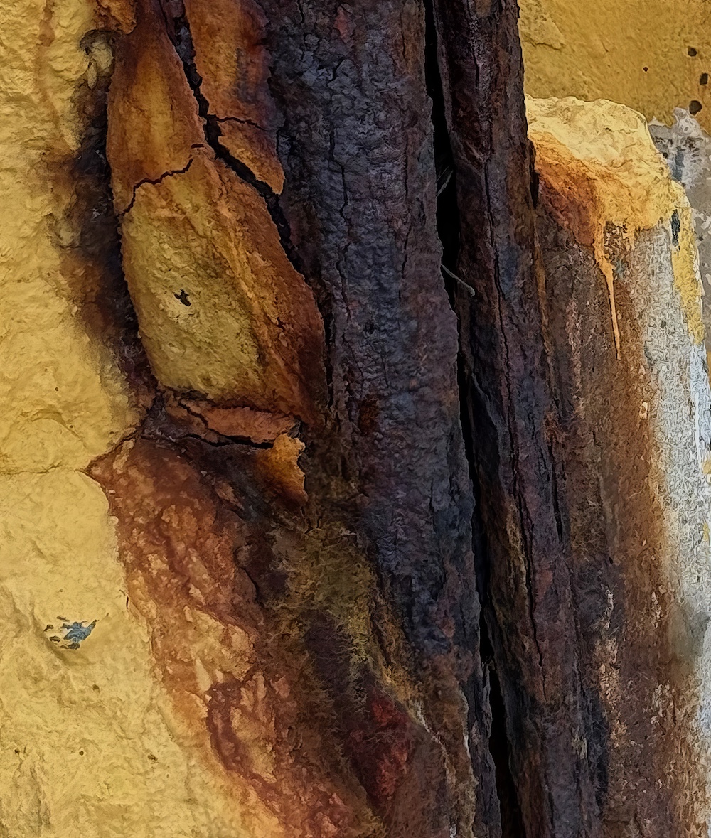
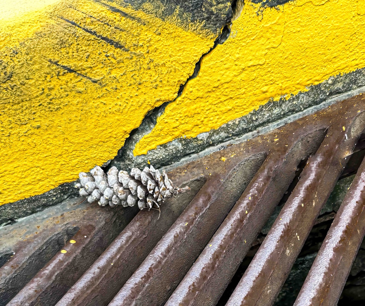
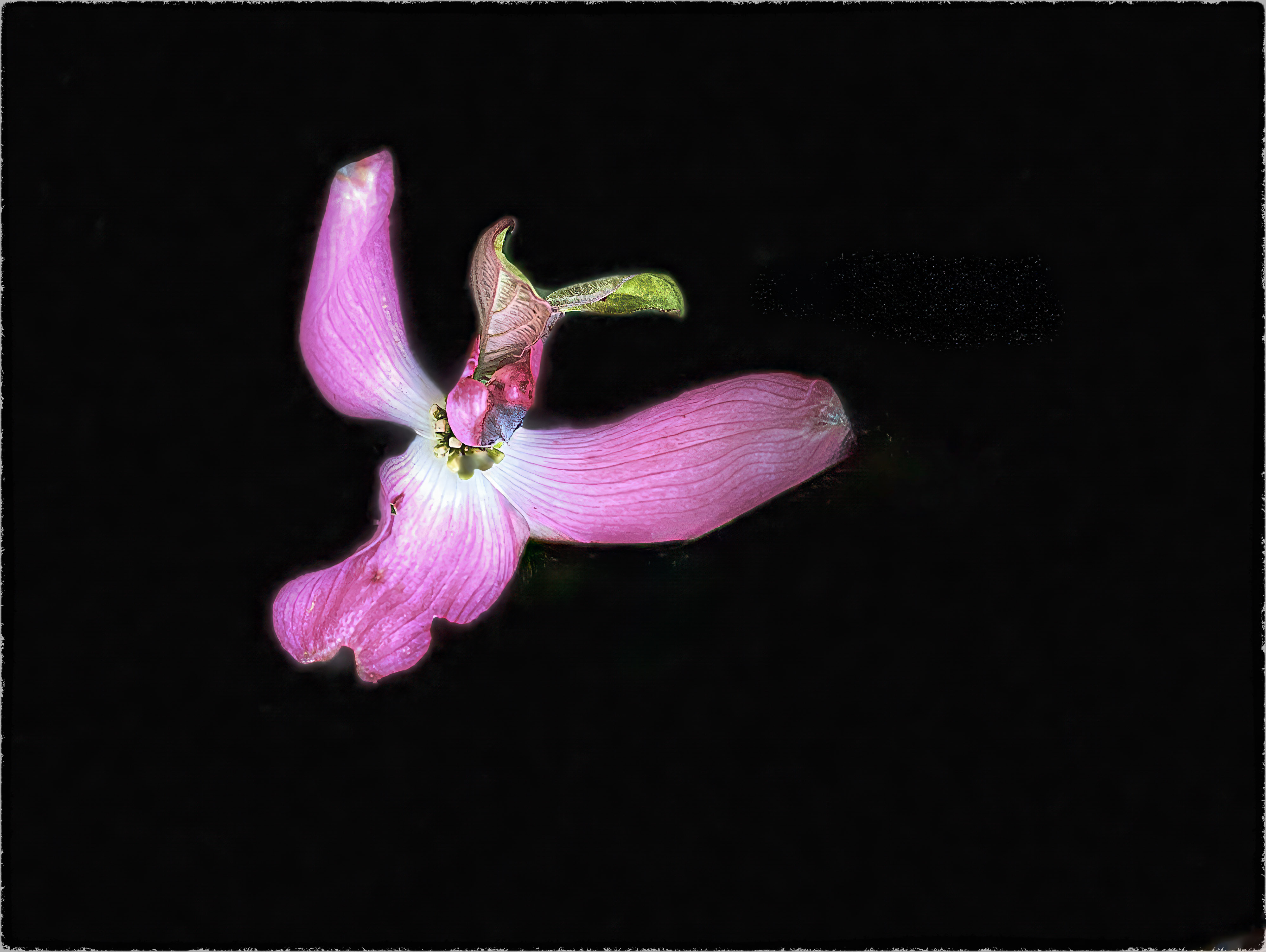
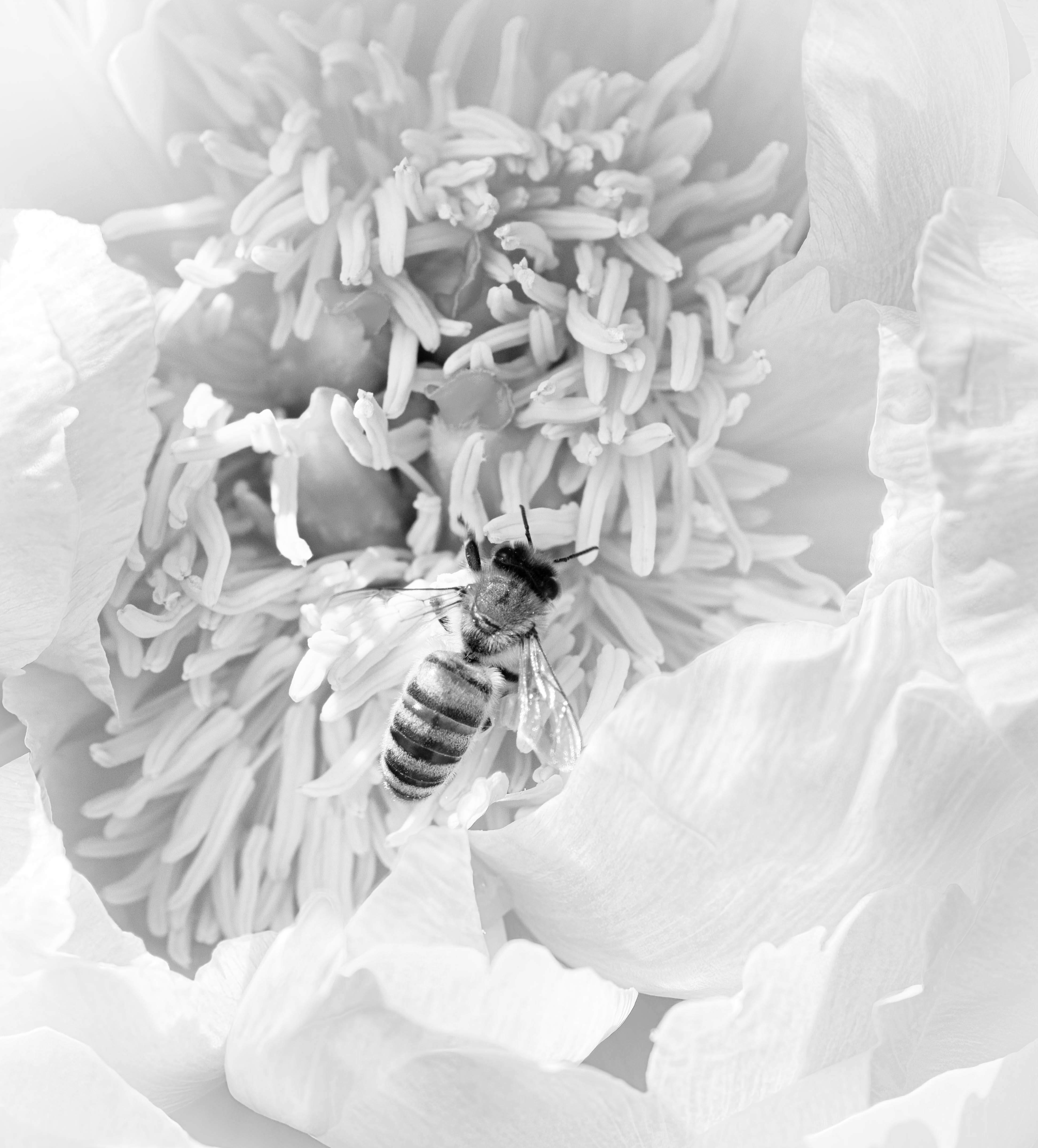
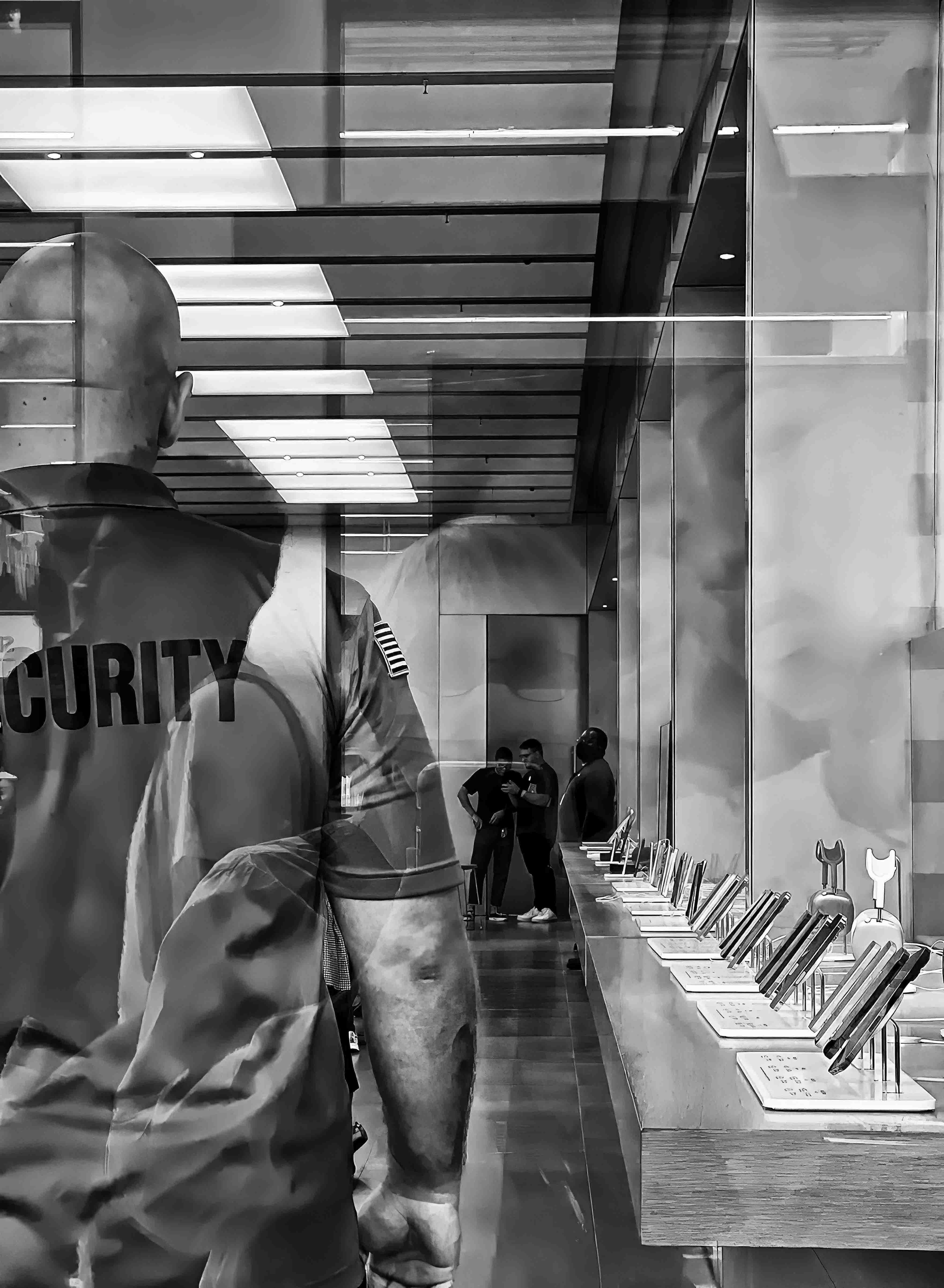
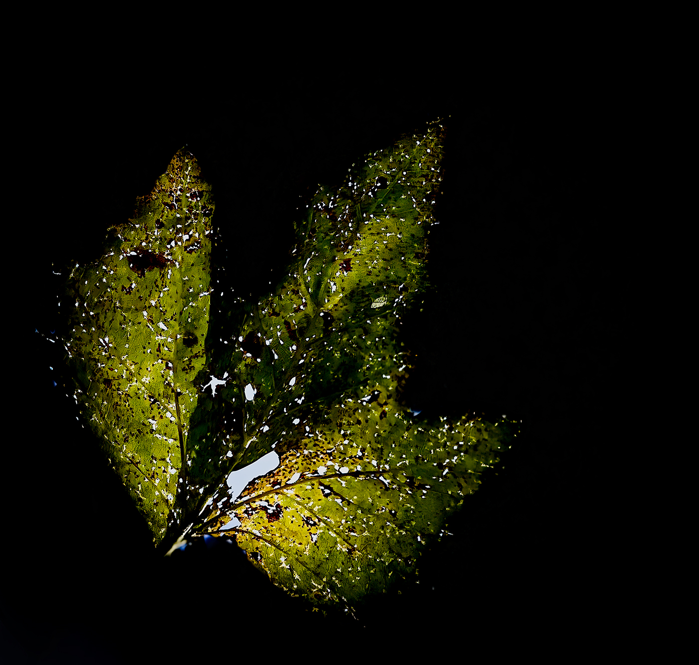
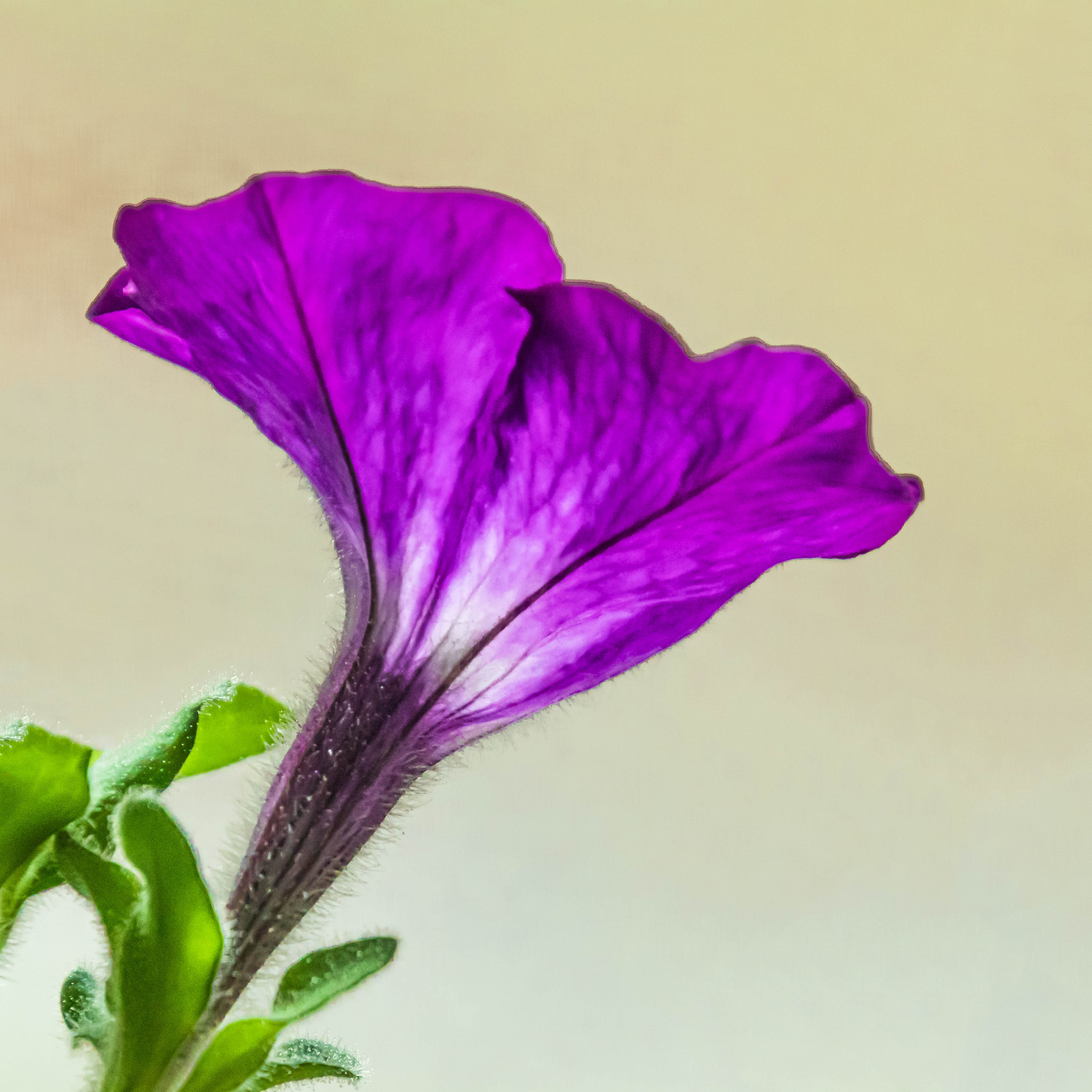
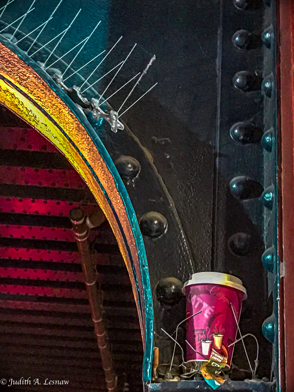
The colors and composition are lovely. What produced the brown background? It works very well and gives a unique look to the image. The 1:1 crop is perfect. The detail on the torso and speckled wing are amazing - the more so in view of your hand-holding the 500mm lens. How far were you from the subject here? If a horizontal flip is allowed in the Nature Division, see if you like it. The white spot in the soft purple blossom above the one serving as dinner pulls my eyes away from the subject. If permitted I would selectively dim it. This image will look grand in exhibition. |
Aug 5th |
7 comments - 5 replies for Group 52
|
| 79 |
Aug 23 |
Comment |
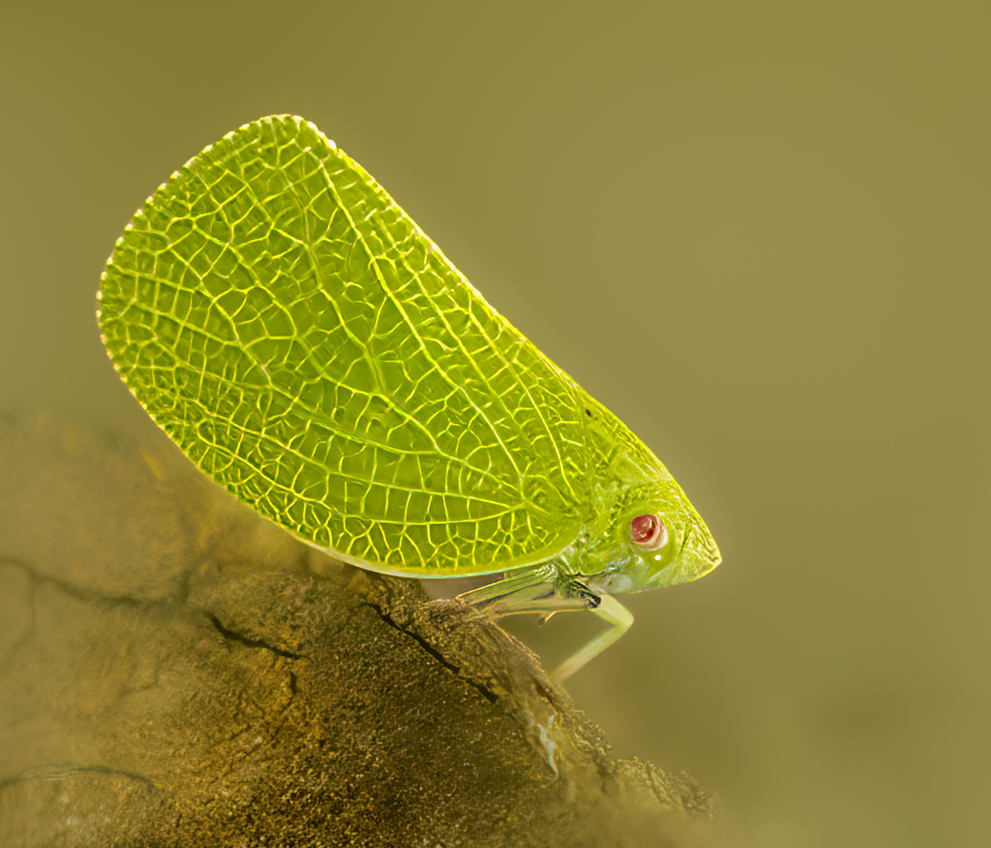
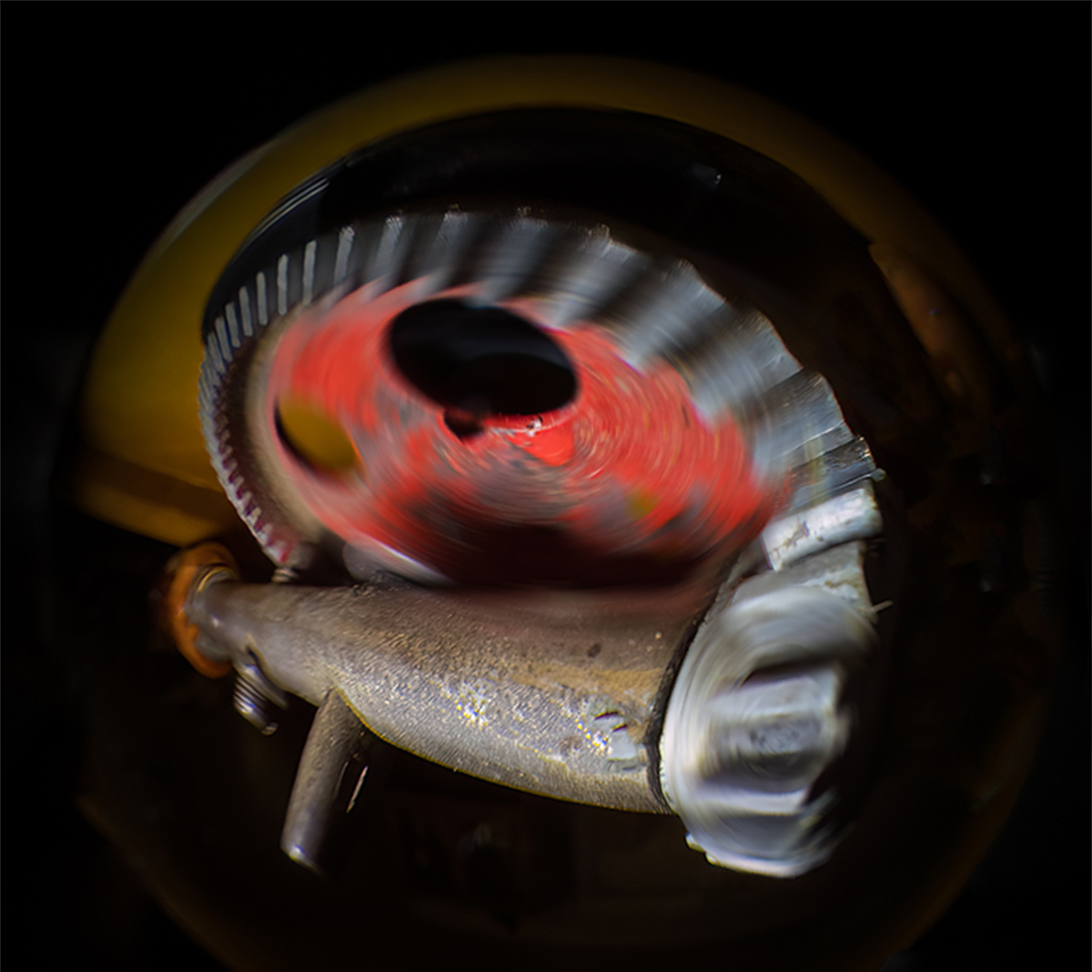
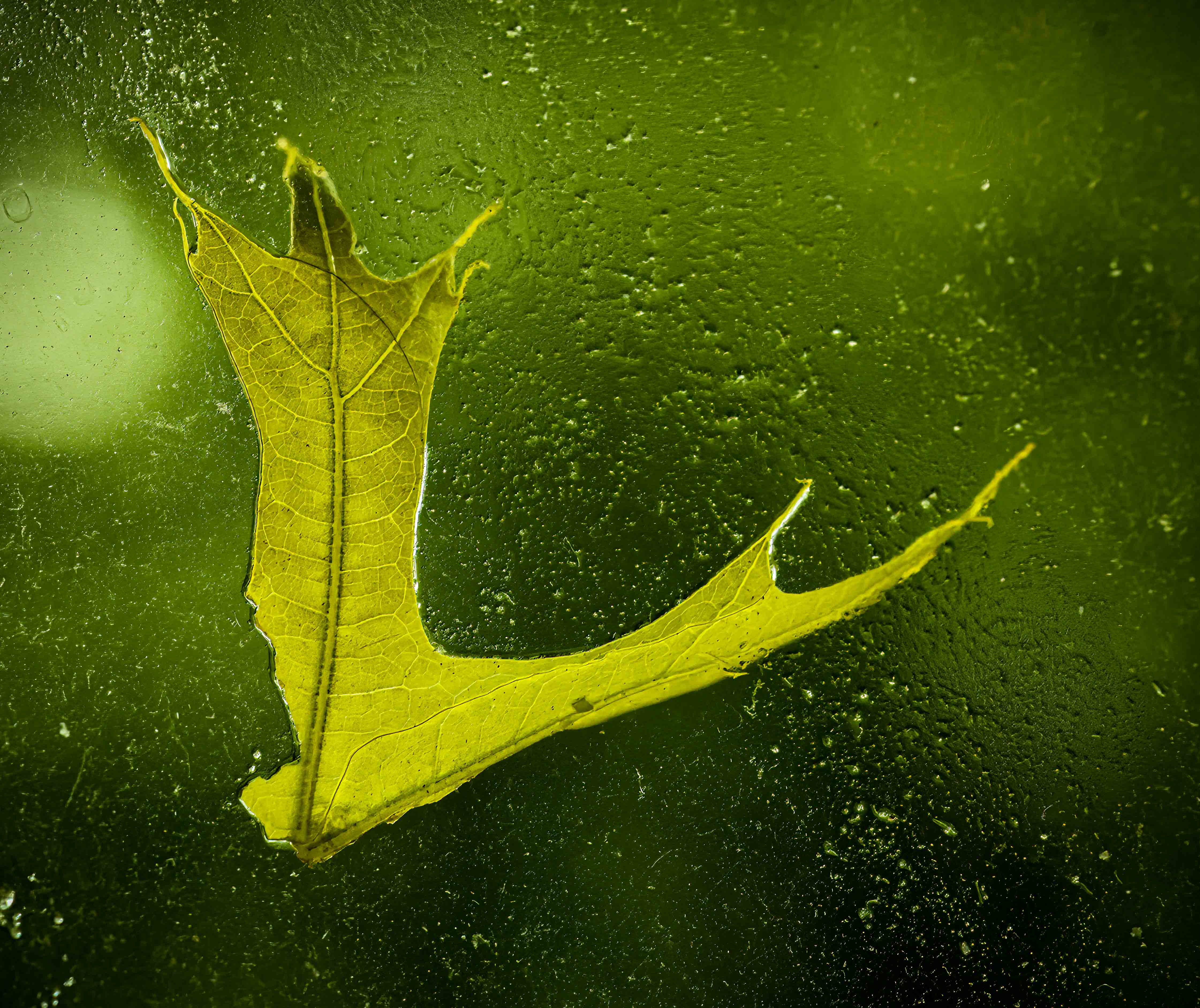
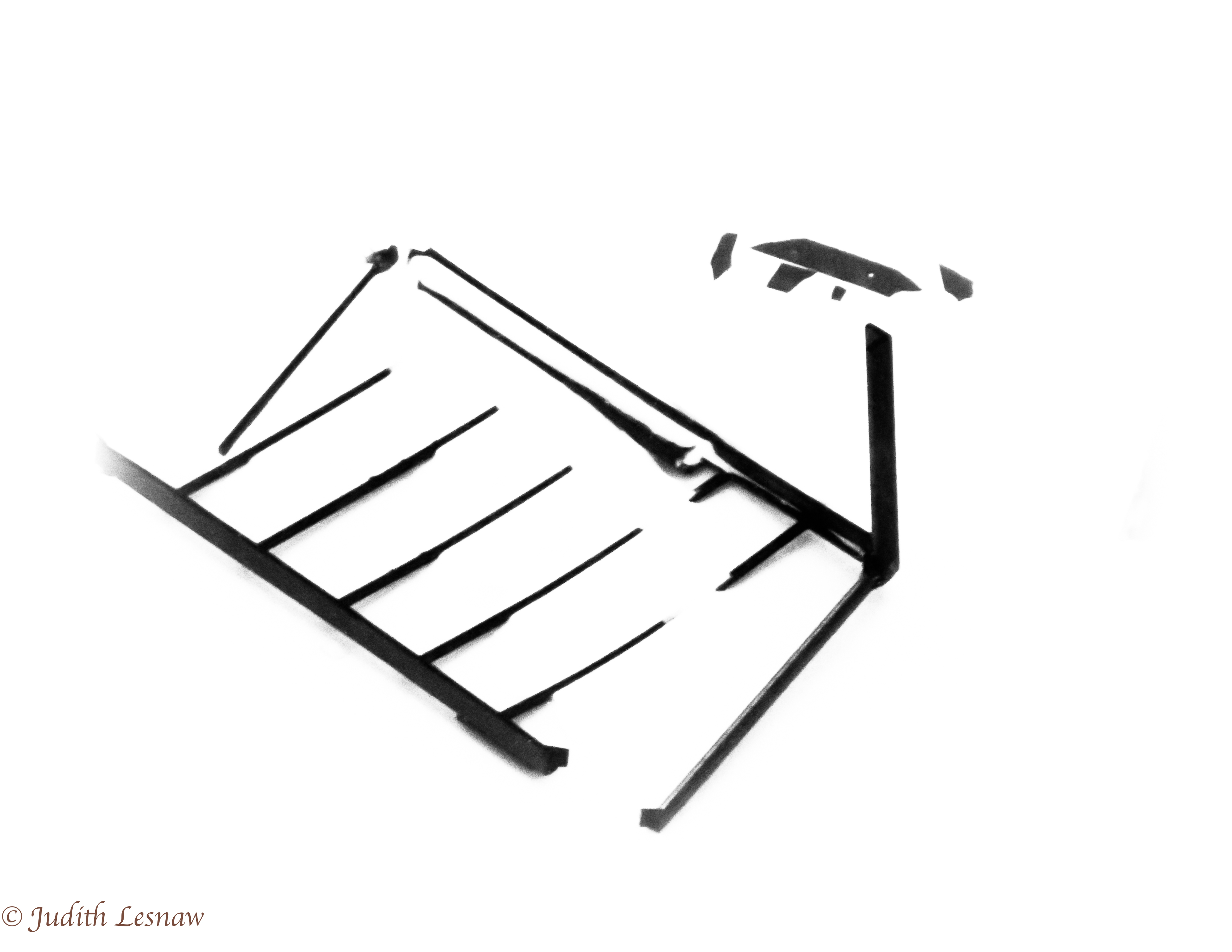
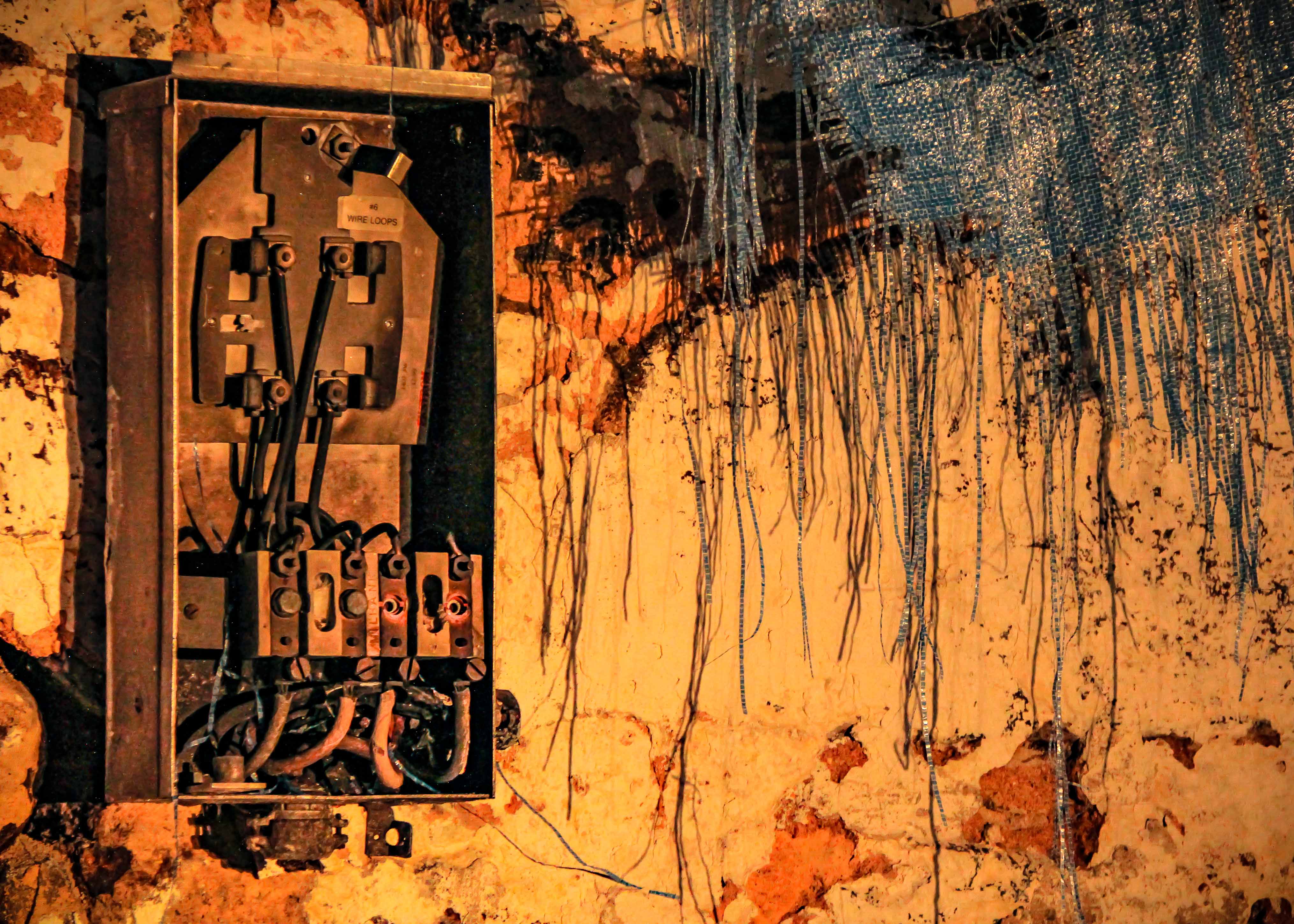
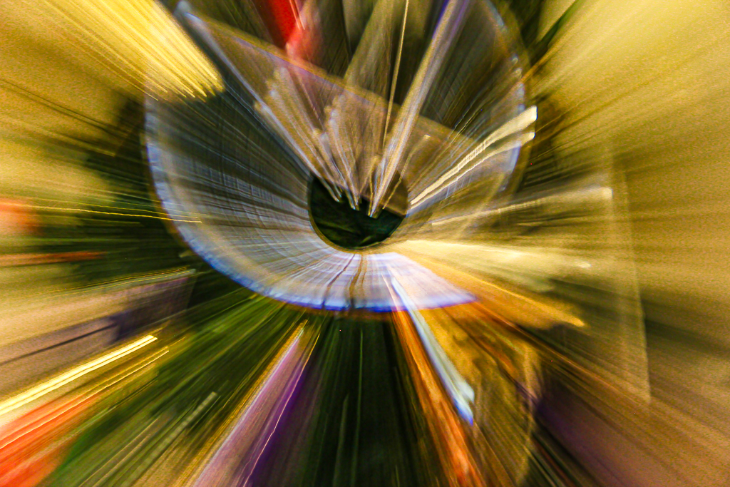
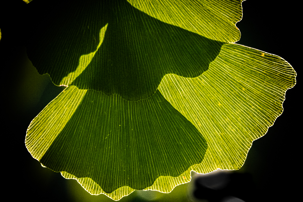
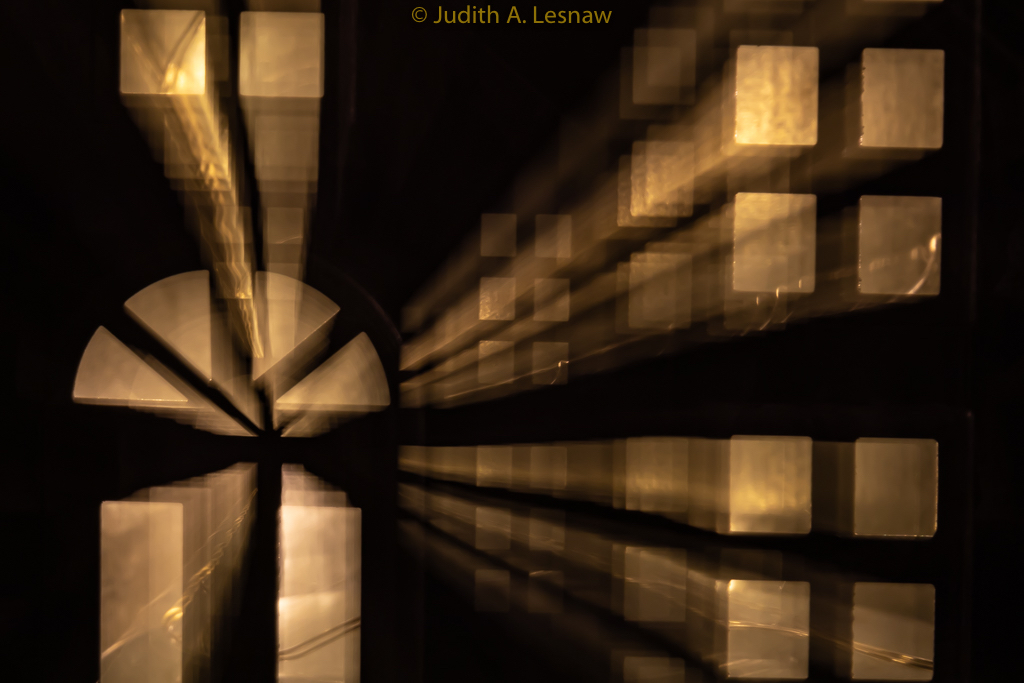
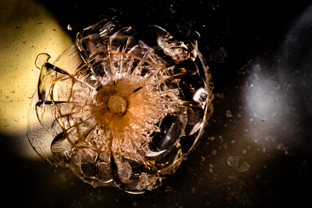
Marvelous abstract! I love the contrasts between the lines and blade curves, the textures, the colors, the shapes; the asymmetry in the sides of the blade. Gerald's version is also very good, yet I prefer your version because it has greater contrast and punch. |
Aug 30th |
| 79 |
Aug 23 |
Comment |
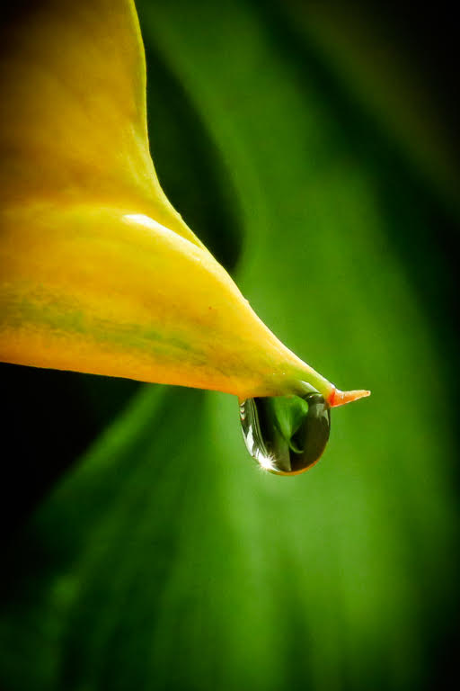
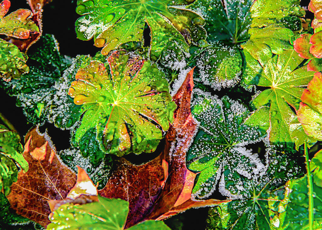
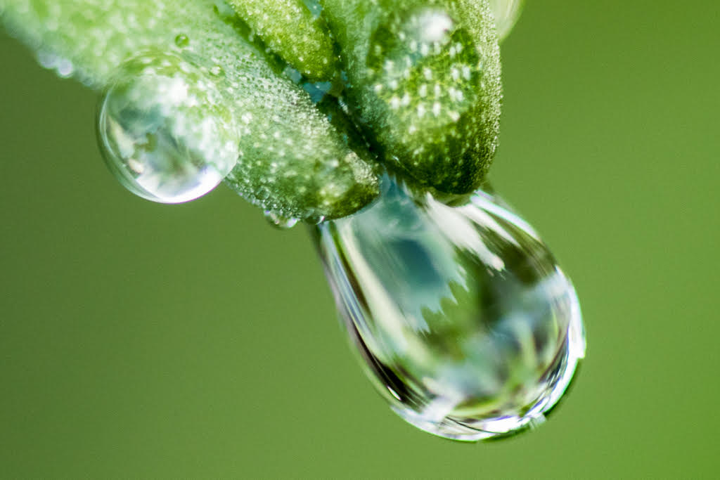
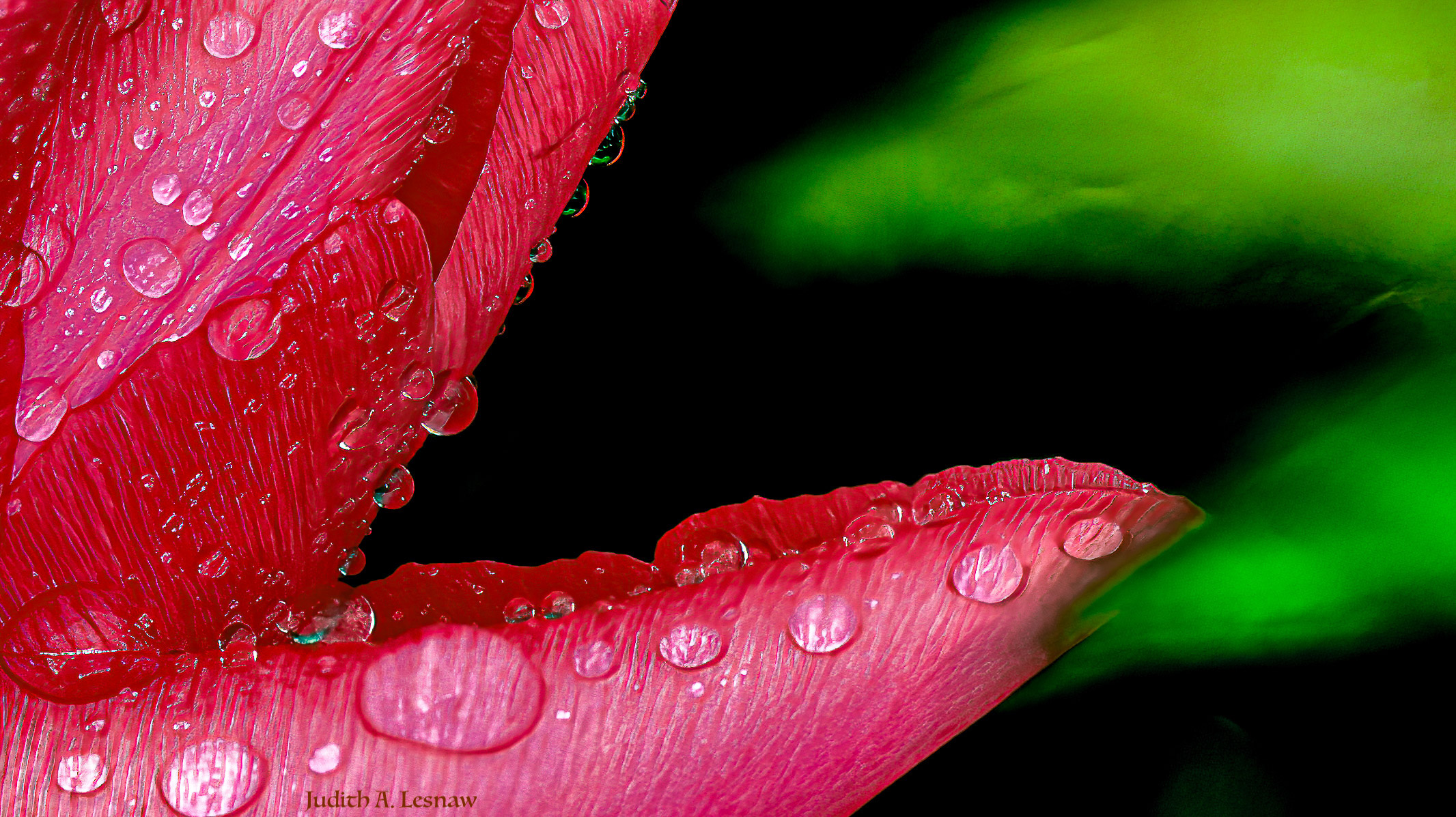
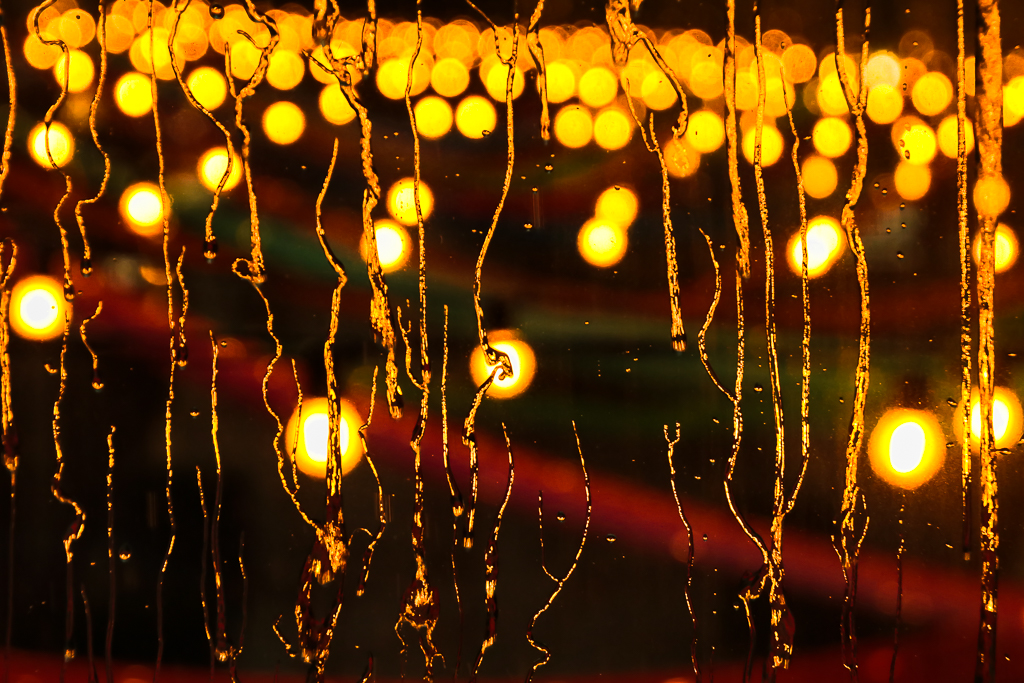
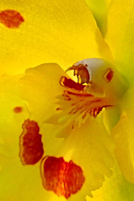
Stunning image! The colors are grand. The sharp focus and water drops add to the beauty. This was an interesting experiment well executed with a great outcome. |
Aug 30th |
| 79 |
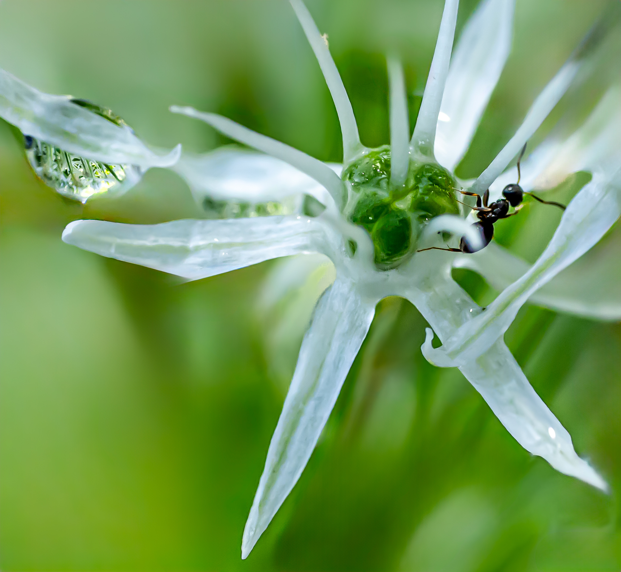
Aug 23 |
Reply |
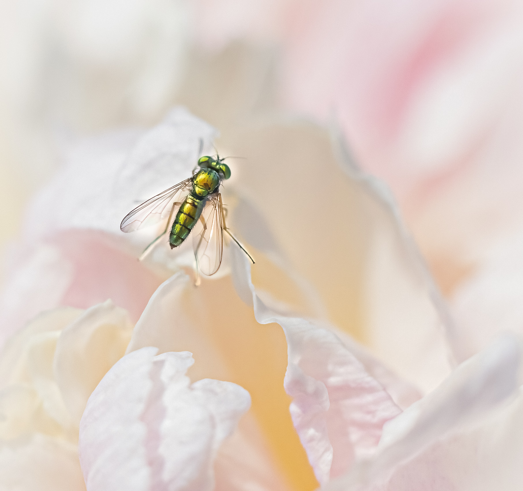
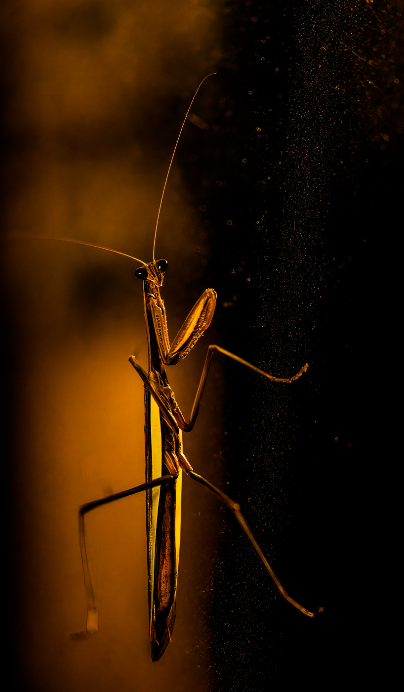
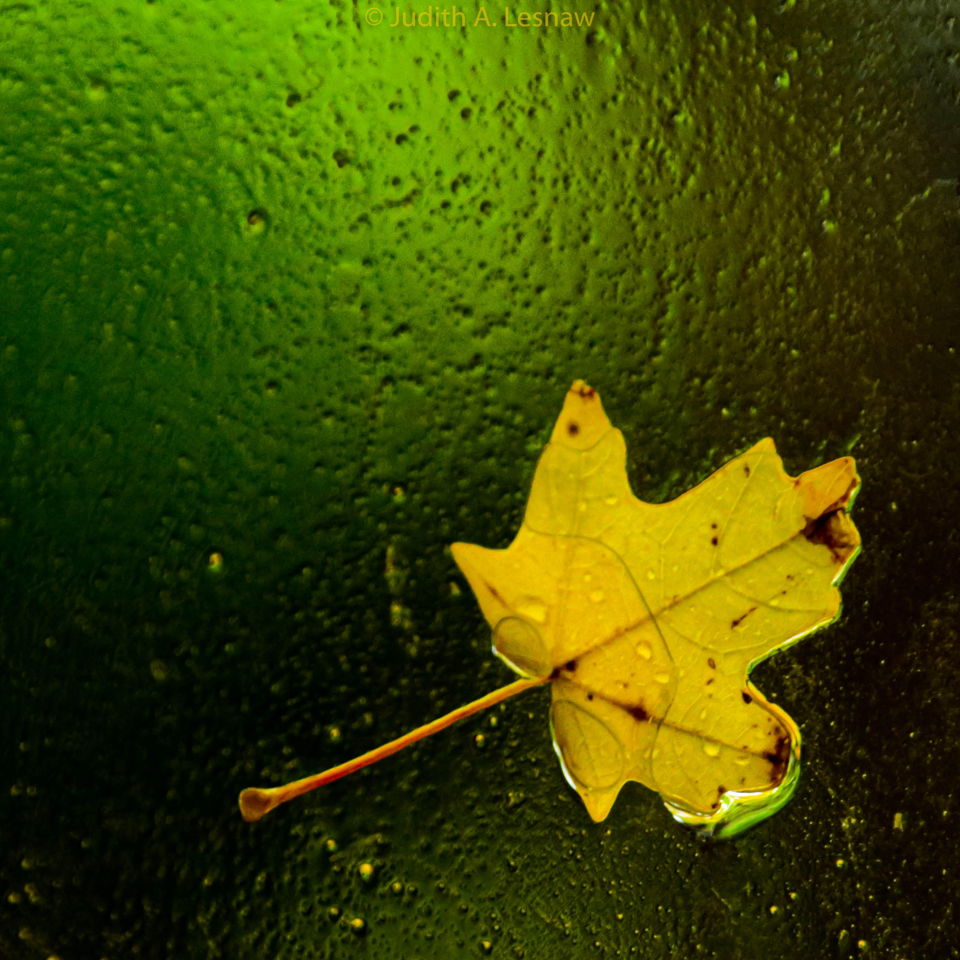
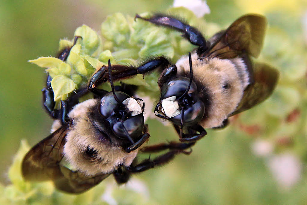
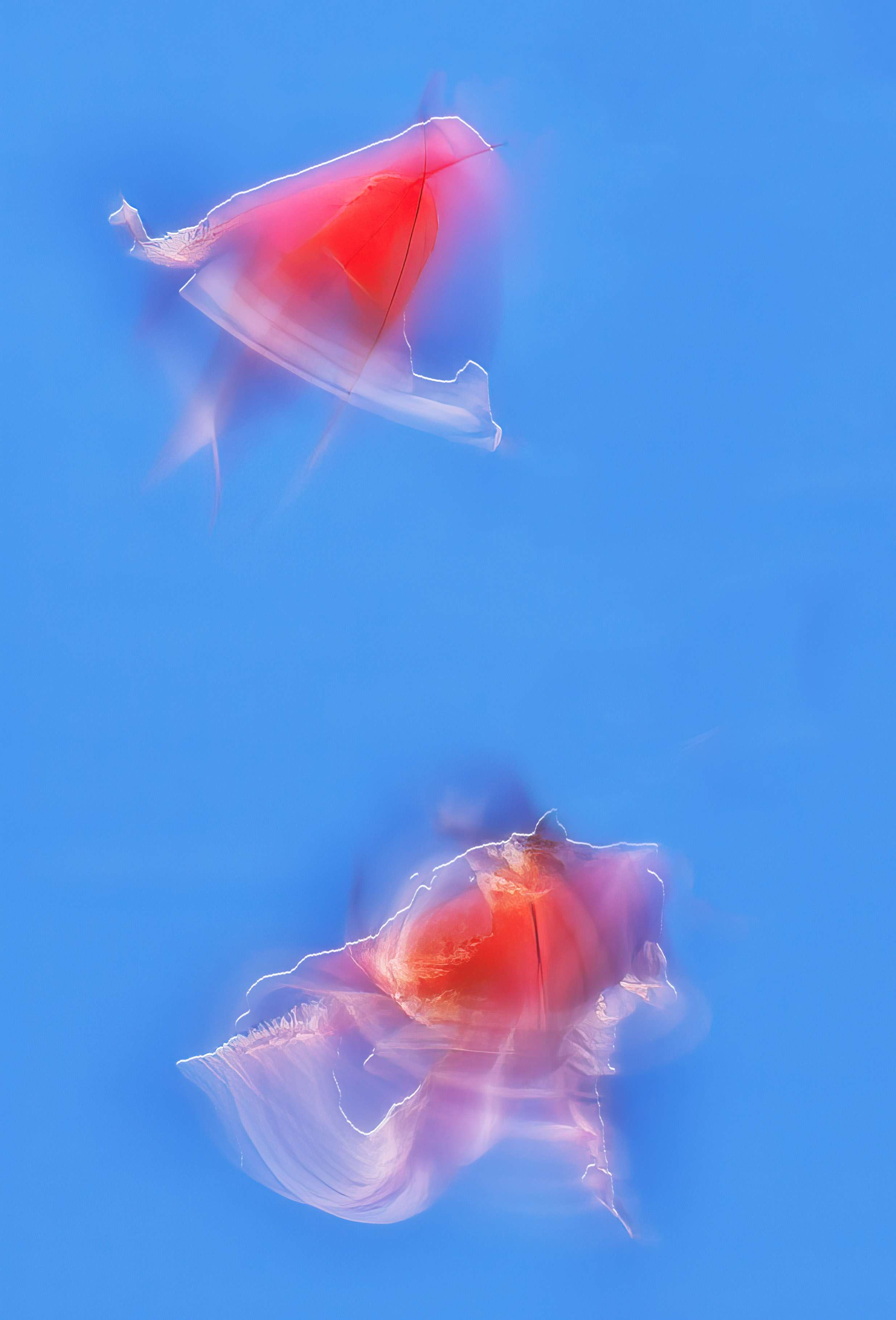
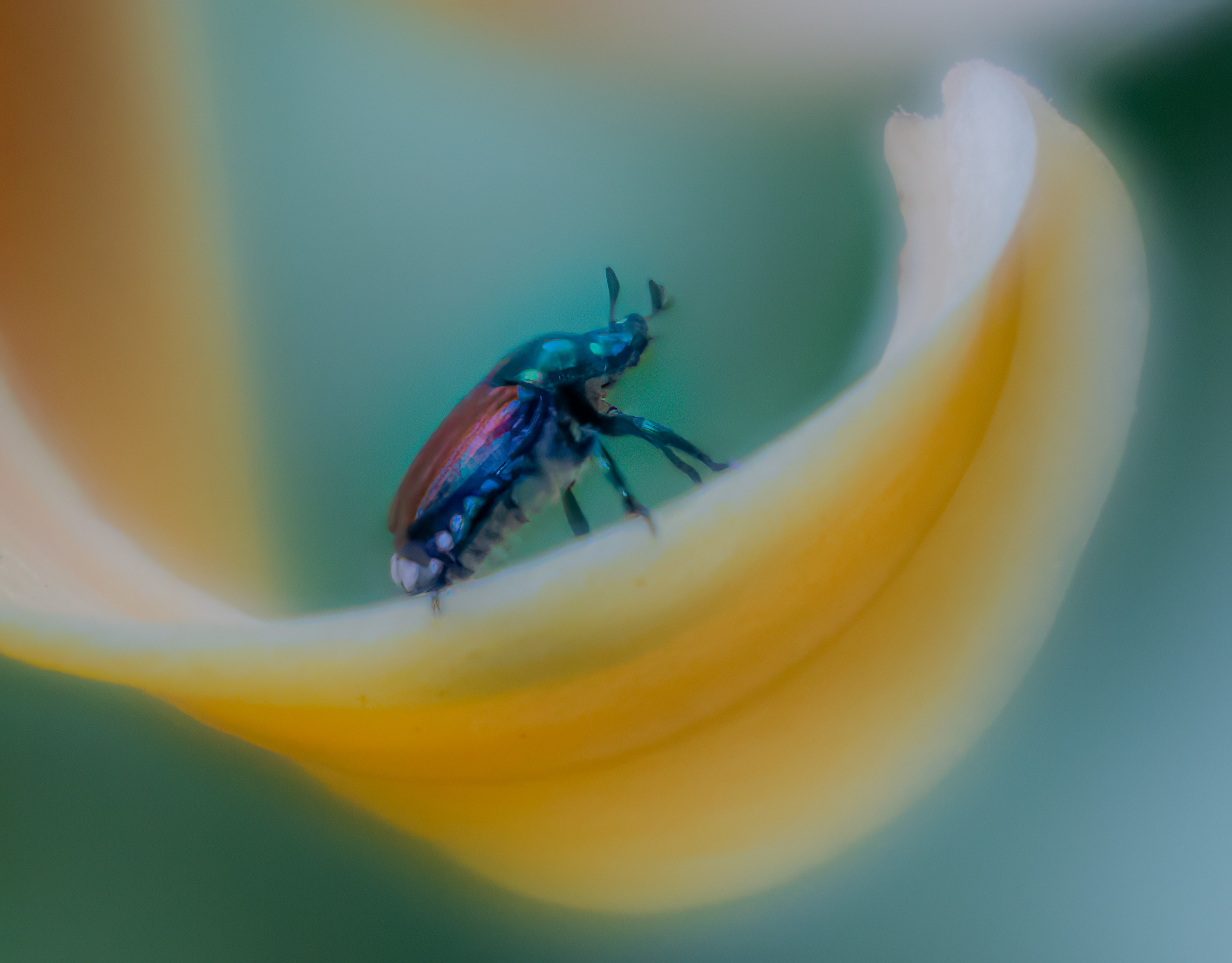
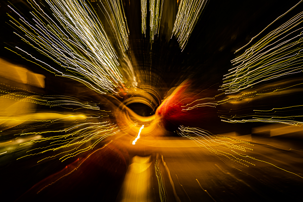
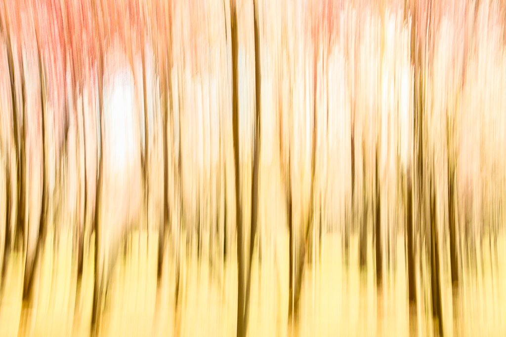
Many thanks for your comments. Although when I took this photograph I tried to compensate for the wind, when I saw the image I realized that the wind had painted a dreamy affect. Rather than seeing the bug as having been placed on the petal, I see it as having hopped on for an exciting ride. While I often strive to get subjects in sharp focus, in this image the slight blur seemed to fit in with the overall motion theme. I do enjoy contemplating the many images that one could create from a single capture of light, and I thank you for expanding my vision.
|
Aug 6th |
| 79 |
Aug 23 |
Comment |
Very clever concept well executed. This image would make a great cover for a paperback SciFi of the sort I read in the 1950s. Your interpretation is creative - and chilling. I see this image as a symbolic representation of the relativity of time. You have juxtaposed the fleeting existence of the fireworks with the "endless?" progression of the moon across our sky. I hope humanity's fleeting existence does not take the moon and our planet with it. |
Aug 6th |
| 79 |
Aug 23 |
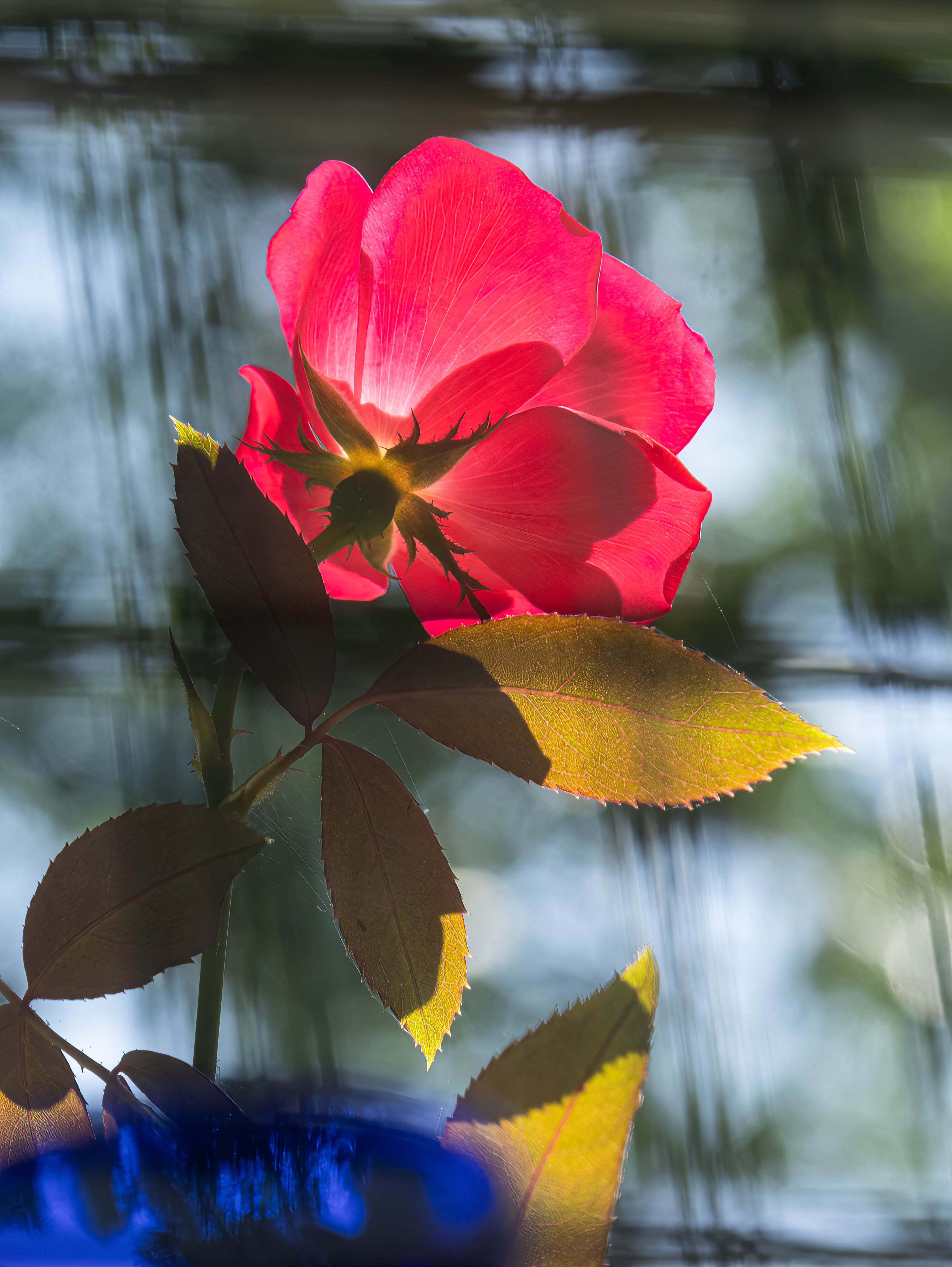
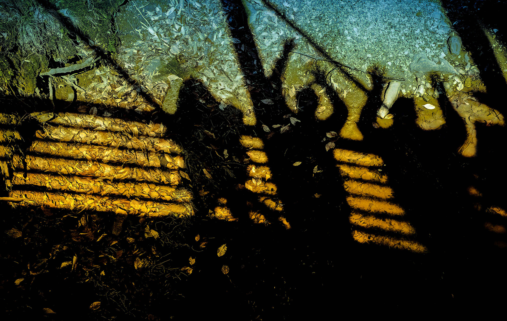
Comment |
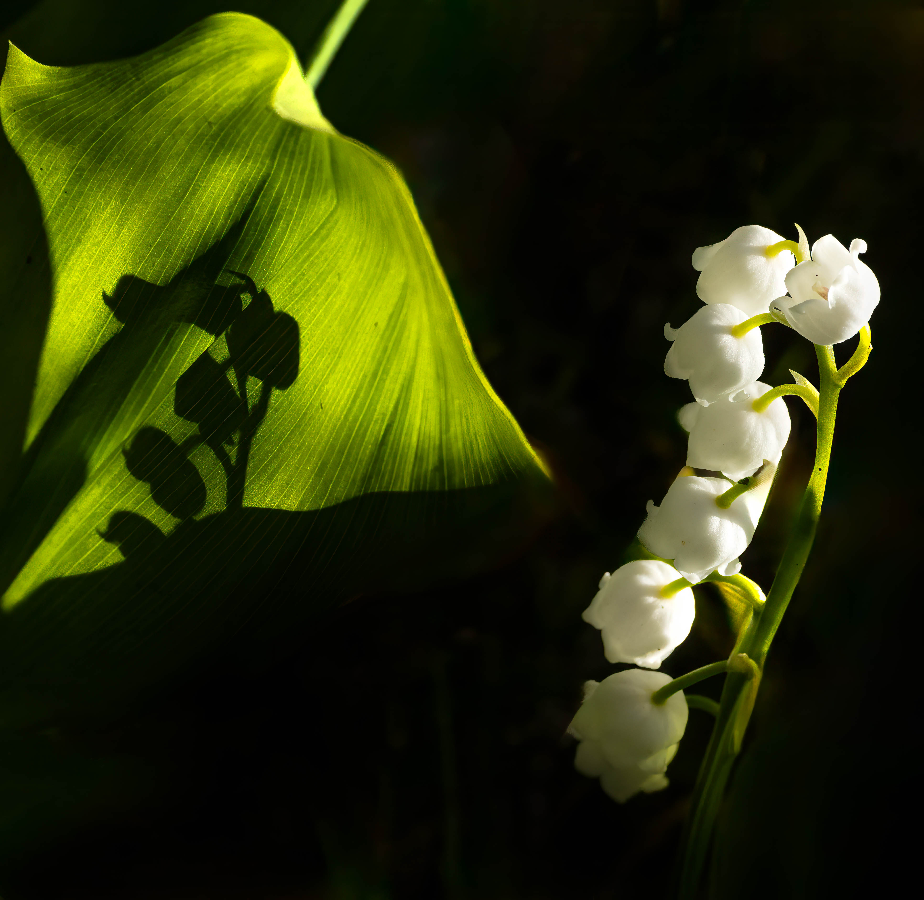
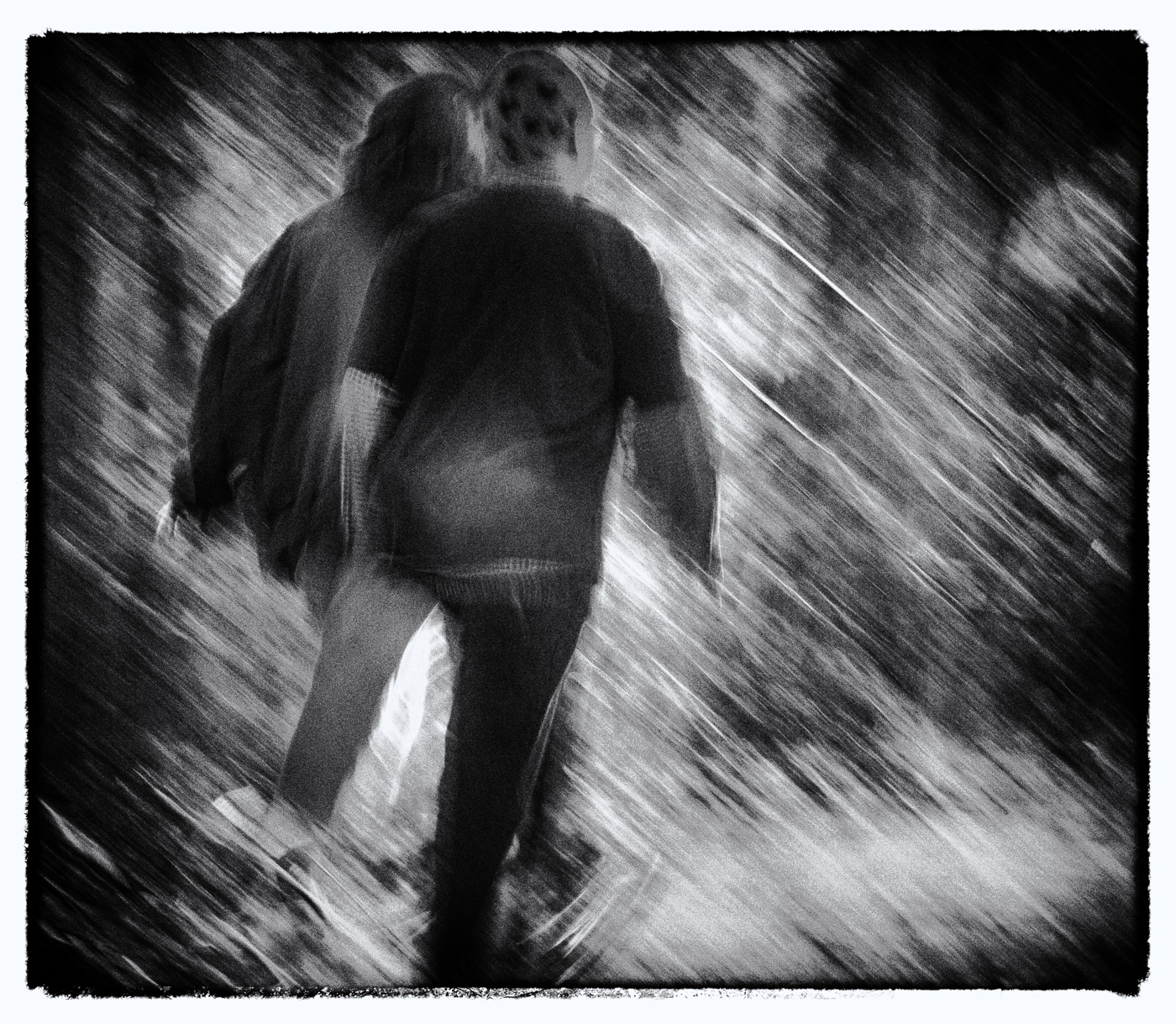
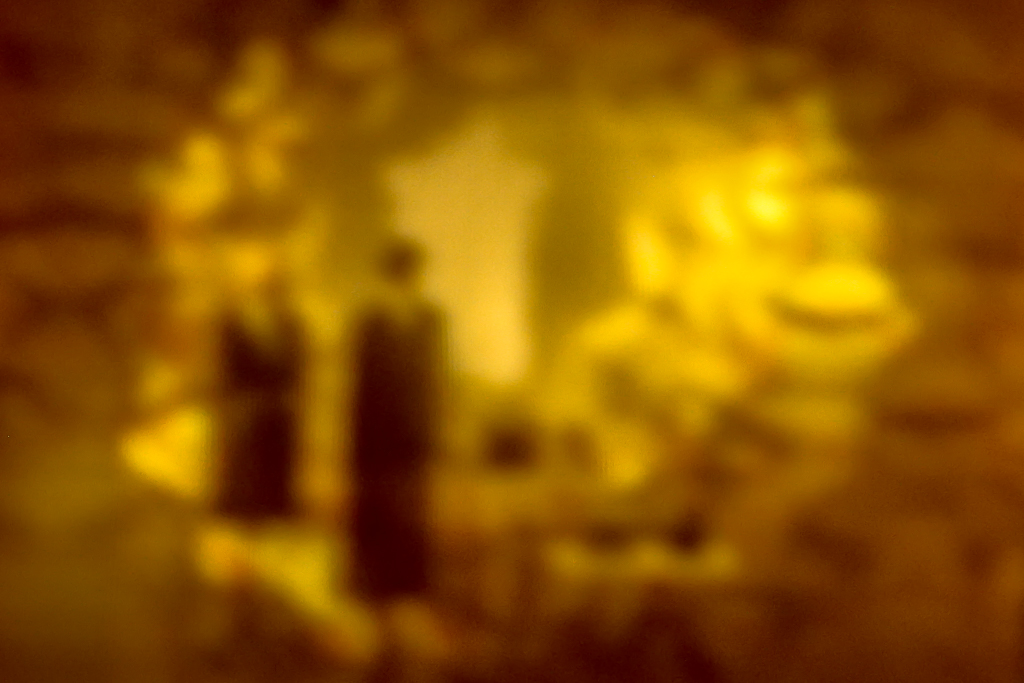
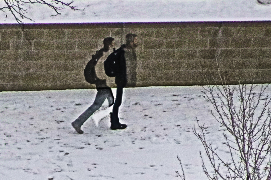
This is a wonderful story told subtilely in just the right colors. The suggestion rather than sharp focus of two figures is powerful, and engages the viewer in the story-telling. I can almost see their expressions. I love it! The only tweak I would try is opening up the crop a bit to extend the space on the right and top. |
Aug 6th |
| 79 |
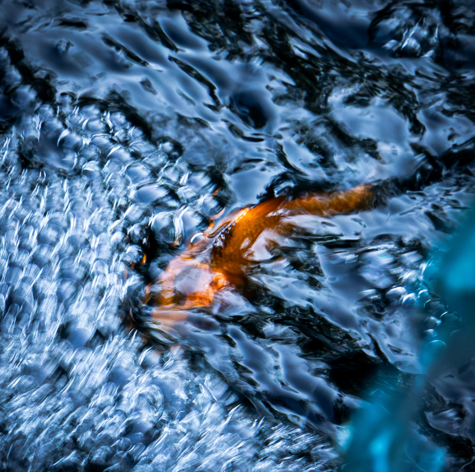
Aug 23 |
Comment |
This image captures the power of that water. How close were you to that site, and what lens did you use? The complexity of textures holds my attention, and my eyes roam the image. The harsh punch of the processed version contrasts with the with the foamy almost dreamy original. I like both. I might try backing off the sharpening a bit and restoring some of the white to the water. |
Aug 6th |
5 comments - 1 reply for Group 79
|
13 comments - 7 replies Total
|