|
| Group |
Round |
C/R |
Comment |
Date |
Image |
| 52 |
Jan 20 |
Reply |
Many thanks for your comments. Please see my reply to Mike for my attempt to address the comments. |
Jan 27th |
| 52 |
Jan 20 |
Reply |
Many thanks for your comments. Please see my reply to Mike for my attempt to address the comments. |
Jan 27th |
| 52 |
Jan 20 |
Reply |
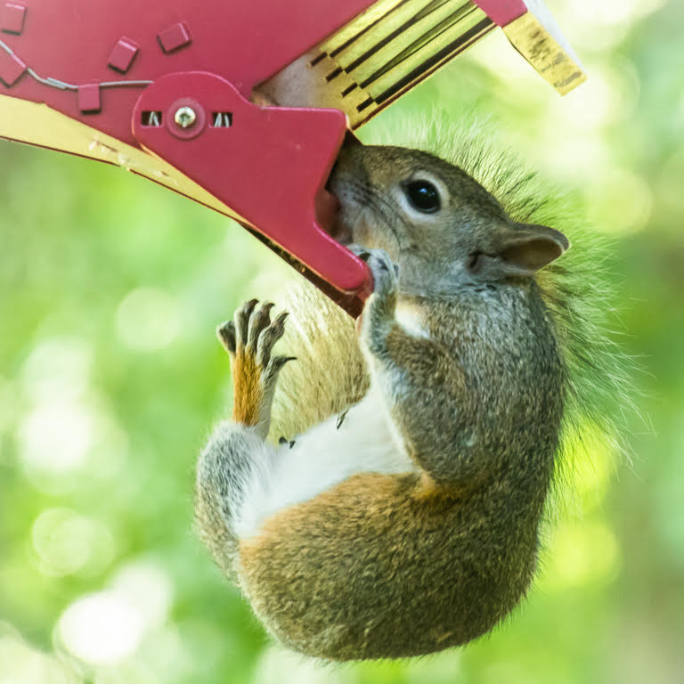
Thanks for the suggestion to employ the servo setting on my camera. I finally figured out that the reason it wasnt working was that I had the camera set to shoot raw. For servo on my Canon only JPEG will work. I now feel empowered. Of course I had to get a larger smart card. |
Jan 27th |
| 52 |
Jan 20 |
Reply |
Many thanks for your comments. Please see my reply to Mike for my attempt to address the comments. |
Jan 27th |
| 52 |
Jan 20 |
Reply |
Many thanks for your comments. Please see my reply to Mike for my attempt to address the comments. |
Jan 27th |
| 52 |
Jan 20 |
Reply |
Many thanks for your comments. Please see my reply to Mike for my attempt to address the comments. |
Jan 27th |
| 52 |
Jan 20 |
Reply |
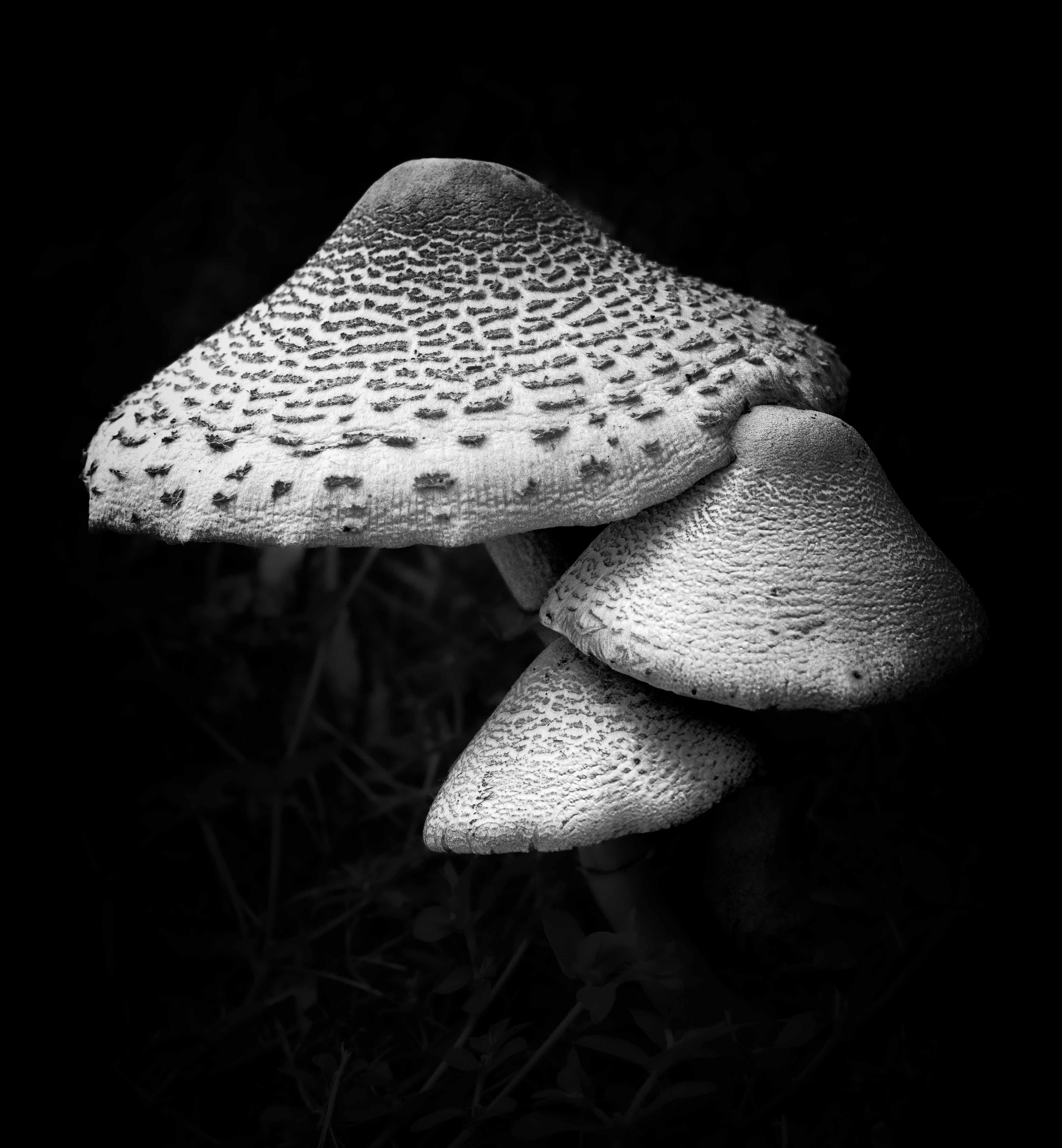
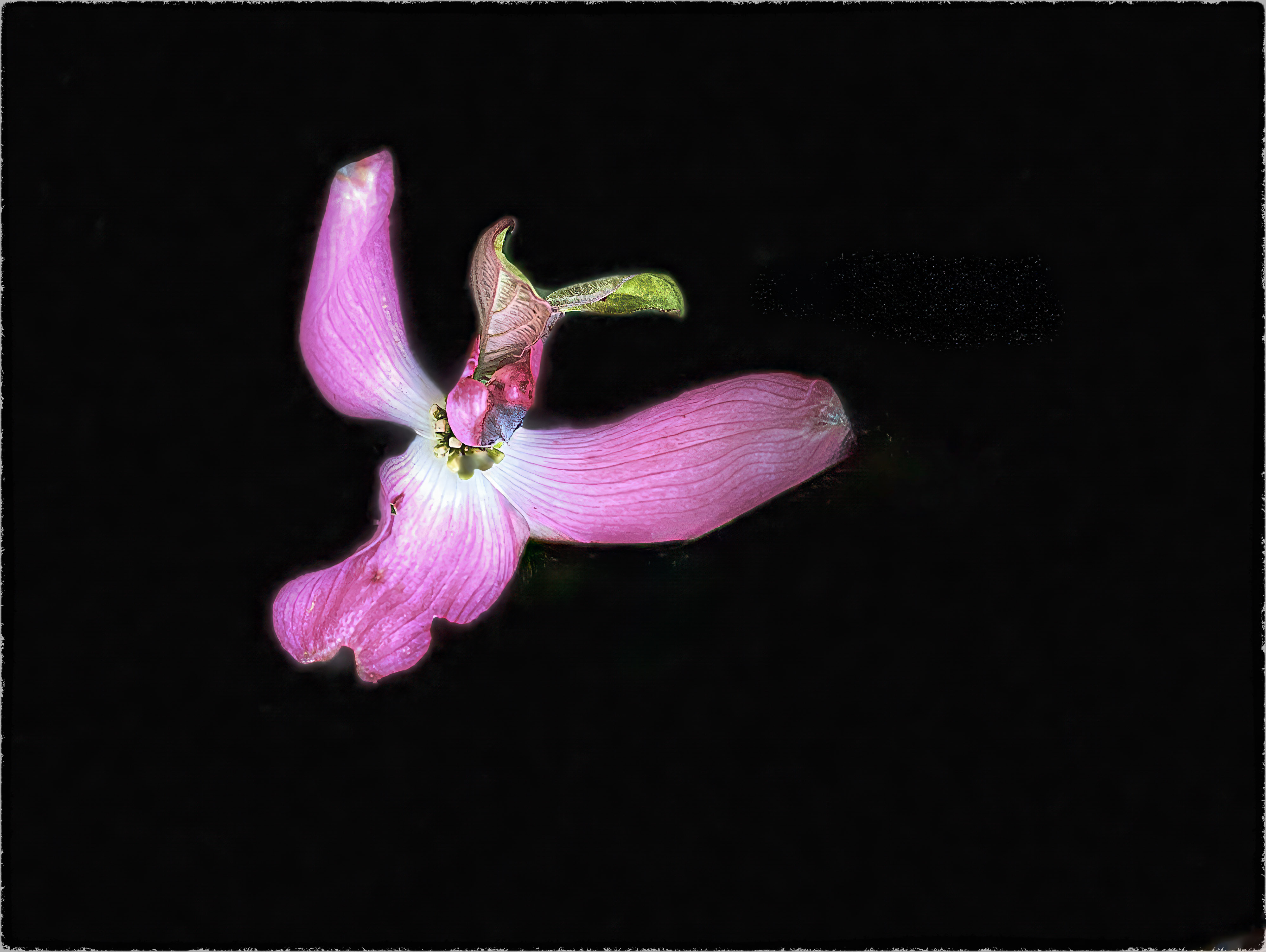
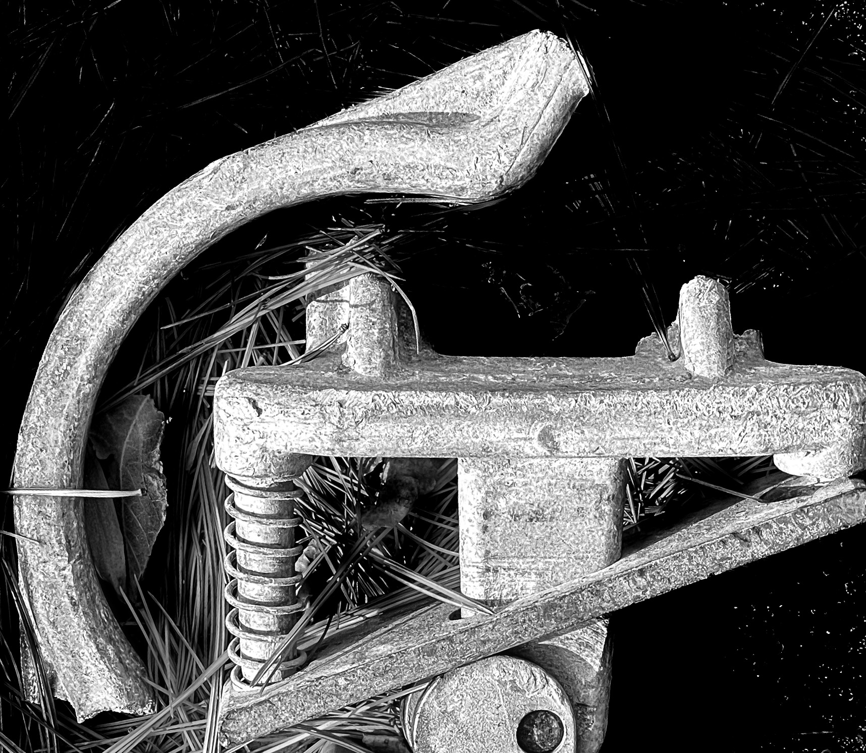
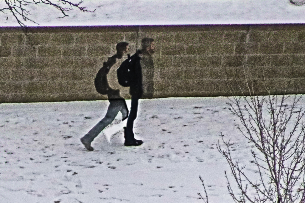
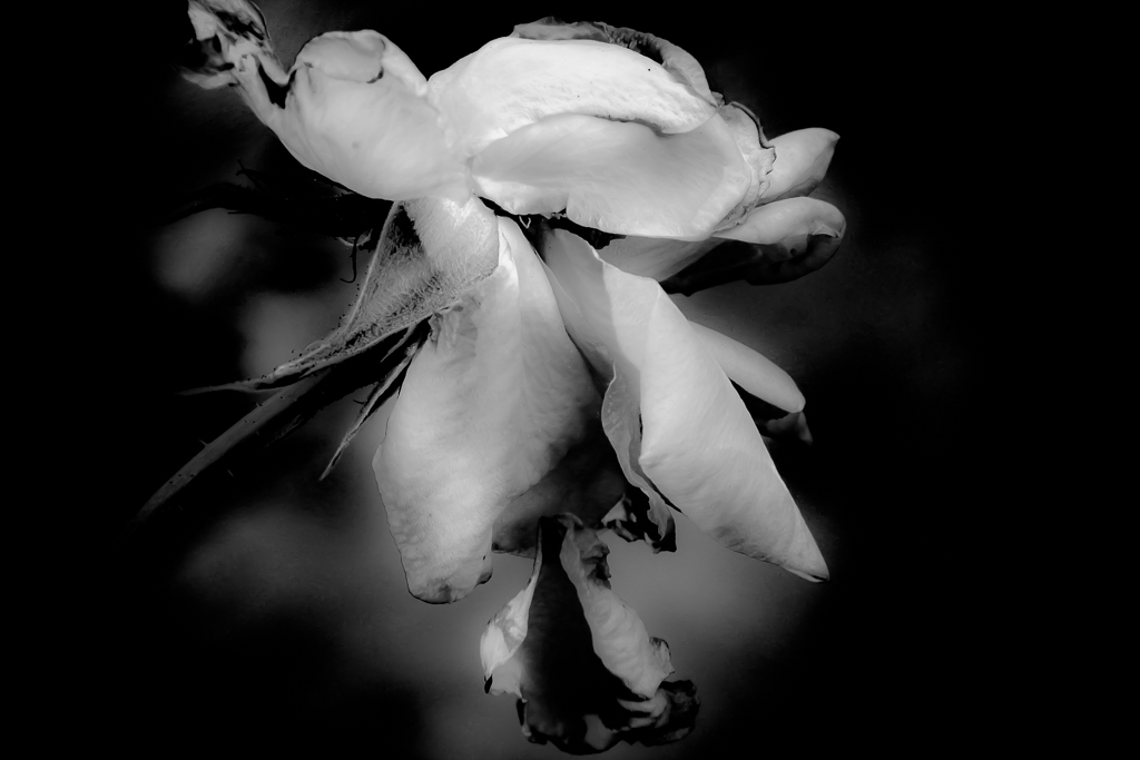
Thanks for the suggestions. I did attempt to learn some tools in photoshop, and apply them to my image. I still have MUCH to learn, but I am thrilled that I finally bit the bullet and dove into photoshop.
In the image below: 1) I selected large objects of distraction and then applied fill-content aware. Then 2) I attempted to clean it up with the clone stamp. I did all this with the pad on my laptop. I now realize that I must get one of those Wacom drawing pads to achieve more detailed results. Any advice would be welcome--and taken.
|
Jan 27th |
 |
| 52 |
Jan 20 |
Comment |
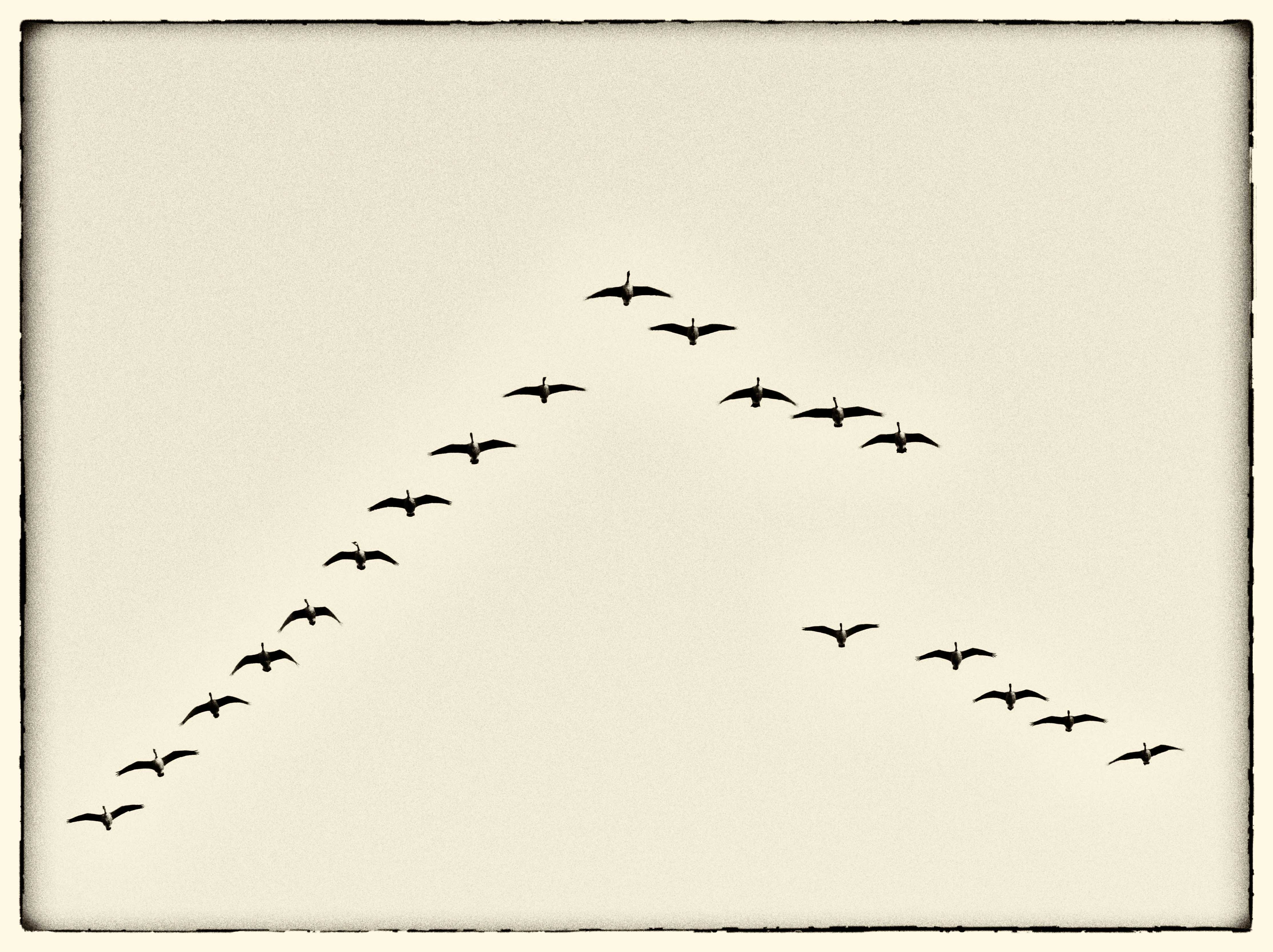
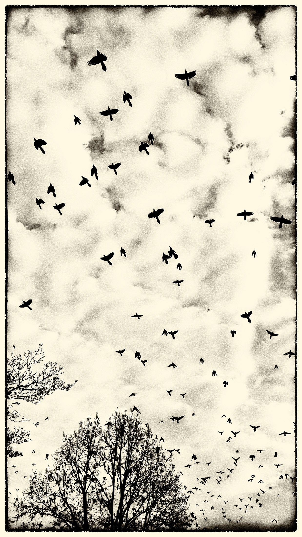
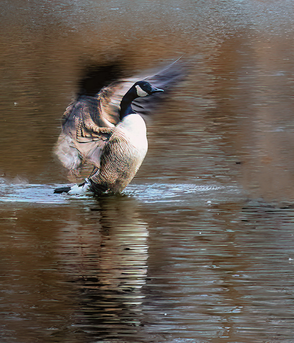
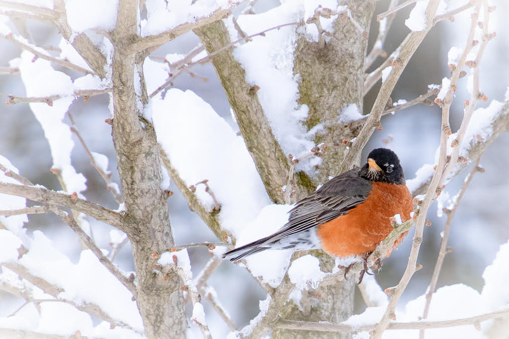
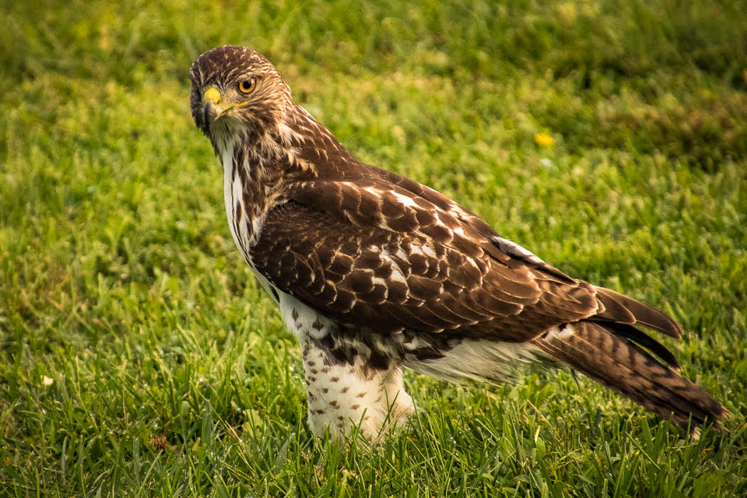
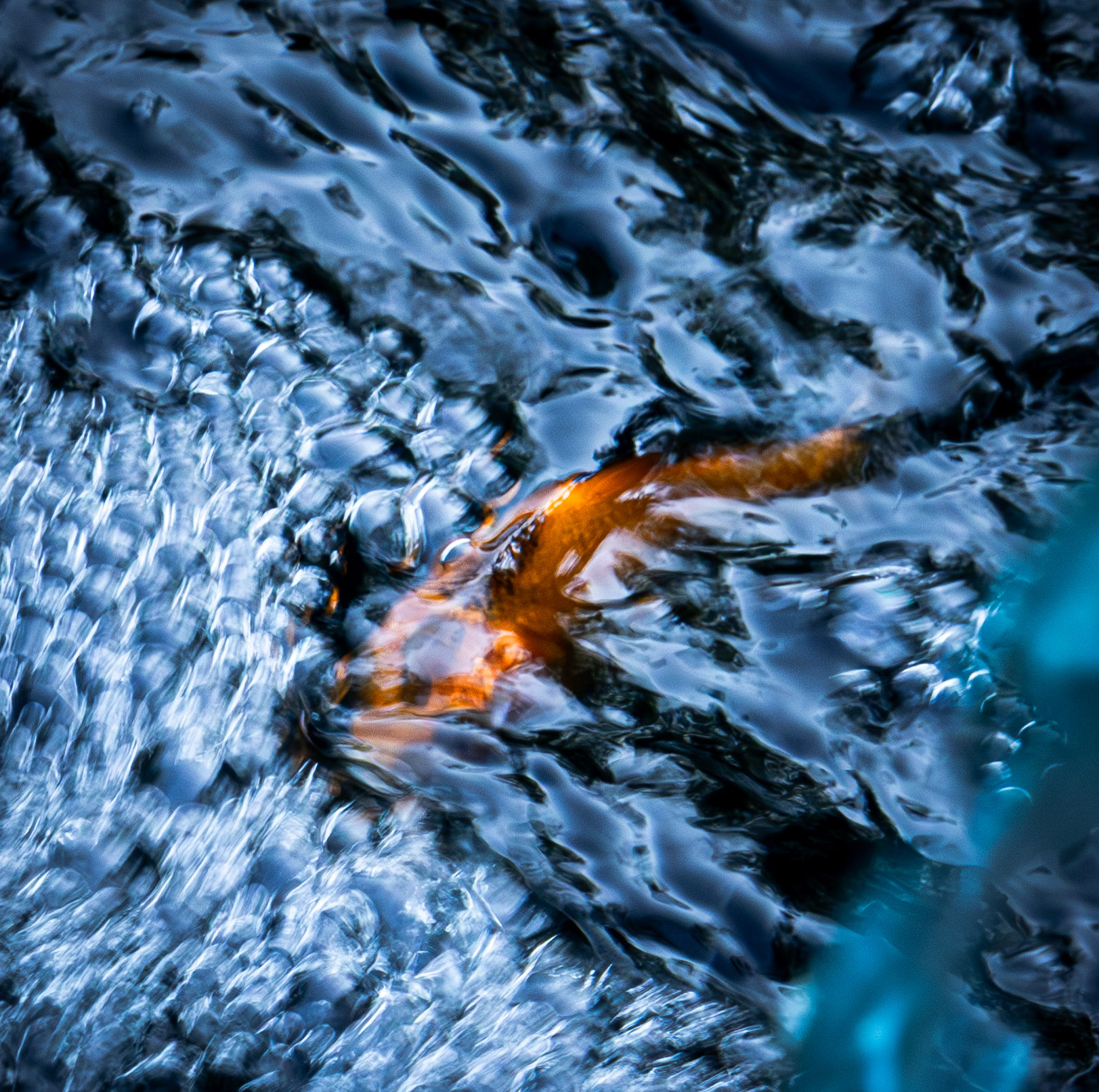
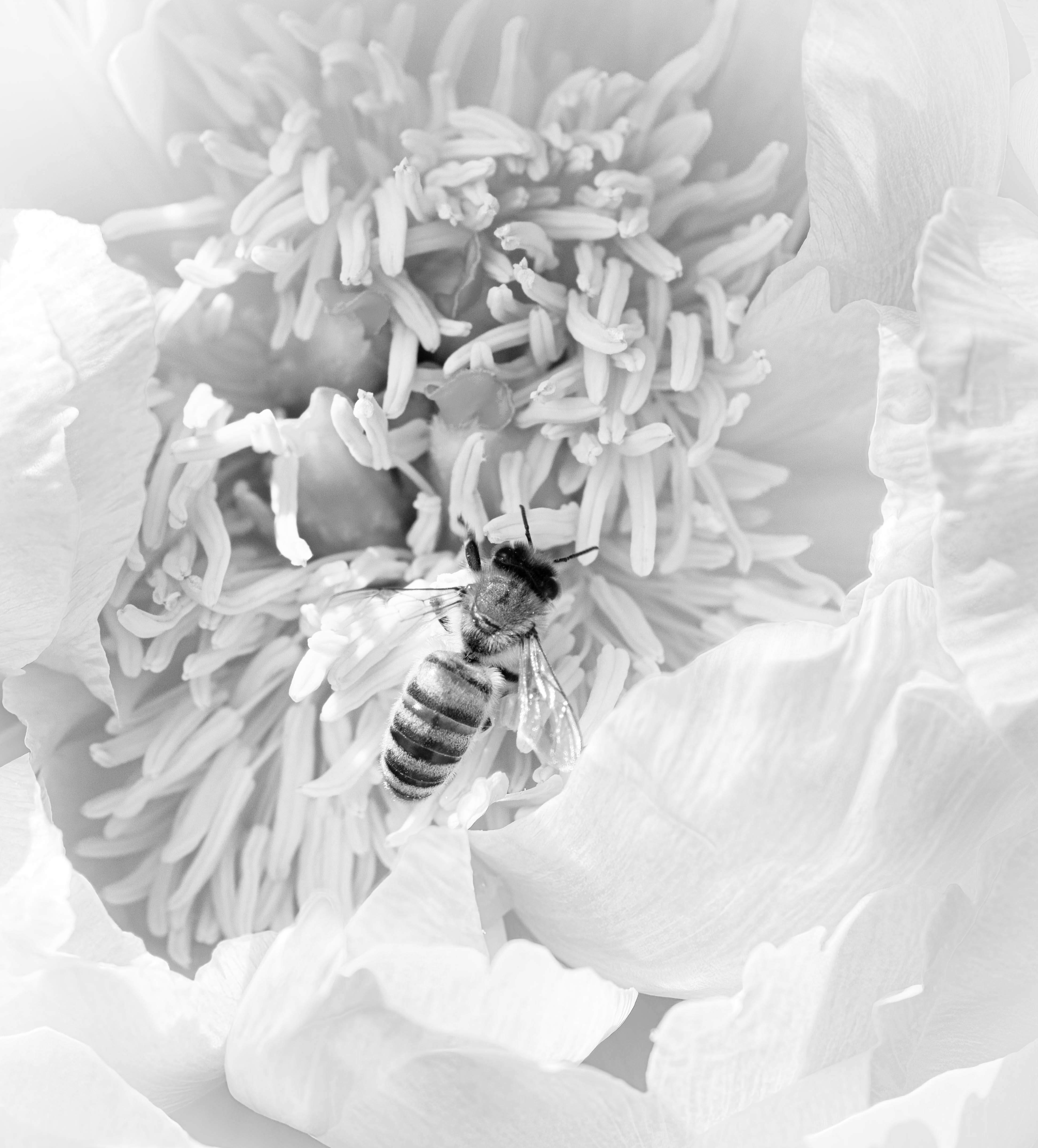
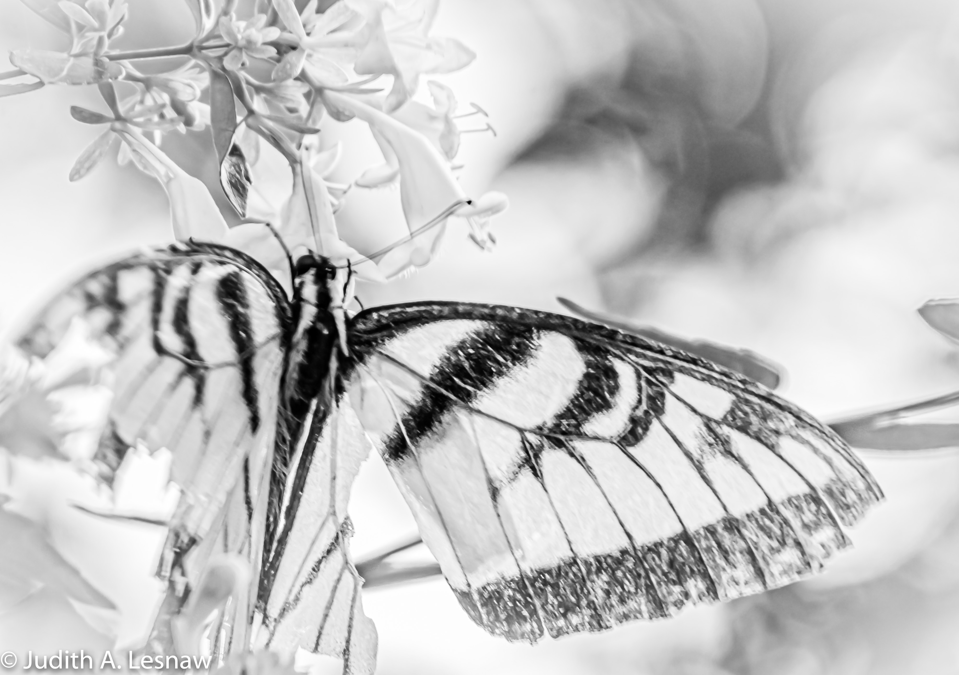
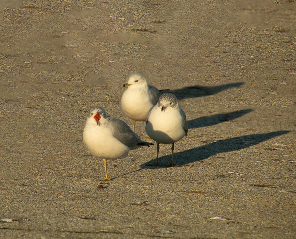
Amazing image. I did have to study the bird a bit before I realized that you had frozen a movement in the bird's landing choreography. The position of the bird's body, the graceful upward of the wing tip feathers, the downward-pointing head, the landing gear feet, and the overall detail are wonderful. The crop is perfect and provides negative space below the bird for the descent. The blurred and mottled blue/brown water provide an interesting background against which the orange in the beak and the pink feet attract my eyes. Where were you standing when you captured this image? |
Jan 22nd |
| 52 |
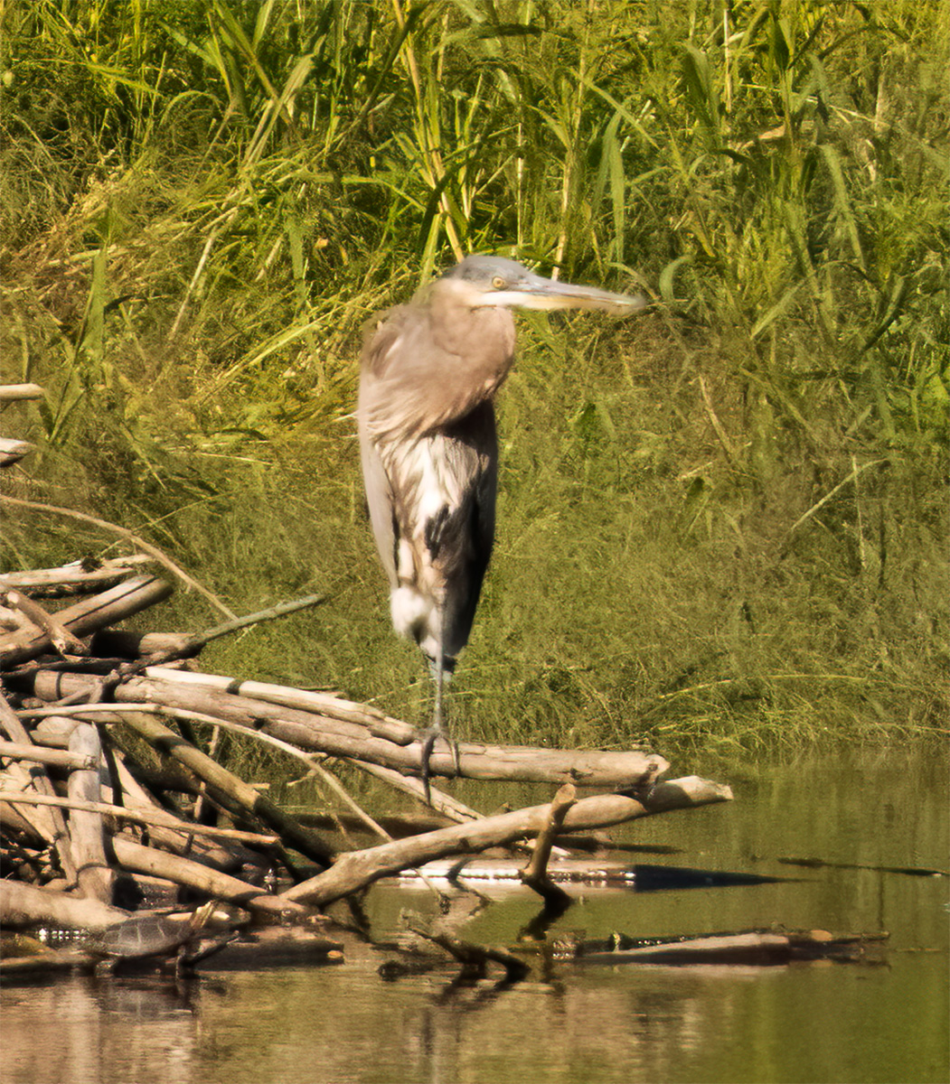
Jan 20 |
Comment |
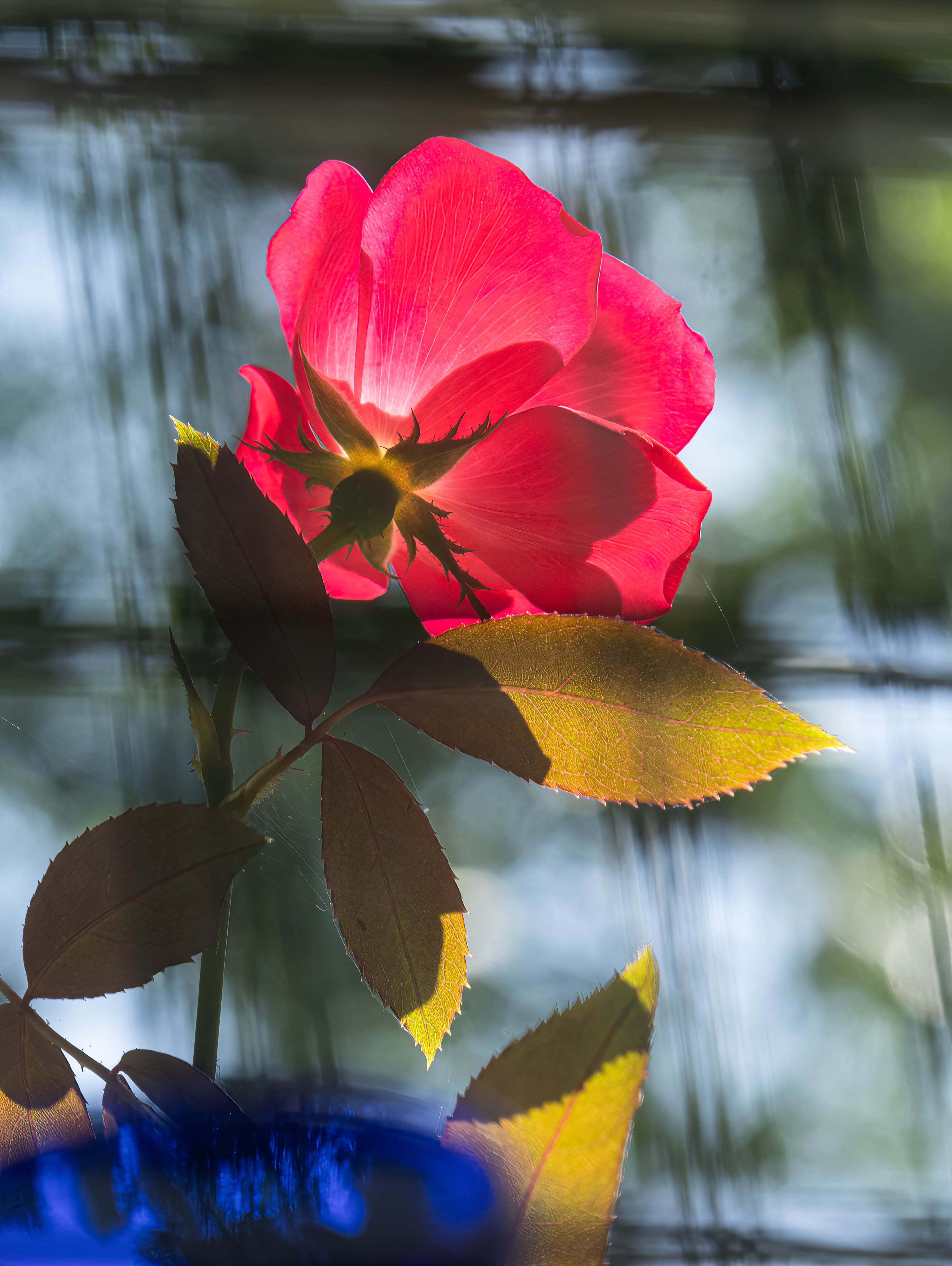
Great nature image. The detail on the bird and fish, and the eyes is wonderful. I would try to bring out the eyes a bit more. The gleaming white of the egret really pops against the dark water, and I see the a hint of the blue/grey of the fish in that water. The curves of the bird and fish take my eyes up and over the bird's head and down the beak and fish right into the rippled water. The fish tail points to some ripples that appear to be reddish. Perhaps lightening the water slightly would bring this out without sacrificing the pop of the bird. This adjustment would also make more apparent that dark leg of which others have spoken. |
Jan 22nd |
| 52 |
Jan 20 |
Comment |
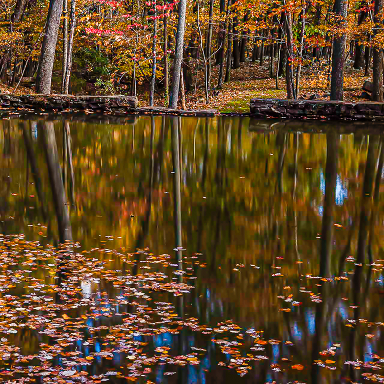
Great capture of the shapes and colors of early winter. The blue-beigh color combination is always pleasing to my eye, and the white clouds and trees really pop. Of the versions you have posted I prefer the last one. The rolling water adds much to the scene's atmosphere,
and I prefer the ratios of the brown and blue zones that the increased water provides. Additionally, for me, the position of the brown zone of trees relative to the two blue zones in that version produces a stronger composition. |
Jan 22nd |
| 52 |
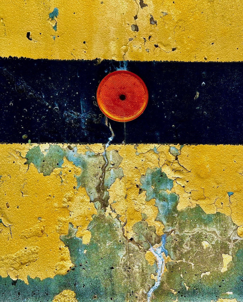
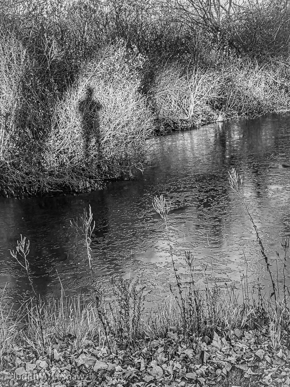
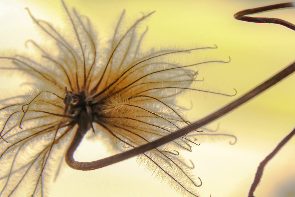
Jan 20 |
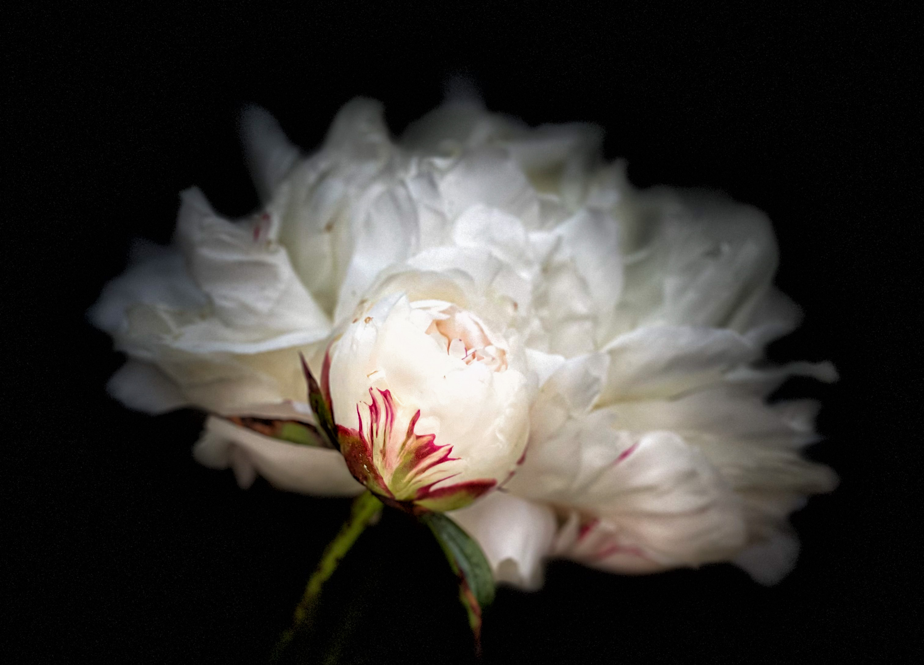
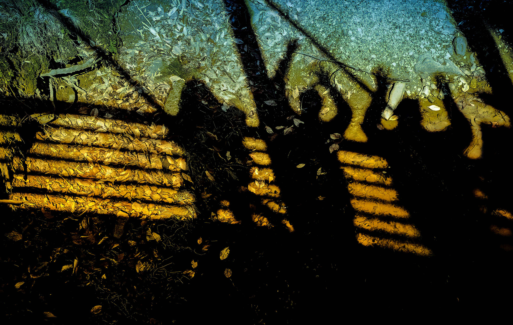
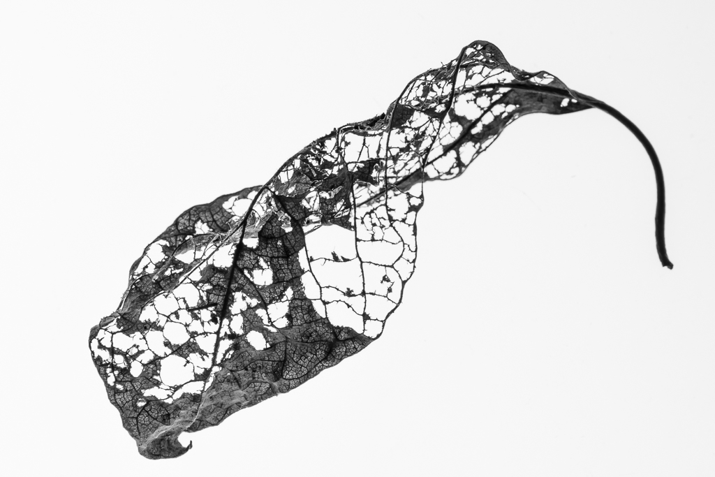
Comment |
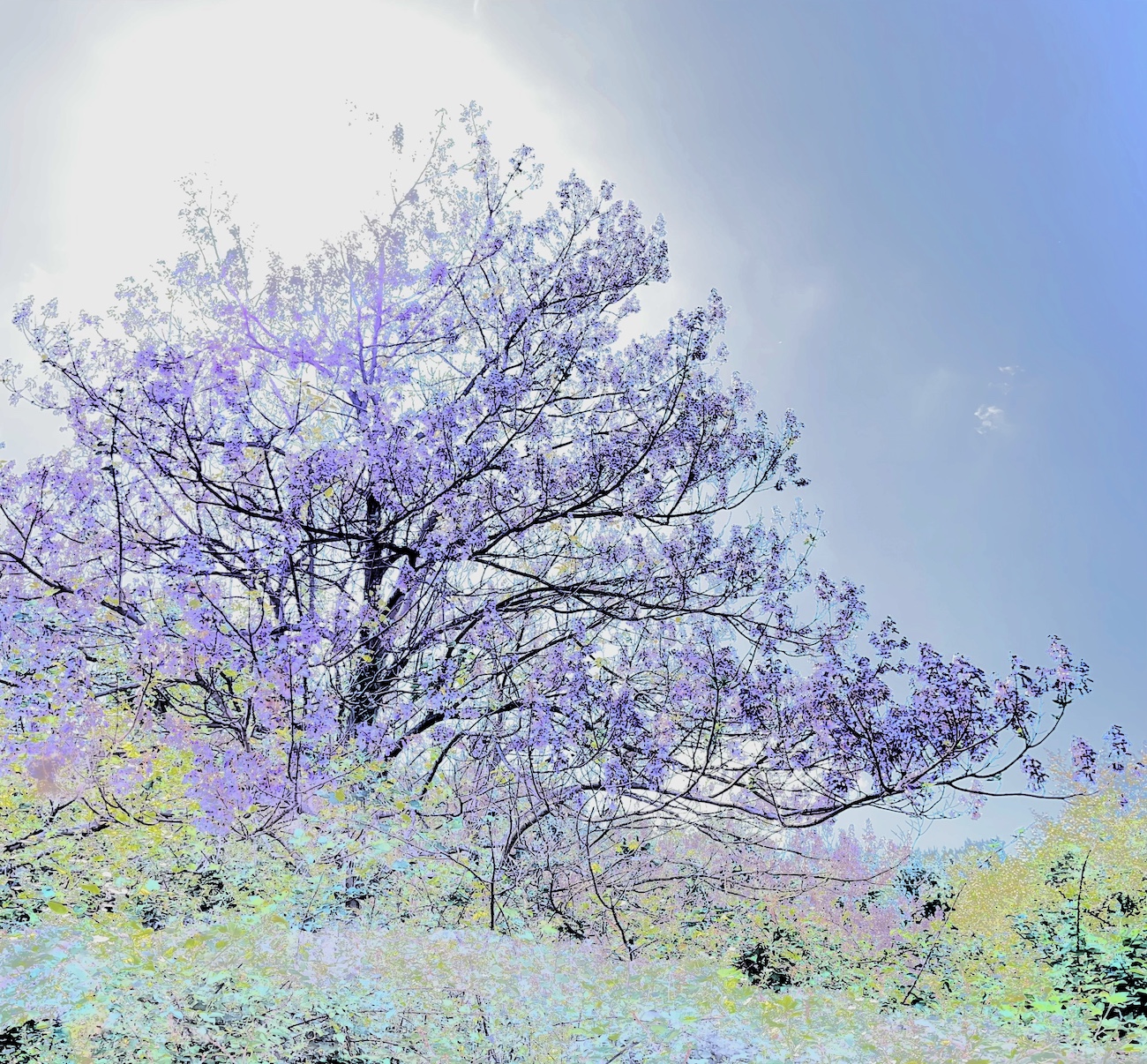
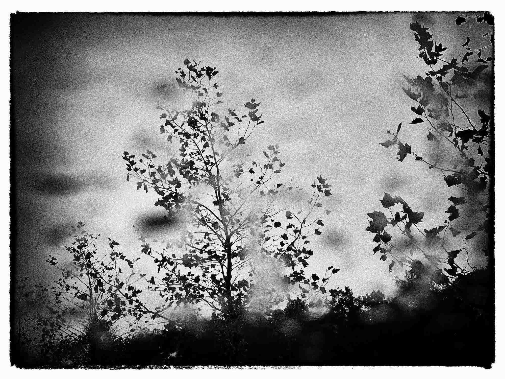
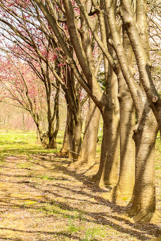
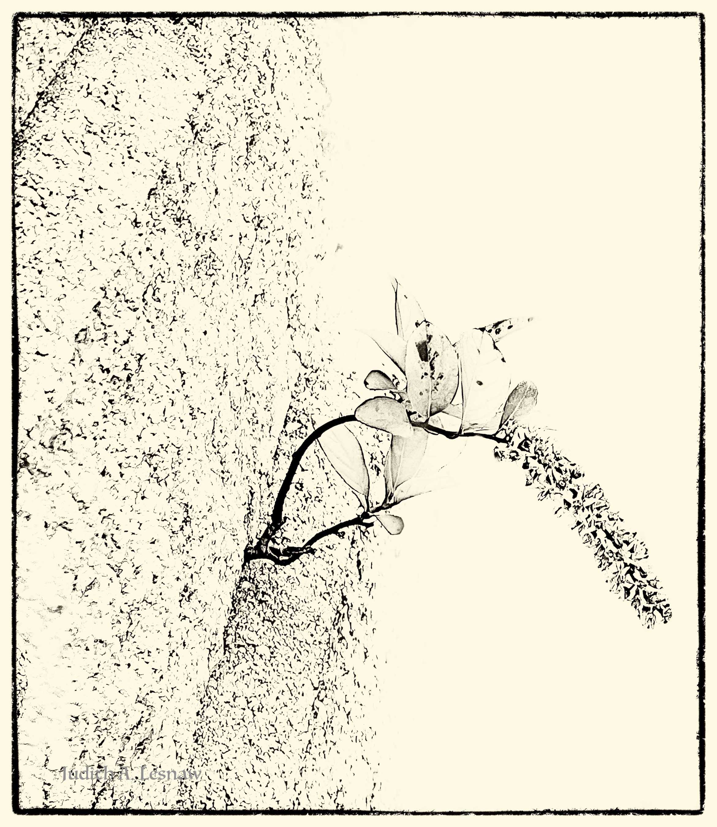
In looking at your image I sense a magical quality in this place. The original displays faint blue streaks that add much to to the affect. Most of these these streaks are lost in your crop. I tried a square crop that retained them. My eyes are now swept upwards, into the gap in the wall on the bank, and on into the leaf-strewn path. See what you think. |
Jan 22nd |
 |
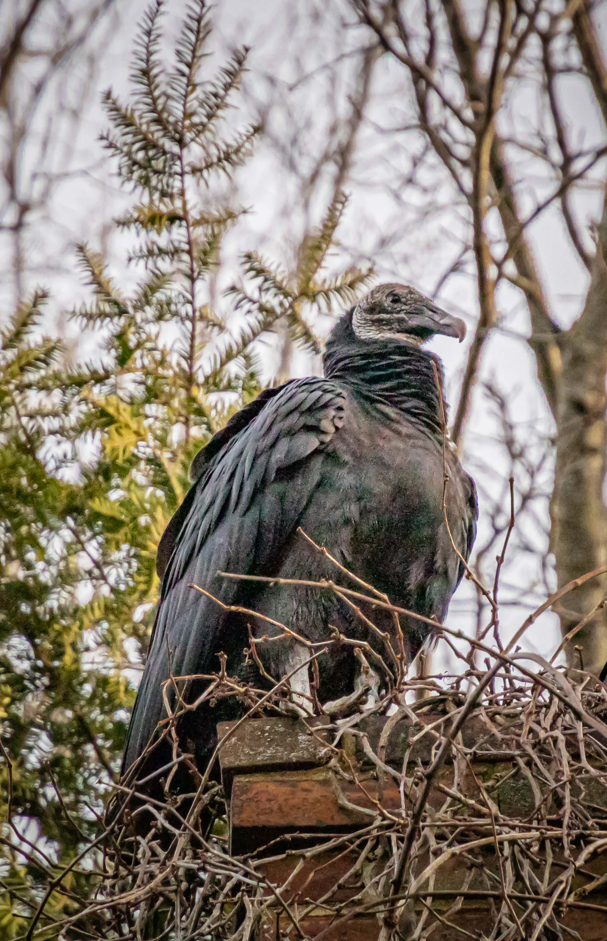
| 52 |
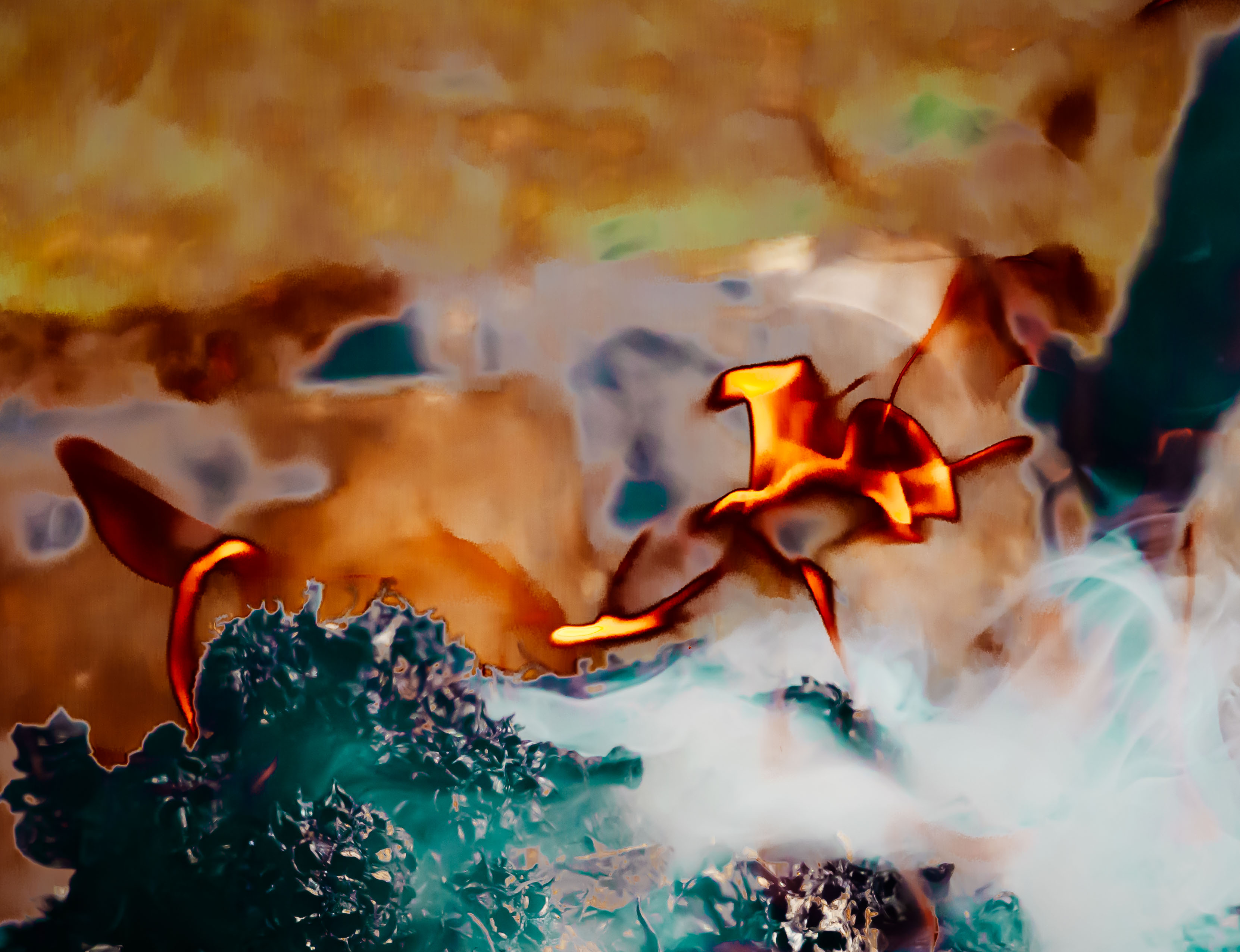
Jan 20 |
Comment |
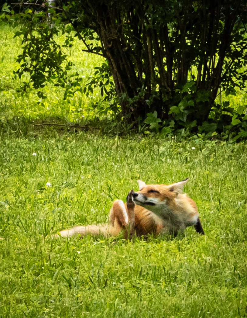
WOW! You have captured a powerful moment in nature. The composition is is wonderful: the curves of the bird's neck and snake's body, the opposing bird beak and snake mouth, the repetition of the snake's green in the background grasses, and that bird's eye. I believe that the background blur is sufficient; it is the brightness that is distracting. I would follow the suggestions others have made to tone it down. Welcome to our group. |
Jan 22nd |
| 52 |
Jan 20 |
Comment |
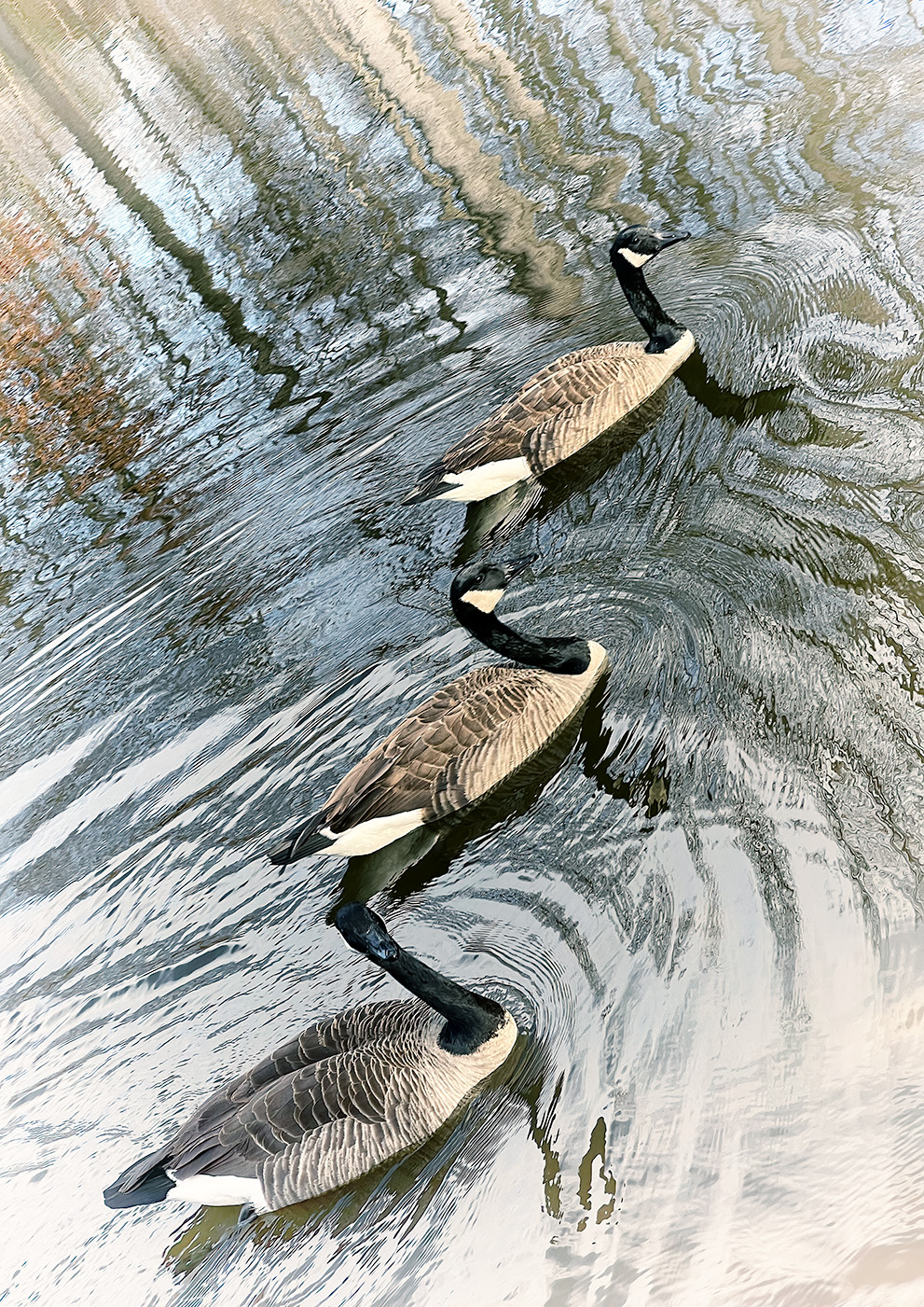
Sharon, your composition is wonderful. The crop works very well, and suggests that you are standing in the churning water. Where were you standing? Are those mountains in the upper right? The river draws my eye up the V in the trees. The detail in the rocks and lichens is lovely. The software you used in post processing is unfamiliar to me. I have much to learn. I agree that the edits you made in response to Pamela have made this great image even better. For me this image most certainly does pop, and has an unpredictable affect: the energy in that water generates a sense of peacefulness. |
Jan 22nd |
6 comments - 7 replies for Group 52
|
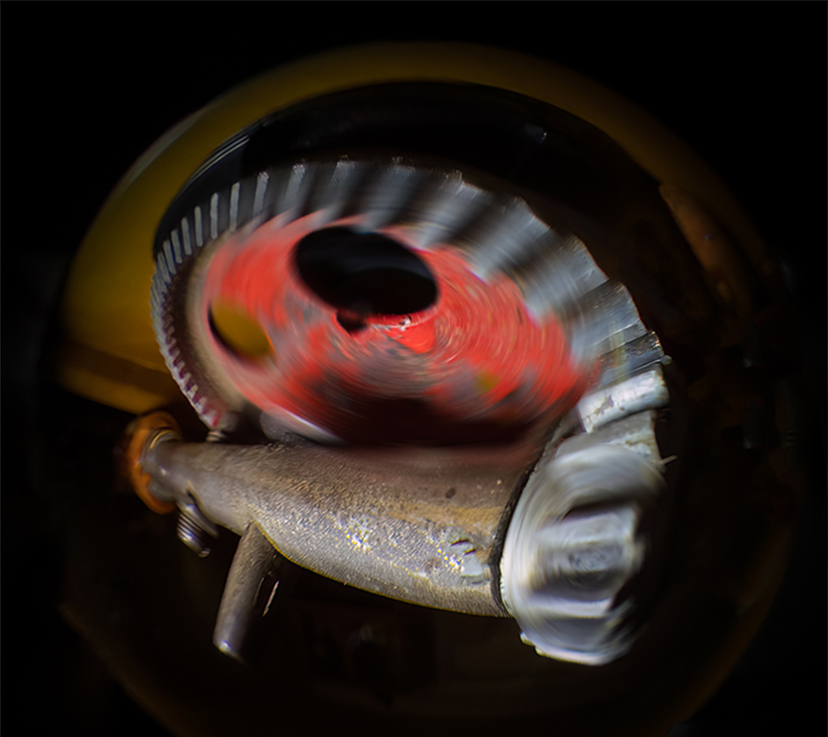
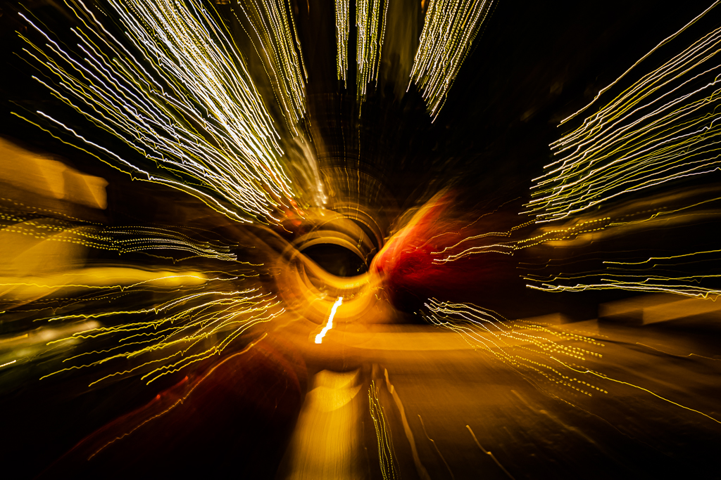
| 79 |
Jan 20 |
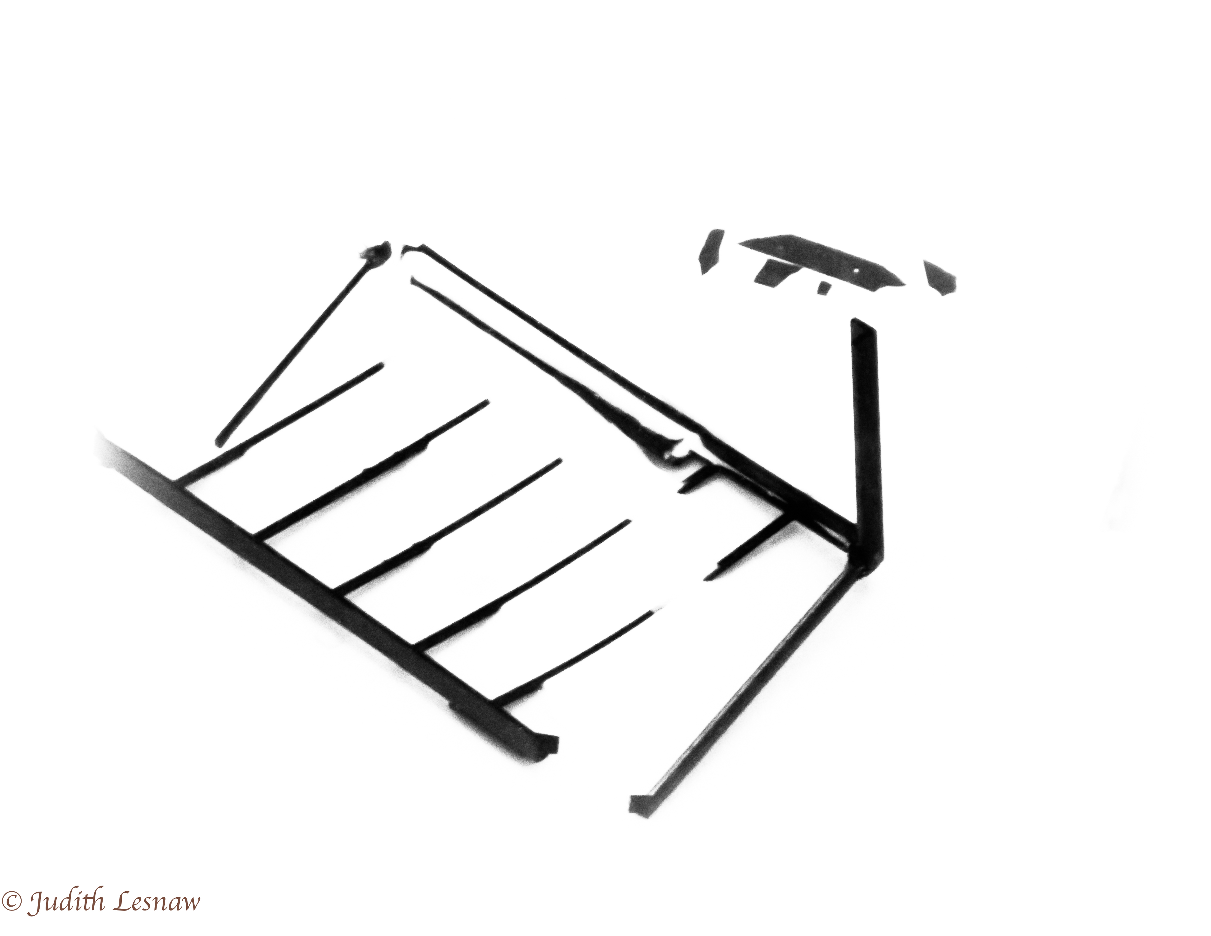
Comment |
May, this is a very interesting image. What were your camera settings? What lens did you use? How did you achieve the multiple images, long exposure, merging,? What was your artistic goal? |
Jan 9th |
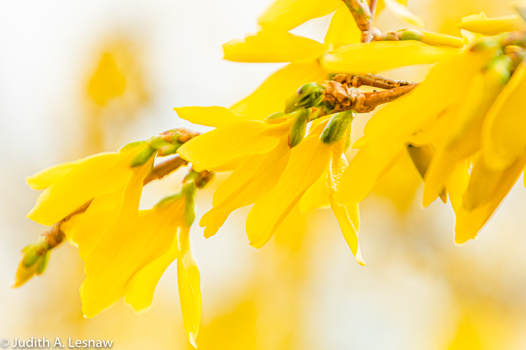
| 79 |
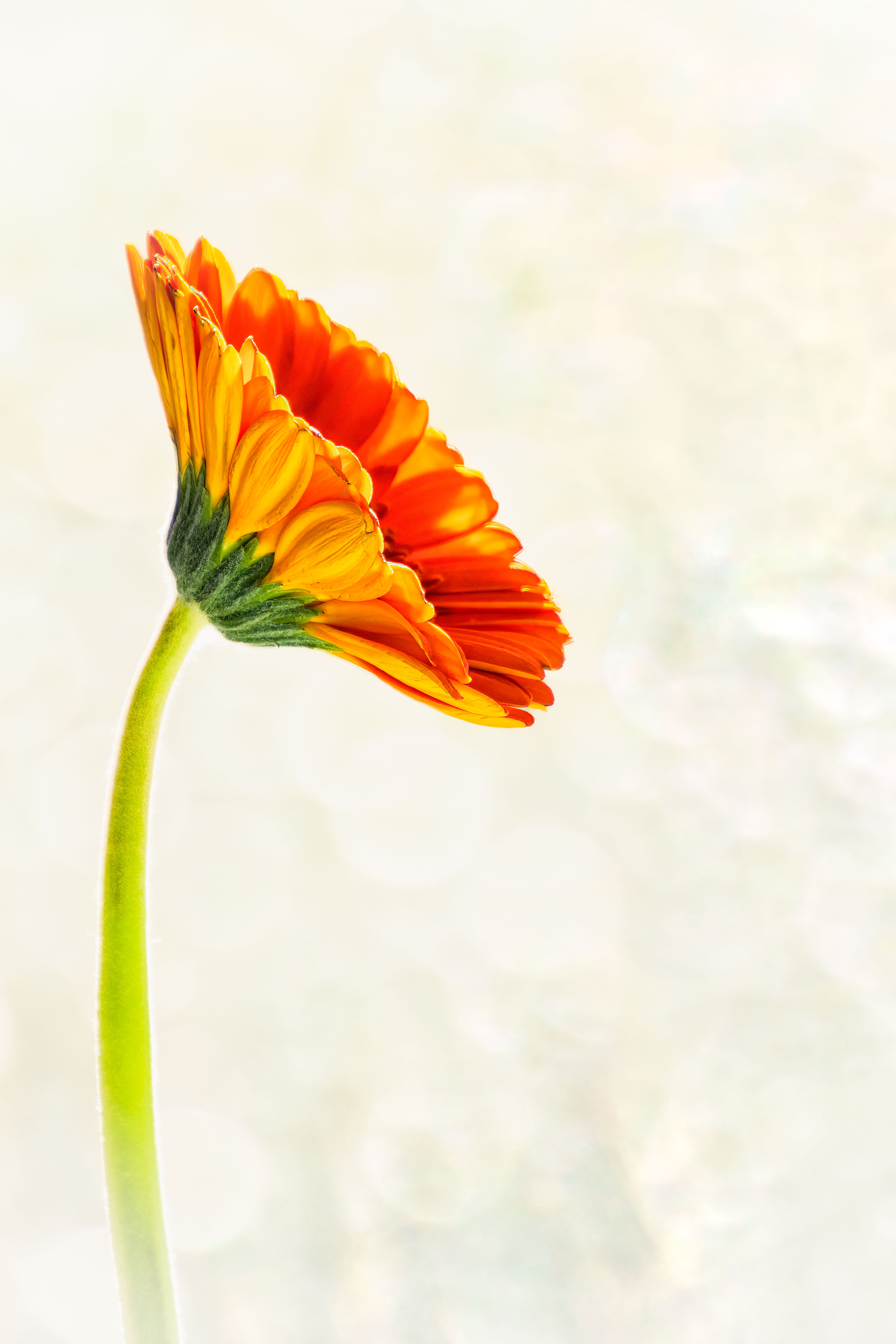
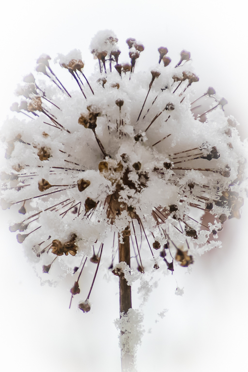
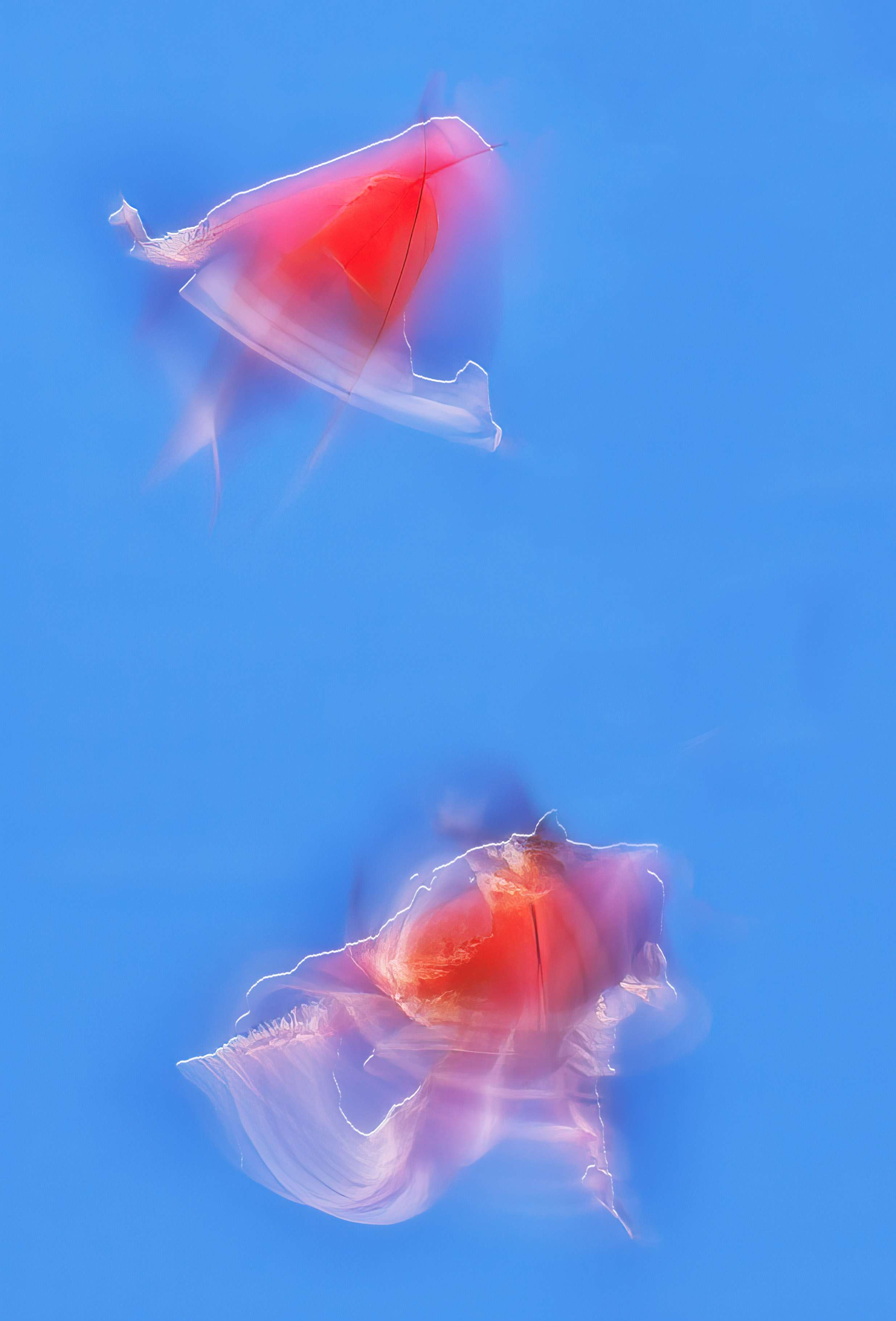
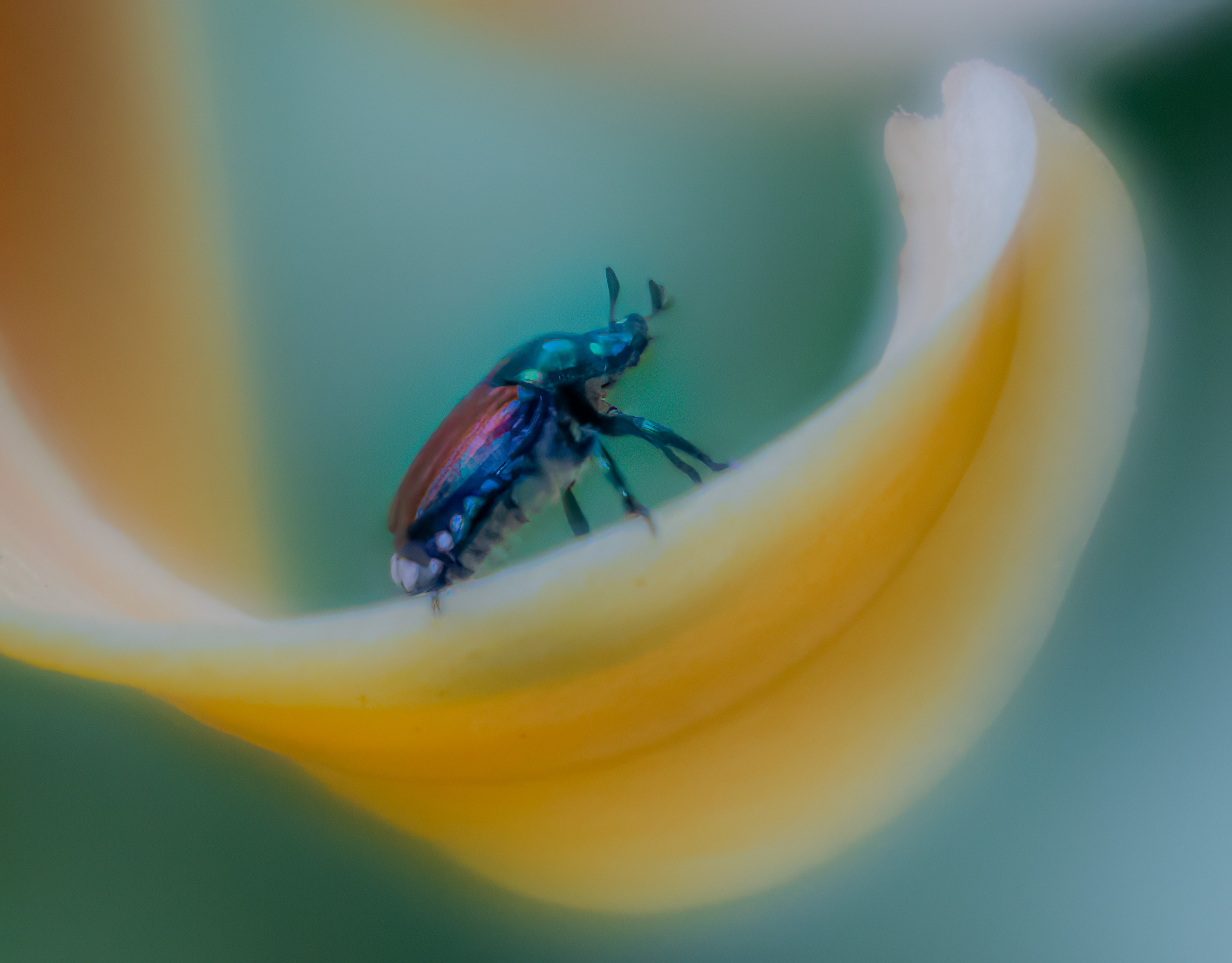
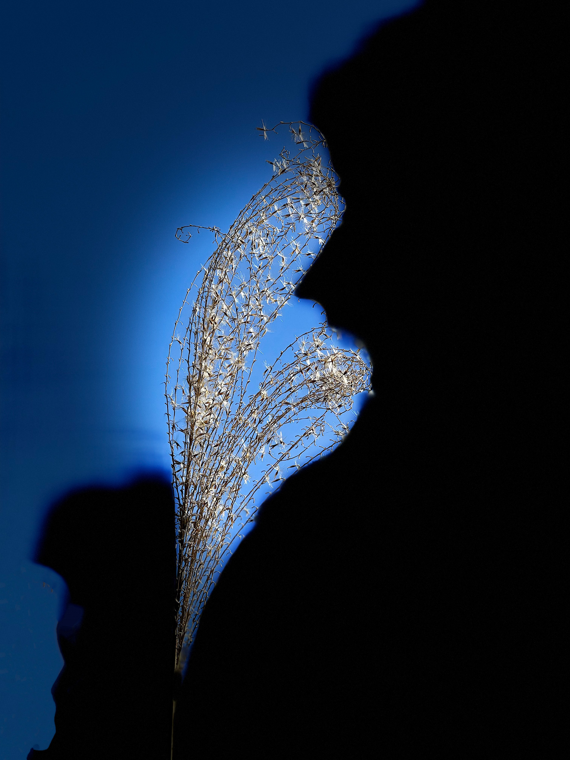
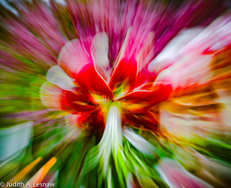
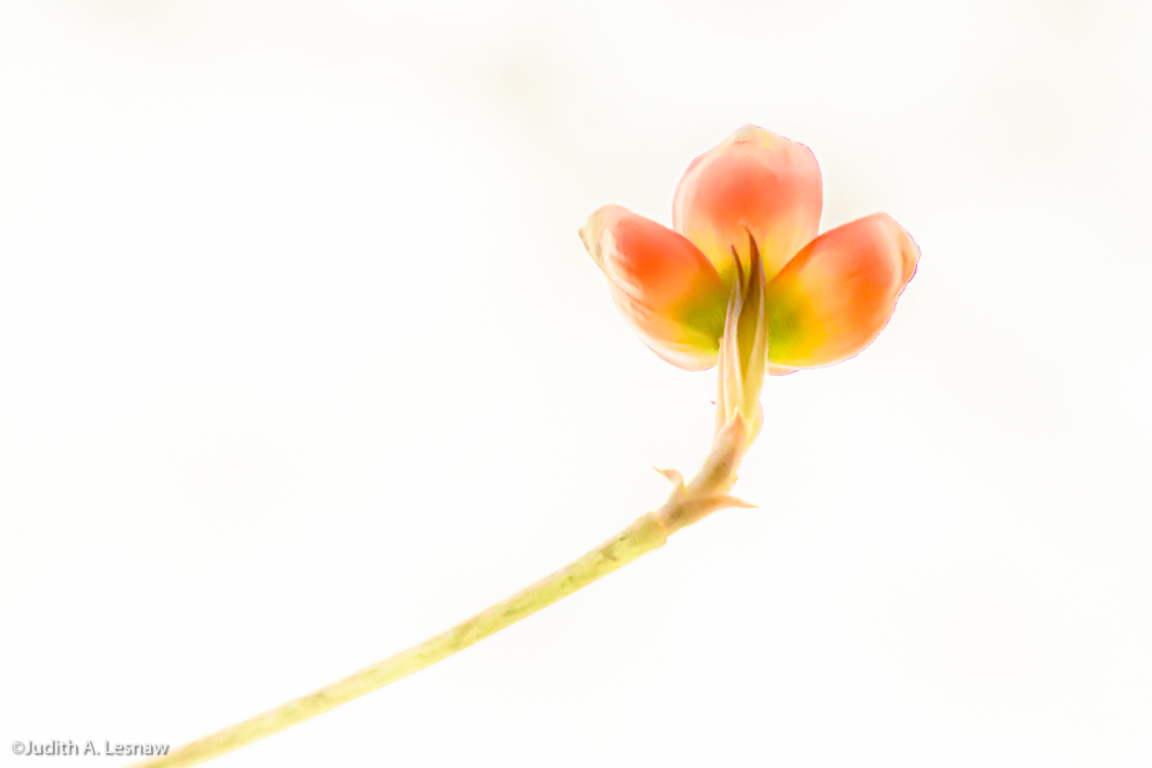
Jan 20 |
Comment |
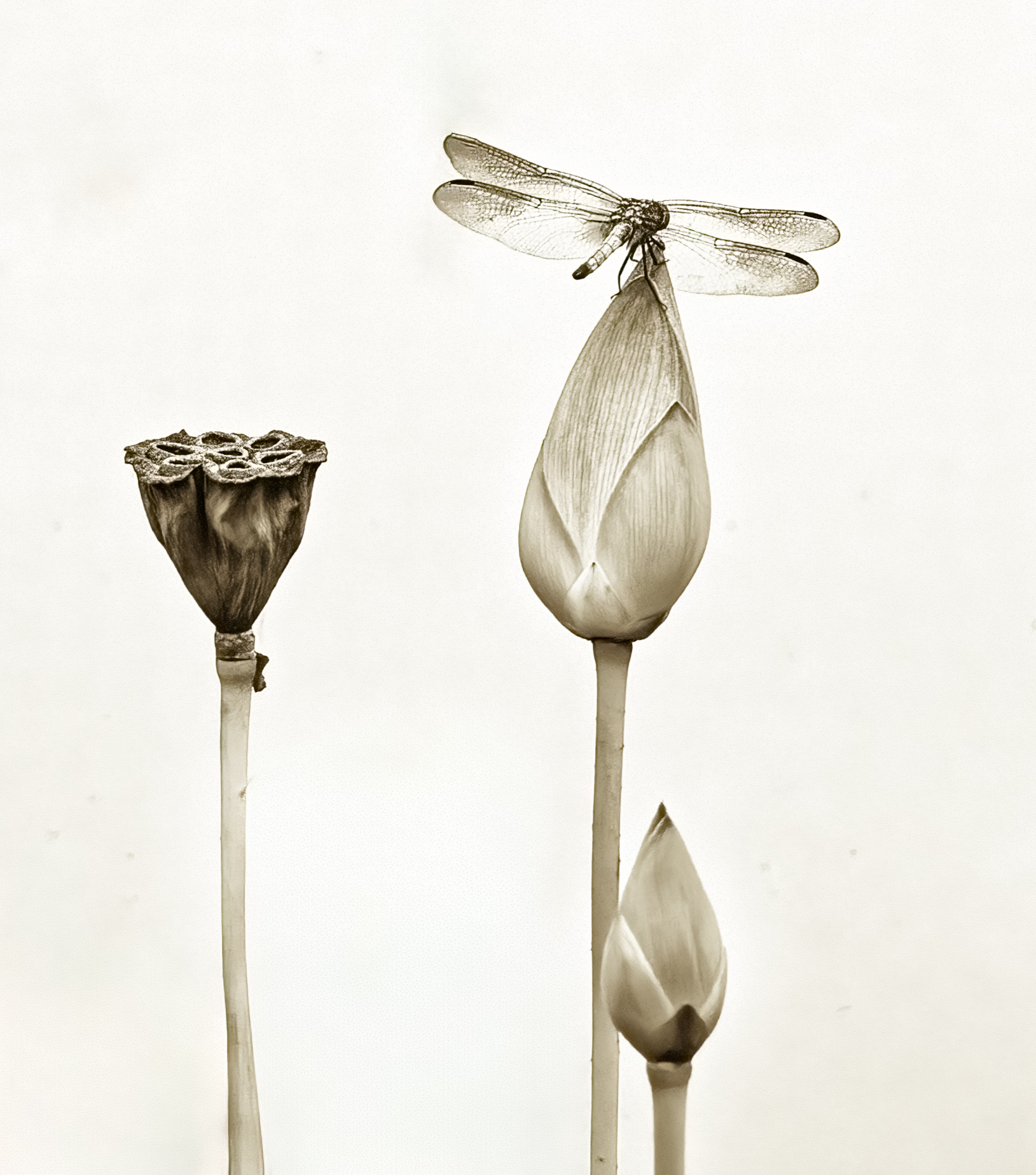
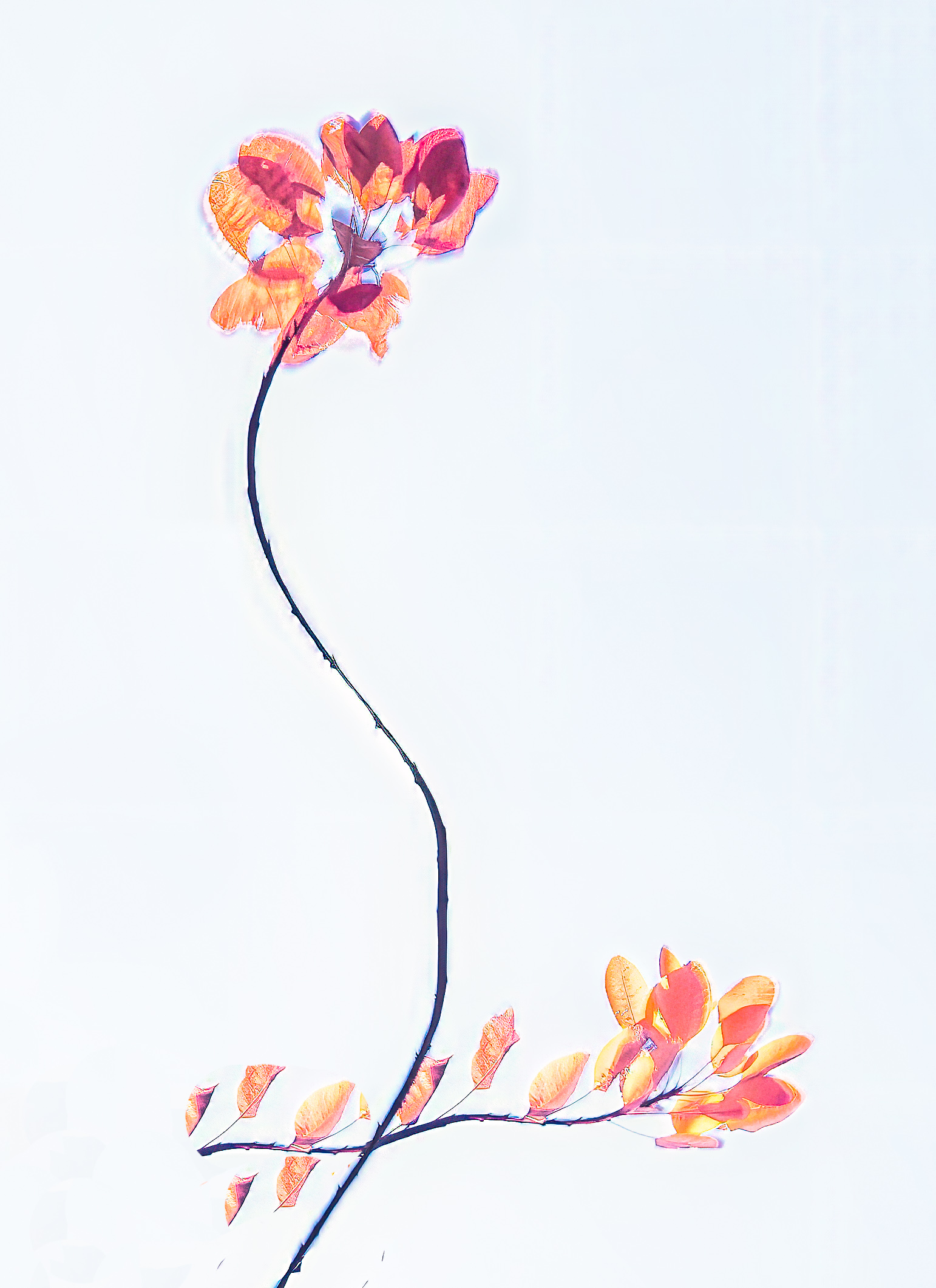
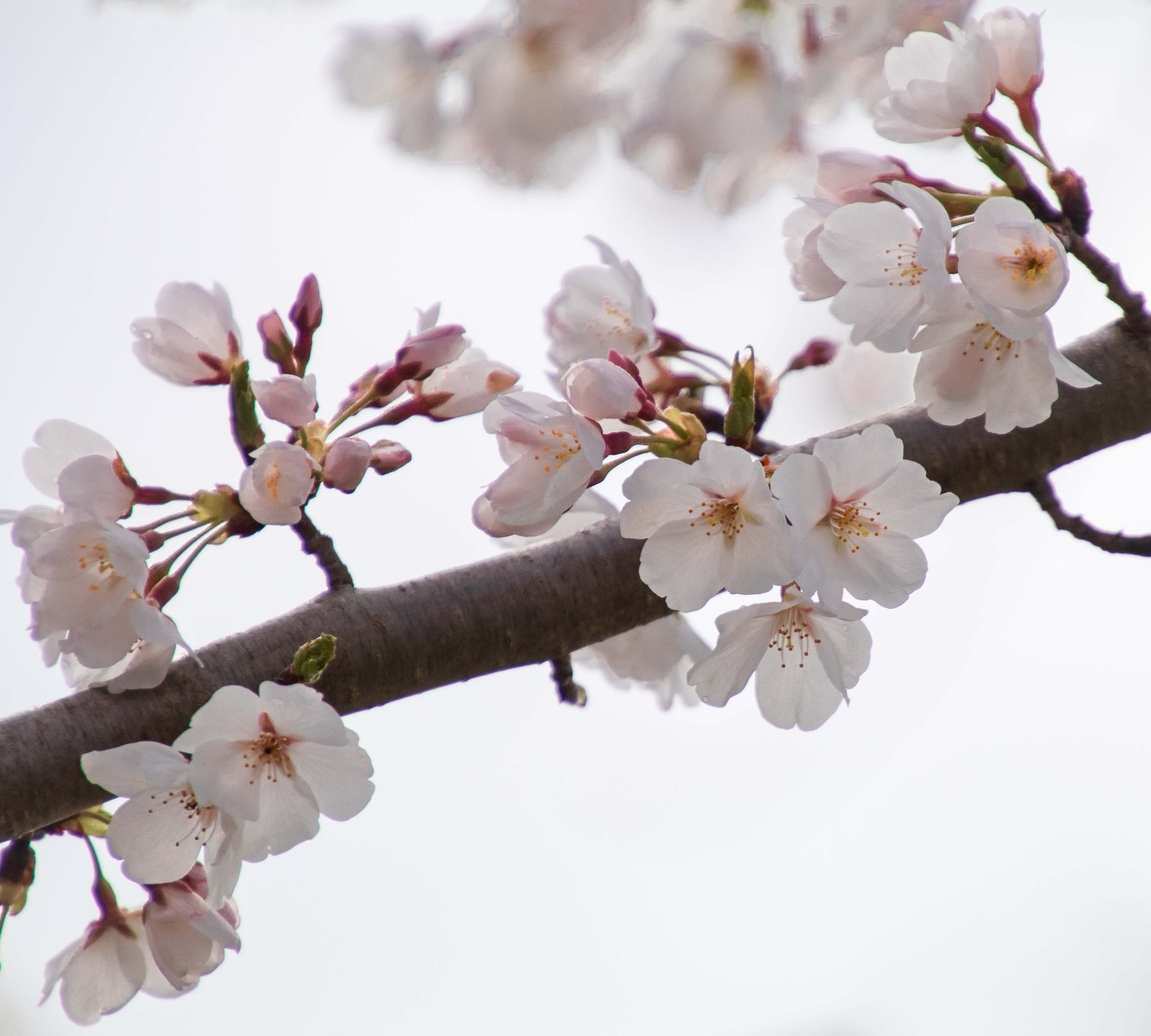
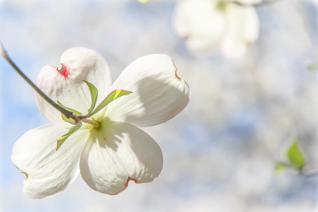
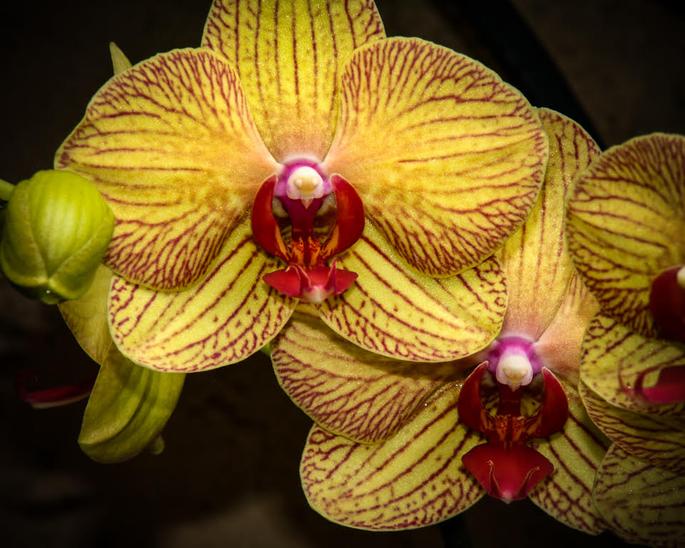
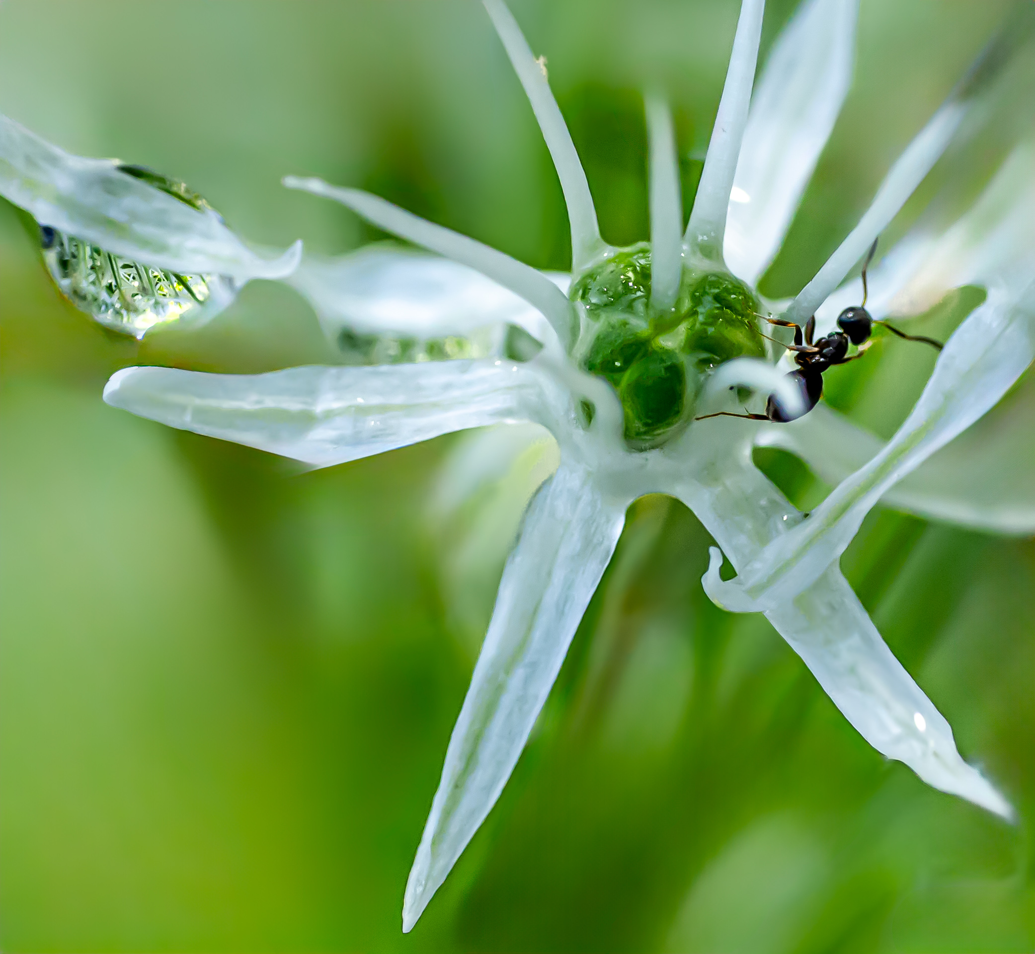
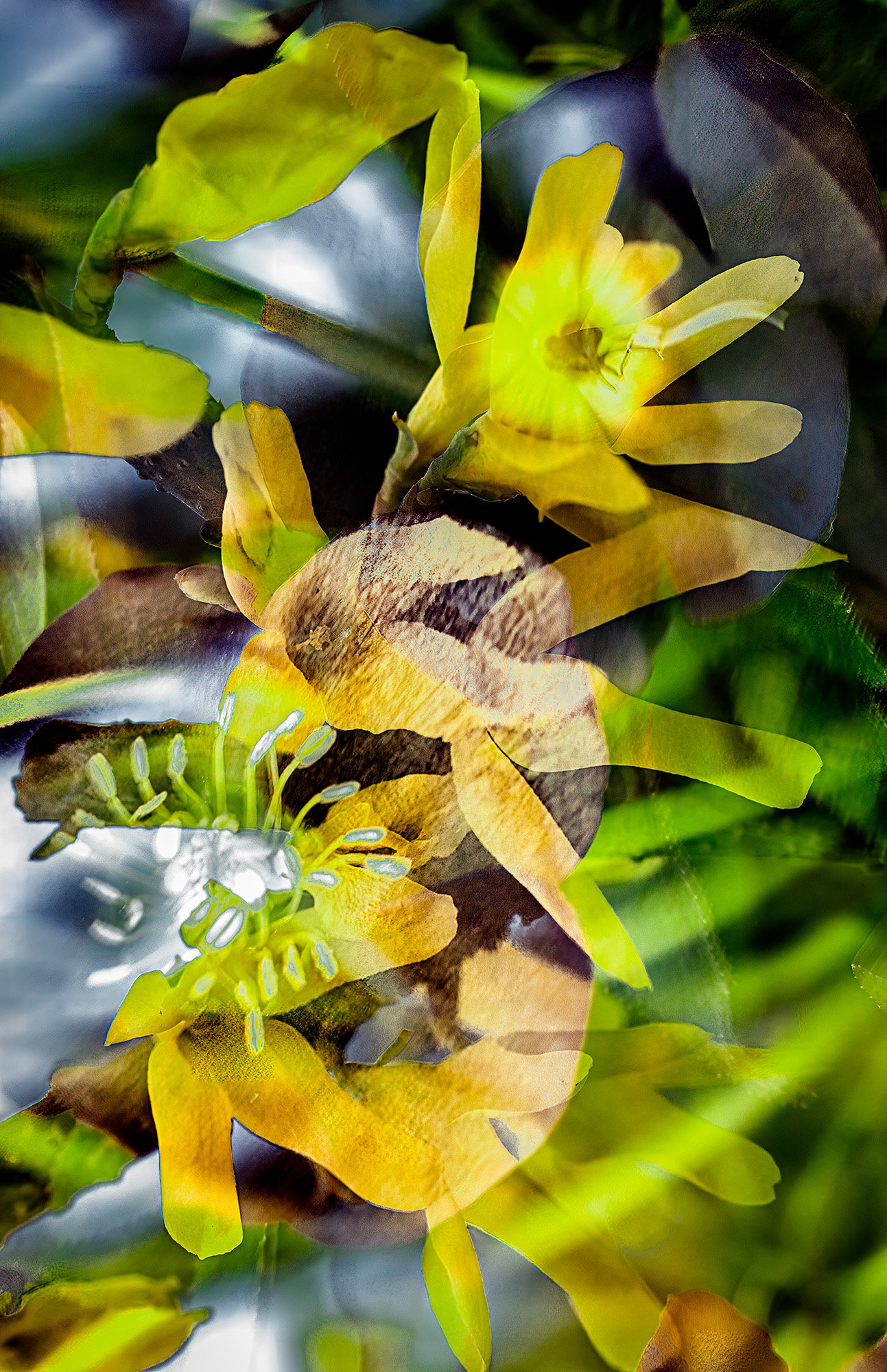
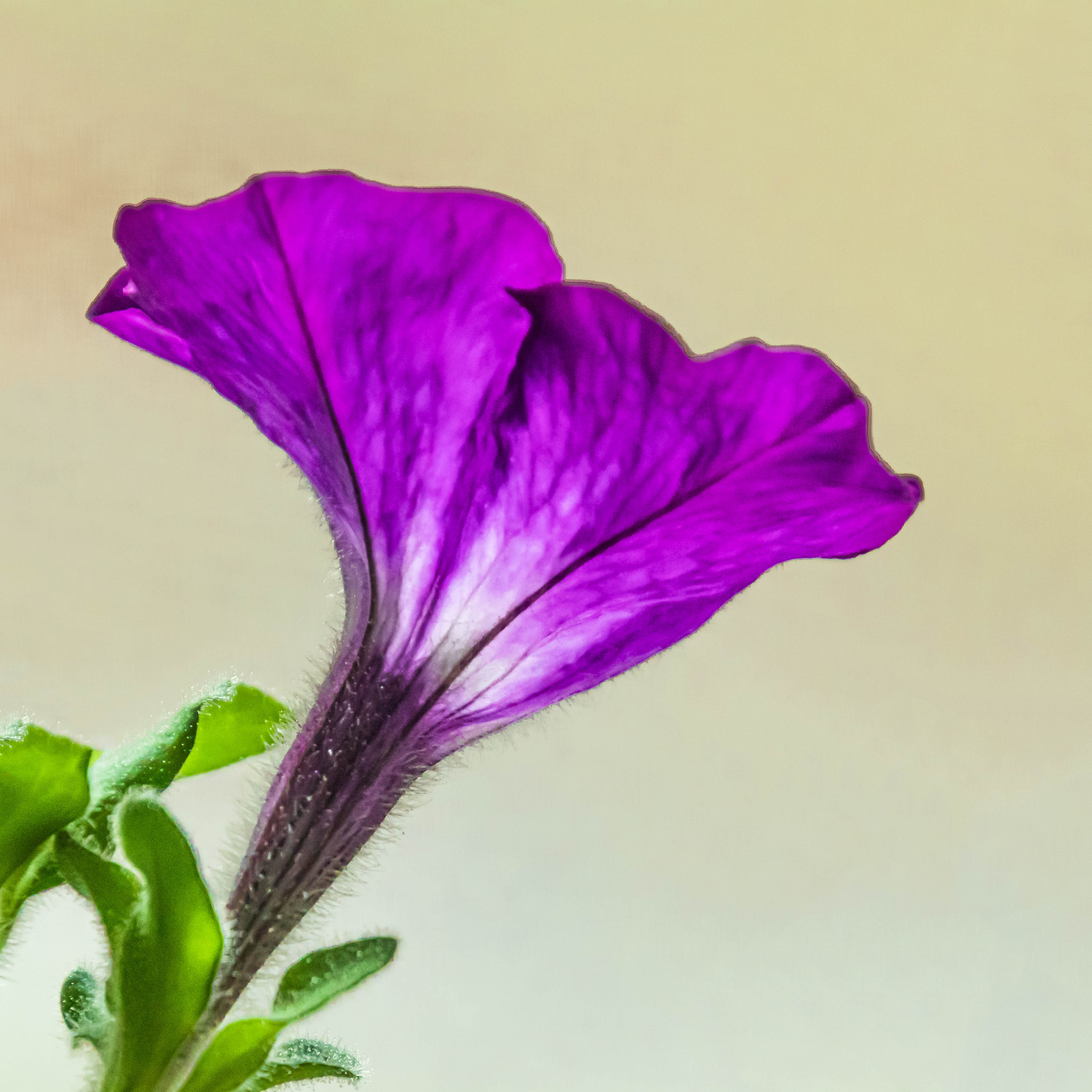
What a lovely way to brighten the winter! This is a wonderful high key image. The colors and texture of the flowers just pop against the white background. I feel distracted by the stems. I would mute them by lowering their vibrancy and saturation, or perhaps applying a haze. |
Jan 8th |
| 79 |
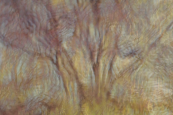
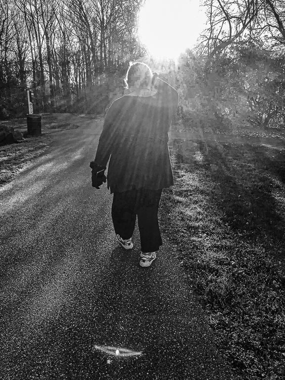
Jan 20 |
Comment |
Wonderful composition. You really captured the majesty and loneliness of this place. I get cold and exhausted and out of breath just imagining myself hiking there. The detail, contrast, and sky in the mono version are remarkable when compared to the original which looks very hazy. The edges of the mountains seem to have a halo. Is it the light, or could it be from processing? What lens did you use? I would love to see the print. |
Jan 8th |
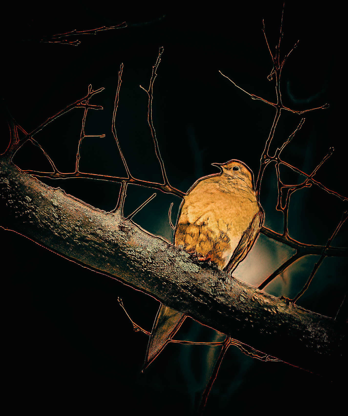
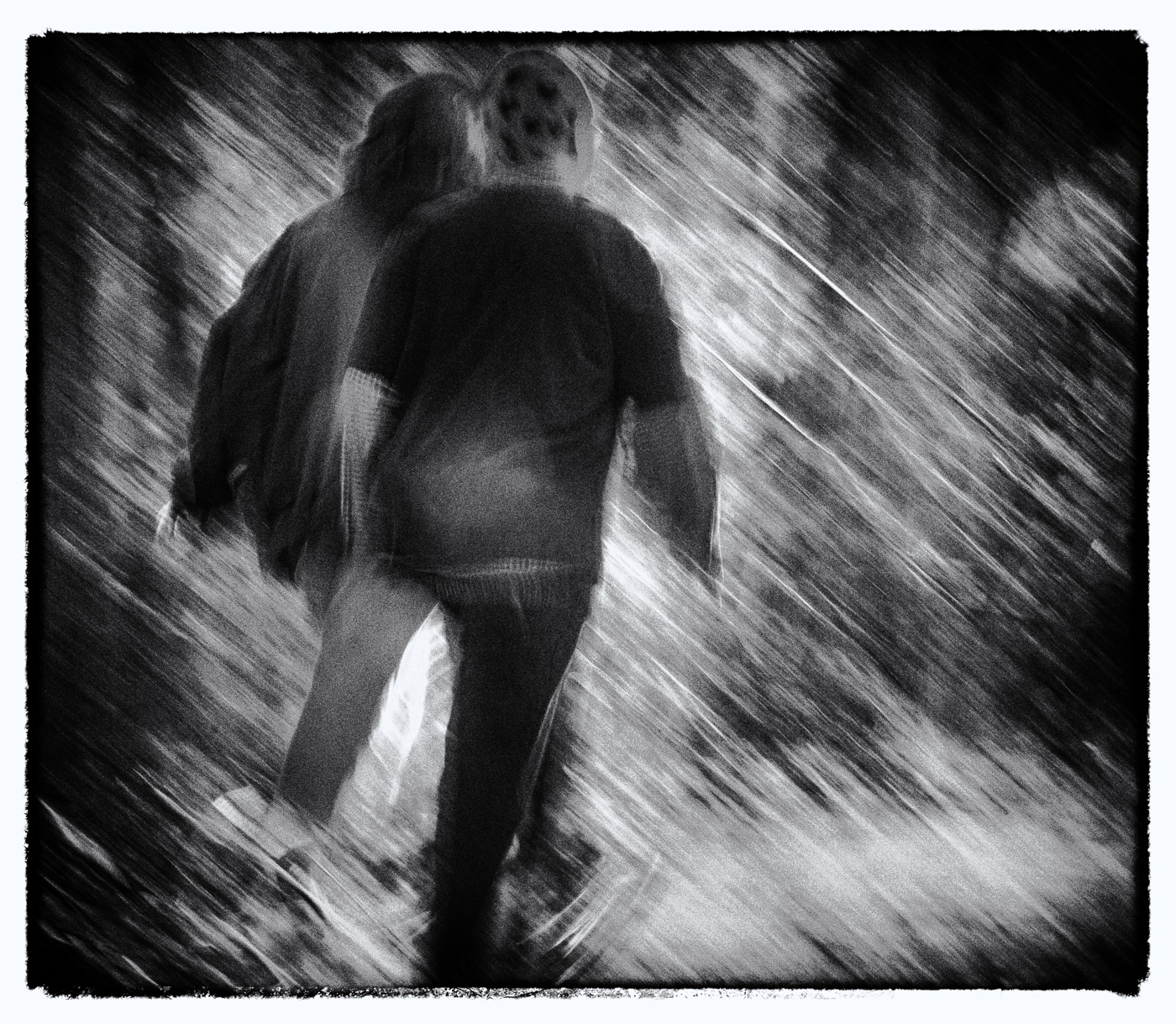
| 79 |
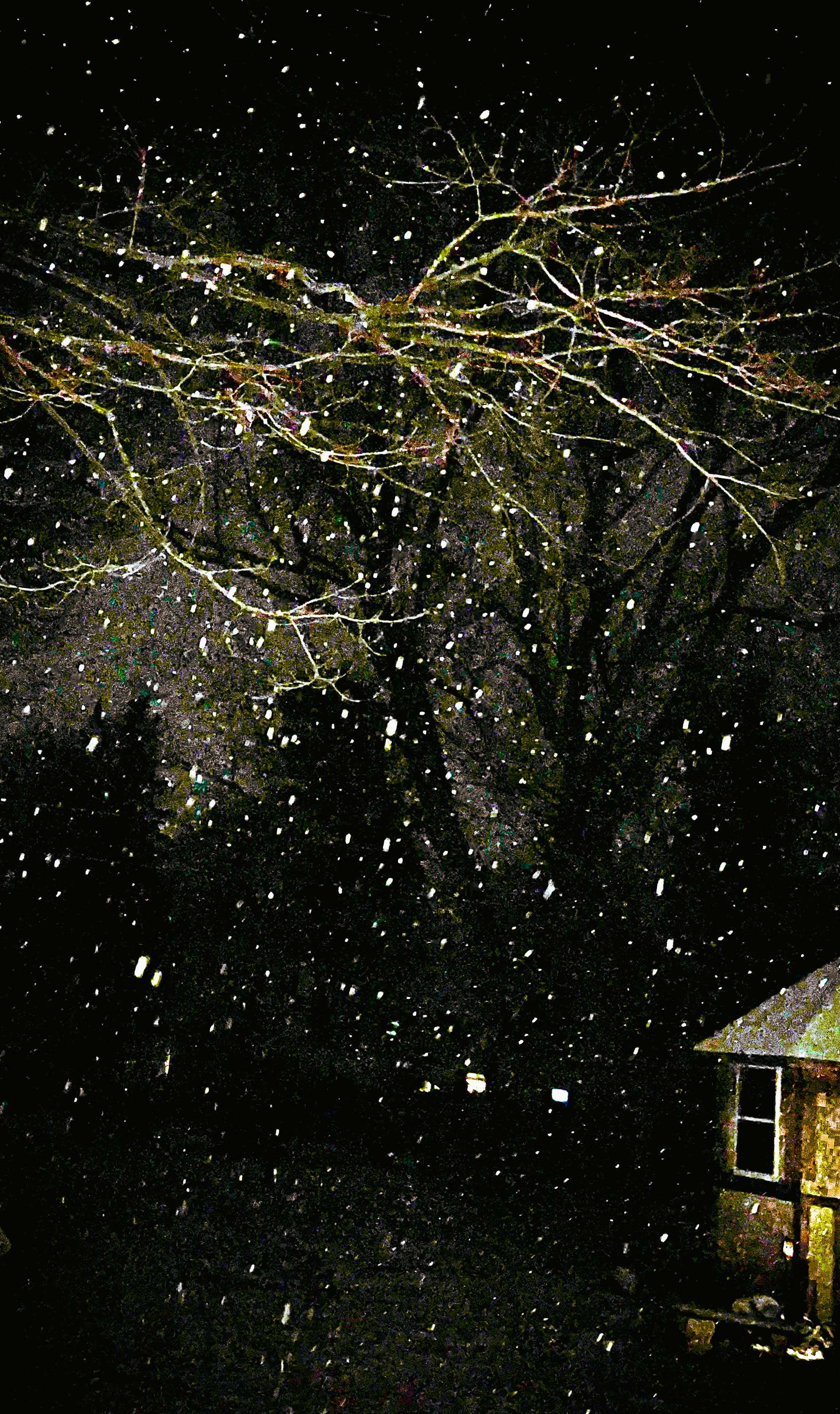
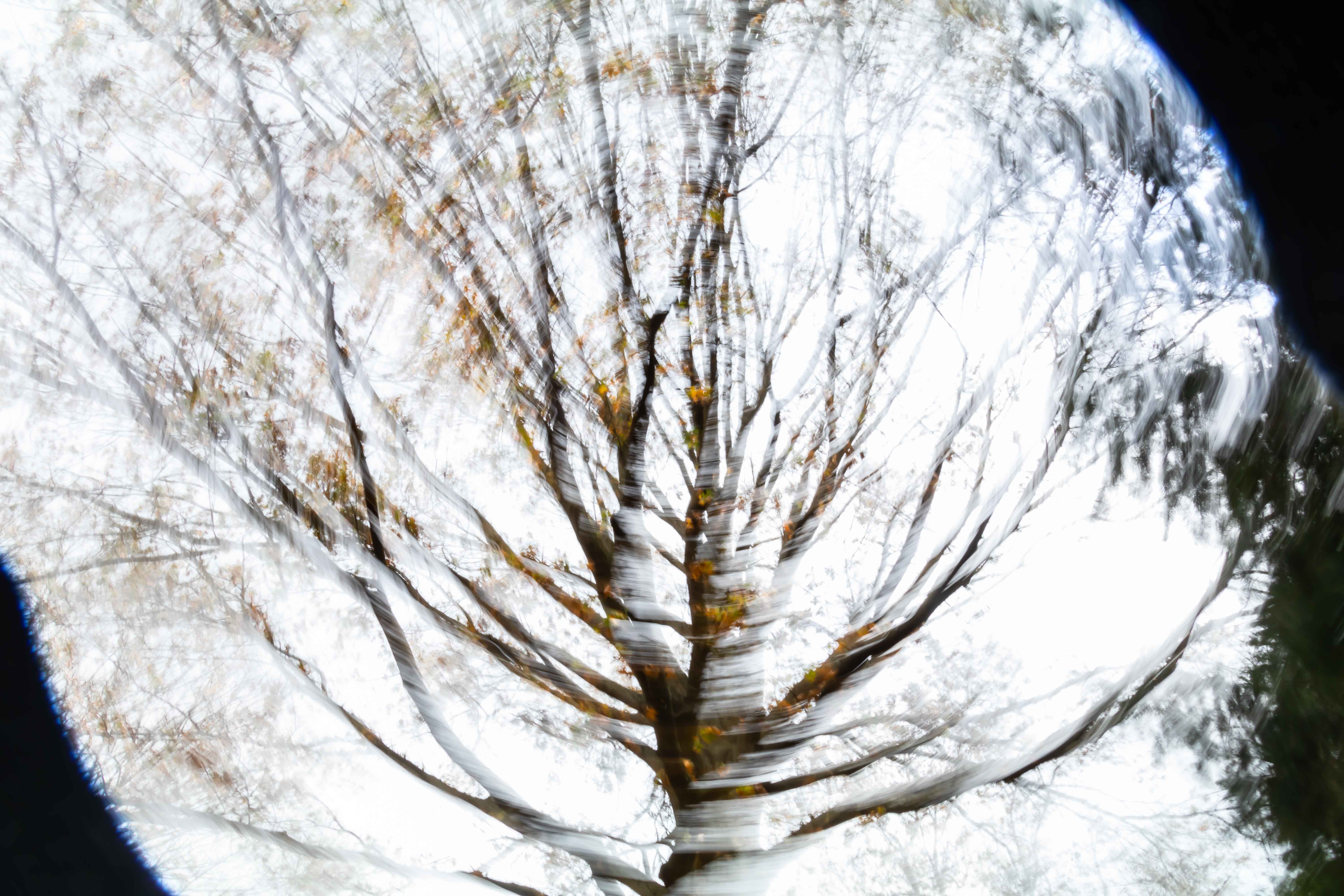
Jan 20 |
Comment |
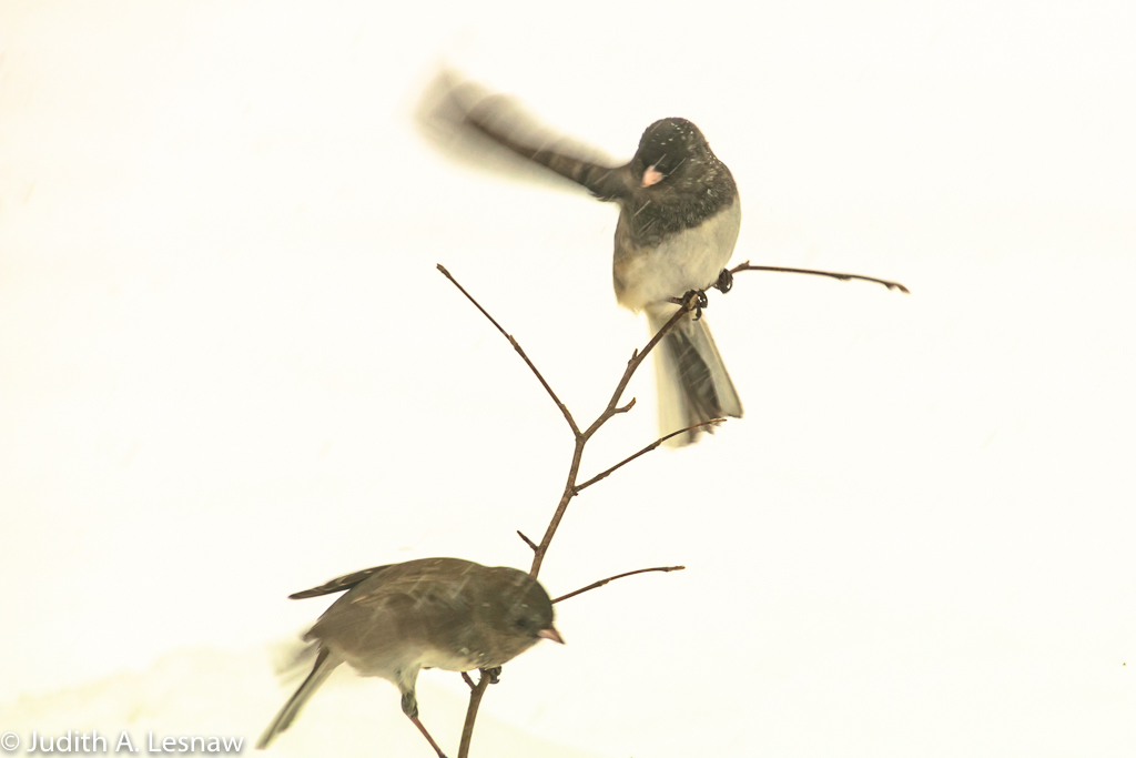
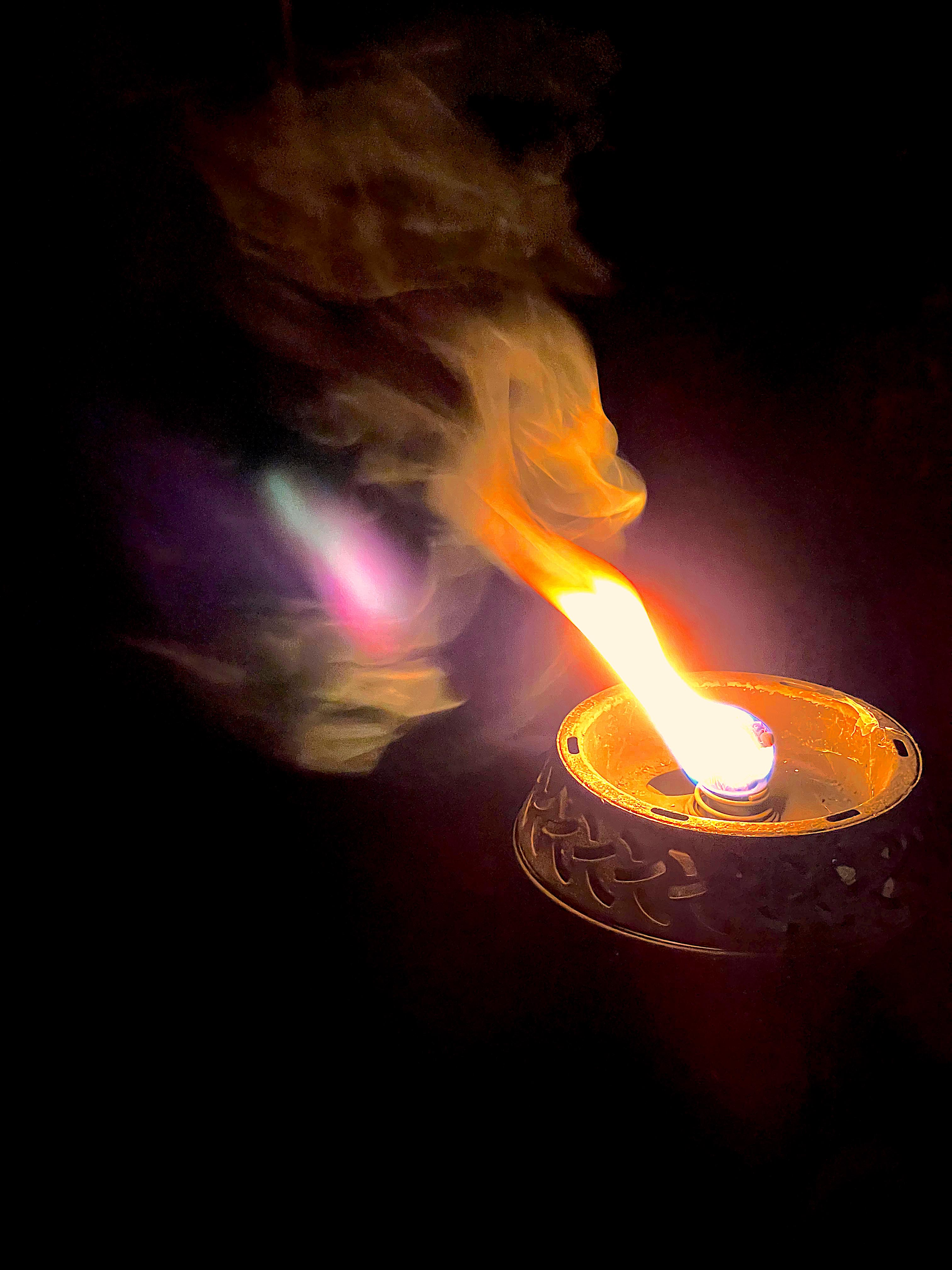
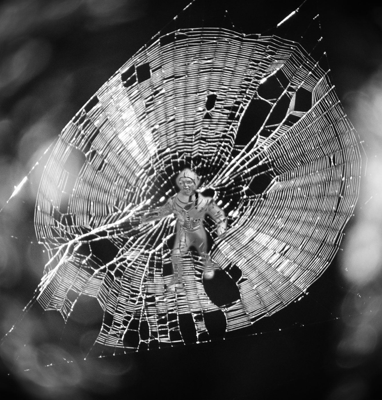
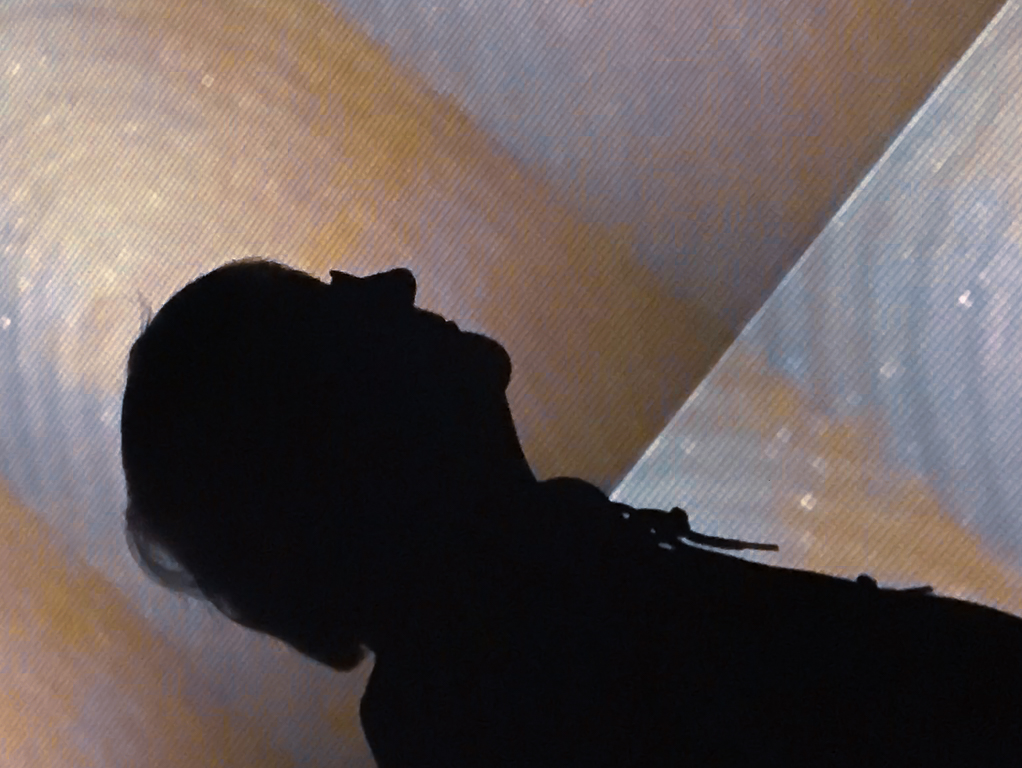
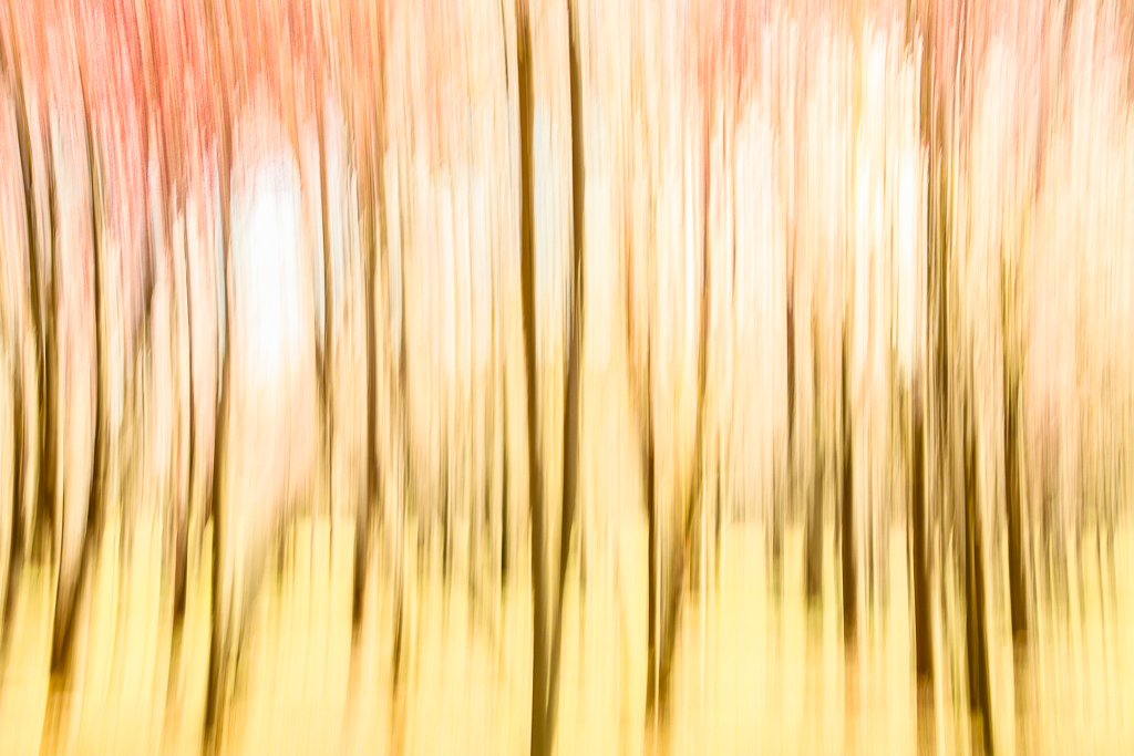
I love tree man. He looks a bit like an Aztec warrior marching off to battle. I find the motion streaks distracting and would try to fade them. Could you show us the original? You can post it in your reply. |
Jan 8th |
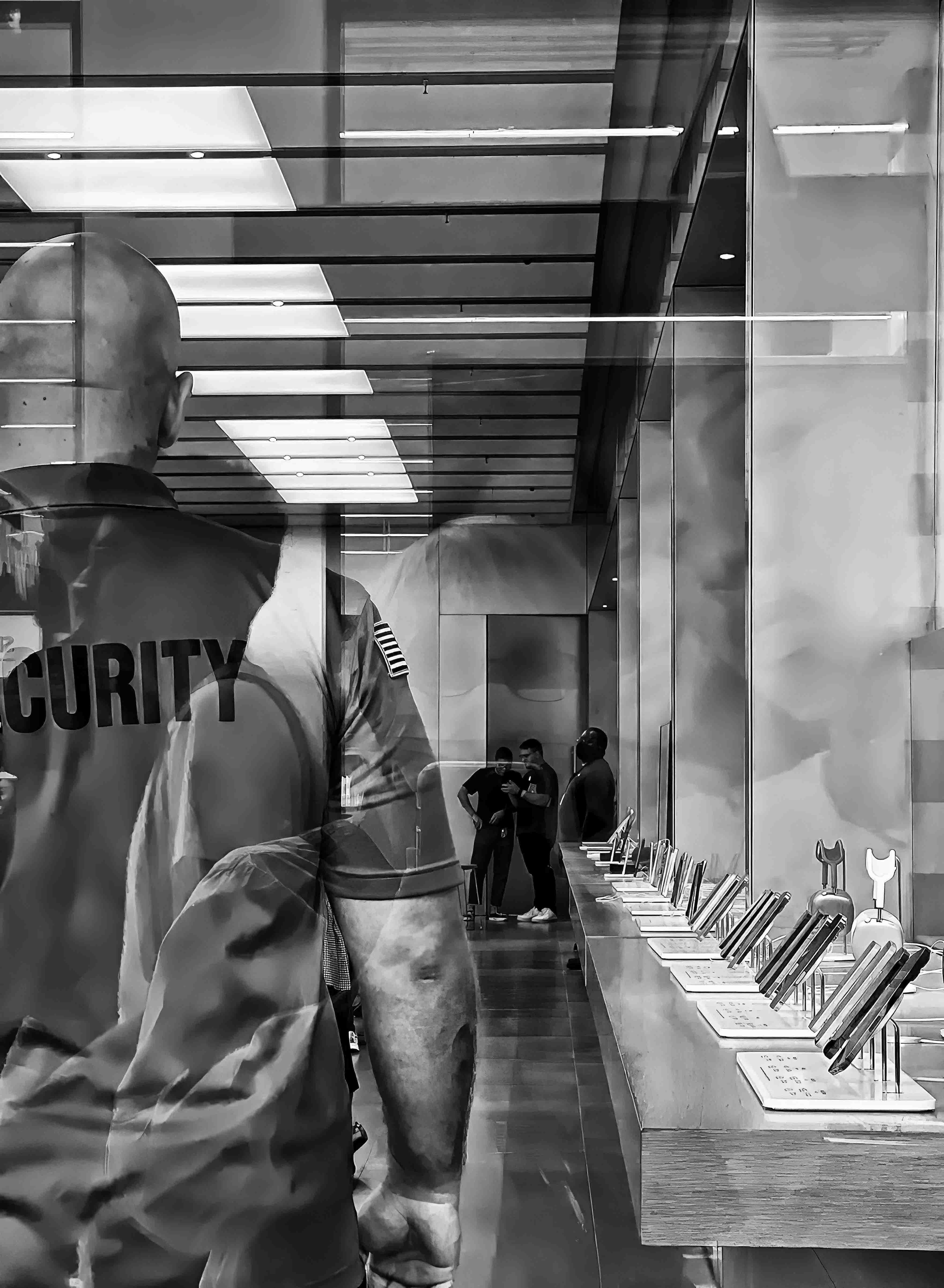
| 79 |
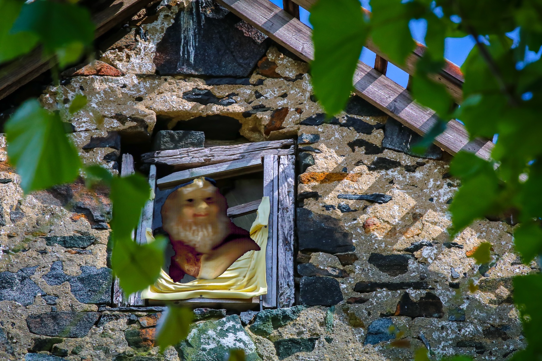
Jan 20 |
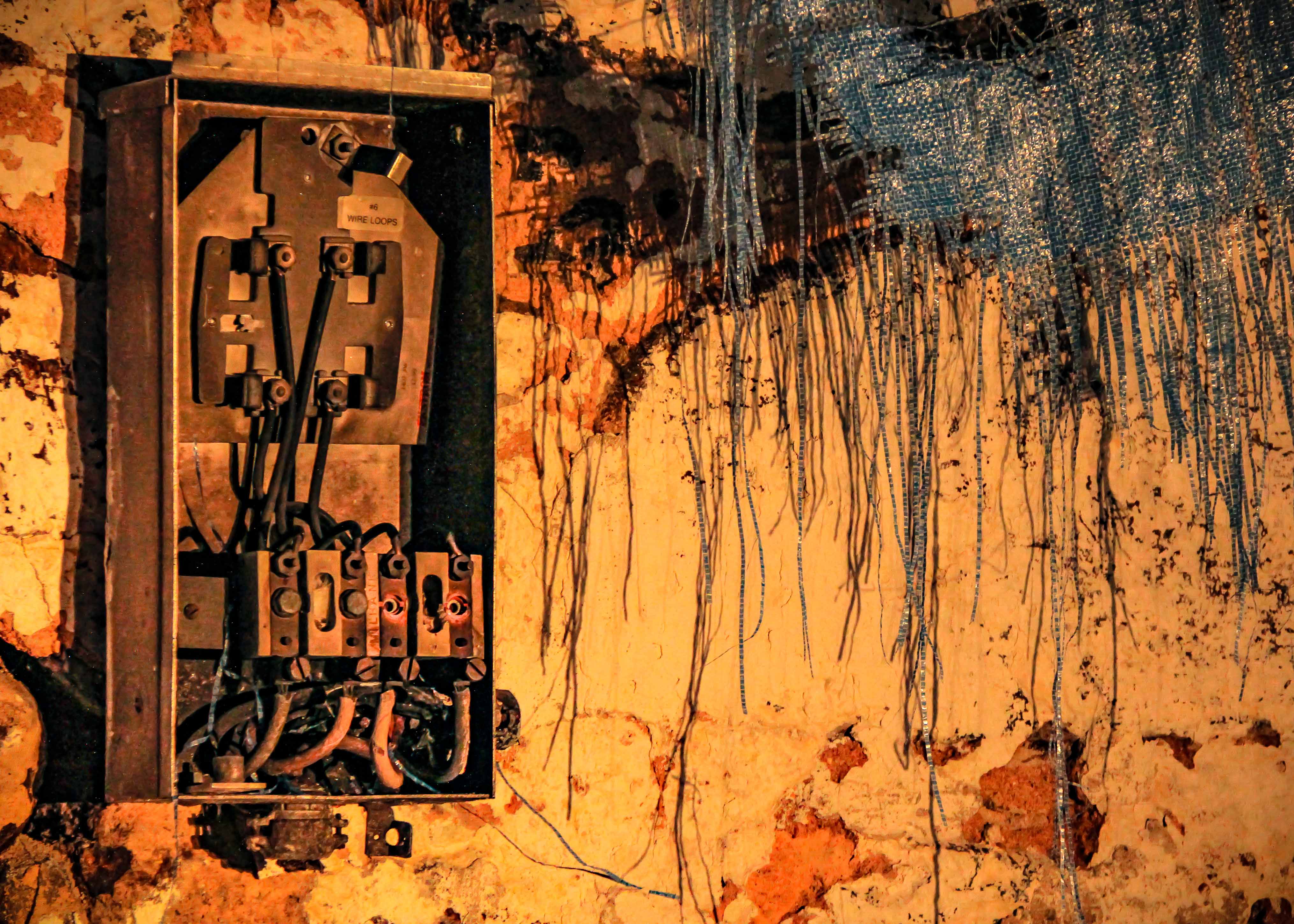
Comment |
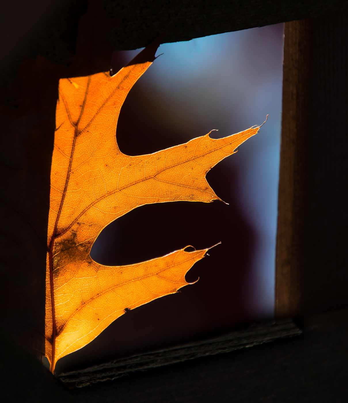
I love the composition and the subject. You did a great job with the light. Darkening the background, adding the space on the left, and adjusting the light on the subject gave the image that Rembrandt look and feel. I would try removing the texture. The lines cut across the subject in an artificial way I think the image is very strong without them. |
Jan 8th |
5 comments - 0 replies for Group 79
|
11 comments - 7 replies Total
|