|
| Group |
Round |
C/R |
Comment |
Date |
Image |
| 52 |
Sep 19 |
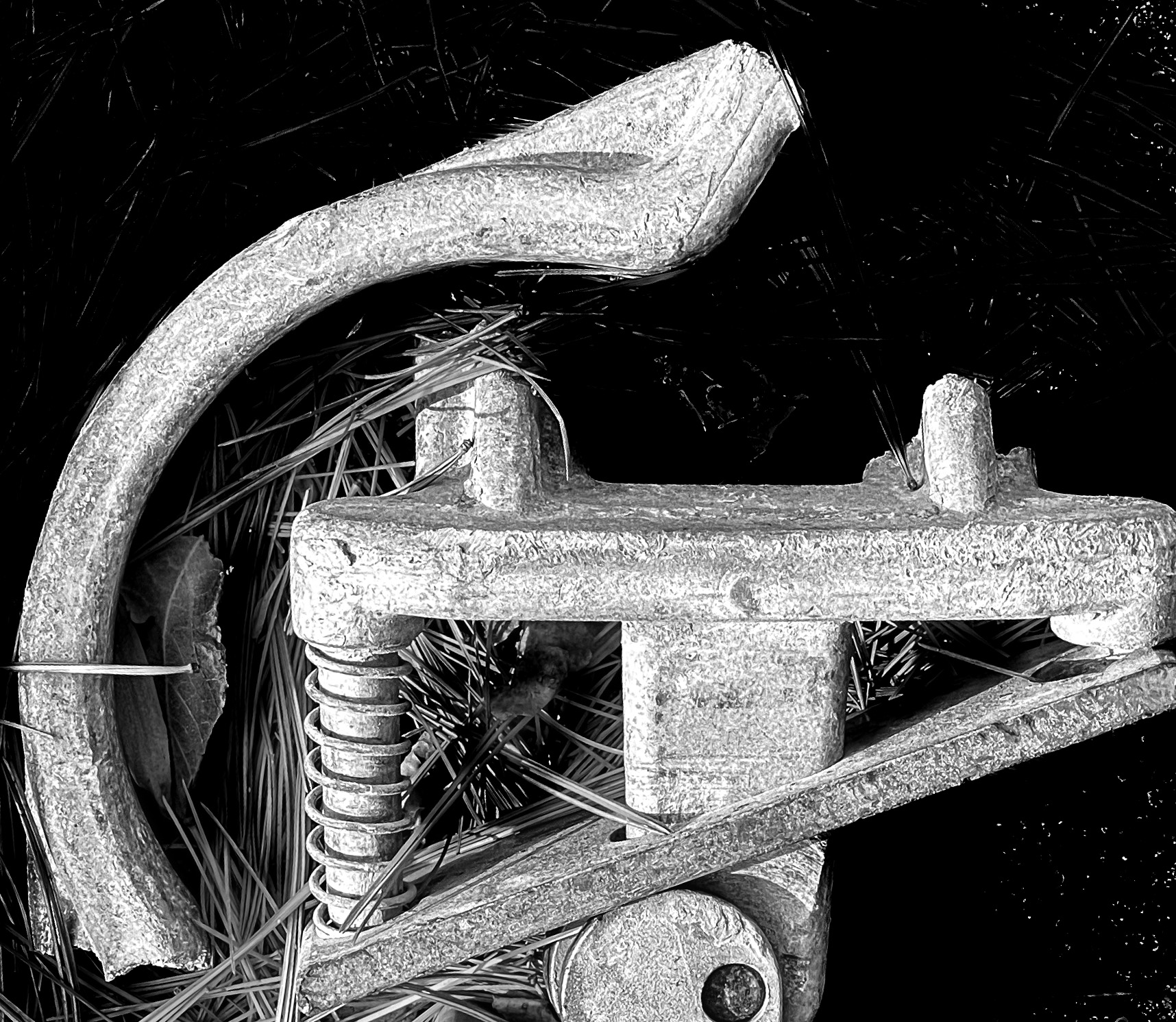
Comment |
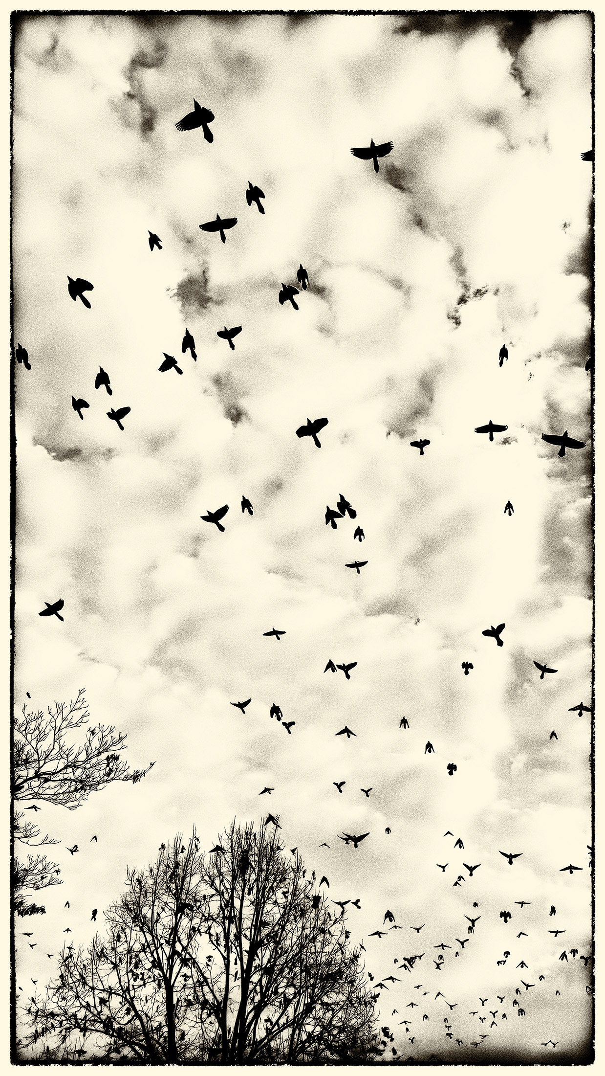
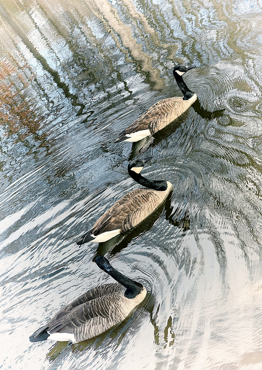
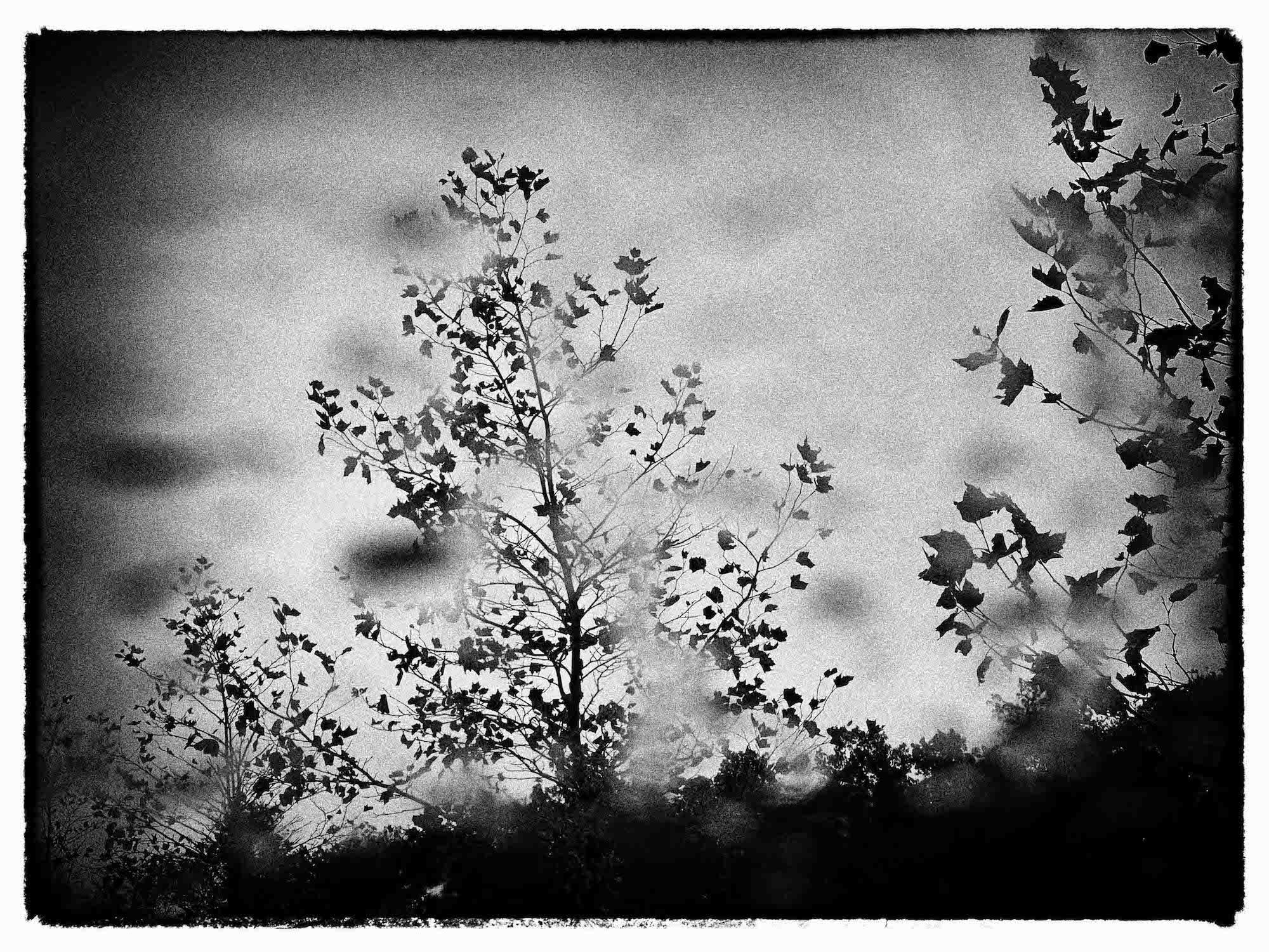
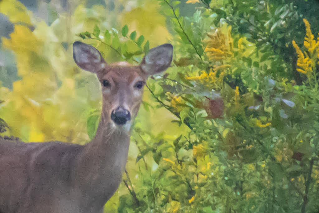
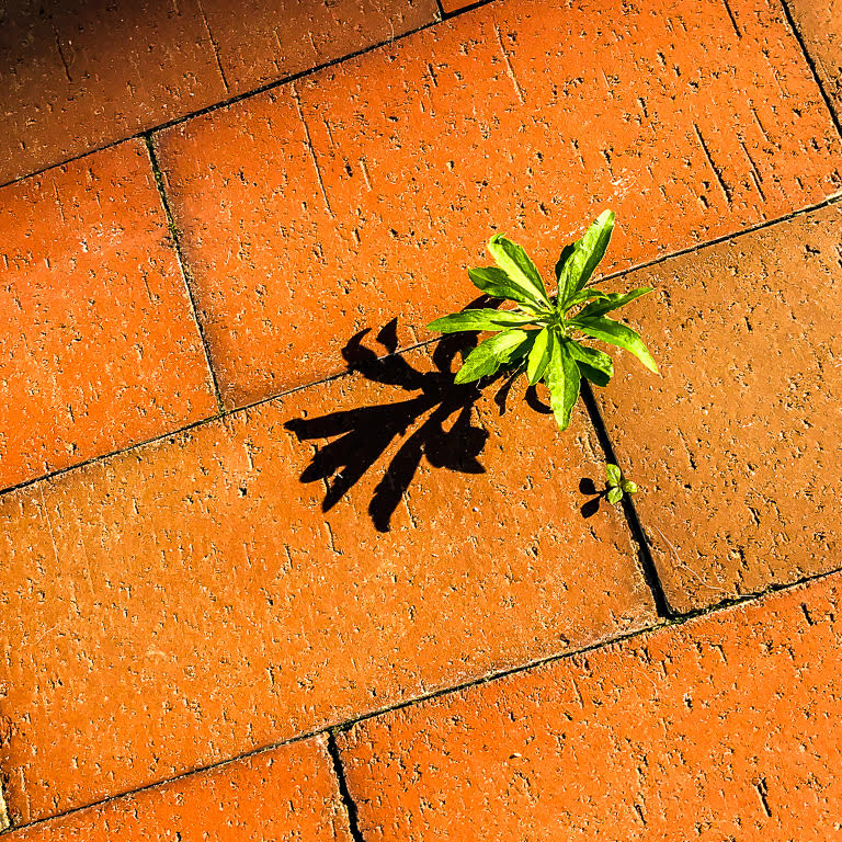
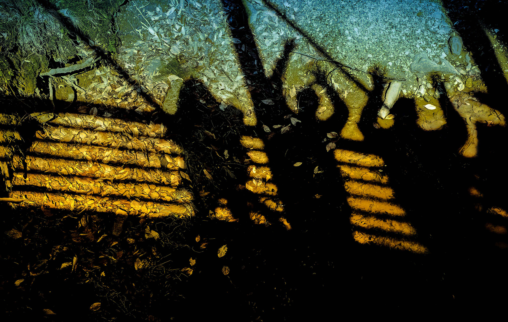
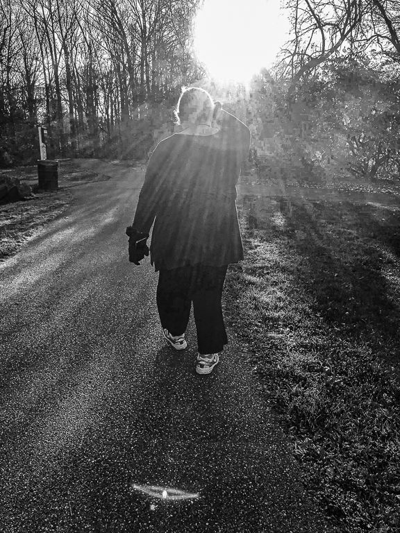
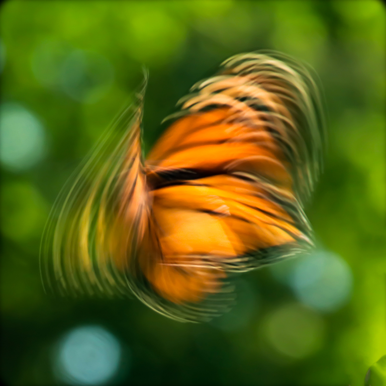
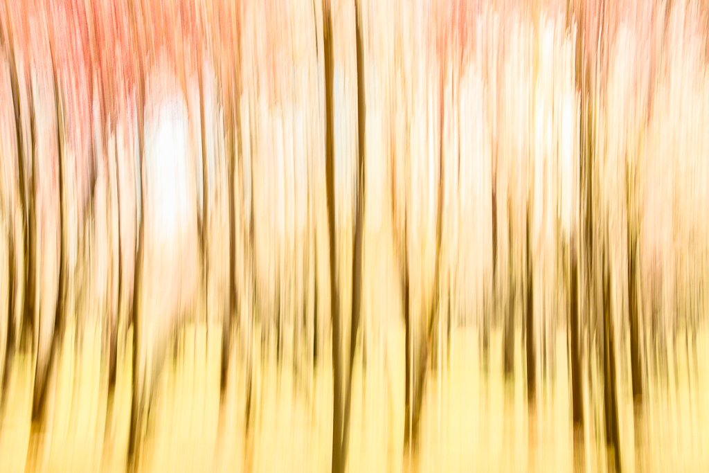
Mike, this is a spectacular composition. It is reminiscent of a Rorschach inkblot and I found myself interpreting it. The symmetry is perfect. The faint pink in the sky and reflection, and the glow of the tree trunks contribute to a feeling that a great day is dawning. I would not alter it. |
Sep 10th |
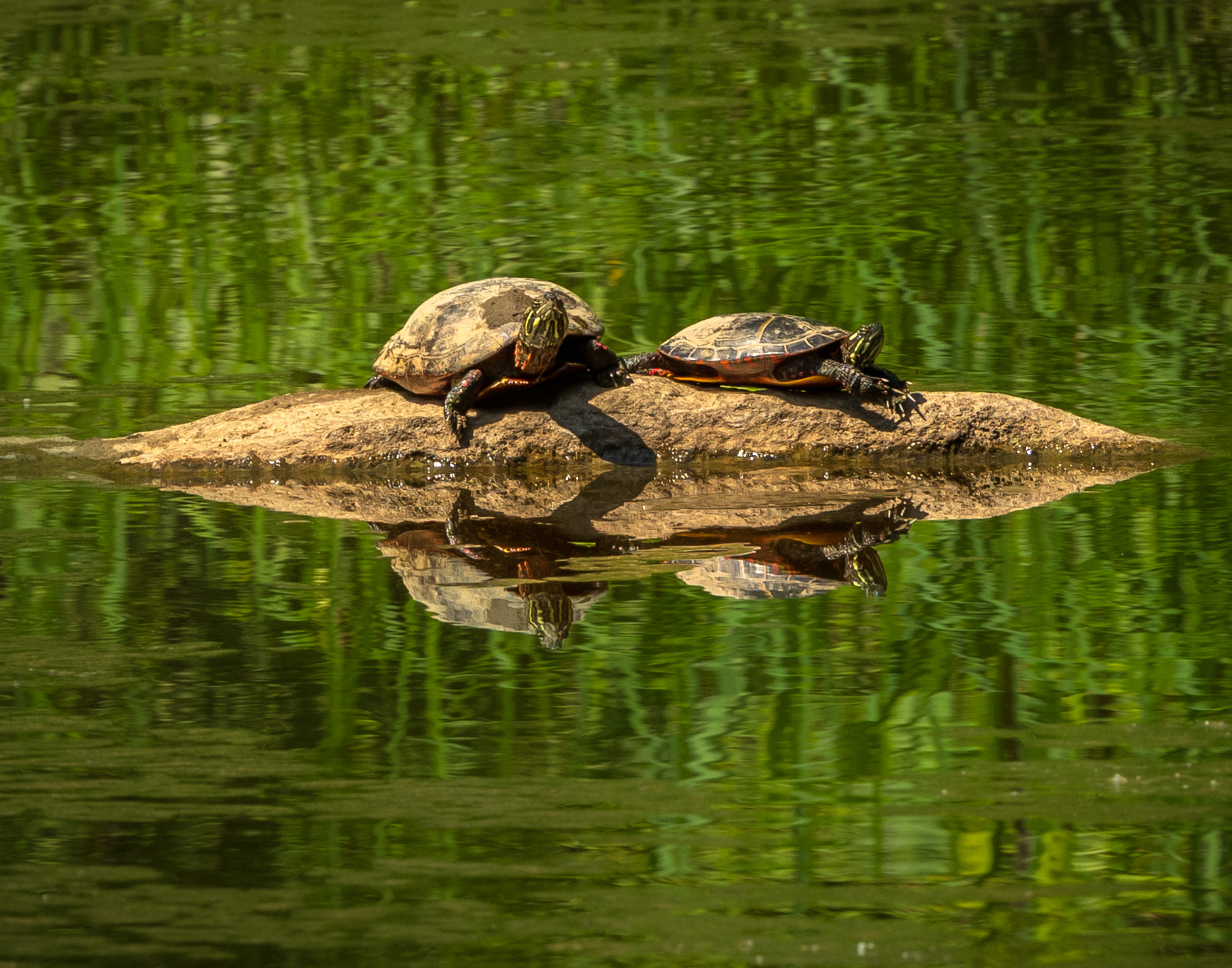
| 52 |
Sep 19 |
Comment |
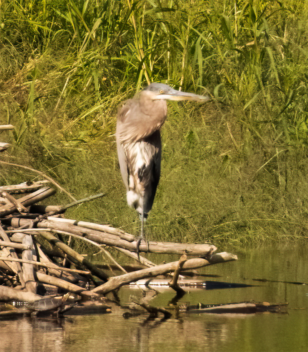
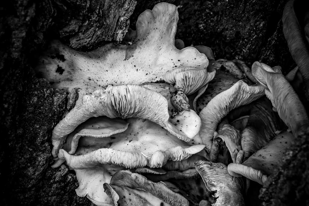
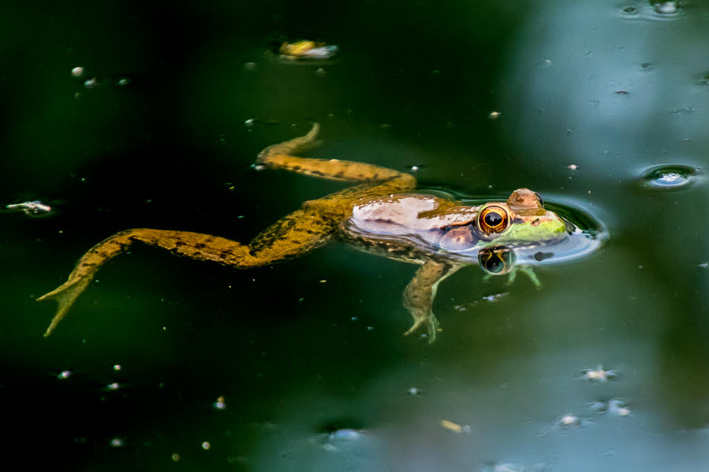
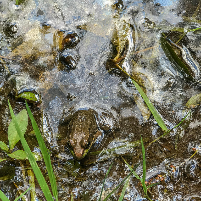
Beautiful image. The background boehk with its misty plants and reflections, and the swirls of amber and green generate a magical affect as though I were peeking into the Emerald Lagoon. The repeated textures and colors draw my eyes from the rocky bank to the bird's breast. I like the dodging Mike did on the wing. The rocky bank and bird's breast are less harsh in Mike's version and I like it. |
Sep 10th |
| 52 |
Sep 19 |
Comment |
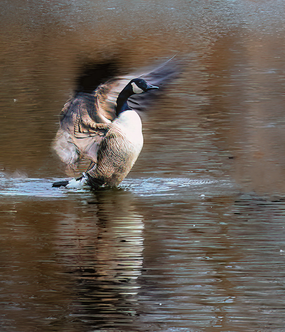
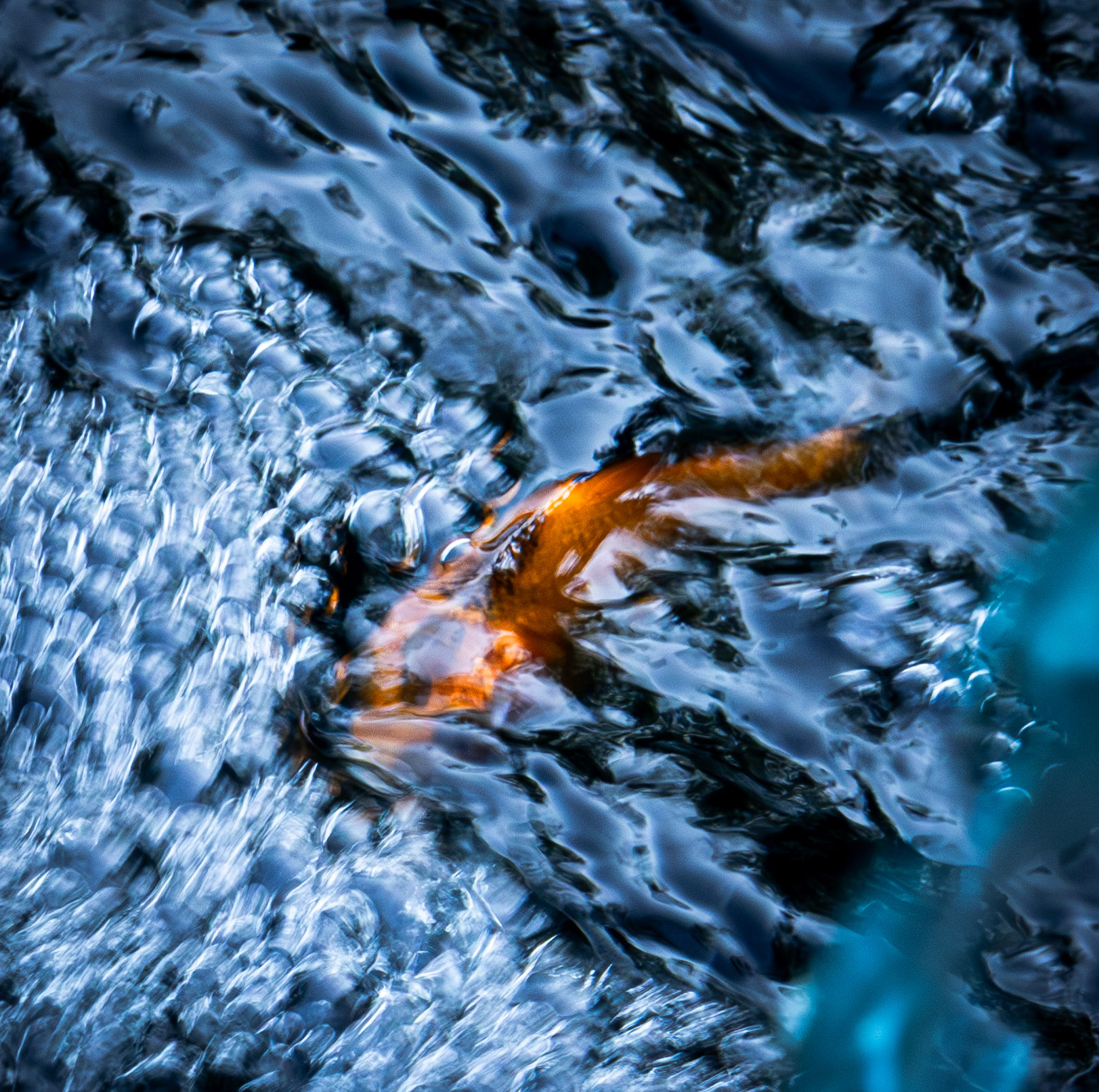
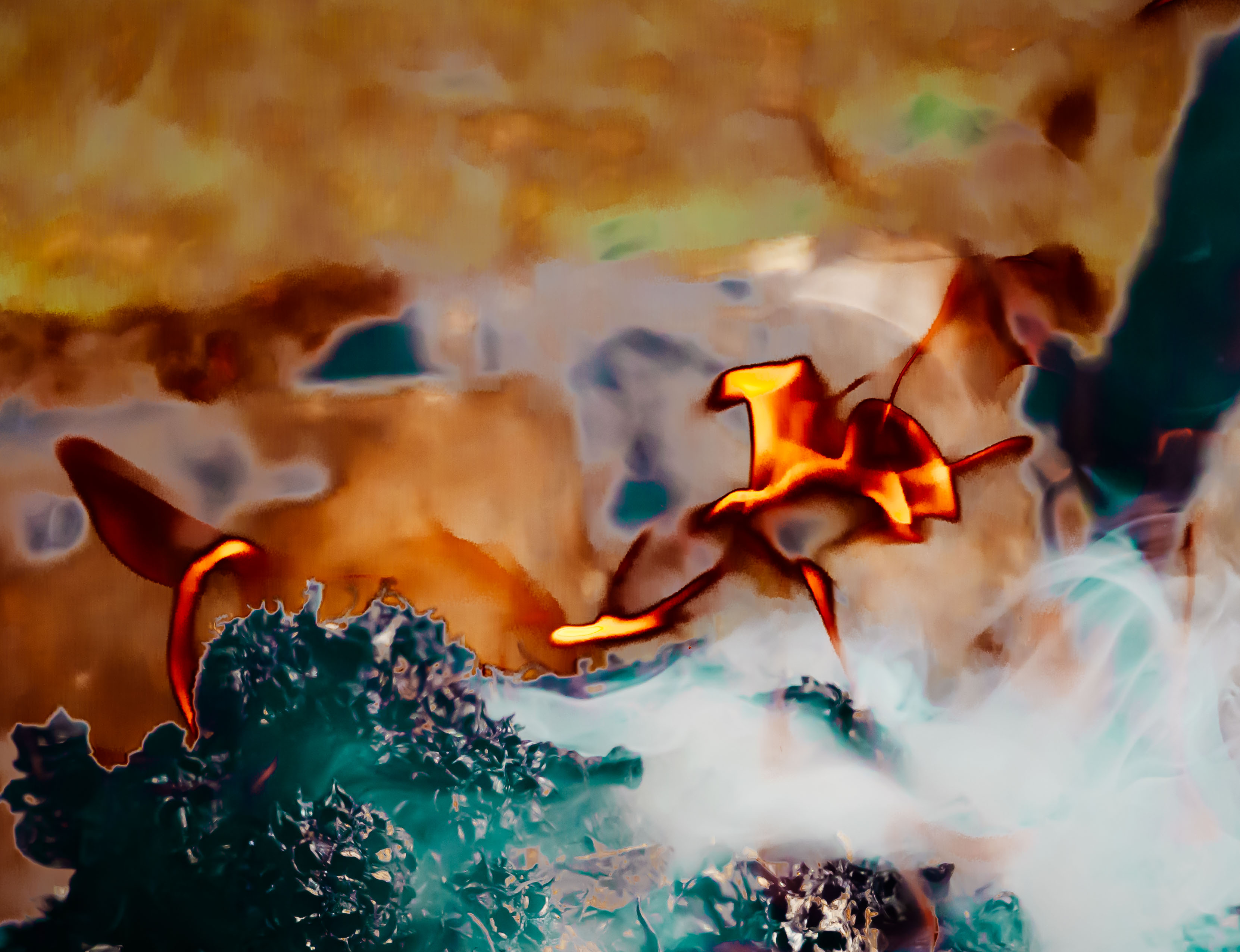
Great action shot! The power and motion in the wings, and the determination in the eyes of that bird contrast with the poor helpless open-mouth fish. Bird, fish and roiling water are all in great focus. The background water at the top is somewhat distracting. I would try to lighten it. Great catch! |
Sep 10th |
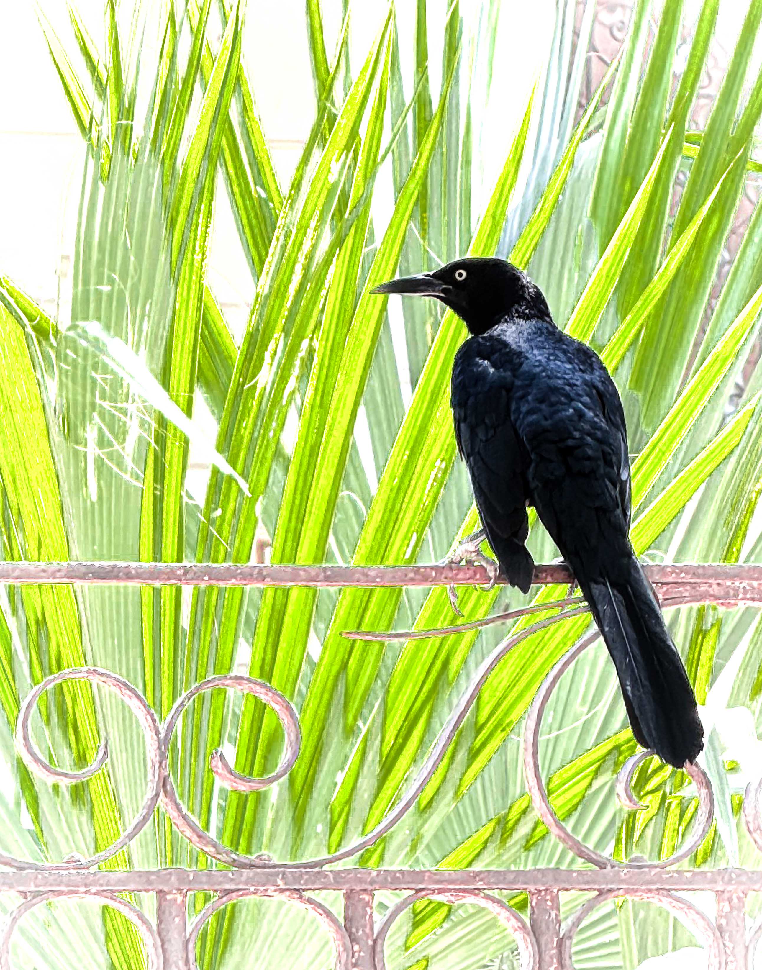
| 52 |
Sep 19 |
Comment |
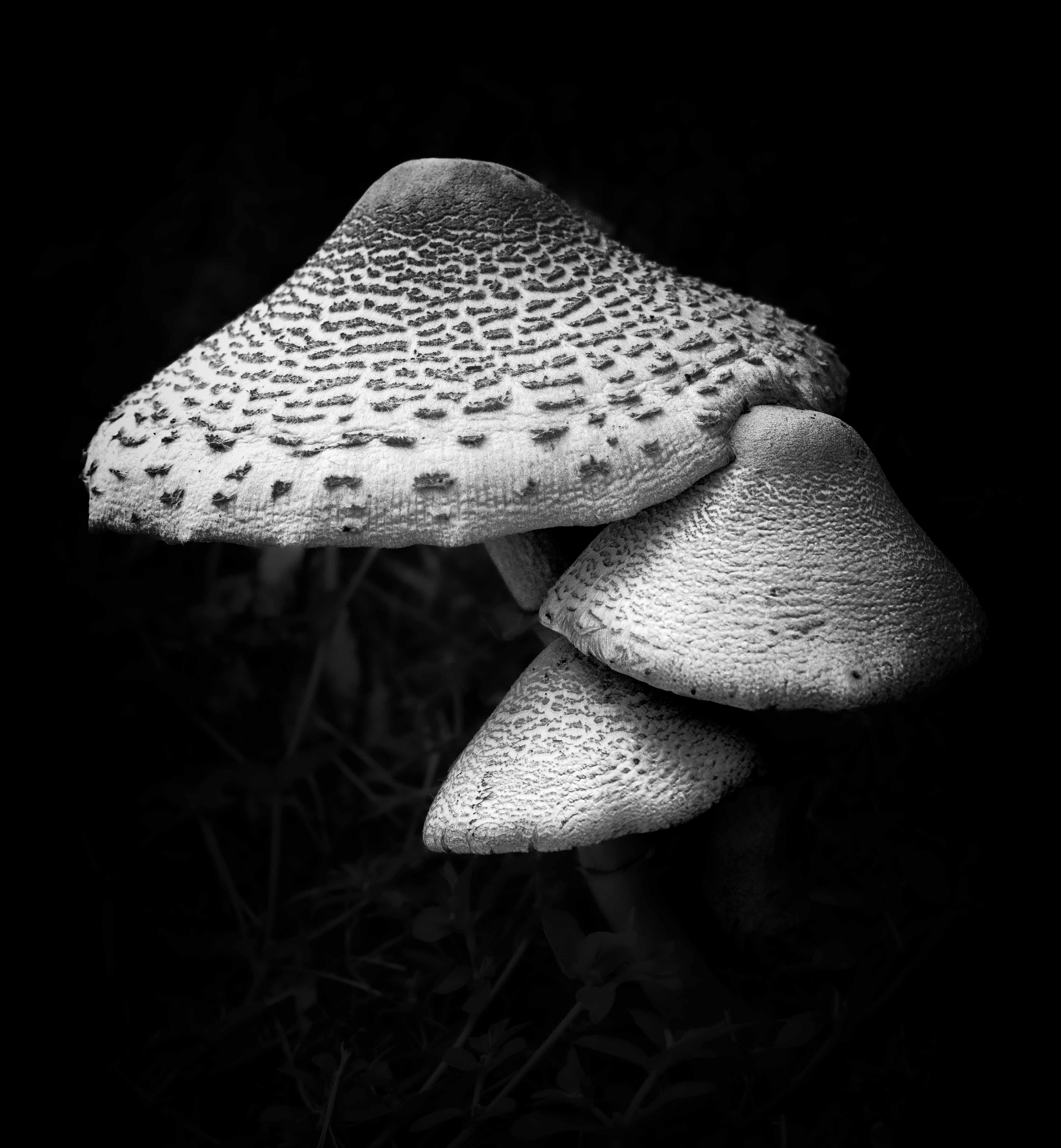
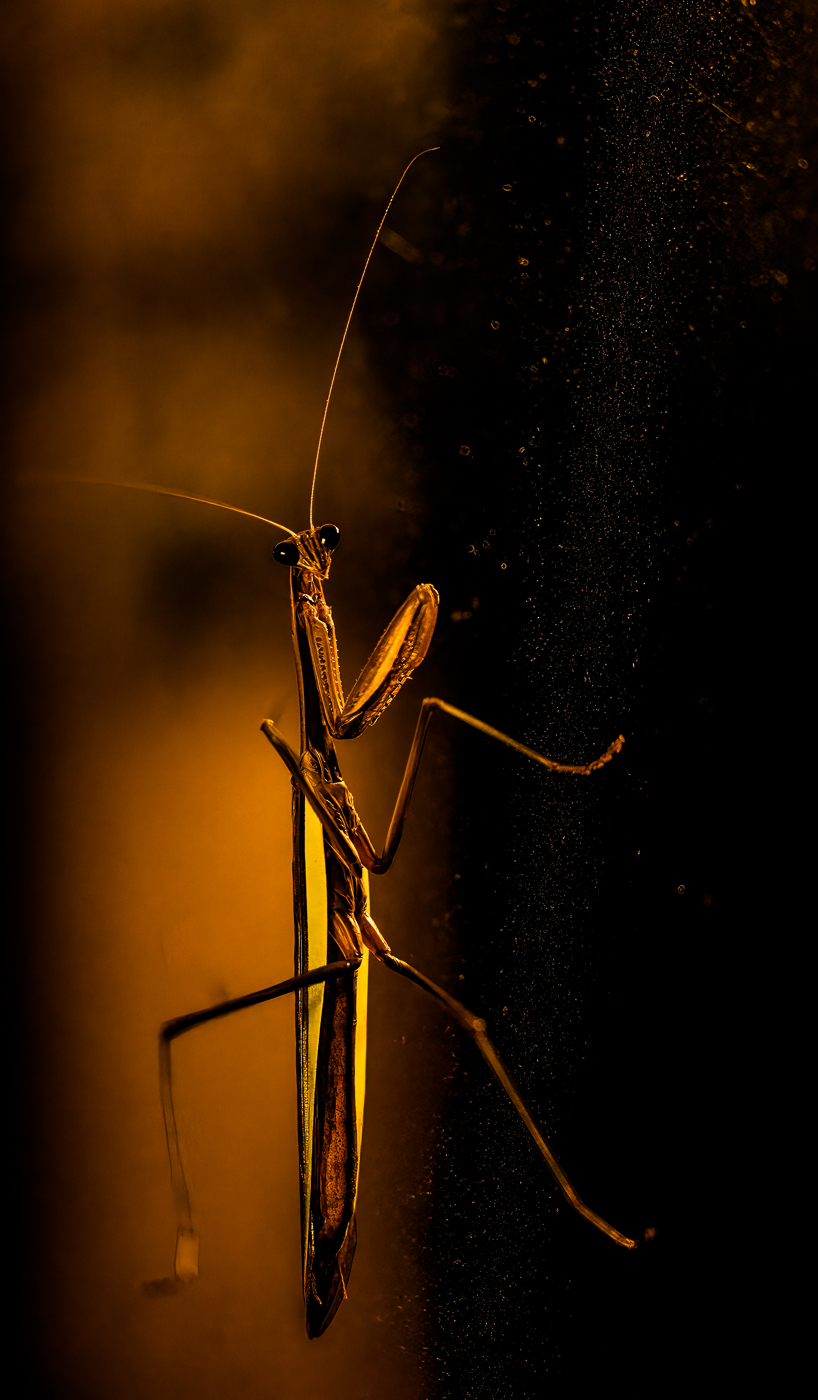
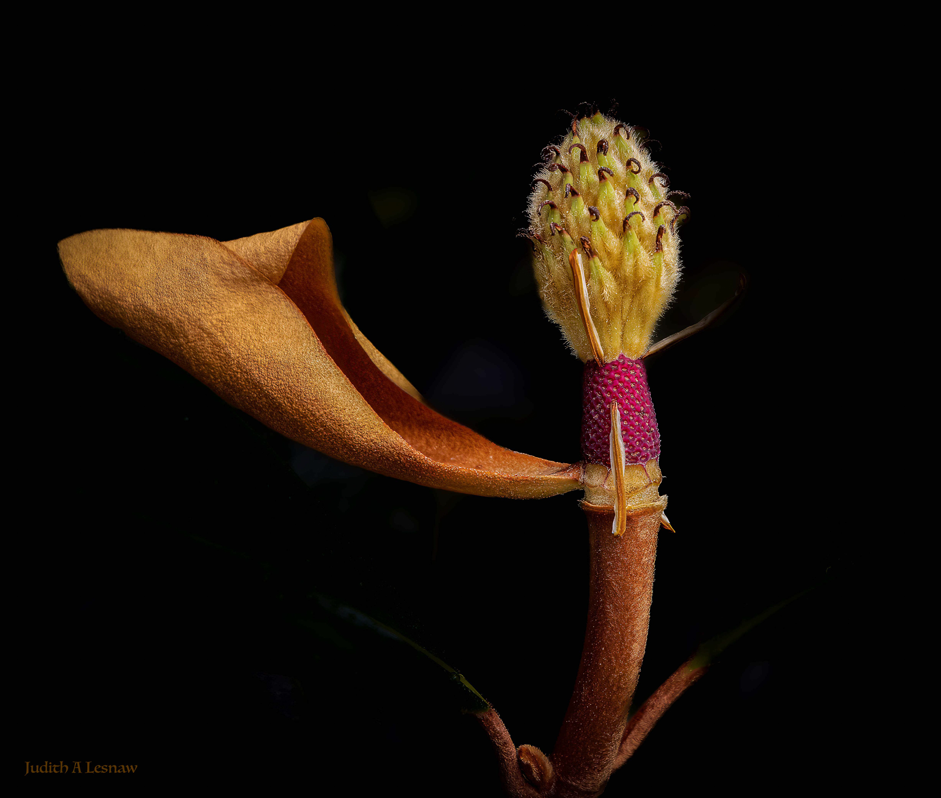
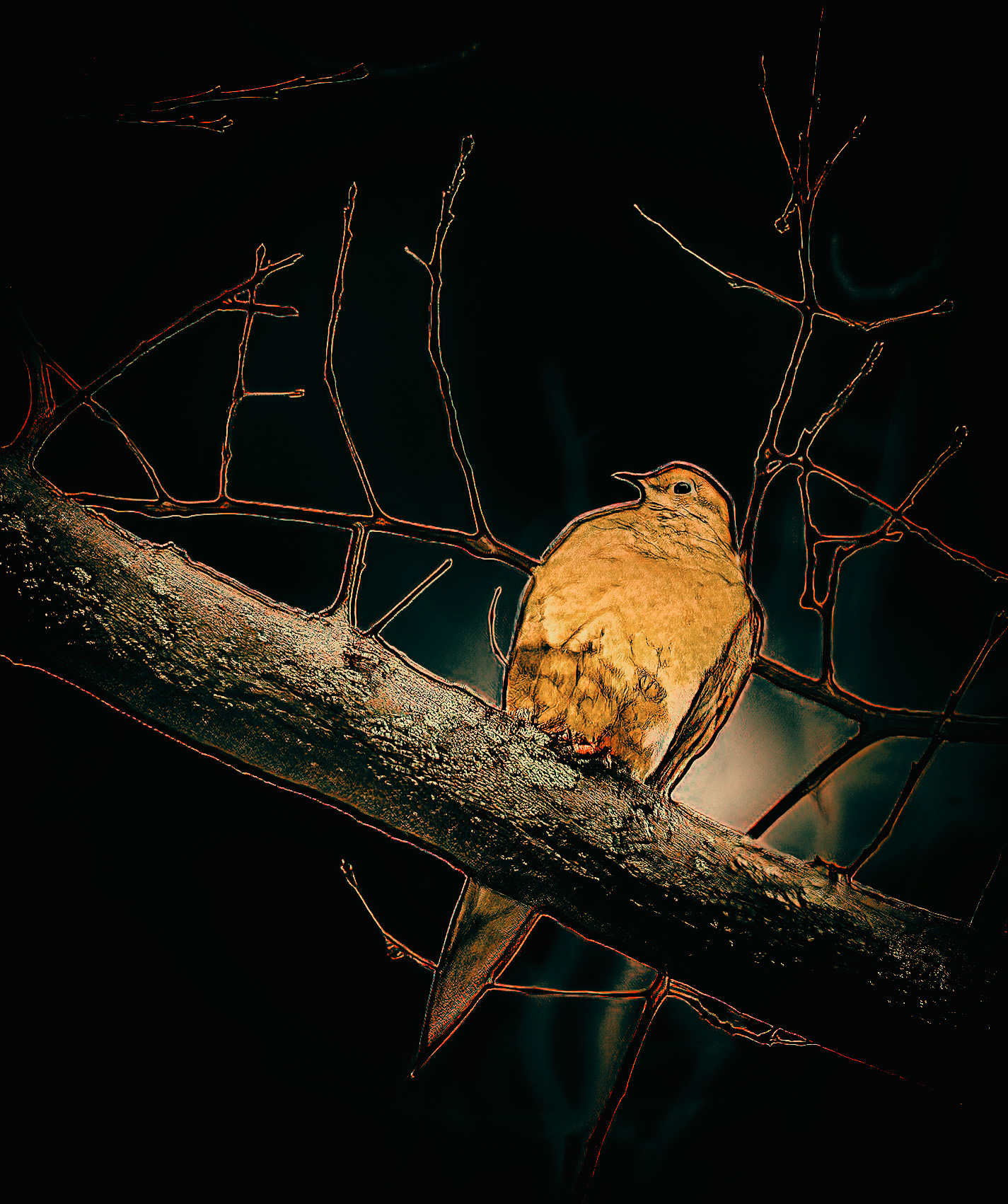
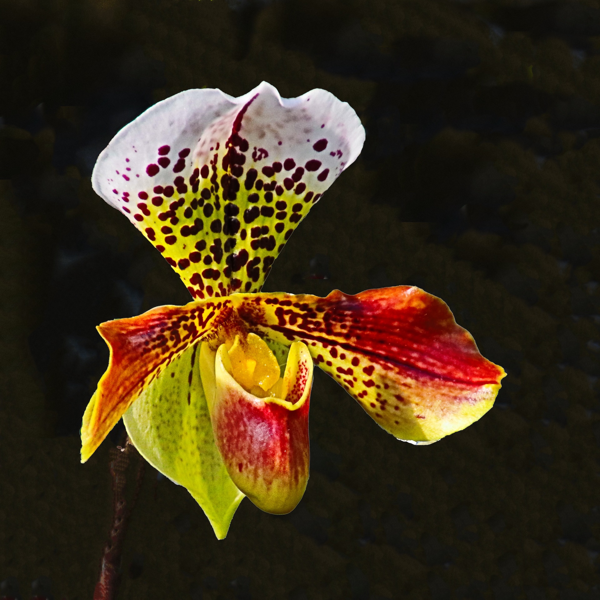
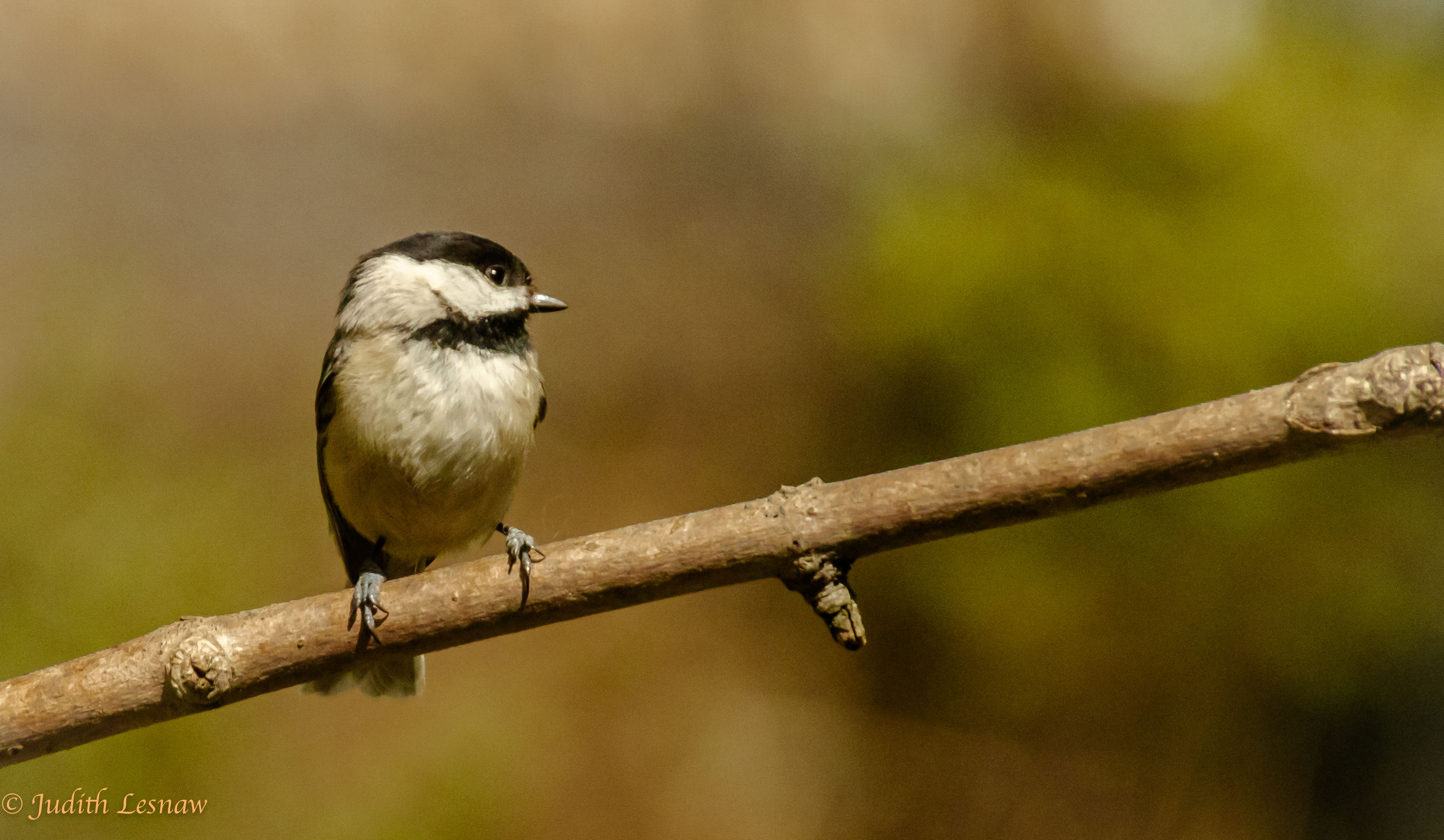
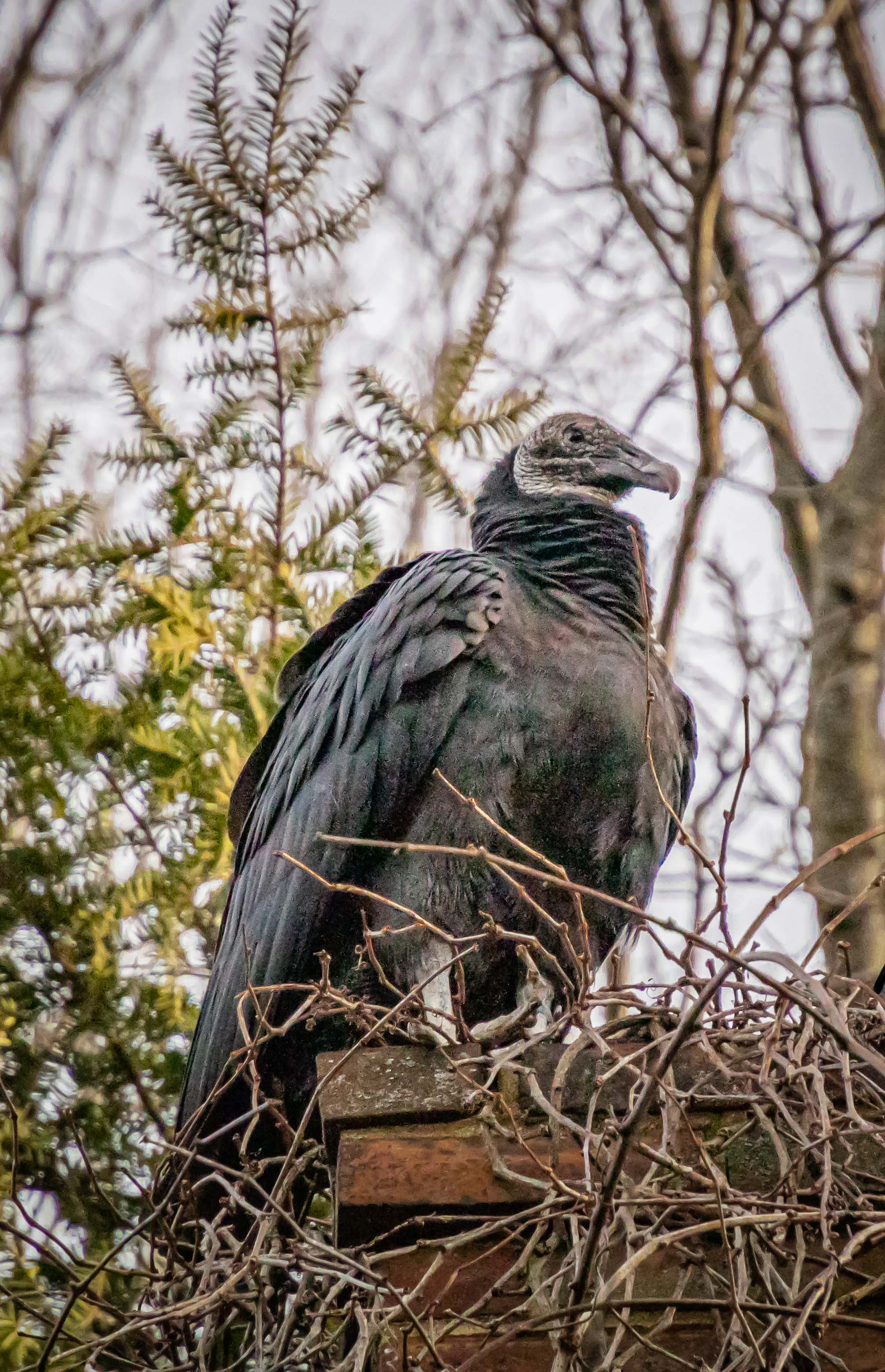
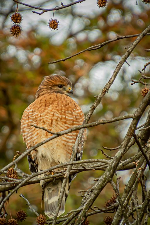
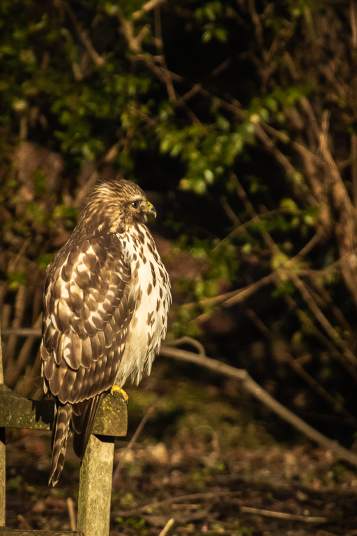
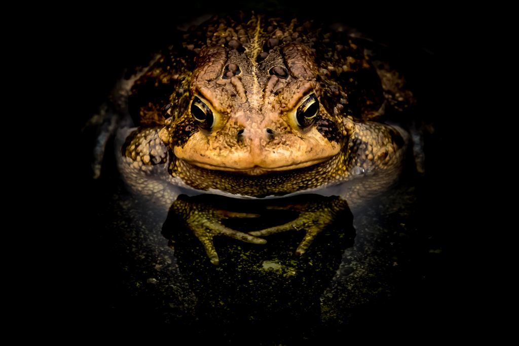
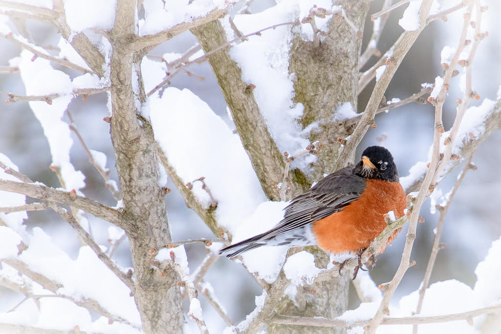
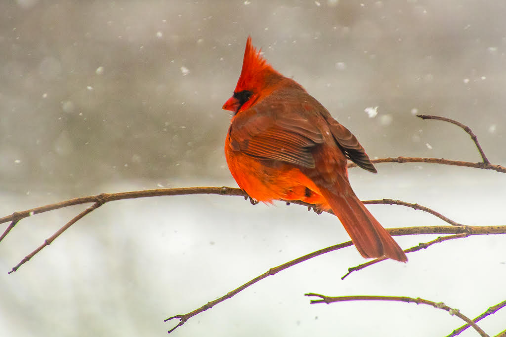
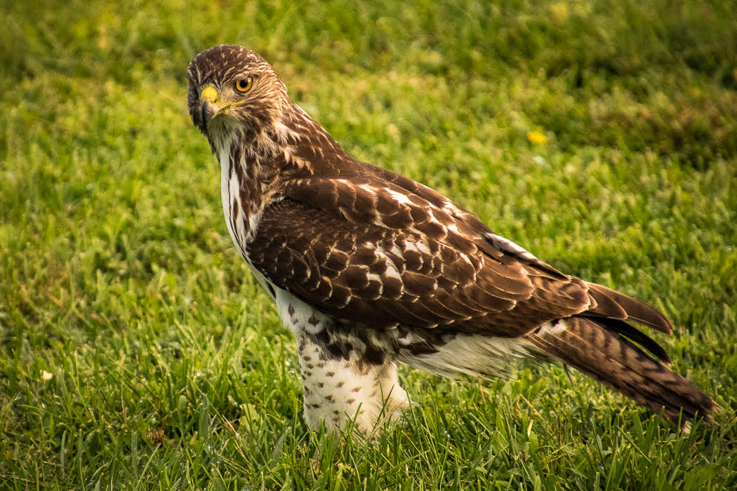
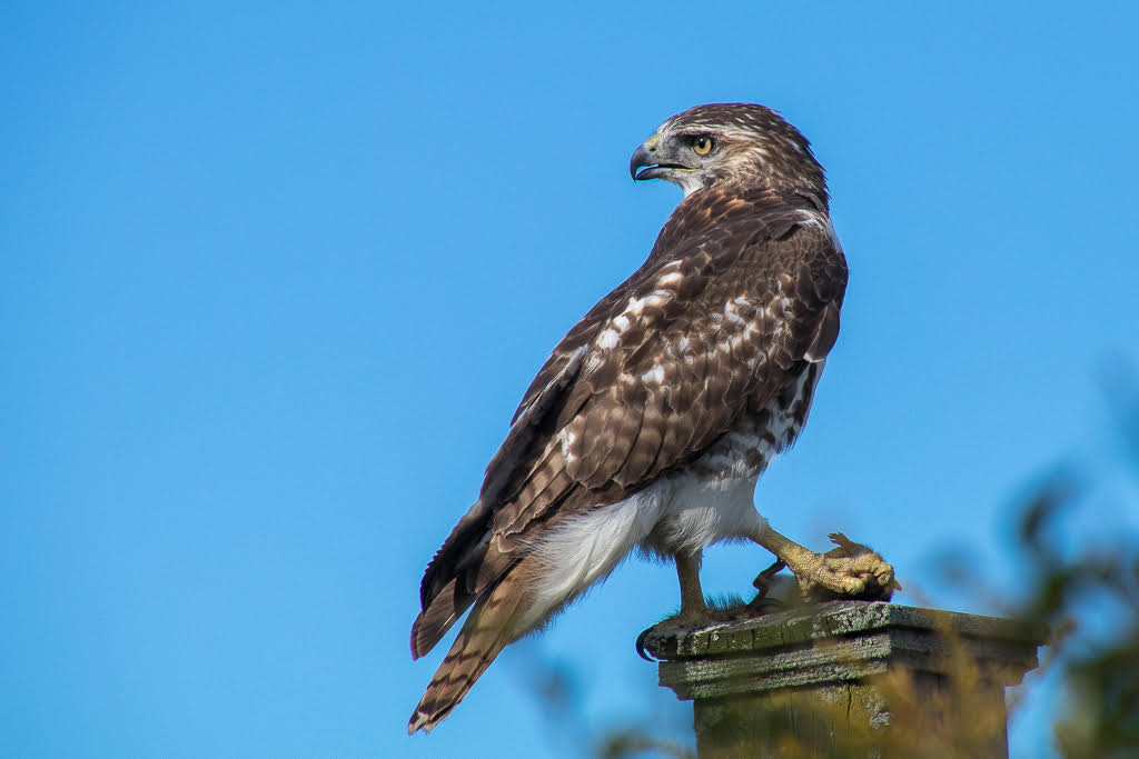
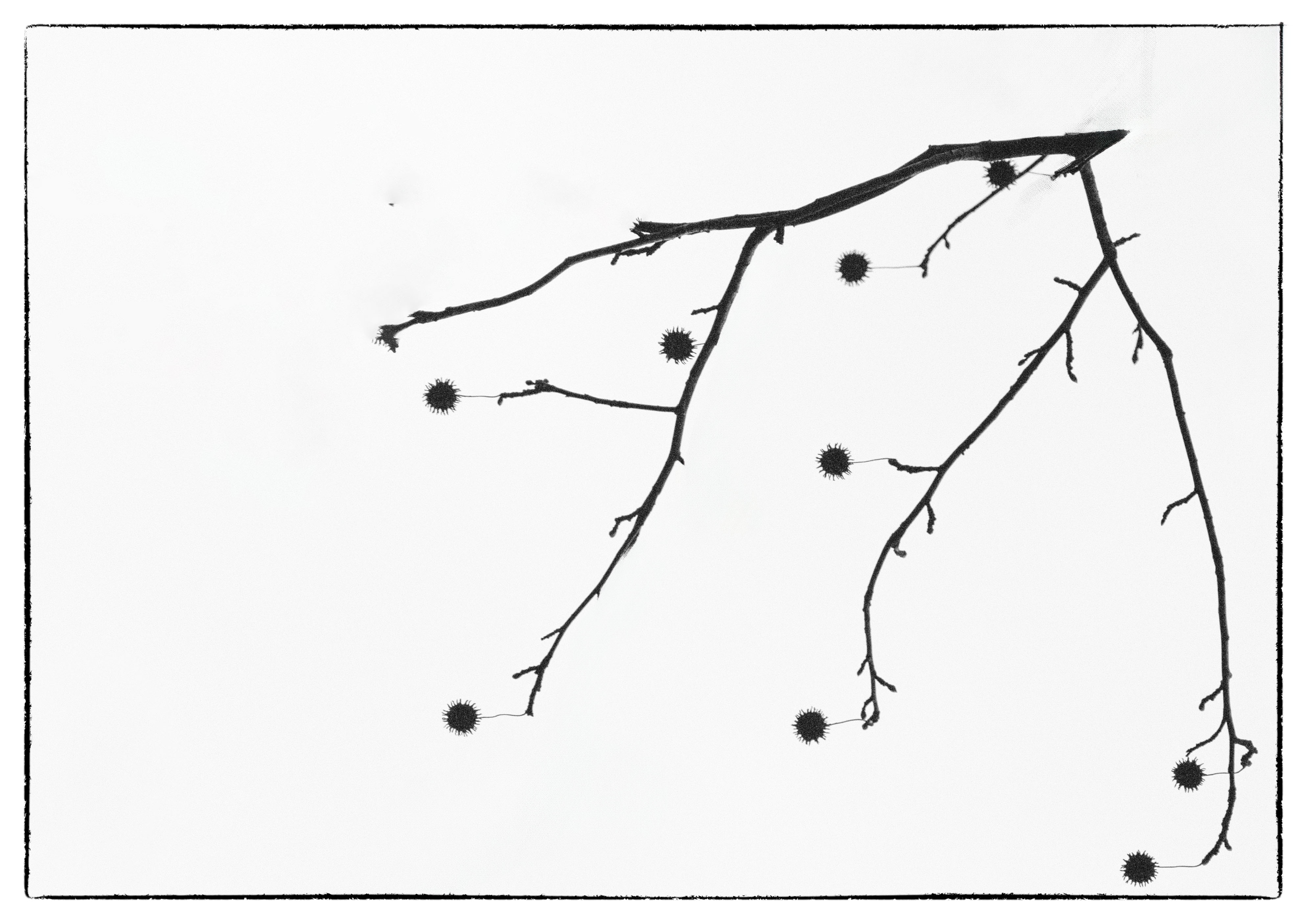
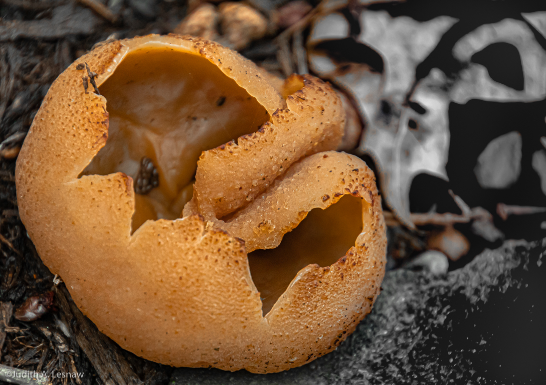
What a fine fellow! His protective mimicry is wonderfully apparent in the texture and colors of the rock on which he perches. I like Mike's crop, and I agree that the bright spots should be toned down. Great catch! |
Sep 10th |
| 52 |
Sep 19 |
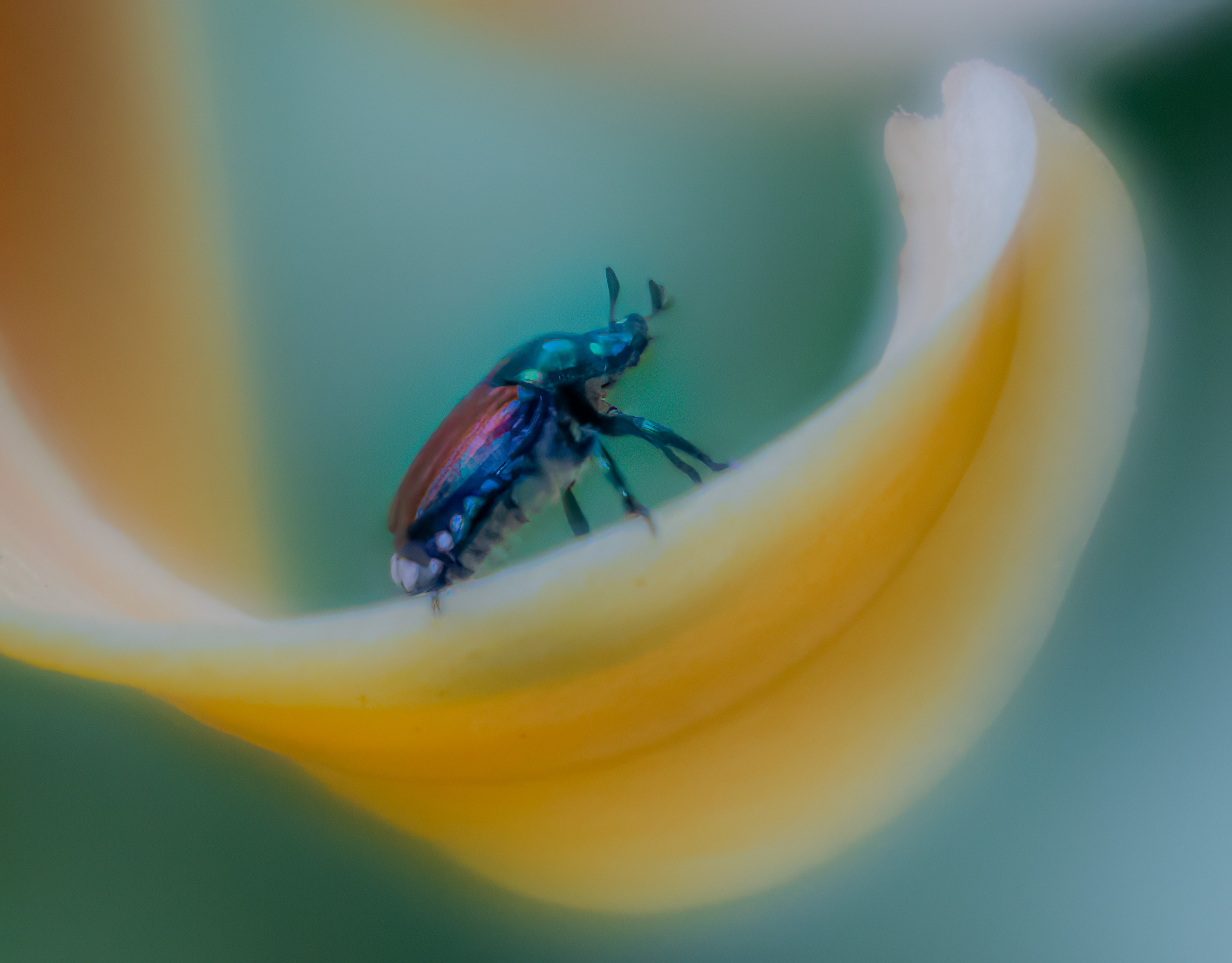
Comment |
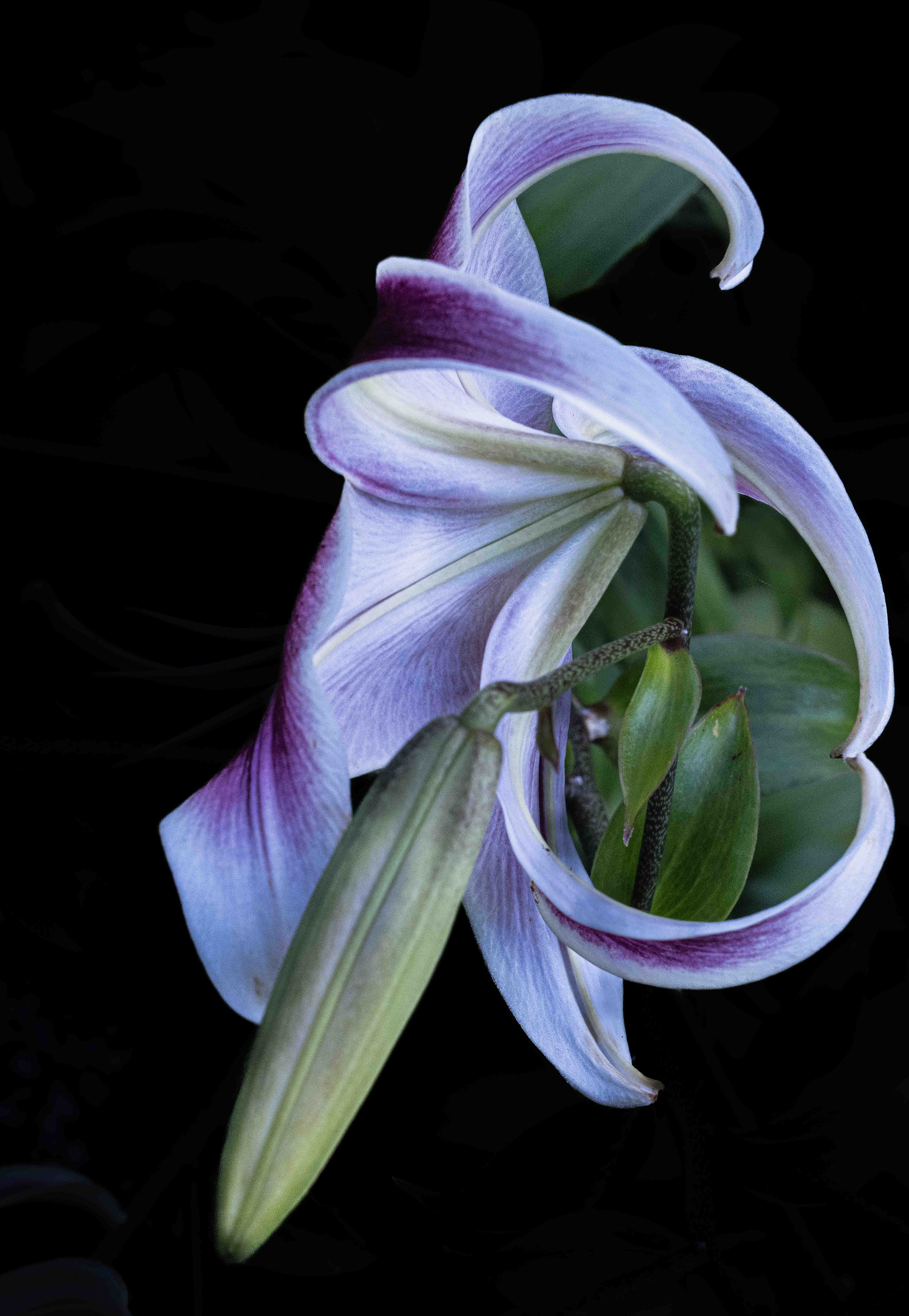
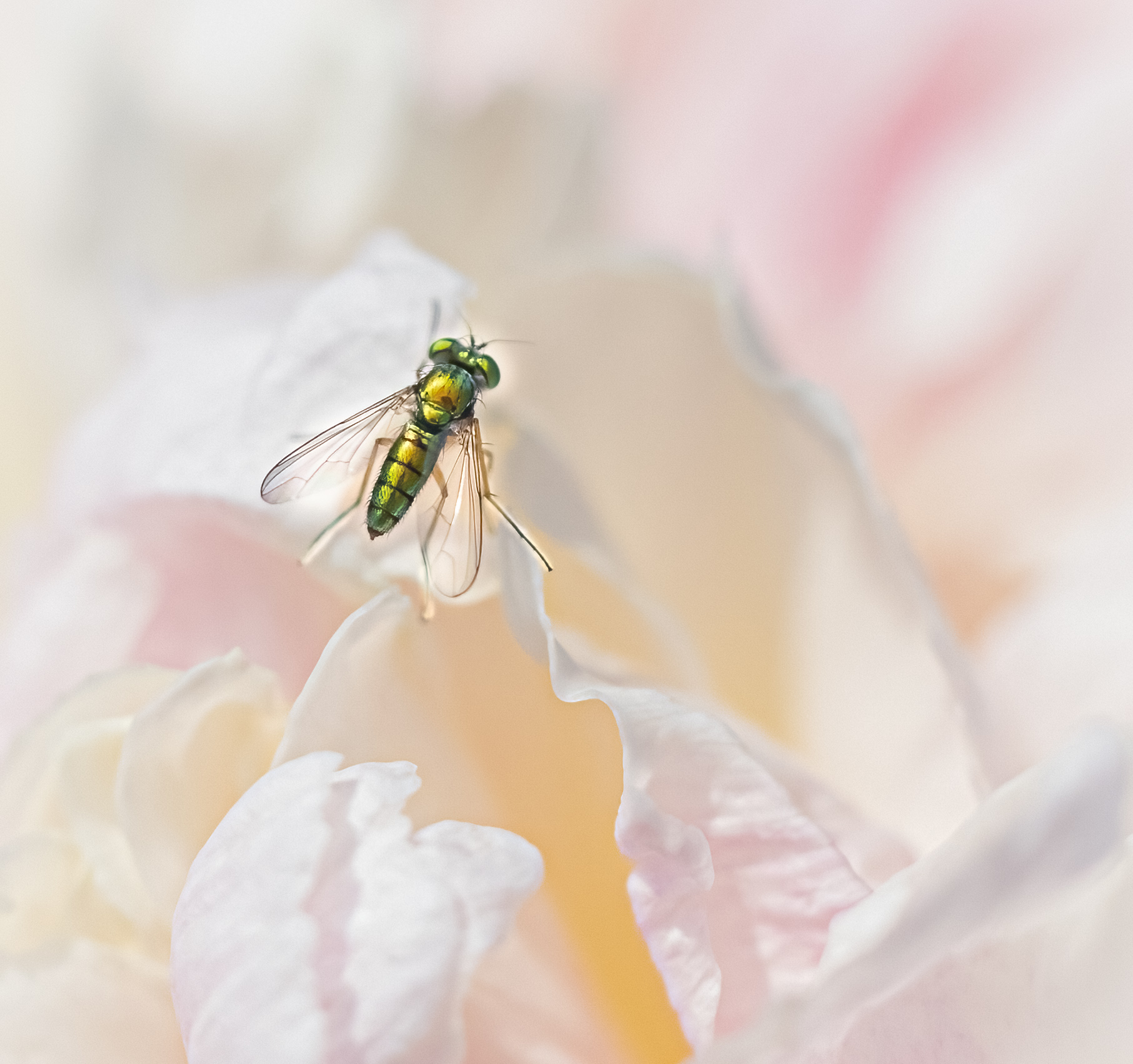
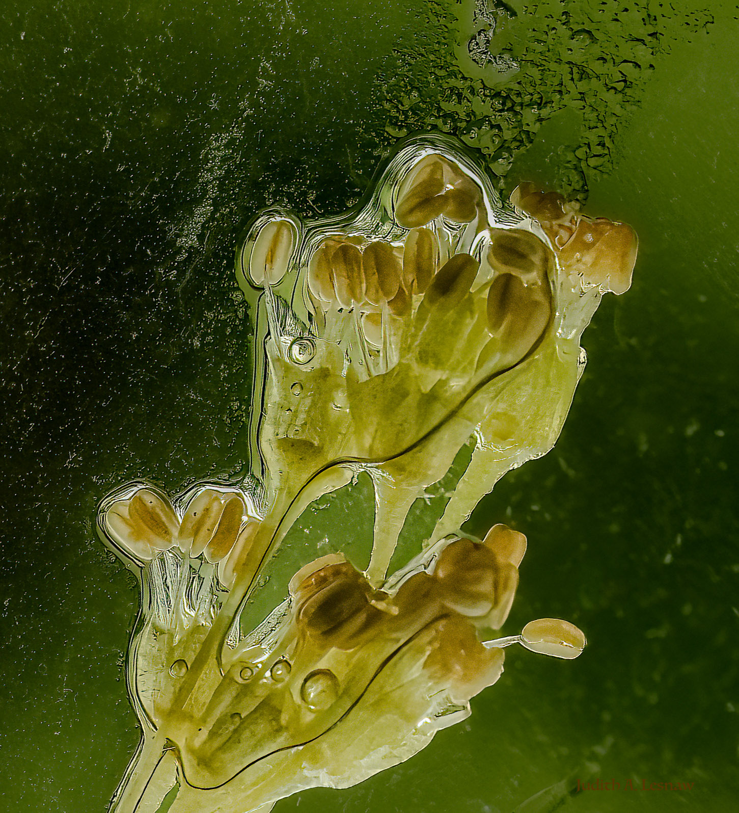
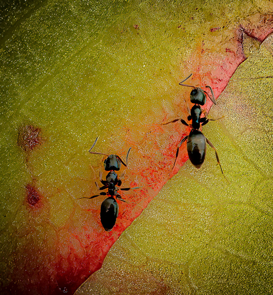
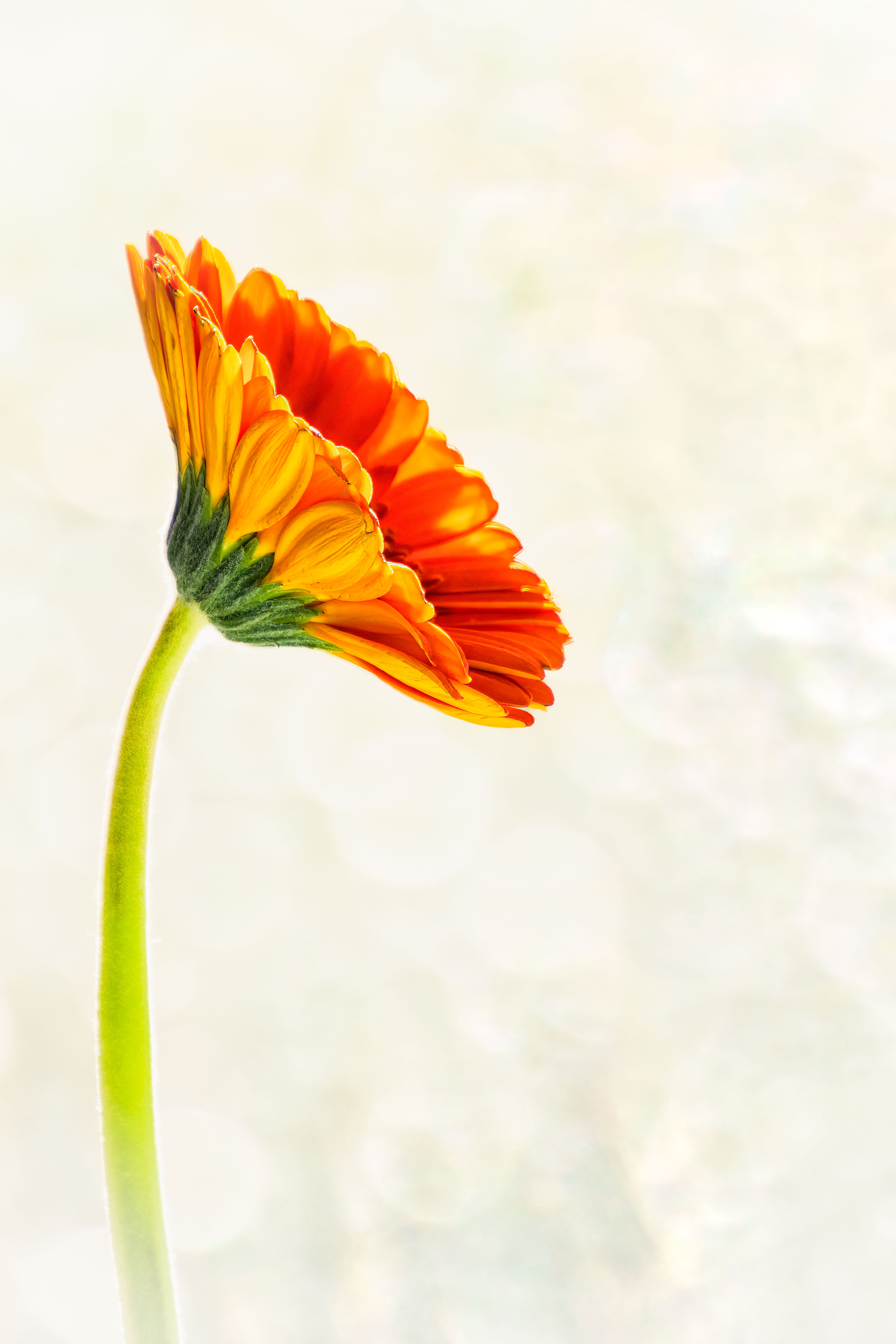
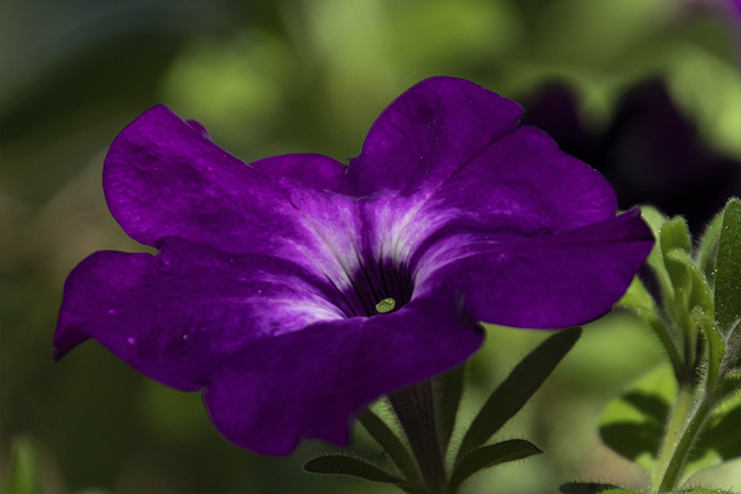
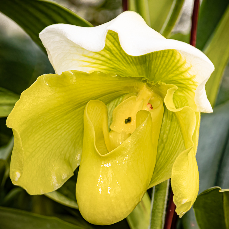
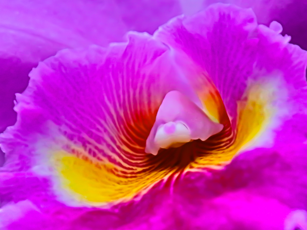
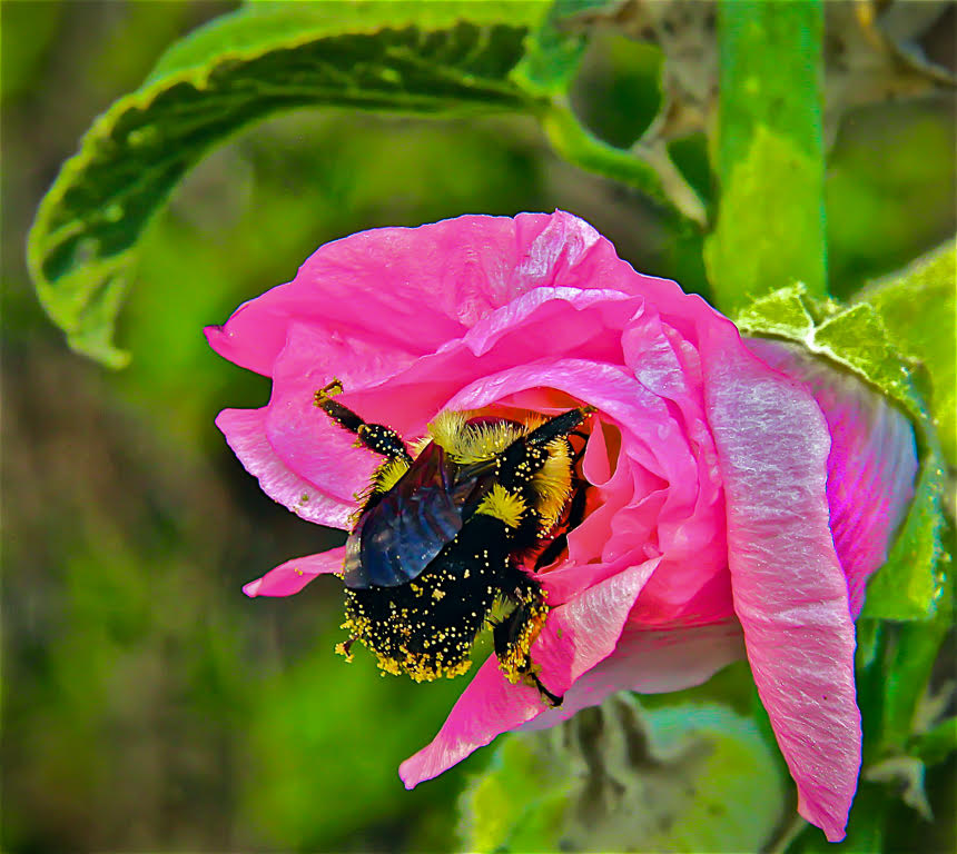
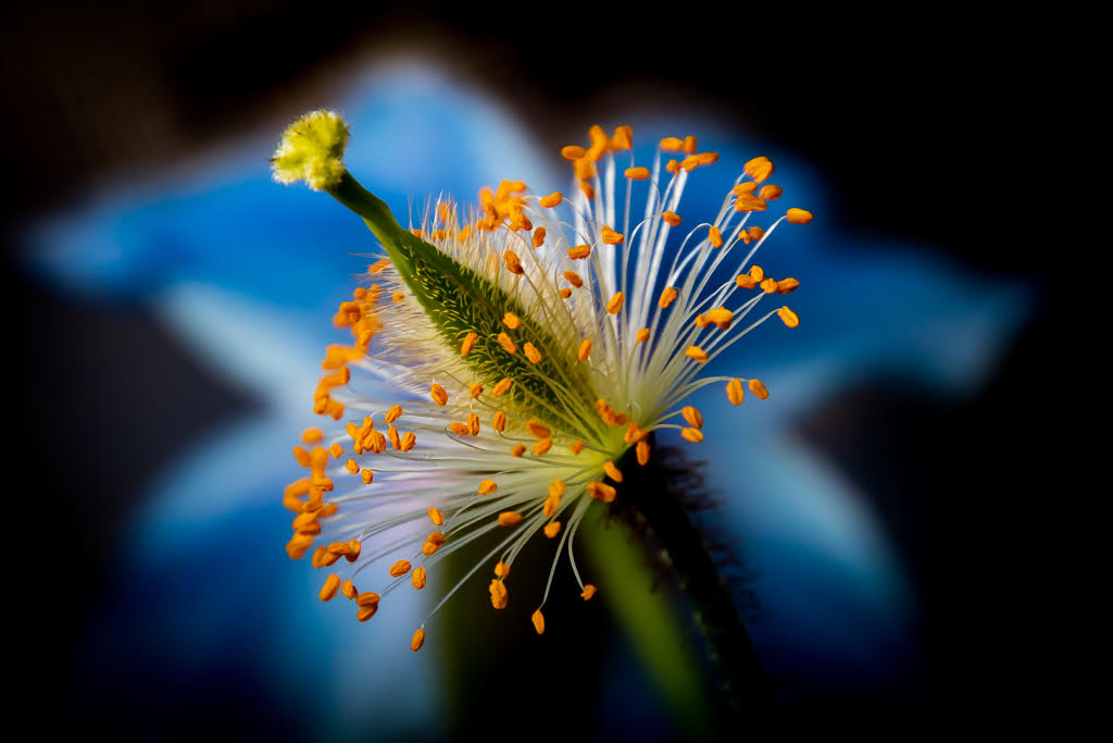
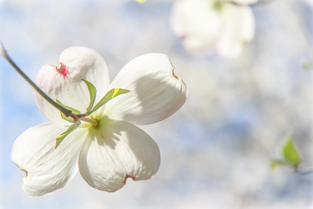
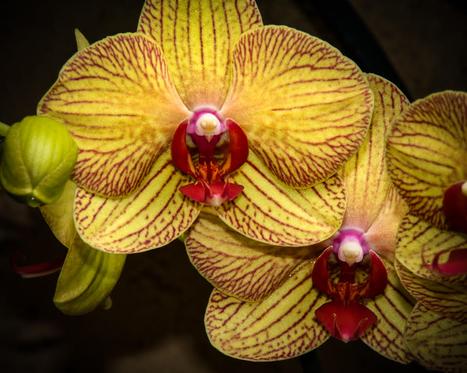
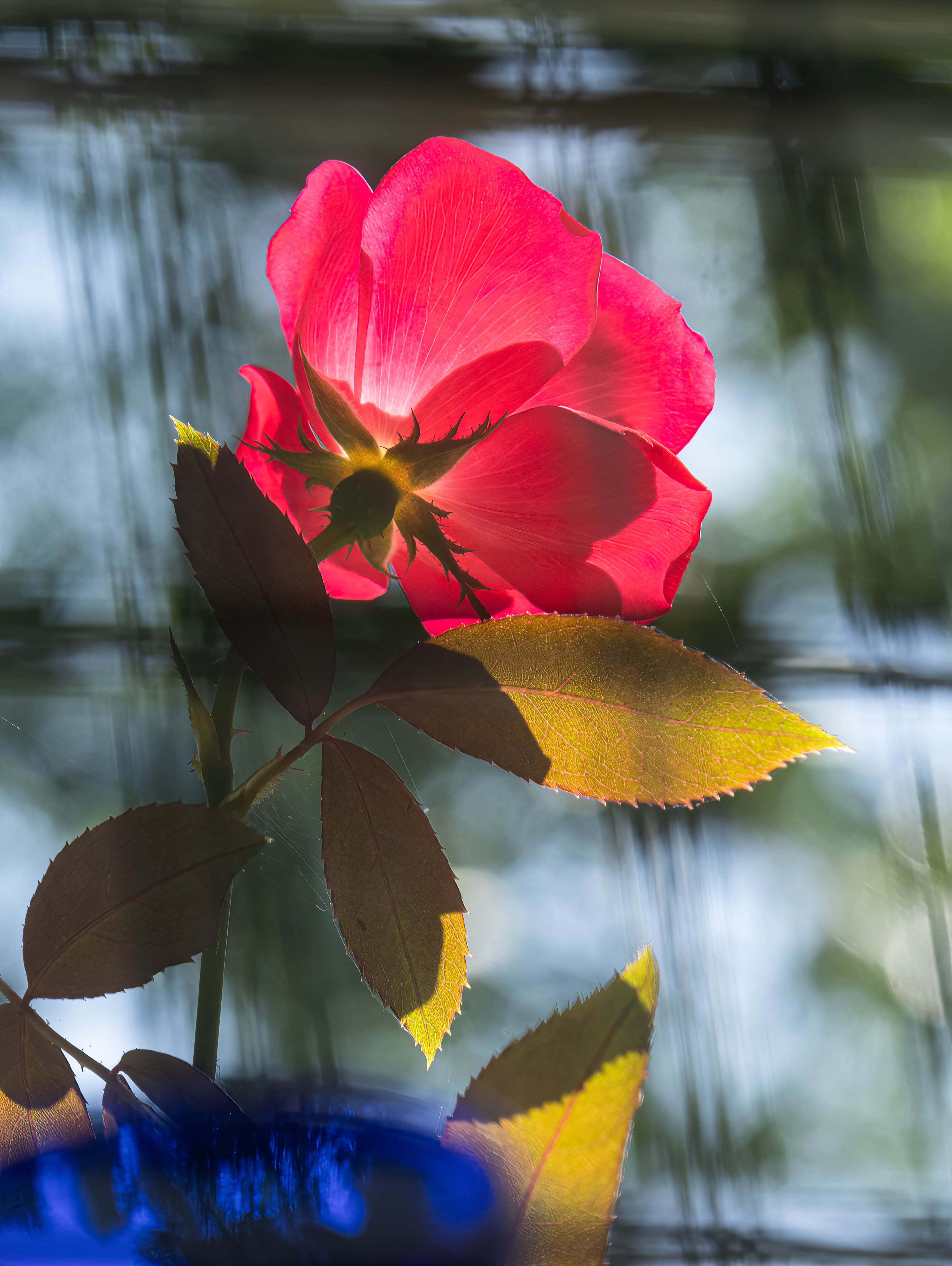
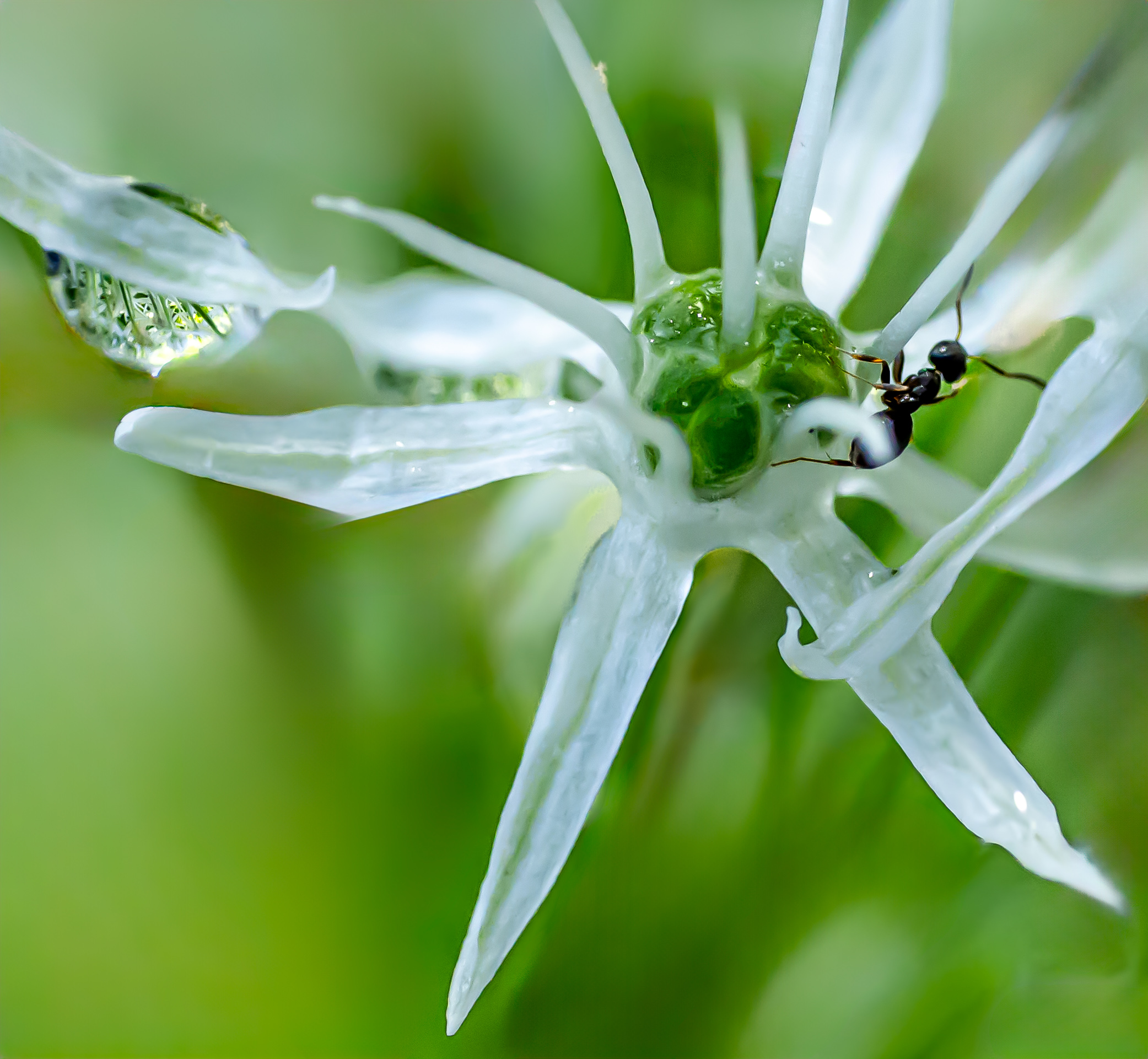
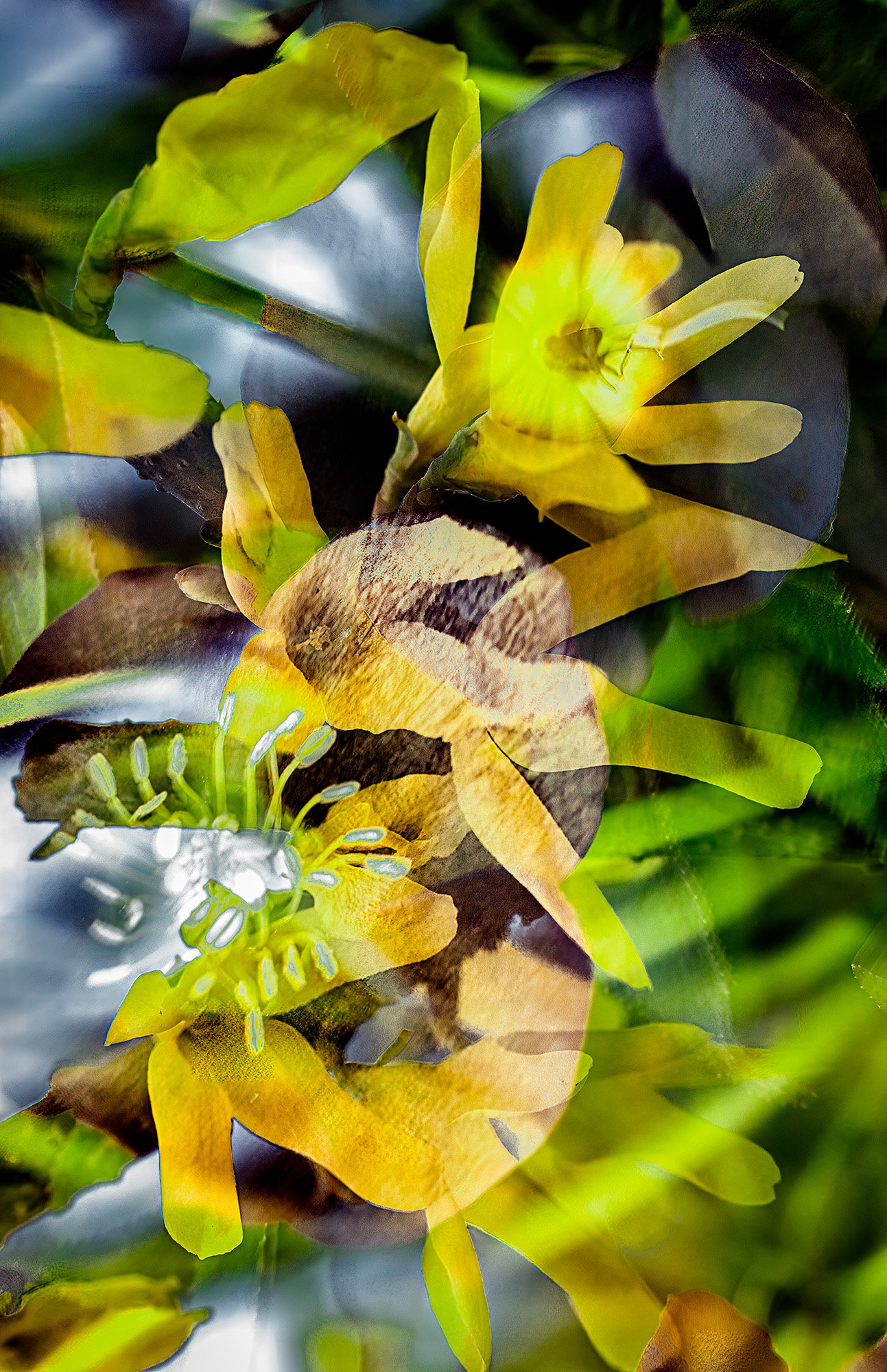
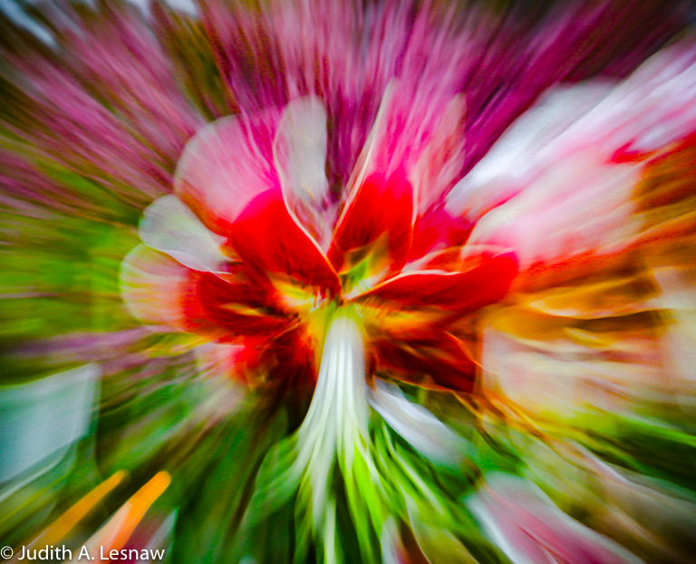
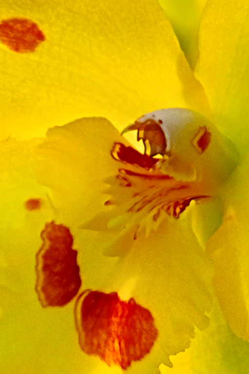
Sharon, wonderful background. The colors in the flower reappear in muted hue, and the flower emerges gracefully. Closer examination reveals the gems: bee with flapping wing and ants, all in focus. These elements of interest might become more prominent with a tighter crop, but I do like your composition as presented. This image will reward the careful observer. |
Sep 10th |
| 52 |
Sep 19 |
Reply |
AH HA--I do believe that I see what you mean. I really appreciate nitpiks as they help me to become a better photographer. Many thanks! |
Sep 3rd |
| 52 |
Sep 19 |
Reply |
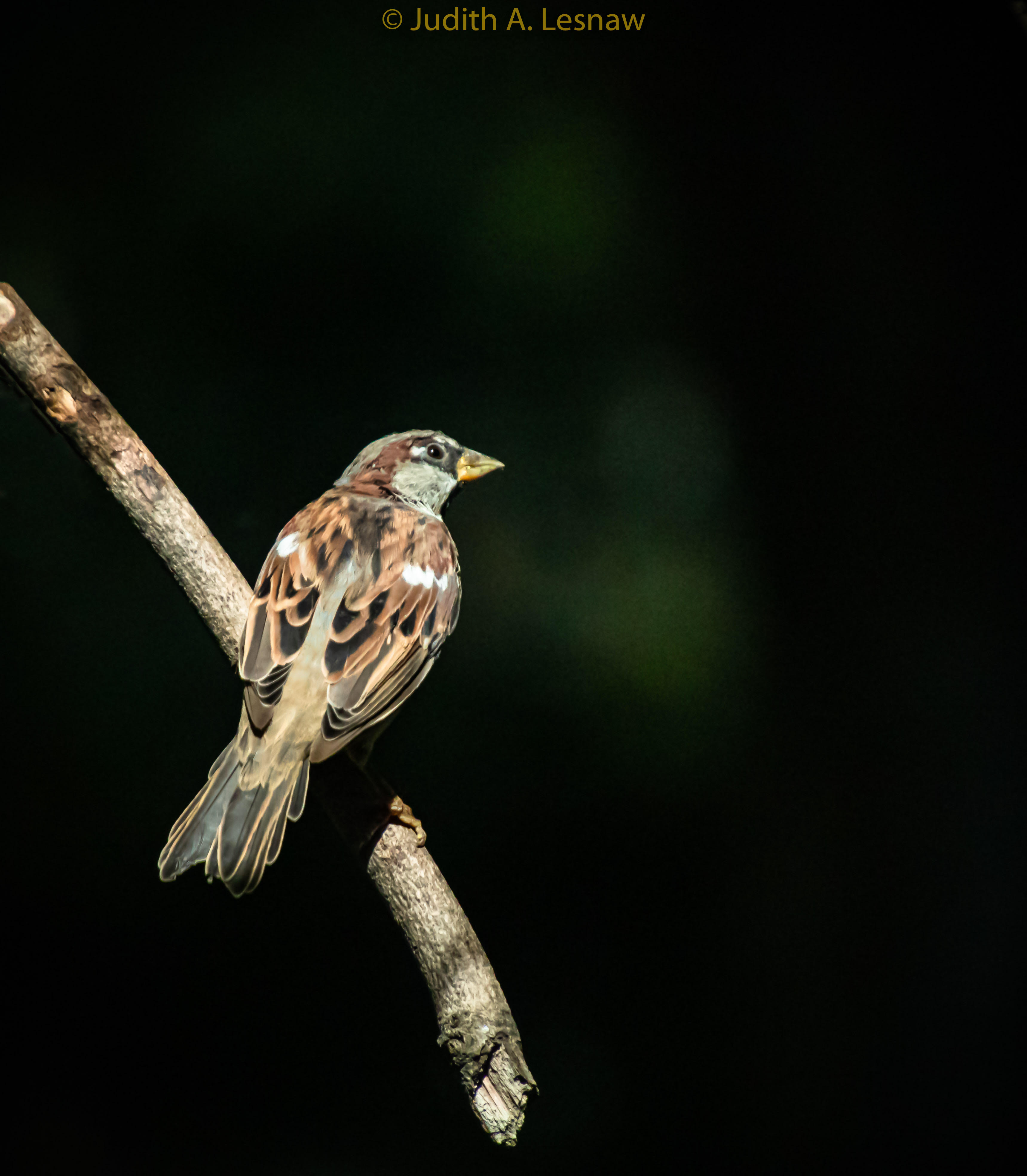
Mike, try though I may I cannot see the the flower stem of which you speak--even when I compare my version with yours. Can you direct me to it in other terms? Also what do you mean by "tight"? I do see that the upward-pointing wing looks softer in your version. I like very much the flower color in your version, and will experiment with the color luminosities again. Thank you so very much!! |
Sep 3rd |
5 comments - 2 replies for Group 52
|
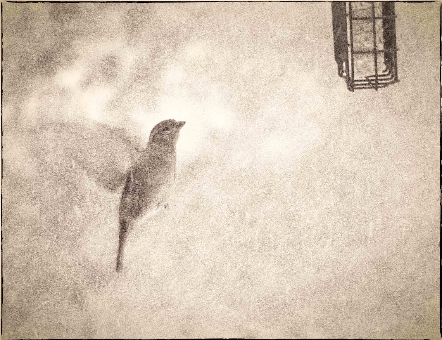
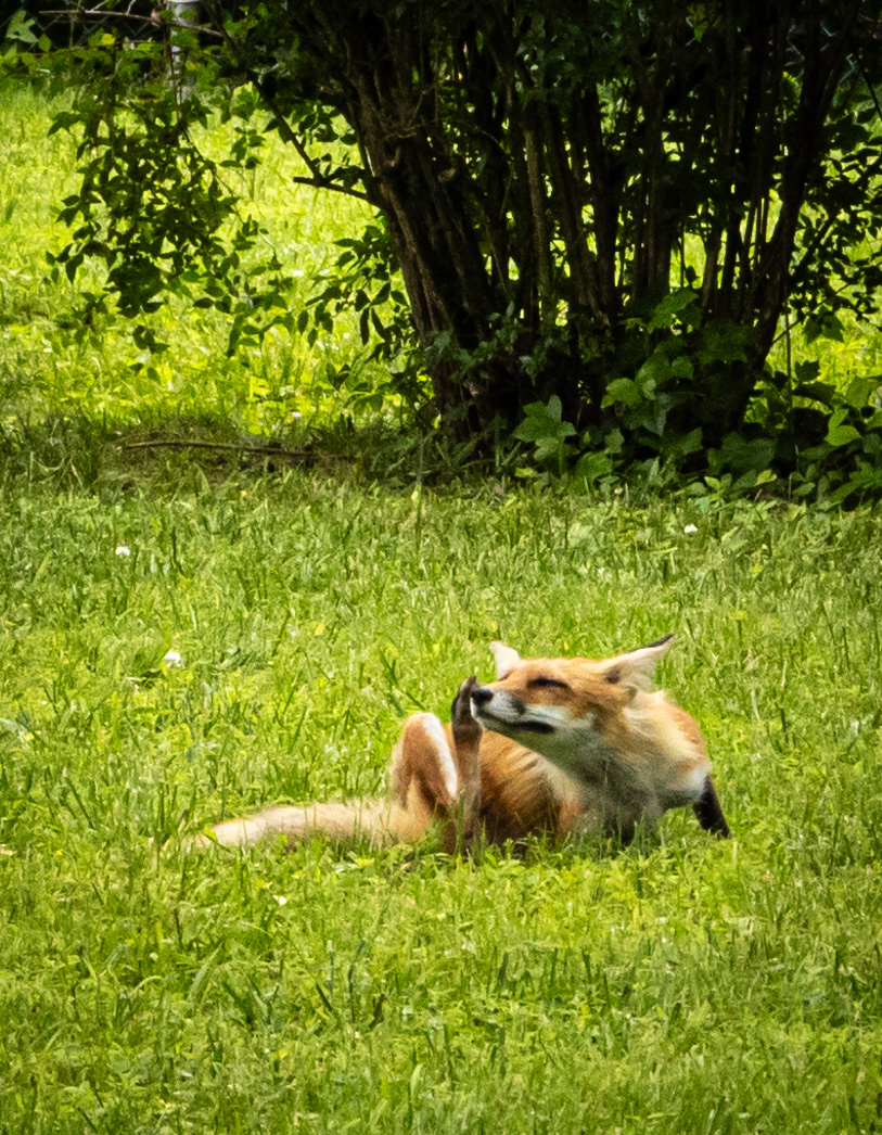
| 79 |
Sep 19 |
Reply |
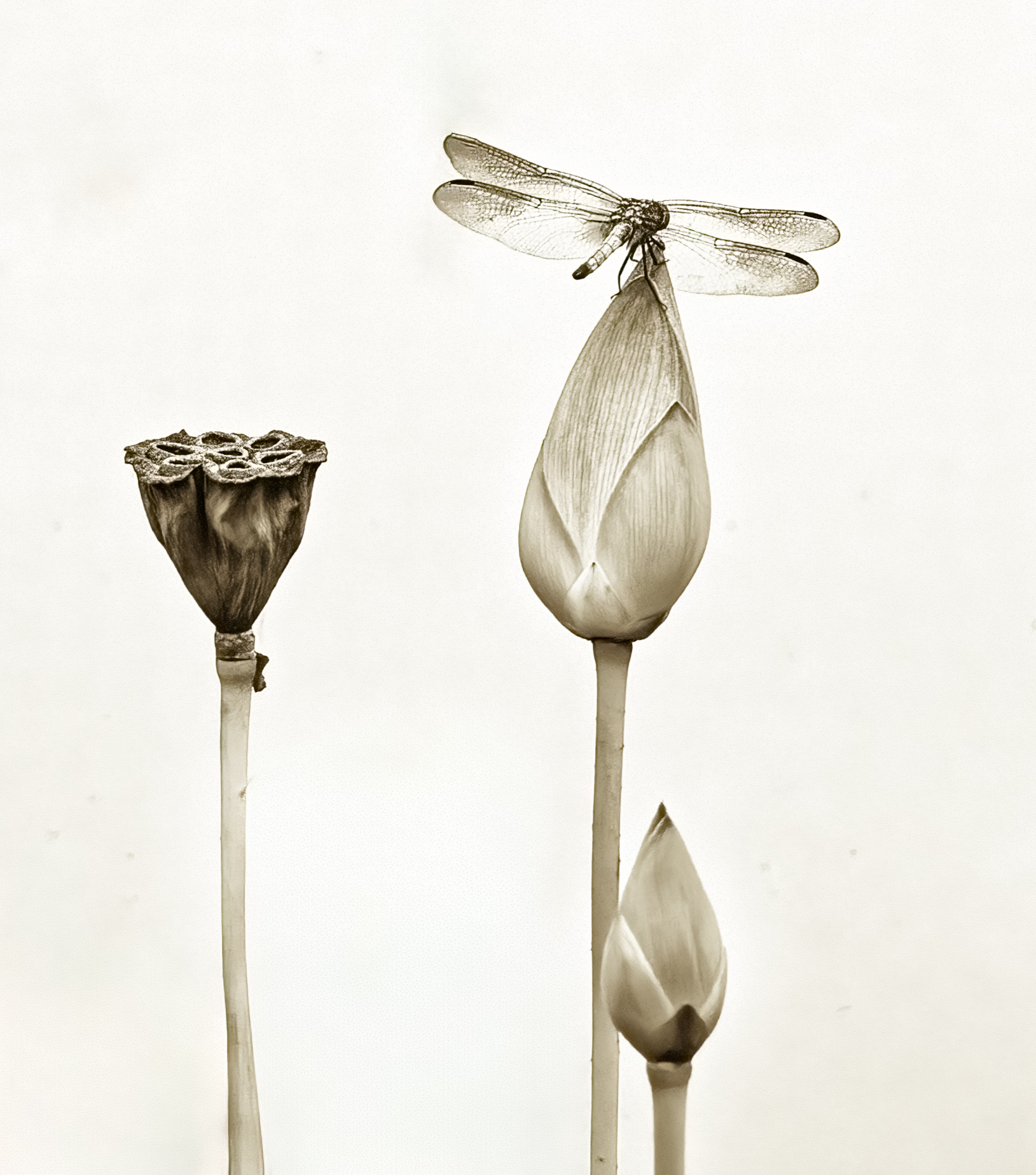
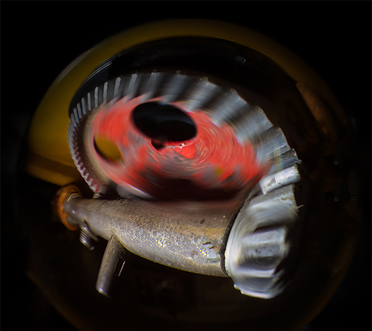
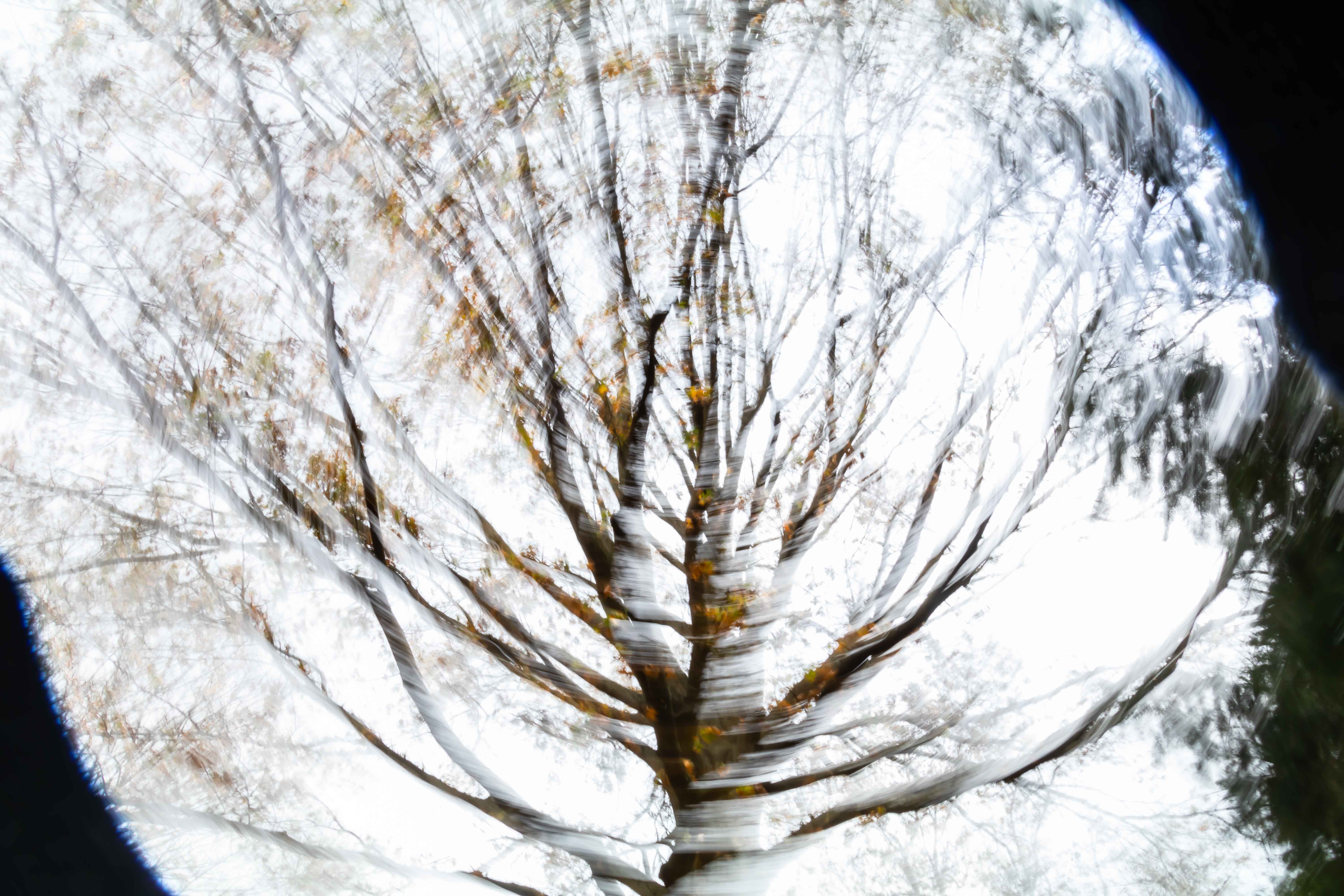
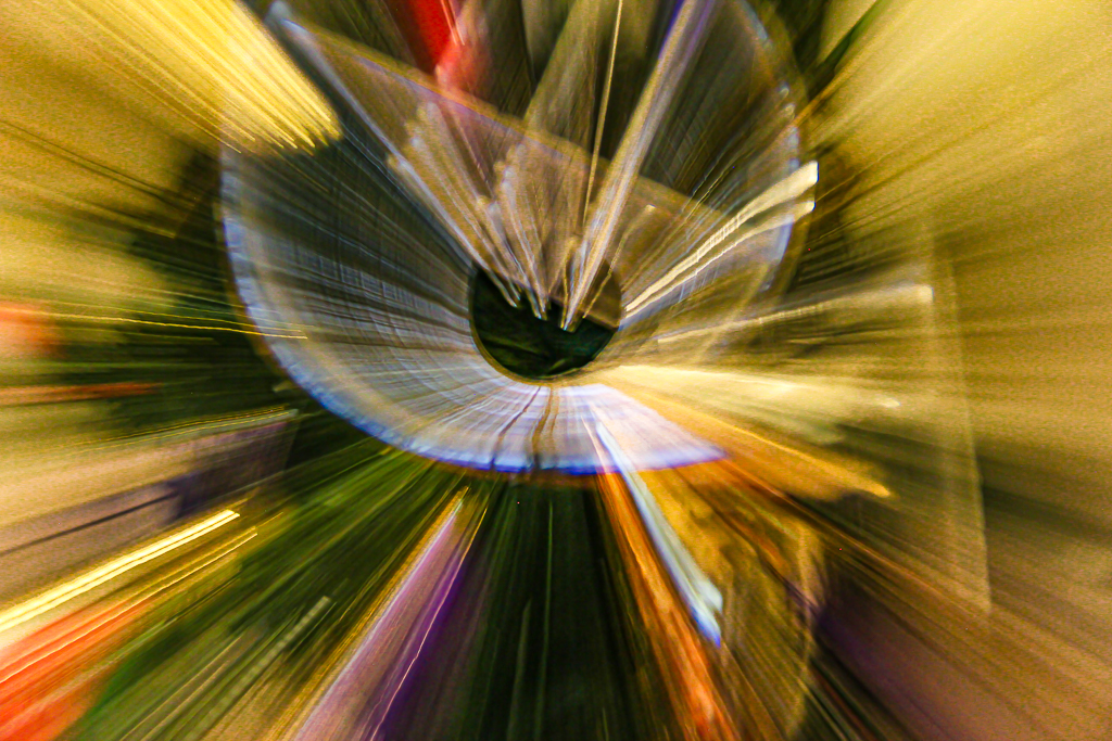
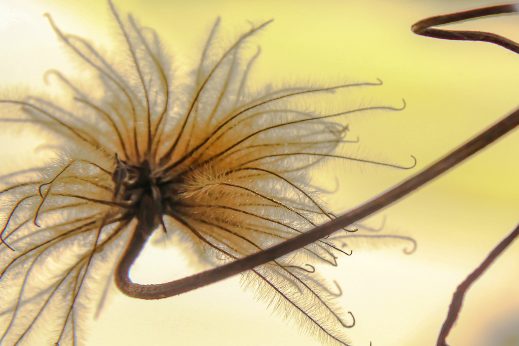
Karl thanks for introducing me to the term "pareidolia". I experience the effect often.
|
Sep 10th |
| 79 |
Sep 19 |
Reply |
Karl, thank you so much for these tips. Were you using LR or PS? I dont remember a gradient tool in LR, but perhaps it is in the new version. |
Sep 9th |
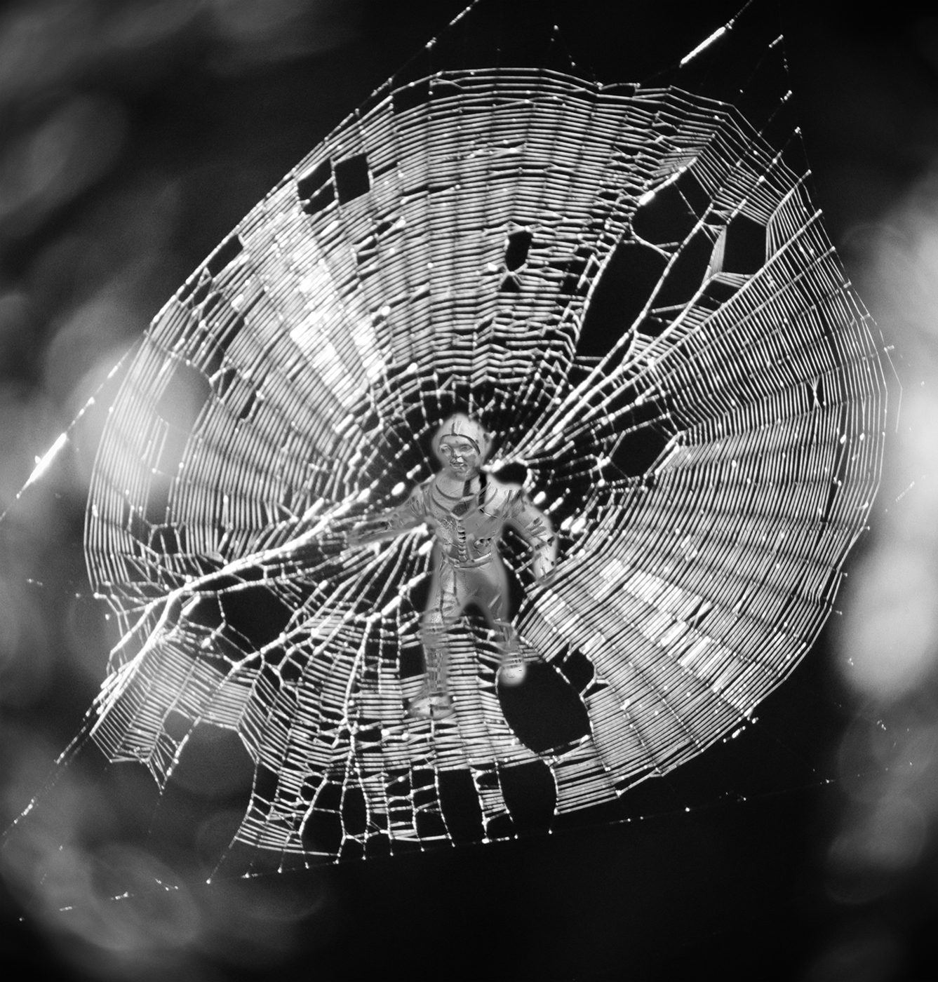
| 79 |
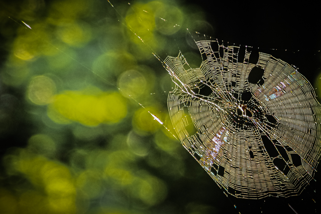
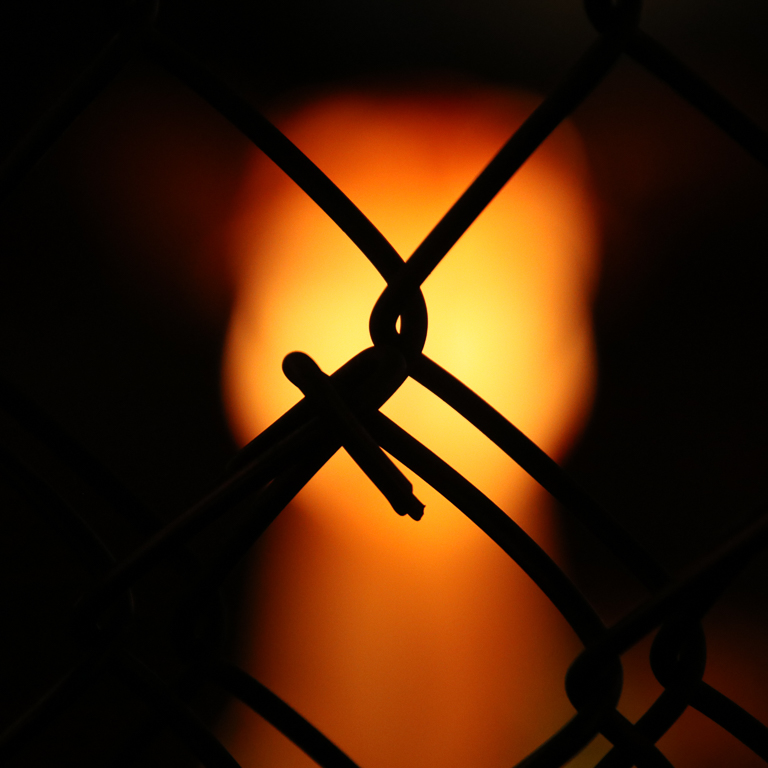
Sep 19 |
Reply |
Karl, you are absolutely right! I love your crop. I had cut off the right side because I didnt know how to mute the highlights on the right without darkening the web. Did you perform your edits in Photoshop? I have not yet learned it. I am learning Lightroom. I have MUCH to learn. |
Sep 9th |
| 79 |
Sep 19 |
Comment |
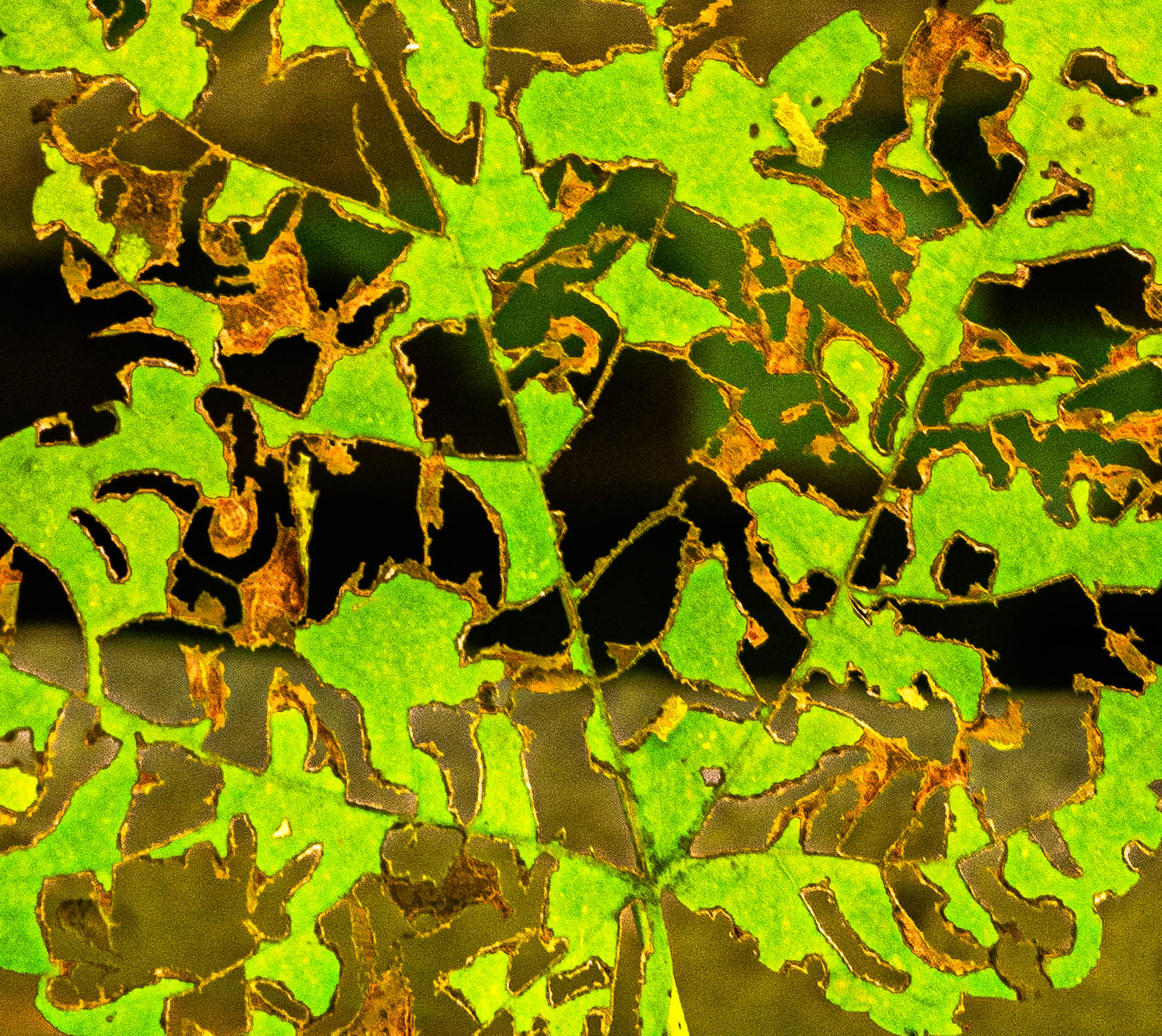
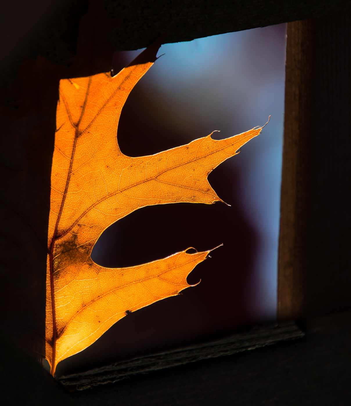
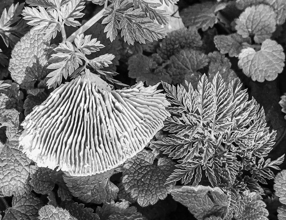
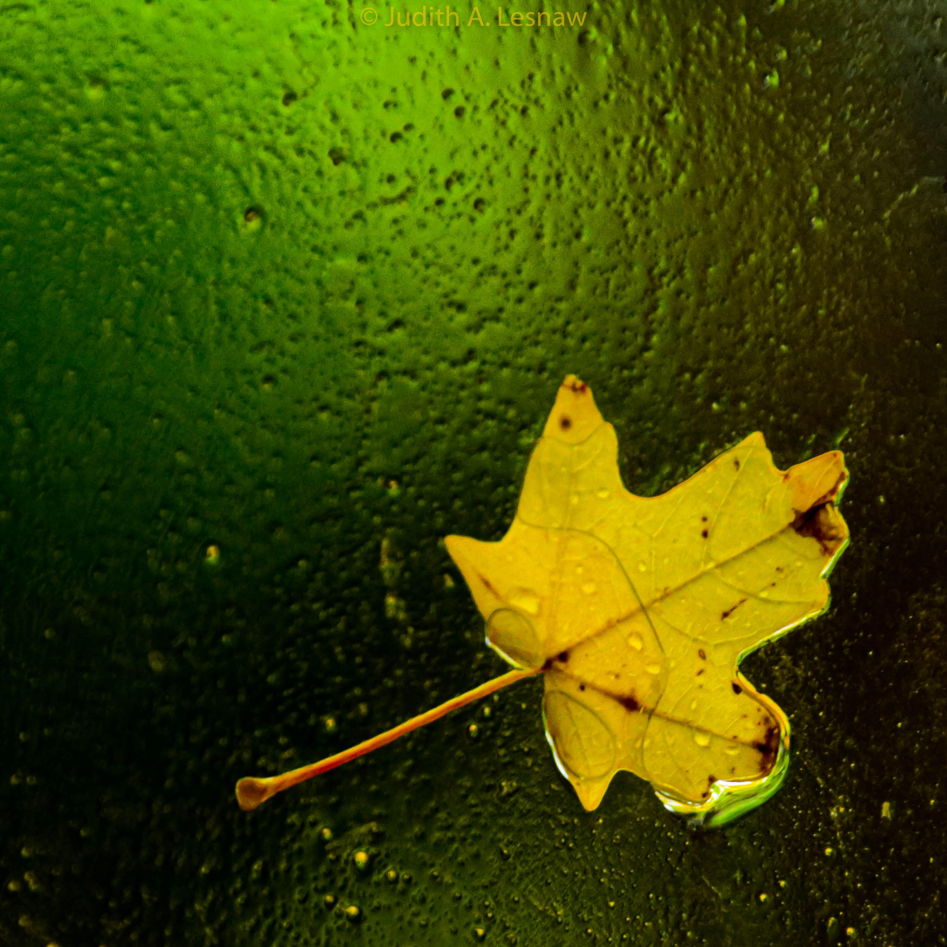
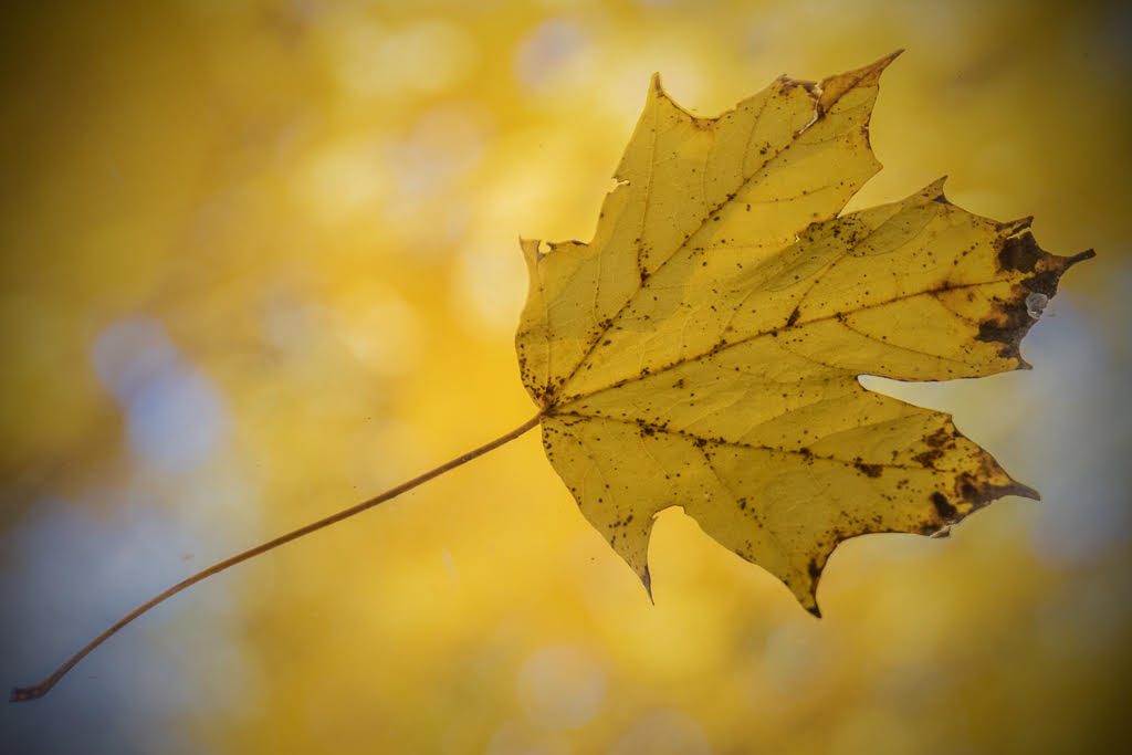
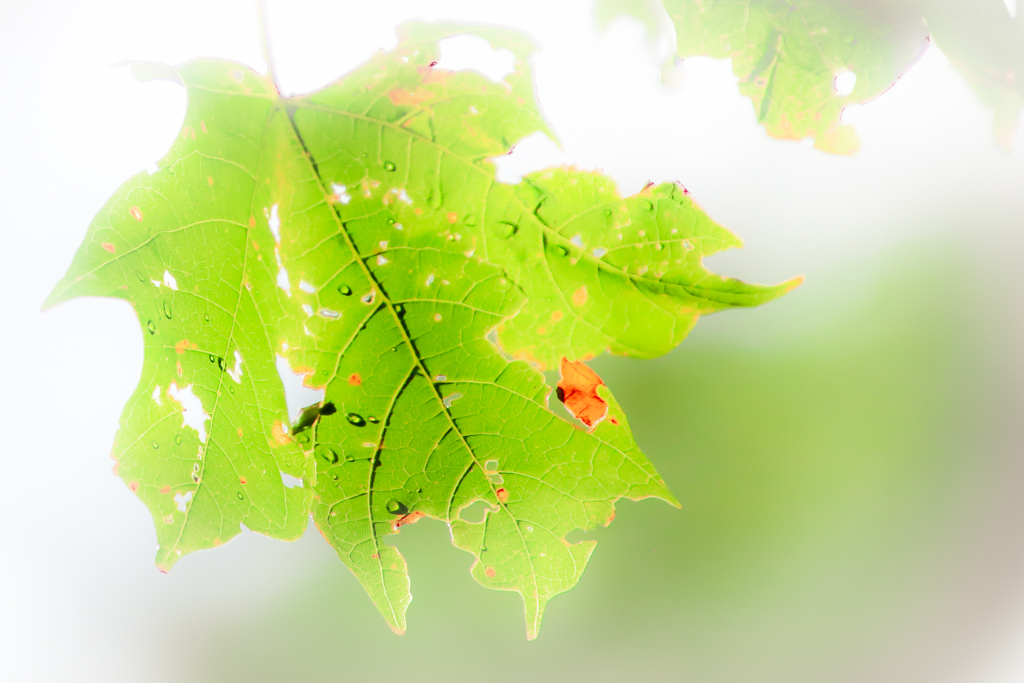
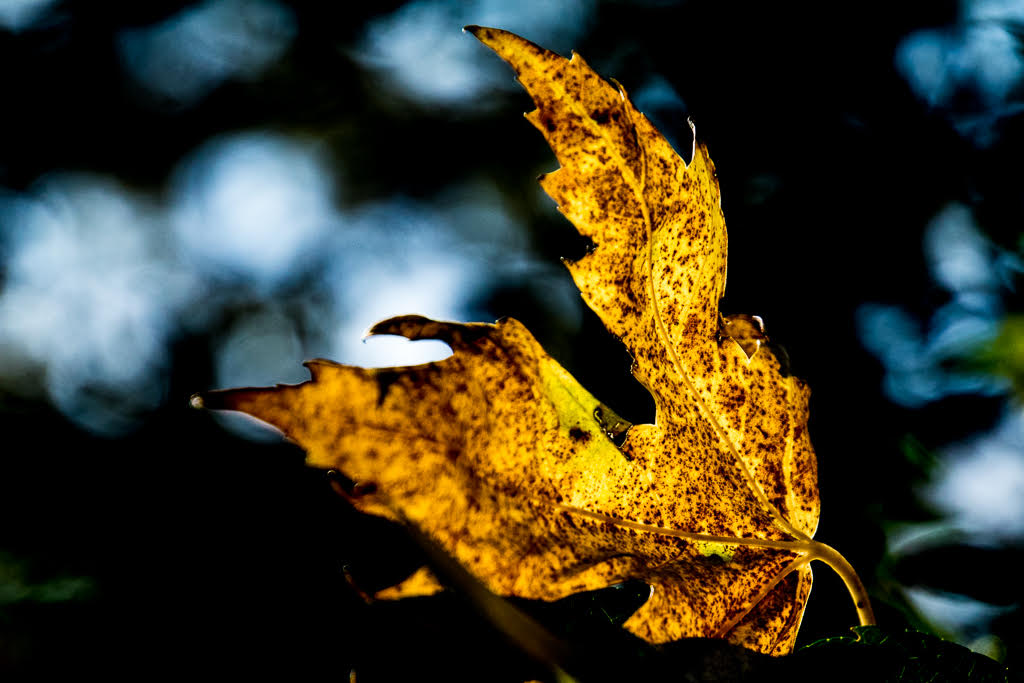
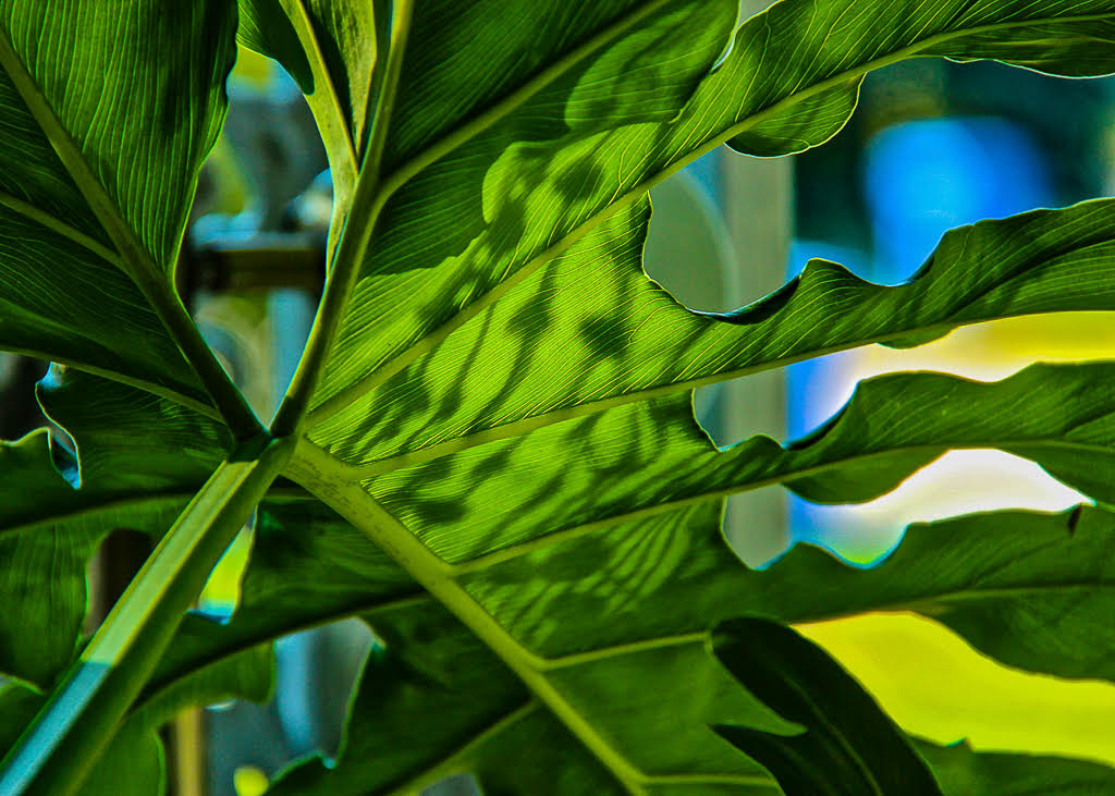
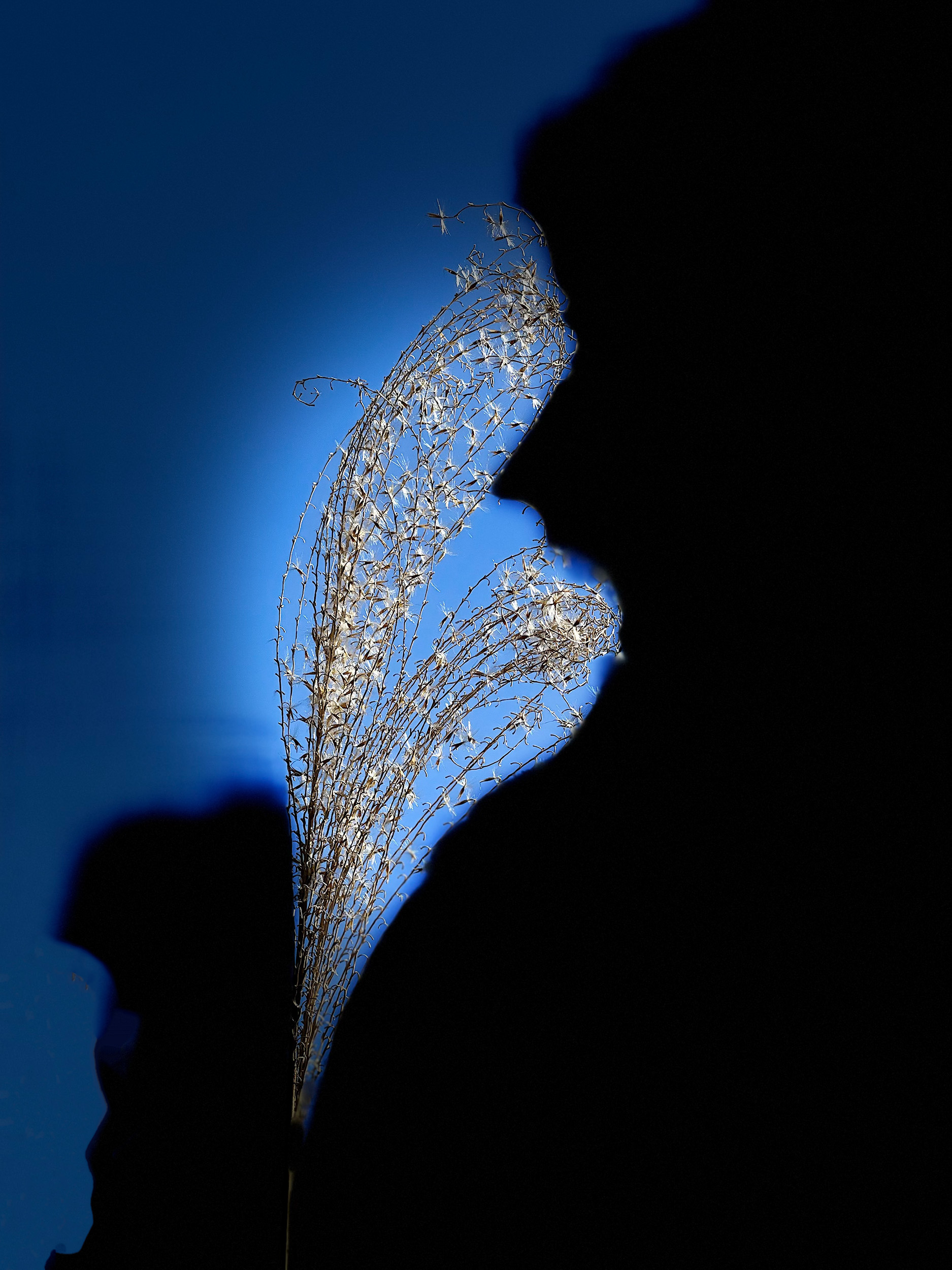
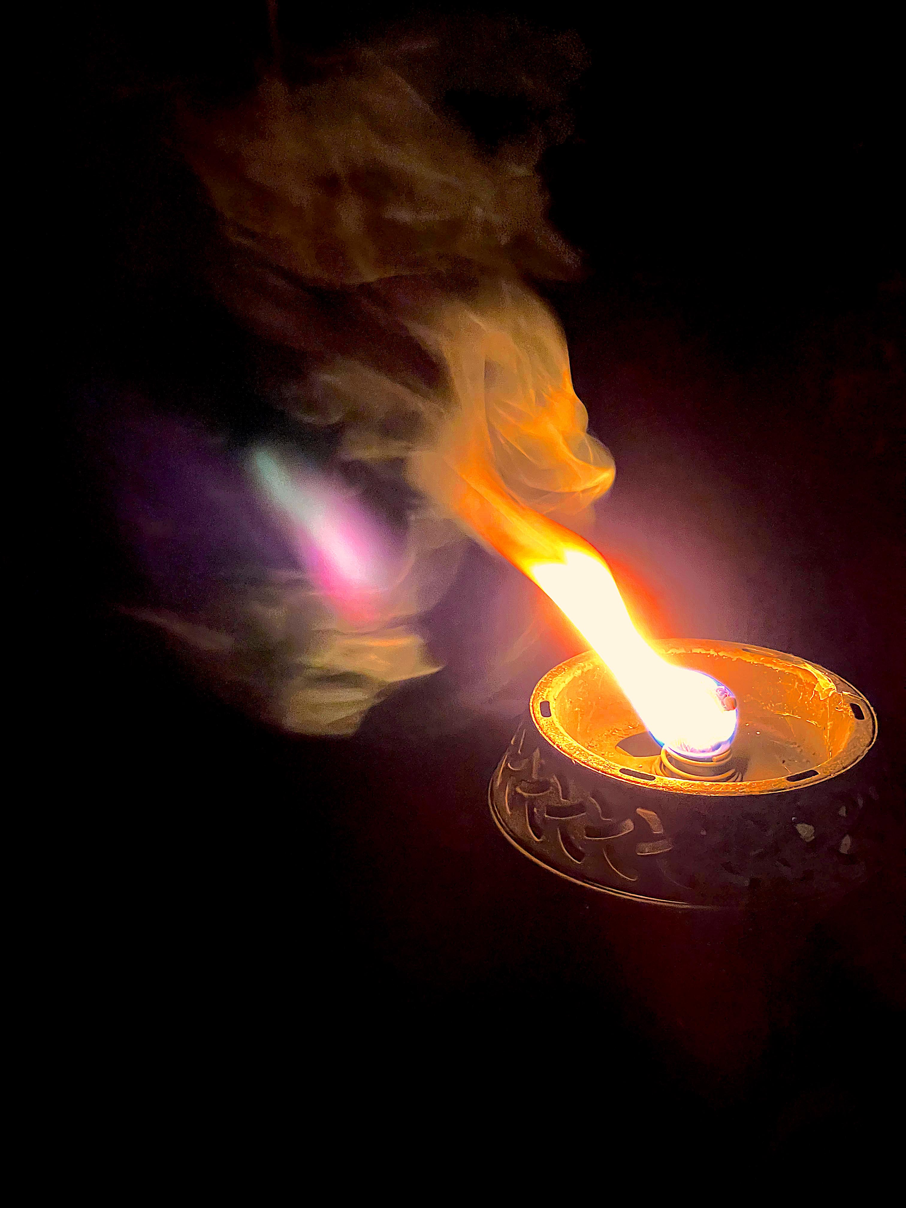
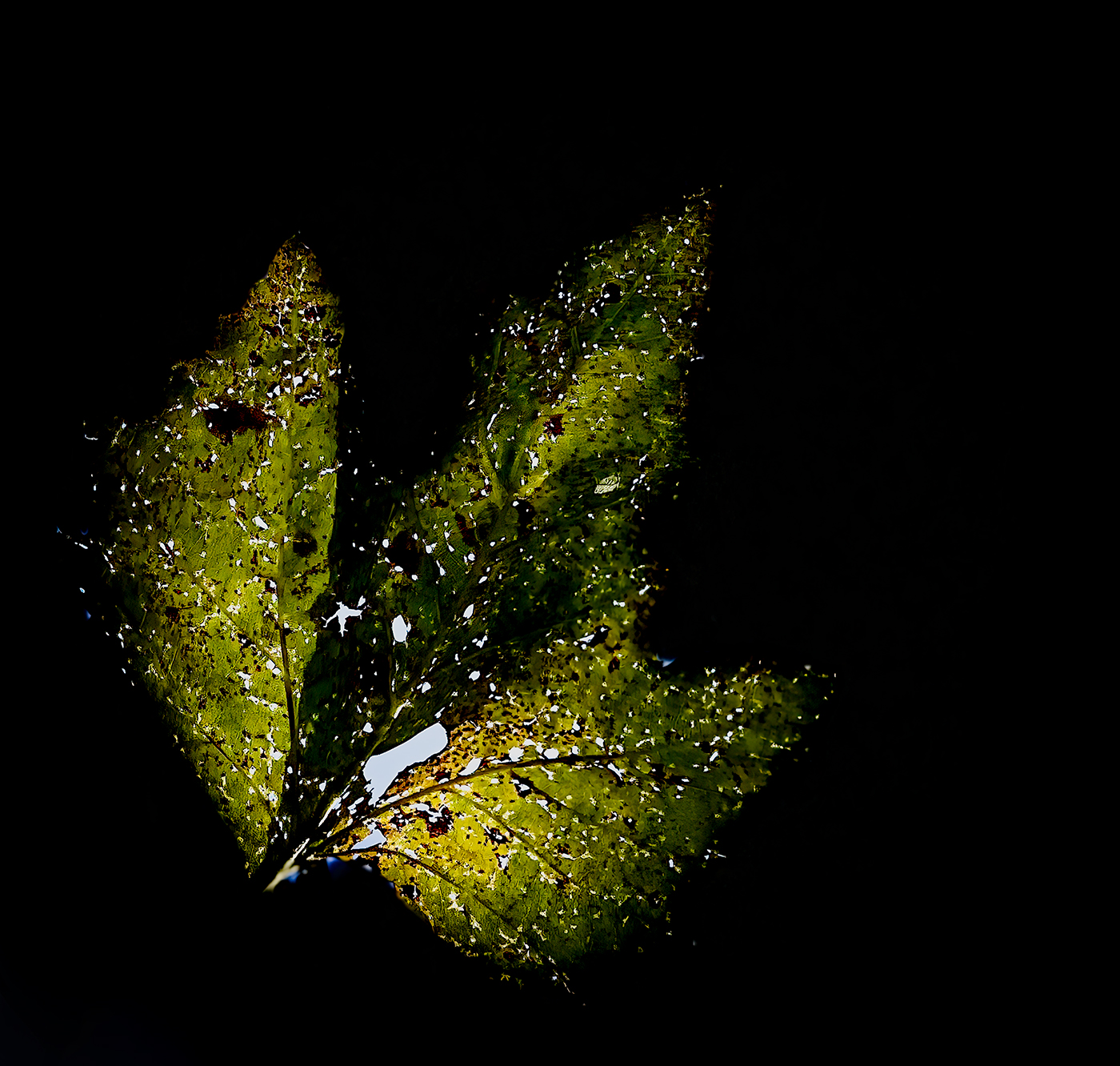
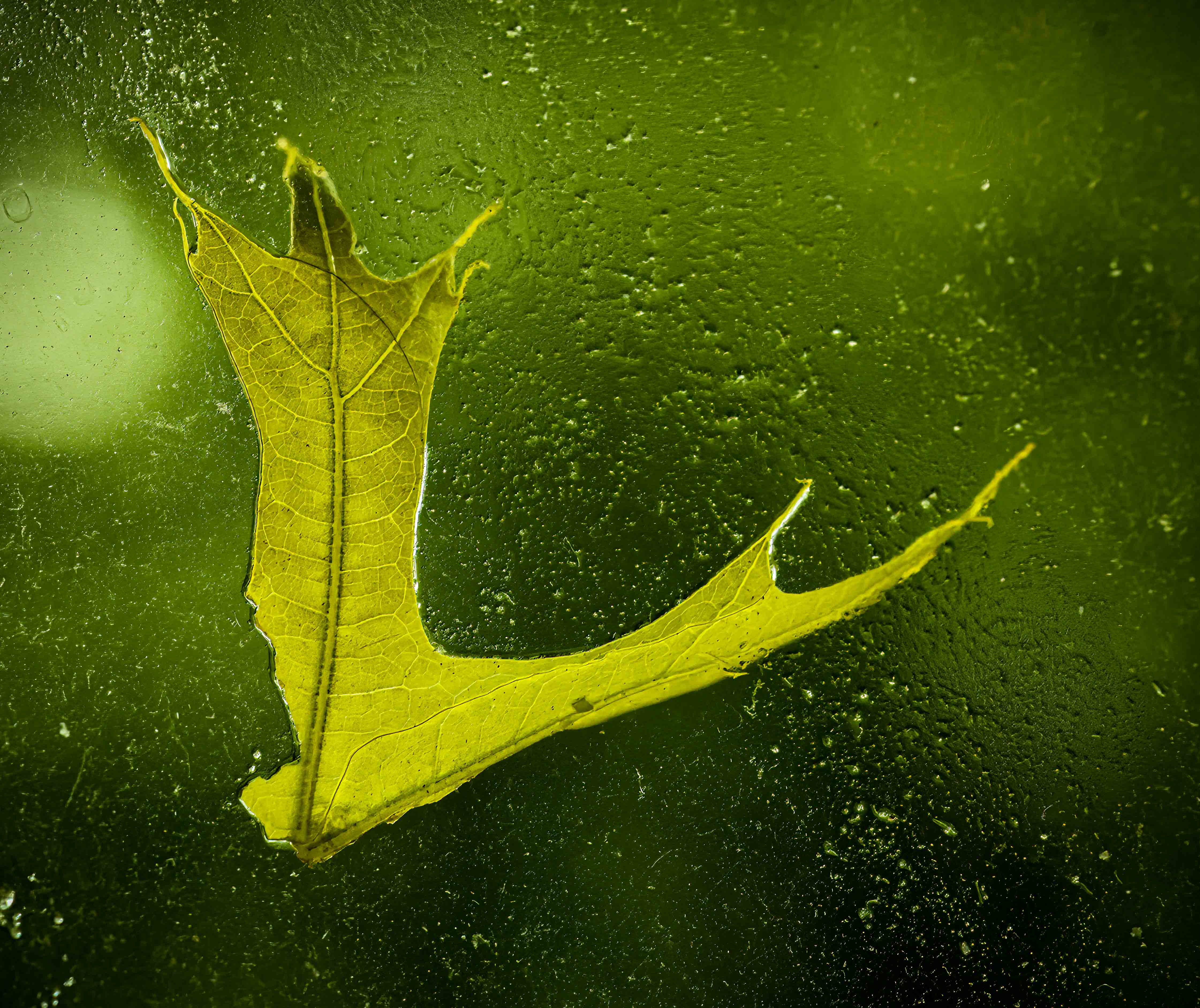
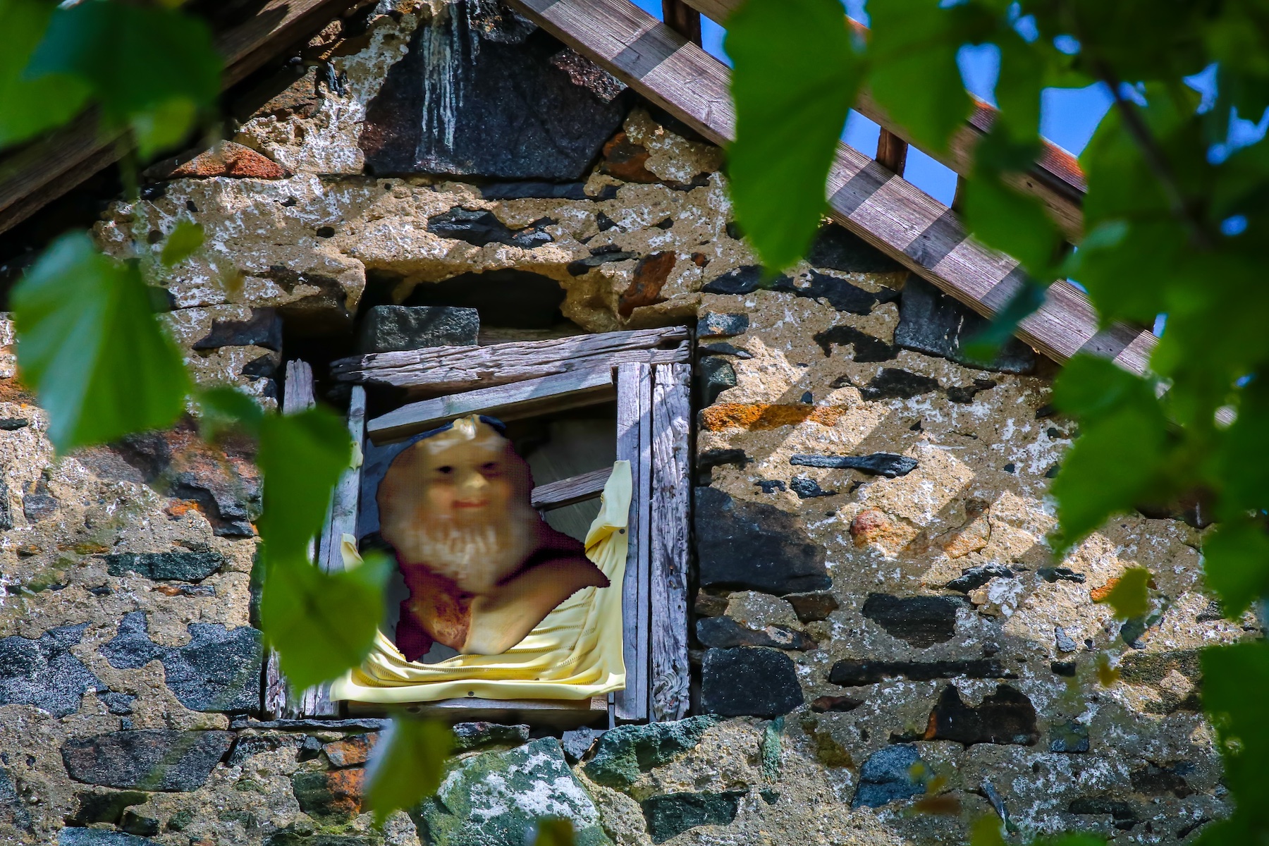
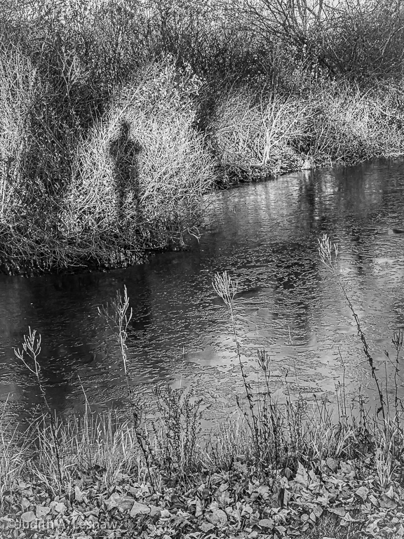
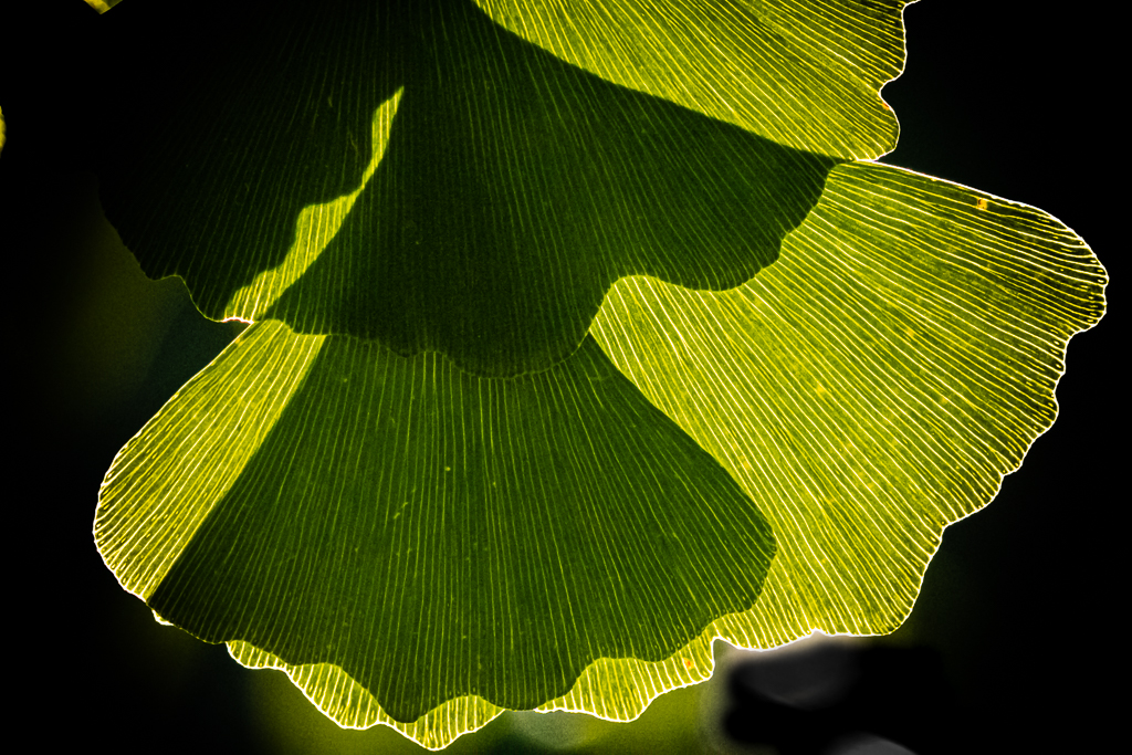
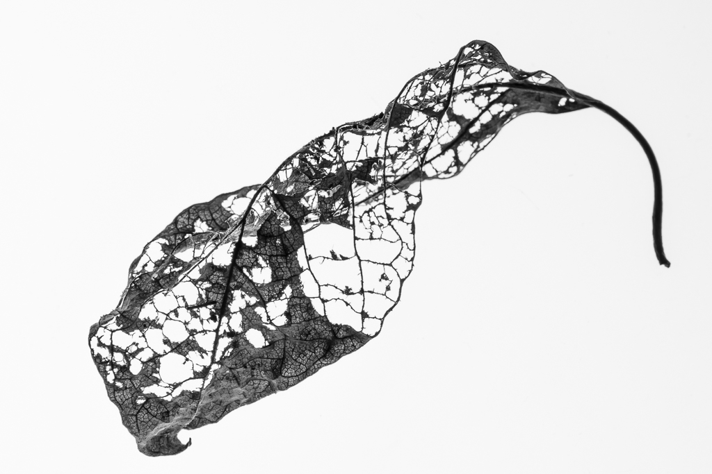
Sandra, there are some pleasing colors and interesting patterns in this image. It is difficult to tell where the lens was trying to focus as overall the image appears to be soft. You might capitalize of that softness by cropping the image to concentrate on the patterns on the left, and applying a filter that would simulate an impressionistic painting. Alternatively, you might concentrate on the right-hand splits in the leaf. It resembles an abstract woman with long hair draped over her left shoulder, sitting on a rock and balancing herself with her right hand resting on the rock. I would try to increase contrast a bit to help her emerge. |
Sep 8th |
| 79 |
Sep 19 |
Comment |
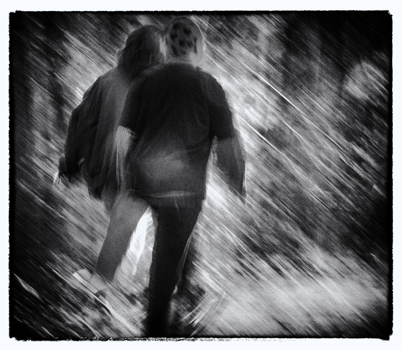
Dear Karl, you certainly captured an atypical nude pose. The monotone works well. Upon viewing the image for the first time I was reminded of a contrived 1950s horror, or Hitchcock film. But then I had not heard of William Mortenson or the book to which you refer. So I looked into his work. It is not an oeuvre that I will willfully pursue. But back to your image. Until I read your description of the day and conditions I had missed the defining element: her misty breath that escapes as she screams. For me that mist elevates the image from contrivance to a lived moment. But one cannot see the mist. It is lost among the reflections in the river. And while the resemblance of her hair to the grass along the river bank is interesting, the lack of contrast between the model and the background grasses is distracting. I would try to enhance the visibility of that misty breath, and deemphasize the bright background to allow that subject to jump from the paper screaming.
All that said, you have a great unposed model moment, and I bet it does very well in competition. |
Sep 8th |
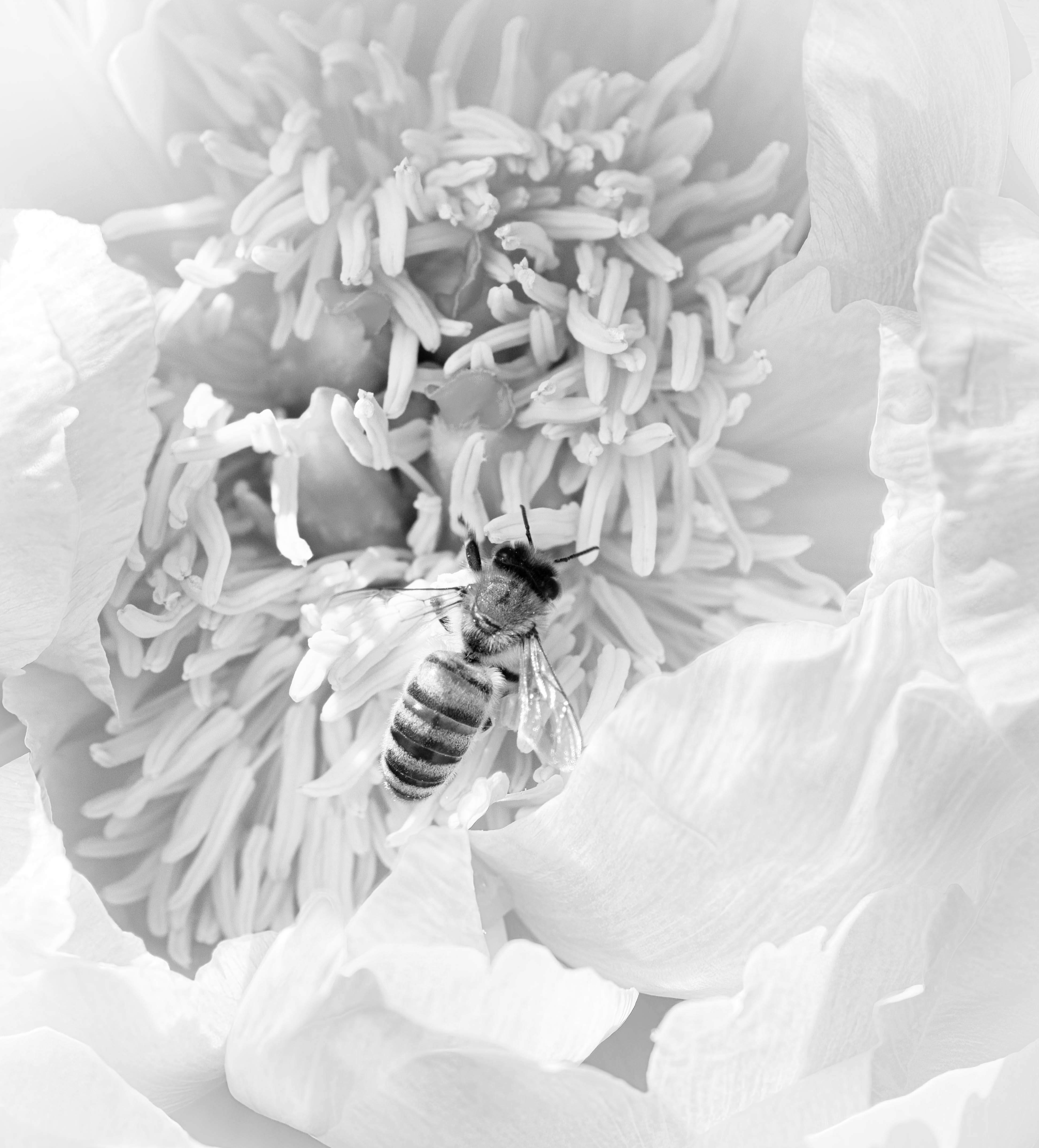
| 79 |
Sep 19 |
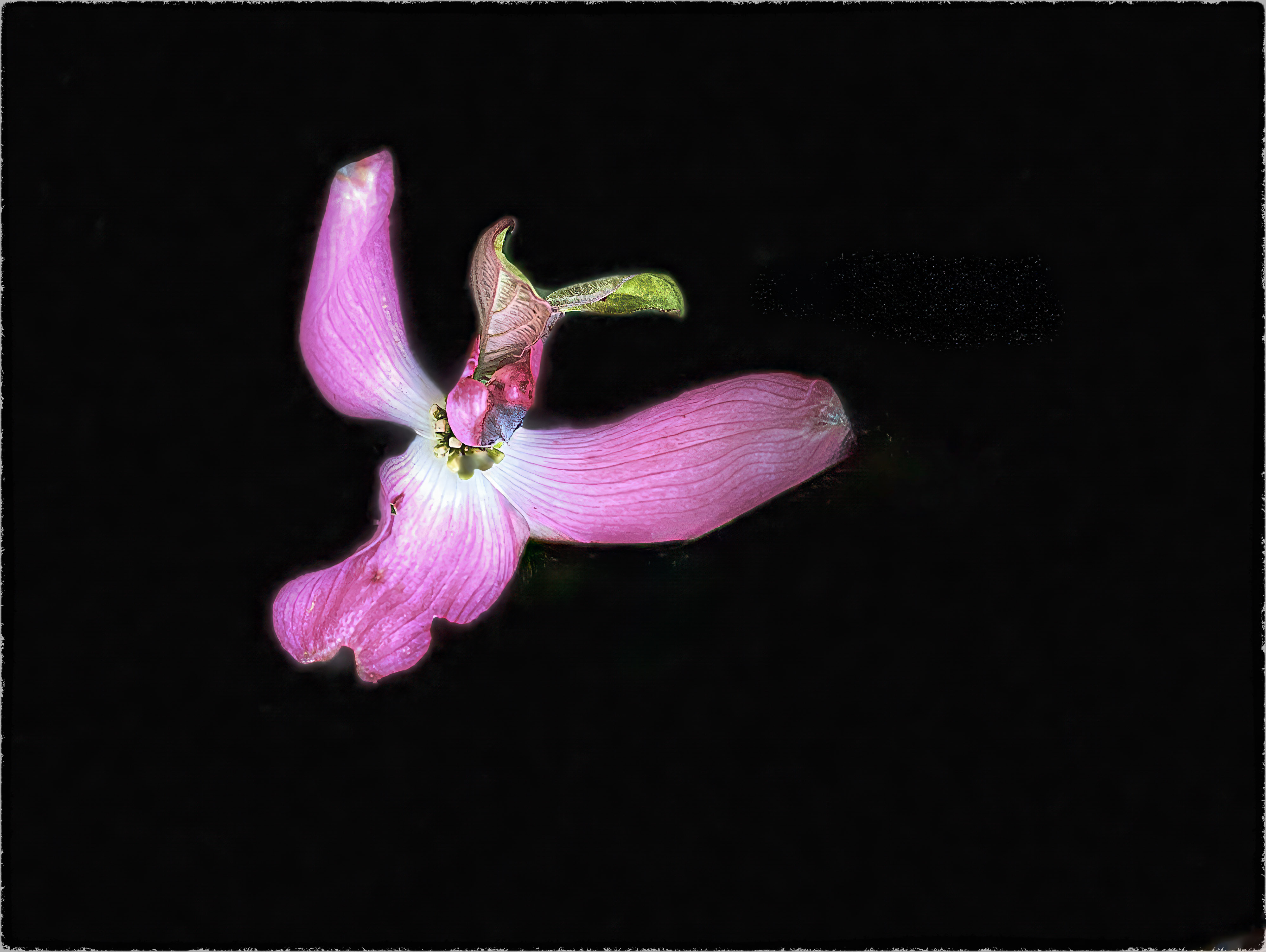
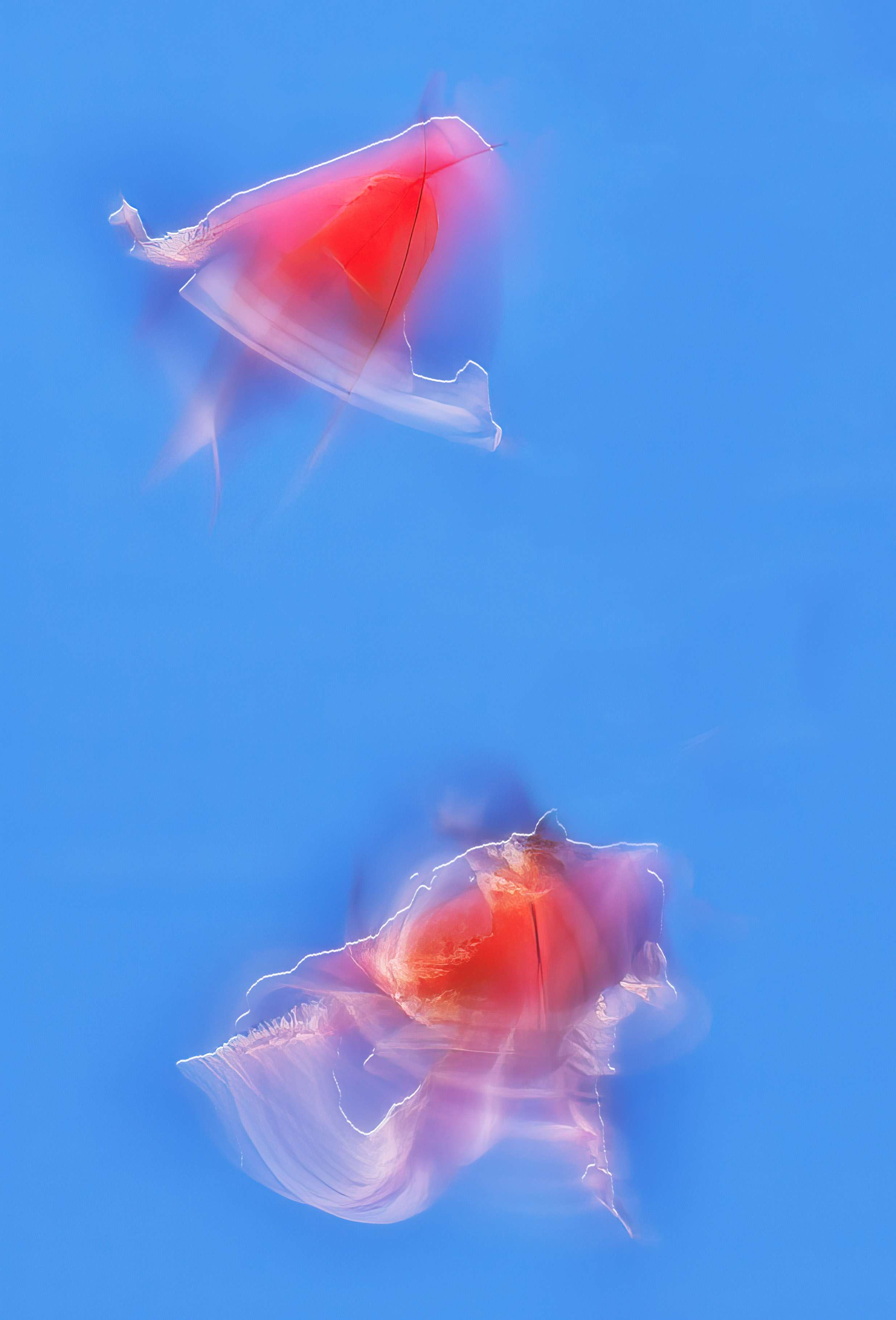
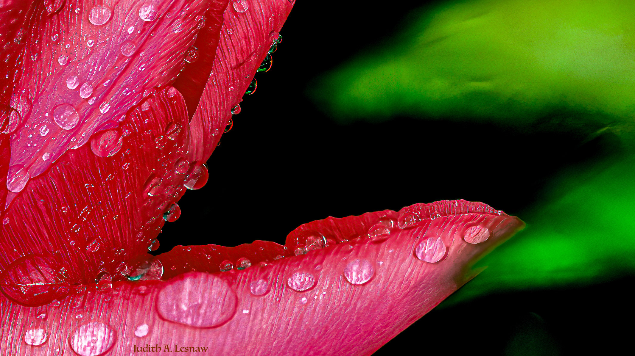
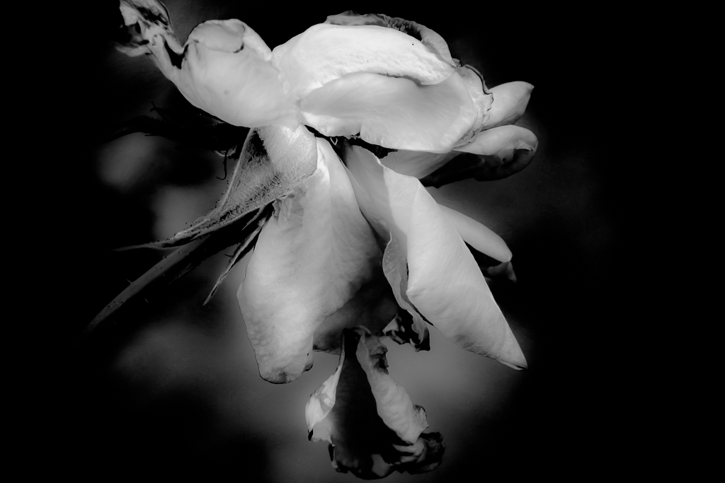
Comment |
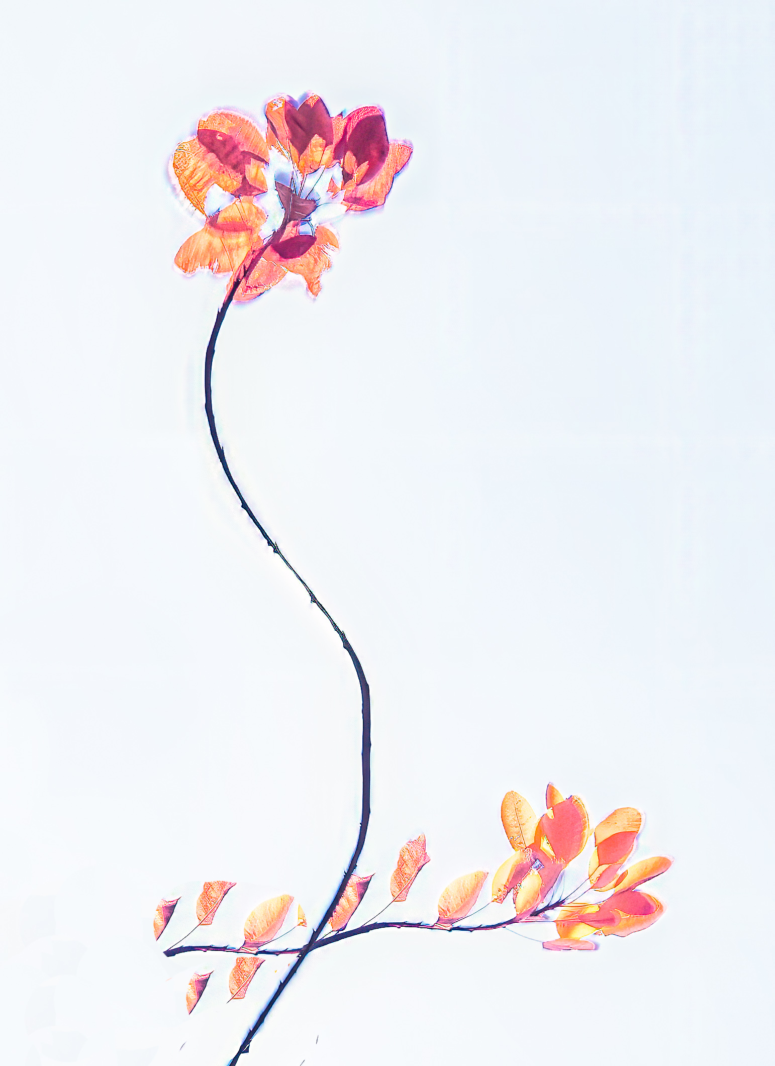
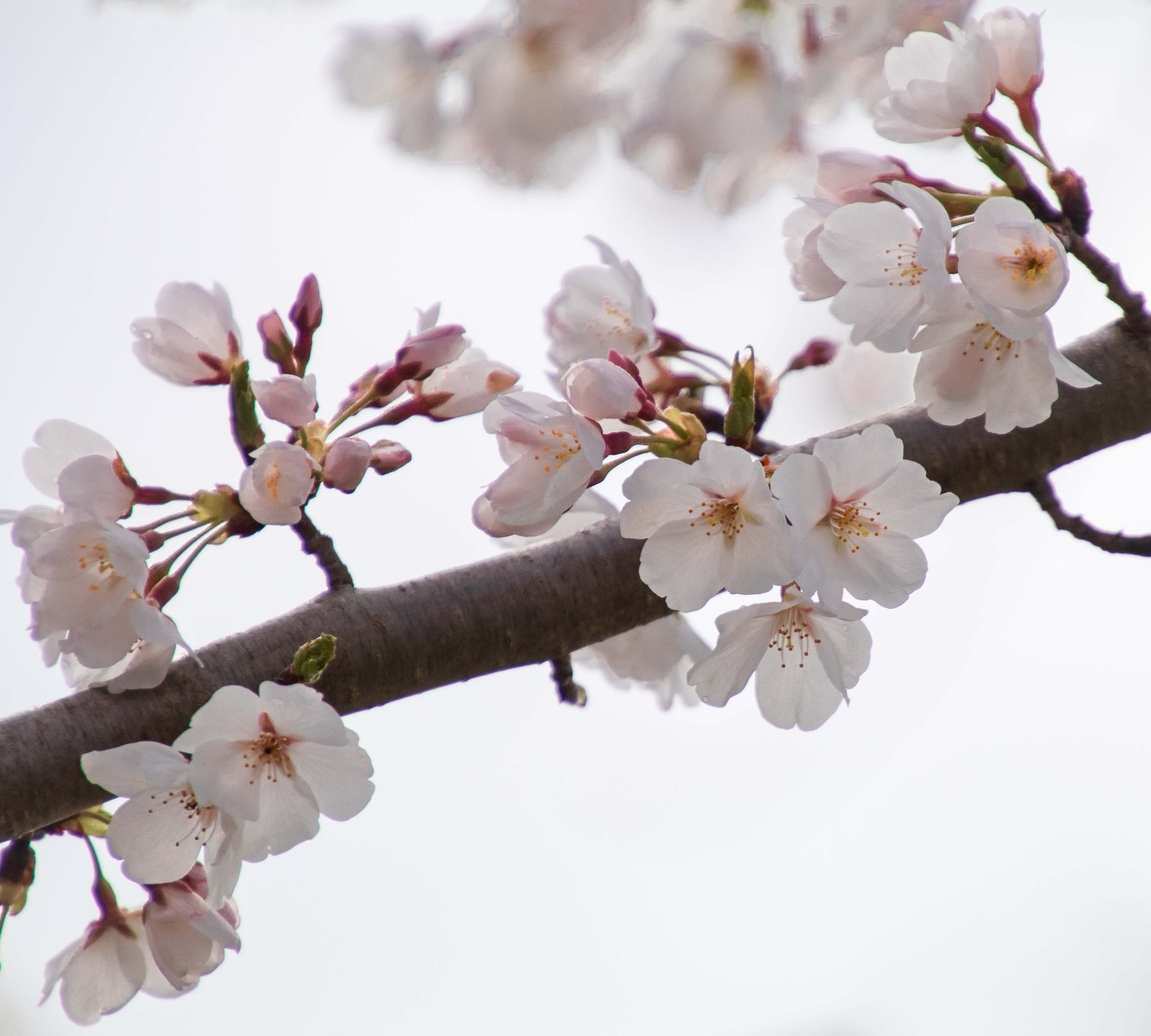
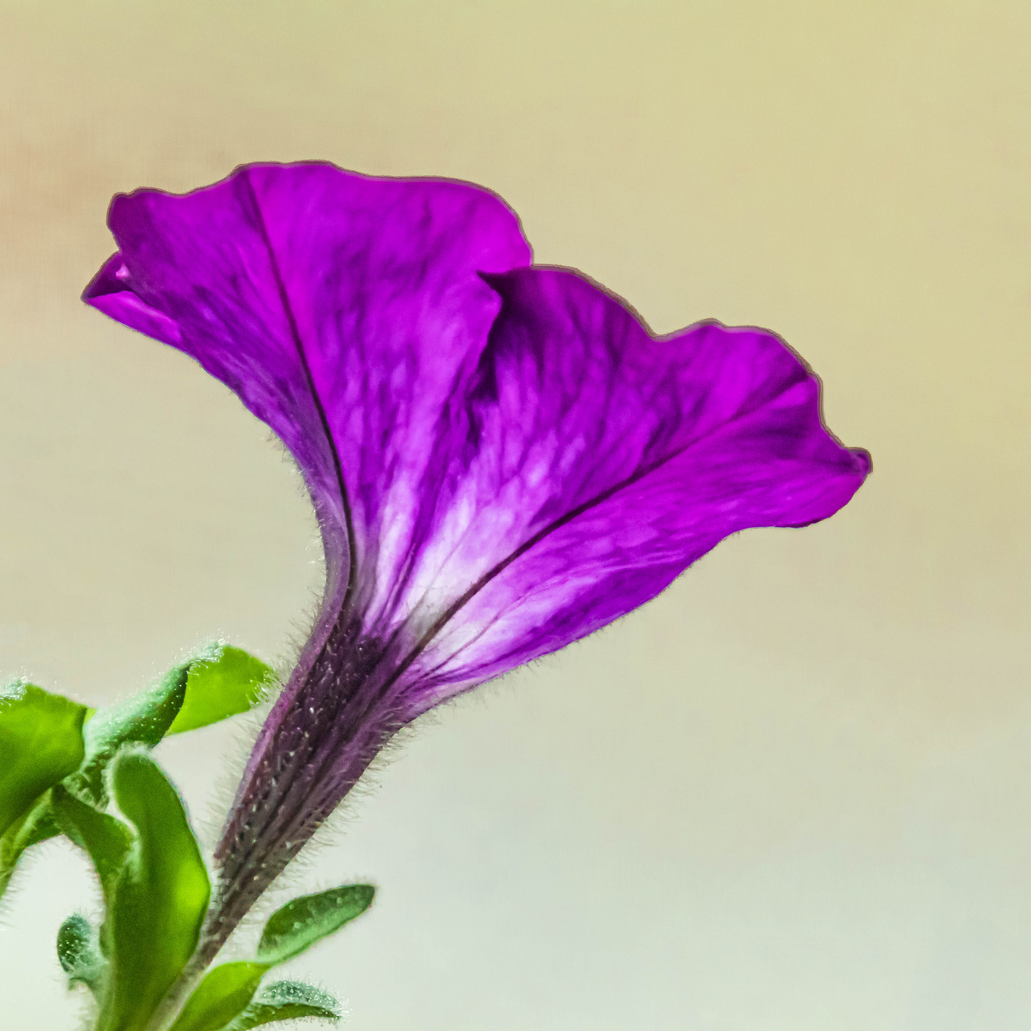
Marie, your image is strikingly beautiful. The peony is perceived through a filter of grief that desaturates and equalizes natural color to embolden the core elements texture, symmetry, and shape. The faint rose hues in the monotone are restful and pleasing. The circle of brighter stamens that opens upward is symbolic of release and peace. I too am very happy that you rescued this image.
|
Sep 8th |
| 79 |
Sep 19 |
Comment |
Valerie, I too love the blue-grey-rust pallet. The sky, mountains, ground, and road form a lovely torte of leading lines. I think they could be given stronger definition by reducing some highlights, and strengthening the blues. I like the topaz effect. Removing the markers is a good idea. I would experiment with the crop. As presented the mountains cut across the middle of the image and the vast expanse of grey road is prominent. The expanse of road does balance that of the sky, and the hues in the road are found in the sky. However, cropping out some of that road to produce a near panorama, along with highlight and color editing, would bring greater attention to the canal which is the subject of the image's title. Both approaches are interesting. |
Sep 8th |
| 79 |
Sep 19 |
Reply |
Thanks Susan. I did try to lighten that highlight on the web, but I failed. Any suggestions? Sometimes I photograph webs after a soft rain. You are right, the light play off a web bearing water droplets is beautiful. |
Sep 3rd |
| 79 |
Sep 19 |
Comment |
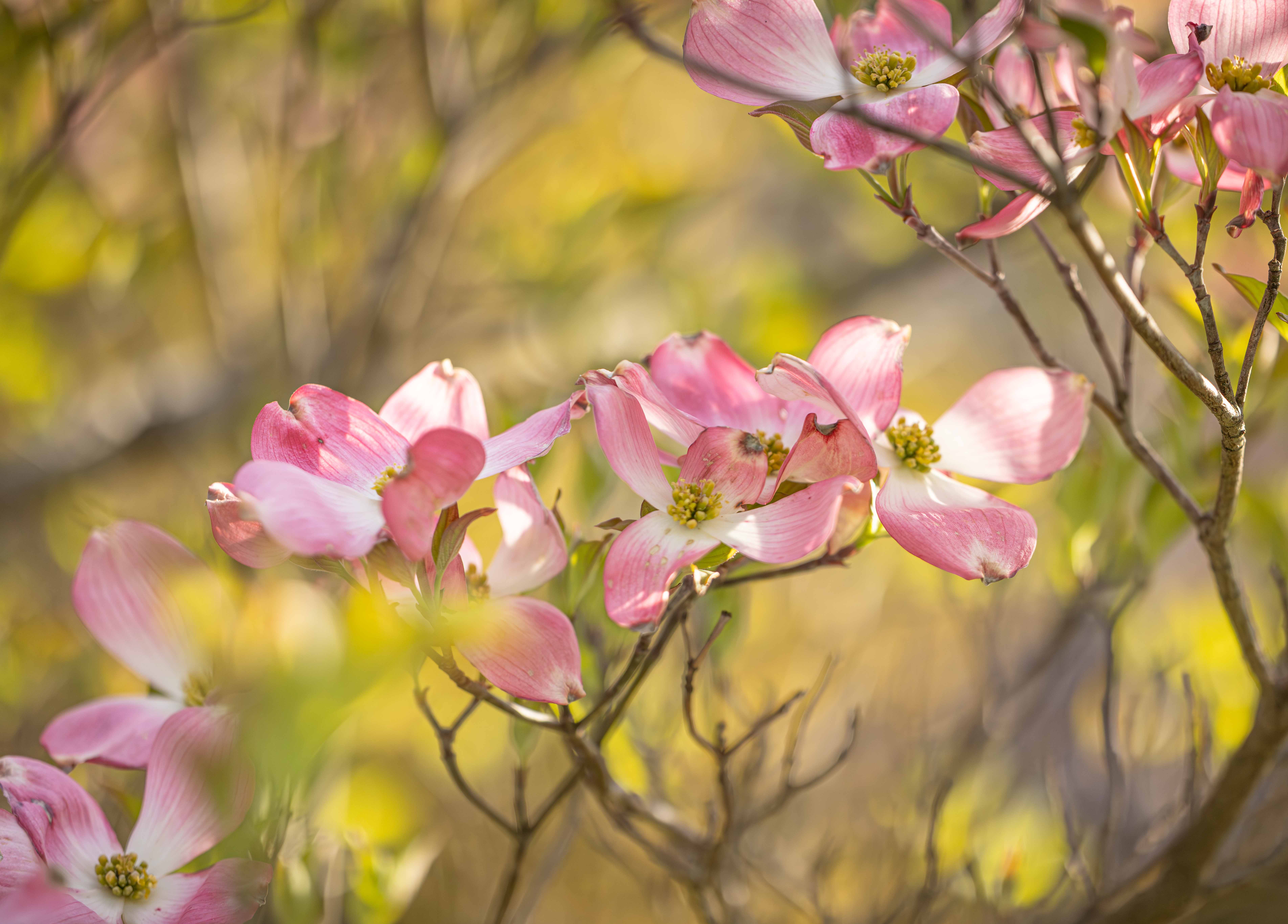
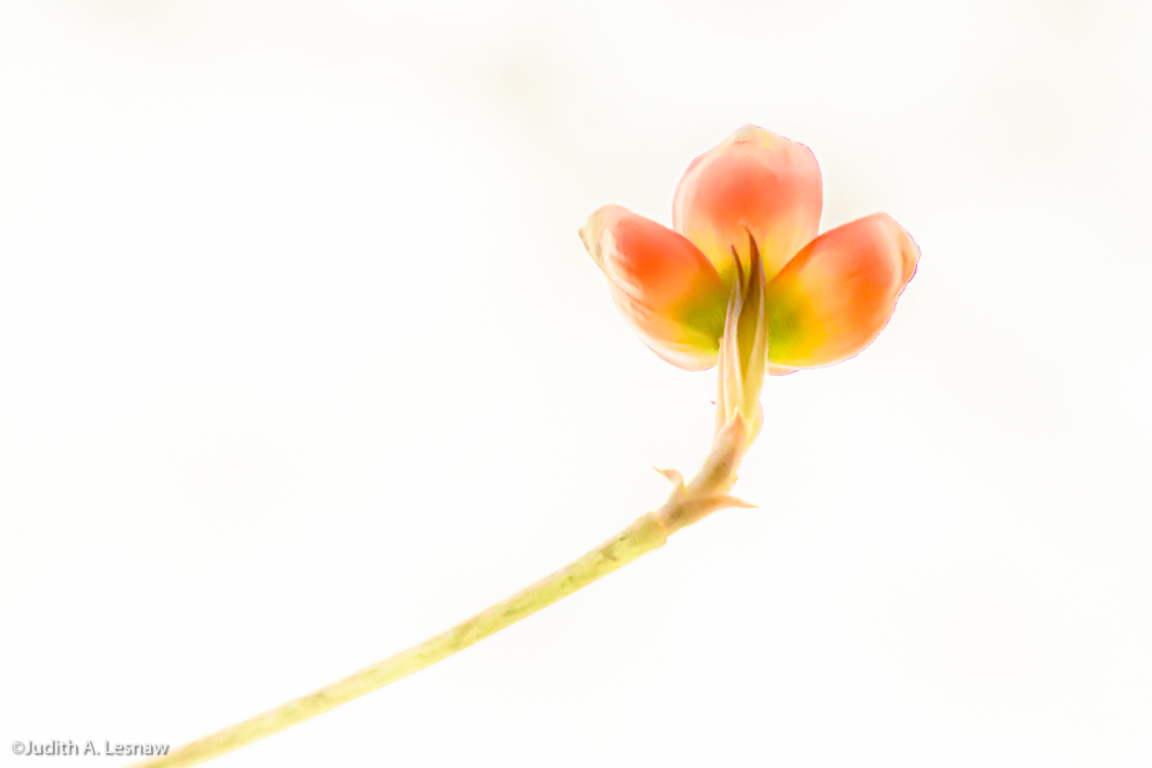
I love your tulips. You have altered the colors in a most artistic way. I could not help but think of a virus I studied: tulip breaking virus, that also alters the color of tulips to produce a "painterly pathology" (a term I coined). The impact of this virus on the Golden Age of Dutch Painting in the Renaissance, and a bit of the biology behind this tiny artist's techniques are reviewed in https://apsjournals.apsnet.org/doi/pdfplus/10.1094/PDIS.2000.84.10.1052.
Your technique for adding the canvas texture is very effective-and a great idea. How close were you to the canvas when you took the shot? The grain seems a bit large to me. It might be interesting to try different distances. The crop is great. |
Sep 3rd |
5 comments - 4 replies for Group 79
|
10 comments - 6 replies Total
|