|
| Group |
Round |
C/R |
Comment |
Date |
Image |
| 79 |
Jan 19 |
Comment |
Anurada, you have created an abstract moment of great interest here.
I always look at the image first before reading the description to allow my first impression to be free from input beyond the picture itself. My reaction when I looked at the image was one of "agitated peace." Agitated, because the dynamic movement of the water drew my eye downward and evoked a sense of powerful movement. Peaceful, because the the overall image is soothing to me and allows my eye to wander across the different textures and shapes.
The definitive dividing line at the top separates a crisp and sharp view from the softer more fluid content below. (No pun intended)
The rotation gives it a twist and I like it. I would suggest that you consider darkening the lower right corner to keep the eye moving throughout the image.
|
Jan 16th |
| 79 |
Jan 19 |
Comment |
I hope you create the book, Karl. |
Jan 16th |
| 79 |
Jan 19 |
Comment |
|
Jan 11th |
 |
| 79 |
Jan 19 |
Comment |
Vivian Maier meets Henri Cartier-Bresson.
I enjoy this image, Judith. It evokes for me a bit of existential wondering about the integration of one's many selves. It also brings a bit of whimsy to the idea of hustling along. The negative space of the third "sandwiched" version of the figure gives a Kafka-esque sense of disintegration of self.
The framing tree branches in the upper left and lower right effectively mimic the individual separations of the figure into three "branches." The texture of the wall and snow-covered ground are nice opposites to the sleek, smooth lines of the person's silhouette.
Small suggestions to try:
1. Clone out the upper right shape.
2. Rotate the image so the horizon line is straight. This will have the added benefit of giving more forward momentum to the moving figure.
Super cool art. |
Jan 10th |
| 79 |
Jan 19 |
Comment |
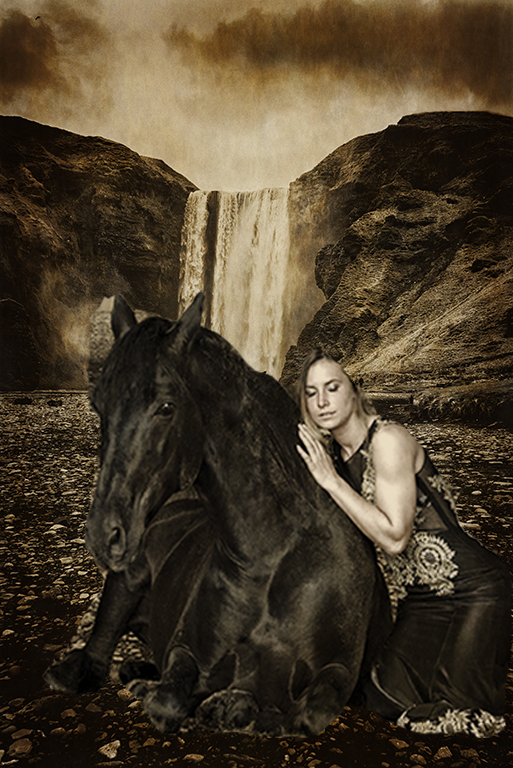
Daring adventure, Susan!
Great start to this image story. Several small options to consider:
1. Play with the "Luminance" and "Color Intensity" of Kat and her horse to align with the background imagery. In Photoshop: Image > Adjustment > Match Color > Image Options > Luminosity (then Color Intensity)
2. Disrupt the symmetry and centering of Kat and the horse. The asymmetry will create more interest and help form an elegant triangle among Kat, the horse and the waterfall. In the current view, the three elements are "crowding" each other. Each is similar in size and the placement does not create a triangle view.
a. For example, perhaps allow Kat's image to emerge from off of the side of the image
b. For another example, move the horse out from under the waterfall to avoid the illusion that the horse is "under" the waterfall.
You can do both symmetry-disrupting actions by making the foreground characters larger using the Transform tool.
I've done a very rough example attached (using my mobile phone on a crowded moving train, so forgive the crude work).
One last thing to experiment with: Less sky. I think the dark sky clouds unfairly draw attention to themselves. Also, the sky creates a third vertical layer above the foreground and mountain layers. Let's keep the story in the centre/lower-part of the image. The result will be three focal images (Kat-horse-waterfall) triangulated nicely on just two vertical layers (mountains/sky/waterfall as one level and the foreground as the second level).
Fun work. I think this could become a powerful image. |
Jan 10th |
 |
| 79 |
Jan 19 |
Comment |
Howard Pyle and Andrew Wyeth meet Vincent Van Gogh. I love this image.
The left-to-right movement of the wind in the golden plants juxtaposes beautifully with the right-to-left view of the moody sky and background.
A restful and contemplative piece. Please do more of these. |
Jan 10th |
| 79 |
Jan 19 |
Comment |
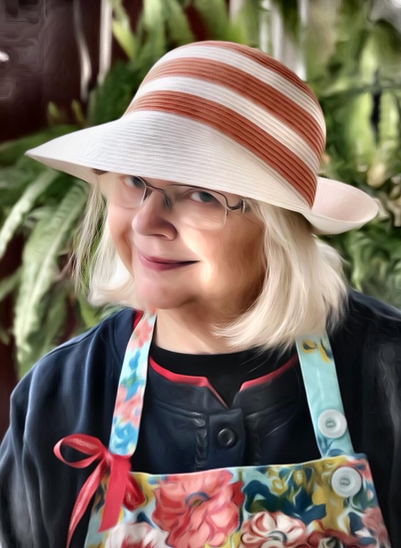
I like your concept, Mary.
My eye seems to seek more differentiation of the imagery within the photo, maybe because I am looking for a more clearly-defined focal point. Obviously the person is the focal point, but it is hard to focus on her. Perhaps my difficulty in connecting to the focal point is due to limited chromatic range and the limited variance in shapes. Lastly, my eye is seeking less symmetry and more directional influence to rest on a spot in the image.
In the attached version, I've played with both clarifying the color story, and illuminating the skin and hands.
Lastly, my eye is seeking less symmetry and more directional influence to allow me to rest on a spot in the image.
In the attached version, I've played with three elements:
1. Clarifying the color story by separating the colors and adjusting the tint and tone
2. Disrupting the symmetry by cropping
3. Leading the eye inward through vignetting
One idea to try is enhancing the hands in the image, as they really add power and a sense of space, but in your current version they are not visible. Perhaps a tighter overall crop will also clarify the story. Another thing to try would be to give more definition of her locks of hair .
Please keep playing with your idea, as I think you're onto something. |
Jan 10th |
 |
| 79 |
Jan 19 |
Comment |
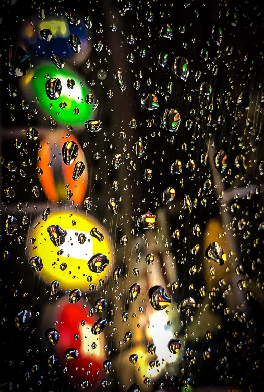
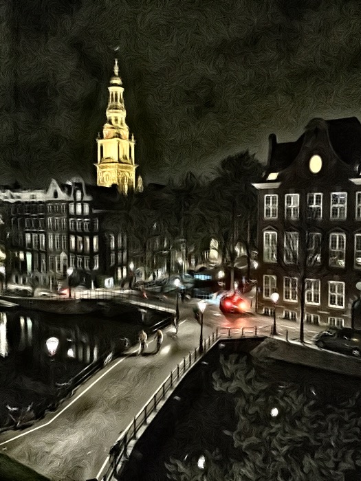
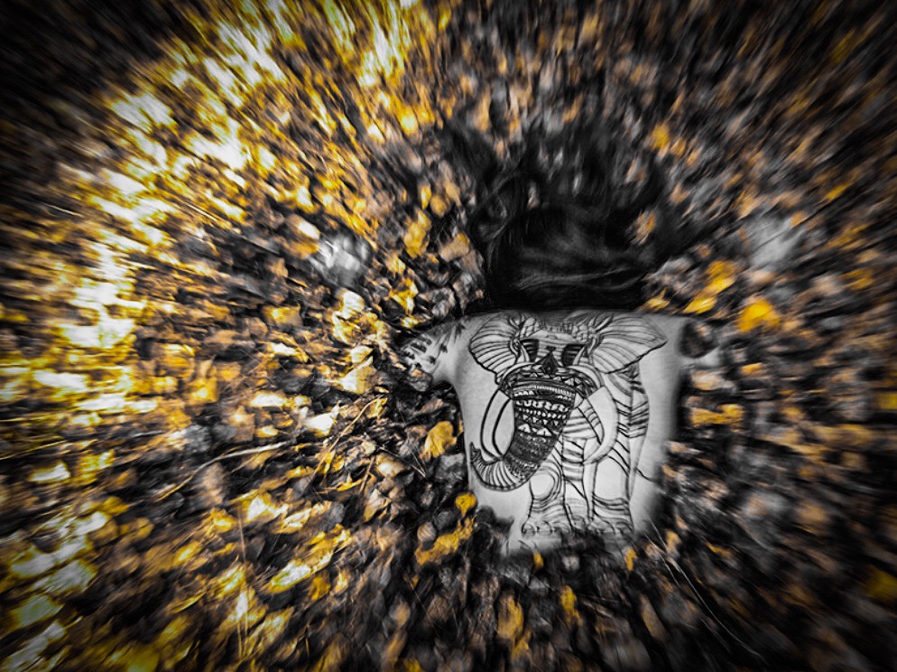
Mighty crisp and eye-catching image, Karl.
Great dynamism and fluidity to this artwork. A couple suggestions to try, if only for the playful alternatives:
1. What would happen if you were to give a bit of angularity to the image by rotating 10 or so degrees left?
2. I would like to see a little bit more breathing room above the top of the image.
3. I'm interested in the leading lines in the pavement, as they seem to correspond to central elements within the dancing lights. Could you burn them a bit to enhance their presence?
It would seem to create additional relationship between the "concrete" (no pun intended) and the abstract.
4. I am mesmerized by the lemony citrus-orange wheel on the right. Could you emphasize the starburst effect of the center of the wheel a bit? I'm thinking this could provide an anchor on the right side of the image to allow the eye to rest for a moment before continuing around the delightful pathway drawn by your pixel stick.
Lots of fun potential here for a series. I also would consider doing something with the selfie version. It's delightful. |
Jan 10th |
8 comments - 0 replies for Group 79
|
8 comments - 0 replies Total
|