|
| Group |
Round |
C/R |
Comment |
Date |
Image |
| 40 |
Oct 17 |
Comment |
Curtis, you have a real knack for capturing colors and textures in nature. This image is dynamic in feel and very attractive. I love the idea that the viewer is "under" the top of the falls, looking across/up instead of down.
Small ideas to consider:
1. Rotate the image 1 or 2 degrees to the right. See how that changes the sense of place and horizon.
2. Consider cropping the left-most side of the image such that the yellow tip of the bright green leaf at the bottom is the left edge.
3. Next I might crop the bottom 30% of the image, creating a more panoramic view and emphasizing the grandeur of the falls. You still would have some of the foreground leaves pointing your eye to the falls, and plenty of space to travel there. The benefit could be a nice third-third-third of water-falls-trees.
4. Finally, I would crop out the right-most portion of the photo, to again focus more on the falls.
Beautiful, fresh Fall feeling with this one. Well done. |
Oct 16th |
| 40 |
Oct 17 |
Comment |
Jamie this is a cool and airy image that makes me feel relaxed when I view it.
My only suggestions are:
1. Perhaps consider pulling up the shadows a bit more to allow the beauty of the leaves' veins to be featured more.
2. Allow the background to be a brighter white. This may change the mood of the image in a way you like or don't like.
Both of the above suggestions are aimed at ensuring a full spectrum from pure white to pure black.
This image would make a lovely greeting card. I would buy it. :)
|
Oct 16th |
| 40 |
Oct 17 |
Comment |
How do you do it, Bai?
Gorgeous, print-worthy shot.
Perfect angle.
I would be tempted to crop the right-most portion of the image (see attached).
Overall, a stunner. |
Oct 16th |
 |
| 40 |
Oct 17 |
Comment |
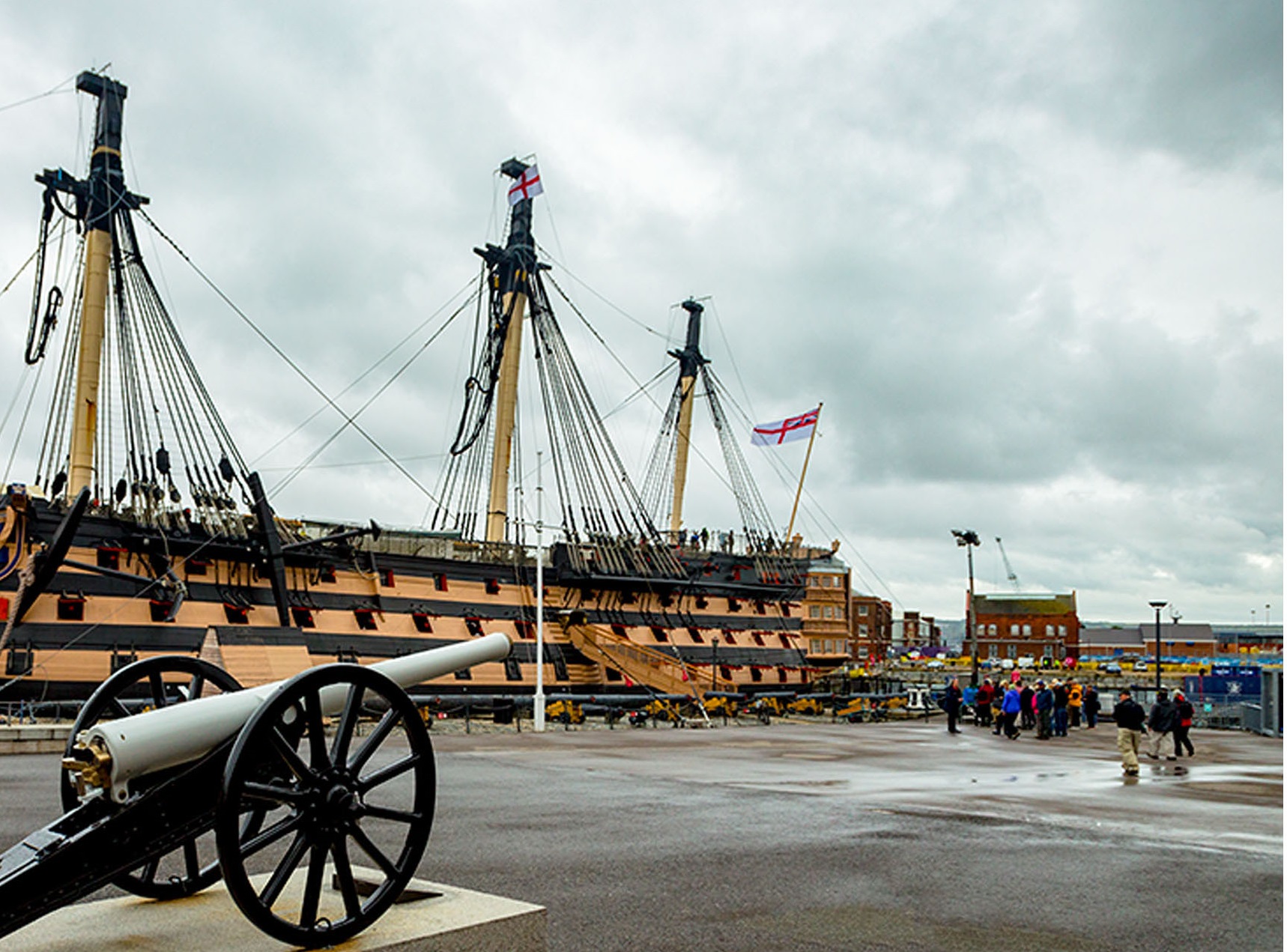
Your adjustments are a great improvement, Henry, particularly to the sky. As with Andrew's image this month, I am inclined to "flip it" to allow the eye to be led left to right.
Perhaps also consider a bit of a radical crop (see attached) to eliminate unhelpful details. The sacrifice of part of the ship may not be so bad.
Overall, an interesting scene capture!
|
Oct 16th |
 |
| 40 |
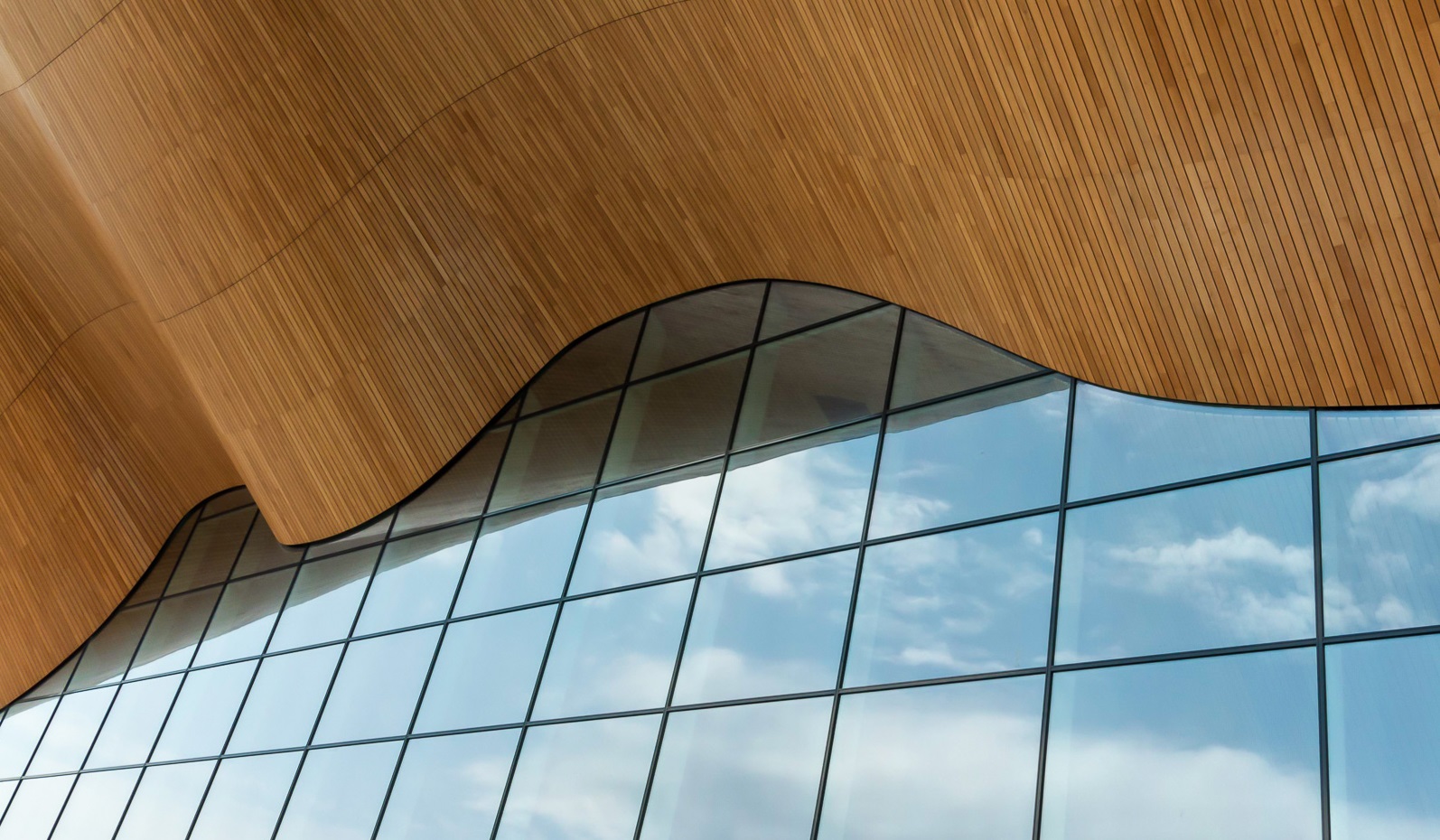
Oct 17 |
Comment |
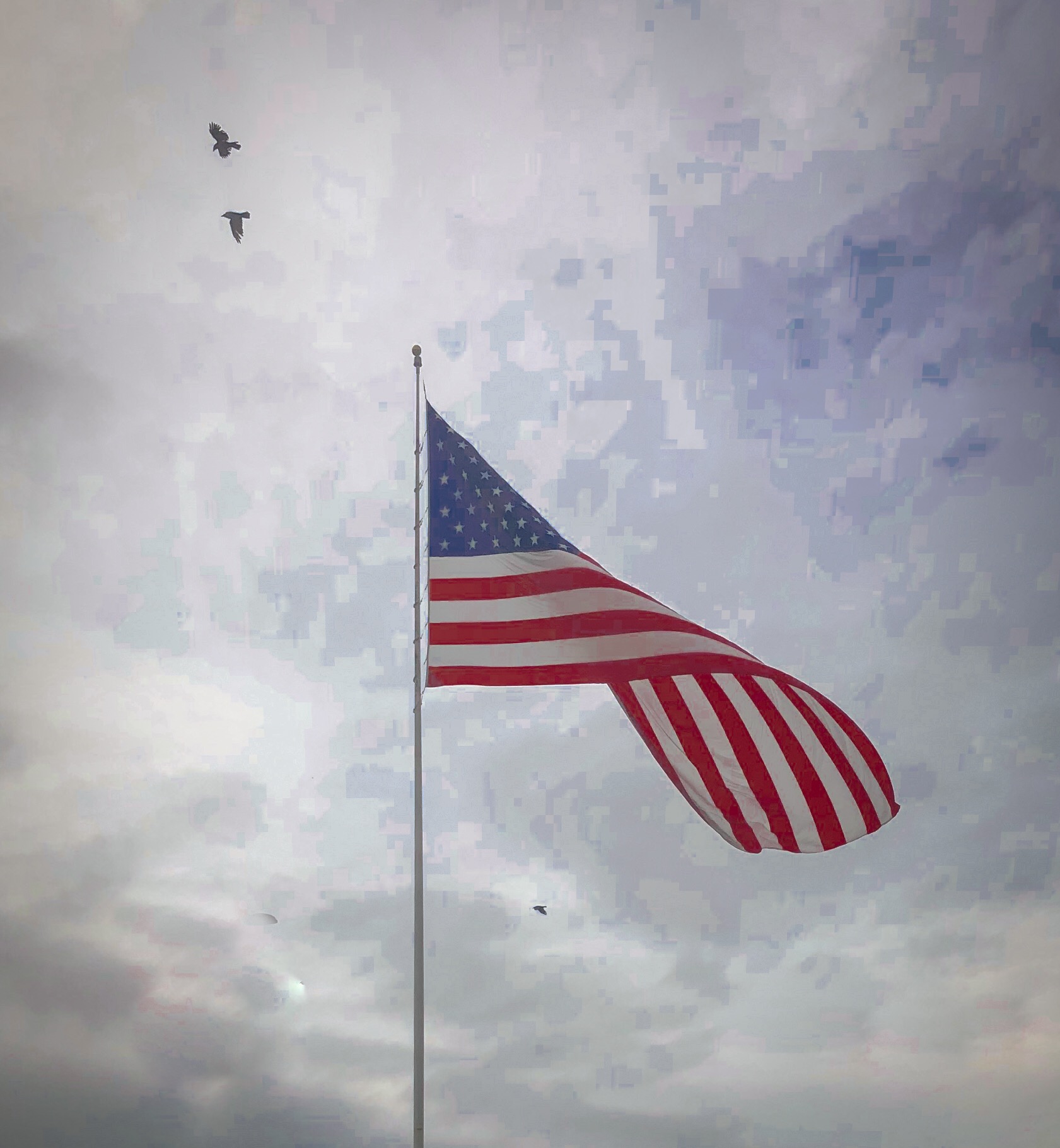
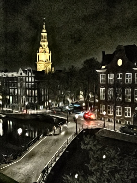
This imsage is a strong symphony of organic and man-made; warm and cool; earthly-solid and ethereal.
Colours are pleasing and texture variation is attractive.
Two changes suggested:
1. "Flip it." I recently learned that it can have strong impact to lead the eye from left to right such that the "weight" of the image is toward the right. I suppose this is a Western concept, but nonetheless, I liked the image "flipped." (see my attached example).
2. Consider cropping the woood to allow more of a third-third-third balance to the image. (again, see example).
Overall, this would be a great large-scale art piece for a room with complementary colours.
|
Oct 16th |
 |
5 comments - 0 replies for Group 40
|
5 comments - 0 replies Total
|