|
| Group |
Round |
C/R |
Comment |
Date |
Image |
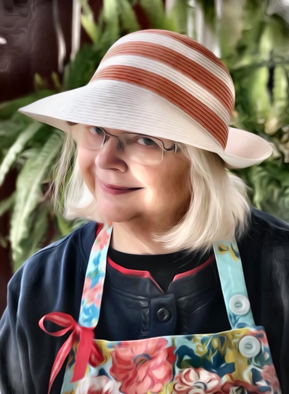
| 40 |
Jul 17 |
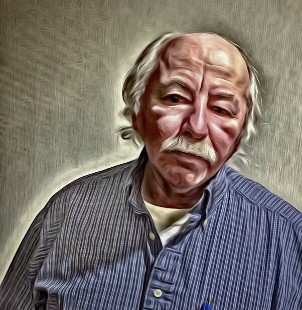
Comment |
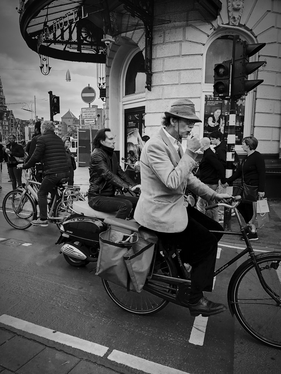
Karen, your creativity just keeps growning and growing! I love the "soft tweed jacket" texture to this image. It's all at once old vintage and hip, new style.
If you can, perhaps try to make the lower right portion of his ear a bit more detailed in its cutoff.
Love the cropping. Love his/her expression.
A real winner. |
Jul 22nd |
| 40 |
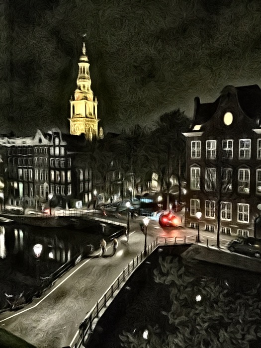
Jul 17 |
Comment |
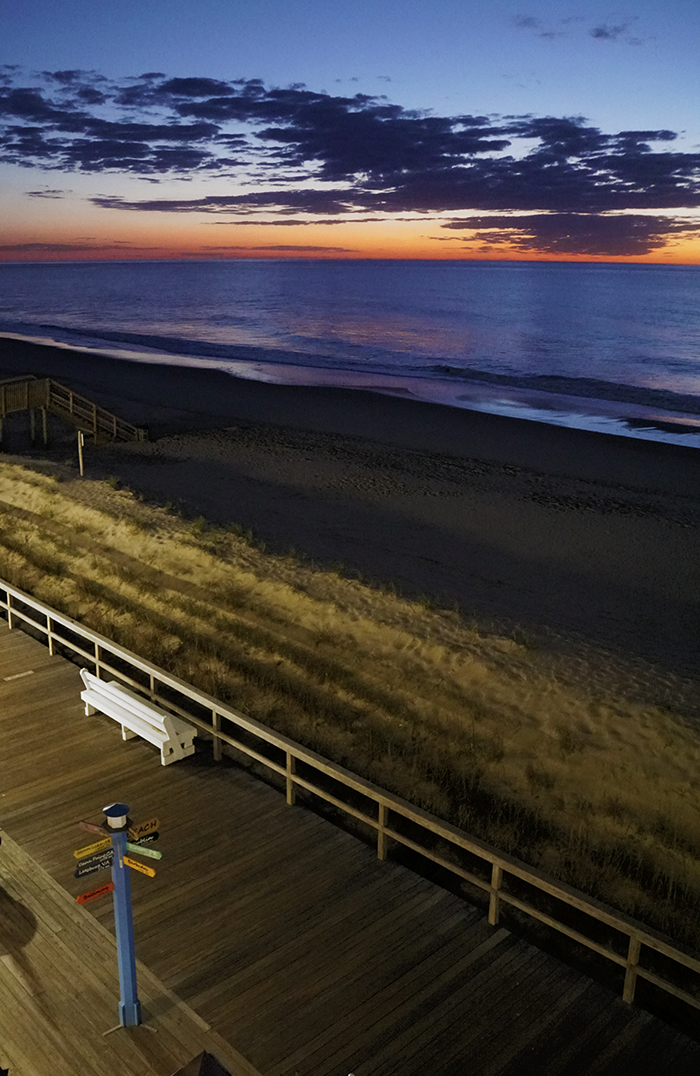
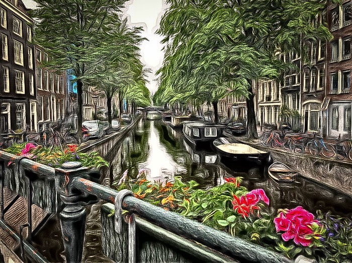
Jamie, I need to take a photocopy of your travel journal, as it seems to represent my bucket list. This beautiful image is strengthened by the unexpected view of the Snaefellsnes Volcano in the distance, which is not immediately noticed. Three minor thoughts:
1. Try removing the blue sky to allow the blue of the water to be the star contrast to the warm yellows and oranges.
2. I agree with Andrew about squaring up the photo. I might even be so bold as to crop out the right-most quarter of the image. Doing so will set the sun against the volcano and create a nice fibonancci grid.
3. Bring out a bit more detail within the rocks.
None of the above are necessary as it is a lovely photo as-is. |
Jul 22nd |
| 40 |
Jul 17 |
Comment |
Lush, verdant, peaceful and inviting, Curtis.
I want to swim here.
Your post-processing is strong, and I might take it even further. For example:
1. What happens if you crop the left, right and top 10%? This zooming in will feature the landing spot more prominently.
2. My favorite part of the image is the unexpected shallow-water view of rocks in the lower right corner. Can you bring out the translucency of the water and allow the rocks to "shine" through a bit more? This would create an eye flow from the back bank to the front-submerged rocks and back again.
3. I like what Karen did to lighten the scene, but there is something otherworldly about that tiny section being spotlighted by the sun.
Beautiful work. |
Jul 22nd |
| 40 |
Jul 17 |
Comment |
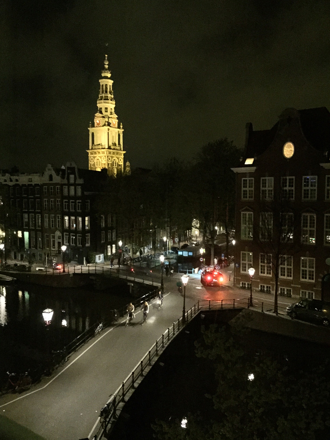
You've done it again, Bai. This one goes in your coffee table book. I love the sinuous curve of the building that sweeps your eye from left to right, then down to the colorful water and back again. Tiny tweaks to consider:
1. As you remove the grass blades in the foreground, perhaps crop the bottom 10% of the image. You still would have the colorful water reflection, but I don't think you need so much to have an impact.
2. Similar to the first suggestion, consider cropping the left-most side of the image to remove the structure in the water (bridge footing?).
3. I agree with Andrew that upping the exposure a bit would add to the photo |
Jul 22nd |
| 40 |
Jul 17 |
Comment |
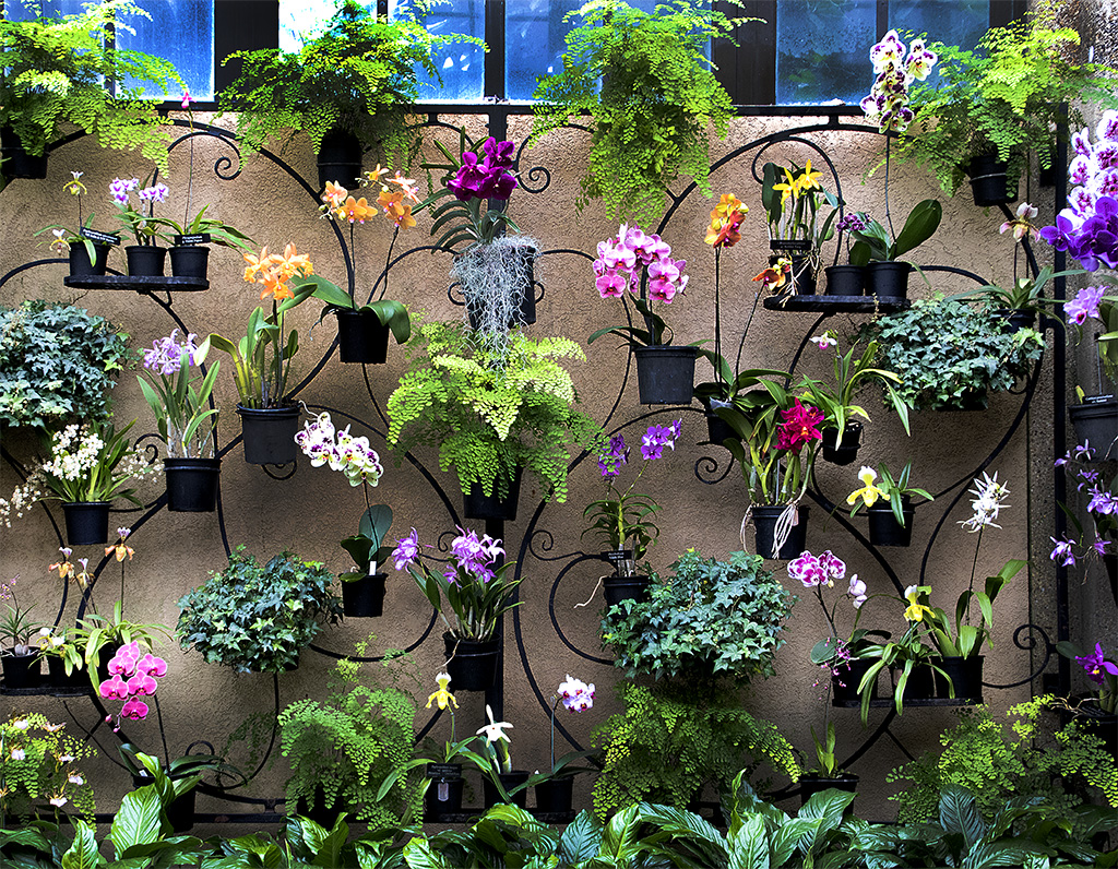
Gorgeous, Henry.
This image is both energizing and soothing. The bright, happy colors invigorate the eye. The effect you added provides a linear geometry that pairs well with the soft curves of the petals. What you've done here reminds me of one of my favorite painters, Jason Cianelli: http://www.cianellistudios.com/blog/.
My small suggestions:
1. Bring out the light/highlight action in the upper left portion of the flower.
2. In contrast (pun unavoidable), bump up the black point/darker elements in the center of the flower to add drama. |
Jul 22nd |
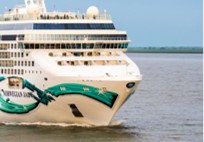
| 40 |
Jul 17 |
Comment |
This image is pleasing to the eye. The post-processing adds good value.
Radical suggestion: What if you were to crop in on a portion of the image to reveal the human figures at the top, and allow them to be juxtaposed against the vastness of the ship. The cropping I've shown here as example allows the eye to see that the waves made by the ship are as big as a person. |
Jul 22nd |
 |
6 comments - 0 replies for Group 40
|
6 comments - 0 replies Total
|