|
| Group |
Round |
C/R |
Comment |
Date |
Image |
| 40 |
May 17 |
Comment |
great catches---all of which i shall implement, Andrew! |
May 11th |
| 40 |
May 17 |
Comment |
Welcome to Group 40, Mike!
Well you've started off with a bang here. This is a beautiful daffodil image, and I love the "extras" in the scene. The tiny twig at the bottom does indeed make one think that both twig and flower are focused on something great off to the right. Also, the texture of the twig mirrors the brown, peeling portion at the base of the yellow flower. My eye enjoys the diagonal branch in the background. I would prefer that we de-emphasize it a bit. Either through further blurring or by using a brush to paint down the exposure. Of course you also can do as Andrew suggests, by using a spot healing tool as well. I do enjoy both the orange and yellow background elements, but would like to push them back a bit to let the daffodil shine.
Super debut, Mike! |
May 11th |
| 40 |
May 17 |
Comment |
Super cool, Jamie! This image looks like one straight from the Ansel Adams school of moody, majestic landscapes. I might trim the top 10% off the top so that there is less of a "perfect set of thirds" to the image. Another option would be to trim most of the sky, leaving the image such that the bottom 2/3 of the photo are of Shiprock and landscape, while the top 1/3 is sky.
One other tiny tweak to consider is painting up the exposure of the rocks to reveal more of the texture and lighten the bottom portion of the image. I love the snow-capped mountains in the back, and would like to see some highlighting in Shiprock to complement that white-contrasting in the mountains.
Very relaxing, attractive image. |
May 11th |
| 40 |
May 17 |
Comment |
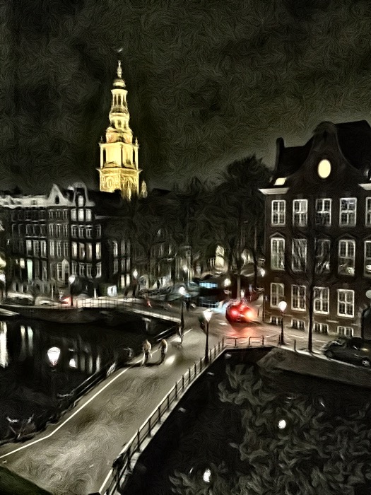
Another amazing image, Bai.
The bright highlight on the side of the buildings at the leftmost side of the image is a bit distracting. Perhaps burn it down a bit or crop it out? For interest and to tie together the color story, it might be interesting to dodge (lighten) the bottom-most area of the image to show more detail of the dock. The repetitive pattern of the dock structure would mimic the repeating patterns of buildings and mountains, providing symmetry across the three layers of thirds.
One last idea is to tone down the blue color of the largest boat to give a more monochromatic feel to the overall image. Either that or the drastic opposite - bumping up the blue color to let it pop out.
Another coffee table book-worthy image! |
May 11th |
| 40 |
May 17 |
Comment |
I like the painterly effects, Henry. Your experimental approaches are always interesting and fun. In this image, I think your HDR and paint work is lovely. I would be tempted to go even further with the effects, in order to distinguish these effects as intentional and artistic (rather than "too much saturation" or "too much clarity"). Composition is great. I can just imagine being there and hearing the water flow. Beautiful. |
May 11th |
| 40 |
May 17 |
Comment |
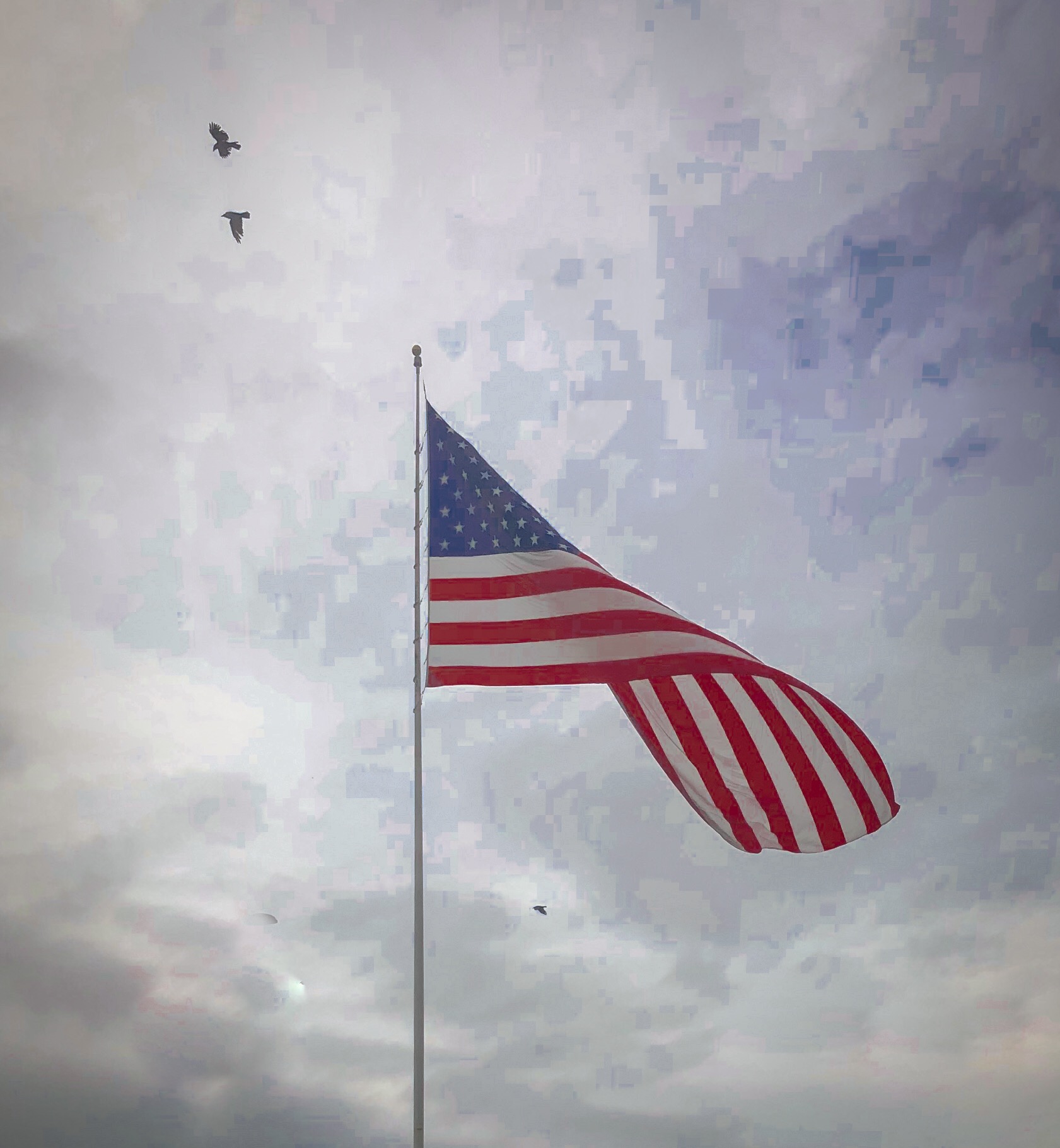
Hauntingly beautiful, Andrew. I like that you stitched together three horizontal images in a vertical stack. Great image clarity at all levels. Nice diagnonals and circular flow for the eye to travel.
My favourite part is a subtle one. The child in the crowd with light-coloured jacket is pointing to the right, in the same direction as the poppies flow. So, too, is the flag's furl in that same forward direction. It's as if the image is trying to say that we should not allow the future to continue the spill of blood that this war created.
Don't change a thing, Andrew. |
May 11th |
6 comments - 0 replies for Group 40
|
6 comments - 0 replies Total
|