|
| Group |
Round |
C/R |
Comment |
Date |
Image |
| 40 |
Feb 17 |
Comment |
This is my favorite of your works, Karen. When I first saw the thumbnail, you took me back to my favorite department store art gallery in Tokyo, Japan. Tokyo has several world-class art galleries (and even museums) on the top floors of its high-end department stores. Ten years ago I fell in love with an abstract piece, rich with colors and alight with an ethereal movement like a kite in a gentle wind. Your image evokes the same playful, childlike wonder that I felt a decade ago. By the way, that abstract art piece cost over $10,000 USD, so all I had until today was its memory!
I love how the mustard colors seem to carry swirls of all the other colors, and how everything moves with such fluidity.
My only suggestion is to allow a little more "breathing room" around the dragon, especially at the top. It will be nice for the eye to be able to sweep along with the breeze.
Gorgeous! |
Feb 12th |
| 40 |
Feb 17 |
Comment |
Jamie, I love this photo.
Judi's suggestions seem spot-on, although I do like the bottom portion being a bit heavier to anchor the beginning of the story.
If you are using photoshop, you could use Image > Replace Color (Selection), then hold your shift key and select several areas of blue until you see an adequate amount shown in the black/white square preview space. Then, adjust the lightness to brighten up the blues you've selected.
I want this photo in my kitchen.
|
Feb 12th |
| 40 |
Feb 17 |
Comment |
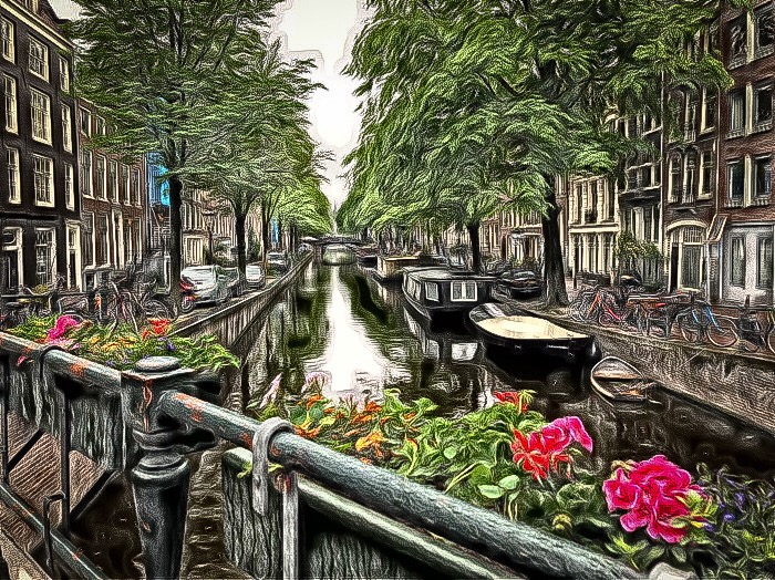
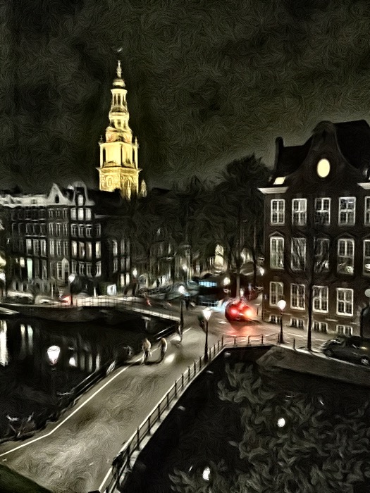
Judi, this panoramic view is gorgeous. It sweeps the eye from the crystalline water to the boats and then up-left to Mt. Rainier and back again. It's as if the boats and trees all are standing at attention to the majesty of the mountain.
Two suggestions:
1. I would like to see a bit more warmth in the photo. While the primary blue feel is wonderful, it could be anchored and enhanced with some warm glow from the cluster of buildings in the center. Also, the white colors in the image could be brightened to allow them to pop a bit more.
2. Now here's the radical part: What if you trimmed the bottom 5th portion of the image? And/or, what if you cropped out the right-most 6th of the scene. Cropping the bottom could harmonize the horizontal thirds; cropping the right part of the scene would allow Rainier to counterbalance the front-most boat (with the black mast reflection).
As an added bonus, I think the left third of the image is a beautiful photo in itself.
Wonderful capture!
|
Feb 12th |
| 40 |
Feb 17 |
Comment |
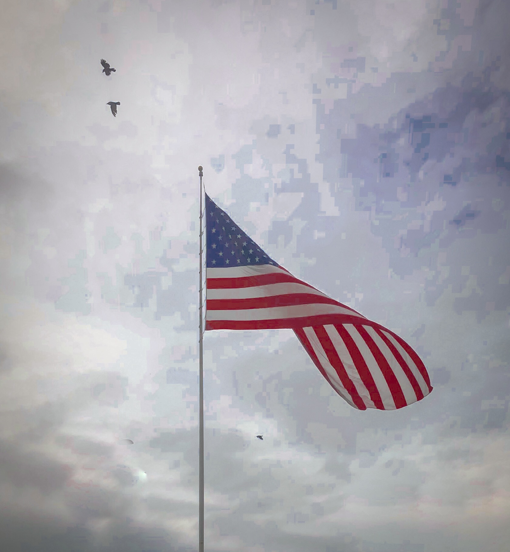
Amazing that you could capture this with a mobile phone, Bai. Two thoughts:
1. Perhaps crop the left-most sliver of the photo. The empty space between the trees and the left edge of the photo leads my eye away from the story.
2. I wonder what a little bump in vibrancy/ saturation and contrast might do. Orange from the sunlight, plus the blue haze over the valley, would play well against the foreground of greens.
Nice photo, Bai. |
Feb 12th |
| 40 |
Feb 17 |
Comment |
Henry, well I agree with our colleagues that the original version is great, I can see the vision you are going for here. This image reminds me of paintings by Bev Doolittle, one of my favorite artists. She often depicts the soft creamy nature of snow or seafoam juxtaposed against the harsh and in penetrable permanence of stone.
What I believe your image could benefit from is additional range between black and white. There's plenty of white in the image, but not much dark to anchor that white. Bumping up the contrast or otherwise creating an increased sense of depth will go along way.
Lastly, you may want to consider cropping out the top third or so of the new version of the image. This traditional panoramic look will keep the I am moving in a forward and backward direction, following the story, rather than being drawn up into the sky to try to find something to land on. I don't believe that the sky offers too much added benefit in this particular photo.
I think both versions of this photo have the potential to be winners. What a beautiful place you visited! Someone recently gave me the idea when evaluating the dynamic range of my photos, that it's a good idea to step far away from the image and see what you were able to discern from across the room. After that will show me that I don't have enough, or in other cases have too much highlighting.
|
Feb 11th |
| 40 |
Feb 17 |
Comment |
Andrew, you captured intense emotion in this image. I've wrestled with the idea of discontinuing redmeat for a long time. Images like the one you've captured here are undeniable displays of the sentiment nature of these beautiful beings.
Several suggestions: first, try burning or otherwise deemphasizing the plaid fabric in the upper left corner of the image. Similarly, perhaps burn out the man in the lower right corner. Next, if you can darken or otherwise remove the "white stick" going through the top of the steer's head, it will allow the eye to stay with in the face frame.
Finally, it might be interesting to see if you can create a little more contrast on his lower lip to show the foaming liquid he is spitting up from all of the excitement and anxiety.
Very strong, albeit upsetting image. |
Feb 11th |
6 comments - 0 replies for Group 40
|
6 comments - 0 replies Total
|