|
| Group |
Round |
C/R |
Comment |
Date |
Image |
| 22 |
May 18 |
Comment |
WOW! Great image! I agree with Joseph and I attach the result. |
May 21st |
 |
| 22 |
May 18 |
Comment |
I agree with Jerry. I propose my version of Peggy's image. I think the background should be darker. Great image! |
May 21st |
 |
| 22 |
May 18 |
Comment |
Great image. I agree with Jerry. It would be interesting to separate the planes, to make the first planes "stronger". Concerning Mike's opinion, it is like a double vision. |
May 21st |
| 22 |
May 18 |
Reply |
You are absolutely right. |
May 9th |
| 22 |
May 18 |
Comment |
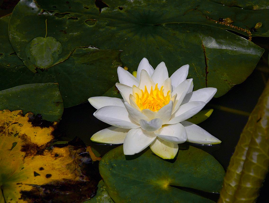
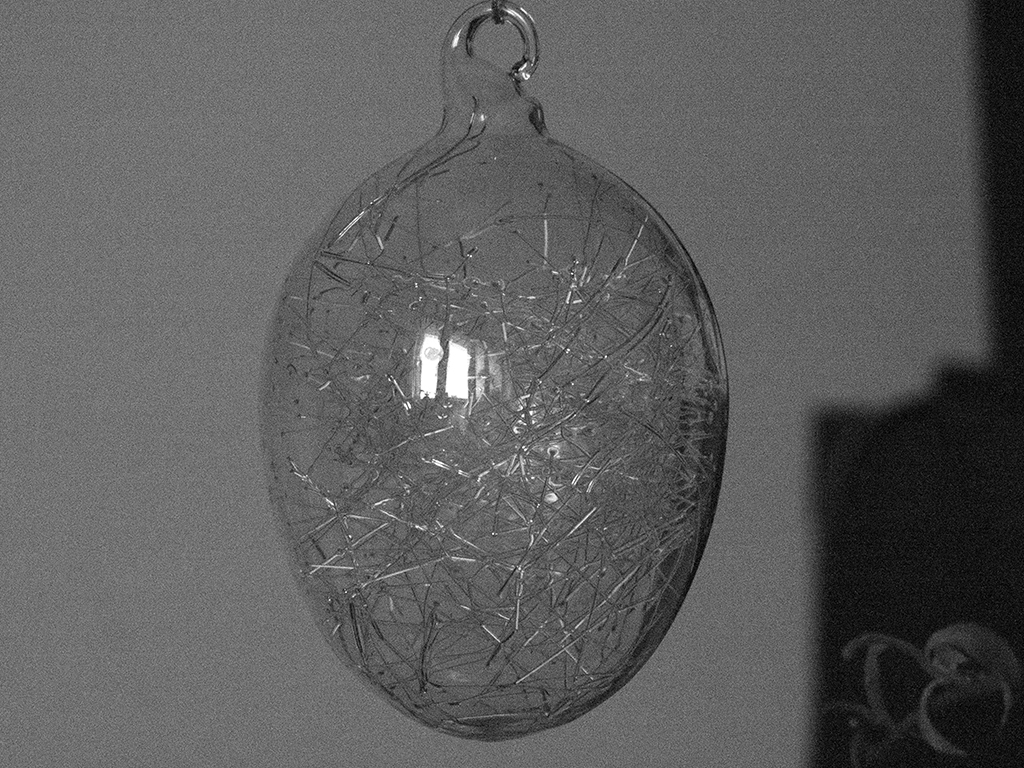
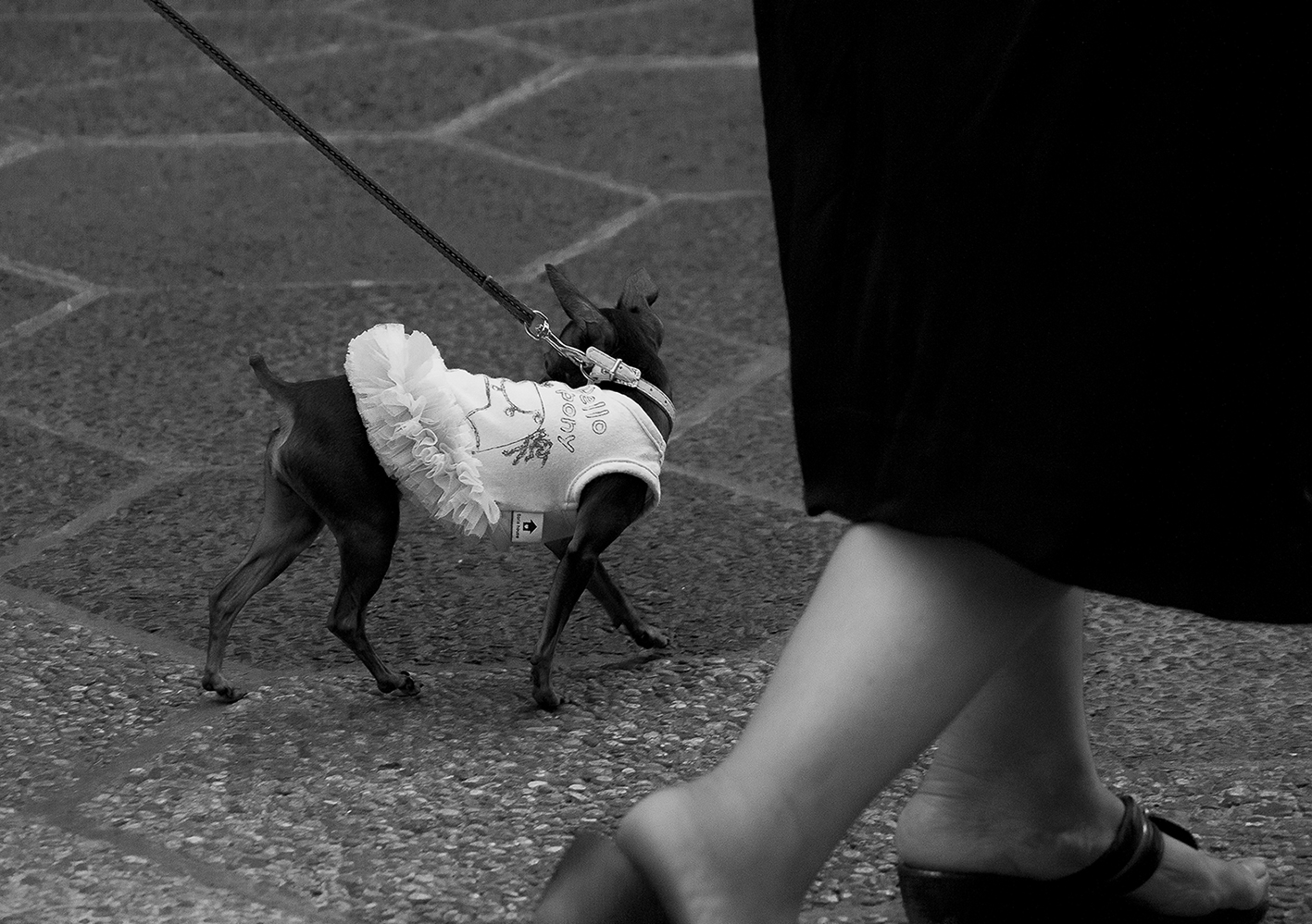
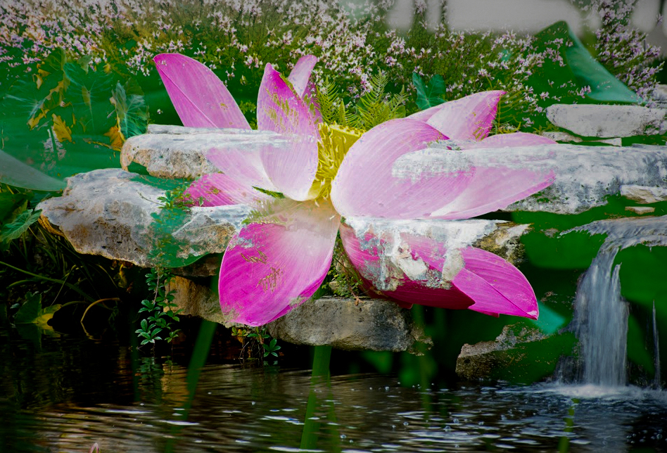
WOW! Perfect kaleidoscope.
|
May 8th |
| 22 |
May 18 |
Reply |
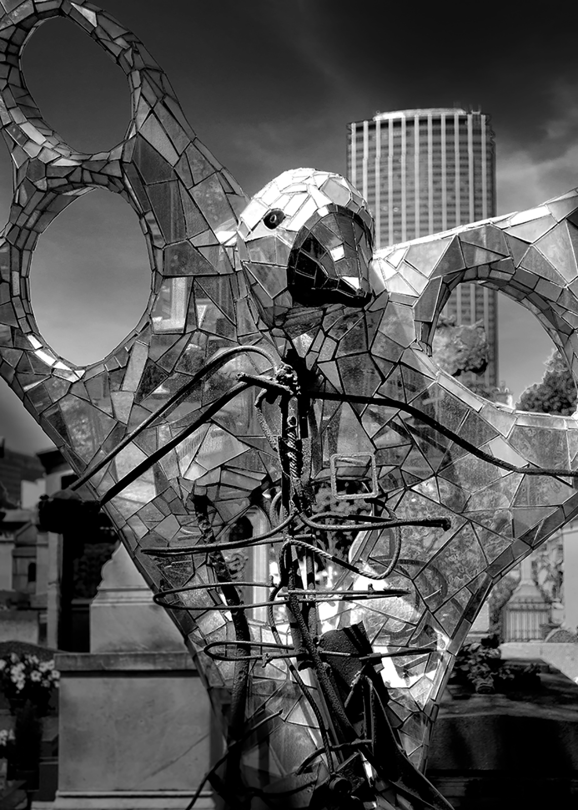
I am not sure but perhaps the right dark side should be darker to make image deeper? I want eyes to go the up right corner and search there. |
May 8th |
| 22 |
May 18 |
Reply |
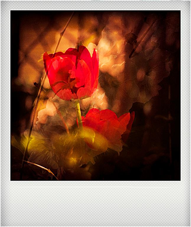
You are right in a way. I see the construction of the image differently. The string on the left side is stronger and longer and corresponds to the smaller and shorter on the far right. It make the image deeper (3D). Than, the red tulip swings to the left which plays well with the strings which swings to the right. The bottom line is a short light string at the bottom left. My eyes goes from tulip to long string, than to short one, and finally to the light one on the bottom left. |
May 8th |
4 comments - 3 replies for Group 22
|
| 47 |
May 18 |
Comment |
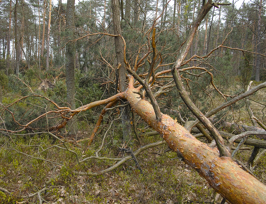
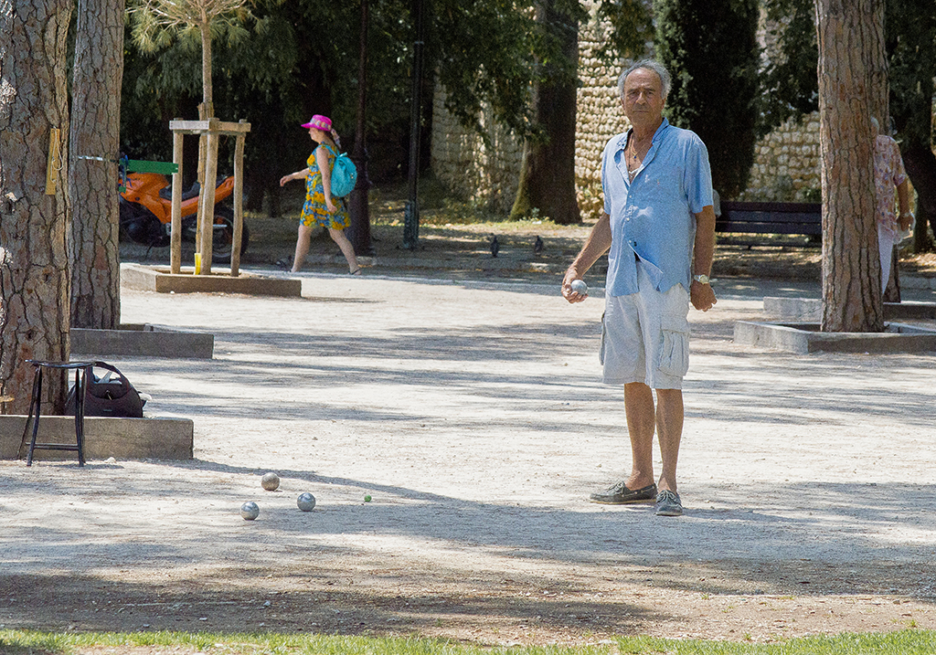
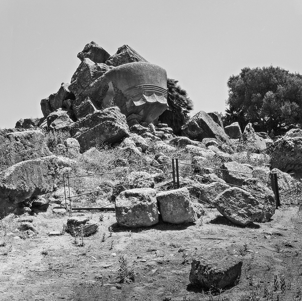
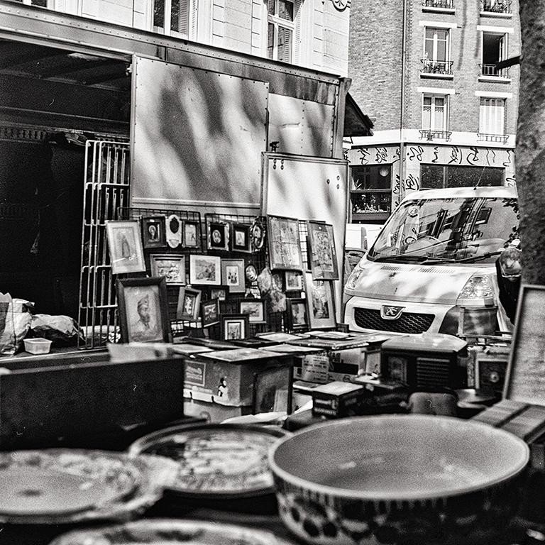
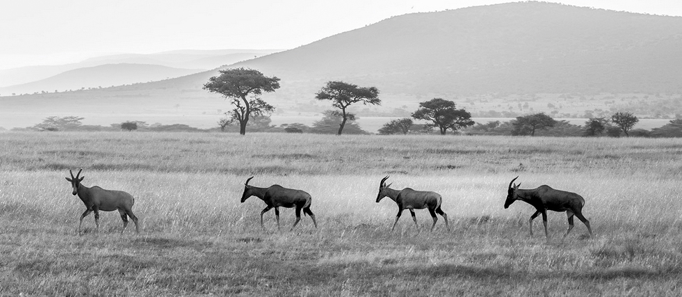
Very interesting image. It reminds me Jack's dunes. I would minimize the foreground and remove the bird. Otherwise I agree with Jack. 3 would be better. Great shot. |
May 21st |
 |
| 47 |
May 18 |
Comment |
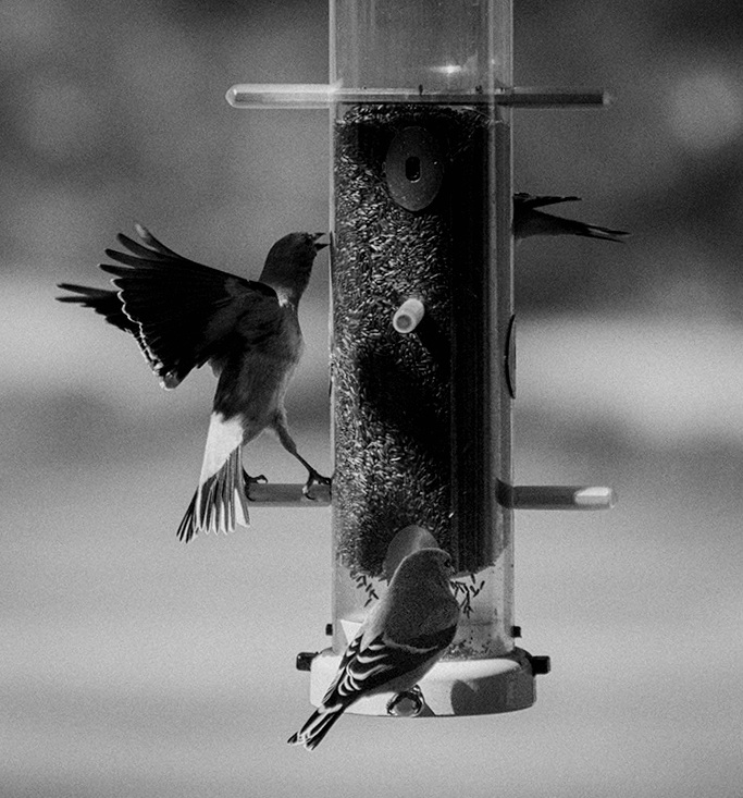
Great movement capture. Congratulations. |
May 21st |
| 47 |
May 18 |
Comment |
Beautiful gray tones. I couldn't resist to make leaves and background darker. |
May 21st |
 |
| 47 |
May 18 |
Comment |
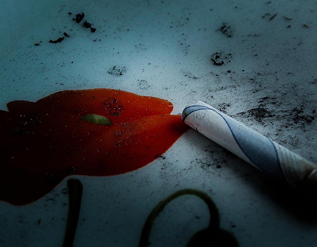
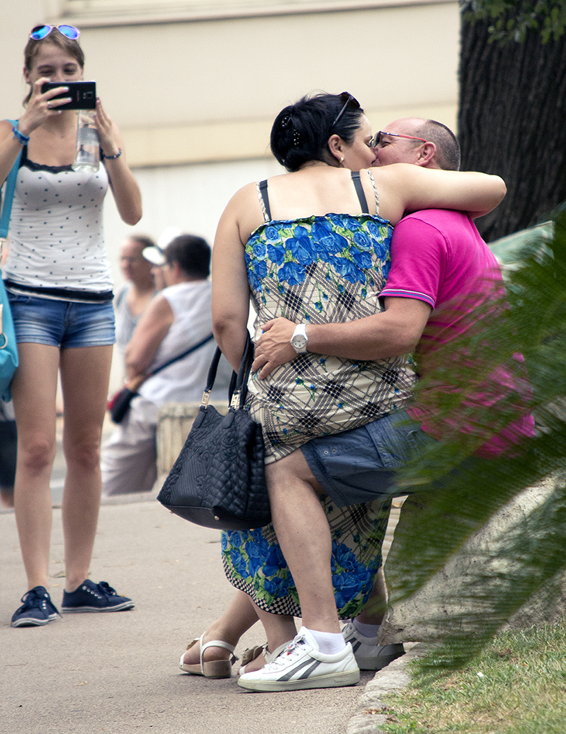
Very dramatic wonderful image. What I would add I would remove one bottle. One is enough. And the light from the window is too flat, no shadows, no details. I would put the bottle horizontal in parallel with cigarette, too. Otherwise a perfect impressive image. |
May 21st |
| 47 |
May 18 |
Comment |
I was impressed by the image but I had to make one correction because, I think, it is in some imbalance. I attach my version. |
May 21st |
 |
| 47 |
May 18 |
Comment |
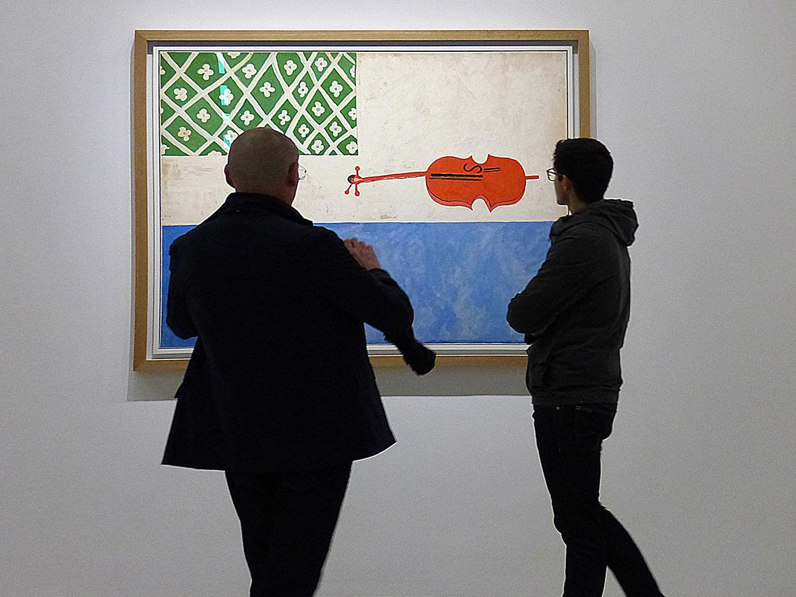
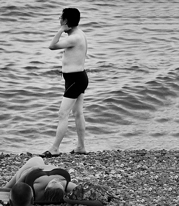
Great composition. For me it is correct. The face of the other man is not necessary. This way it is more dynamic and exiting. I agree with Don. It is a story, as interesting as Vivian Mayer's photos. The only think I would change would be the color. I would make it black and white. On the other hand it looks like made with analog camera. |
May 21st |
| 47 |
May 18 |
Comment |
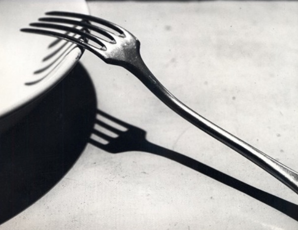
Thank you All. The idea comes from Andre Kertesz photo (attached). |
May 21st |
 |
| 47 |
May 18 |
Reply |
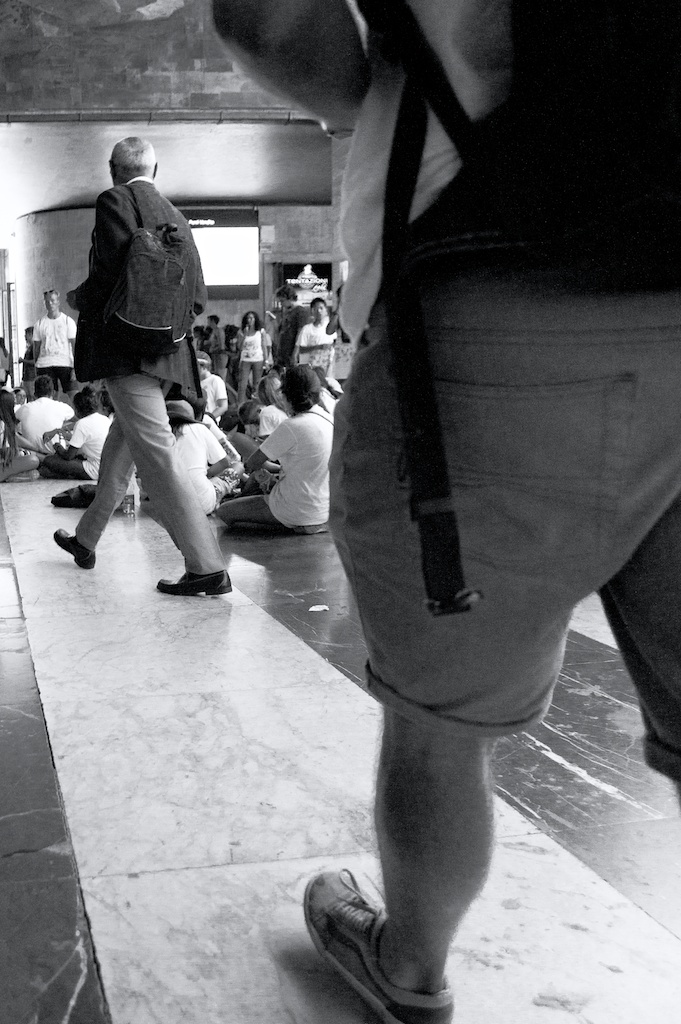
It is simply an abstract composition and a study of texture, as you say. No story included. |
May 13th |
7 comments - 1 reply for Group 47
|
11 comments - 4 replies Total
|