|
| Group |
Round |
C/R |
Comment |
Date |
Image |
| 22 |
Feb 18 |
Comment |
Flying horse on fire, very creative. I would brighten up the left side. I think the black spot is too heavy and takes attention from the horse. |
Feb 21st |
| 22 |
Feb 18 |
Comment |
It looks like a science-fiction image, part of a movie. Great job! |
Feb 21st |
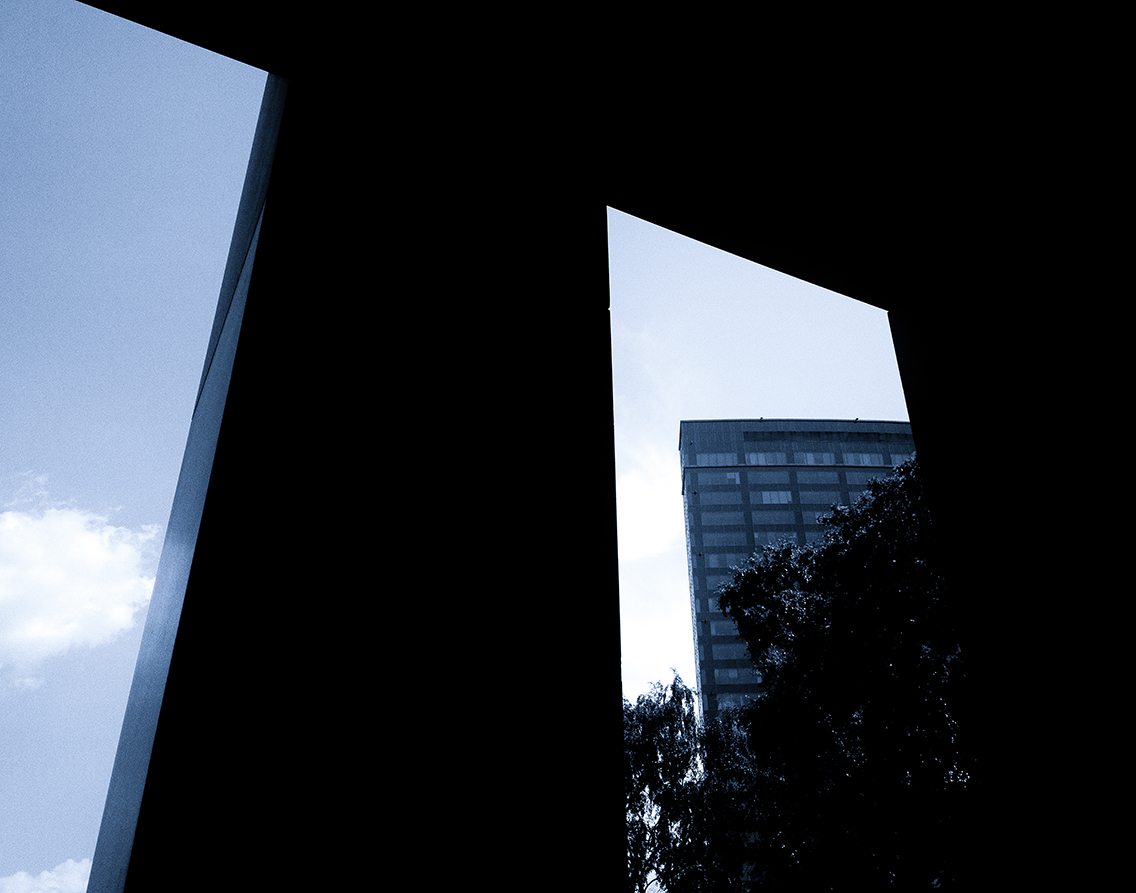
| 22 |
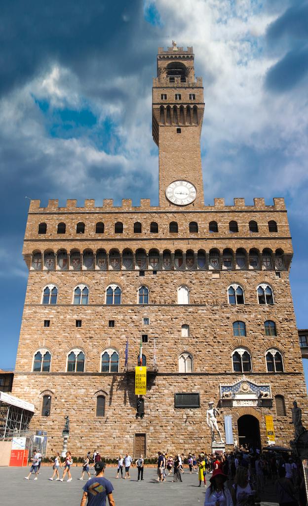
Feb 18 |
Comment |
Keystoning is a problem but didn't have any tilt-lens. I used prime lens. I could eventually move backwards but I think it was another building behind me. Thank you Joseph for the correction. |
Feb 21st |
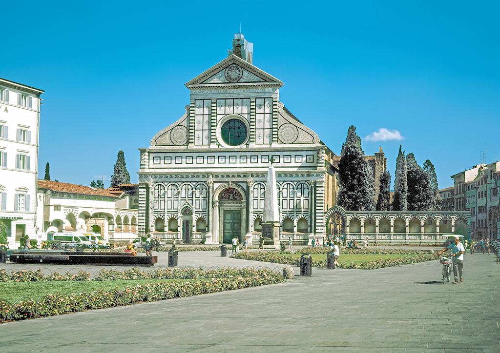
| 22 |
Feb 18 |
Comment |
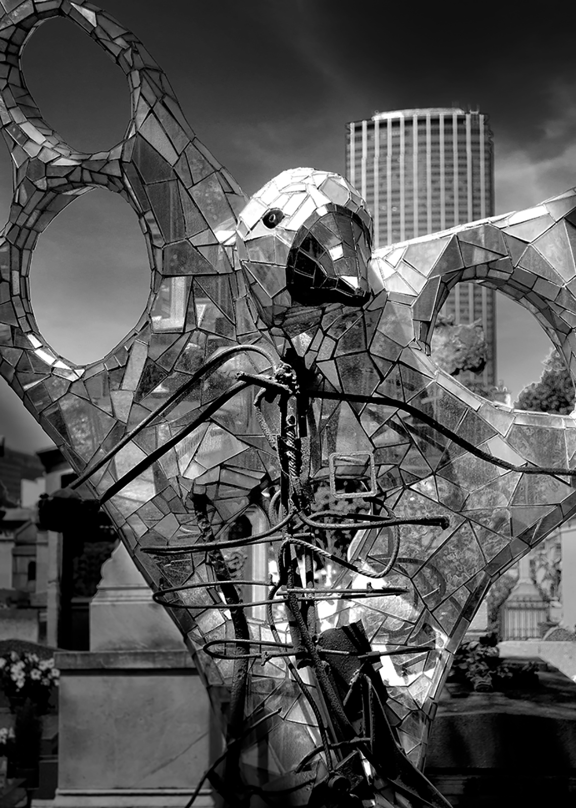
Blending the images is perfect but I would cropp it to concentrate on the maim object. |
Feb 21st |
 |
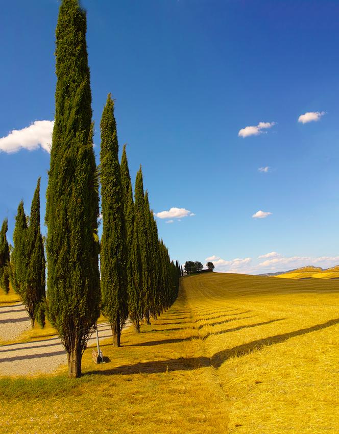
| 22 |
Feb 18 |
Comment |
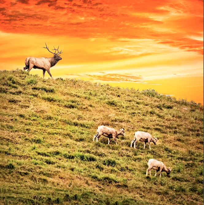
It is almost perfect. The line between the grass and the sand is too strong. I think you should darken the grass before adding to the other photo. Another small problem is the direction of the shadows. Peggy's cropped version is better, I think, but doesn't solve the problem with too strong green color in the background. |
Feb 21st |
| 22 |
Feb 18 |
Comment |
As Jerry I see the line round the lighthouse. You probably should try another method. Try the one i used. Perhaps it will eliminate this problem. There is no other way than to try. Generally I agree with Jerry. |
Feb 21st |
6 comments - 0 replies for Group 22
|
| 47 |
Feb 18 |
Comment |
Thank you, All.
|
Feb 24th |
| 47 |
Feb 18 |
Comment |
I like this frosty atmosphere, the line of the waves and the abstract nature of this image. Gear job, Jen. |
Feb 20th |
| 47 |
Feb 18 |
Comment |
I propose to make left side darker to get 3-D. Otherwise very interesting image. |
Feb 20th |
 |
| 47 |
Feb 18 |
Comment |
What shall I say? Good composition and very well done technically. Perfect. |
Feb 20th |
| 47 |
Feb 18 |
Comment |
I propose to crop on the right side to move attention to the left. Otherwise I like it. Great job, Ed. Thank you for sharing. |
Feb 20th |
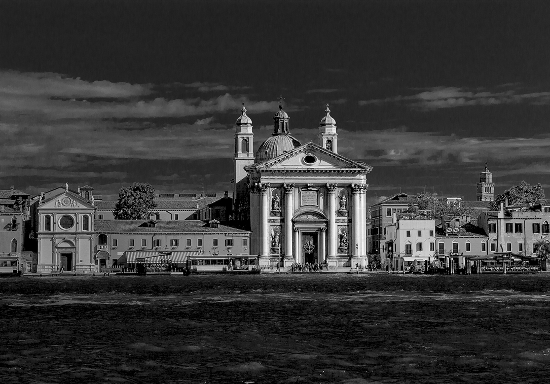
| 47 |
Feb 18 |
Comment |
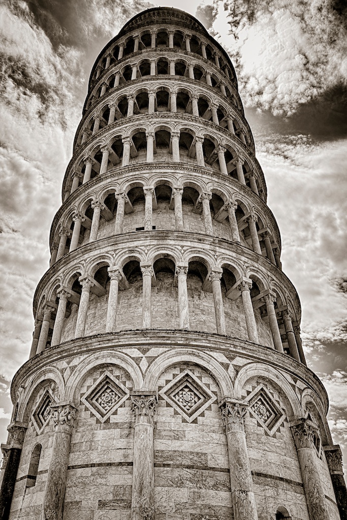
I agree with Ed but I would rather say that my eyes struggle to recognize details below the tower. The details on the left side are not necessary. I would simplify the image. |
Feb 20th |
 |
6 comments - 0 replies for Group 47
|
12 comments - 0 replies Total
|