|
| Group |
Round |
C/R |
Comment |
Date |
Image |
| 22 |
Mar 17 |
Comment |
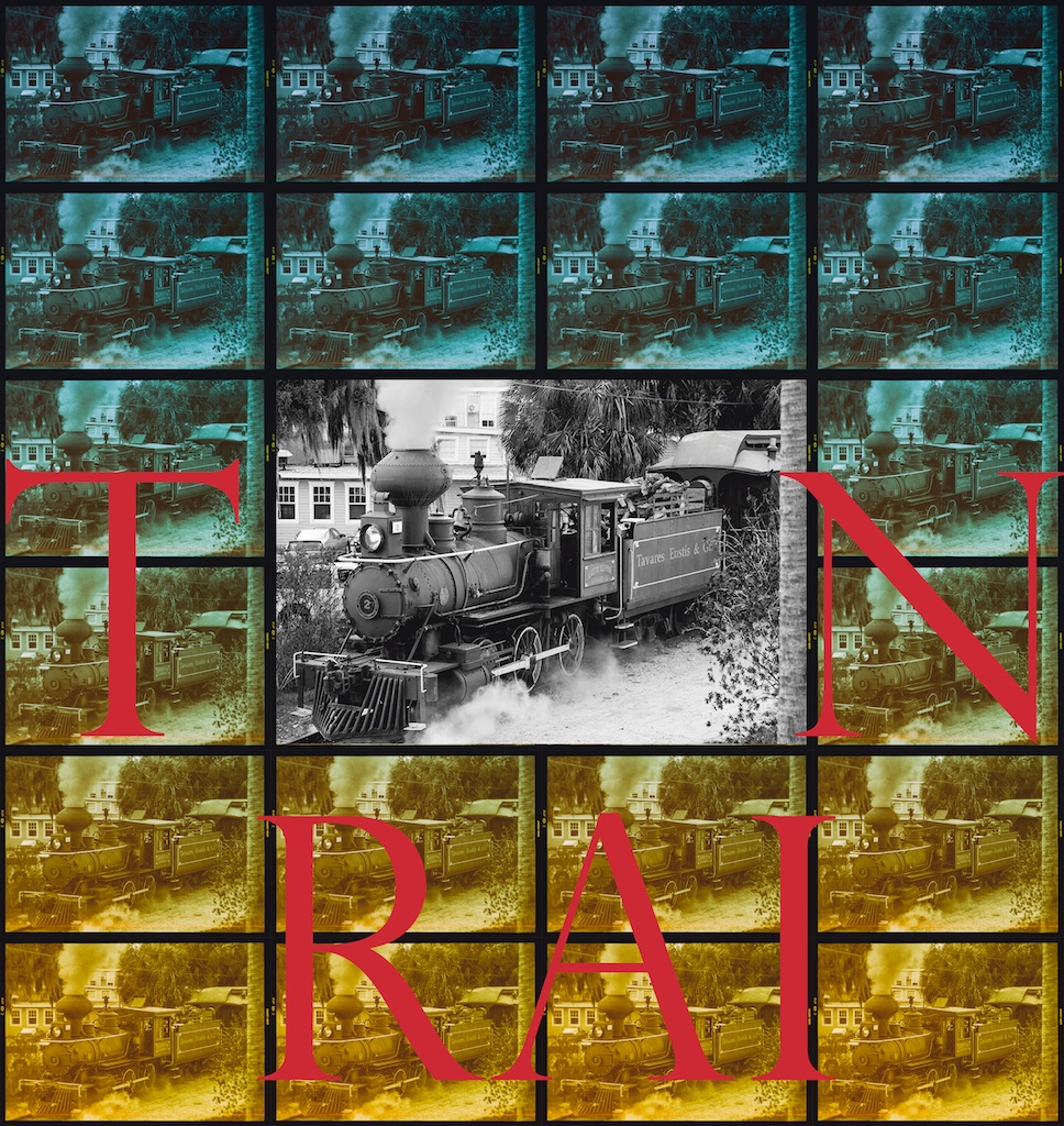
Thank you, Vicki. I used letters to put attention to the lower part of the image and forget about 2 first rows. Not to say something. I also wanted to color the lower rows with red, transparent red. Perhaps violet. It depends on the composition. |
Mar 13th |
| 22 |
Mar 17 |
Comment |
Thank you, Marti. |
Mar 13th |
| 22 |
Mar 17 |
Comment |
It is flawless work. Great. I would adjust light on the front of the train to fit better, coexist with the trees. The trees are illuminated from the right but the train from the left (or from the front). Should WB of the train and the tree be adjusted? |
Mar 9th |
| 22 |
Mar 17 |
Comment |
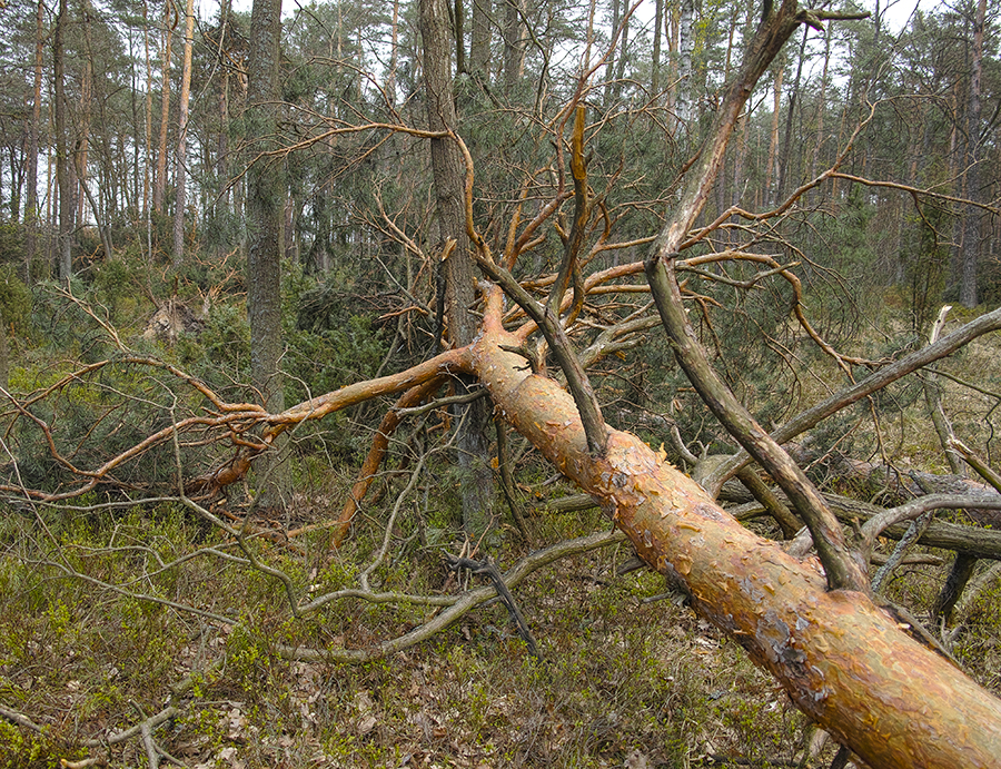
It was not an easy assignment. |
Mar 9th |
| 22 |
Mar 17 |
Comment |
True, it is very interesting illustration for a book. I would make background darker.
|
Mar 9th |
| 22 |
Mar 17 |
Comment |
Modern art! Very good, what a fantasy. |
Mar 9th |
| 22 |
Mar 17 |
Comment |
Hi, Peggy. Your interpretation is very consistent. Very elegant. |
Mar 9th |
| 22 |
Mar 17 |
Comment |
Great job, Marti. The smoke is too strong, I think. Composition is fine. I would diversified the light. For example made the background darker. |
Mar 9th |
| 22 |
Mar 17 |
Reply |
Thank you, Peggy |
Mar 8th |
| 22 |
Mar 17 |
Reply |
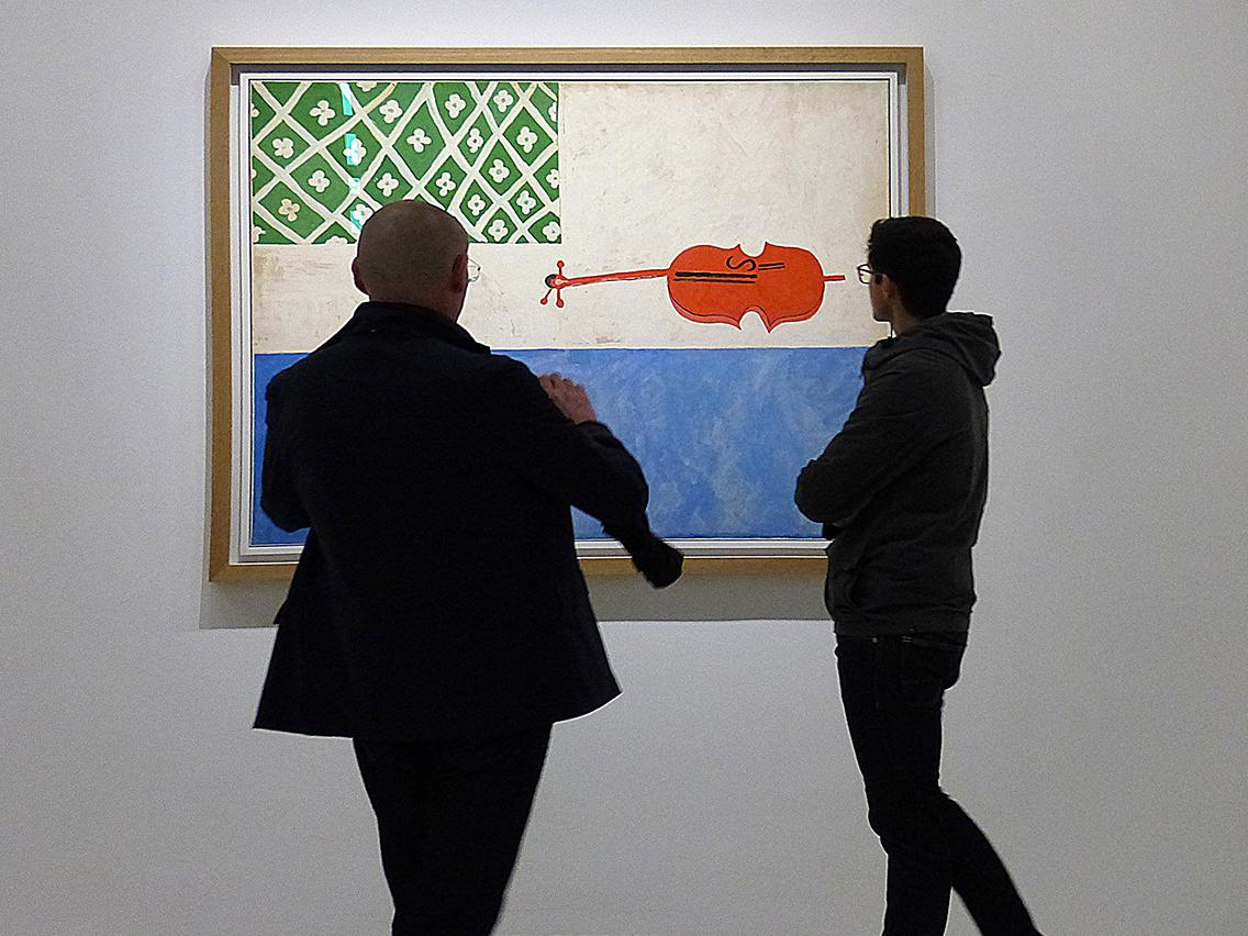
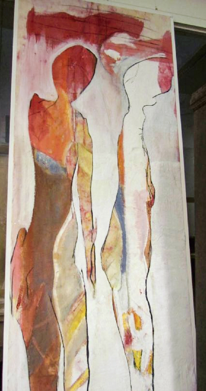
I have background as a painter. I attach one of my 1981 paintings. |
Mar 7th |
 |
| 22 |
Mar 17 |
Reply |
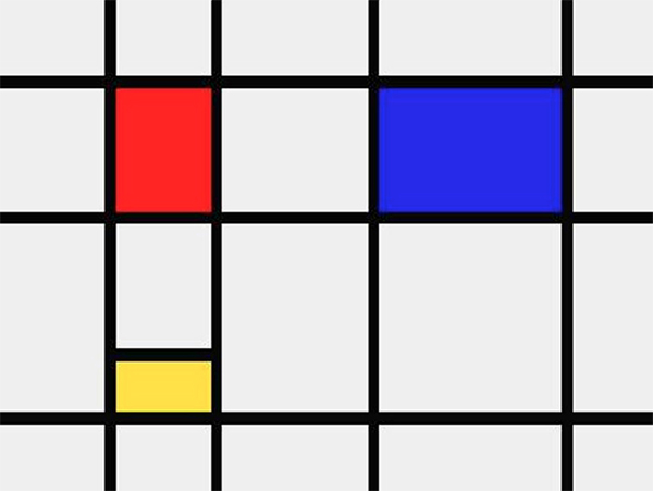
Idea of the train image comes from Mondrian painting. |
Mar 7th |
 |
| 22 |
Mar 17 |
Comment |
I would agree with the palm but on the other side it strengthens the vertical lines. I've used letters on the downside of the image to "settle" image down. The orange color of the bottom is to put attention the downside of the image. The top of the should be less visible, less interesting. I treat the letters as a collection of abstract signs, not is text. |
Mar 6th |
9 comments - 3 replies for Group 22
|
| 47 |
Mar 17 |
Comment |
Thank you, Don. |
Mar 13th |
| 47 |
Mar 17 |
Reply |
Thank you, Jen. |
Mar 12th |
| 47 |
Mar 17 |
Comment |
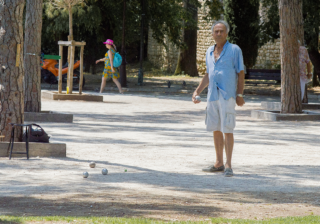
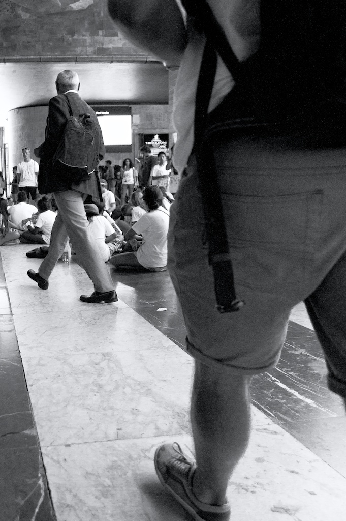
Great afford. As I see it, it has to many "strong" elements. I think, there is no priority in the image. I would concentrate on woman and make all other elements softer, especially the background. |
Mar 11th |
| 47 |
Mar 17 |
Comment |
Very good photo. The only change I would propose, is to make it "deeper", add filling of depth. Is it not over-sharped? |
Mar 11th |
| 47 |
Mar 17 |
Comment |
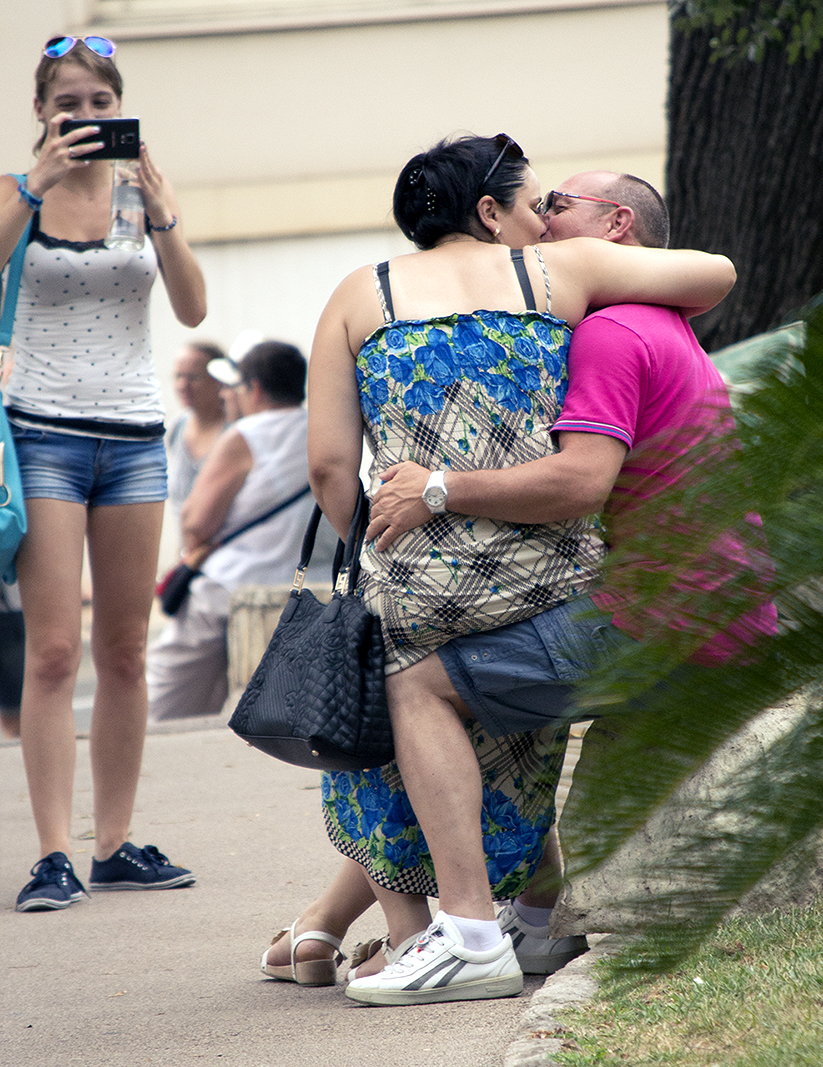
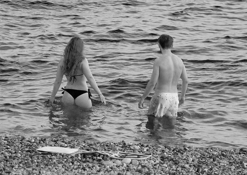
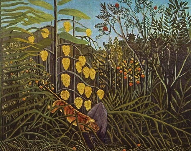
Interesting. I don't know why but it looks like a painting of Henri Rousseau (attached). Can you publish it in color? |
Mar 11th |
 |
| 47 |
Mar 17 |
Comment |
Great image. I agree with Jack. I would make the cliff much darker and cropped the image on the top. |
Mar 11th |
| 47 |
Mar 17 |
Comment |
For me, it looks like large format photography, the same lightning, same filling and great detail. Simply great. |
Mar 11th |
| 47 |
Mar 17 |
Comment |
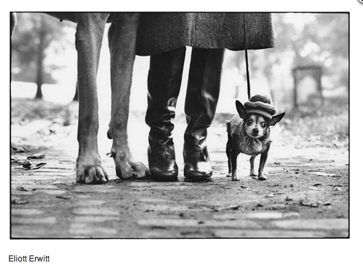
Thank you, Jack. My inspiration comes from Eliott Erwitt photography (attached). My photo is much more simple, but I can say, it is not staged. |
Mar 11th |
 |
7 comments - 1 reply for Group 47
|
16 comments - 4 replies Total
|