|
| Group |
Round |
C/R |
Comment |
Date |
Image |
| 22 |
Feb 17 |
Comment |
Hi All,
Before March, I would like to start a discussion about some aspects of the composition. We all have tendency, in our remarks, to eliminate from the image most of the elements and concentrate on one, "main" subject. It should be dominating, sharp, "first" in the image. "Multi-subject" images are not accepted. Unsharp, or not enough sharp (partly), either.
It is a general problem, not only ours. I know a few pro photographers who judge photos that way. OK, they have their point but in the same time we can see a lot of accepted images which are not single-subject images.
Examples:
https://www.bing.com/images/search?view=detailV2&ccid=m%2bJG7HgD&id=8074B85CE5CF2196E40F8B4F639AD8231090B163&q=william+klien+photographer&simid=608051036970352696&selectedIndex=0&ajaxhist=0
If I posted this image anywhere, they will send me home and tell "take a few lessons, boy". Person in the middle not sharp, one man on the left, others on the right???
https://pro.magnumphotos.com/C.aspx?VP3=CMS3&VF=MAGO31_10_VForm&ERID=24KL53Y_H
The left side should be cropped out?
https://pro.magnumphotos.com/C.aspx?VP3=CMS3&VF=MAGO31_10_VForm&ERID=24KL53Y_H
The boy on the right?
https://pro.magnumphotos.com/C.aspx?VP3=CMS3&VF=MAGO31_10_VForm&ERID=24KL53Y_H
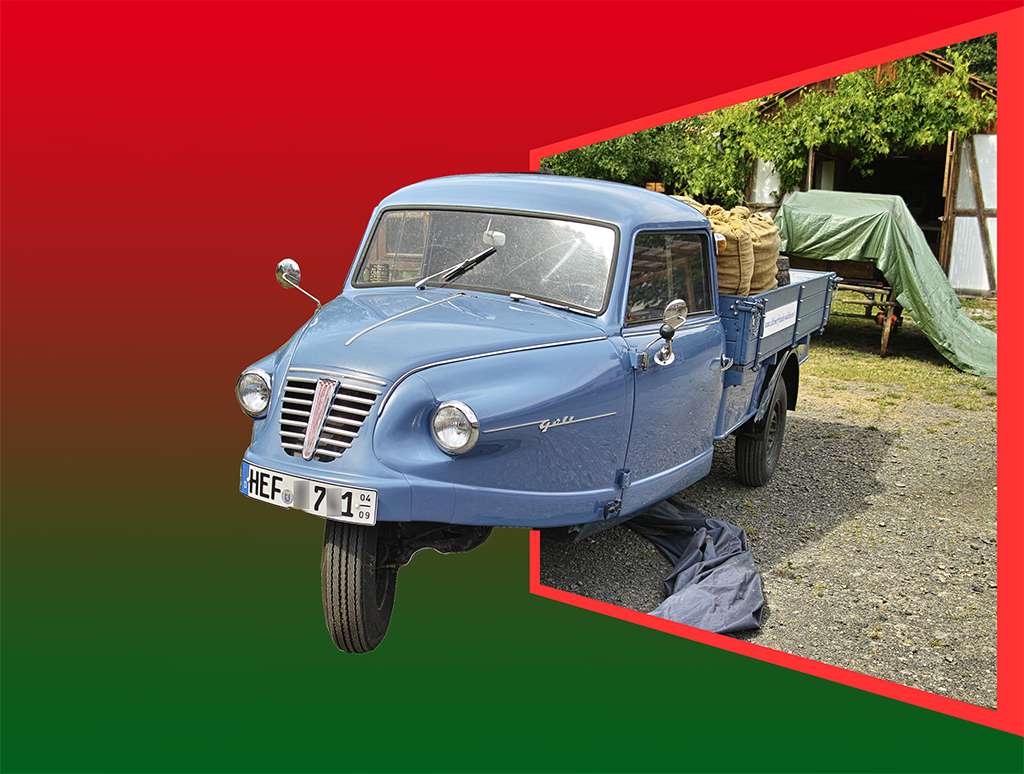
The maim subject is the walking man, in the red frame. What with the man on the left and the pink glass? I think should be cropped out?
Are the above photos good? Would they take first place in the photo contest?
I would like to know your opinion.
John |
Feb 11th |
| 22 |
Feb 17 |
Comment |
I would crop it on the left side (not too much), but it is my opinion. Colors are great! |
Feb 8th |
| 22 |
Feb 17 |
Comment |
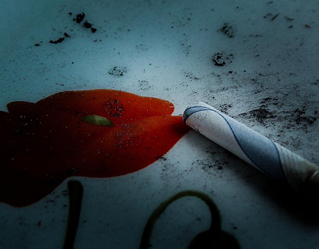
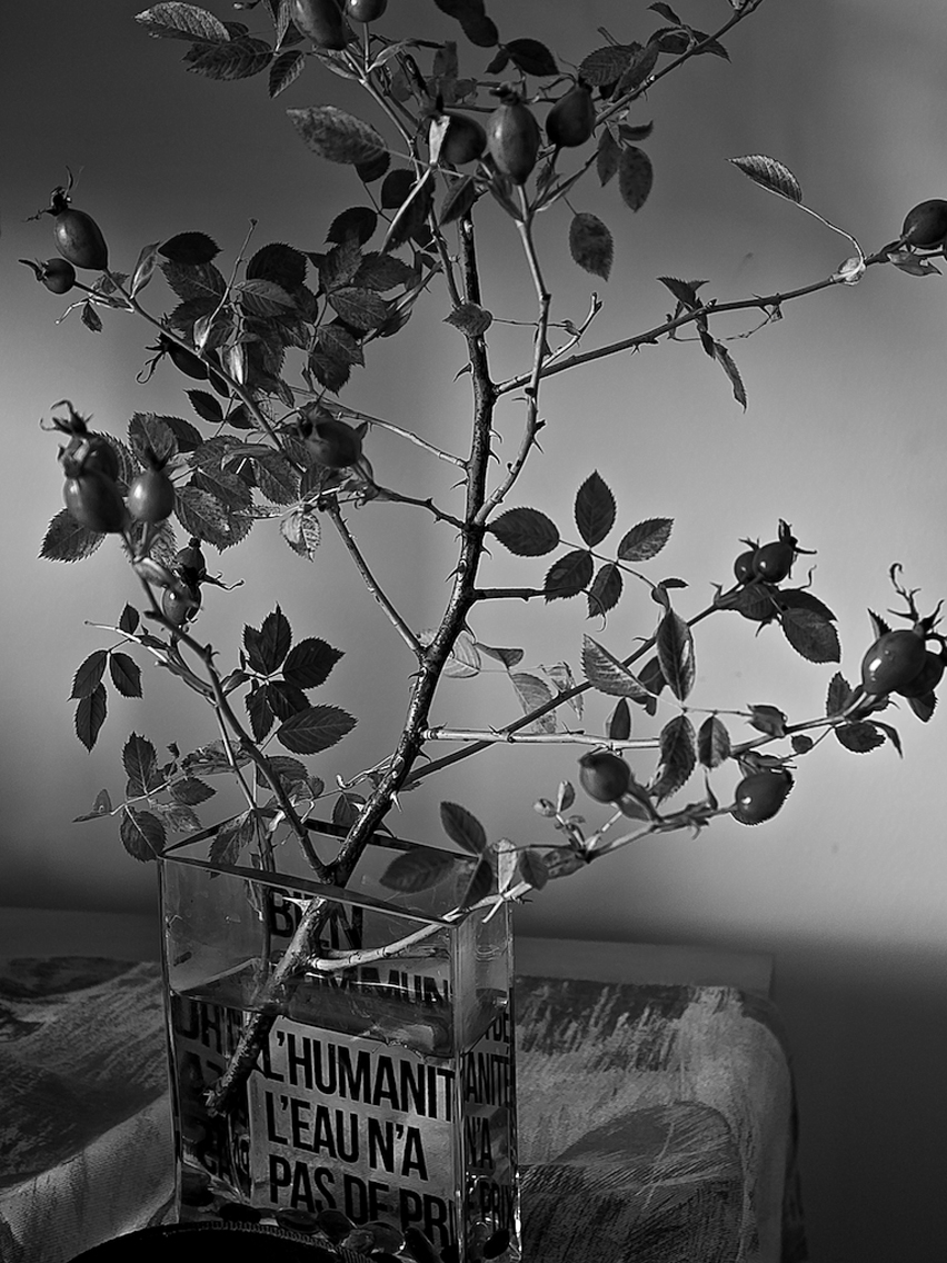
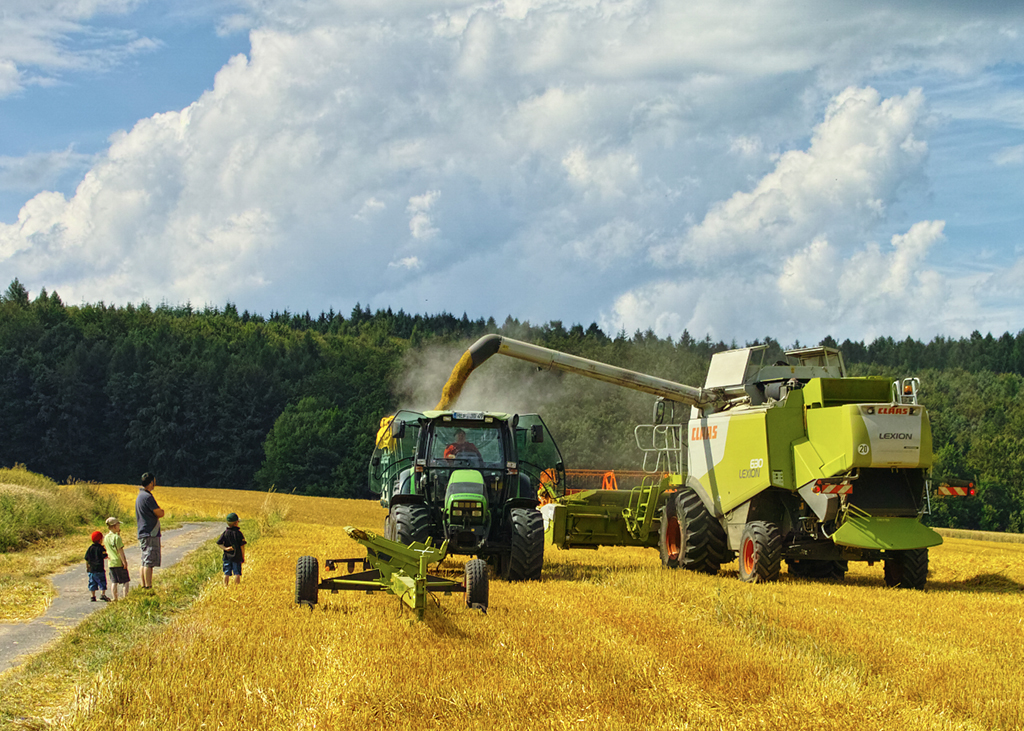
I would like to show another photo which illustrates what I mean. In the attached image I could show the action only, the working machines. But the children add "story" to the photo. |
Feb 8th |
 |
| 22 |
Feb 17 |
Comment |
Congratulation! The image is full of action and is not sharp. Which is good. Instead, your photo is fill of atmosphere. I mean, it is another dimension of the photography. Most of us try to make sharper and sharper images. I personally think, it is not always the best way. |
Feb 8th |
| 22 |
Feb 17 |
Comment |
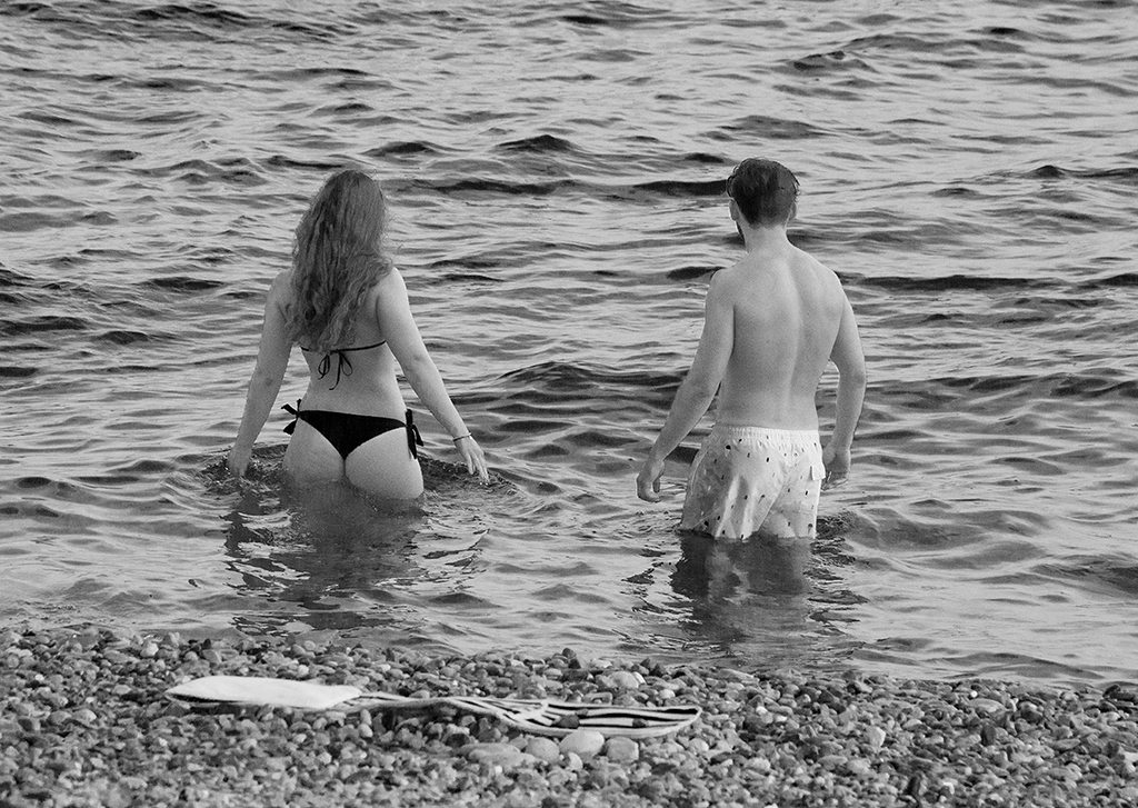
This "kiss" scene, kiss between older couple, in public, is rare, not existing. Of course it would be better to shoot from the other side of the street, come closer, but I had 1/125 of a sec. to take a decision or loose it.
The girl. I like images which tells stories, showing multiple elements. |
Feb 8th |
| 22 |
Feb 17 |
Comment |
Thank you All,
I could crop it tight, as you say. On the other hand I though it could nice to show a part of the street, which is important for the situation taking place. As I remember the girl was a member of the family. |
Feb 7th |
6 comments - 0 replies for Group 22
|
| 47 |
Feb 17 |
Comment |
Hi All,
Before March, I would like to start a discussion about some aspects of the composition. We all have tendency, in our remarks, to eliminate from the image most of the elements and concentrate on one, "main" subject. It should be dominating, sharp, "first" in the image. "Multi-subject" images are not accepted. Unsharp, or not enough sharp (partly), either.
It is a general problem, not only ours. I know a few pro photographers who judge photos that way. OK, they have their point but in the same time we can see a lot of accepted images which are not single-subject images.
Examples:
https://www.bing.com/images/search?view=detailV2&ccid=m%2bJG7HgD&id=8074B85CE5CF2196E40F8B4F639AD8231090B163&q=william+klien+photographer&simid=608051036970352696&selectedIndex=0&ajaxhist=0
If I posted this image anywhere, they will send me home and tell "take a few lessons, boy". Person in the middle not sharp, one man on the left, others on the right???
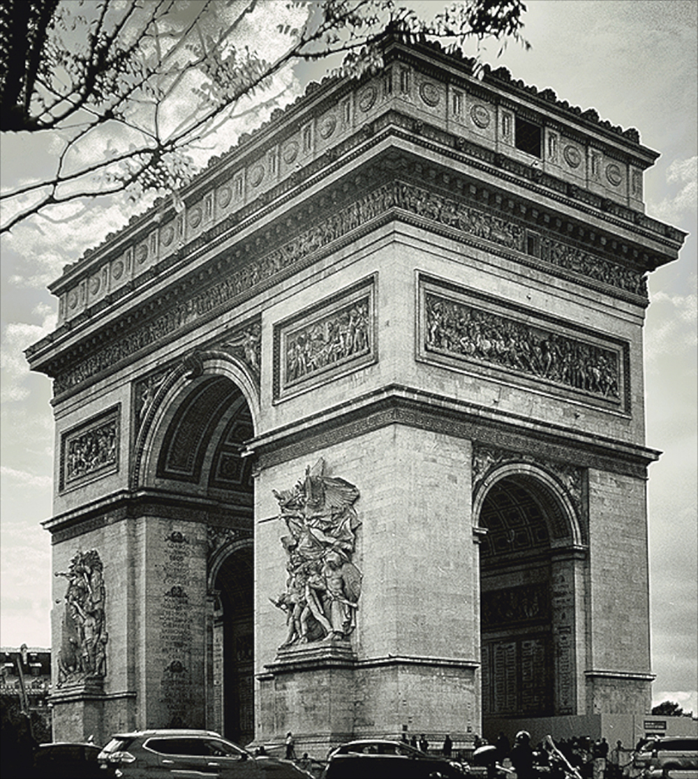
https://pro.magnumphotos.com/C.aspx?VP3=CMS3&VF=MAGO31_10_VForm&ERID=24KL53Y_H
The left side should be cropped out?
https://pro.magnumphotos.com/C.aspx?VP3=CMS3&VF=MAGO31_10_VForm&ERID=24KL53Y_H
The boy on the right?
https://pro.magnumphotos.com/C.aspx?VP3=CMS3&VF=MAGO31_10_VForm&ERID=24KL53Y_H
The maim subject is the walking man, in the red frame. What with the man on the left and the pink glass? I think should be cropped out?
Are the above photos good? Would they take first place in the photo contest?
I would like to know your opinion.
John
|
Feb 11th |
| 47 |
Feb 17 |
Comment |
Very nice photo. I would add, the vignettes at the bottom distracts me. Tourist at the left? What about cloning out 2 horses on the right. |
Feb 11th |
| 47 |
Feb 17 |
Comment |
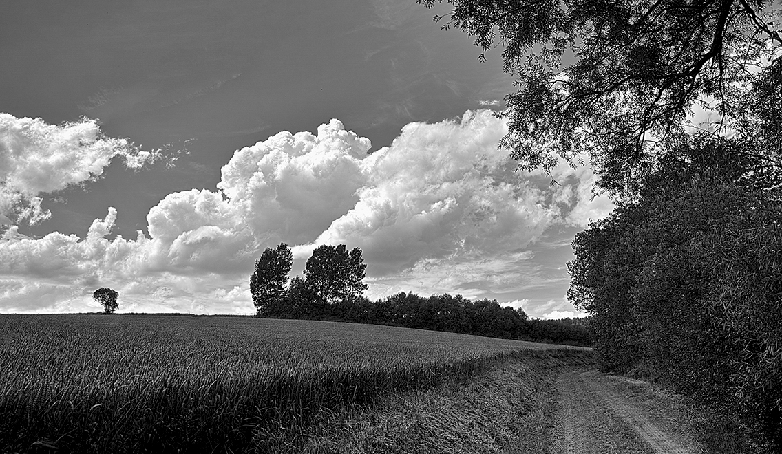
In the first moment I agree with you, All. The image is fantastic. The sky is very well done and impresive. But... a small "but". There is difference between the sky and the rest of the image. I think, the sky is in different perspective, which makes the image a science-fiction image: an enormous cloud closing to the Earth, from space. I thing the horizon line is too strong. And the cloud is too intensive at the horizon. In other words, horizon and the cloud collides.
|
Feb 11th |
| 47 |
Feb 17 |
Comment |
Very strong message. Very interesting image. Done in 1970-ies "style", I would say. I like very much this period in photography. Like Vivian Mayer. |
Feb 11th |
| 47 |
Feb 17 |
Comment |
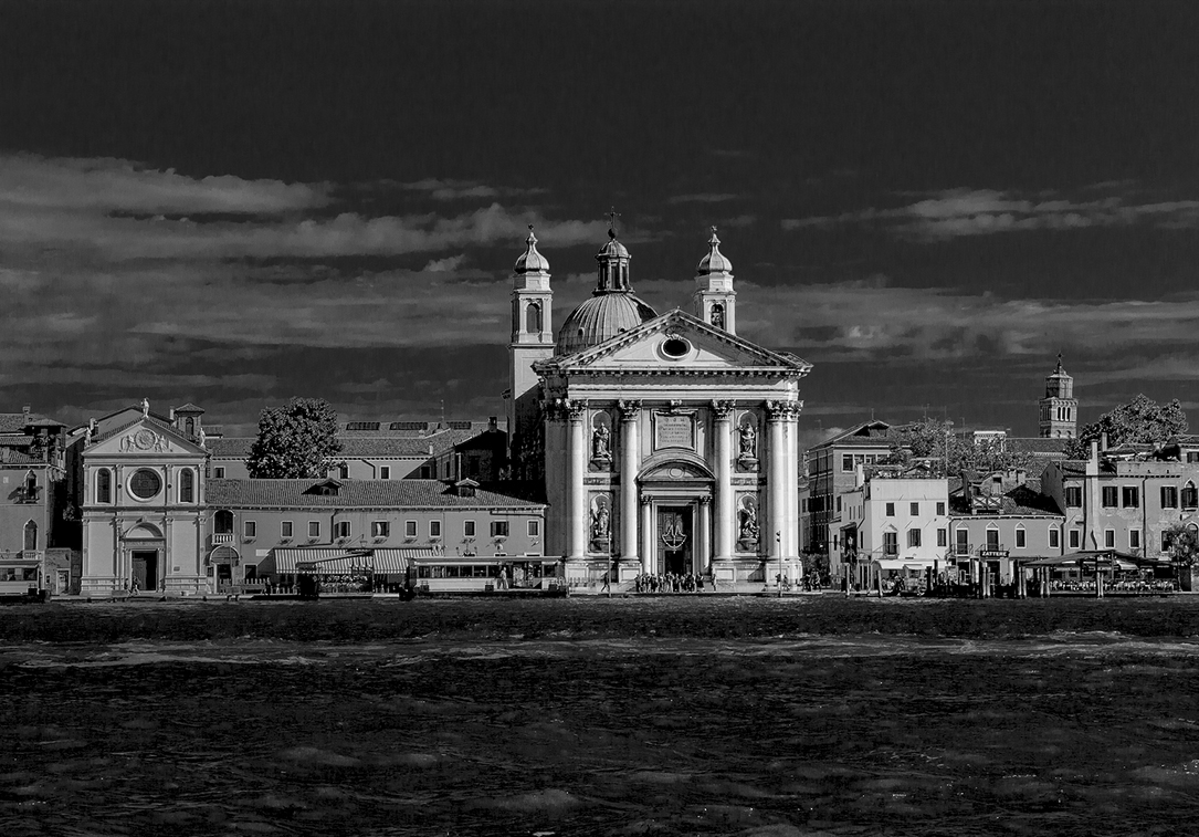
Hi Ed,
Very nice and interesting shot. A bit of history at the high seas! Another world. |
Feb 11th |
| 47 |
Feb 17 |
Reply |
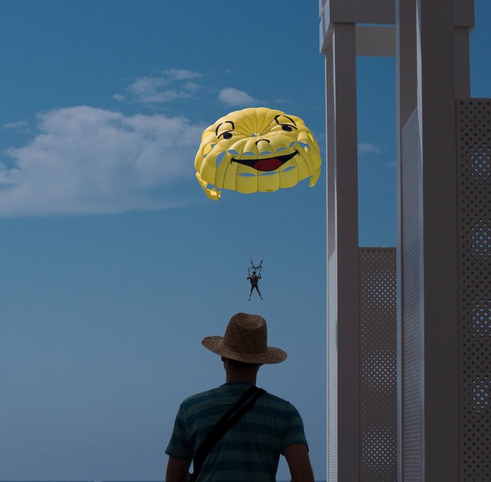
Fantastic desert! Interesting place to shoot. It should be difficult to climb a dune? We don't have desert here, only small towns, large towns. |
Feb 9th |
| 47 |
Feb 17 |
Comment |
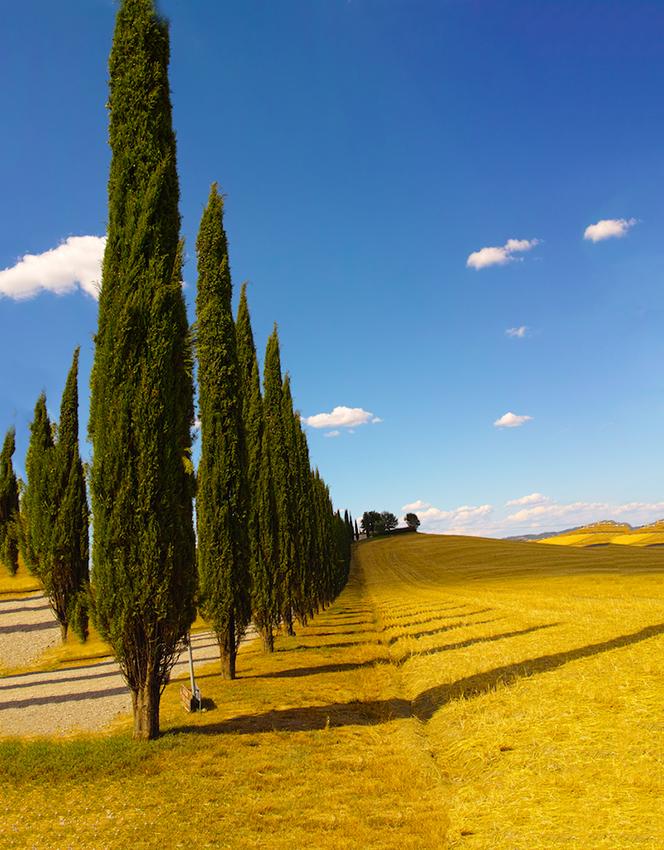
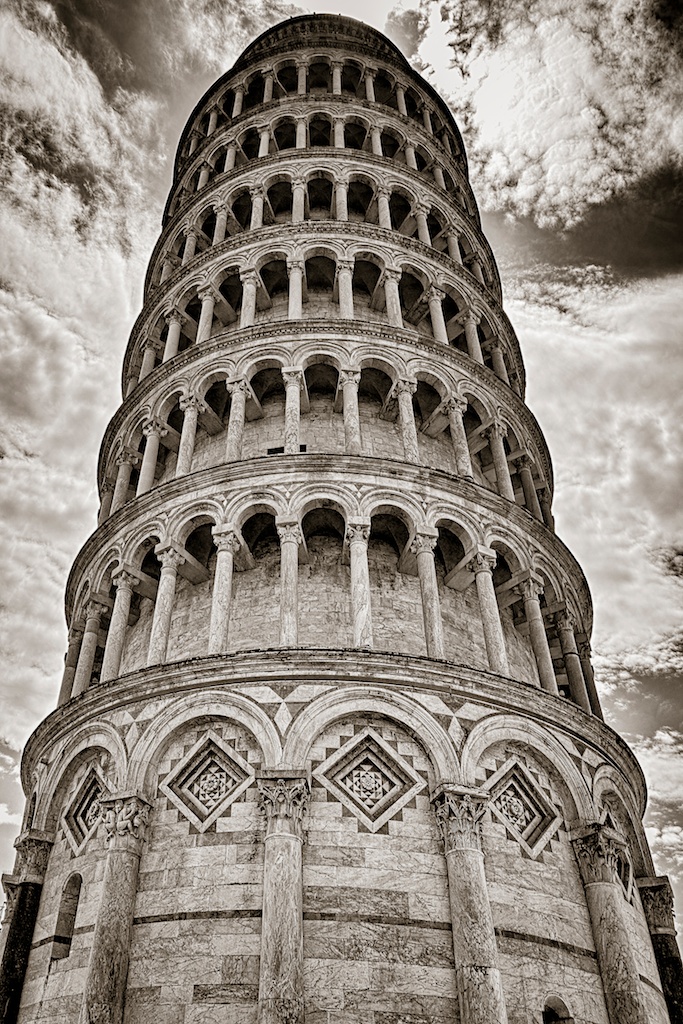
Simple and elegant.
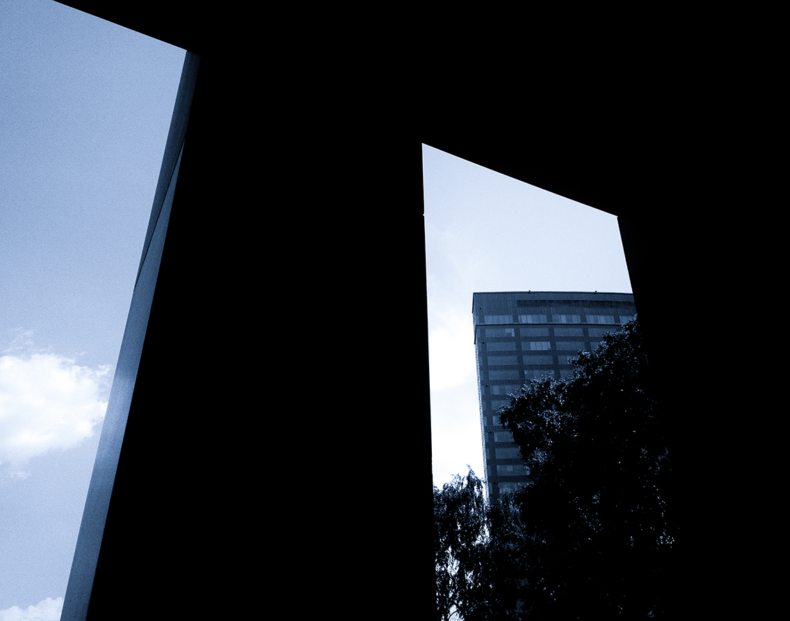
For me, it is divided in two parts: sharp front and the rest. I would need something in between. Did you use drone to get this shot? Is it a panorama? Or did you crop it? Upper right is too dark. |
Feb 9th |
| 47 |
Feb 17 |
Comment |
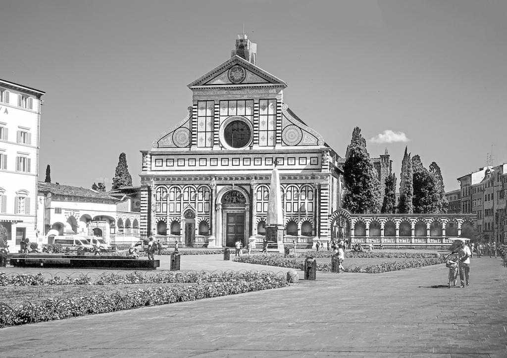
Hi All,
Nice to hear you again. It was not possible to get a clean shot. I decided to crop it tight to eliminate the background. The tower is still a problem. |
Feb 9th |
| 47 |
Feb 17 |
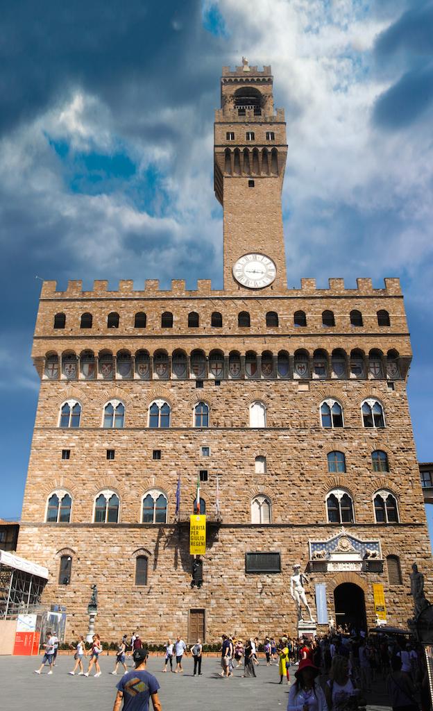
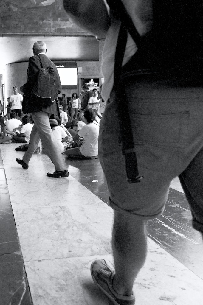
Comment |
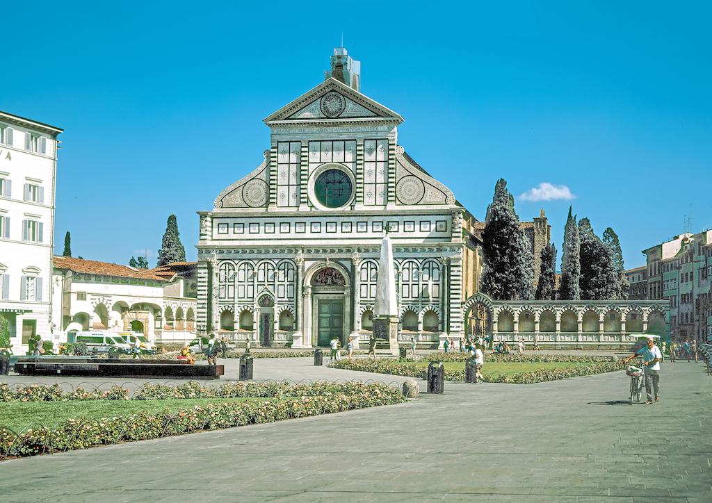
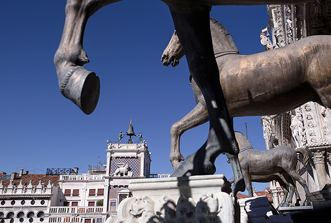
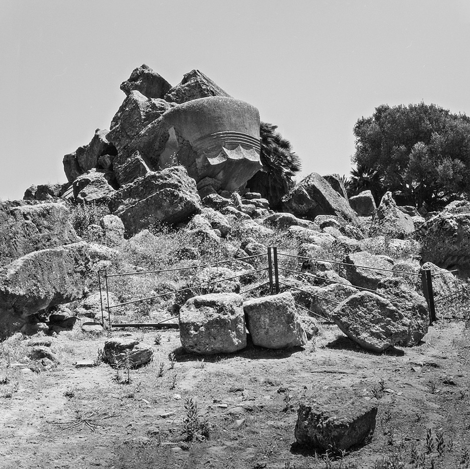
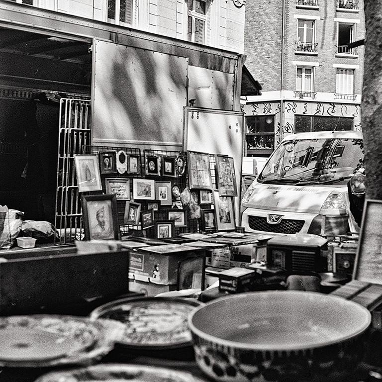
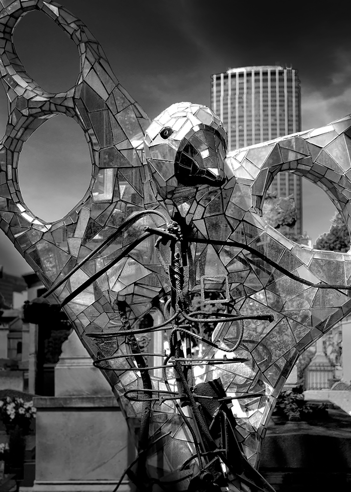
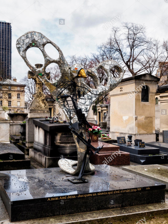
True, a lot of happens within the image but when I look at it I see the eye, the head and the tower. Than, I see the rest of chaos. I found the same image at Alamy photo agency, I attach it. It looks like my is much better. The sculpture is by a well known artist Niki de Saint Phalle. |
Feb 9th |
 |
| 47 |
Feb 17 |
Comment |
I don't know what went wrong. The image is too small. I asked Jack to change it. |
Feb 9th |
9 comments - 1 reply for Group 47
|
15 comments - 1 reply Total
|