|
| Group |
Round |
C/R |
Comment |
Date |
Image |
| 22 |
Jan 20 |
Comment |
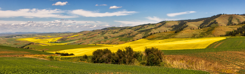
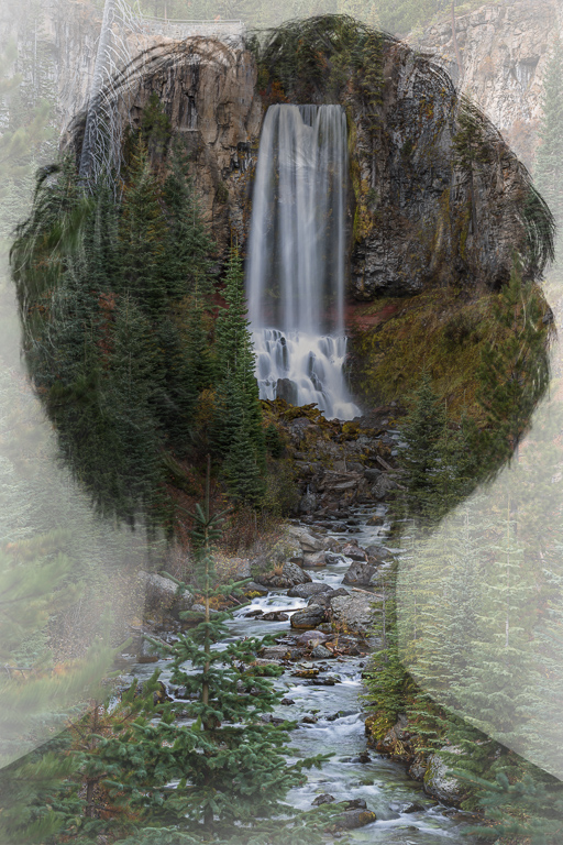
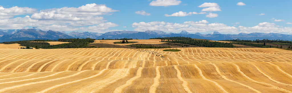
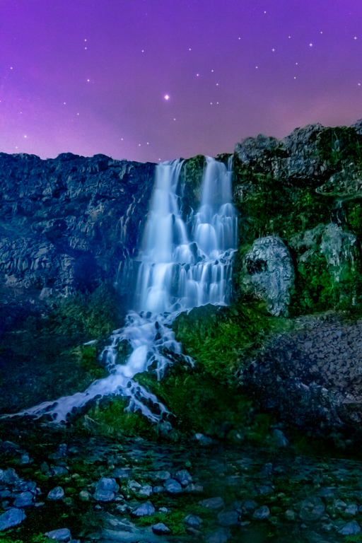
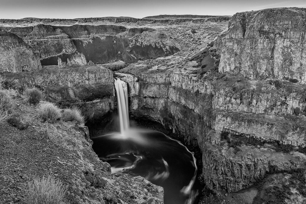
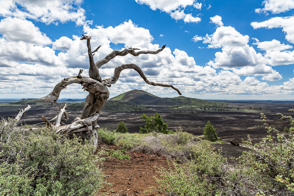
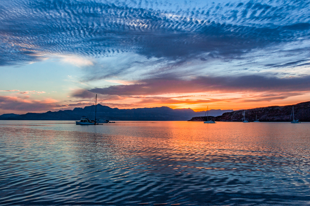
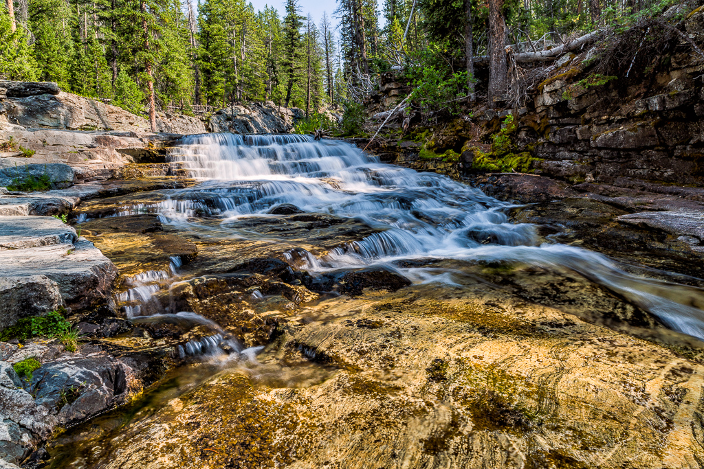
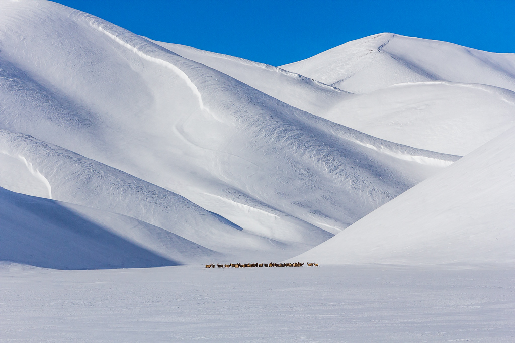
Great feedback. I too went back and forth on the cropping and settled on the one I submitted to illustrate the vastness of the area.
On a side note, I won a Revili Album from ACI valued at $265 at a workshop I attended. I had never heard or seen this type of album. I decided to feature all my waterfalls. I got to go all out with the cover, pages, trim, paper type and finish. I included this photo in the collection. I was stunned with the results of the album. The photo printing is some of the finest I have ever seen. |
Jan 27th |
| 22 |
Jan 20 |
Comment |
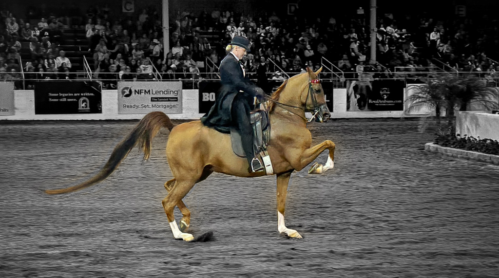
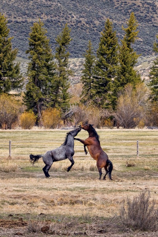
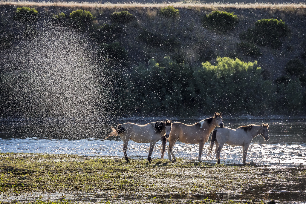
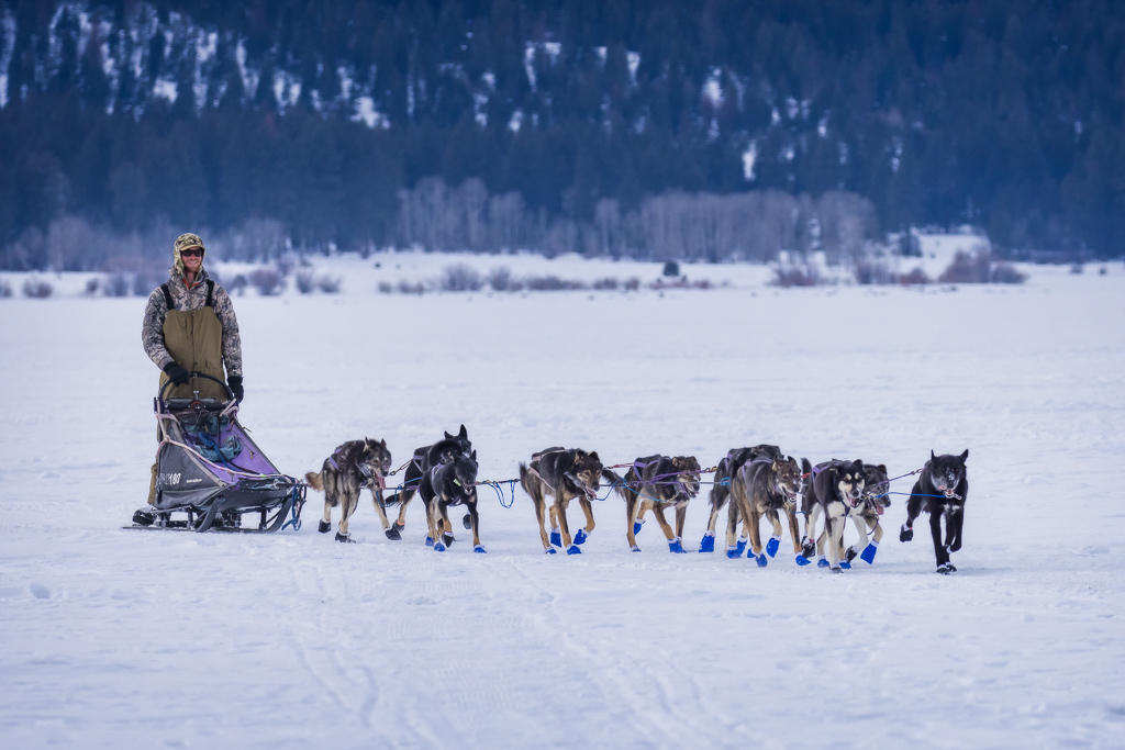
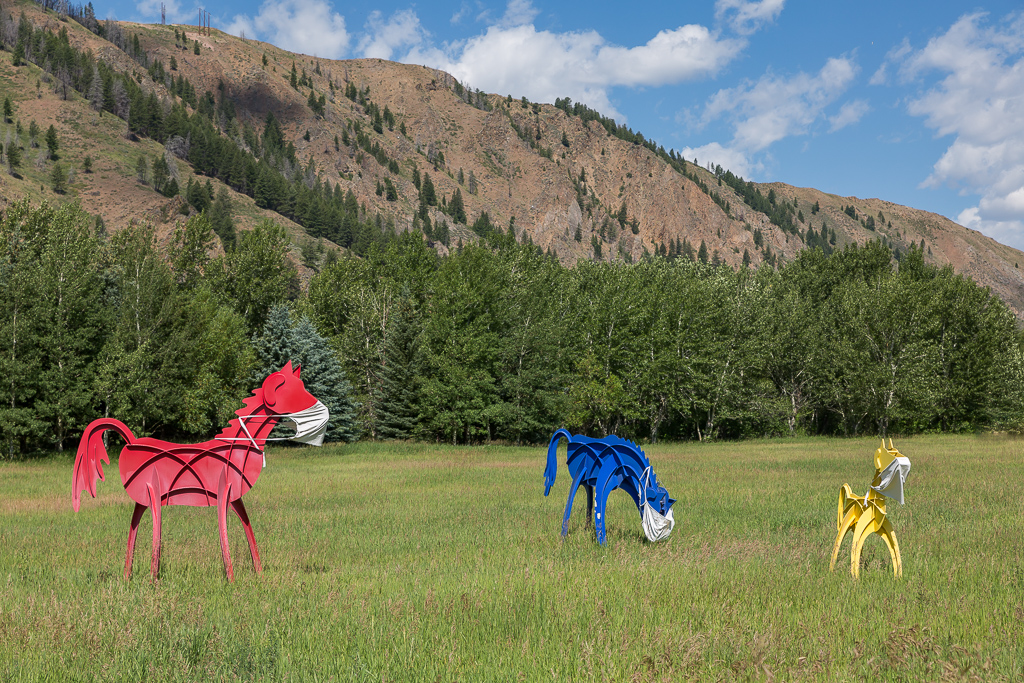
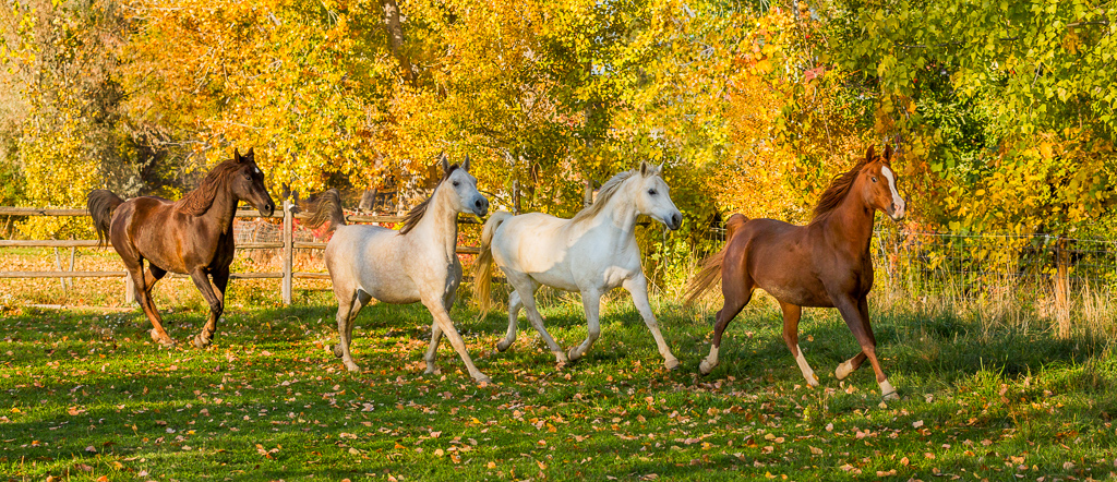
First of all congrats on capturing this iconic image. I dream of capturing the wild horses running in a majestic environment. You capture good leg separation of all horses. I wish the white horse on the right was separated, but can live with it. I have to agree with Joseph the paint needs to in the image and I like his rendition. I like the crop he used which eliminates more of the grass, sage brush and emphasizes the unique geology. |
Jan 27th |
| 22 |
Jan 20 |
Comment |
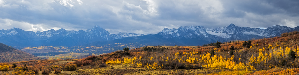
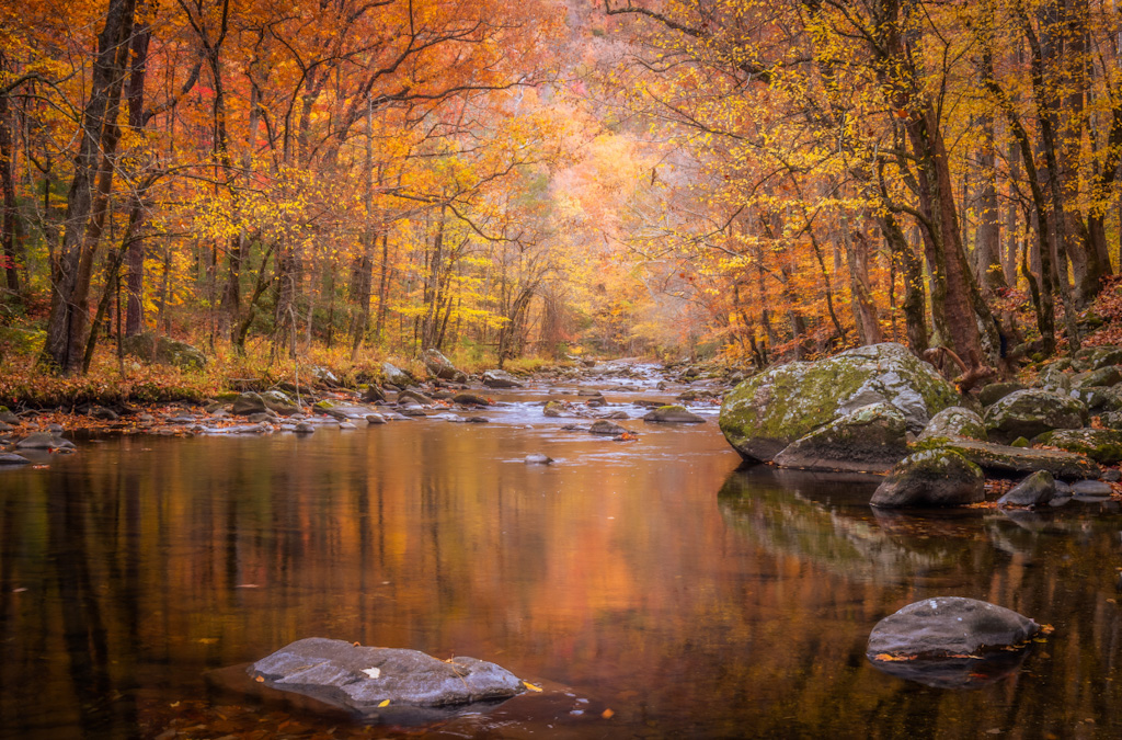
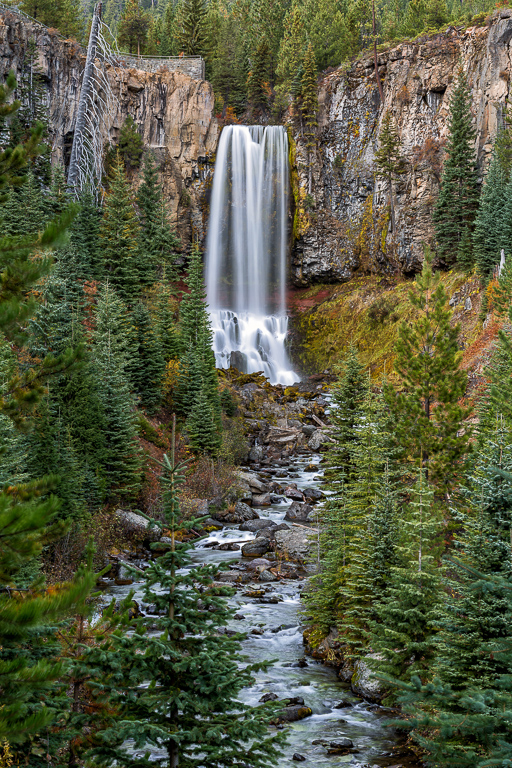
Nice color palette. It is very pleasing to the eye. I have to agree with Marti on leaving the reflection of the tree in. The crop feels to tight at the bottom of the frame. The reflection will offer a leading line and not feel so tight. I'd also clone out the little hanging bunch that does not appear to be attached to anything. |
Jan 27th |
| 22 |
Jan 20 |
Comment |
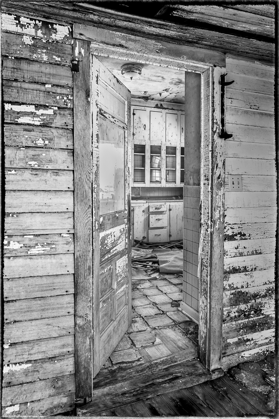
The edges of the windows, tips of the yucca plants, and the angle of the awning over the door lead my eye to the red door. I feel the color palette works to enhance direction to the door. I will suggest trying to tone the blue color cast on the right and left to match the middle of the home. I'd also remove the leaf/stem in the lower left. I like the final processing you used to create an artistic affect. |
Jan 27th |
| 22 |
Jan 20 |
Comment |
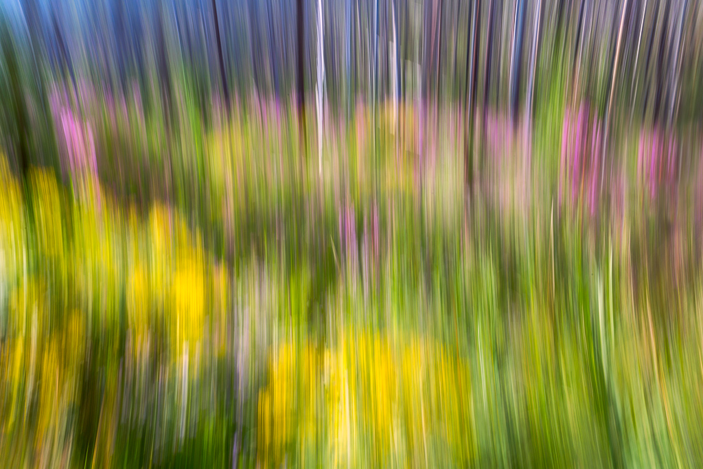
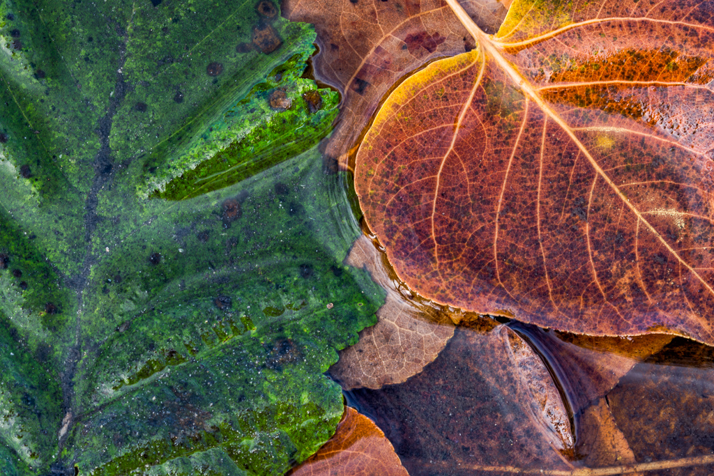
What I love about this group is the diverse perspectives, so I will offer mine. I like the composition as it was created. The cropping is perfect. The leaves at the bottom provide a leading line to the center and then my eyes can wander to the left or right or top to explore each leaf texture. The little white flowers appear blown out so I wonder if dropping the saturation will bring them back to perspective and all add texture to the other leaves. I would clean up all the little specs in the water and I would clone out the dark corner with the lighter areas so it creates a frame for the leaves. |
Jan 27th |
| 22 |
Jan 20 |
Comment |
I like the position you placed the church and cropping/cloning of other objects. The filter you selected is spot on For the image. I have to agree with Jerry on the blues being a bit bold. The church is blue and does not appear natural. I believe decreasing the blues, so the church is white will dramatically enhance the image.
I just returned from Imaging USA in Nashville where Topaz had a booth and was offering a screaming deal, but I didn't go for it:(. I am regretting it now.
After seeing what you have created with this filter, and all the images Marti has shown, I must add it to my collection of tools!!! |
Jan 27th |
| 22 |
Jan 20 |
Comment |
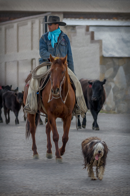
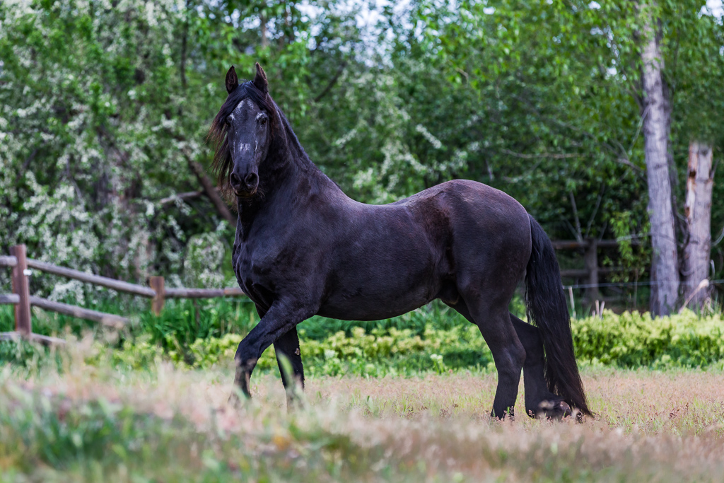
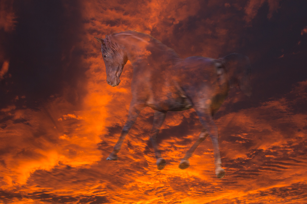
What a fun shot! Great job of removing the fence lines. The colors on the horse, fence posts and bushes appear to have a purple cast on my computer. I have a new IPAD Pro 12.9 (which I am falling in love with), so I feel comfortable the colors I fairly tru. I'm wondering if the saturation needs to be reduced a touch for that color range. |
Jan 27th |
8 comments - 0 replies for Group 22
|
8 comments - 0 replies Total
|