|
| Group |
Round |
C/R |
Comment |
Date |
Image |
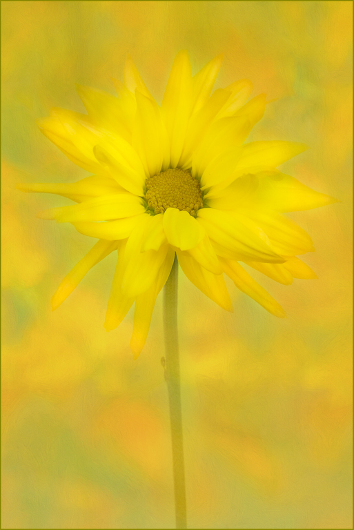
| 25 |
Sep 17 |
Comment |
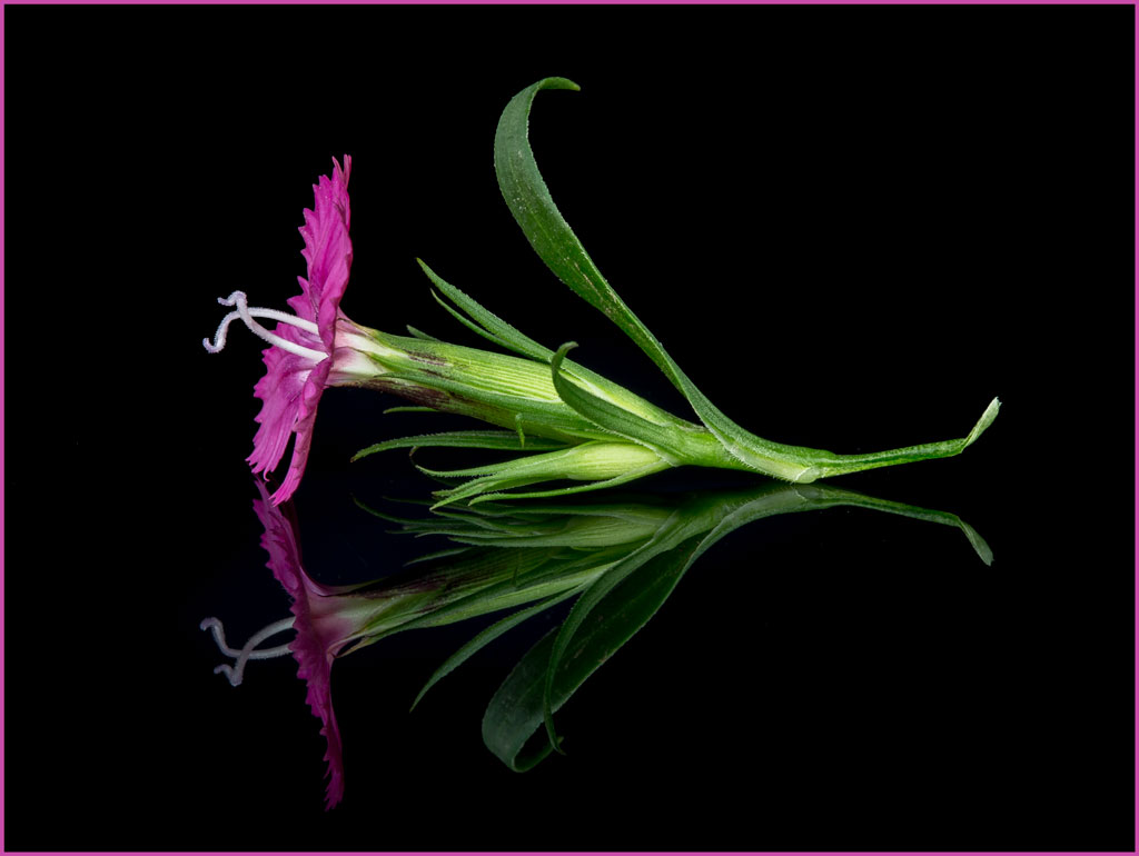
I like the composition and lighting on the flower. There is a nice mood to this photo. I would like to maybe see a version that brings out more detail in the lower part especially the stem area. Although I do like this cropping, I think a square crop may work as well. Nice job! |
Sep 7th |
| 25 |
Sep 17 |
Comment |
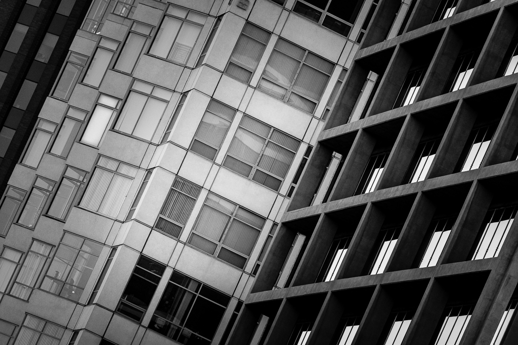
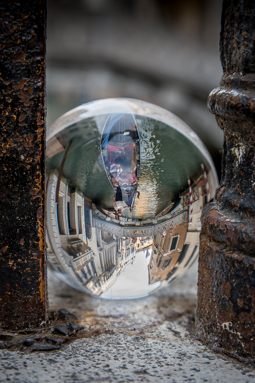
I really like the composition of your image. The only thing that I feel you could try is to make the building have equal lighting from top to bottom. The top is lighter than the bottom so that catches my eye. Some people may not like the warped perspective of the building but that doesn't bother me. Nice capture! |
Sep 7th |
| 25 |
Sep 17 |
Comment |
I like the water drops on the flowers, it adds good impact. Normally with flowers it is a good idea to add part of its stem so it doesn't look like it is floating but here I think it isn't too pronounced. You might try adding some blur effect to the green grass to see how it looks with that effect. Nice capture. |
Sep 7th |
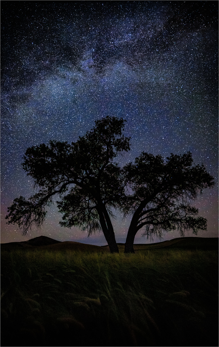
| 25 |
Sep 17 |
Comment |
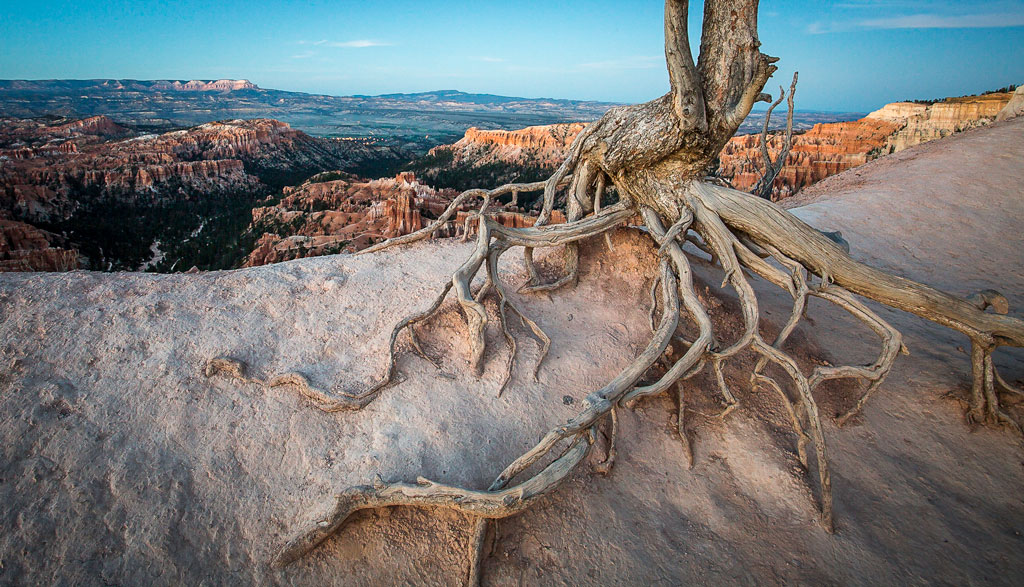
I think you found a great subject. I like the darkening of the foreground and background that you did. I think it helped quite a bit. Also nice job of correcting the blown out areas. I think you could also do that to your original shot and it would look fine as well. I like both compositions. |
Sep 7th |
| 25 |
Sep 17 |
Reply |
Thanks for the comments Marla. After seeing the extra room that you created, I thought it was a good idea so I checked back through my images and found one that had more spacing so I started over again and took off the heavier vignette which I decided was too thick so the enclosed photo is my new version. |
Sep 7th |
 |
4 comments - 1 reply for Group 25
|
4 comments - 1 reply Total
|