|
| Group |
Round |
C/R |
Comment |
Date |
Image |
| 22 |
Mar 26 |
Comment |
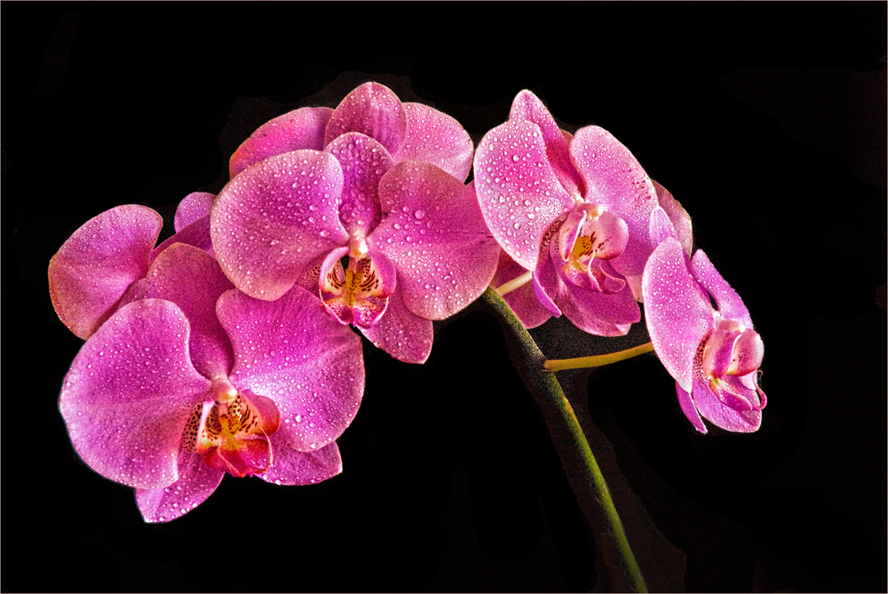
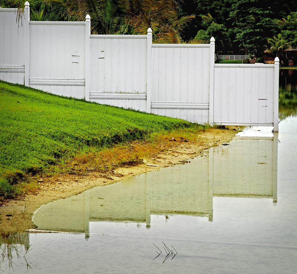
In what some might consider to be a dreary or drab scene you have revealed the underlying or hidden beauty. Nice depth of field in that both the rain drops and flowers are in focus. The yellow and green work well off of each other. Very much an atmospheric image. You might have waited a month and then had the title be 'April Showers.' |
Mar 12th |
| 22 |
Mar 26 |
Comment |
Do you mean that every step -- from A to Z -- was done using only the software in your phone? If so, that's amazing! The accuracy of the masking just by itself seems to be spot on. So now you can take a picture using your phone and immediately import it into Snapseed and a few minutes later end up with a finished image ready to print? No Photoshop or Lightroom? Can you have a good large size print using your iPhone? |
Mar 11th |
| 22 |
Mar 26 |
Comment |
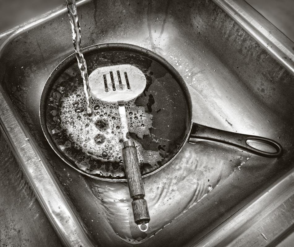
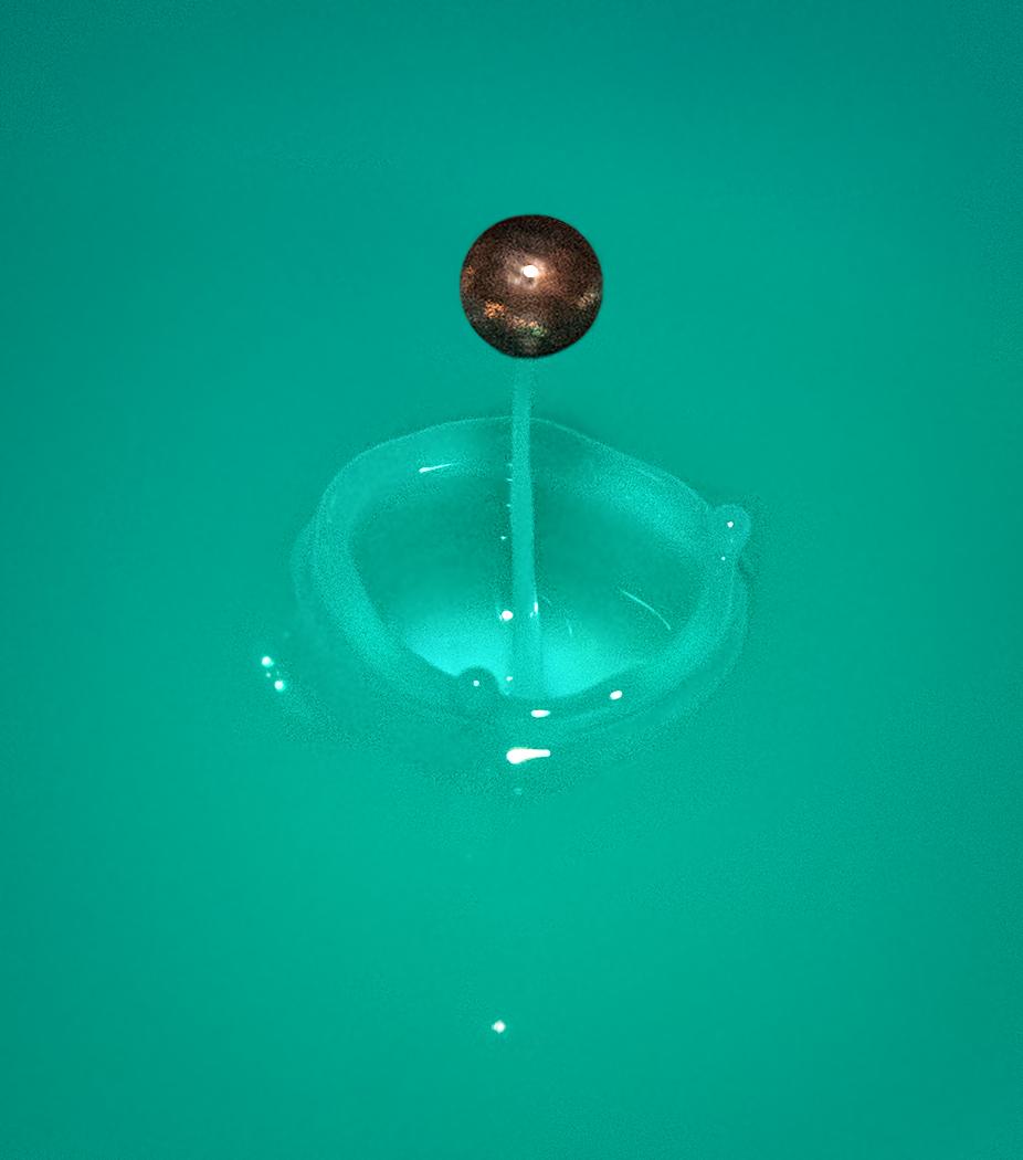
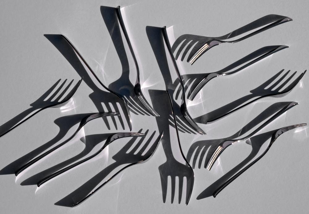
Interesting and creative technique, with the appearance of having combined a still life with time lapse photography, and at the same time getting the exposure pretty much spot on. Perhaps the clouds could be brightened just a little. I assume this is some kind of rock formation; unfortunately, I viewed this around lunch time and I thought at first it was a giant cinnamon bun.... |
Mar 10th |
| 22 |
Mar 26 |
Comment |
Nice treatment from the original. I agree with Marti that the vignette adds to the final. My only problem would be that the subject -- the butterfly -- is somewhat lost in the foliage, but still, it is nice and sharp. Subtle coloring. |
Mar 8th |
| 22 |
Mar 26 |
Comment |
Nice idea that turned out well. Is the center of the flower placed too close to the lower right, or does the bright upper left balance out the overall composition? This is a combining of both realistic and abstract elements in the same composition, as you note, and I think it works. |
Mar 8th |
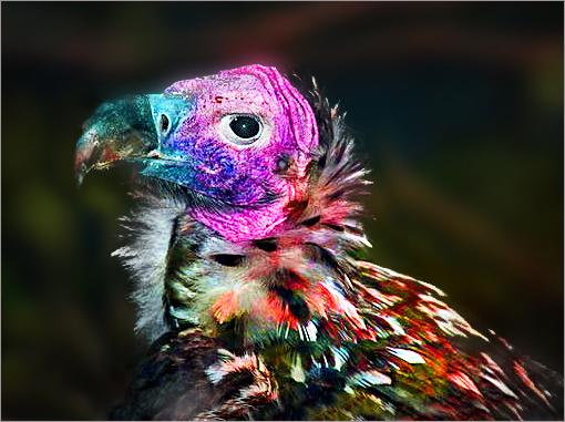
| 22 |
Mar 26 |
Reply |
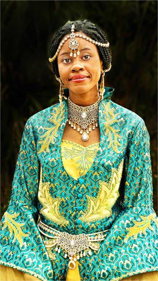
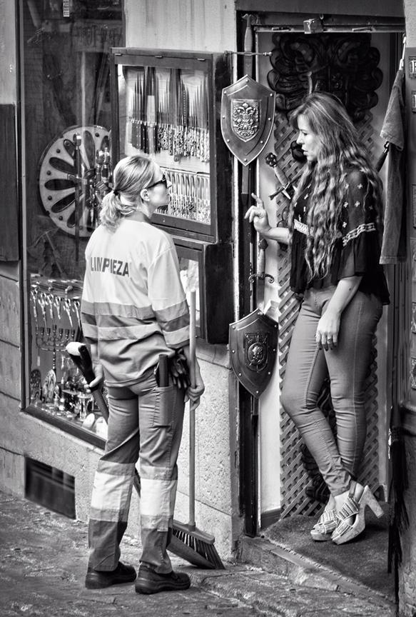
The area around her lip is in the original -- maybe I should have toned it down somewhat. As far as her facial coloring, I think the original was lacking in hue or saturation. |
Mar 6th |
| 22 |
Mar 26 |
Reply |
It's not meant to be a solid black background, rather a more mottled look giving a hint of the original background. Perhaps I went a bit overboard. |
Mar 6th |
5 comments - 2 replies for Group 22
|
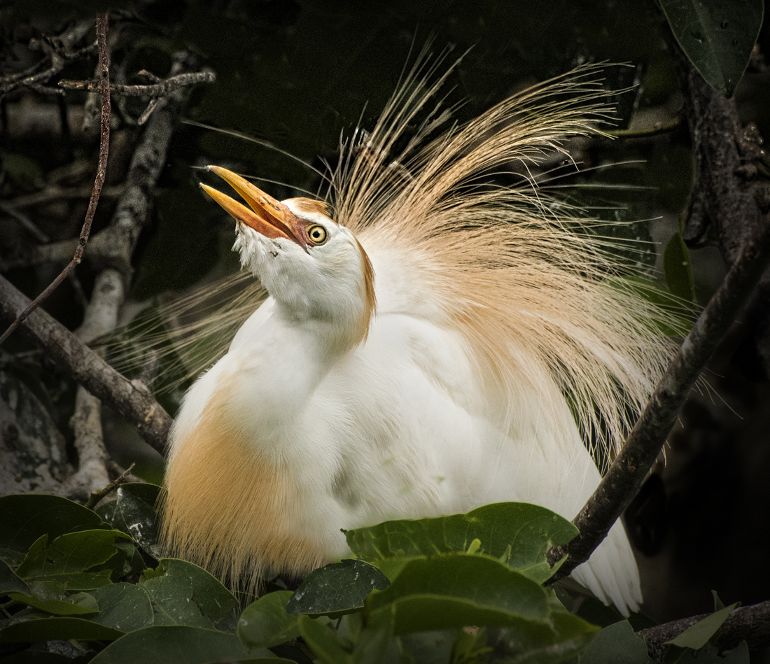
| 91 |
Mar 26 |
Reply |
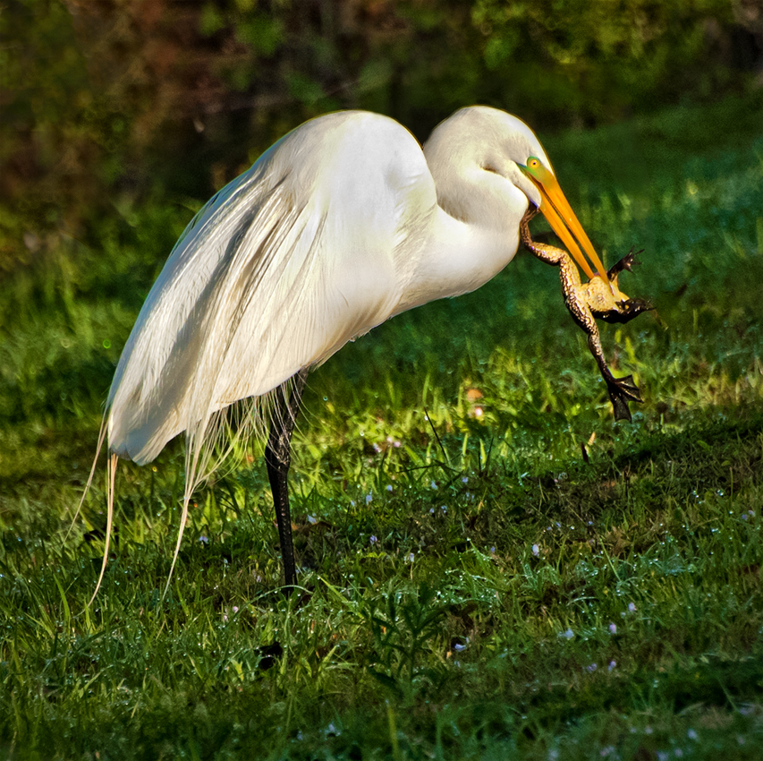
The bird was standing on a river bank, which was on a thirty or so percent angle. |
Mar 29th |
| 91 |
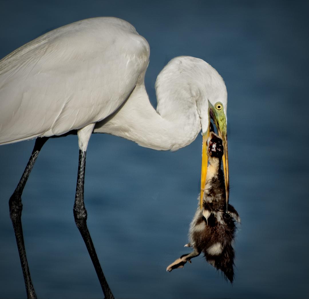
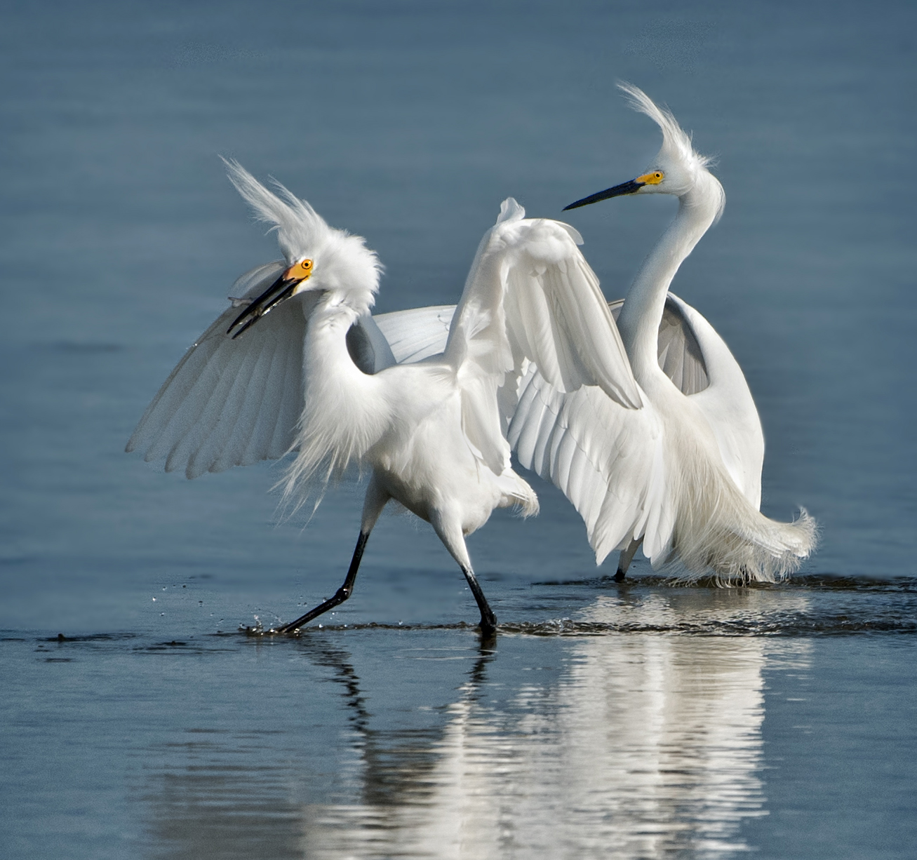
Mar 26 |
Comment |
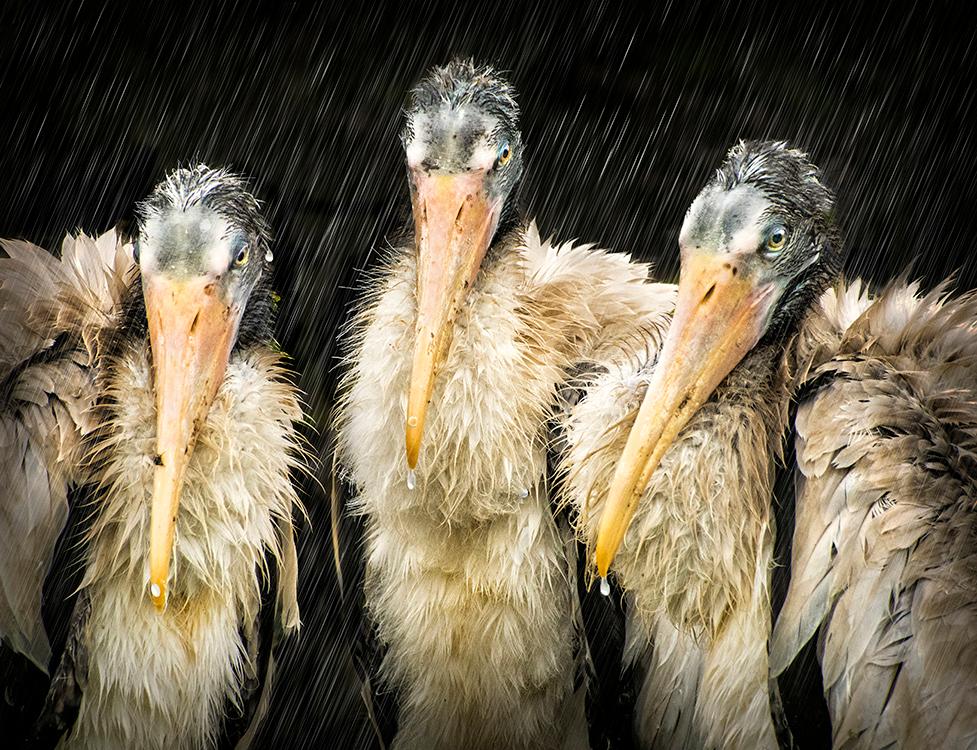
Let me guess -- they were dancing to "The Bird Is The Word
" -- if you know, you know... Good background, with soft colors and not too bright and demonstrating their natural habitat. Their courtship ritual tells a nice story. Always hard to get detail from close to pure white feathers but you did well in this case. I hope this gamming works out for the young couple... |
Mar 9th |
| 91 |
Mar 26 |
Comment |
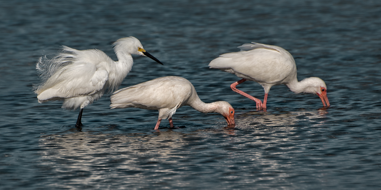
Similarly to your entry of last month, you've captured a dynamic moment well stopped and displayed against a background of rhythmic wave motion. I think you did really well to get so much detail from objects so far away. There's a kind of a choreographed feel to this because of their being pretty much the same height above the water. Too bad there wasn't a third penguin in the image, but still well done. |
Mar 9th |
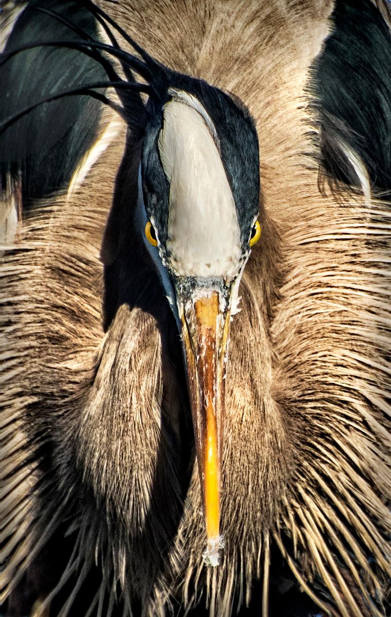
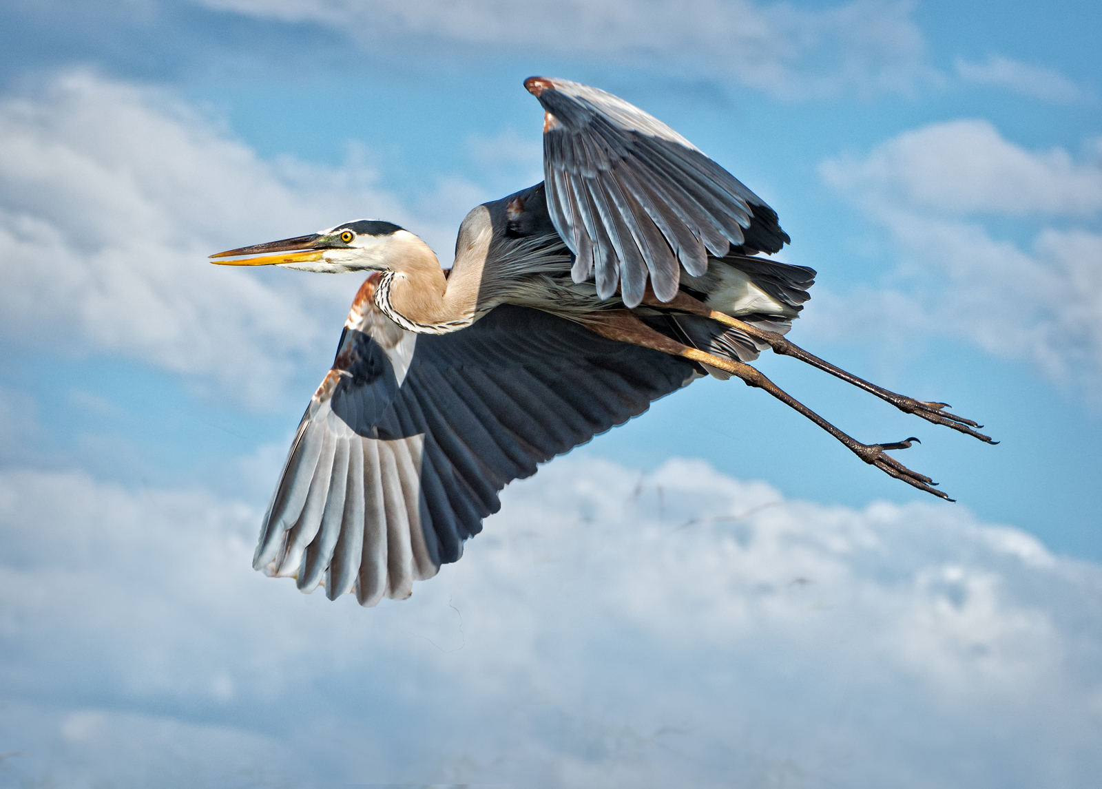
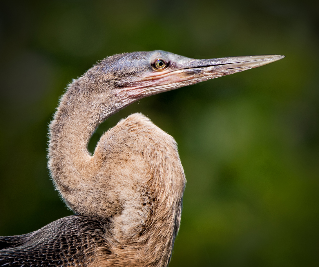
| 91 |
Mar 26 |
Comment |
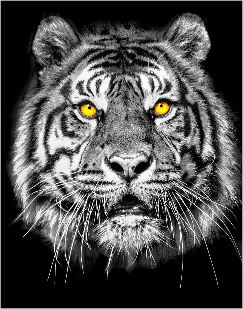
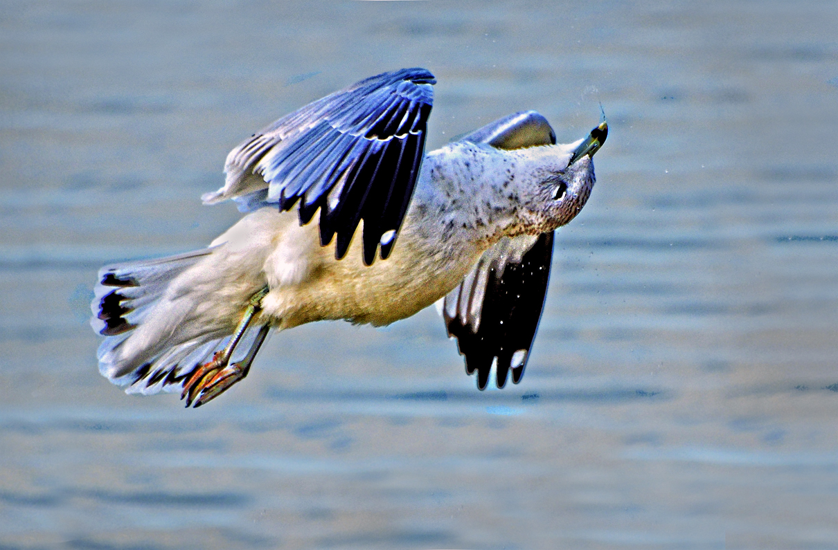
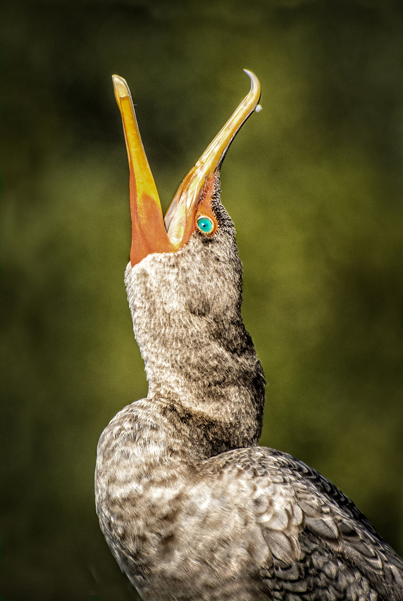
Well done portrait. Everything on the bird is sharp and nicely exposed. The coloring of the head allows it to stand out from the background and body; the gray from the water picks up well on the gray of the feathers. The eye is handled well. Not much to criticize here. The editing is done well ...very good effort! |
Mar 8th |
| 91 |
Mar 26 |
Comment |
The soft box effect adds to the exposure and overall lighting of the body of the chickadee. Maybe the eye could have been brightened somewhat. I think the branch forms a nice V, or maybe even a Y line and gives a sense of a strong base for it to perch on. The snow has no hot spots. Good job. |
Mar 8th |
| 91 |
Mar 26 |
Comment |
Good recovery from the original, which was too dark and lacked contrast. As the ducks are the subject, here I think that they are made too small in the overall composition, and that even though it's nice to include the natural habitat, the surrounding area could be cropped out quite a bit. |
Mar 8th |
| 91 |
Mar 26 |
Comment |
Nice, sharp, interesting portrait of the grouse. Fine earth tone colors that demonstrate how the bird fits in with its surroundings. The bright upper portion of the shot tends to overwhelm the bird, visually, which is the subject. Because of this, you could crop down quite a bit. I'm glad your move went reasonably well. |
Mar 8th |
6 comments - 1 reply for Group 91
|
11 comments - 3 replies Total
|