|
| Group |
Round |
C/R |
Comment |
Date |
Image |
| 22 |
Mar 24 |
Comment |
Nice capture of texture, especially in the light house. The background continues into the front as a sandy beach. If both left and right sides were brought in so as to slightly cut off the rocks, it might give the illusion of there being a larger front area, as well as having a less isolated -- and less static -- overall image. That humongous claw has a sci-fi feel -- as in "The Claw That Devoured Cape Hatteras .." |
Mar 17th |
| 22 |
Mar 24 |
Comment |
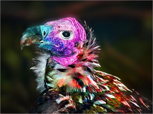
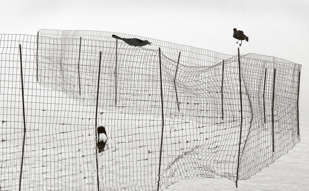
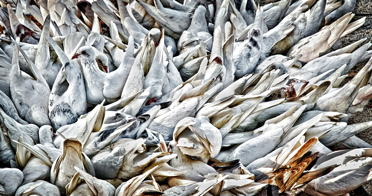
Creative look at resting birds. Subtle shades of green and pink. Did you use a tripod -- if not, the tripod would have allowed a slower shutter speed and lower ISO. Perhaps a little too much negative space at the top. Still, an unusual presentation, and a good effort. |
Mar 13th |
| 22 |
Mar 24 |
Comment |
I love the pale blue and sand coloring. The barely visible horizon line adds a sense of mystery and fantasy, of a floating vision from another time and place. Could the shirt be saturated and brightened just a bit more? The repeating curves add a rhythm to the composition. Very well done. |
Mar 11th |
| 22 |
Mar 24 |
Comment |
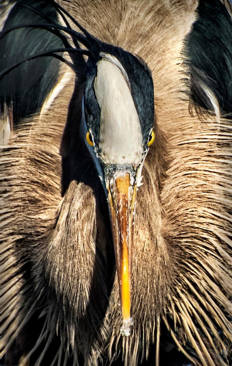
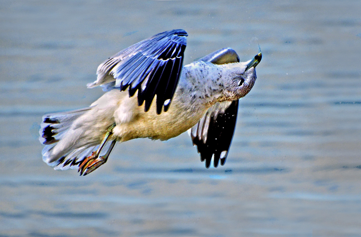
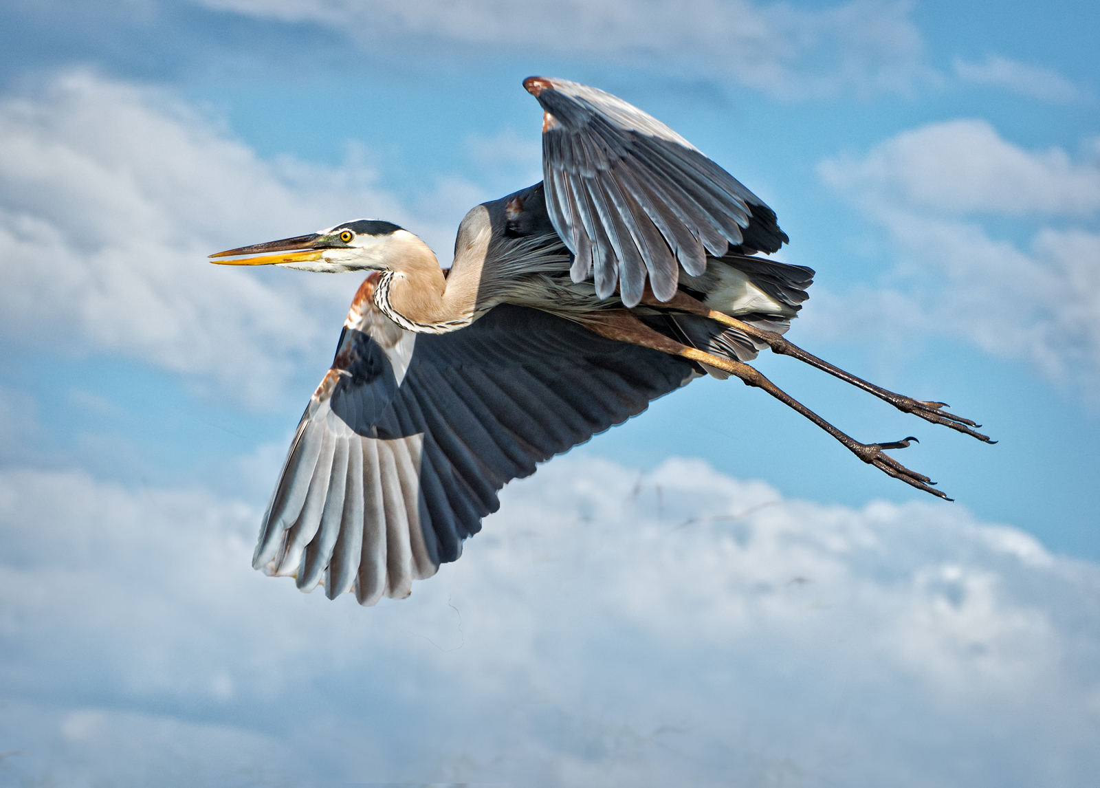
I'm guessing that this was a late afternoon sun, which provided great textures in every part of the bird's body. Perfect eyes, and the water added a great, out of focus background. I know, it's a blue heron, but are the wings a little too aqua? Maybe it's my monitor. Well done. One could say it's a little too much of a butt shot, but still a well done pic. |
Mar 10th |
| 22 |
Mar 24 |
Comment |
Yes,I too was surprised, a while back, that you could actually process jpg, sometimes even in Camera Raw. You have a nice image here, certainly presenting a timeless and evocative feel. I wonder though, if the cliffs are a little too blue or purple. There is a kind of rule of thirds, with the green foreground, the cliffs, and the blue sky. Pretty to look at. |
Mar 10th |
5 comments - 0 replies for Group 22
|
| 91 |
Mar 24 |
Comment |
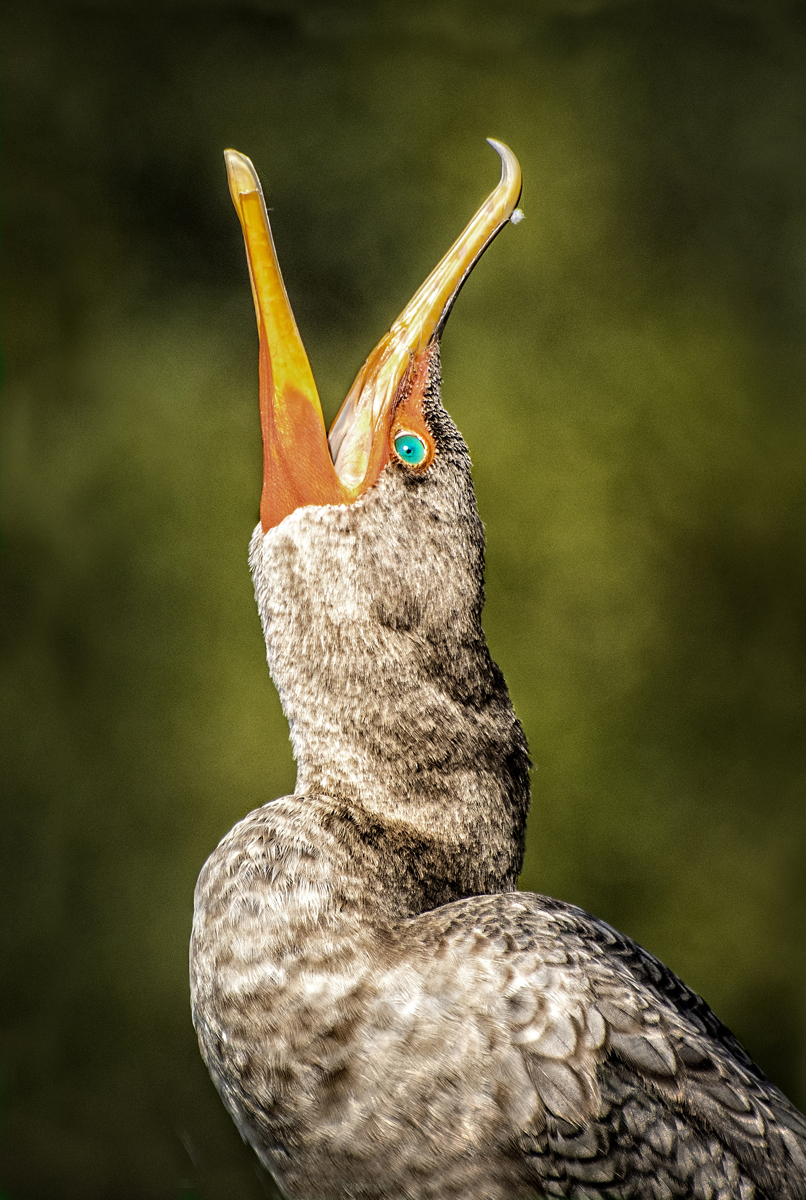
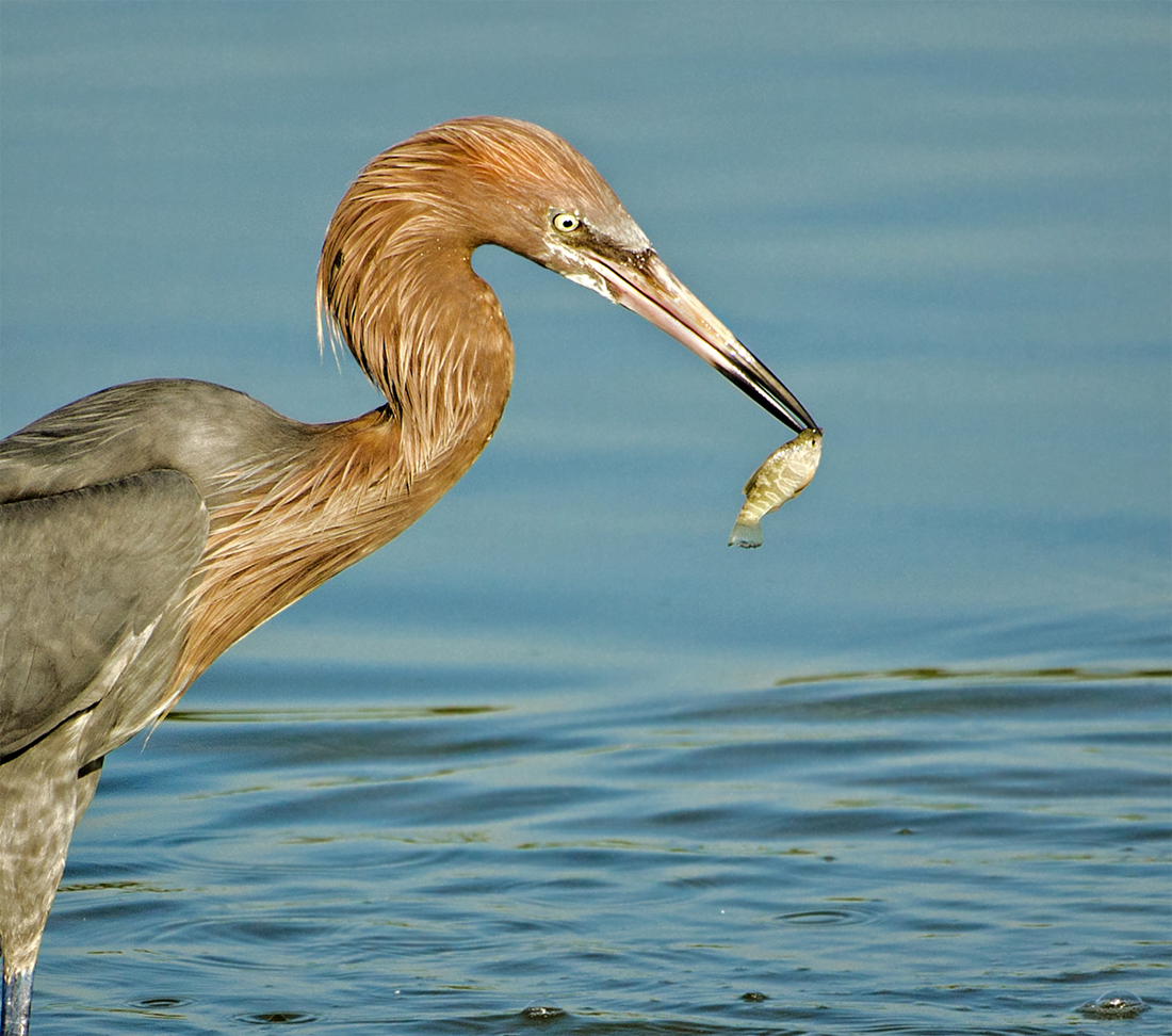
Those red feathers really add to this image. Nice pose, and the color balance seems correct. At first I thought that the picture might be over sharpened, but nothing else seems to be, so perhaps the white feather edges are actually that sharp. Nice placement in its natural setting. Good job. |
Mar 16th |
| 91 |
Mar 24 |
Reply |
Sanat -- this is a reminder that this is strictly a study group for the interchange of ideas -- you do not have to conform to any contest or salon rules. The only requirement is that your entry(s) do not go over 1 mb. You may have any combination of pixel size. |
Mar 16th |
| 91 |
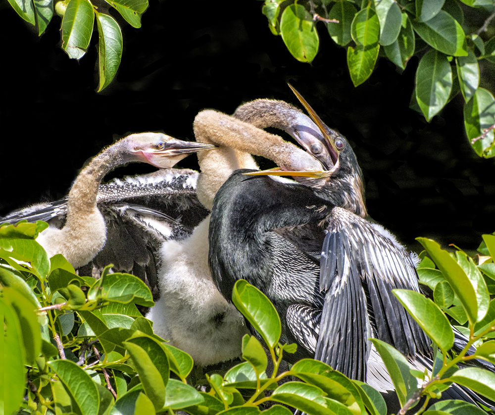
Mar 24 |
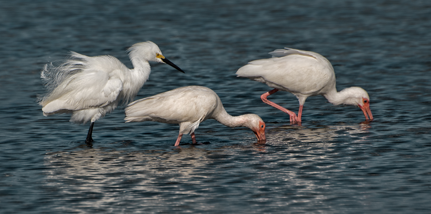
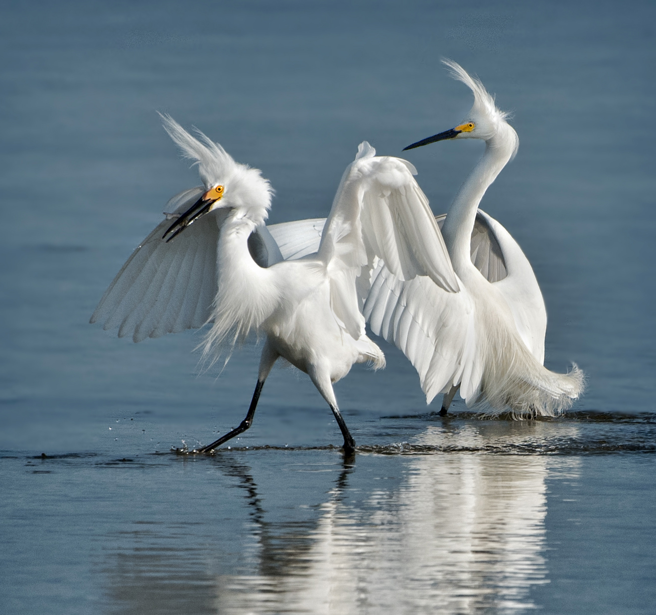
Comment |
The diagonal line formed between both sets of eyes adds to the composition. Nice detail in the bodies, and while the top of the heads might be a little hot, you handled the balance between darks and lights well. |
Mar 16th |
| 91 |
Mar 24 |
Comment |
I agree with Cindy about the color balance -- at least as it affects the bird. The warmer color in the original seems more natural. The background is OK by me, if a bit dark. Bruce has a good suggestion about the cropping -- after all, it is the bird that takes center stage in this image. |
Mar 15th |
| 91 |
Mar 24 |
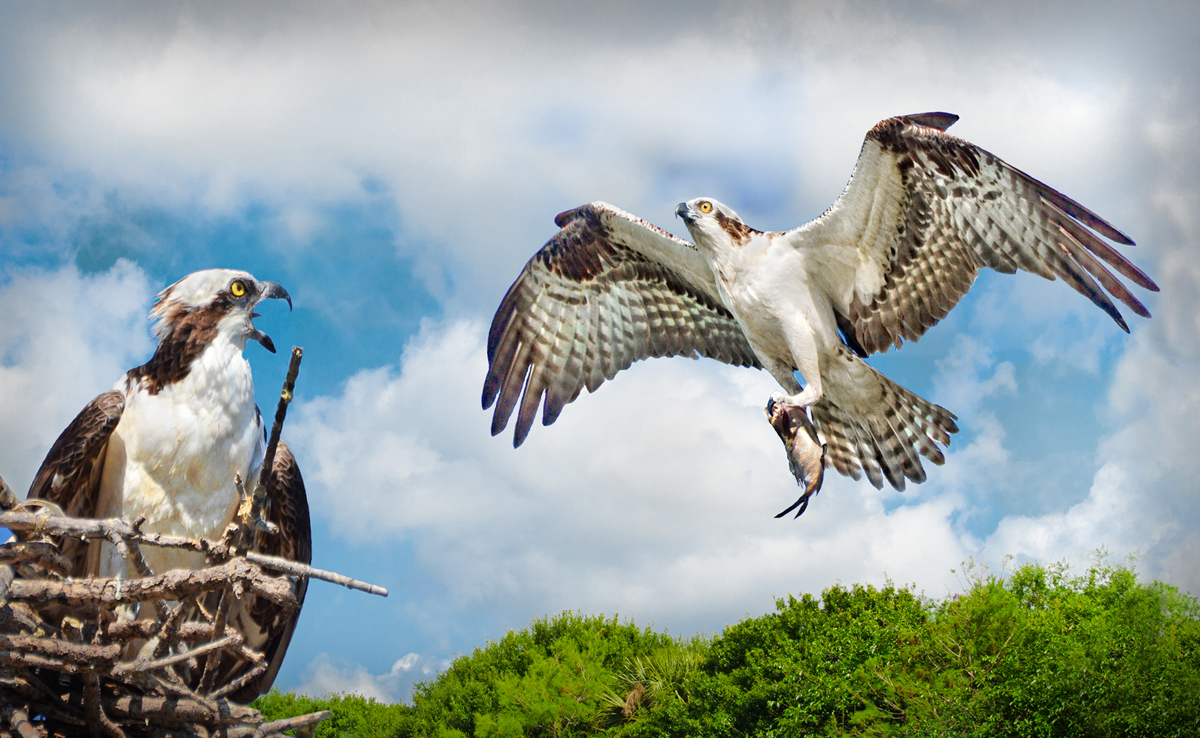
Comment |
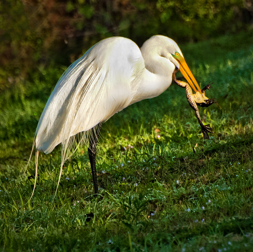
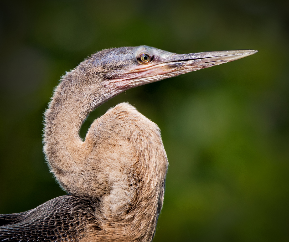
Excellent capture -- fine diagonal line and great color saturation and sharpness. The only objection I would have here is that the head, and particularly the eye and grub capture are so dominant that the composition is balanced quite a bit to the bottom left. Perhaps you could add to the left side, thus moving the center of action more toward the center. Otherwise, very well done. |
Mar 15th |
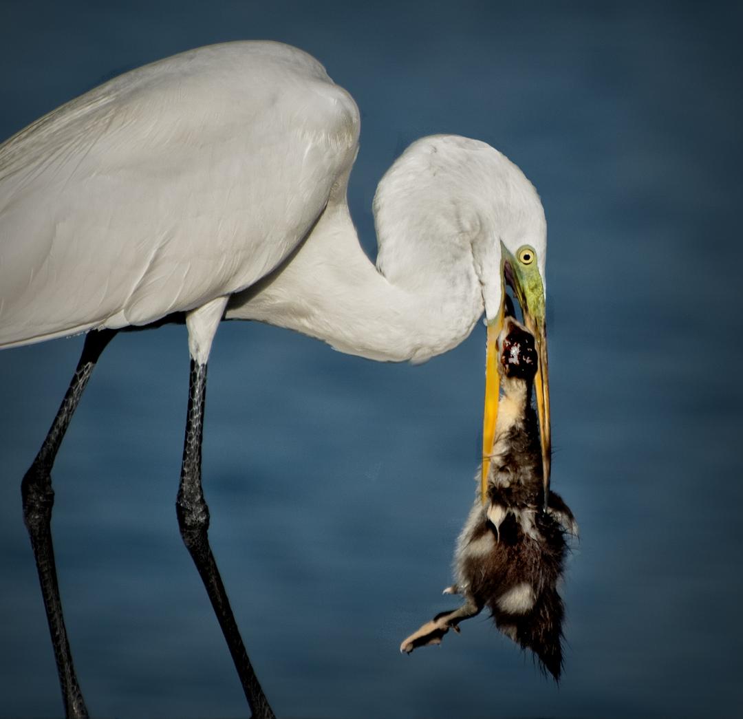
| 91 |
Mar 24 |
Comment |
My comment would be in agreement with both Cindy and Adrian. The story here is the contact between adult and chick, and the portrayal of the entire adults body is not really necessary, especially because it adds clutter to the composition. The essence is the closeness of the two birds. It is a nice capture and a good story. Brighten the chick's eyes just a little? |
Mar 14th |
| 91 |
Mar 24 |
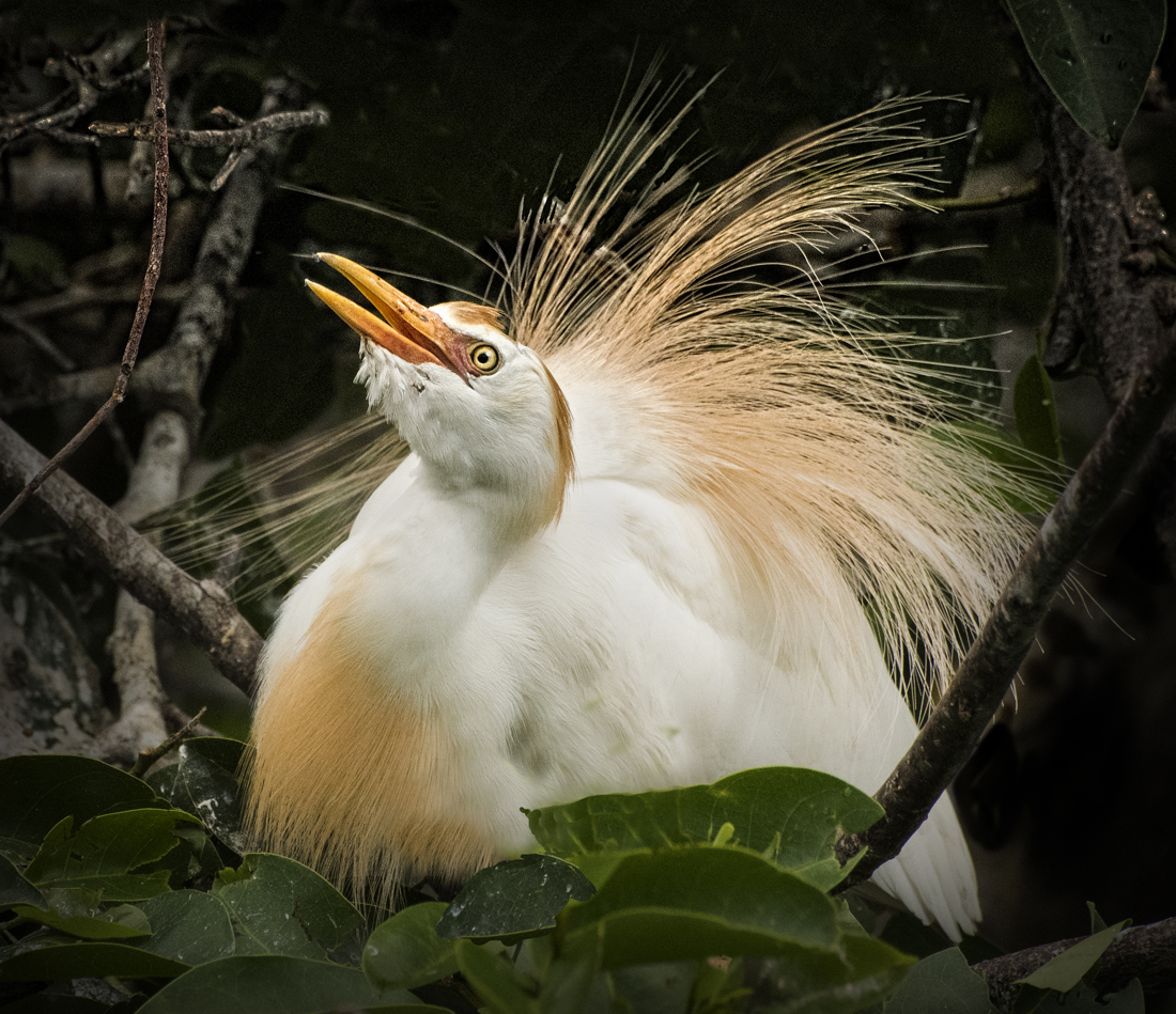
Comment |
This image is a great example of subject modeling (be it painting, drawing or photography) where shadows and highlights work with each other to give an almost 3D effect. This pigeon looks like it is ready to fly right out of the picture plane. Very nice exposure, sharpness and color balance. The bokeh is also well done. Could be a contest winner. |
Mar 13th |
6 comments - 1 reply for Group 91
|
11 comments - 1 reply Total
|