|
| Group |
Round |
C/R |
Comment |
Date |
Image |
| 22 |
Nov 21 |
Comment |
This was pretty much a one-off; I almost never use Elements, one of the reasons being the 8 bit processing that for one reason or another continues to this day. Please refer to my comment about Al's picture of the sport jumpers. As to the other remarks: rightly or wrongly, I thought the white spot helped define the placement of her nose, and I wanted the mic left in to enhance the fact that she was singing on stage and not just posing. One more thing, this might be pushing it a bit, but I didn't think of this as someone else's work -- it was taken off of a TV show. Of course I would never enter it in a composition. |
Nov 15th |
| 22 |
Nov 21 |
Comment |
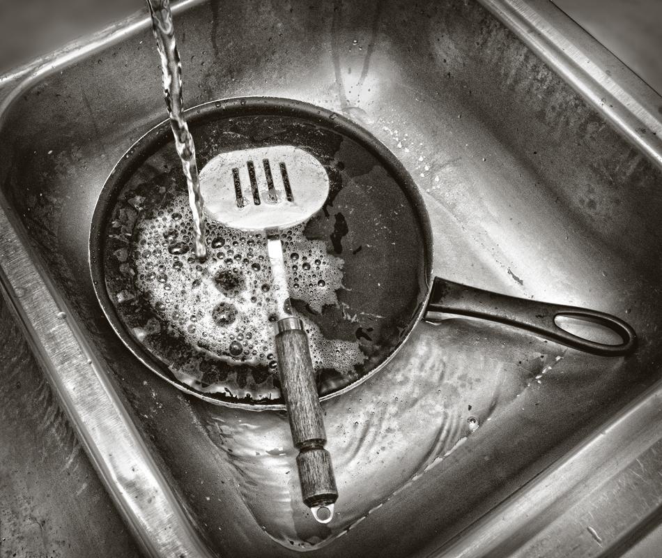
Al, please bear with me on this; I notice a problem in your picture that plagued me early on in my photography and in fact I didn't even know what to call it at the time. Actually two problems -- banding and artifacts. I don't notice banding here but you do have lots of artifacts, which are the splotchy areas at the edges, and this is a result of compression of image data down to 8 bit processing. This can be overcome with going to 12 or even 16 bit processing, which gives you a much greater range of color tones. 8 bit processing is typical of Photoshop Elements, and for that reason I tend to stay away from Elements (I've had three or four versions) and make sure that I am at least using 12 bit -- artifacts are especially prominent in large, even areas of an image, like skies, either day time or night time skies. One more thing; you probably didn't need such a high shutter speed (the subjects weren't moving that fast) nor did you need such a great depth of field -- this would have enabled you to drop your ISO. |
Nov 12th |
| 22 |
Nov 21 |
Comment |
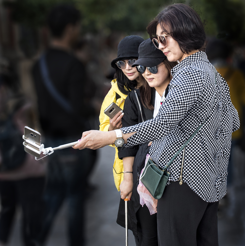
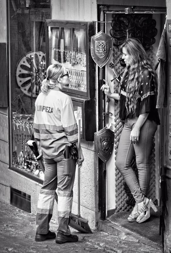
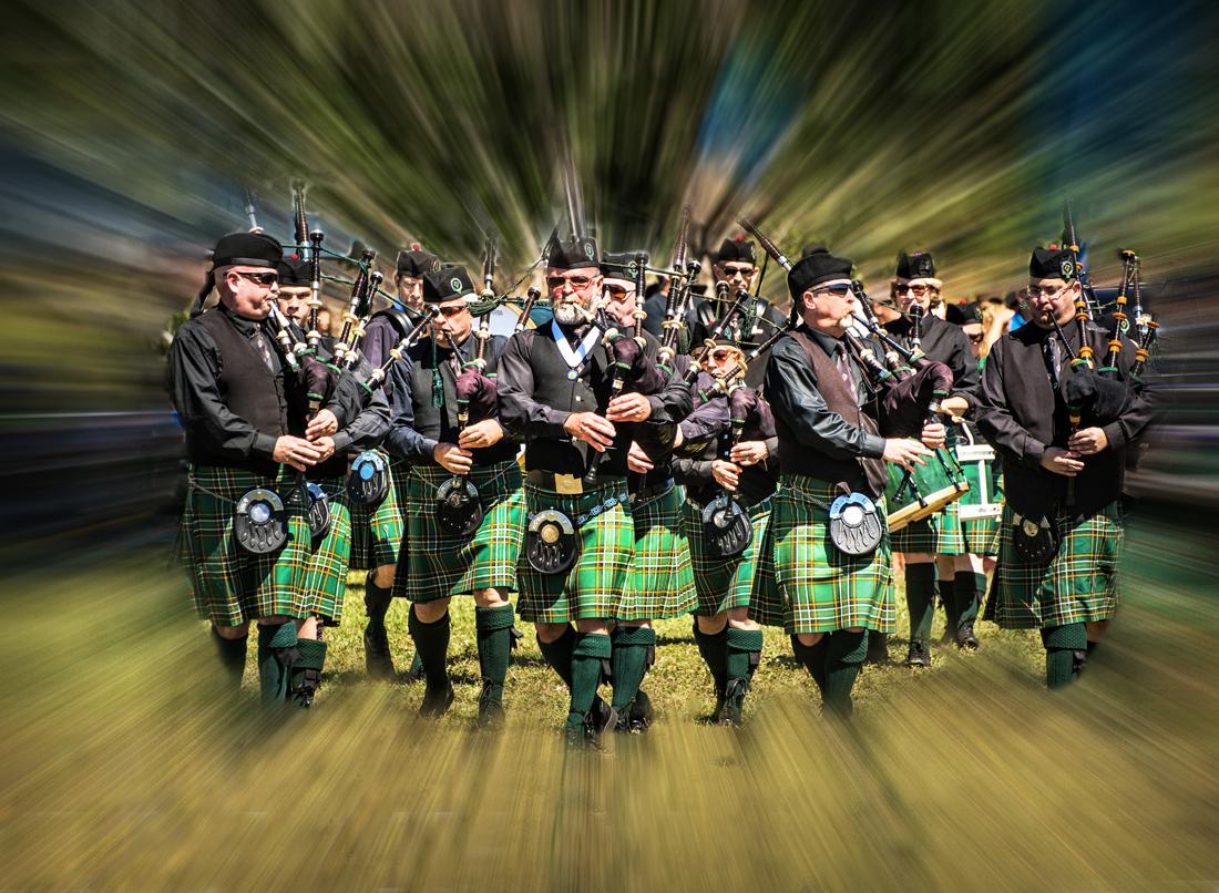
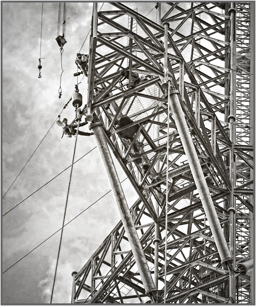
First and foremost, this is an excellent 'rescue' of an image with almost no detail in the shadows, and it's great to see how you were able to bring those details out. The pipes, for me, are not a great problem. As others have mentioned, adding some contrast and a wee bit of saturation to the subjects helps, but at the same time perhaps darkening the sky somewhat would also help. Fun image, well done!
Also, unless these women have a practice in an animal clinic, everybody seems to want to know what a 'spey chic' is .... yeah, I know, wrong spelling, but .... |
Nov 12th |
| 22 |
Nov 21 |
Comment |
As Joe says, it tells a great story. One of the basic rules in photography is no butt shots, but here you turned that rule upside down. The overall look of the sheep make for a great recurring pattern, balanced off both in terms of color contrast and composition, by the dog. As well, you have a 'hair light' effect on the sheep, which adds to the rhythmical feel. A lot of the background, IMHO, is not necessary, and in fact the bright yellow tree is a distraction. Maybe the pic could be cropped down to just above the fence line. Very creative spot! |
Nov 11th |
| 22 |
Nov 21 |
Comment |
Peggy -- I find there's a lot to like about this. I don't know if this was your intention, but it's an unusual approach to a still-life to sort of combine the near abstract look of the rear two pears with the realistic portrayal of the pear in the foreground. You mentioned this being a stacked image; did you want all the pears to be in focus? If so, I'm guessing that, assuming you used a tripod, you could have gotten all three in focus by using a setting of, say, f/11 or even f/16. Even so I like how the prominent red pear is balance by the other two pears, both in terms of color and composition. I think you broke a few rules here, but in this case that's not a bad thing. Nice outcome! |
Nov 11th |
| 22 |
Nov 21 |
Comment |
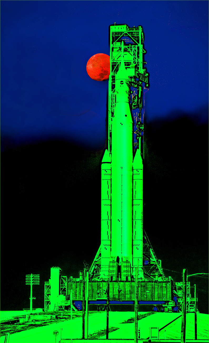
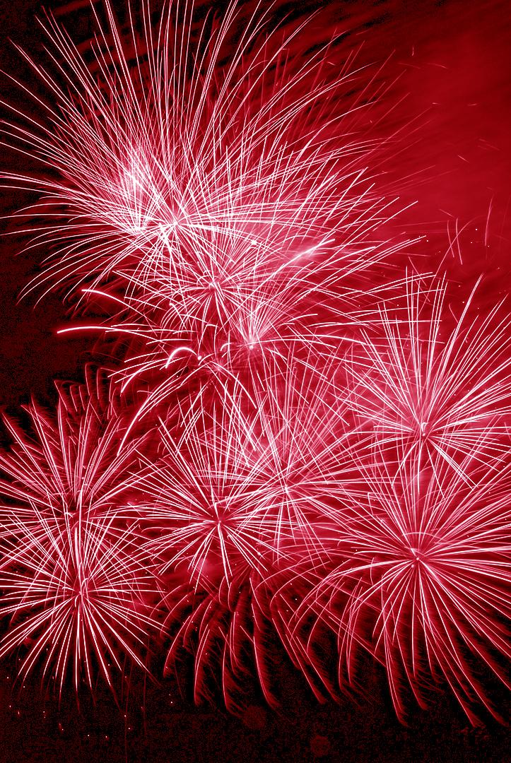
Joe -- what a bold, vivid, and beautiful graphic! This image is really just dominated by blues and reds, but with an almost infinite variation of tones. Let the figure spotting begin -- I see a machine-owl top center and two women praying to heaven in the upper corners. Holy Freud, batman! I love staring at this pic. Great job! |
Nov 10th |
| 22 |
Nov 21 |
Comment |
Interesting experiment and well worth the attempt. Interesting your mention about the pumpkin looking like it was going bad -- the overall effect, especially in the straw -- is that it appears that there is a lot of mold and decay, rather than frost. Just the way it strikes me. Perhaps more saturation would help. This technique has possibilities, but maybe in a different type of image. |
Nov 10th |
7 comments - 0 replies for Group 22
|
7 comments - 0 replies Total
|