|
| Group |
Round |
C/R |
Comment |
Date |
Image |
| 22 |
Jul 20 |
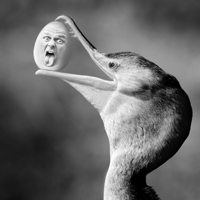
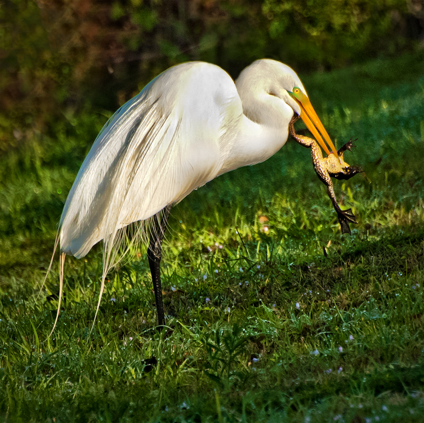
Reply |
Heh heh heh .... I only wish I was having a little more trouble eating! |
Jul 20th |
| 22 |
Jul 20 |
Reply |
Great job on the editing, Joe! The only thing I would do is add a bit of space on the bottom. |
Jul 20th |
| 22 |
Jul 20 |
Reply |
Stephen -- thanks so much for the kind words! While of course it was not your intention to compare my work with Penn's it was still great to have his name mentioned in the same critique. |
Jul 17th |
| 22 |
Jul 20 |
Comment |
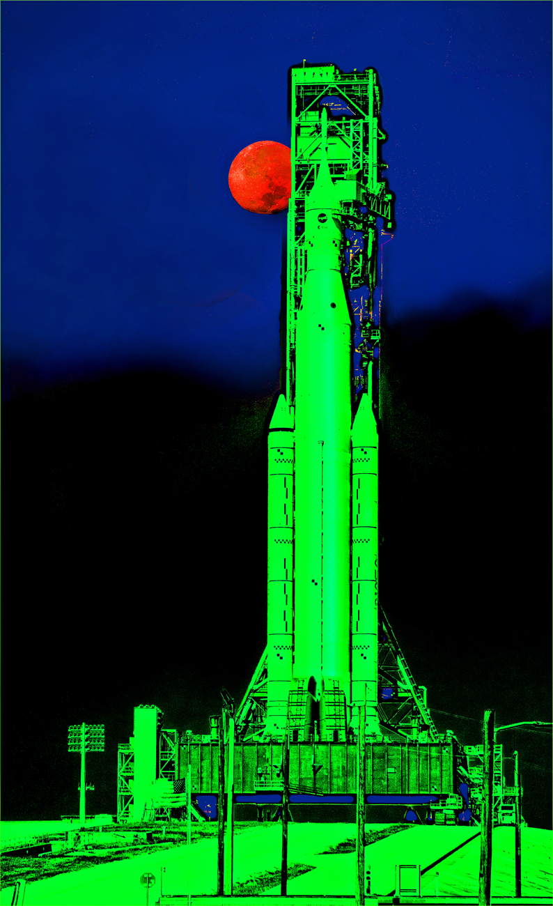
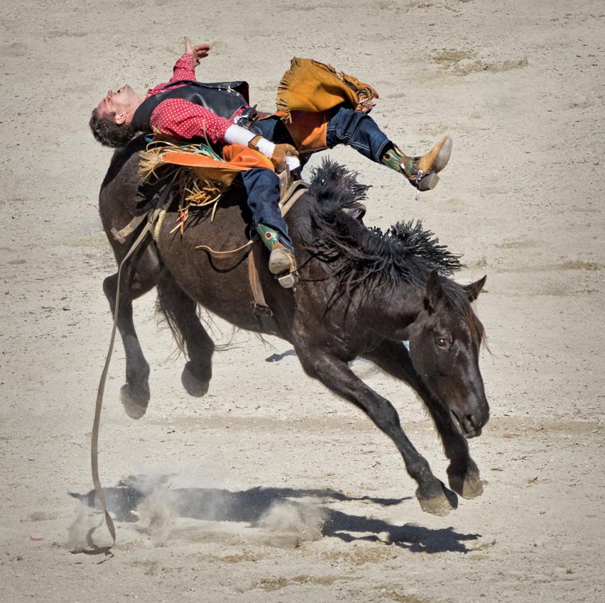
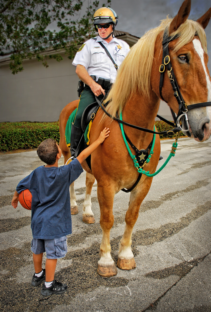
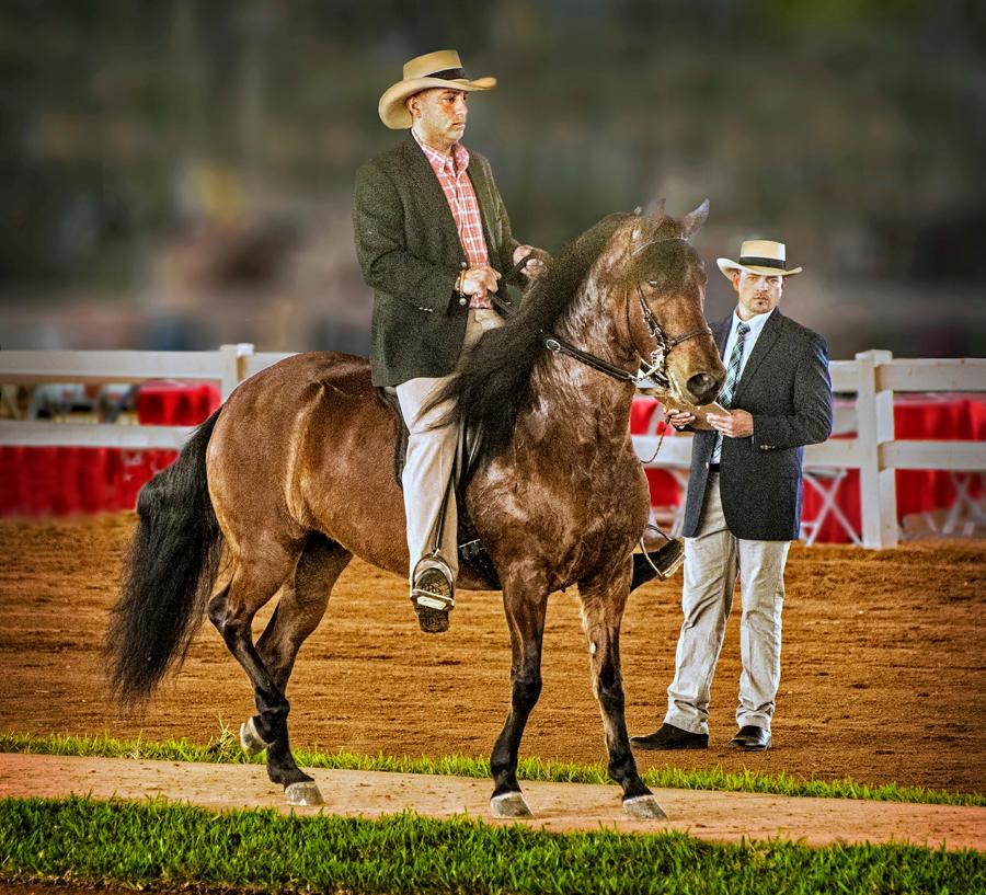
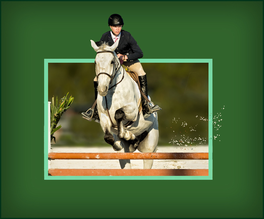
I hope your surgery has been successful and that you are well on your way to recovery and taking more pictures. This image has a nice story but since the horses are the subject, they seem to be dwarfed by the background, as attractive as it is. This possibly could have benefited from shooting at a lower angle and from a more leftward position, so that the yellow horse could be more in profile. The person who set this up had a sense of humor as well as a knowledge of color -- red, blue and yellow being the primary colors of pigment. I hope this all ends soon so that the horses can run free of those damn masks -- I do a lot of walking and the masks are a giant pain in the _ _ _ ! And I don't mean face ... |
Jul 14th |
| 22 |
Jul 20 |
Comment |
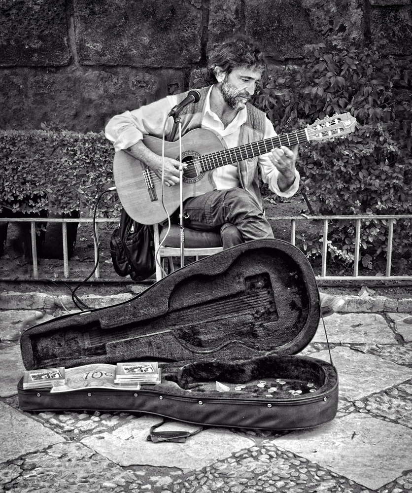
Fine story telling aspects in this picture. I always like portrayals of the lone figure being dominated by the vastness of natural surroundings. Timeless, in that with all of the modern technical wizardly (including of course, photography!) at our disposal, there's still room for the most ancient of artistic endeavors. Joe is on to something here in that the gear behind the painter tends to detract from the human form, mostly, I suspect, because it is sitting behind the artist. Eliminating it entirely from the picture would be a challenging job but might be worth the effort. It would also help if the painter was not quite so close to the bottom of the picture. Having said all this, this picture is very well done and enjoyable to look at. |
Jul 13th |
| 22 |
Jul 20 |
Comment |
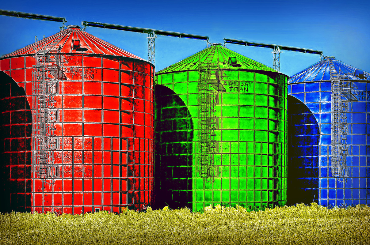
Could do with a little more color, Joe. Of course I kid -- the riot squad should be called out for this riot of color. As Al mentions, there is a great circular visual path of the elements of the composition, and you did a perfect job of "plumbing" up the house. Could the pathway be a little blown out? Perhaps it's my monitor. One thing -- could the sign be given an edge on the left side so that it would appear to be an actual part of the scene as you found it? The way it appears now it's as if the face was inserted into the image. What is the story behind this place -- it looks like a museum dedicated to the singer. Excellent, impactful image, Joe! |
Jul 13th |
| 22 |
Jul 20 |
Comment |
Very pleasing composition, Al. I wonder if a little more contrast could be added, to give more of a sense of the direction of light -- maybe the shaded areas might be darkened up a bit. The mind can fill in the rest of the back barn, so I think your placement is OK. The newer building can easily be removed in editing, leaving a nice triangle of the three main structures. The vignetting in the upper left and upper right is somewhat overdone. Also, a nice rule of thirds, with the grassy foreground, the row of buildings, and then the sky. Well done! |
Jul 13th |
| 22 |
Jul 20 |
Comment |
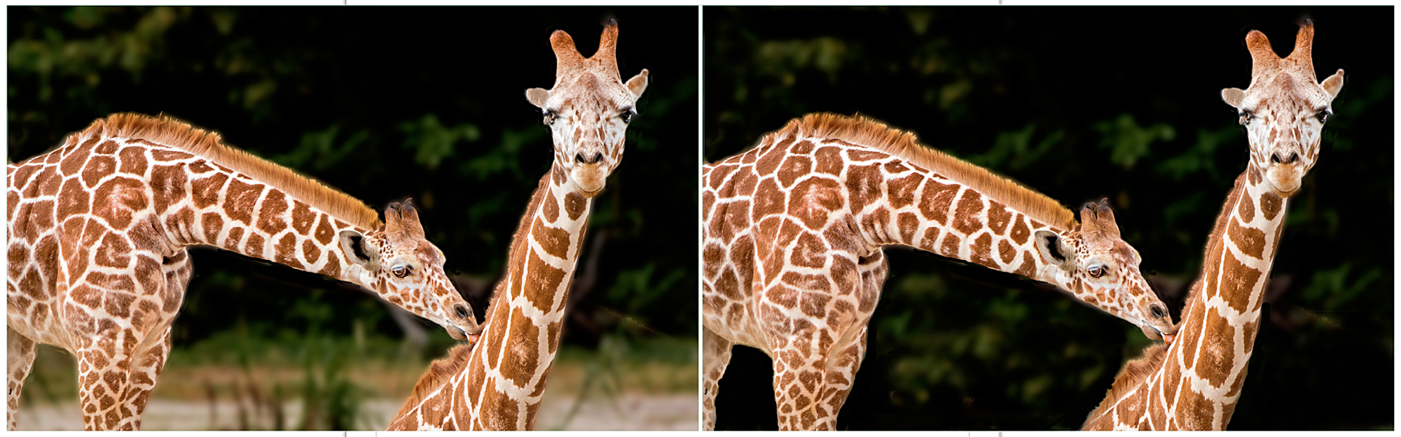
Peggy, this is an interesting and creative attempt. This time however, the caterpillar has become somewhat lost in the overall image, and while generally a light part of a picture tends to draw your eye toward it, in this case the dark green drew my attention away from the subject. I actually think your original has a lot going for it. The color balance is great -- and how many times do you see a caterpillar comin' round the corner? It's nice and sharp and shows great movement. This was one example of a picture that needed only relatively minor adjustments. Maybe a competition winner? |
Jul 9th |
| 22 |
Jul 20 |
Comment |
Very creative idea! Picking up on Mike's thoughts, perhaps you could place a suggestion of clouds or mist over the stairway, but in an uneven way. It looks like you put a lot of effort into selecting out the staircase -- about how long did it take you just to do that? Led-Zeppelin could use this for their album cover ... |
Jul 7th |
6 comments - 3 replies for Group 22
|
6 comments - 3 replies Total
|