|
| Group |
Round |
C/R |
Comment |
Date |
Image |
| 22 |
Jun 18 |
Comment |
One other question that occurred to me: was this displayed as representative of the type of camera he used? Or was this the actual model? If so, I think he might've had to sneak it in with his other effects when returning home. |
Jun 14th |
| 22 |
Jun 18 |
Comment |
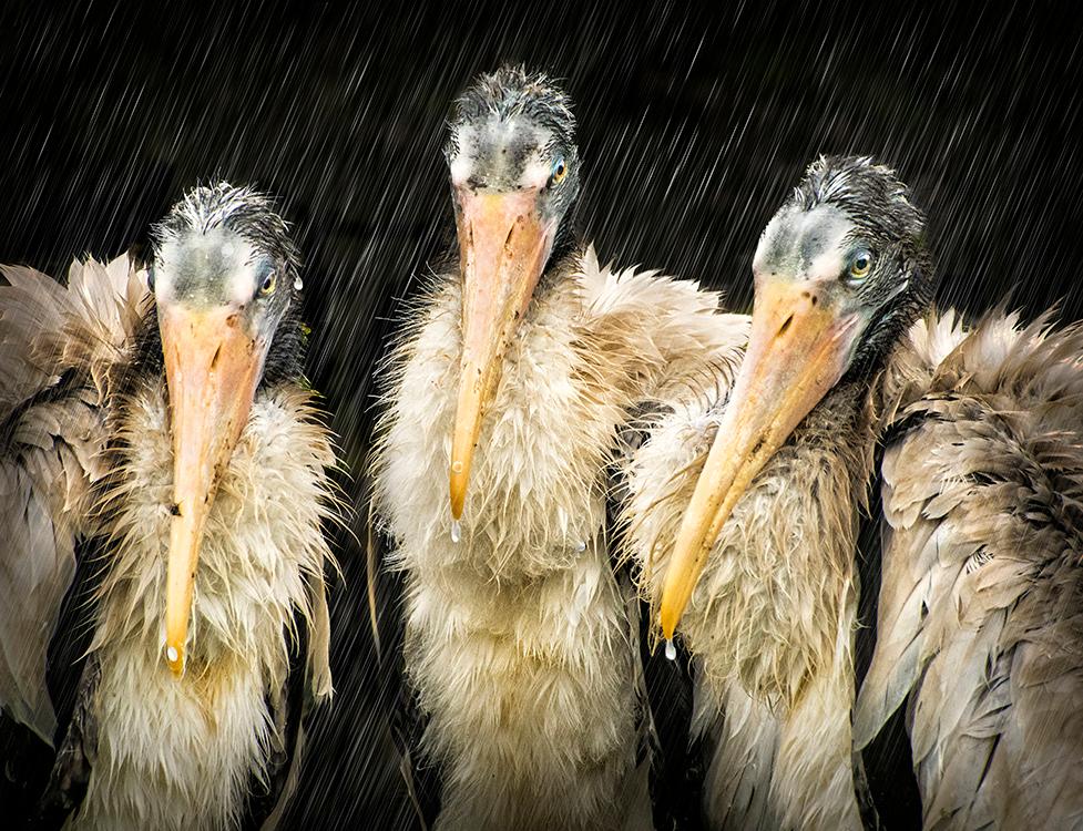
Hi Joe. Fascinating picture which piqued my curiosity about the camera so I did a little research. Apparently the rolls came in 20 and 200 ft lengths, which seems to be depicted in your image. Some are available for sale at a modest price, but I'm guessing it's strictly a collector's item, inasmuch as film would have long since disappeared. I wonder what kind of an image you would get if you could use this as a studio camera. Did you use a polarizing filter to minimize glare from the glass case? I enjoyed your picture and report. |
Jun 14th |
| 22 |
Jun 18 |
Reply |
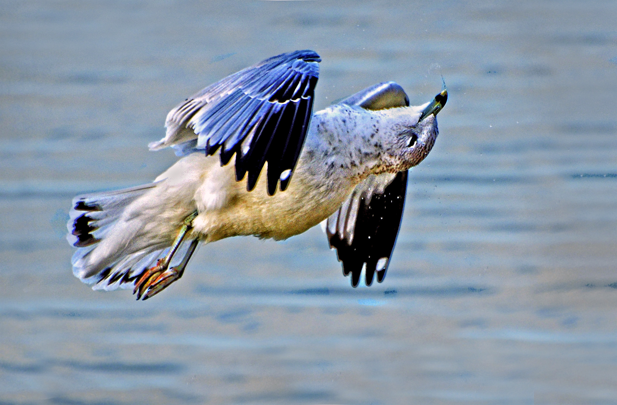
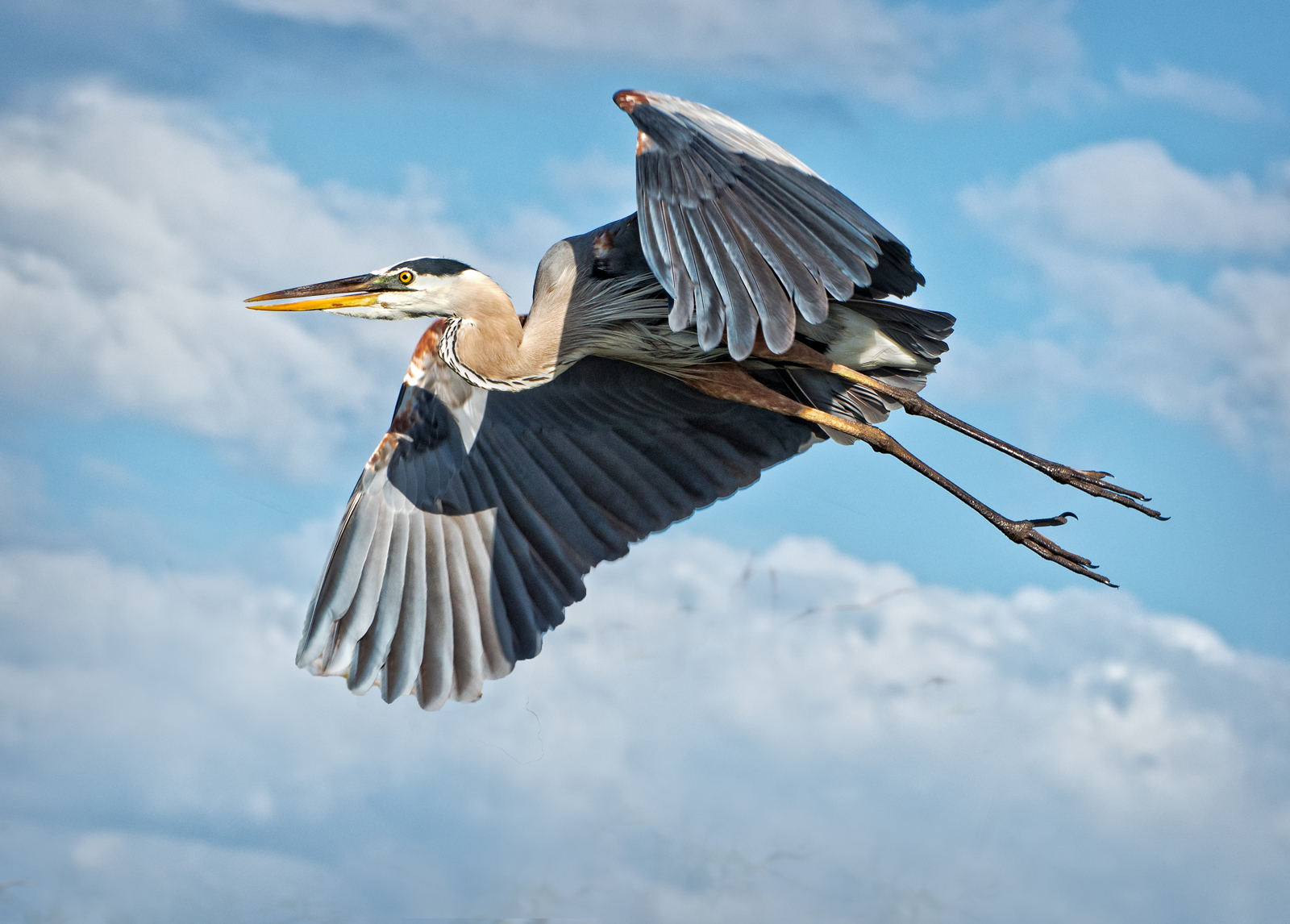
PS: The birds were not a long exposure; the shots were taken with my 70 - 300 mm lens at probably more than 300 (factoring in the crop value of my DX camera) at probably 1/800 sec. or maybe even 1/1000 sec. The rain drops on their beaks were real, but composited from another picture in the sequence. I couldn't have the drops falling from the birds because it wouldn't make sense to have blurred "rain" while at the same time freezing the drops in mid air. Hope this helps. |
Jun 14th |
| 22 |
Jun 18 |
Reply |
Depending on the resolution of the image simple sharpening in PS is enough. However, more often than not I go to some presets in On1 Effects. If it's a color image I primarily use the "natural" preset and then work with the various sliders to get the right balance. There are other presets (in color) such as Surreal but for my liking they go overboard. In the black and white settings I prefer Chrome and Roadie. There is a downside to using these presets and that is a lot of the time detail is lost, especially in the face, if you want an image that is to be made into a larger-sized print. You'll find also some artifacts in a lot of the darker parts of the picture. There are similar presets in other programs, such as Nik. I use Effects a lot, but with varying results. |
Jun 14th |
| 22 |
Jun 18 |
Comment |
Brilliant image Peggy. As Joe alludes to, it has pop and sizzle. Because this has the aura of fantasy and dream-like state, the glow around the edges of the leaves are OK by me. The brightness of the colors fit this approach. I do think Marti is correct about the leaf in the lower corner, and perhaps should be removed entirely. The greens, yellows, and blue of the sky looks great. Speaking of the sky, I wonder if something can be done to add to the abstract quality of the picture as it pertains to the sky. A unique and creative picture. |
Jun 11th |
| 22 |
Jun 18 |
Reply |
Thanks Peggy. This looks promising -- I'll give it a try. This could save me a lot of work. |
Jun 11th |
| 22 |
Jun 18 |
Reply |
Hello Joe, By method, do you mean achieving the rain effect? |
Jun 11th |
| 22 |
Jun 18 |
Reply |
Many thanks! |
Jun 11th |
| 22 |
Jun 18 |
Reply |
Peggy, could you go into more detail on setting the mode to darken? |
Jun 10th |
| 22 |
Jun 18 |
Reply |
In that this was the first time I attempted using the fake rain technique, I was having trouble getting the right balance, and perhaps the background rain should be a little lighter. I guess like all of us I reach a point of "editing fatigue" where you just say enough is enough and this is the best I can do for now. |
Jun 10th |
| 22 |
Jun 18 |
Comment |
Marti, what you might have here is a kind of photographic Rorschach test wherein what one sees gives some insight into one's state of mind at a particular moment! I must admit that I'm having a tough time finding the turtle -- I can see several different shapes that give me a clue. That aside, I do like this as an abstract shot which reminds me of tree bark. It does have a nice flowing rhythm to it. |
Jun 10th |
| 22 |
Jun 18 |
Comment |
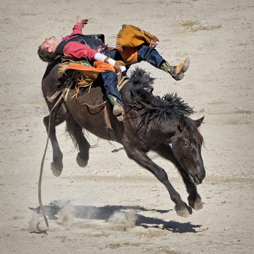
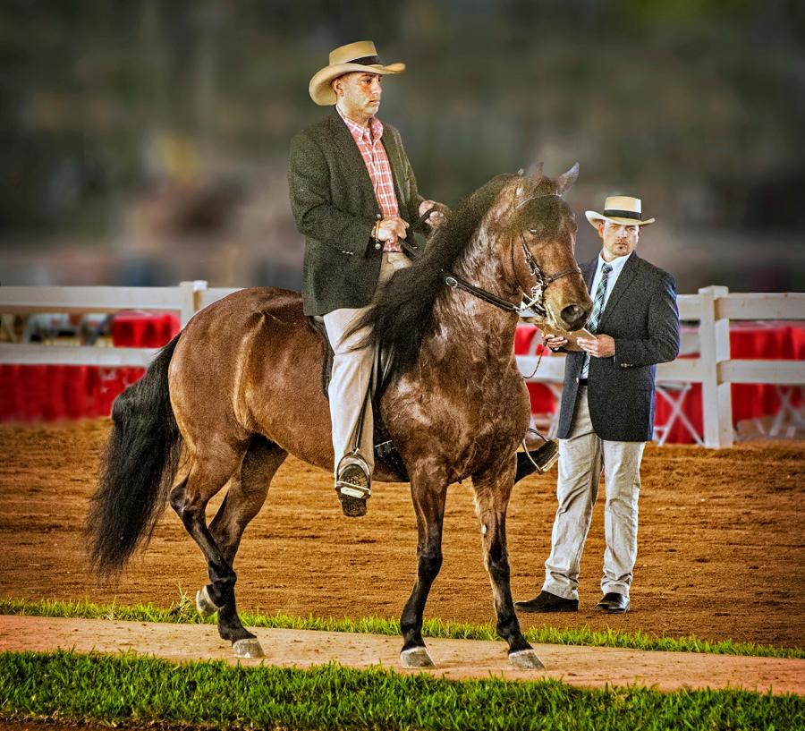
You did well in eliminating the tree above his hind quarters but the remaining trees are still pulling my eyes too much to the right. Instead of cloning out those trees how about cropping the right side out entirely and moving the horse out of the center of the composition? This could be a monitor difference, but I think the horse could be brightened up in order to bring out more detail. I like the bokeh in the foreground and background which frame him nicely. I see Mike's point but this could also be a portrait of a proud animal which gives off an aura of "I'm king of this here hill." |
Jun 10th |
| 22 |
Jun 18 |
Comment |
As Marti says, your picture has a nice tranquil and pastoral mood. The foreground grass, the barn and surrounding areas, and the sky makes for a good rule of thirds element. In my opinion the bright sky, relative to the rest of the image, is too distracting in that the eye is usually drawn first to the lightest and brightest parts whereas in this image the focus of the composition should be the barn area. I like the gradation of tones from the middled part up to the sky. I wonder if the pic as a whole should have more contrast. |
Jun 10th |
| 22 |
Jun 18 |
Comment |
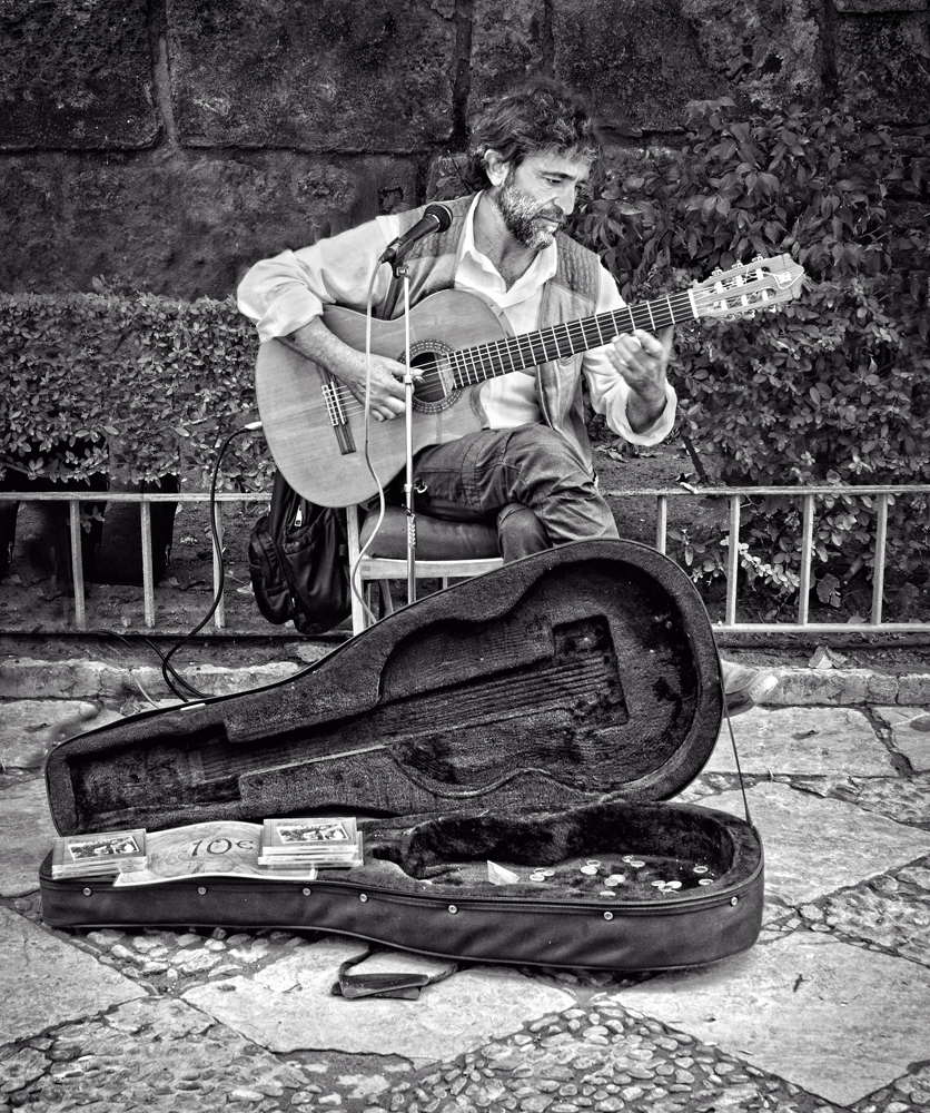
Very nice picture John. The light gray walls act as a frame for the composition and all of the colors are on the muted side which makes for an overall consistent composition. My eyes are drawn first to the red of the violin which is off center and not too bold. The man on the left looks as if he is about to take a picture of the art work which introduces the idea of two different eras of image making. I like that the two men are not in total silhouette which gives a hint of what they are looking at. If you want to eliminate the halos and are patient enough, you can zoom in the image quite a bit (maybe to the point of seeing pixels) and take the clone tool set to 100% and on the hardest setting and very small brush size and go along the edge of the black areas and extend the black far enough out to cover the white of the halo. |
Jun 10th |
7 comments - 7 replies for Group 22
|
7 comments - 7 replies Total
|