|
| Group |
Round |
C/R |
Comment |
Date |
Image |
| 22 |
Jan 18 |
Reply |
I don't use LR, only Photoshop and Elements. The red book would have been nice if it had been anywhere else but on the extreme left. I guess this is an example of a picture that could go either color or monochrome. |
Jan 19th |
| 22 |
Jan 18 |
Comment |
I like this picture a lot John. Colors and leading lines are it's strong points. There is a sense (except for the pipe) of absolute timelessness -- people at the time could see this vista well over a thousand years ago. The tree in front should not have had it's top cut off. The composition might appear to be two vertical halves place together but the horizontal shadows help to unite the image into one view. I'm not sure if the trees are offset enough by the negative space on the right, perhaps one or two more clouds in the sky on the right. White balance and saturation dead on. Nice. |
Jan 19th |
| 22 |
Jan 18 |
Comment |
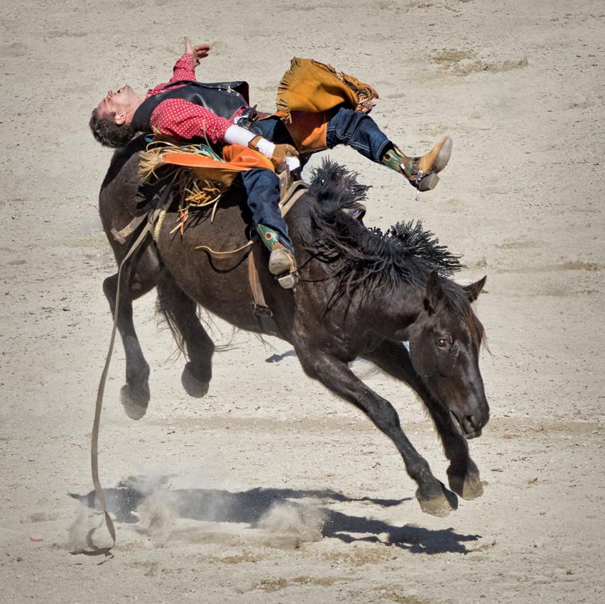
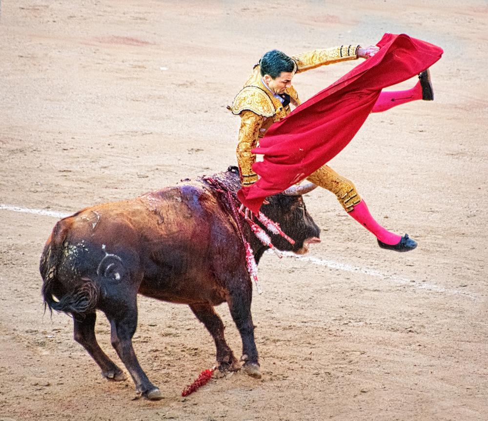
This image, because of all of the restrictions with your camera, looks as if you were playing around with one of the many filters in PS and has kind of an other-worldly look. With the lack of detail it's almost impressionistic and forces your mind to fill in the detail. I think eliminating the cowboy on the left was the right move, it's usually not a good idea to have half a figure in the picture. Do you have enough choice so that you can move around the arena, or is the place sold out? The problem with getting down low, particularly with bull riding, is that they tend to stay close to the chutes and then there's lots of clutter from the stands on the other side. The splotching my have resulted from processing in 8 bit mode. If this is the case, then convert over to 12 or 16 bits. This was a problem that plagued me for a long time until I figured out what was going on. |
Jan 18th |
| 22 |
Jan 18 |
Comment |
Cute animal portrait Mike. I like the overall golden glow and the Llama seems not so much to be standing in front of the background as emerging from it. Or, if you prefer,
melting into the background, which is an interesting approach. As everyone as hit on, it's always the eyes, but it's not as if you could ask the animal to move around so that the sun was shining on them. The light portion of the image at the top might be OK -- certainly no brighter and perhaps darker. The straw in his mouth is great. Nice texture. Did you have to select out the fine hairs? If so, how did you do it? |
Jan 18th |
| 22 |
Jan 18 |
Comment |
Great job of getting rid of the clutter, and matching up both images. I've often thought that there is no reason why you can't approach a photographic image like you would a painting or a sculpture, that is, spend as much time as you need to achieve the desired result. If you've hit a mental block along the way, just save it and come back to it later, whether that's later in the day or a month from now. Very nicely done! |
Jan 18th |
| 22 |
Jan 18 |
Comment |
Peggy, this is a really pretty scene and is a pleasure to look at. I like the composition of the original because there is a nice rhythm and diagonal line from left to right along the tree tops, and because it moves the spire off center. Perhaps clone in the tree on the left a little with more lights -- in this case the dark area of the tree detracts somewhat. I'm 50-50 on the stop sign, after all it is a street scene. Maybe clone in from the right a little so that the sign (Gumbob's?) is not quite on the edge. This has a lot going for it, and as Mike and Kaylyn have suggested would make a nice Chrismas card. |
Jan 18th |
| 22 |
Jan 18 |
Comment |
I like the coloration (is that a real word?) of your image, with the gold, brown, white, and green, which gives it a real autumn look. It gives off the feeling of the horses enjoying the cool weather and loving the freedom and the ability to be really frisky.
It is true that the overall look is nicely portrayed, but I think the others have noted that the brightness of the trees has detracted from the main point of the pic, which are the horses. It has been pointed out by Marti about the use of three objects as opposed to four, but the brown horses do make perfect bookends for the whites. Maybe crop down to just above the horses' heads? |
Jan 18th |
6 comments - 1 reply for Group 22
|
6 comments - 1 reply Total
|