|
| Group |
Round |
C/R |
Comment |
Date |
Image |
| 26 |
Jan 17 |
Comment |
I love before and after photos...your conversion to black and white in this case was a great choice, I think. In the original photo the mountain sides are nothing special, but in the b/w---beautiful! Personally, I wouldn't change anything. |
Jan 21st |
| 26 |
Jan 17 |
Comment |
My eyes were instantly drawn to the sky and the pop of the white clouds. The brown mountain tops really stand out against the sky. Love the flow of the lines...it gives me a relaxed feeling, like I want to be sitting in the green grass area on a lounge chair. I don't have a problem with the roads on either side, to me it balances the scene. |
Jan 21st |
| 26 |
Jan 17 |
Reply |
Oooops, didn't mean for it to post as a reply...my bad. It's very early morning and apparently I've not had enough coffee! |
Jan 18th |
| 26 |
Jan 17 |
Reply |
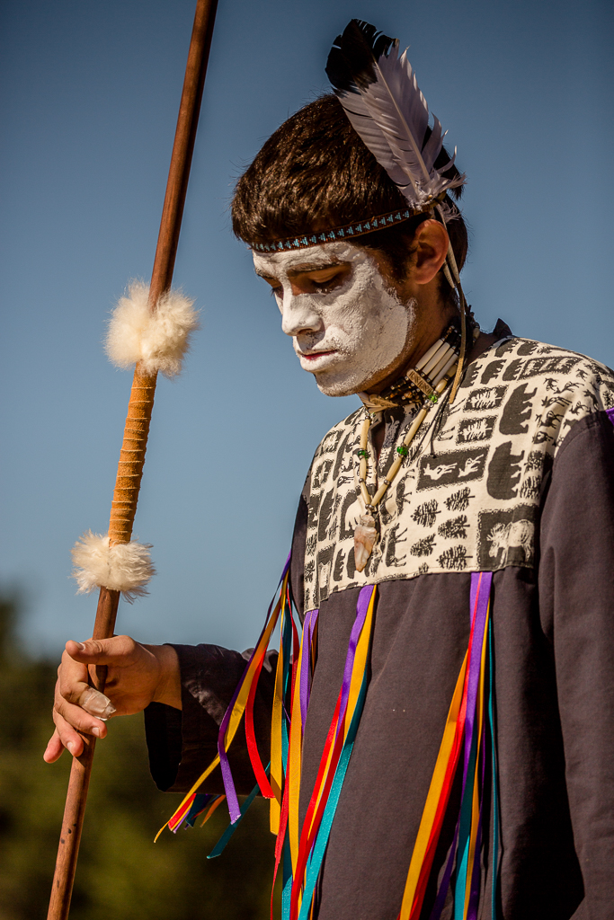
I think it's an honor for your photo to be used on their website, wow...congratulations! It's amazing to me what a crop and some creative thinking will do for a photograph. (thank you for showing the before and after). I like the placement of the people further back among the gravestones...to me, there is no doubt about the solemn feeling of the moment. There does appear to be a piece of trash that keeps drawing my eye directly in back of the people and a couple right in front of the center headstone. Nice job! |
Jan 18th |
| 26 |
Jan 17 |
Comment |
I like the blur of the horse as it gives me the impression he/she is in a fast trot (although the cart doesn't look safe at that speed, in my opinion!). Like Belinda, I also think it works nicely in B/W as it emphasizes the light on the driver. I also like the 3 passengers kind of in a silhouette. To me, it makes the driver stand out even more...he almost looks bored (slumped posture) vs the passengers, who appear this may be their first "ride." I would have preferred a little more room in front of the horse. |
Jan 18th |
| 26 |
Jan 17 |
Reply |
Thank you, Bob, I quite honestly didn't catch the bright end of the fringe. I agree with you...now that it's been brought to my attention my eye goes right to it. How frustrating! |
Jan 17th |
| 26 |
Jan 17 |
Reply |
The bandaid bugged me also, Belinda, but he would have two thumbs on his right hand if I tried to fix it (if it can be done). :-) There is one point at the beginning of each day when you cannot take photos, but the announcer lets you know. Other than that at least at the Pow-Wows I've been to photography is encouraged. |
Jan 17th |
| 26 |
Jan 17 |
Comment |
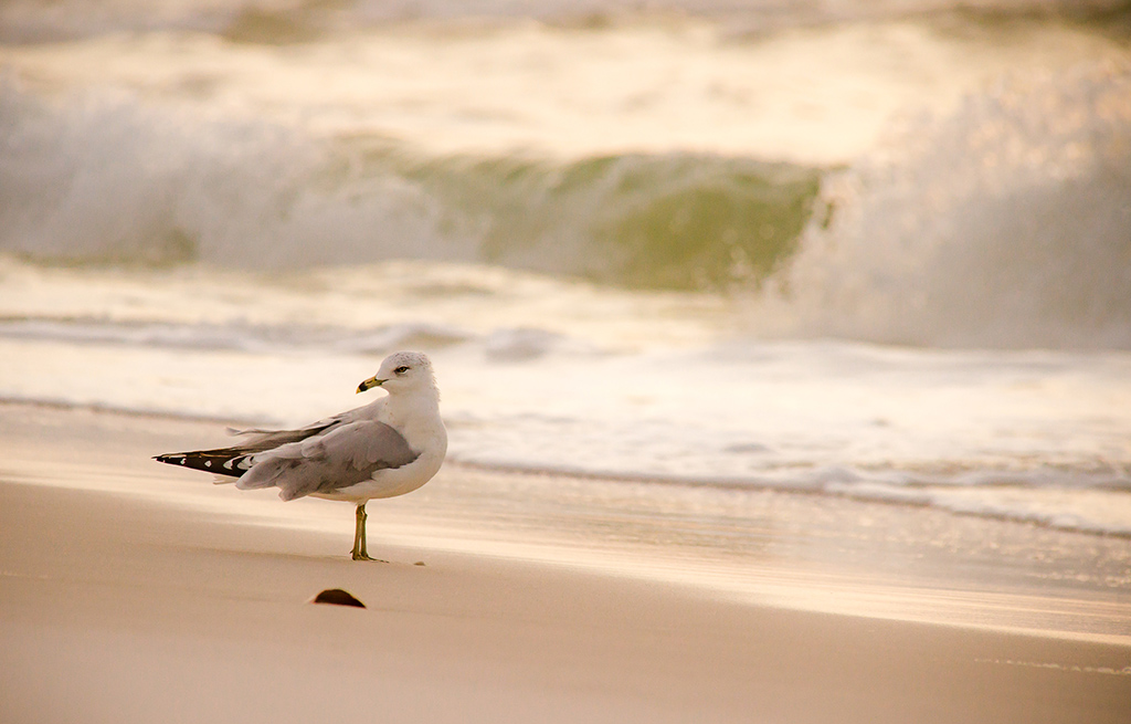
Well, I have never heard of creek surfing...as a matter of fact, that doesn't even look like waves that would come from a creek! It gives me the feeling like I'm looking at the Gulf of Mexico. The surfer's black wetsuit really stands out against the water and she immediately draws my attention. The placement of the surfer in the frame and the angle at which she is leaning gives her room to surf. She feels a little cramped at the top, but I do understand your constraints of the creek's banks. This may be picky, but what appears to be leaves in the water (one straight out from her right hand and one by her right knee) keeps drawing my eyes. |
Jan 8th |
| 26 |
Jan 17 |
Comment |
The lighting on the bird, in my opinion, is fabulous! The little guy is angled perfectly to show all his colors and I think the branch compliments those colors nicely, as does the blurred background. You captured a nice catch light in the bird's eye, too. I would like the leaves at the bottom removed because the bright green bud of the Camellia (?) drew my eye immediately and for me detracts from the bird. |
Jan 7th |
5 comments - 4 replies for Group 26
|
5 comments - 4 replies Total
|