|
| Group |
Round |
C/R |
Comment |
Date |
Image |
| 28 |
Mar 19 |
Comment |
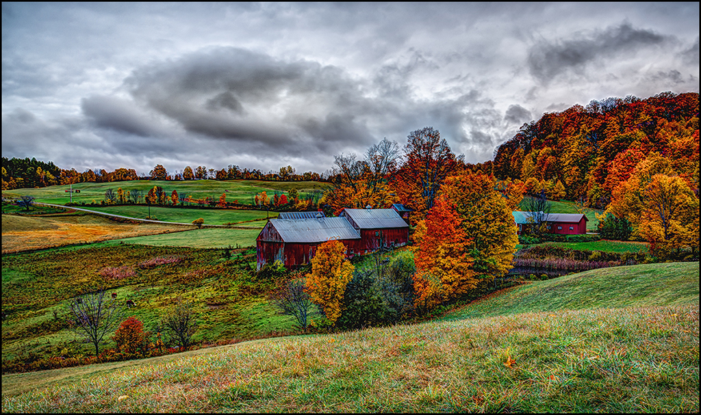
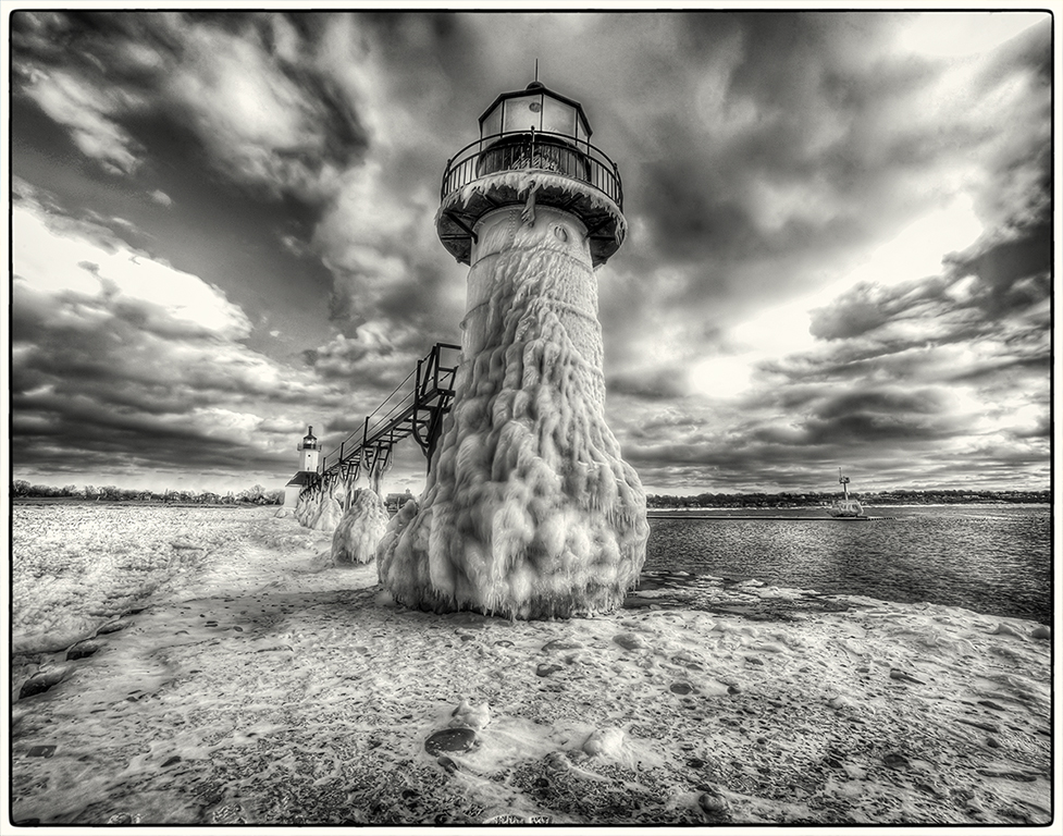
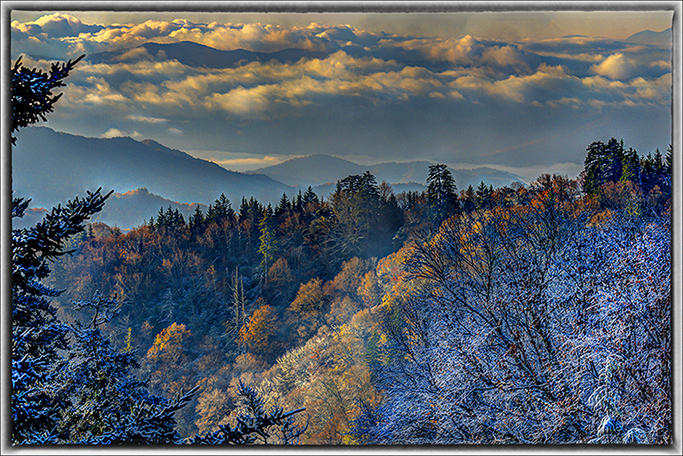
Hi Steve-It was nice you brought out the blue sky in the editing. To me, I felt the whites were a little over where you lost detail in the snow. Check your highlights in photoshop. I feel this would be a great HDR image where you could enhance the puffy clouds and provide more detail in the trees in the background. Nik software(now owned by DXO) allows you to take a single image and make into a HDR. |
Mar 26th |
| 28 |
Mar 19 |
Comment |
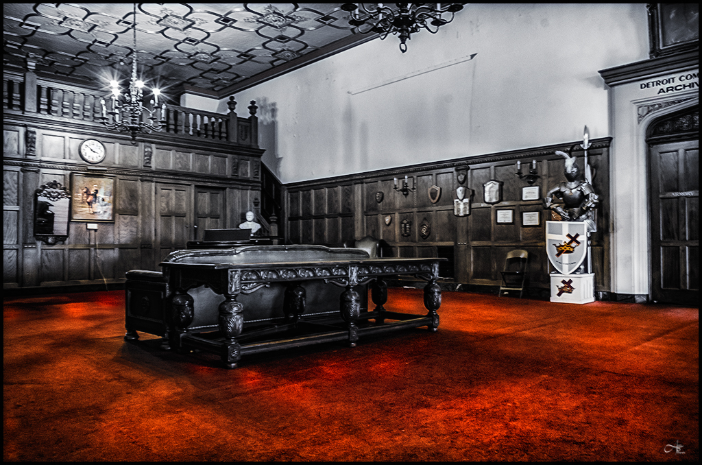
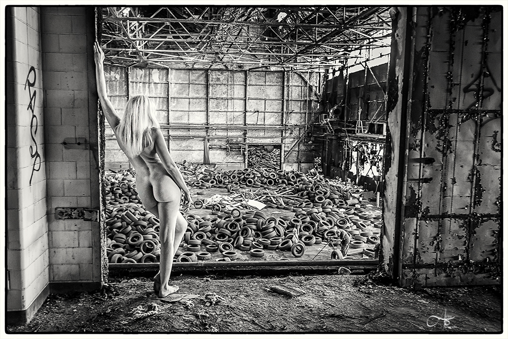
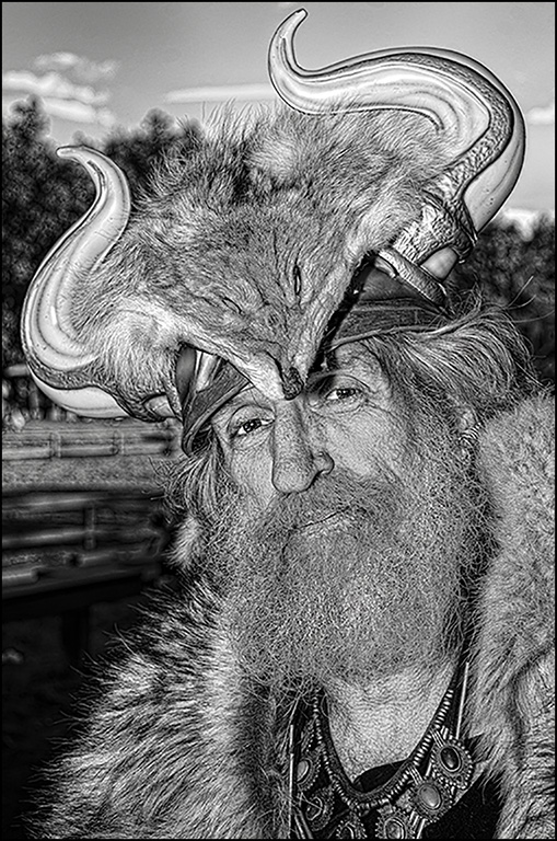
The choice on making this image monochrome was great. My thought would be to also make the "Art will Survive" a black tone to match with the total image. I felt the door was a little bullseye for me. I feel it would be best to eliminate the right side (outside) of the door and focus on inside and left of the door. |
Mar 26th |
| 28 |
Mar 19 |
Comment |
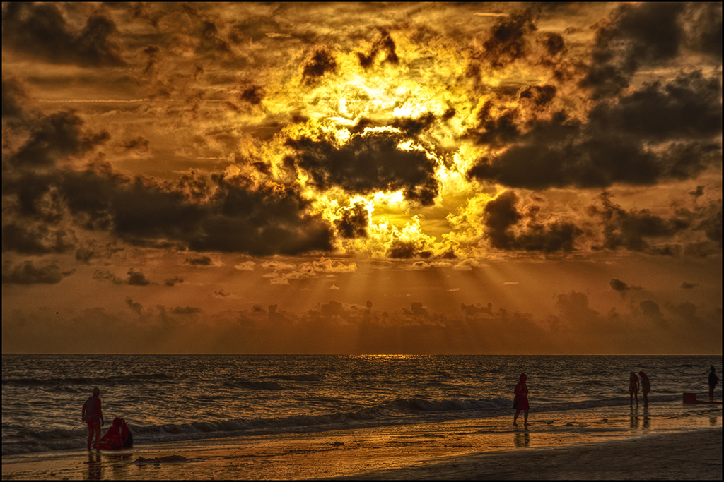
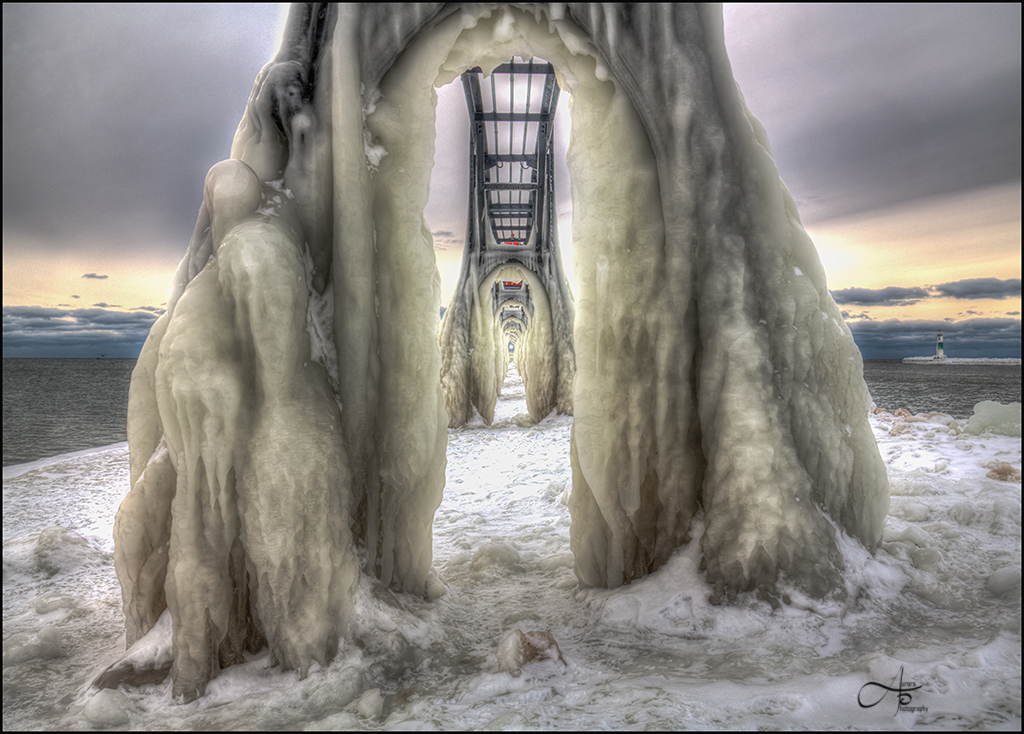
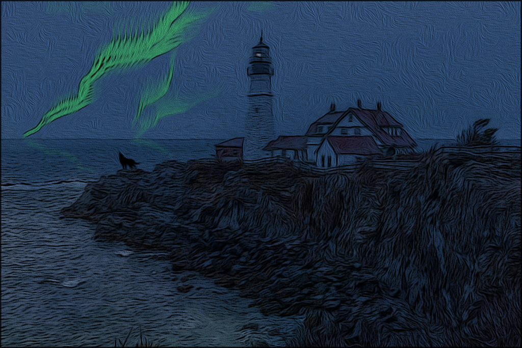
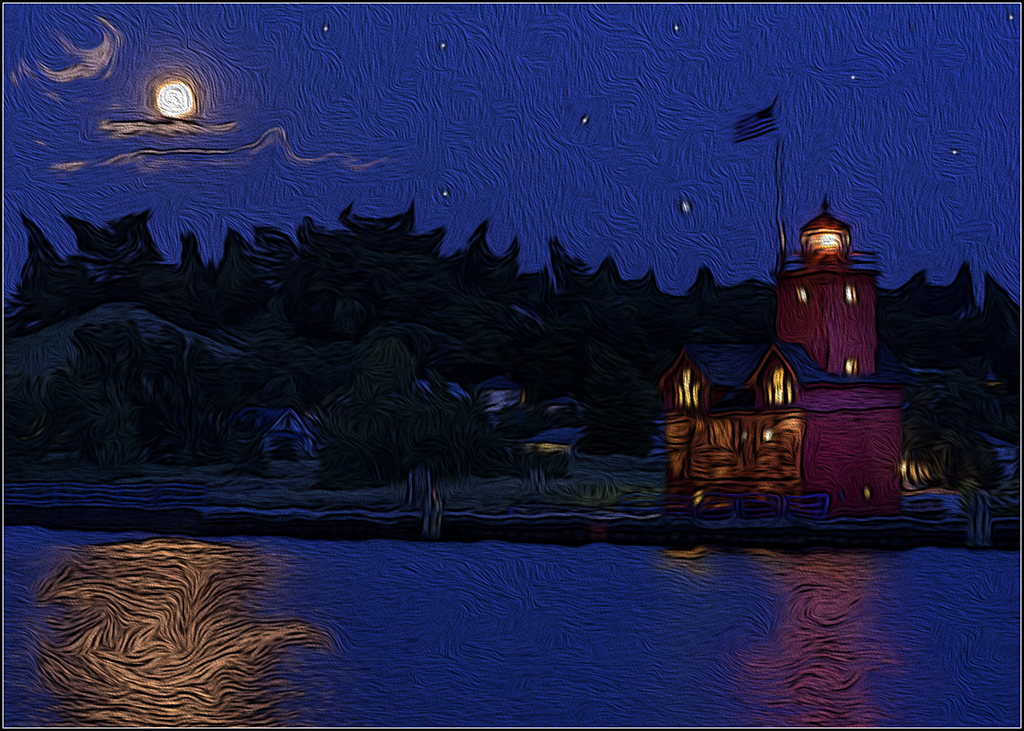
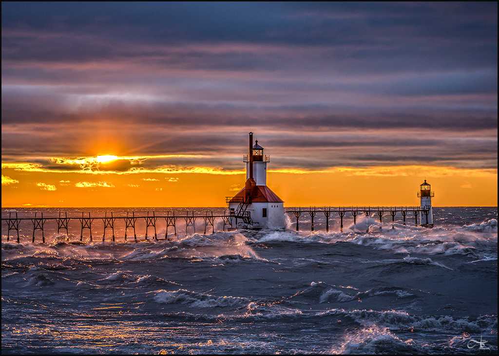
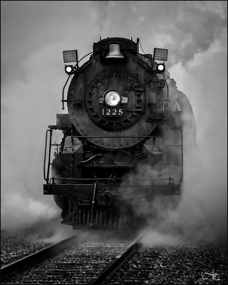
Incredible image. Love the composition, the silhouette and the lighting. Seems like a very challenging shot but turned out perfect. One to hang on the wall. |
Mar 26th |
| 28 |
Mar 19 |
Comment |
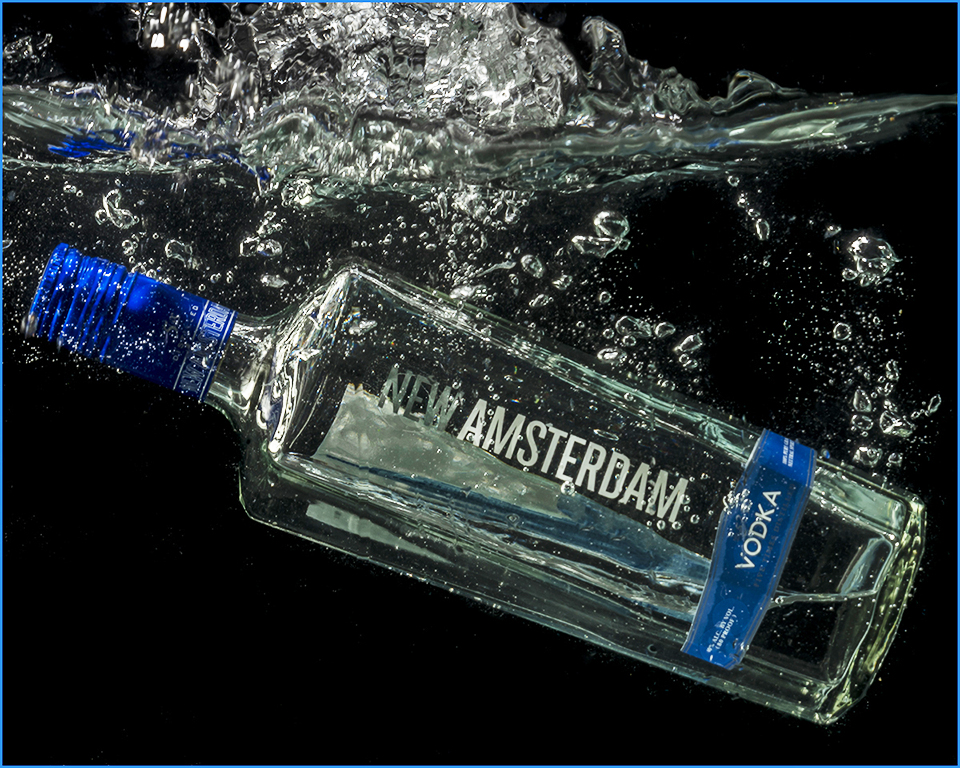
I love the look of this vehicle. I felt you could of close down on the aperture since you had a tripod. Maybe shot at f11 of f/16. The dark vignette makes the image more interesting but used more sparingly (maybe increase the transition of vignette in PS). If it was my image, I would pull the car only and put on another background to decease the busyness of the crowd in the background but great for journalist point of view (if you wanted that look for a local newspaper). Here is a image where you create additional images like take pictures of the hood piece, the front end and the tires. |
Mar 26th |
| 28 |
Mar 19 |
Comment |
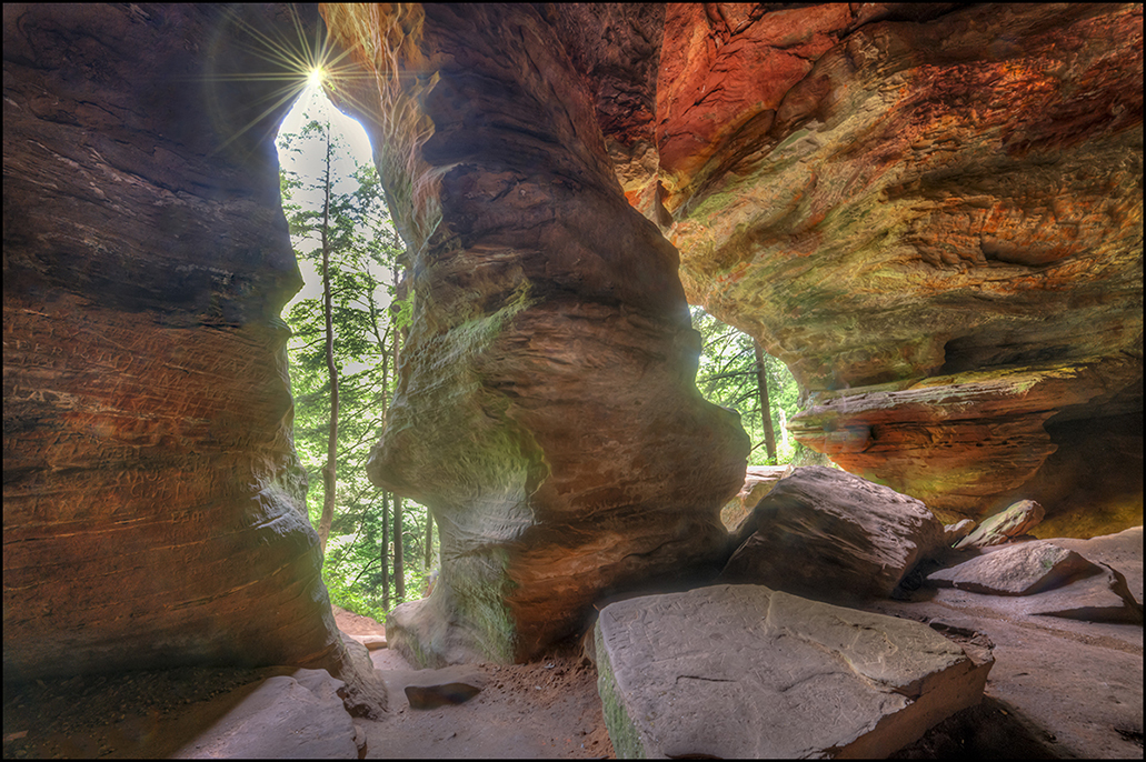
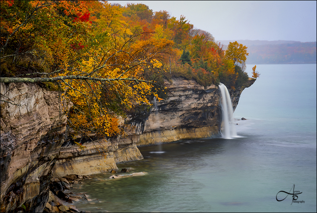
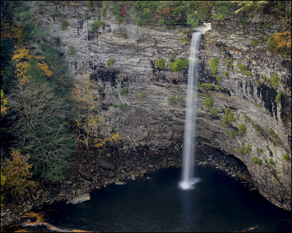
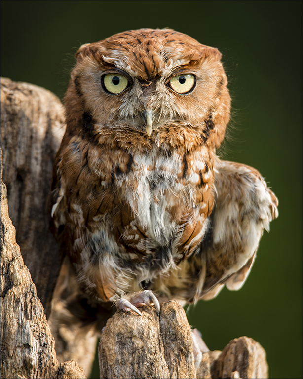
Hi Wanda-You did a great job with lightning up the rocks and providing detail. I would of like to seen more green in the foreground or a nice background view to make it more interesting. Yes; I do agree with the majority that is need more blur in the water to give it more of a punch. |
Mar 26th |
| 28 |
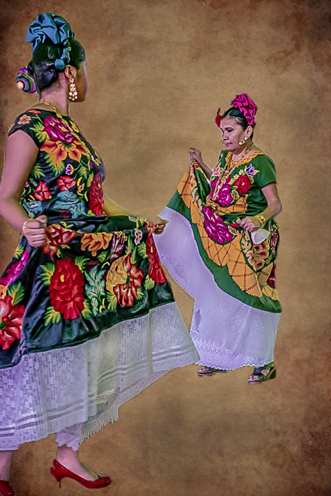
Mar 19 |
Comment |
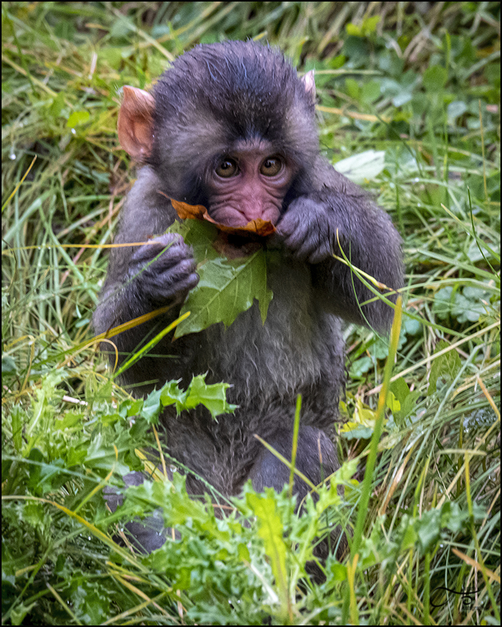
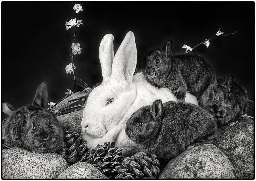
I like the action in the photo. I feel it needs some improvements. I feel the image has too much green tint. I brought it back in to PS and then into Adobe Camera raw. I brought up the tint +53, exposure -.35, contrast -23, highlights -77, Whites +6, Blacks -35, clarity +29, dehaze +12 and saturation +3. Bought it back into PS. I felt the background is busy for me. I use a canvas abstract-ancient-antique-235985 and use lasso to bring just the subjects over (move tool and control T). Brought it on the canvas and did some adjustments. |
Mar 9th |
 |
6 comments - 0 replies for Group 28
|
6 comments - 0 replies Total
|