|
| Group |
Round |
C/R |
Comment |
Date |
Image |
| 70 |
May 21 |
Comment |
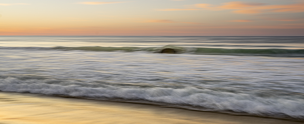
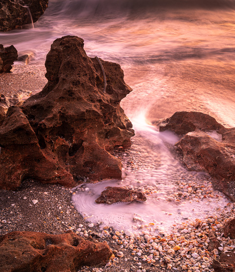
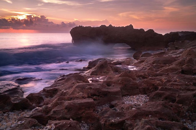
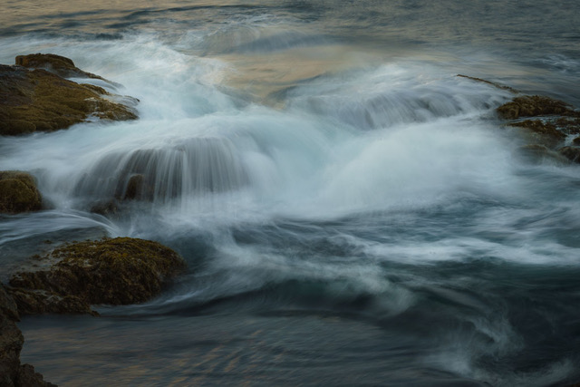
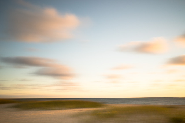
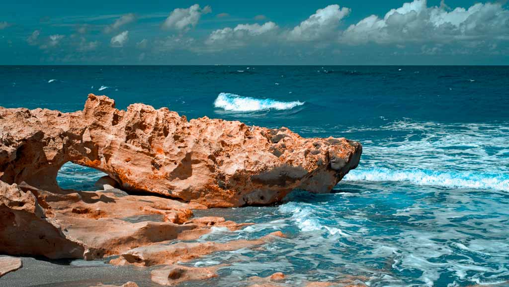
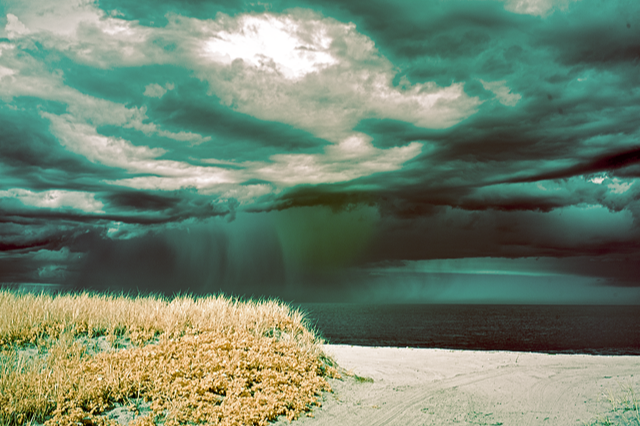
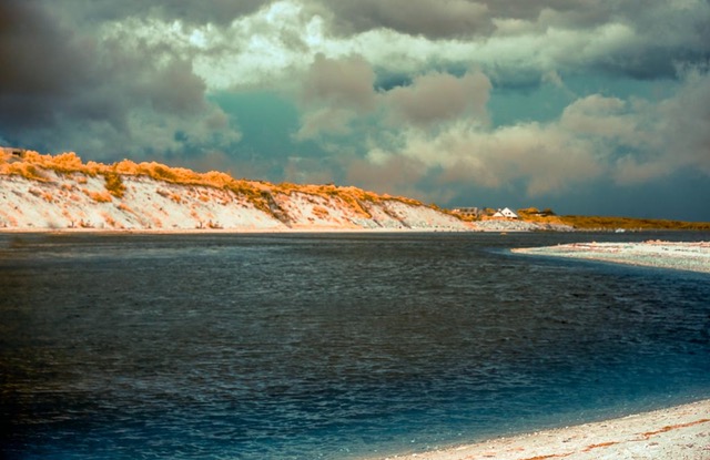
The focus point for me is how the image goes from dark to bright and guides me right back to the sun rays coming down from those dramatic clouds. Love all the motion, action and tension created in the water with the cold color palette that guides me to the bright sky and clouds that I wish were a tad warmer. The rock edges and water swirls caught the motion in a most effective way. These are all eye control elements that take me back to the main subject; the rays. Corners are clean; no distractions. Well composed, captured, and processed. |
May 19th |
| 70 |
May 21 |
Reply |
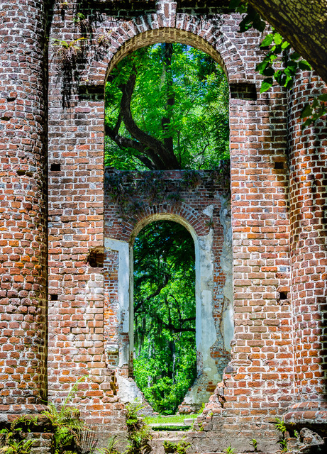
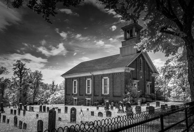
I'm discovering that cemeteries are often terrific places to photograph; especially the older ones done by landscape designers. |
May 12th |
| 70 |
May 21 |
Comment |
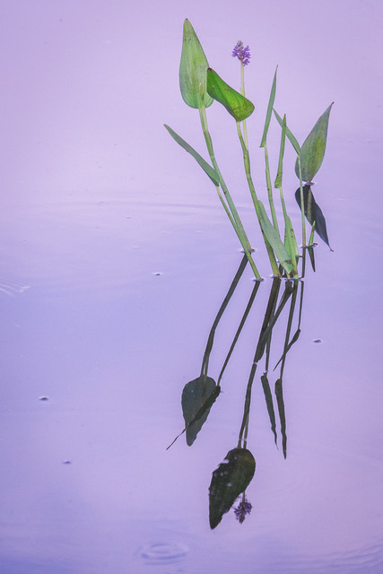
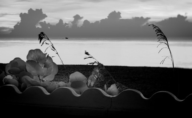
I love these little guys but haven't been able to pull off a nice shot like this. I would suggest considering a slight crop off the top to eliminate whitish line that distracts my eye althhough it it might be too tight and consider toning down the green foreground. The OOF background came out well. |
May 12th |
 |
| 70 |
May 21 |
Comment |
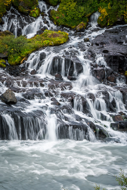
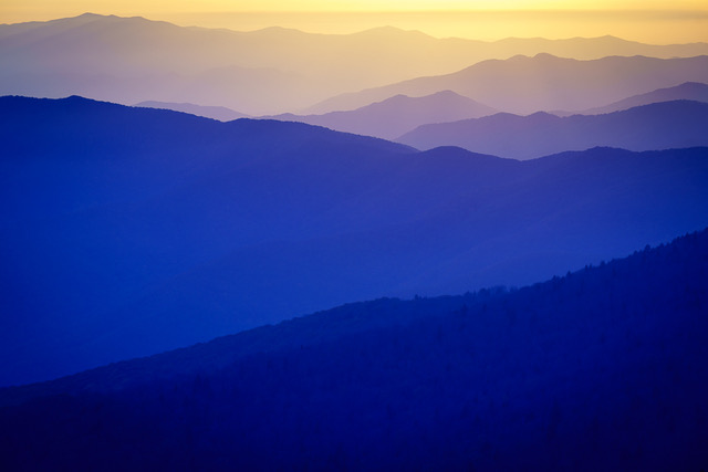
Never tire of this view. Good water flow this year! Such majesty & beauty no matter the day.
Could use some dodging and burning to help direct my eye to your primary and secondary supporting elements where you want it to go. Determine areas of attack you want to bring forward by adding warmth, light, sharpness, texture and areas you want to retreat to darken, cool, blur, move back.
I envy your ability to wake up on site to shoot dawn! Be safe. Take all precautions the bear don't smell your food & come investigate. |
May 12th |
| 70 |
May 21 |
Comment |
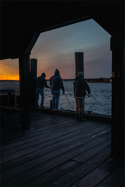
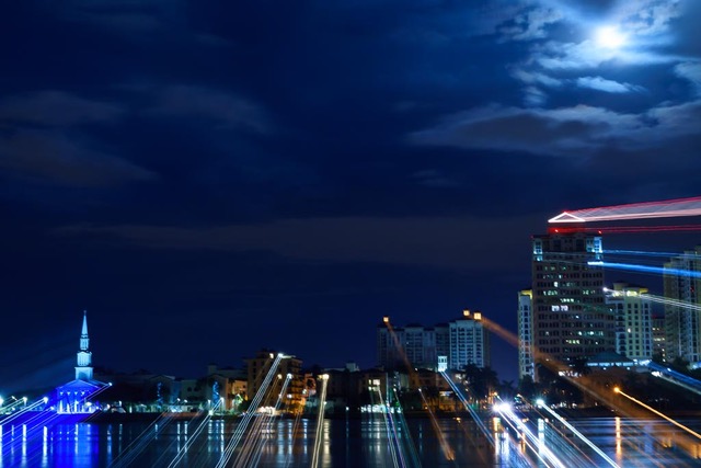
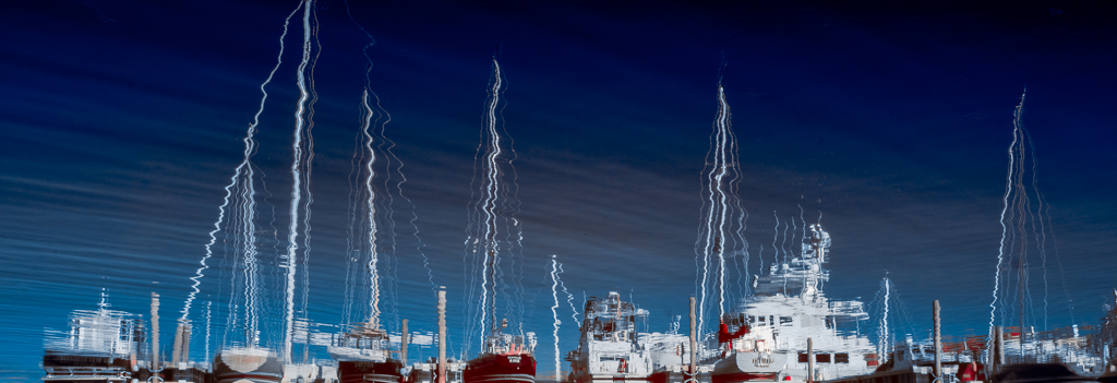
Nice work on the wet street reflections. Unfortunate the hotel has such a dominant white luminescent display. Can the heads of the figures above that are in shadow be brought out more, sharpened, warmed up to draw attention away from the toned down white display area?
There's a lot of lightness on left side drawing me away from central theme; perhaps consider cropping in to keep the reflective edge of black building.
Good job eliminating people and vehicles to just subtle blurs of tail lights. |
May 10th |
| 70 |
May 21 |
Comment |
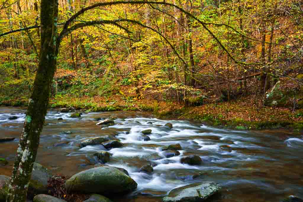
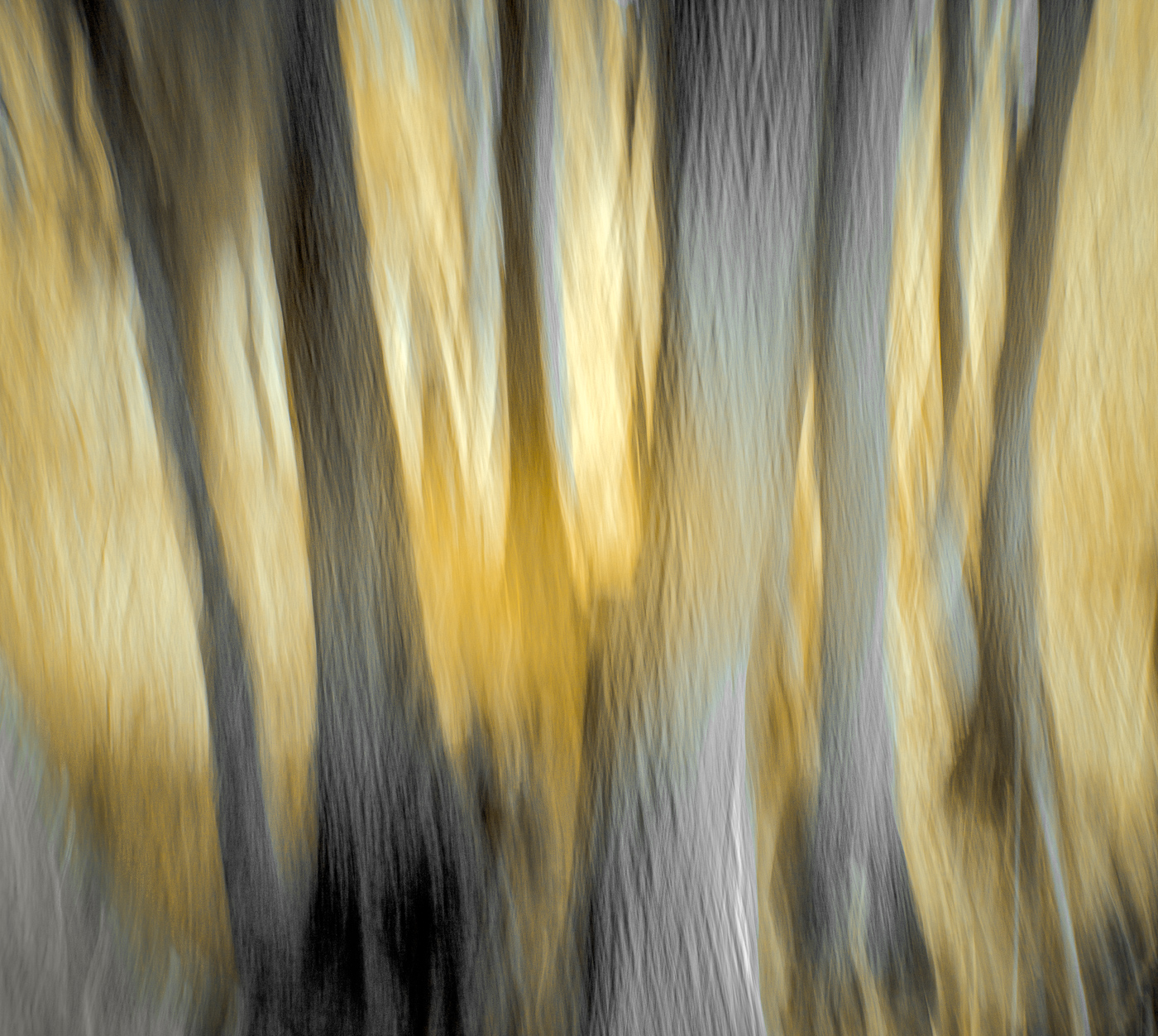
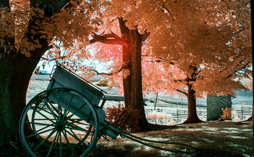
My eye is immediately drawn to the light bright dogwoods on the right edge and follow them back and across while studying their repetitive shapes which provide movement and rhythm as they march across the image. A nicely balanced fall composition with good color, shape, and form. The light areas of water below and clouds above allow my eye to wander out of the scene. The color palette is natural, subdued and muted evoking a peaceful mood.
I would suggest considering using a graduated filter to tone down these areas a little to keep me focused within the image. As my eye reads the image from right to left, consider flipping it horizontally. Their seems to be marvelous fall color in the trees; can you boost their luminosity/saturation to keep my eye on these supportive elements studying them in further detail? A soft vignette would help keep me in the frame too. |
May 10th |
5 comments - 1 reply for Group 70
|
| 91 |
May 21 |
Reply |
Thanks Bev for those most effective & creative tweeks! |
May 28th |
| 91 |
May 21 |
Reply |
This is a nicely framed crop too, and the deeper saturated color tones make it so other-worldly it works as well. Thanks. |
May 27th |
| 91 |
May 21 |
Reply |
YES! Tulips much more natural now. |
May 12th |
| 91 |
May 21 |
Comment |
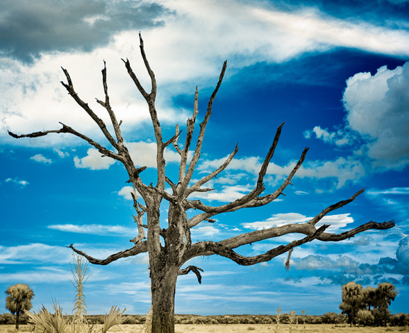
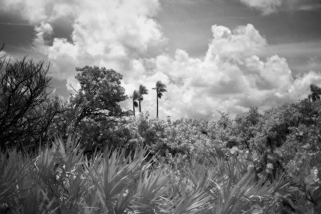
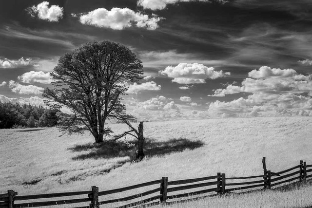
Love how your composition clearly shows the focal point silhouetted against the sky making it more impactful. Also your choice of converting your IR landscape to B&W. Design of visual elements has wonderful tonal contrast which makes it more three dimensional. The tall yuccas shape seems formed by the wind and the curvilinear lines add a sense of energy, dynamism and motion emphasized by their placement in front of the dark stormy sky. The placement of the plants also create an implied triangle on a rise of rocks which gives it a strong base. Well seen, captured and processed. |
May 12th |
| 91 |
May 21 |
Reply |
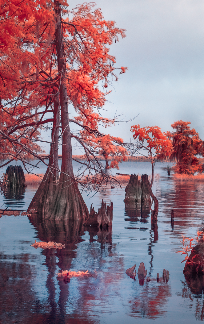
Thanks for the great suggestion Gary. In LR I removed red tint on trunks and lots of smudtz in the water. Much improved I think. Thanks. |
May 12th |
 |
| 91 |
May 21 |
Reply |
Thanks Chuck for your thoughts. Would love to see your experimentation results! I've only been doing IR for a year or so and find making a developing decision amongst all the software choices a bit overwhelming at times. |
May 12th |
| 91 |
May 21 |
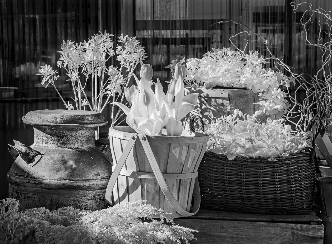
Comment |
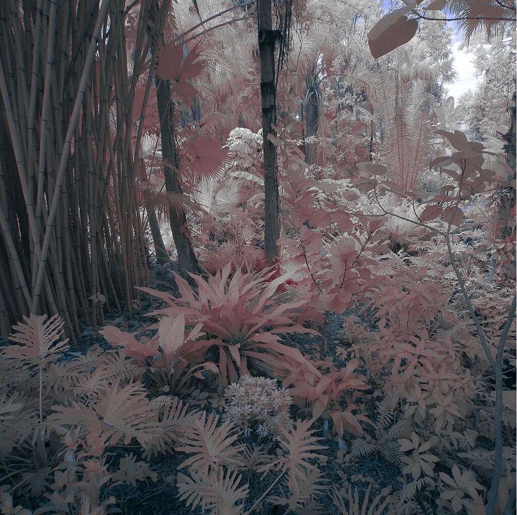
I agree the translucency of IR on the foliage is quite nice but left the tulips a bit flat and unresolved. Importing image into LR, I brushed the tulip buds darker, reduced highlights, and added more contrast to help bring them out. Also burned down the background and some of the other plants to show more detail and sense of depth.
Image is balanced with a peaceful mood and caught a moment in time quite well. |
May 12th |
 |
| 91 |
May 21 |
Comment |
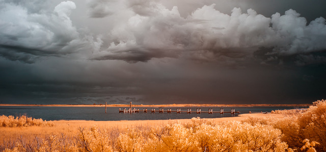
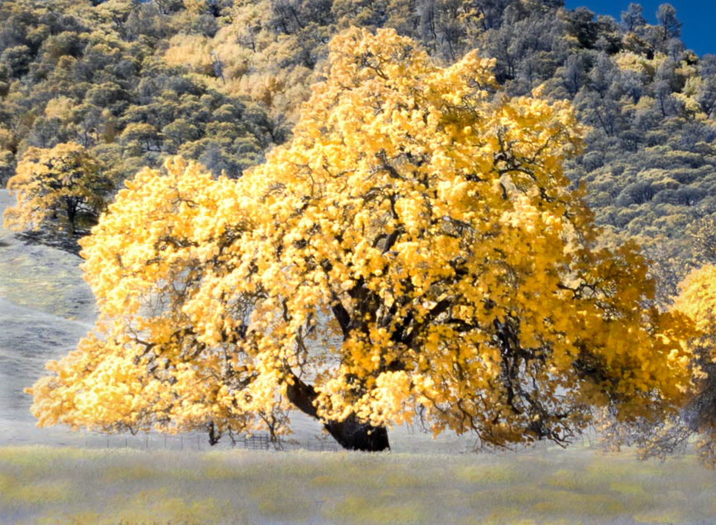
Good job Gary under those shooting conditions.
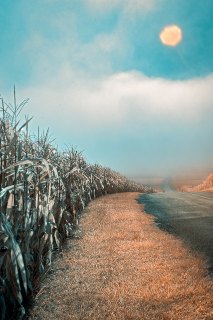
The compositional hook for me and the Dominant element is the beautiful golden tree. Lovely IR color palette.
To keep my eye directed to it, I find the golden trees on the right side of it and beyond not supportive as they also draw my eye. So I cropped the image to help keep the focus of the viewer on The Golden Tree. I also dodged and burned the background hillside to add more contrast from the tree, add a sense of depth and subdue any golden distractions there.
I find the foreground yellow grasses add a softness and lightness that draws my eye back to the tree, so I used a graduated filter to enhance that feeling. All good landscapes need a FG (foreground), midground, and BG (background)
Nice atmosphere and mood. You'd never know it was a windy day. Good job; well seen and captured. |
May 12th |
 |
| 91 |
May 21 |
Comment |
Without knowing your visual intent, lens, aperture, tripod use and whether any lighting besides natural was used in the capture I'll make some blind comments.
The main subject appears to be the spray of three orchids composed in a most pleasing diagonal that reads left to right as they are the lightest objects in the frame and draw my eye right to them. However, the orchid in bottom right appears to be in quite sharp focus with well defined lines and detail and draws my attention as well; thus competing with the soft, delicate diagonal flowers. Perhaps it was your intent to show how soft and delicate the three are. In which case I would suggest you consider toning down all the background areas that surround those 3 orchids, reducing highlights and even reducing sharpness to help blur it out and help keep our eye on the prize: the 3 orchids. There are some small light areas, leaves, and door frame that draw my eye; tone/blur them down. Use burning/dodging tools to redirect viewers eye to where you want it to go. |
May 1st |
| 91 |
May 21 |
Reply |
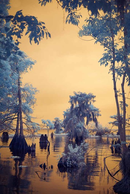
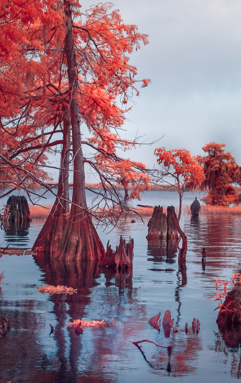
Thanks Chan for your thoughtful comments.
I like your crop down from the top; nothing of value was removed and as you say it re-balances the compositional horizon; I might even come down a bit more in the crop. It helps simplify a busy composition and brings emphasis to the big cypress, its shadow and re-directs the eye to all the water reflections.
As the big cypress dominates and anchors it, I believe I'll leave it on the left. |
May 1st |
4 comments - 6 replies for Group 91
|
9 comments - 7 replies Total
|