|
| Group |
Round |
C/R |
Comment |
Date |
Image |
| 1 |
Feb 21 |
Comment |
Captivating image. The color palette, diminishing perspective, repetition of pattern, converging lines and the dynamic sense of motion from the blowing wisps of feathers atop the teepees is stunning. Well captured and processed.
I prefer the minimalist simplicity of the bald sky. |
Feb 8th |
1 comment - 0 replies for Group 1
|
| 14 |
Feb 21 |
Comment |
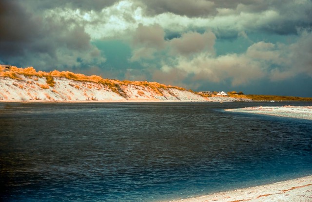
I enjoy the Zig-Zag design of this composition that fills the frame; from cloud to dune to fence. Provides dynamic backdrop for calm windblown wild pony. |
Feb 8th |
1 comment - 0 replies for Group 14
|
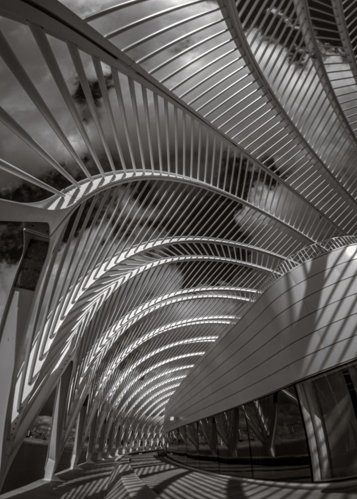
| 70 |
Feb 21 |
Comment |
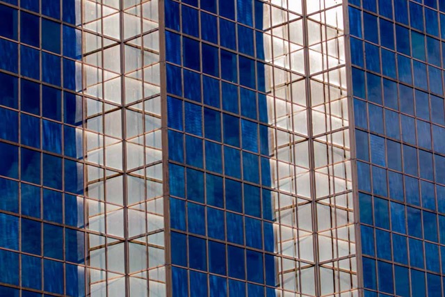
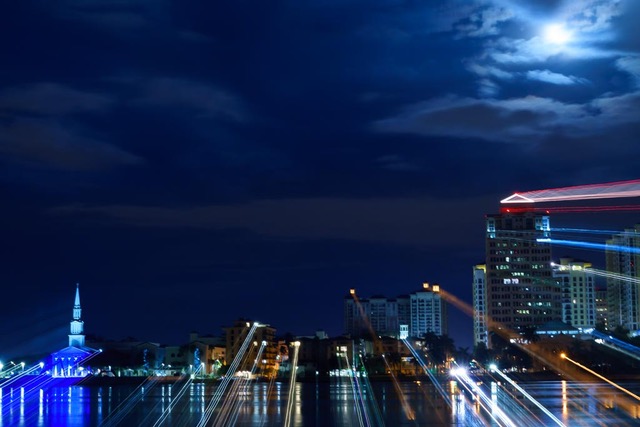
Wonderfully colorful architectural graphic linear cityscape or travel image. Diminishing perspective leads me to a surprise discovery of the river running between the buildings where I expect the street to be. The reflections on the water adds value and helps tie the buildings together. Which brings me to the sky which blend well with the city. Lovely peaceful mood even though the street looks busy. I do feel as if I'm there on a bridge with you. Well captured and processed. |
Feb 27th |
| 70 |
Feb 21 |
Reply |
Thanks Pierre. This was shot in the northern latitude of Maine in October on a clear brisk night, so I believe having a nice weather High in place and low temps so no haze in the atmosphere helped a lot. Summer nights have lots of haze and other moisture stuff suspended in the atmosphere. |
Feb 27th |
| 70 |
Feb 21 |
Reply |
Thanks Frans. Appreciate your thoughtful comments. Thanks for the link! Great. If we're not learning we're not living. |
Feb 27th |
| 70 |
Feb 21 |
Comment |
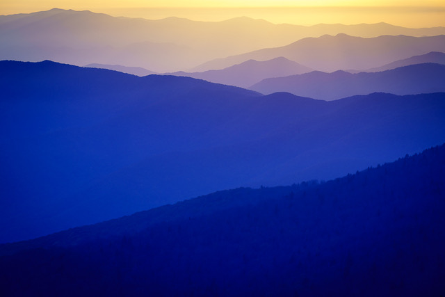
Love the visual depth you've created here. Warm light and tones compliments the cool mountains. The movement and the rhythm of the shapes, lines, layers unifies the composition. Wonderful color palette adds so much value. |
Feb 27th |
| 70 |
Feb 21 |
Comment |
I too, like you, love waiting for that magic crack to appear in the clouds and allow the heavenly Light to sneak in and paint the scene. And I too would use filters and bracketing and a sturdy tripod to hold it all still against the brisk biting wind.
We now have so many choices beyond Adobe in our workflow; Topaz Studio 2, On 1, Luminar AI, Capture One, a little of this, a little of that. I find these multiple choices really opens up my creative flow, especially if you consider using sky replacements and textures.
So the question boils down to what is your intent? How do you pre-visualize the finished image so viewer sees it in a new way? How do you make it yours? Let go. Take the Risk. Develop your personal style. Is your vision of a natural image or creative? The choice is yours. |
Feb 27th |
| 70 |
Feb 21 |
Comment |
My month has been out of control busy too! Sorry I'm late to the party Lamar!
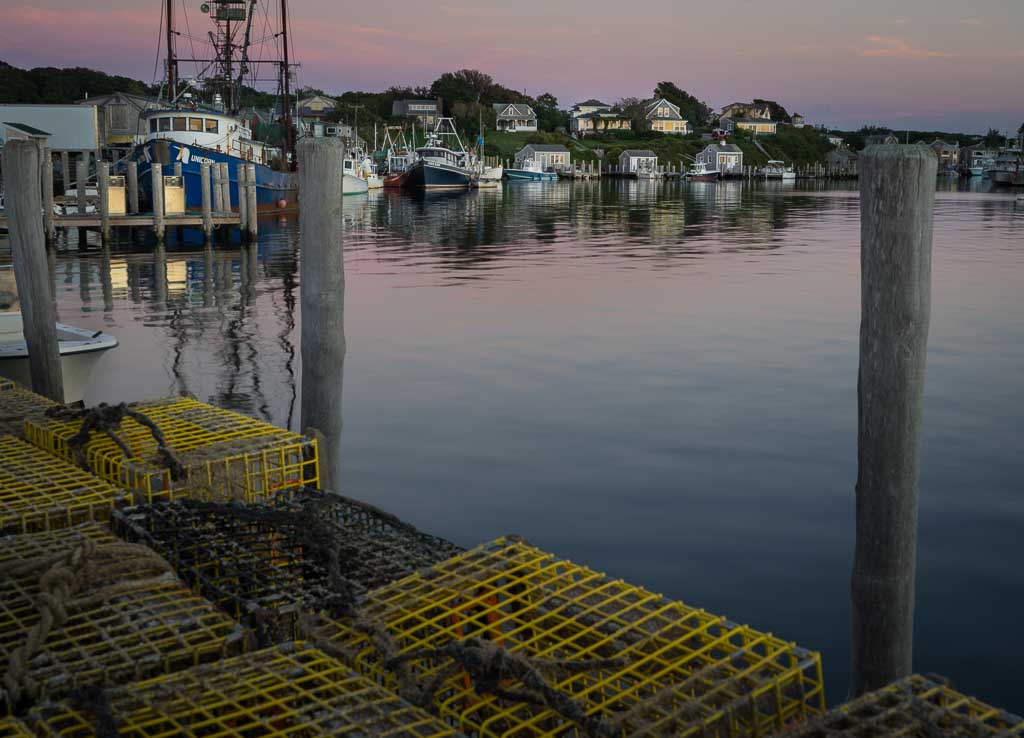
To me the lightest brightest area of foreground keeps drawing my eye; not the subject. Would suggest dodging/burning local areas to re-direct the eye to the story you're telling. And consider a vignette. Otherwise its' in the photojournalistic documentary genre of imagery. |
Feb 27th |
| 70 |
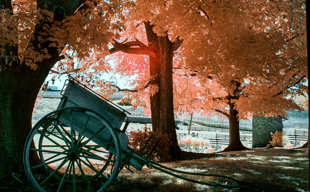
Feb 21 |
Comment |
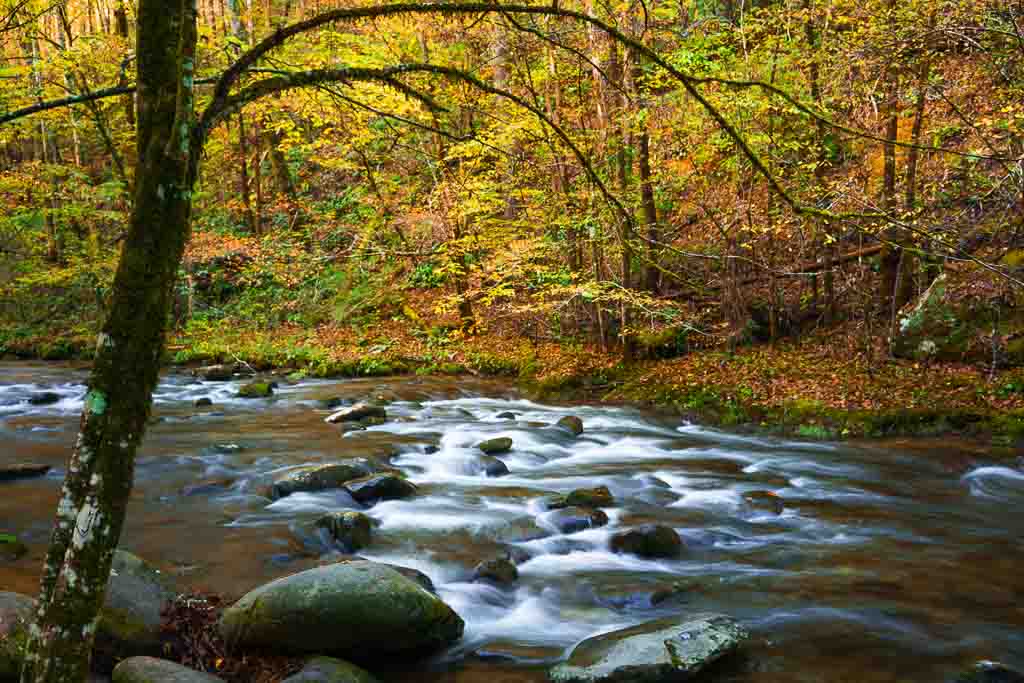
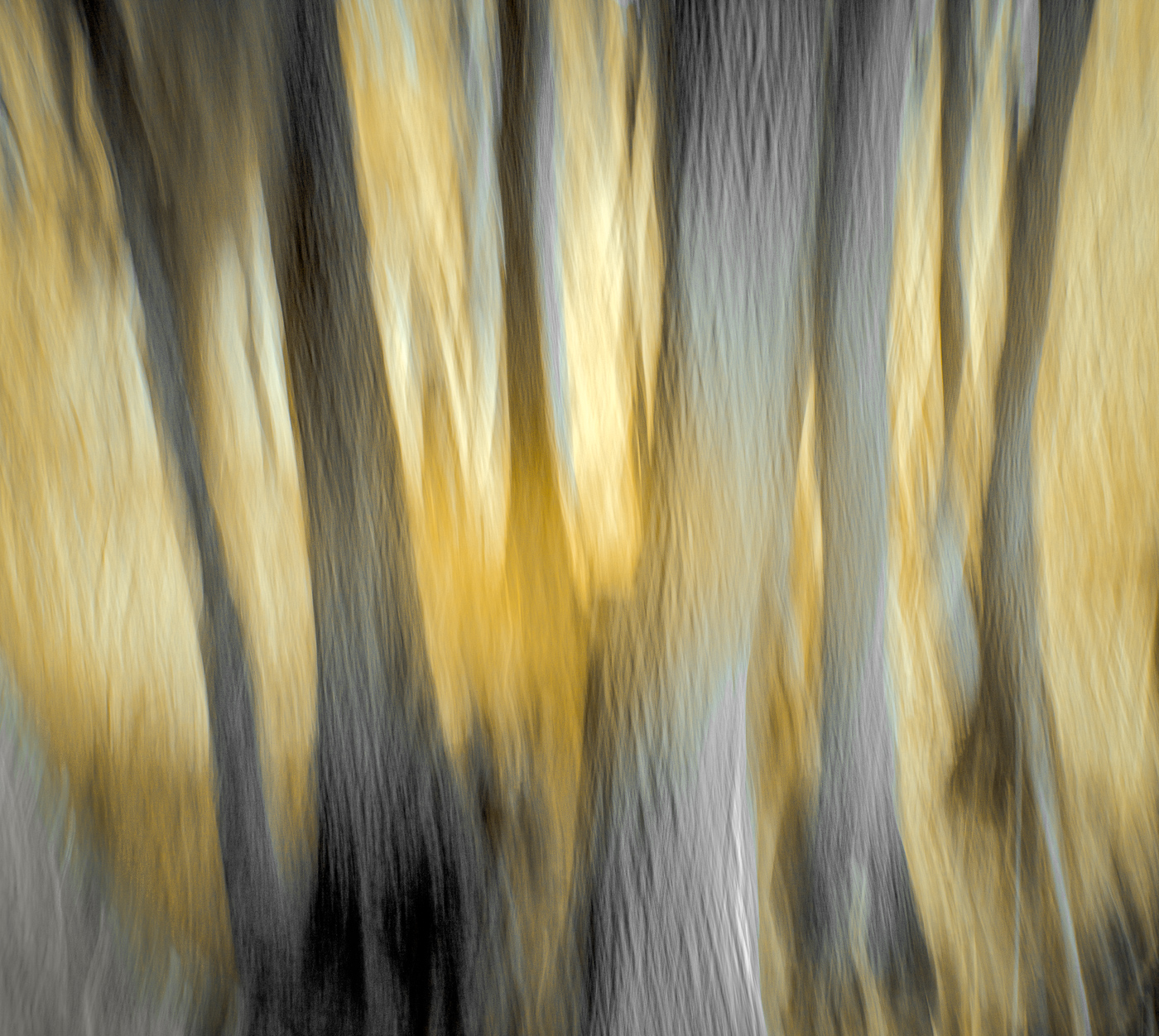
The pattern and movement of the tree branches creates a rhythmical and lyrical aesthetic to this image of a lake at the foothills of grand mountains. It's balanced with form and texture, light, color and shape that creates a most beautiful scene. Love the atmosphere and mood and so glad you were "prepared."! Well done. |
Feb 22nd |
| 70 |
Feb 21 |
Comment |
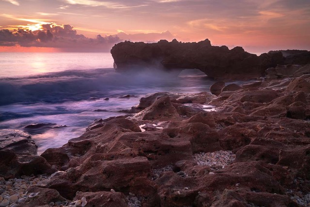
Your low and wide perspective is the hook for me in this image. The light caught at this time of day creates long soft shadows that accentuate the shadows between and bring attention to the dried out cakes of dirt. Their multi-directional cracks all point back to your foreground interest of the skull and horns and then beyond to the mountain. The repetition of the shear expanse of dried out dirt throughout the scene helps unify and balance the design. I might suggest trying to pull out more detail from the shadows in the front side of the dark mountain contours. |
Feb 22nd |
| 70 |
Feb 21 |
Comment |
Thanks Todd! No explanations for f/22... |
Feb 19th |
7 comments - 2 replies for Group 70
|
| 91 |
Feb 21 |
Reply |
Thanks Gary for your thoughts. I believe I used local radial or graduated filter in LR in the sky to bring out the faint texture and contrast. |
Feb 28th |
| 91 |
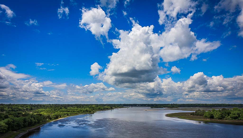
Feb 21 |
Comment |
Agree with suggestion to burn down bottom R area. Love the puffy white clouds and deep blue sky but am pulled away by the horizontal clouds above. Perhaps consider cloning/cropping them out without removing tops of cumulus clouds. Like the color palette.
Looks like a great place to explore. |
Feb 28th |
| 91 |
Feb 21 |
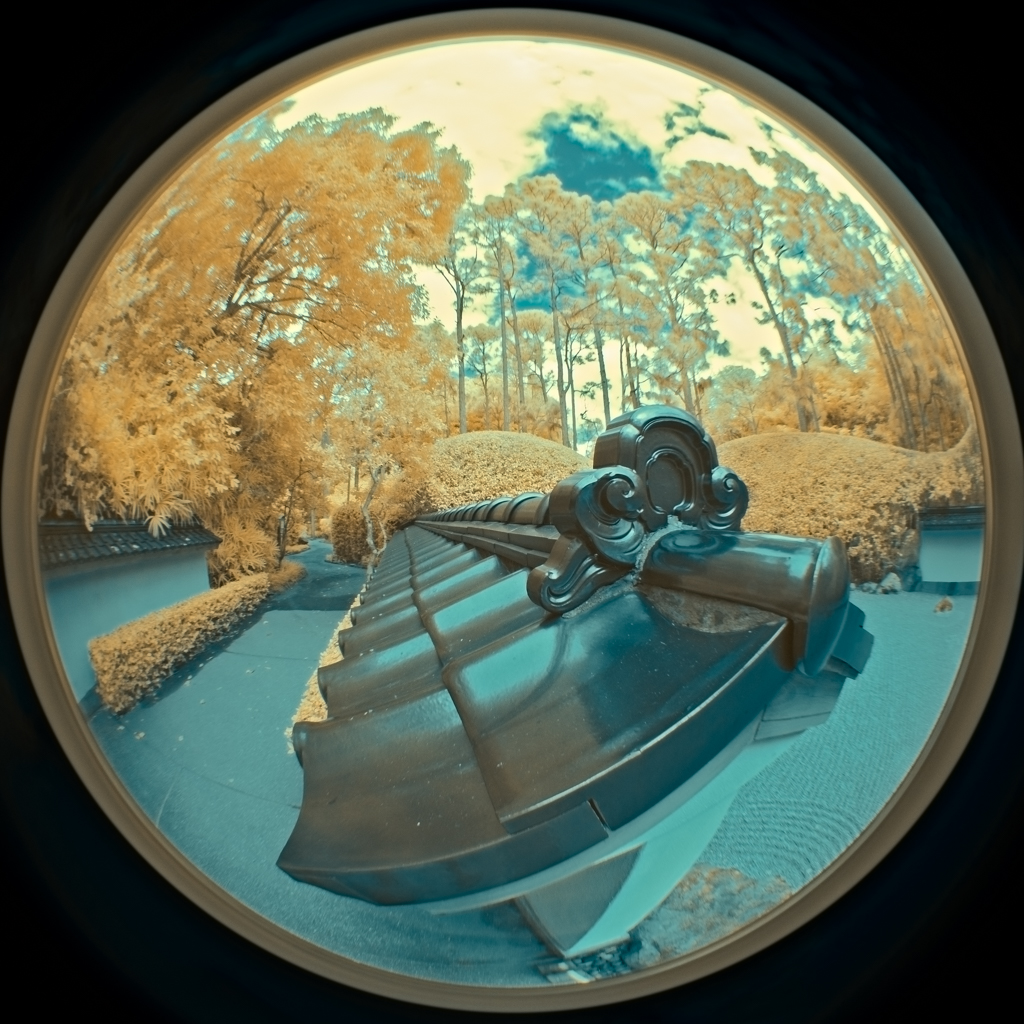
Comment |
To me the 60/40 split of blue/red is a bit too much red; too unbalanced and too heavy for such a strong color and the "horizon" is a bit too central. IMHO I would suggest cropping the bottom up to include just the top row of plants below the sculpture base. This would increase the solidarity of the base and bring the horizon lower bringing more emphasis on the sculpture.
Lovely color palette, the steel blue object against the blue sky as backdrop is super. Nice tonal contrast, detail in highlights and shadows. Well processed. |
Feb 28th |
| 91 |
Feb 21 |
Comment |
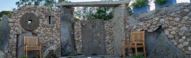
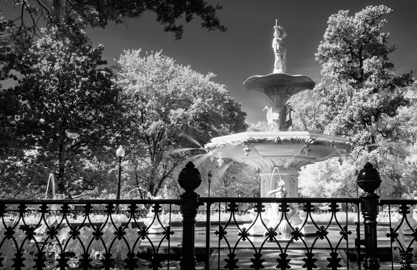
To me this is an image of another artists' work; I'm not seeing enough artistic changes made to it to make it your own.
My eye lands on the scrolling up leading line which directs it up to the bright cloud and out of the image. More contrast and deeper shadows might hold my gaze longer. |
Feb 28th |
| 91 |
Feb 21 |
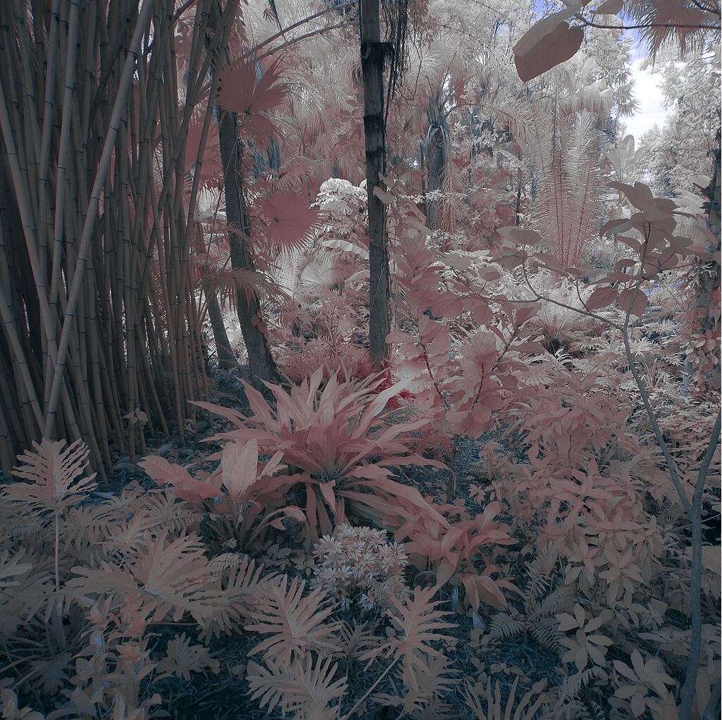
Comment |
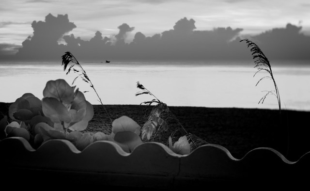
The hook for me in this nature image is the translucent effect of the IR light on the succulent you captured. The repeating pattern of leaves radiating around the plant increase and enrich my visual interest.
Might it be possible to increase the range of tones in just the plant foliage by adjusting the black point for them? I think it might add definition to the lines, shapes and contour of them.
IMHO the small bit of stem emerging from the plant doesn't tell enough of the story of refusing to stay in the pot and crawling away. To me it's a distraction; ergo I prefer Henry's crop. |
Feb 8th |
4 comments - 1 reply for Group 91
|
13 comments - 3 replies Total
|