|
| Group |
Round |
C/R |
Comment |
Date |
Image |
| 3 |
Jan 21 |
Comment |
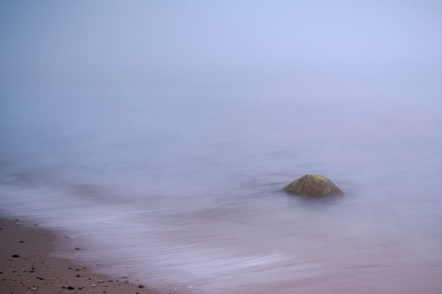
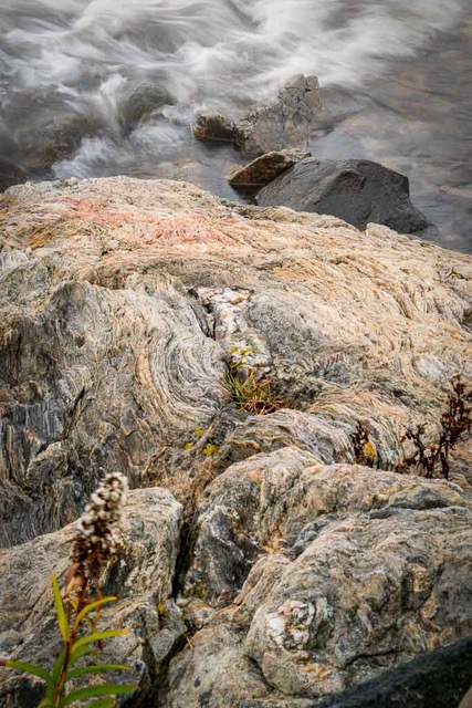
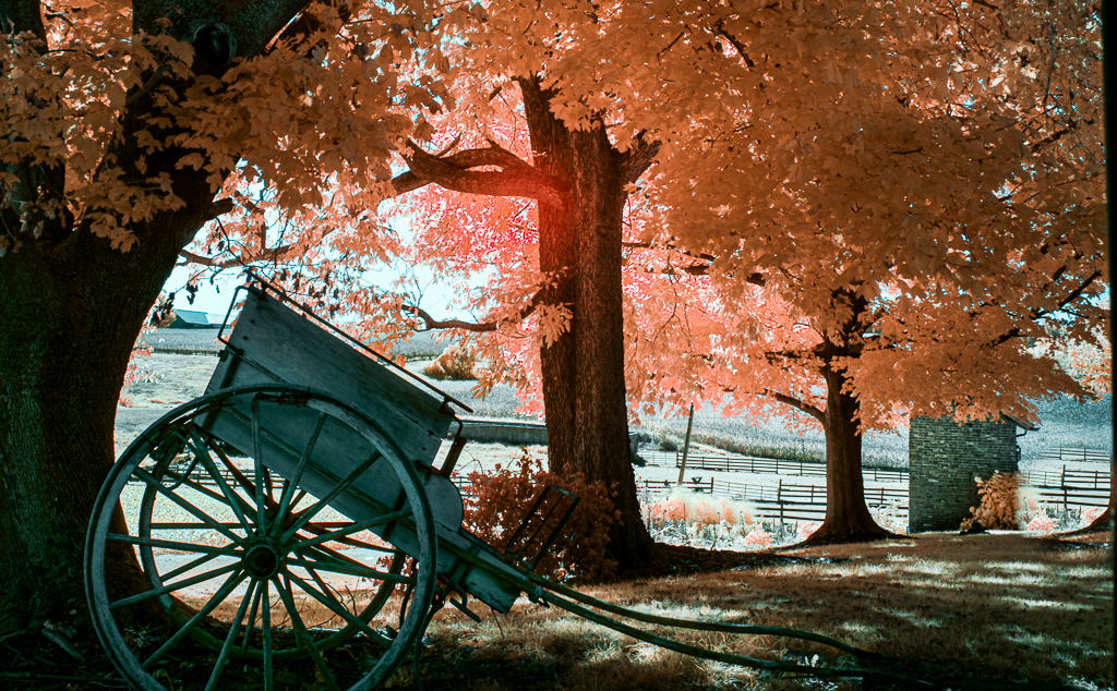
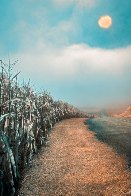
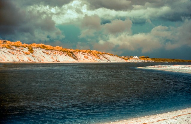
Another view here. I feel the inclusion of the road helps provide a sense of place, an establishing shot that leaves me with more of a sense of pulling off the road for safety due to fog. To me the lines provide added value to the image of wonderful atmosphere and mood. Shot from a nice perspective using leading line, diminishing perspective and the muted colors of fall to good use. |
Jan 31st |
1 comment - 0 replies for Group 3
|
| 18 |
Jan 21 |
Comment |
Love this whimsical filtered version of your Christmas Tree Mark! |
Jan 24th |
1 comment - 0 replies for Group 18
|
| 70 |
Jan 21 |
Reply |
Wow. Very interesting. |
Jan 30th |
| 70 |
Jan 21 |
Reply |
Thanks Todd. I like that idea. |
Jan 24th |
| 70 |
Jan 21 |
Comment |
Yes this really looks like a fun invigorating night to shoot! Good job!
Ditto above comments. The aurora is the dominant element; adjust the dome so it's not so equal but a supportive element that reinforces the visual weight of the aurora.
I see a color cast on foreground tree truck that IMHO can be de saturated. Also suggest further toning down of the areas of light on the grey entryway into the dome. |
Jan 22nd |
| 70 |
Jan 21 |
Comment |
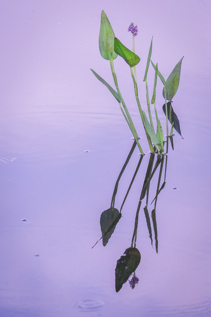
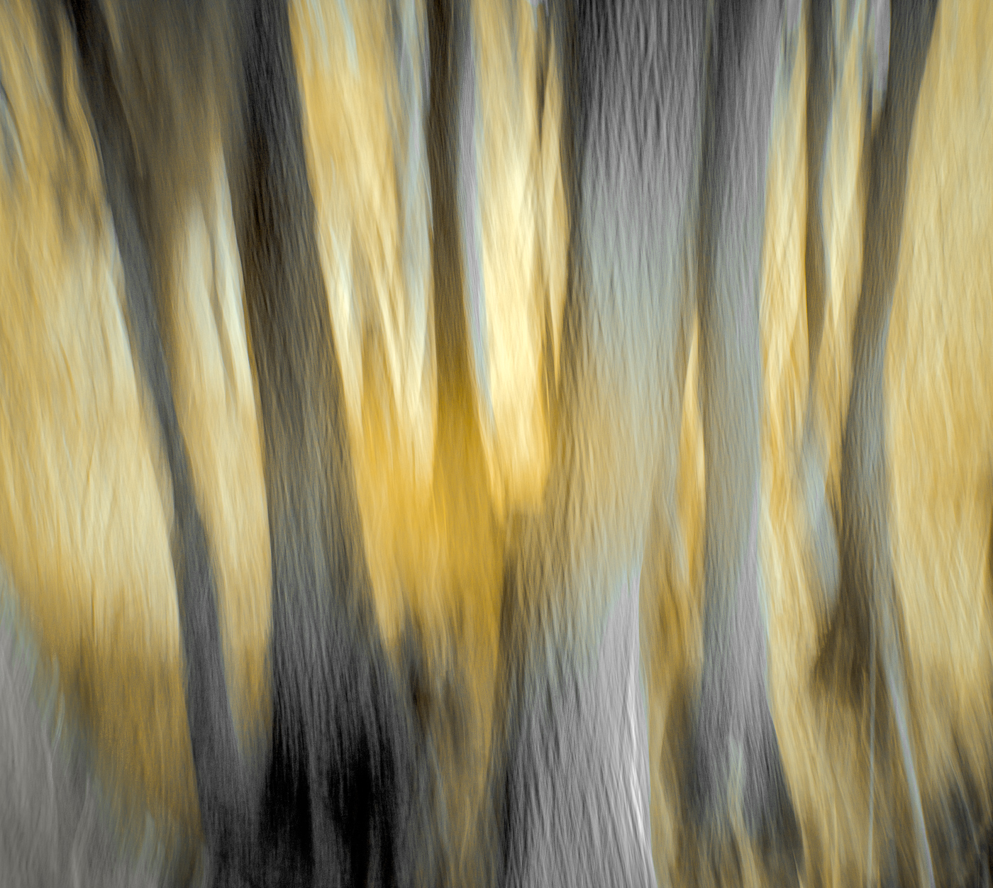
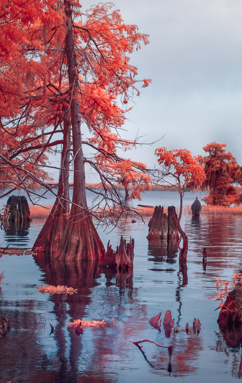
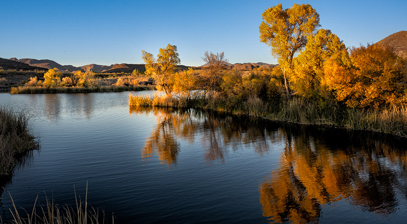
Am drawn to the implied line of 3 diminishing perspective golden tree groups and their reflections in the water. For another perspective, I cropped for simplicity and tried to strengthen the leading line and maintain focus on the trees while increasing color and tonal range. Like the estheteric peaceful mood. |
Jan 22nd |
 |
| 70 |
Jan 21 |
Reply |
Thanks Frans |
Jan 22nd |
| 70 |
Jan 21 |
Reply |
Thanks Kathryn |
Jan 22nd |
| 70 |
Jan 21 |
Reply |
Thanks Lamar. |
Jan 22nd |
| 70 |
Jan 21 |
Comment |
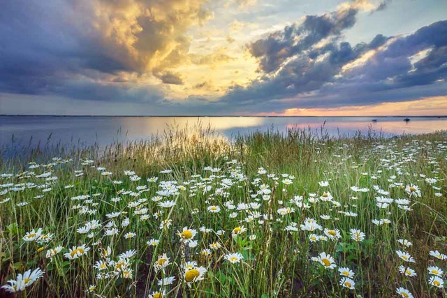
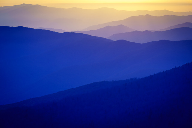
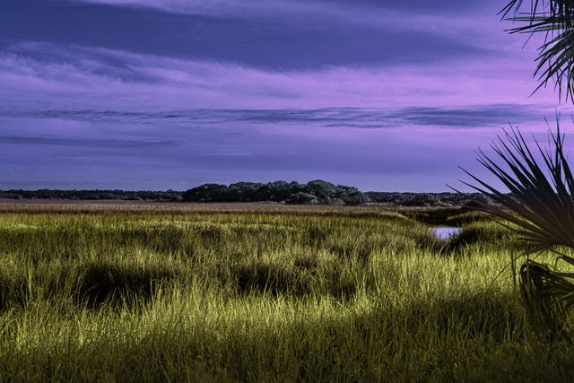
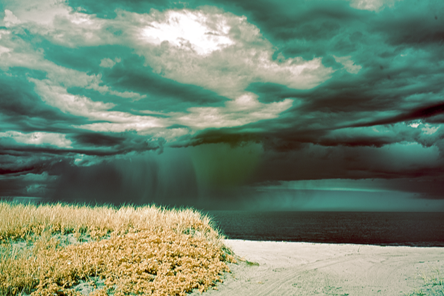
Magnificent grand landscape with an atmospheric mysterious dark and brooding mood. Gives me the viewer a sense of place, of being there, a part of the scene. Areas of dark detail that emerge in the shadows of the clouds and grasses enhance it. The illumination within the clouds juxtaposed beyond the flowers reinforces the mood and is the compositional hook for me. The dramatic color palette enhances the scene. Hope you print it! |
Jan 22nd |
| 70 |
Jan 21 |
Comment |
Your visual intention is well seen, captured, and executed here Todd. Good job! Lots of preconception, visualization, and conscious involvement enhanced this compelling image. You took nothing and turned it into something. You let go, took the risk, and designed a lovely lovely image.
The compositional hook for me is the fireworks and the colorful buildings. The warm twinkling lights of the background city lights with no distractions to draw me away. |
Jan 22nd |
| 70 |
Jan 21 |
Comment |
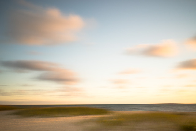
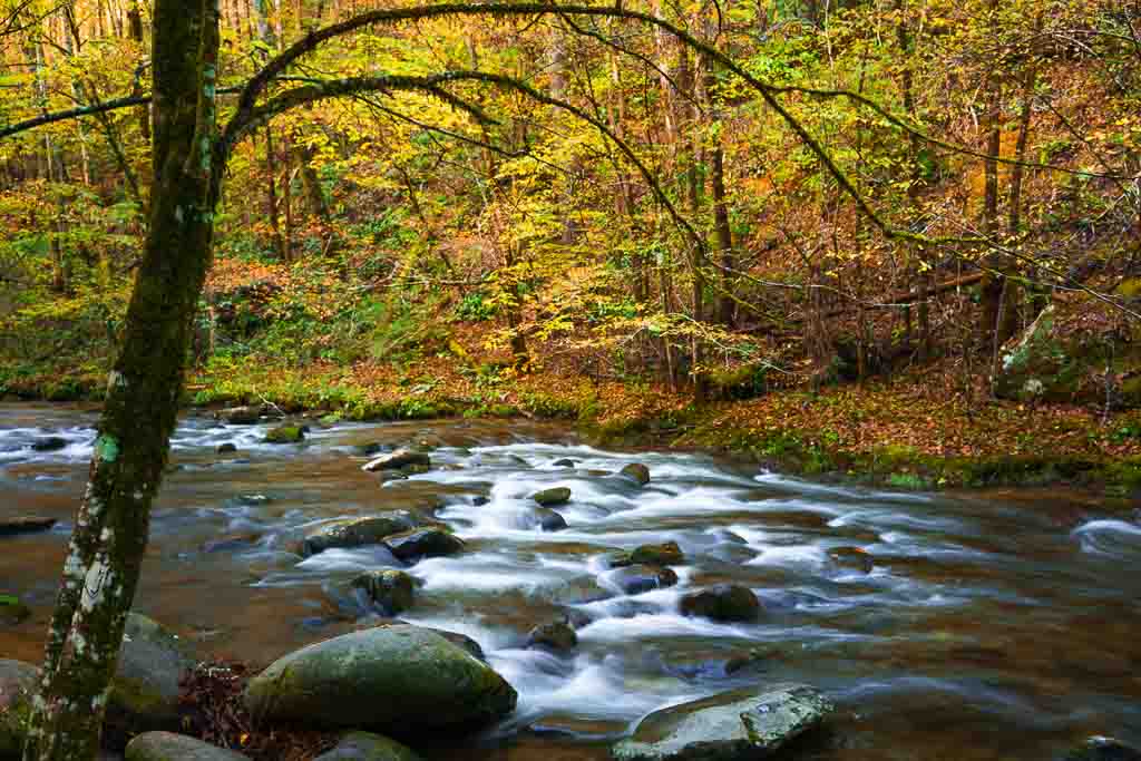
The compositional hook for me is the reflection and the gold foreground leaves still holding on as winter snows settle in. I prefer the crop that removes the misdirection of all the horizontal branches high above the wandering stream. Taken from a nice perspective showing leading line to water reflection and on back to fallen tree and the woods. Would try to soften and diminish presence of that tree to reduce its dominance over the repetitive soothing pattern of the forest beyond.
Said another way, as a landscape image is composed of a foreground, middle ground and background, use editing tools to help direct the viewers eye to the dominant subject in those areas and diminish drawing them to surrounding areas. |
Jan 22nd |
| 70 |
Jan 21 |
Comment |
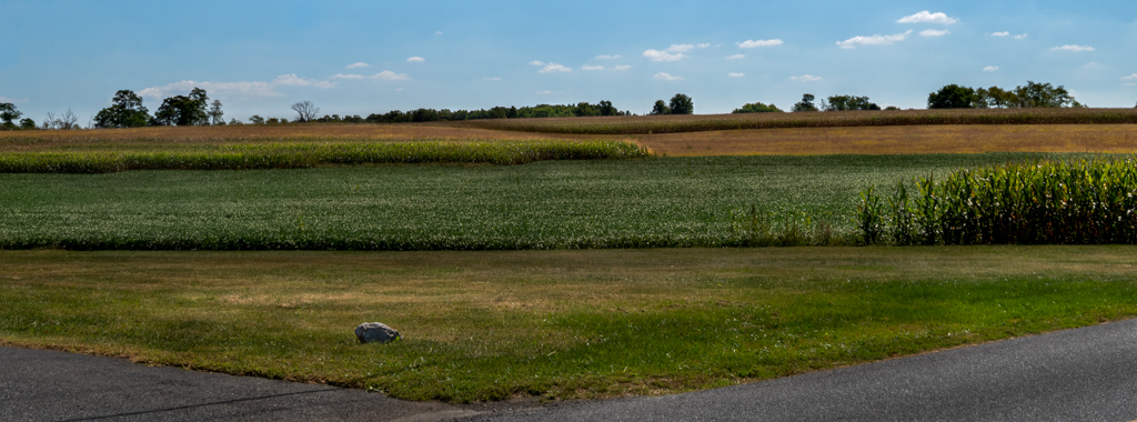
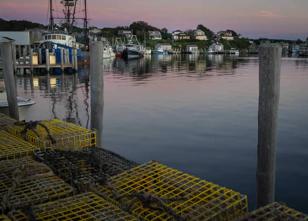
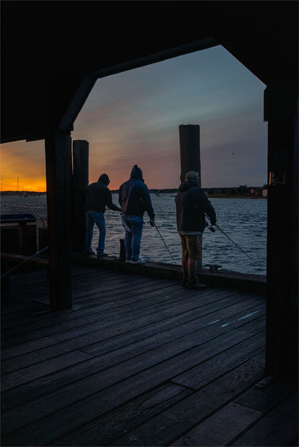
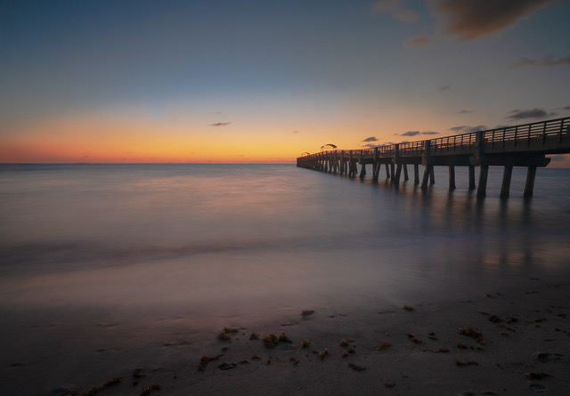
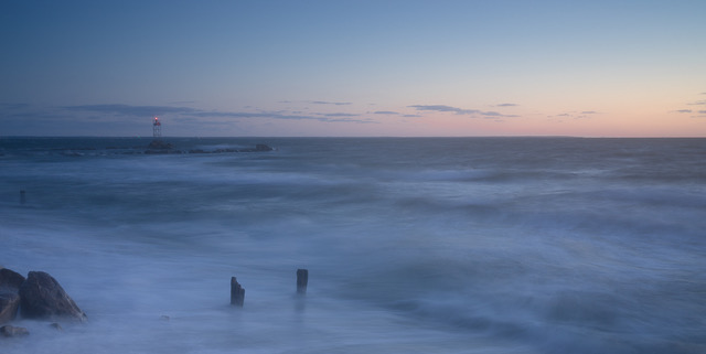
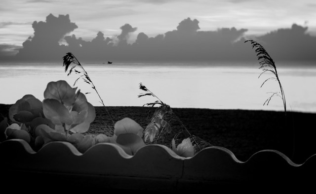
I see this as a graphical landscape image dominated by horizontal blocks. My eye is first drawn to the strong graphical horizontal elements and the red basket, then the other pier supports and finally the vertical pilings beyond that just touch the horizon. Pleasing color palette and calm seas and sky.
The cement elements are in a diminishing perspective arrangement and should serve to guide my eye to travel back into the image, thus providing depth. But to me the first element seems to block my eye travel as I am stopped by the red basket next to it and ping pong back and forth from barrier to basket. Red is such a strong dominant attention getting color in photography. And while exploring what the red basket is about, I then want to understand and make order of the pile of stuff next to the basket.
This first block is bright, light, sharp, full of detail and texture and draws my eye, stopping my exploration beyond. It also seems somewhat separated and disassociated from the further grouping of three; perhaps effect of wide angle lens' slightly enlarging foreground objects. I do like Kathryn's flip so image reads left to right. Perhaps by adjusting light, color and tone its dominance can be reduced.
The centrally located horizon gives equal value above and below it; I believe the scene below is more important and impactful and would suggest considering cropping some sky to rebalance.
|
Jan 19th |
| 70 |
Jan 21 |
Reply |
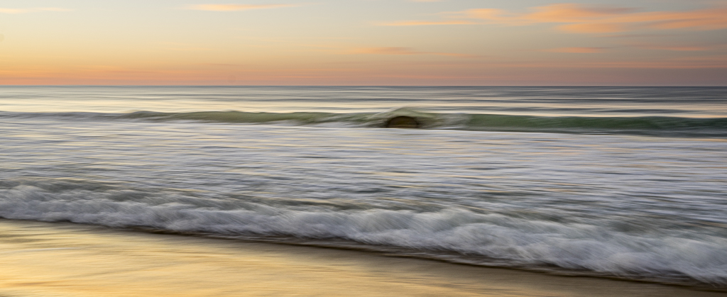
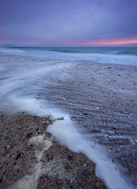
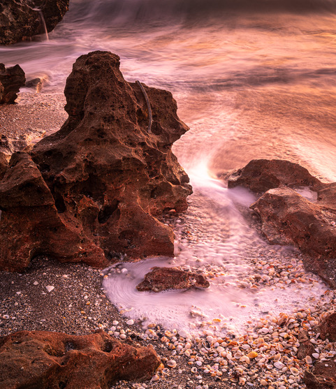
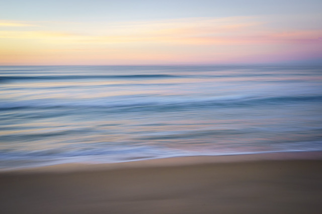
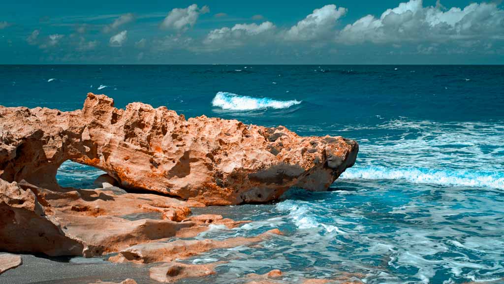
Hi Pierre,
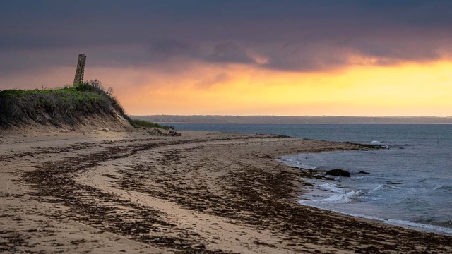
I took this image with camera on tripod. After some long exposure images, I then loosened the mount slightly and moved the camera in line with the wave flow; sort of a diagonal downward left to right motion. I used various exposure times and chose this one for the show of motion in the shore break wave as well as the wet golden sheen on the beach. |
Jan 19th |
6 comments - 6 replies for Group 70
|
| 91 |
Jan 21 |
Reply |
Love your tweeks Henry! That big bland leaf in upper R has been bothering me since posting in group! Glad you took care of it! You've helped it pop. Thanks. |
Jan 31st |
| 91 |
Jan 21 |
Reply |
Thanks Gary for helpful comment. Will see if there's any more detail to be found on the image edges; perhaps there's some 16mm lens distortion. |
Jan 31st |
| 91 |
Jan 21 |
Reply |
Great suggestion to work on some smaller aspects of image. Will try that. |
Jan 31st |
| 91 |
Jan 21 |
Comment |
Like the impact of such a large grouping of tulips. Initially I wasn't aware of the darker tulips but they later emerged. I think I prefer Gary's crop and darker background; I see all the flowers in greater detail. Nice low perspective with sharp focus throughout. Well developed. |
Jan 31st |
| 91 |
Jan 21 |
Comment |
Am drawn to the radiating repetitive pattern of the leaves as they emerge out of the center of the plant and feel a softer vignette would enhance them more. Well done. |
Jan 31st |
| 91 |
Jan 21 |
Comment |
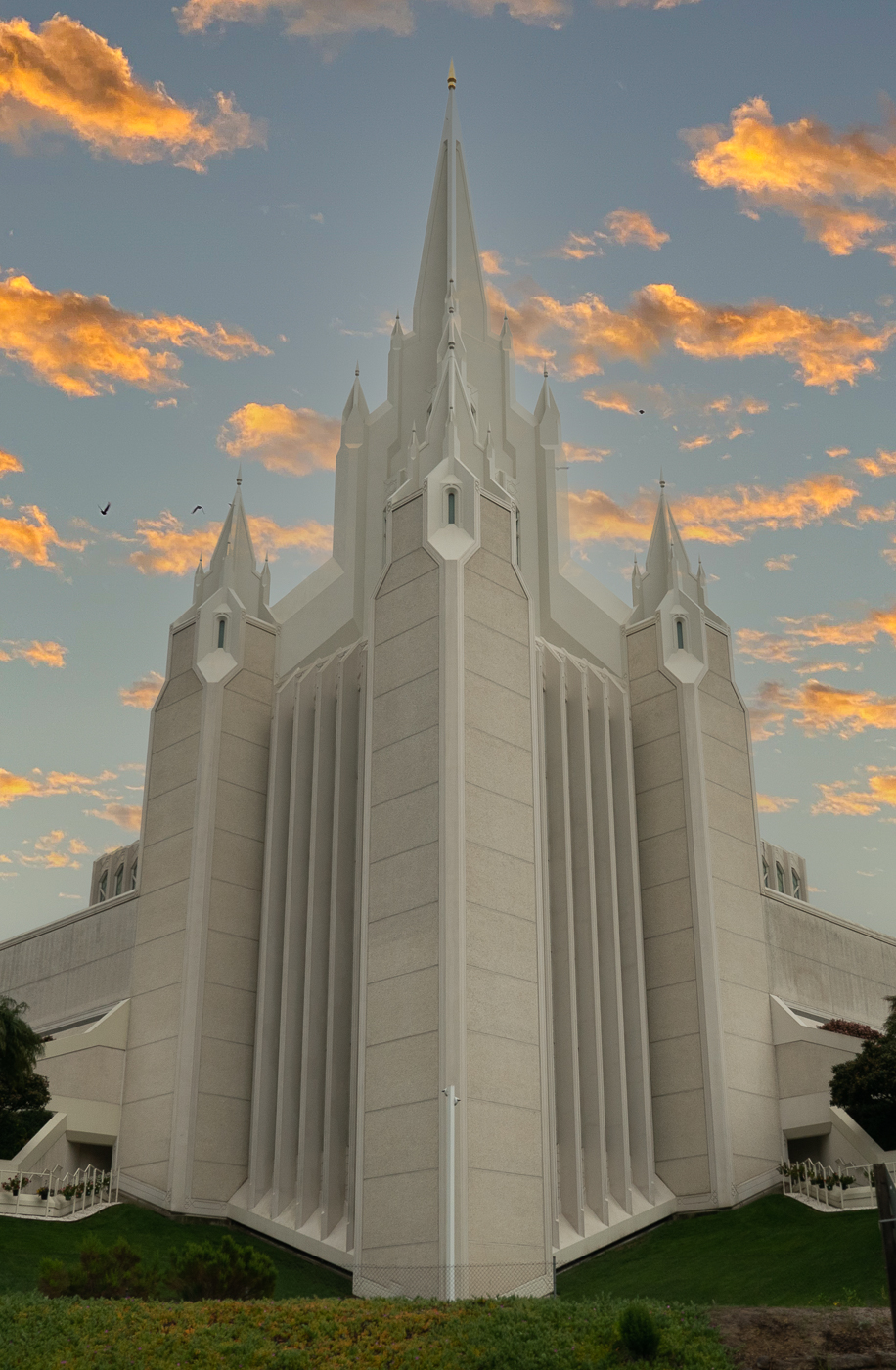
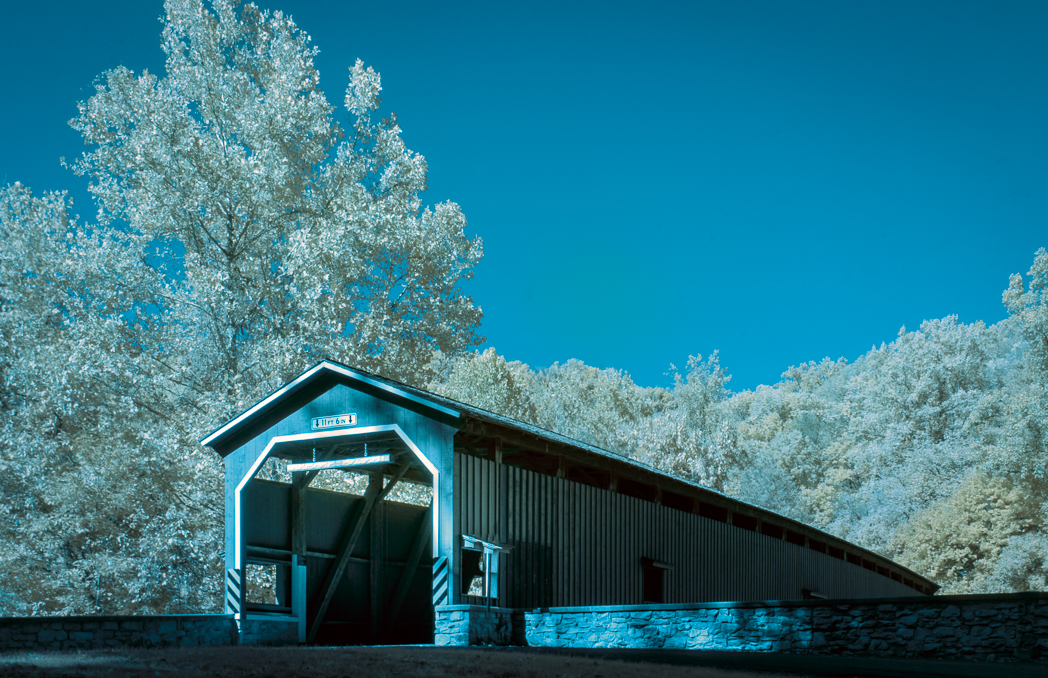
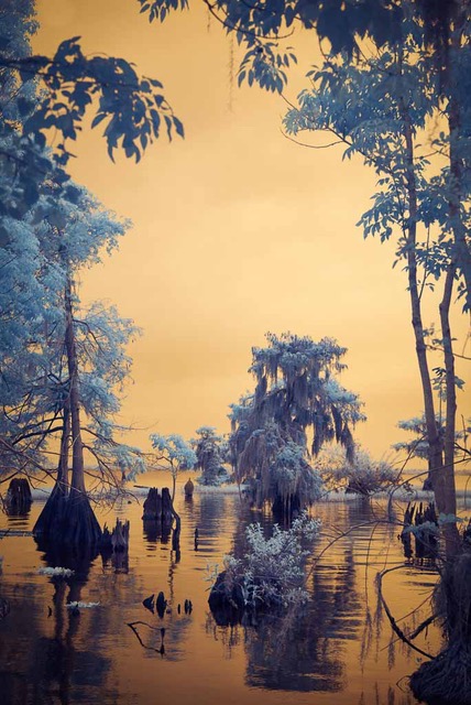
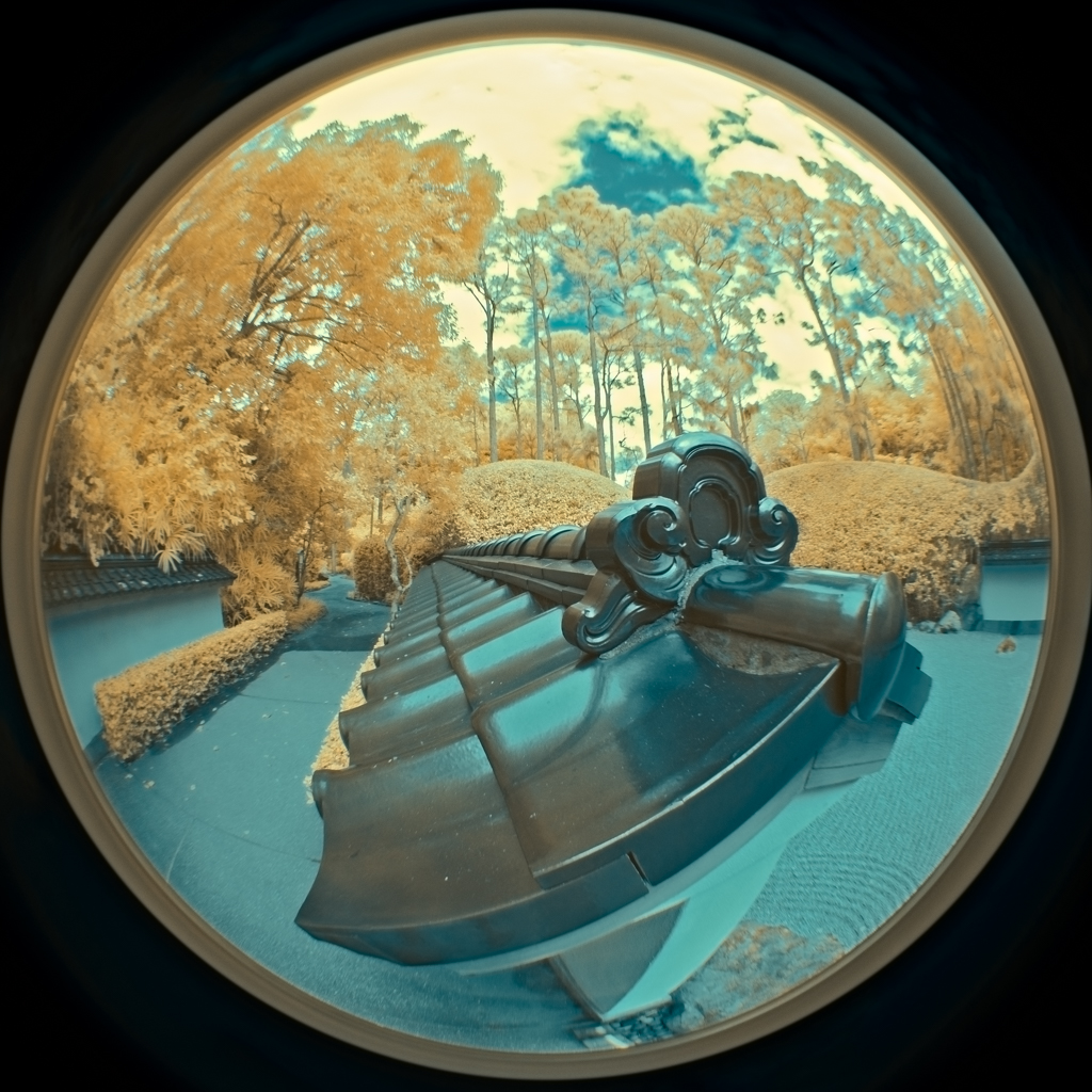
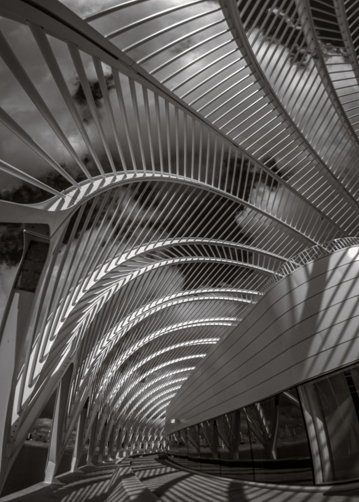
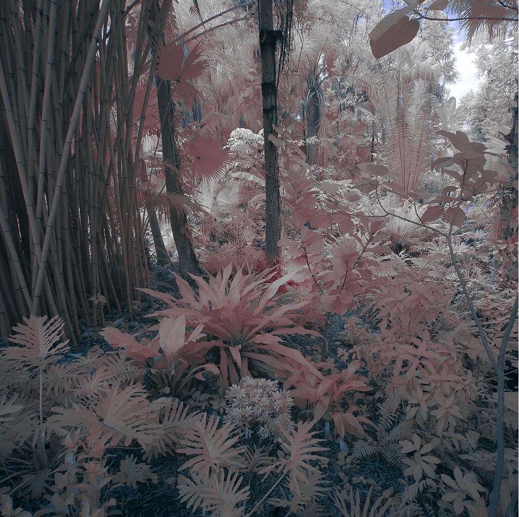
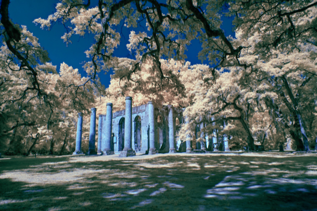
This Architectural genre image has nice diminishing perspective elements drawing me back into it as well as lots of interesting details to study and hold my interest. Like the IR effect on the gold foliage and building details and the color contrast with the deep blue sky. IMHO the green IR effect on the color of the walkway doesn't add value. Lisa's adjustments work for me as well.
|
Jan 31st |
| 91 |
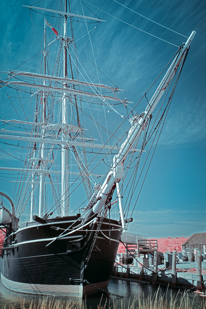
Jan 21 |
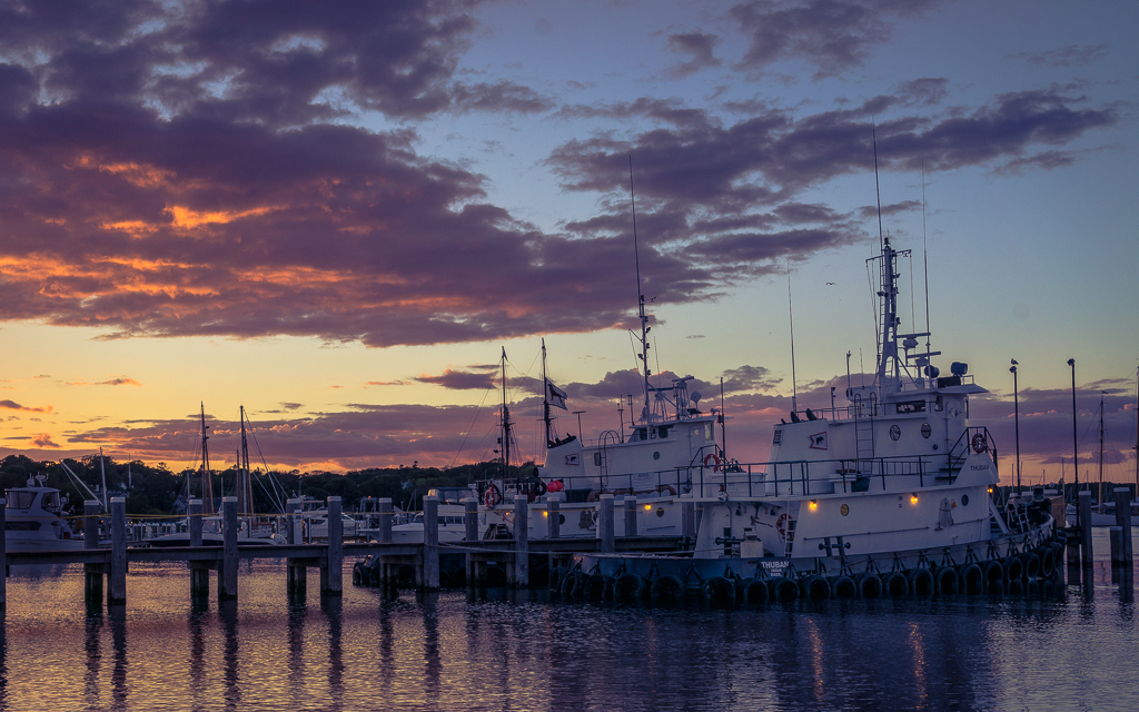
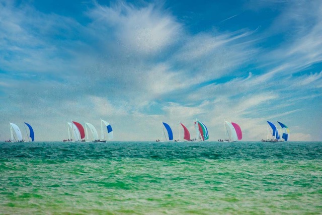
Comment |
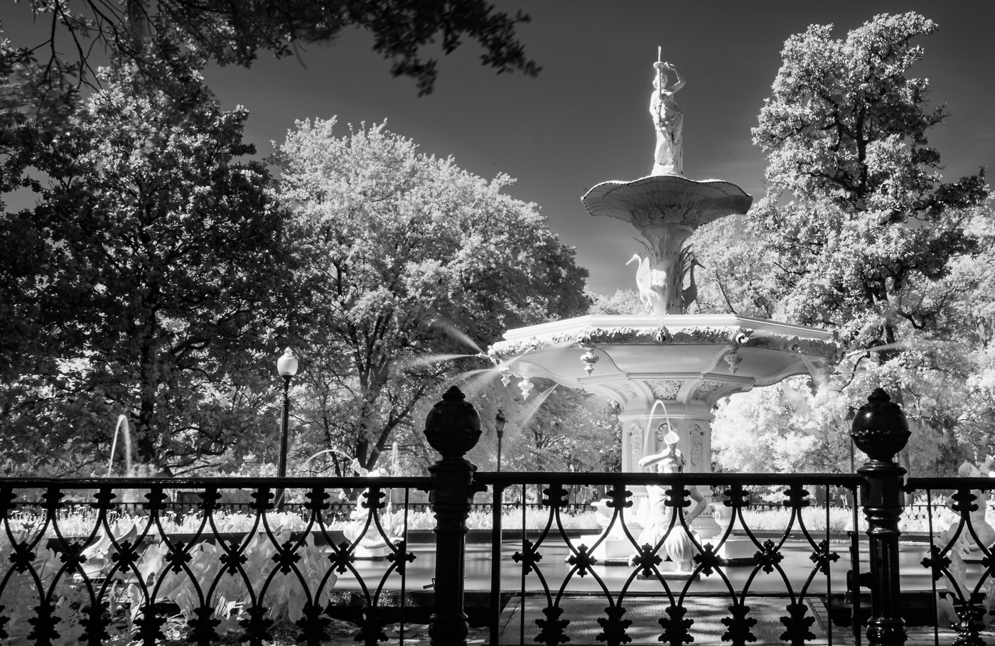
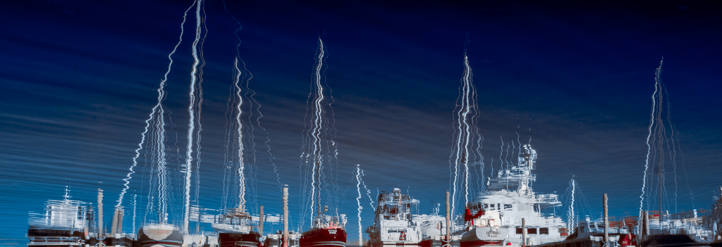
I like your composition; balanced with all the boats radiating out towards you. Agree with slight crop off the bottom on a pano ratio. IMHO would consider slight toning down of foliage, especially on left side of image. Nicely captured and processed. |
Jan 31st |
4 comments - 3 replies for Group 91
|
12 comments - 9 replies Total
|