|
| Group |
Round |
C/R |
Comment |
Date |
Image |
| 70 |
Nov 20 |
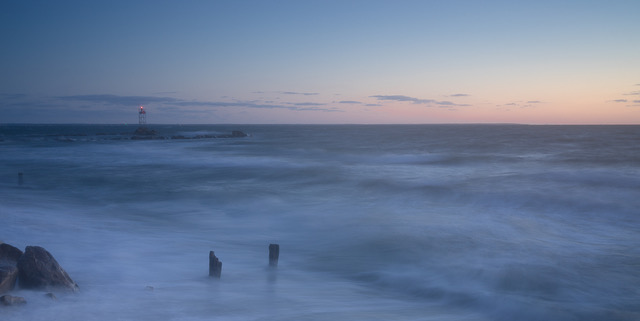
Reply |
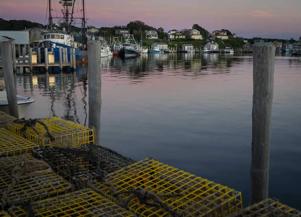
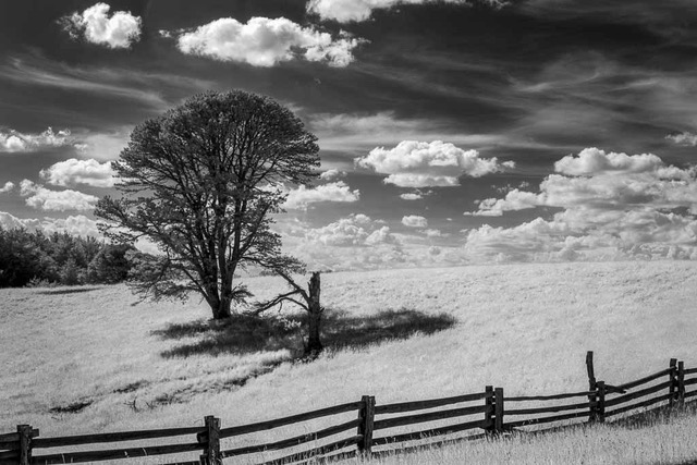
Nice version Frans. The negative space without the pole seems to add impact. I had thought it needed the third pole to keep some rhythm. |
Nov 27th |
| 70 |
Nov 20 |
Comment |
Ditto above comments. Like the pop in texture & color palette seen in San's version. |
Nov 27th |
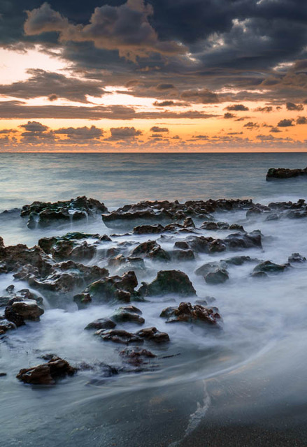
| 70 |
Nov 20 |
Comment |
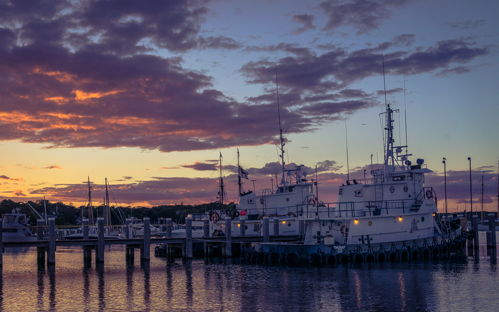
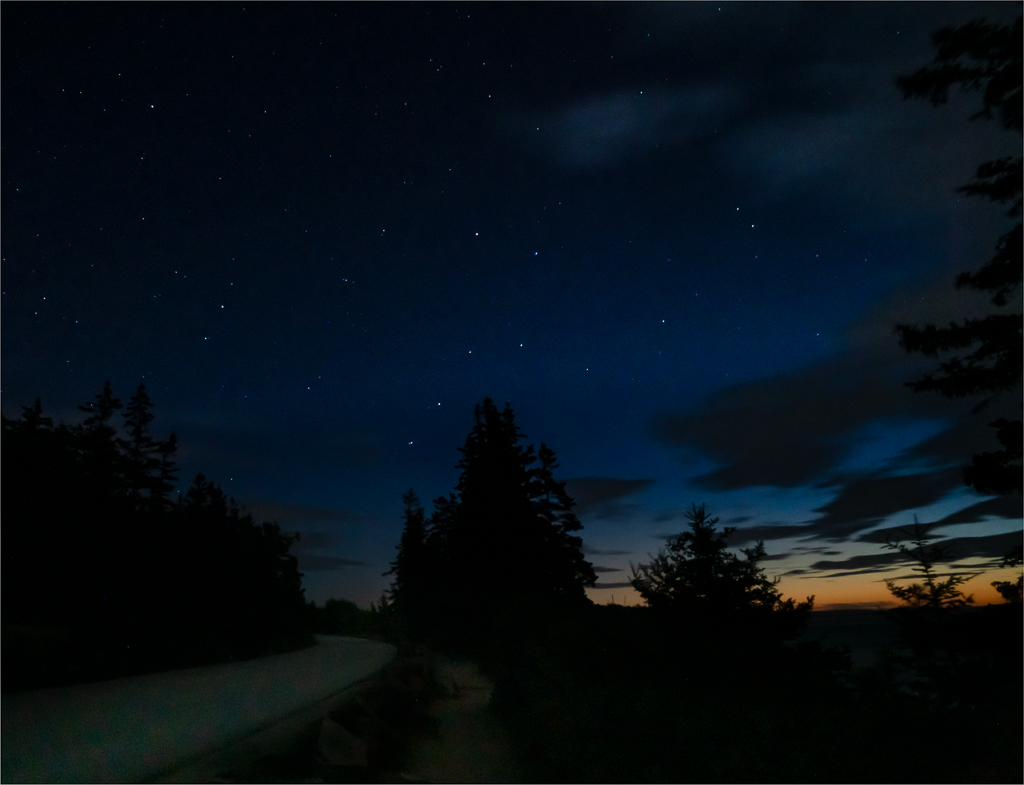
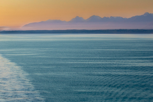
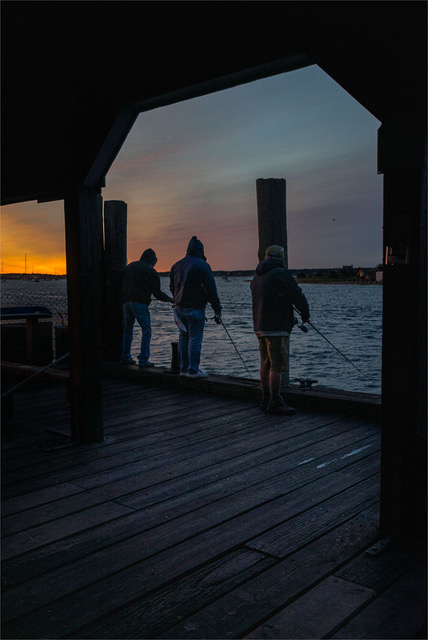
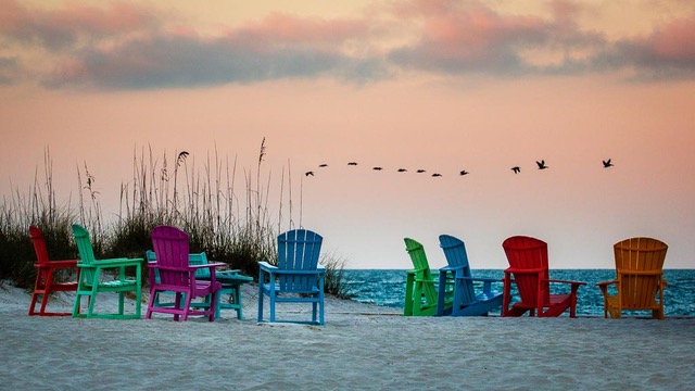
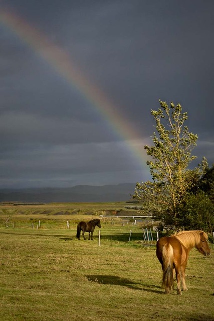
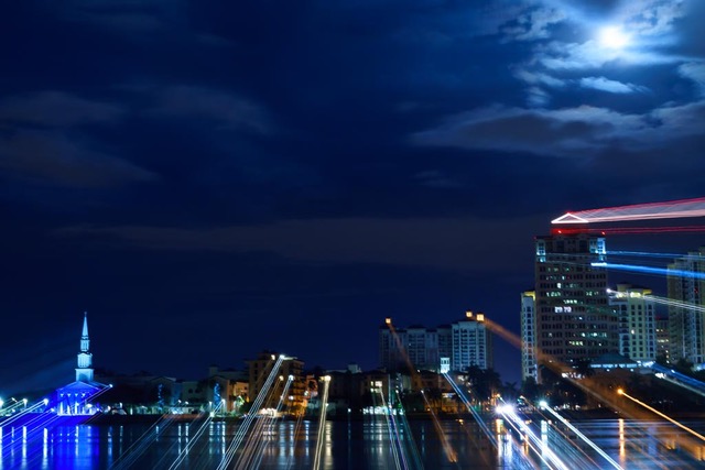
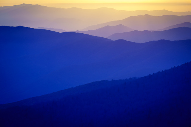
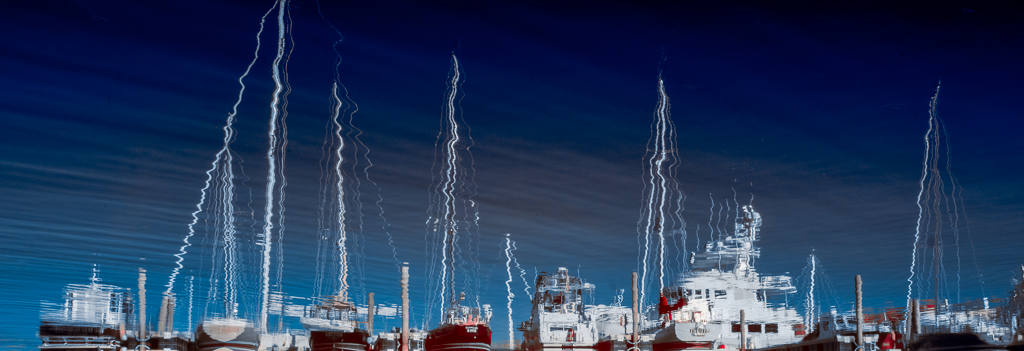
Nice consideration Todd. This Blue Hour image to me seems to have more impact, movement and action. |
Nov 27th |
| 70 |
Nov 20 |
Comment |
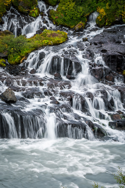
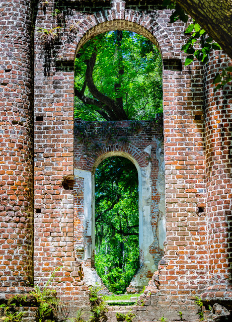
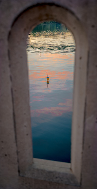
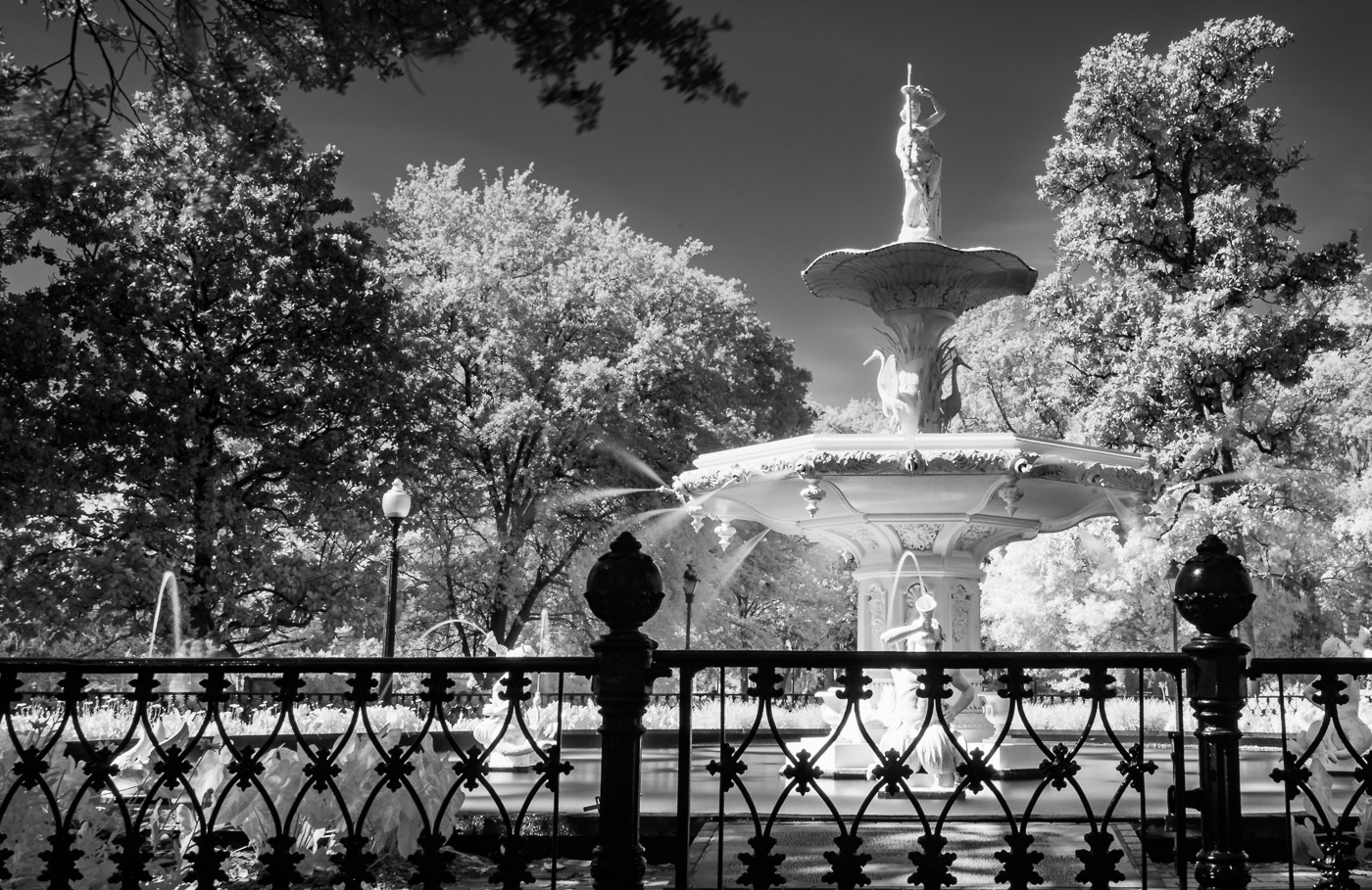
Enjoyed learning how you achieved this marvelous result; a lot of effort well rewarded. Just lovely. Nicely framed composition, well balanced, great sense of depth and separation between layers, no unwanted elements to remove, pleasing color palette. |
Nov 27th |
| 70 |
Nov 20 |
Reply |
Really enjoyed your Adobe Color effects on this image Todd. You created a nice pop! |
Nov 27th |
| 70 |
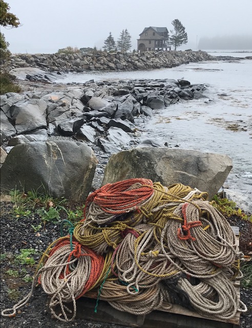
Nov 20 |
Comment |
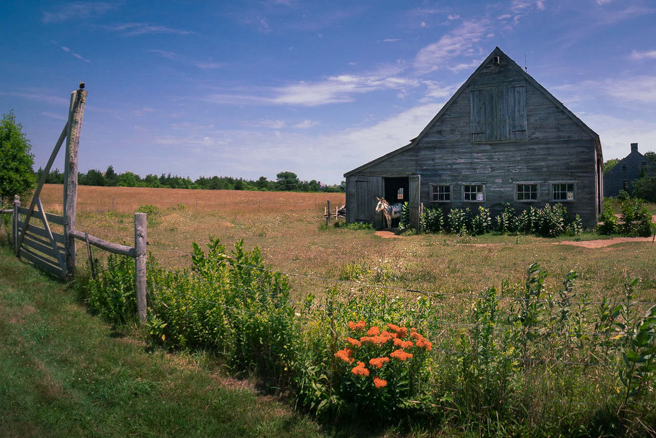
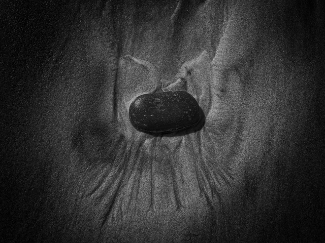
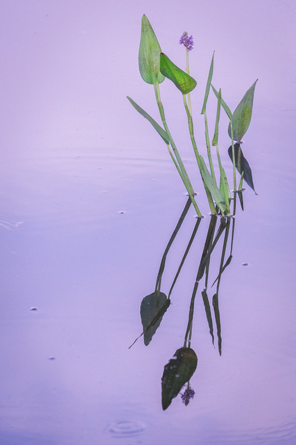
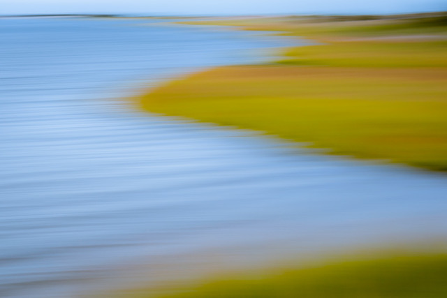
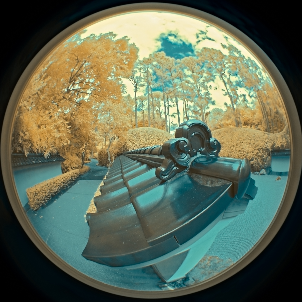
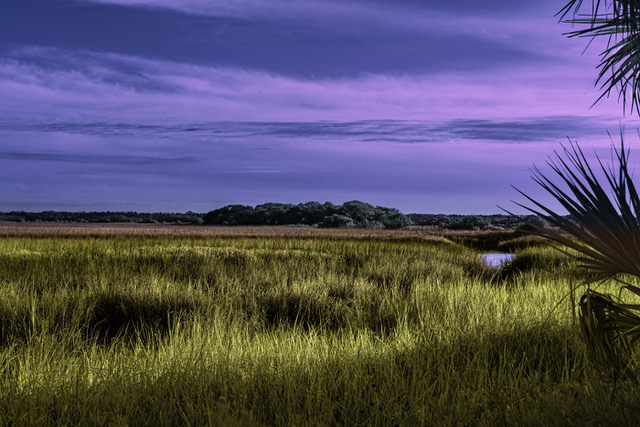
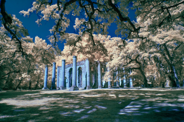
Unique and pleasing perspective. I think however I would prefer seeing grass islands that don't exit the frame.
Another artist to explore on instagram: calebkenna.
|
Nov 27th |
| 70 |
Nov 20 |
Comment |
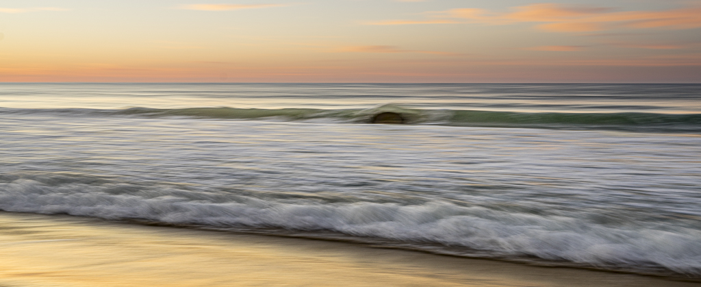
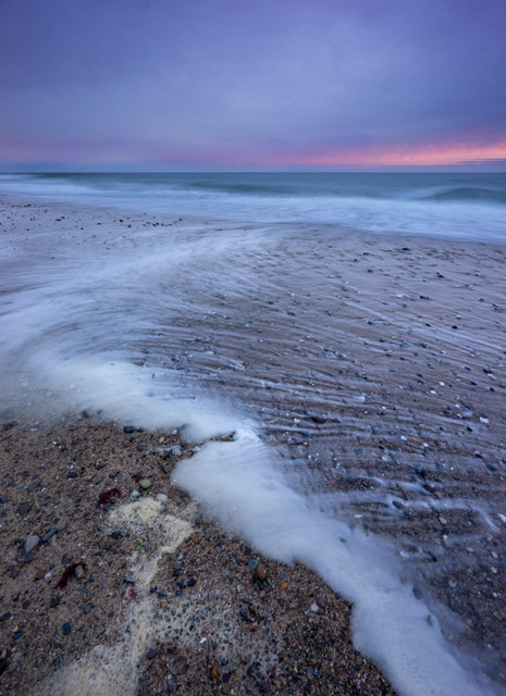
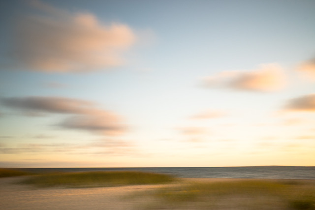
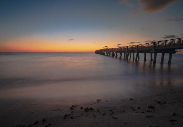
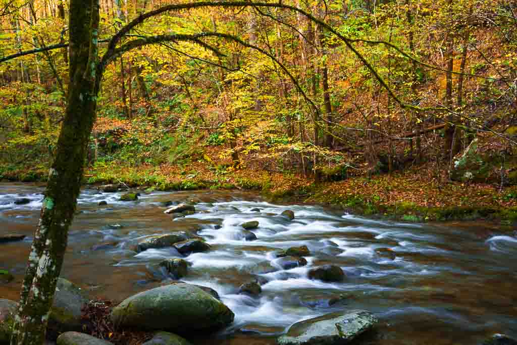
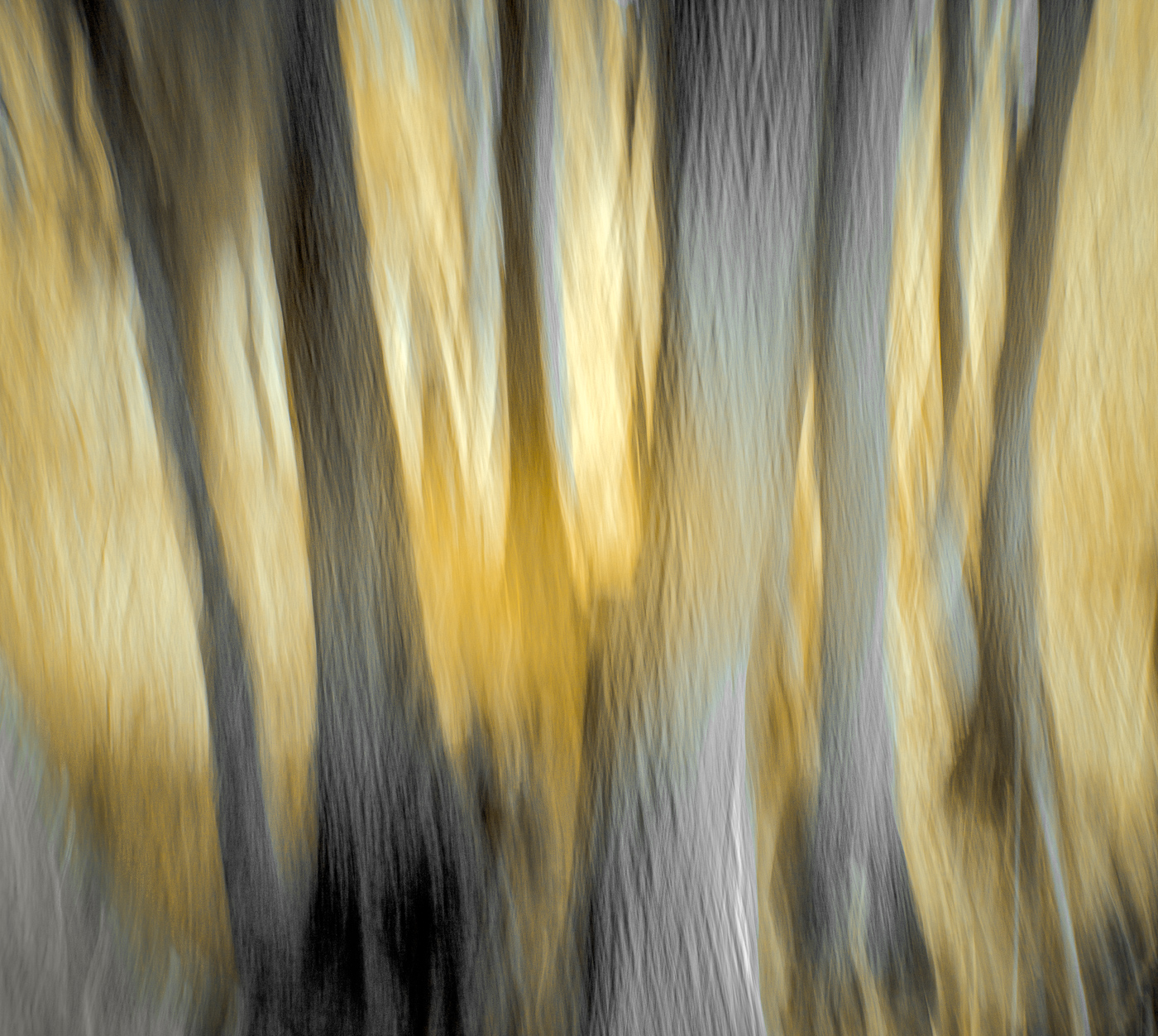
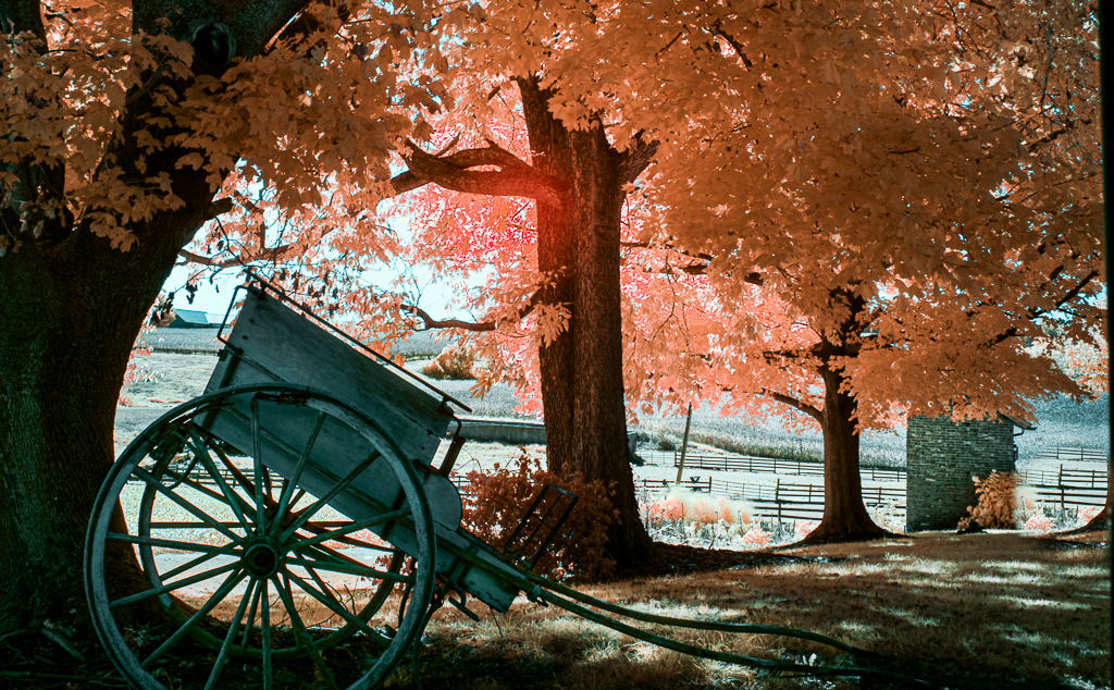
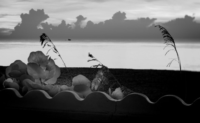
Crisp and clear with the kiss of golden light on the clouds, treetops and grasses. I'm drawn to the layering of tones throughout as you travel from foreground to background and wonder if without a foreground object the contrast in the light, color, tone, textures can be increased to create more depth and interest? Lovely color palette and mood. |
Nov 11th |
| 70 |
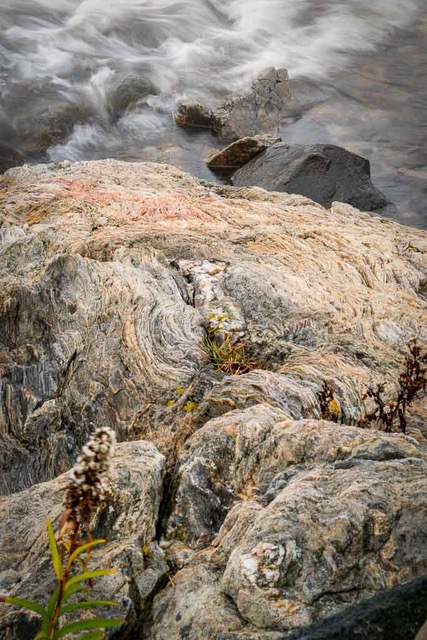
Nov 20 |
Comment |
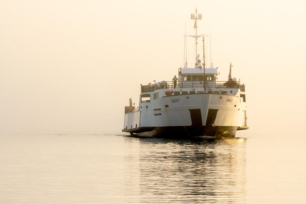
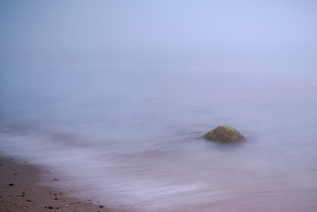
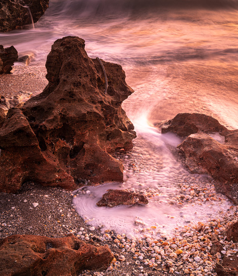
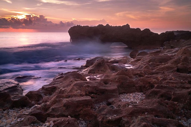
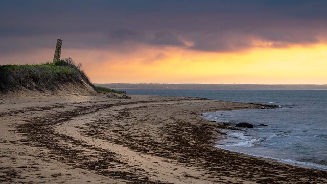
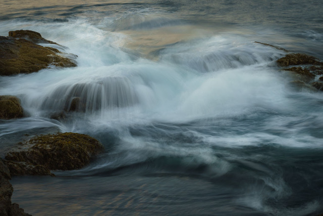
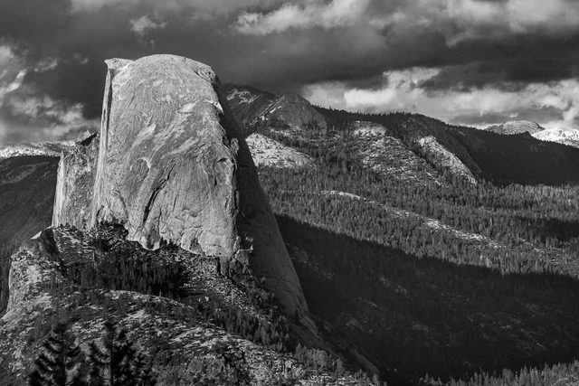
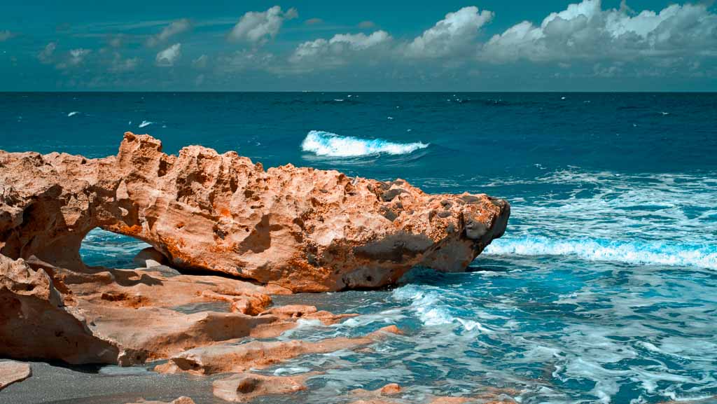
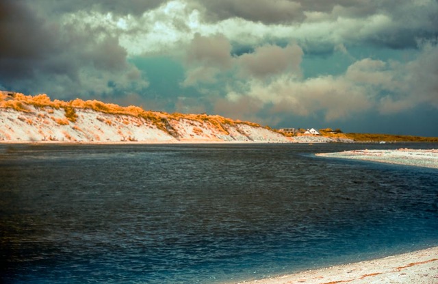
This bit of glacier remained stationary for you and dominates the image. Might there be more blue to coax out of it? The incoming wave is the supporting element that creates the diagonal lines, encircles the bergy bit, and brings energy and dynamism to the scene. The repeating patterns of wave tracks and variations in their tones enhance the visual flow. There is an orderliness to the scene which draws our eye as we study the contrasts in lines, tones, colors, light. Combined with the sky and color palette an atmosphere of peace and calm prevails. Well done. No one said it would be easy; something worth having is worth the effort. |
Nov 11th |
| 70 |
Nov 20 |
Comment |
Wow Frans who knew where a comment would take you. I think you would enjoy John Paul Caponnigro's work.
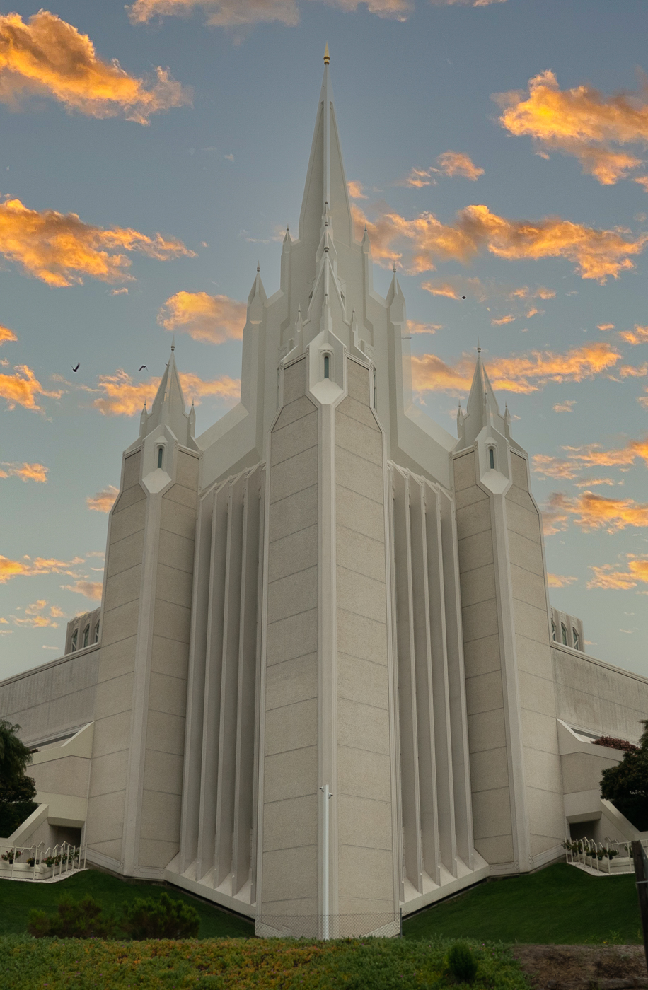
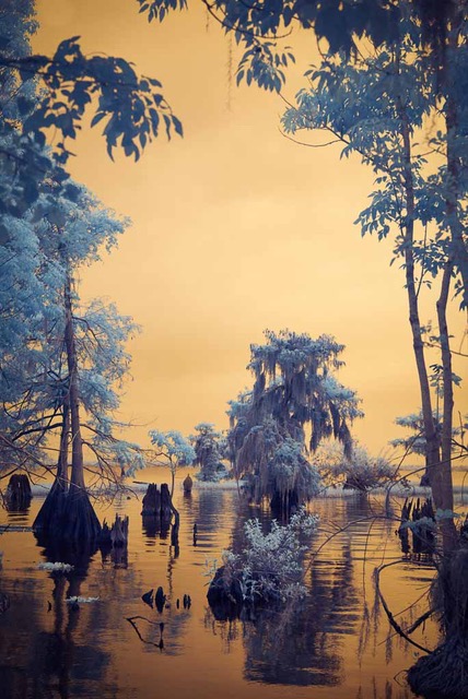
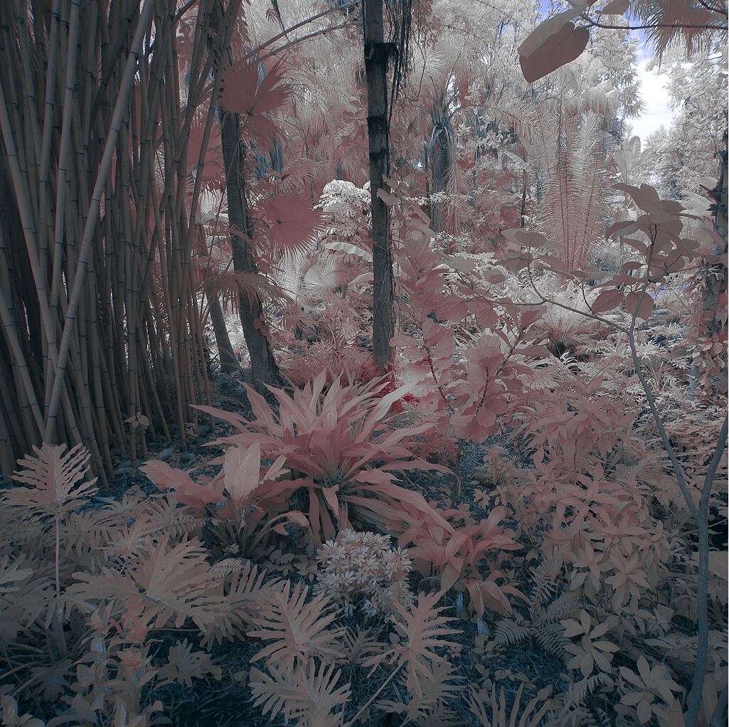
Lines and shapes are important elements of composition and in this image I see triangles, the strongest of shapes, everywhere: the sky reflection in the foreground, a group of underwater logs, the primary mountain, the sky above. They all support the dominant mountain and take you to it and the colorful foliage. The color palette is strong and so well saturated it keeps me in place exploring, rather than wandering beyond to the distal mountains. I keep studying what's underwater and how all the trees seem to glow with color. It's the juxtaposition of this color next to the steep severe rugged mountains that is the compositional hook for me.
|
Nov 11th |
7 comments - 2 replies for Group 70
|
| 91 |
Nov 20 |
Comment |
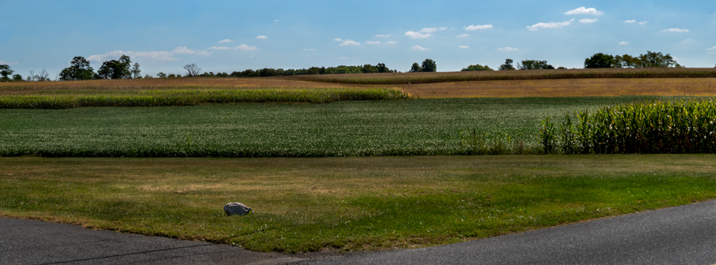
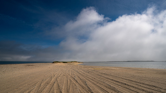
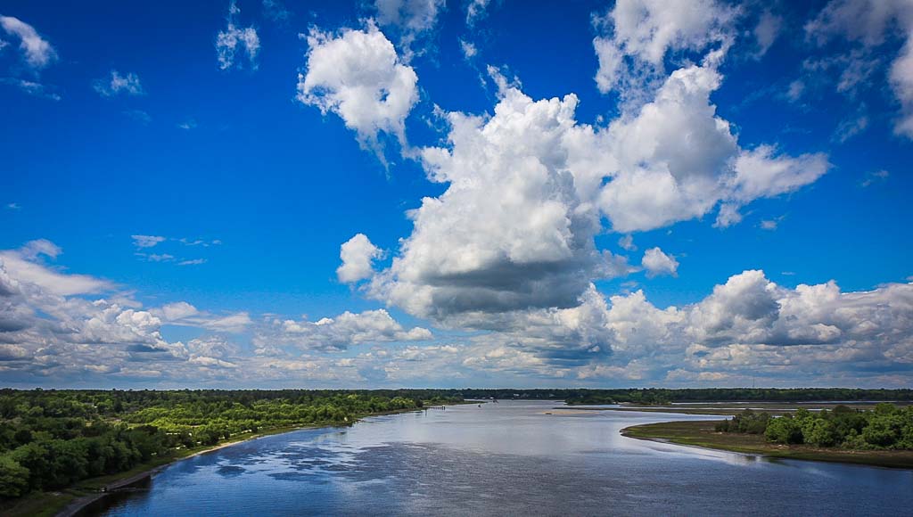
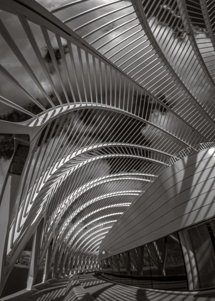
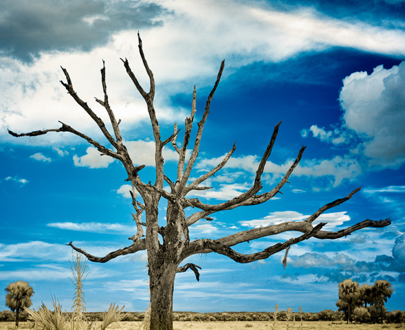
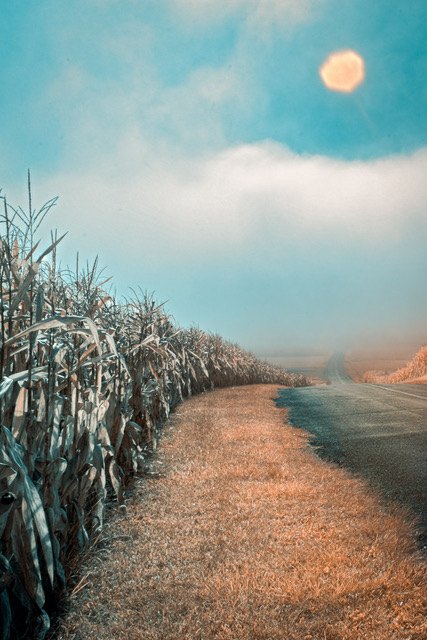
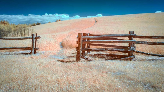
The strong diagonal graphic elements fill the frame well. Repeated elements bring order and definition juxtaposed against the blue sky. The tonal range of the grasses seems limited however making it a bit flat while the perspective you shot from is quite nice. |
Nov 26th |
| 91 |
Nov 20 |
Comment |
Ditto comments made above. Also enjoy how the color of his hat and her hair support the color of the leaves. Nice color palette. |
Nov 26th |
2 comments - 0 replies for Group 91
|
9 comments - 2 replies Total
|