|
| Group |
Round |
C/R |
Comment |
Date |
Image |
| 70 |
Nov 19 |
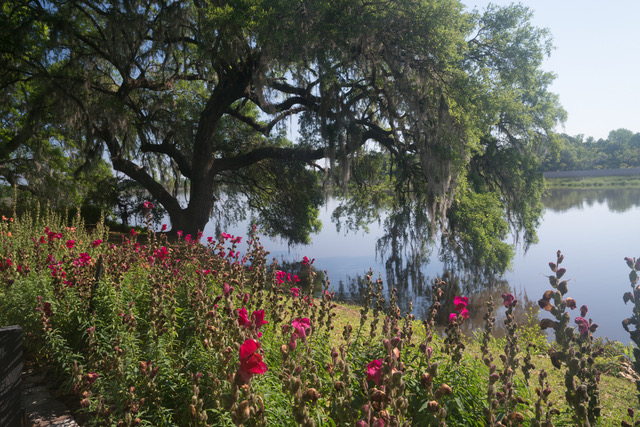
Comment |
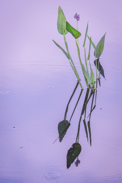
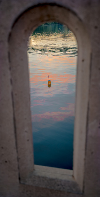
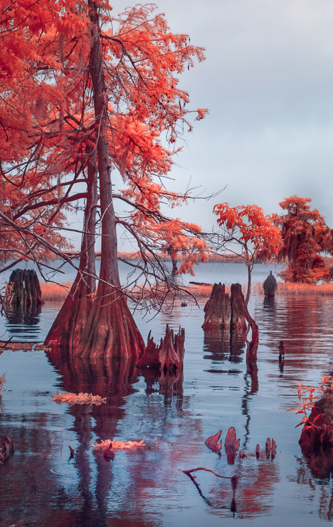
I love that you made an intimate landscape out of the grand image in the style of Eliot Porter. I like this redirection to the water color and the contour, tones, textures of the pond edges. Lack of scale helps make it work I think. |
Nov 29th |
| 70 |
Nov 19 |
Reply |
Thanks Lamar. Actually I have gone ahead and printed it and enjoy it hanging in the Dining Room! |
Nov 29th |
| 70 |
Nov 19 |
Reply |
Thank you so much for the kind comments Frans. |
Nov 29th |
| 70 |
Nov 19 |
Comment |
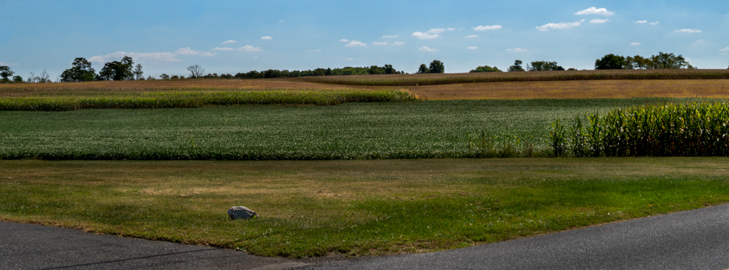
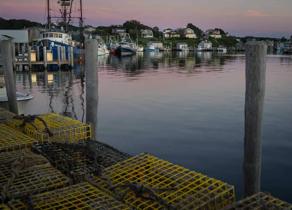
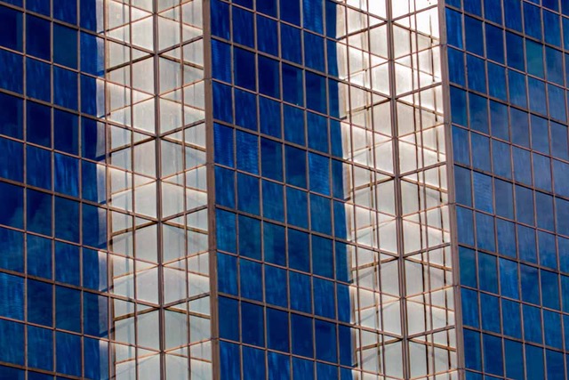
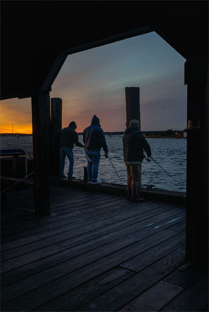
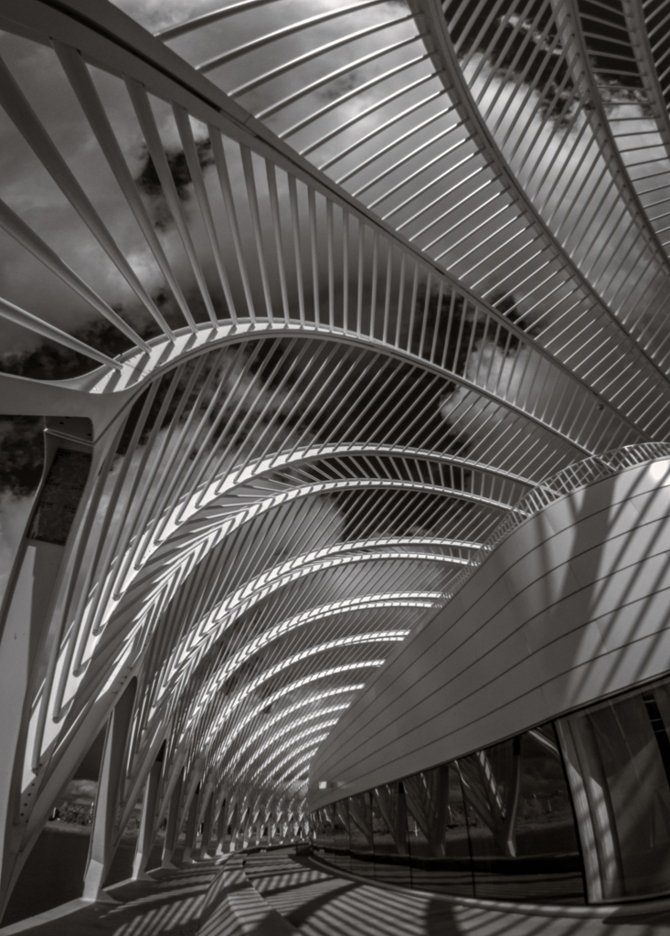
I like your lens choice for the compression it gives to the scene and the diminishing perspective of all the rectangular shapes vanishing off into the distance. Simple tones in single color very effective. |
Nov 29th |
| 70 |
Nov 19 |
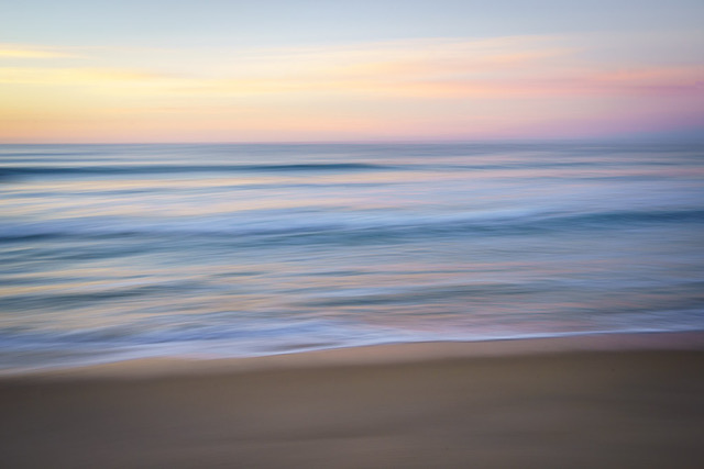
Comment |
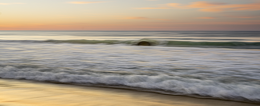
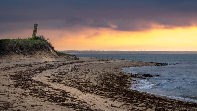
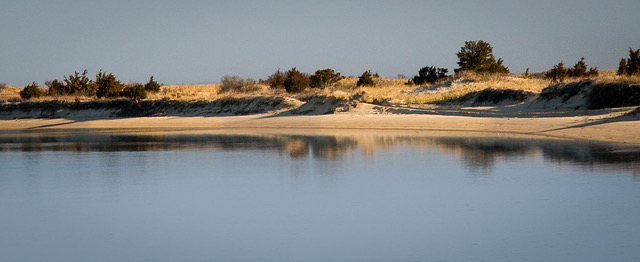
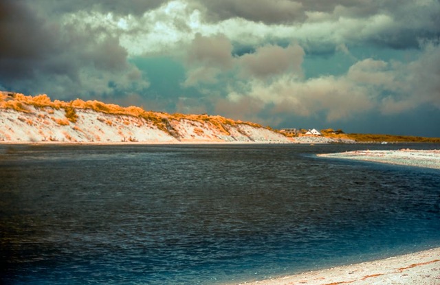
A find this a very inviting landscape with a mood that urges me to stay a while. Its lovely warm color palette even extends up the sand dune. I really like where you placed the palms entering the right edge of the image and where & how they interact with the horizon and distant landforms. Peaceful, calm, relaxing, timeless scene.
The palms begin the movement of my eye as leading lines reaching for the sun. Following the sun rays leads me back to the beach. That works well with the parallel diagonals of the placid waves, the almost untracked beach, and the toe of the dune going the other way diagonally through the scene. The dune itself provides a nice triangle while reflecting back the morning light and helps anchor you. Something about the undulations of the distant hills, their dark tones against the sky, their being partially hidden by the palms and the darker sea that is very intriguing and keeps drawing me back to study them further. They're darker and cooler and more mysterious adding some tension to the scene which I believe helps balance out all the tropical warmth.
For improvement all I can offer is to explore whether the sun rays across the water would benefit from some tweeking of its saturation, highlights, color temp with an adjustment brush.
You've created nice movement for my eye to wander. Wonderful color, light, mood and composition.
|
Nov 7th |
| 70 |
Nov 19 |
Comment |
PS. Love the golden glow of the burners under the balloon! |
Nov 7th |
| 70 |
Nov 19 |
Comment |
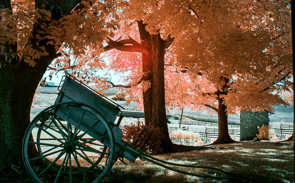
When I view this brightly colored balloon in peak fall foliage splendor I just go Wow! Definitely an image with impact. And you caught it perfectly placed dead center under the bridge arch without allowing it to merge into it or the colorful trees below! Good shutter work. You caught the Moment.
Two images here for sure as below the balloon is a large waterfall with mist blowing up the hillside and layers and layers of striated rock cliffs framed nicely with golden leaves. The balloon is almost in the center of a circle formed by the bridge arch and sloping gorge walls down to the top of the falls. Then your eye follows the falls down through the river pool below. The effect of your choice of shutter speed on the falls is pleasing.
So you've got Gesture and Color and cloudy Light - at least it's not blowing out bright highlights off the wet surfaces everywhere. The foreground leaves seem to be backlit nicely.
The only thing I can think to offer to improve the image might be sky replacement and/or burning/dodging the foliage and rocks to enhance a sense of depth.
|
Nov 7th |
| 70 |
Nov 19 |
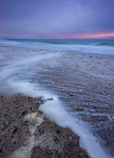
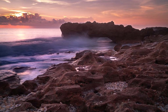
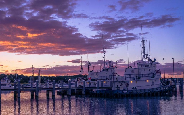
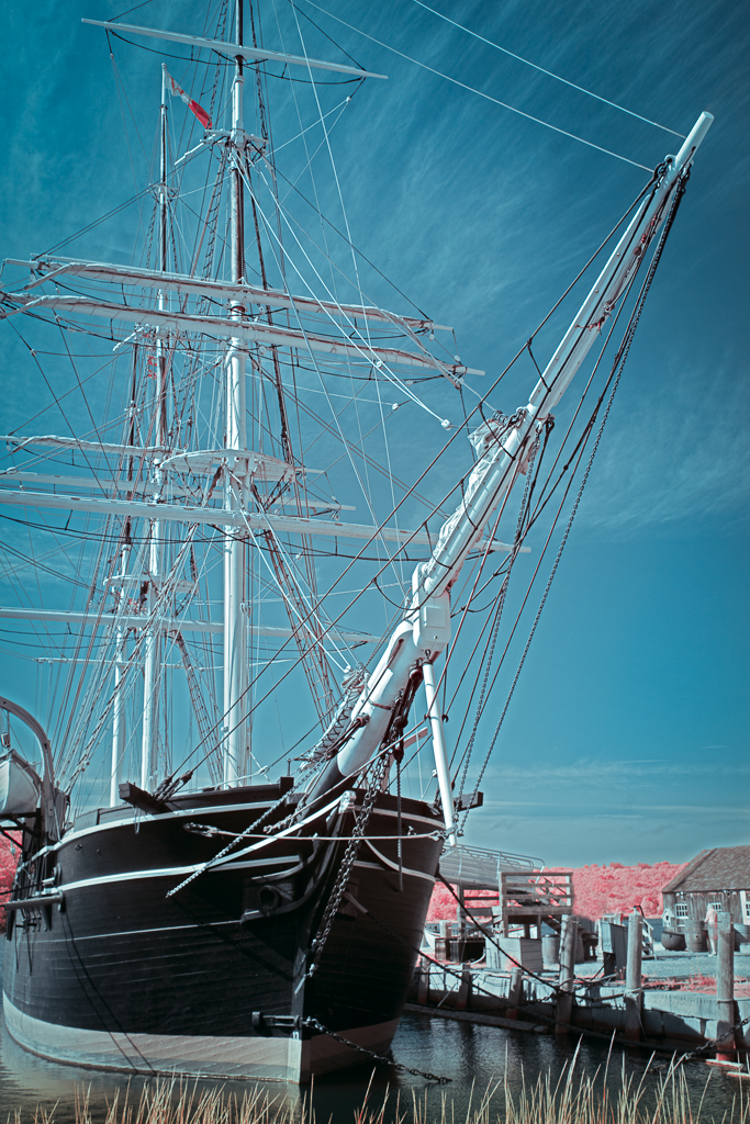
Comment |
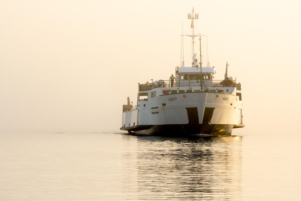
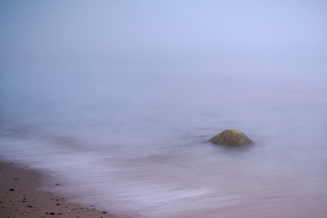
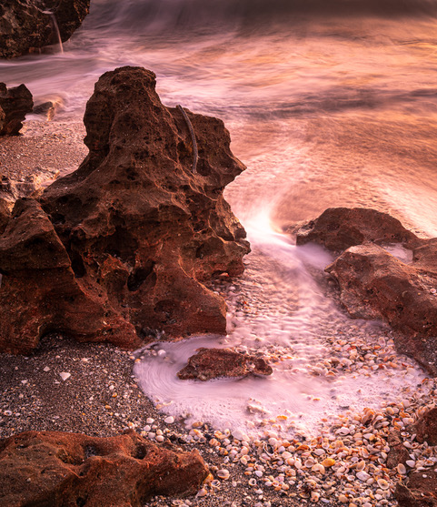
My initial impression of your scene was that there was a large old rusty shipwreck way down the beach. But then I saw it's stern wave breaking close to shore, and with further study I saw its dark wake stretching out behind when finally I realized it's no shipwreck at all - it's under way! Your perspective from this camera position really emphasizes how its course parallels & hugs the shoreline.
I like the white frothy leading line and wish for 3 shore birds working it looking for breakfast. I also enjoy the foreground bubbles. Combined with the warm sunrise reflective glow the scene evokes a peaceful contemplative mood.
If you were to crop off the bottom to have the white leading line begin at the corner it would enlarge the ship and bring it clearly into view. That cropped out foreground is almost devoid of color and warmth; it's cooler, almost blue, which I think adds some tension and interest This negative space to me helps balance the scene. Perhaps a small crop off the blue sky would be beneficial.
Definitely a Keeper!
|
Nov 7th |
6 comments - 2 replies for Group 70
|
| 91 |
Nov 19 |
Comment |
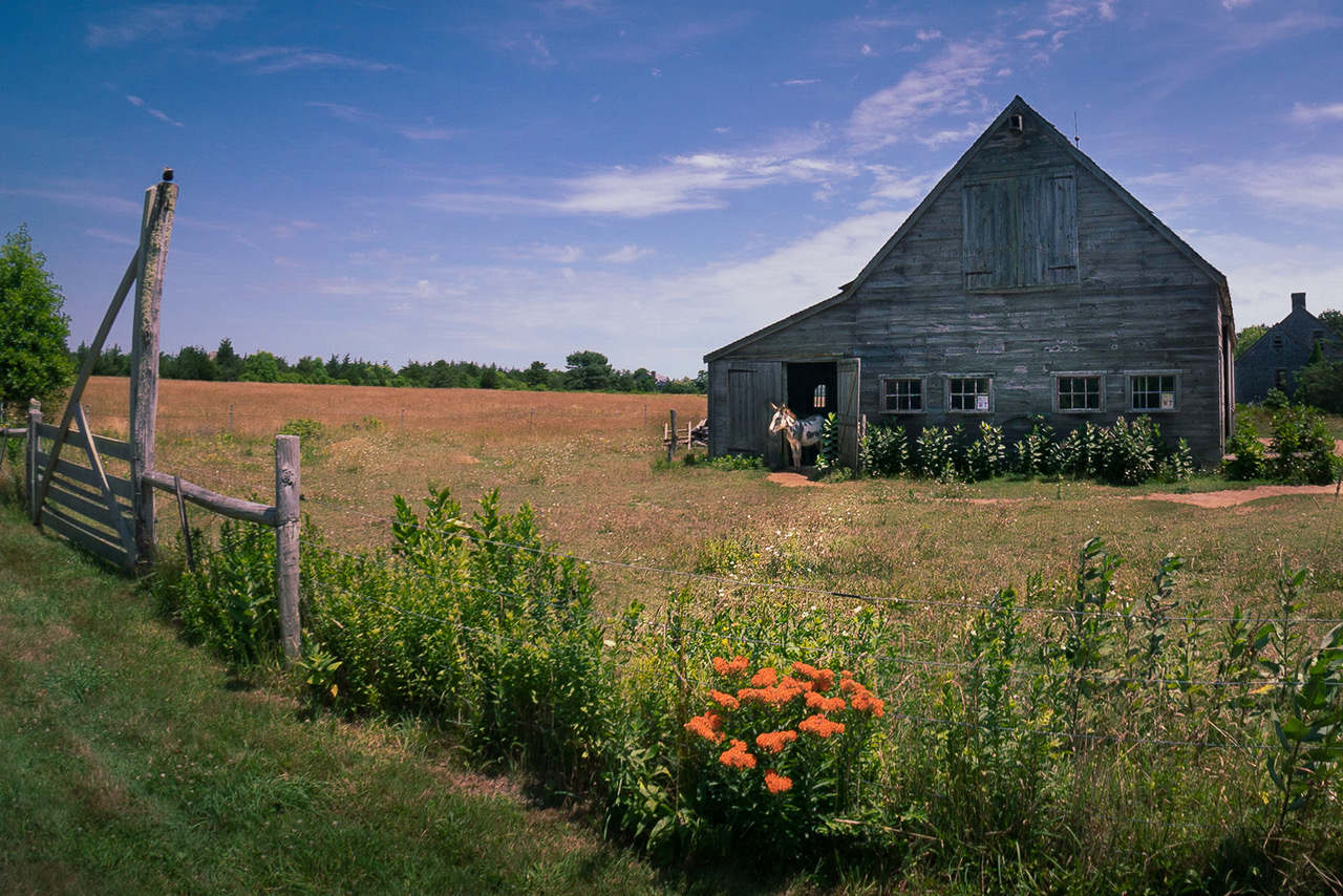
I like this color palette and that the barn fits under the peak of the hills but also am distracted by the OOF wheat. |
Nov 29th |
| 91 |
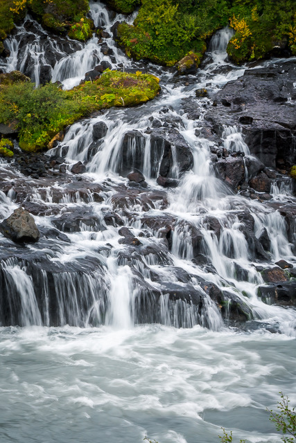
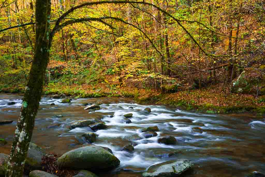
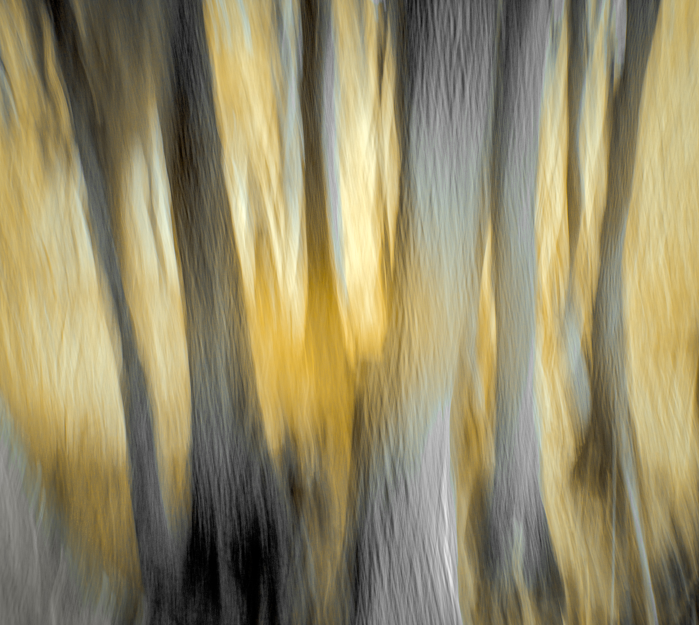
Nov 19 |
Comment |
Love the composition, the leading lines and S curve of the stream all give depth and lead to the mountains with a glimpse of the nice dark sky above. The dark tree trunks against the golden leaves is wonderful contrast. Very nice conversion. |
Nov 29th |
| 91 |
Nov 19 |
Reply |
|
Nov 29th |
 |
| 91 |
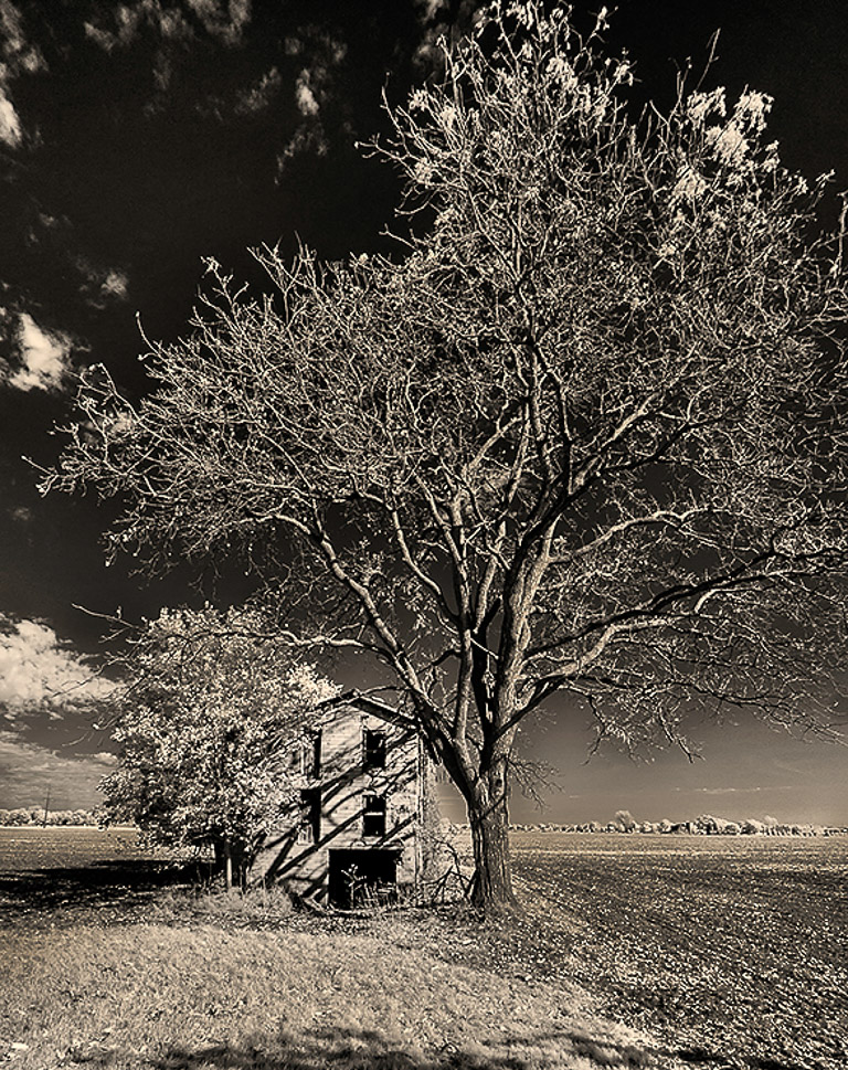
Nov 19 |
Comment |
As I see it the tree seems to overpower the house, which I believe is the subject.
To emphasize the leading line from the right lower corner I would be tempted to burn the field on the right. Darken the field on the left of the house as well. That would provide more of a sense of depth and make the house advance as the fields recede. Perhaps crop a small amount off the bottom again to bring the house closer so you're left with just a small amount of leaf shadow framing.
You could also explore darkening the highlights on the tree trunk and large branches as well as brightening the house to bring emphasis onto it rather than the tree. Light, bright advances, darks recede. |
Nov 29th |
3 comments - 1 reply for Group 91
|
9 comments - 3 replies Total
|