|
| Group |
Round |
C/R |
Comment |
Date |
Image |
| 70 |
Jun 18 |
Comment |
Thanks Frans for the John Gringo video; he does such a great job demonstrating things. |
Jun 20th |
| 70 |
Jun 18 |
Comment |
Thanks everyone for your thoughtful comments. |
Jun 20th |
| 70 |
Jun 18 |
Comment |
Hey Frans - check out group 8! |
Jun 16th |
| 70 |
Jun 18 |
Comment |
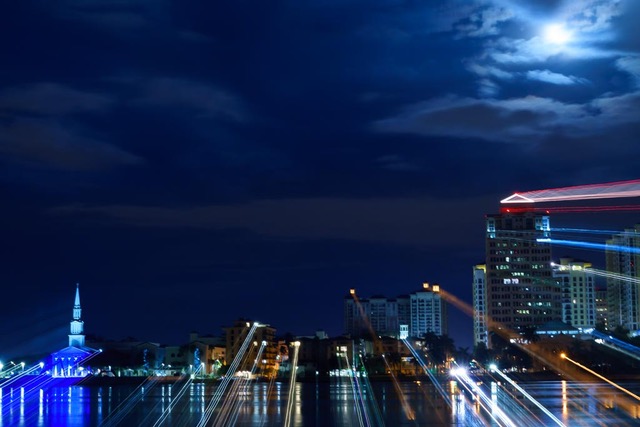
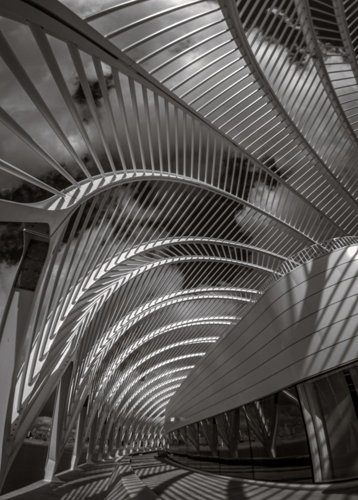
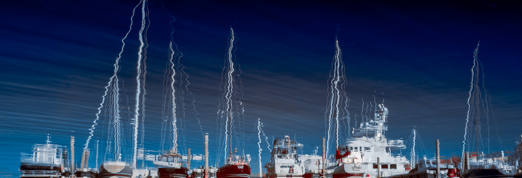
What a great architectural design and night shot! I like your creative vision to combine the blue hour & the Museum & traffic light trails. I like the streaking bus and the tail lights that align and echo the red of the building, and a distant cars red tail lights on the right, but am bummed by the row of cars stopped. Wish they'd been captured moving when the light was green, and over more time than a second. Also like the starburst treatment. |
Jun 16th |
| 70 |
Jun 18 |
Comment |
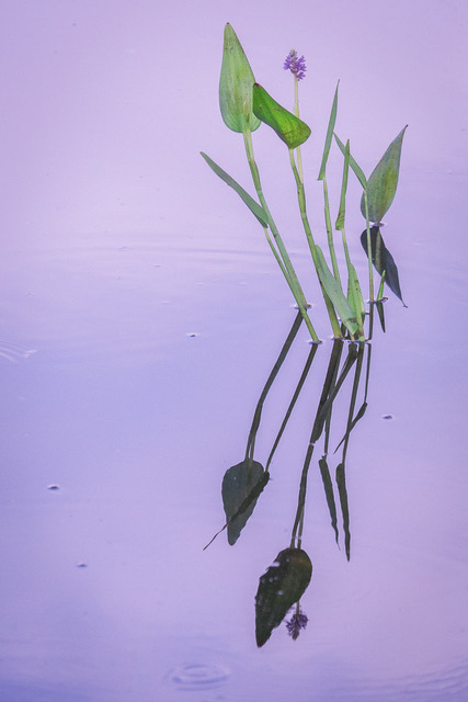
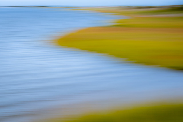
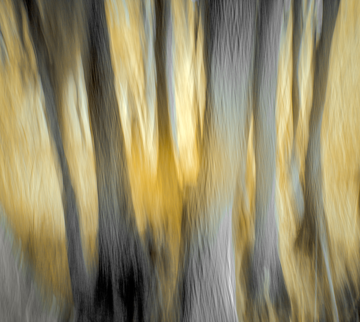
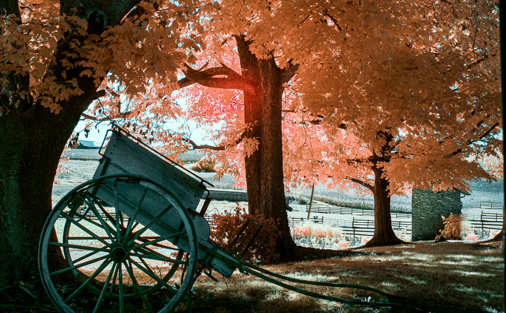
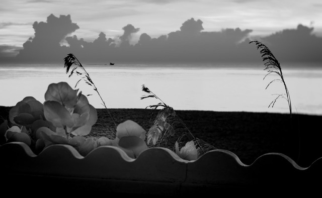
Peaceful and serine in an abstract fine art way. Two very similar shapes; wish there was a tad of separation between them and the tree shorter. But a nice feel to it. |
Jun 16th |
| 70 |
Jun 18 |
Comment |
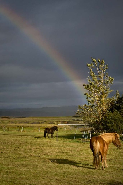
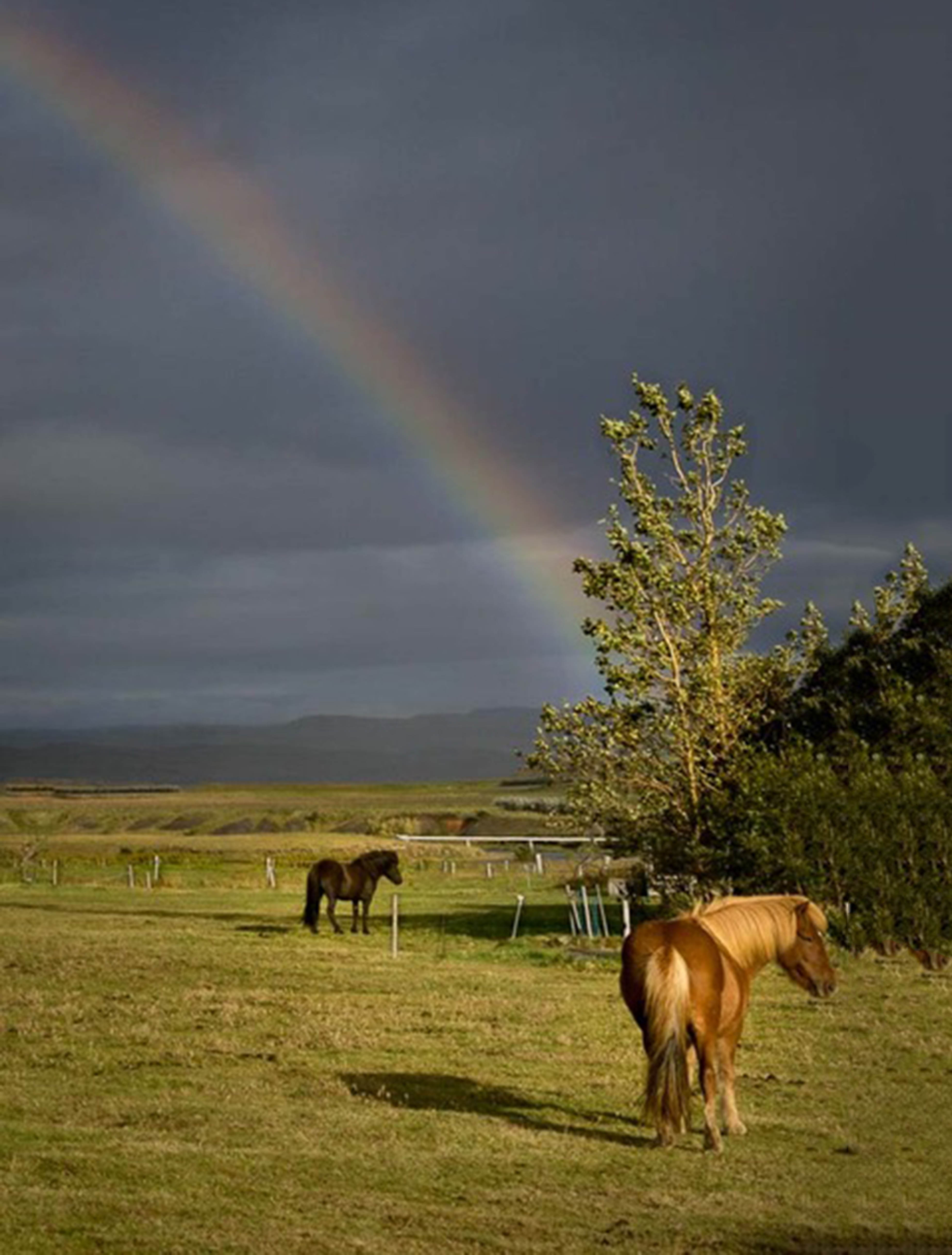
It did ok with the sky but the build up of the repetitive bush is pretty awful. I selected and masked the pony & shadow but was unable to flip them horizontally; the whole image would flip but not just the Icelandic Horse. |
Jun 16th |
| 70 |
Jun 18 |
Comment |
I certainly agree the Chestnut pony needs more space and I love the way his golden coat is where the pot o Gold should be but wasn't.
I gave PS and Content Aware Fill a first go: |
Jun 16th |
 |
| 70 |
Jun 18 |
Comment |
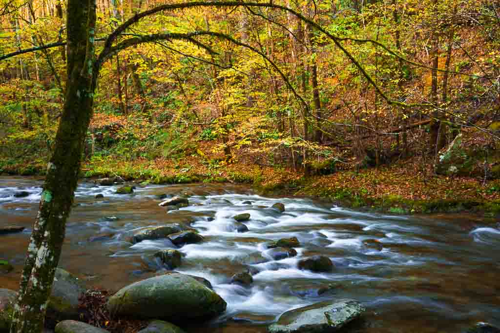
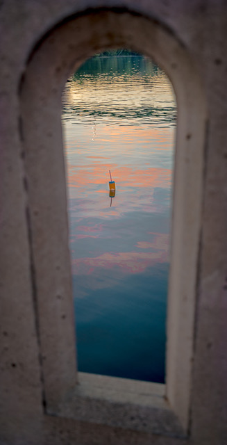
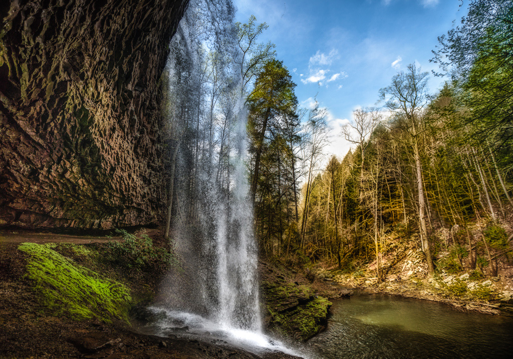
I think I prefer not loosing any of the top of the waterfall; I like the lacy effect of your shutter on the water falling. To straighten the trees on the right I tried Perspective Warp in Photoshop. The edge of the selection needs blending, but you get the idea. I'm new to Photoshop.... |
Jun 16th |
 |
| 70 |
Jun 18 |
Comment |
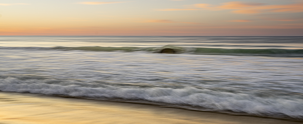
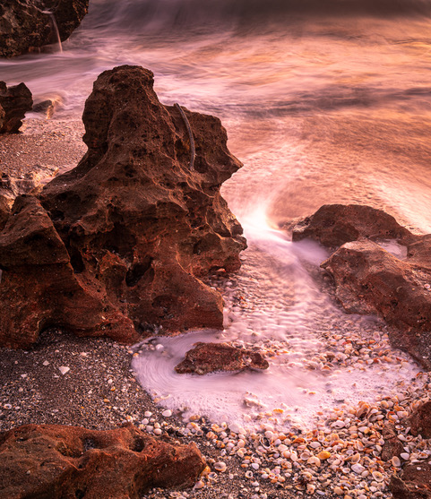
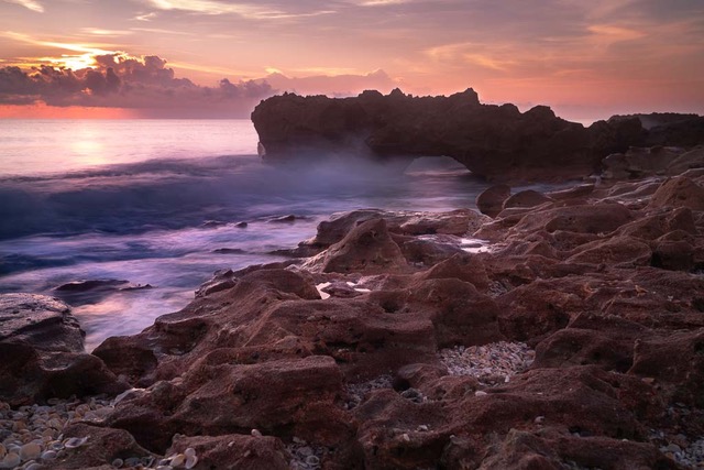
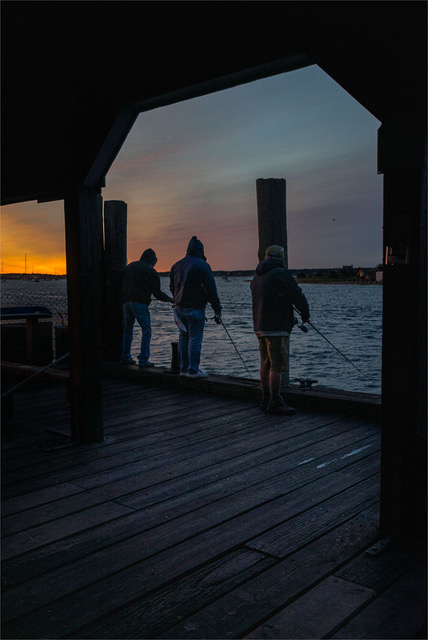
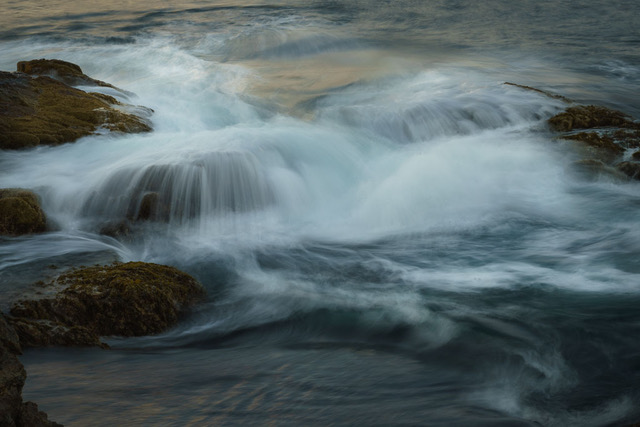
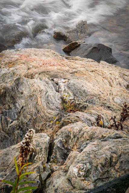
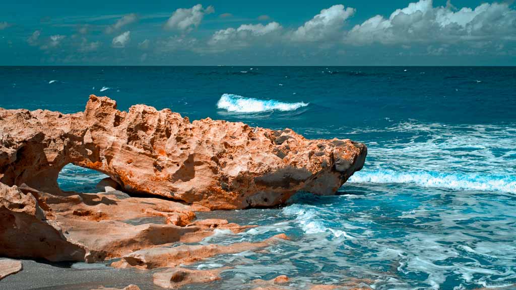
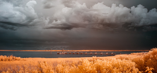
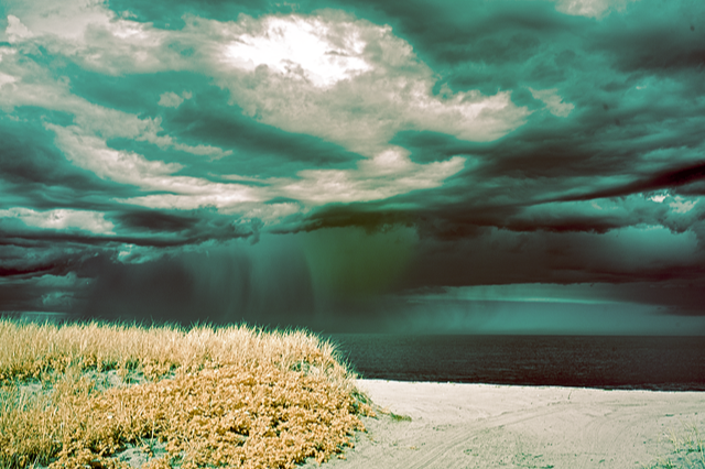
Epic moment and it's got all 3 components of a good composition: strong foreground with nice texture and color in the rocks, a strong wave "gesture" in the mid ground, and a strong background.
Both the foreground and the mid ground have complementary triangular shapes.
The background sunset light is almost another triangle with the storm clouds making up another triangle. Relocating a bit to the right might strengthen the shape/size of the sunset/cloud triangles as well as bring in more of the sunset light and color.
Horizon is 2/3 up placing it at a point of strength in the image. It just needs to be straightened a tad.
Very nice.
|
Jun 16th |
| 70 |
Jun 18 |
Comment |
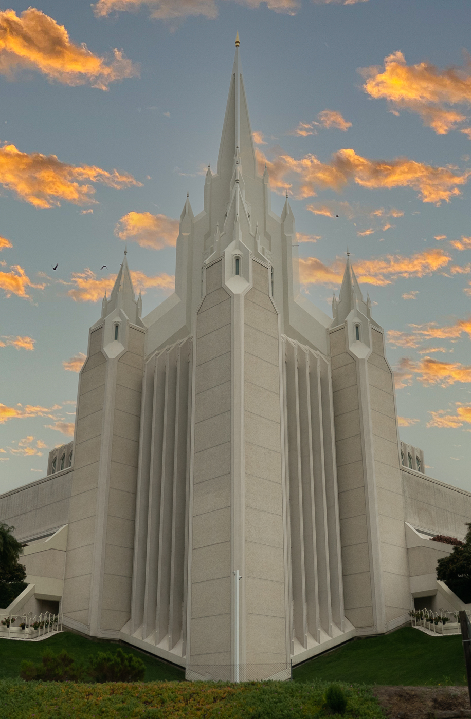
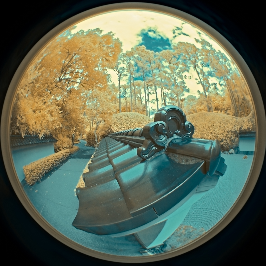
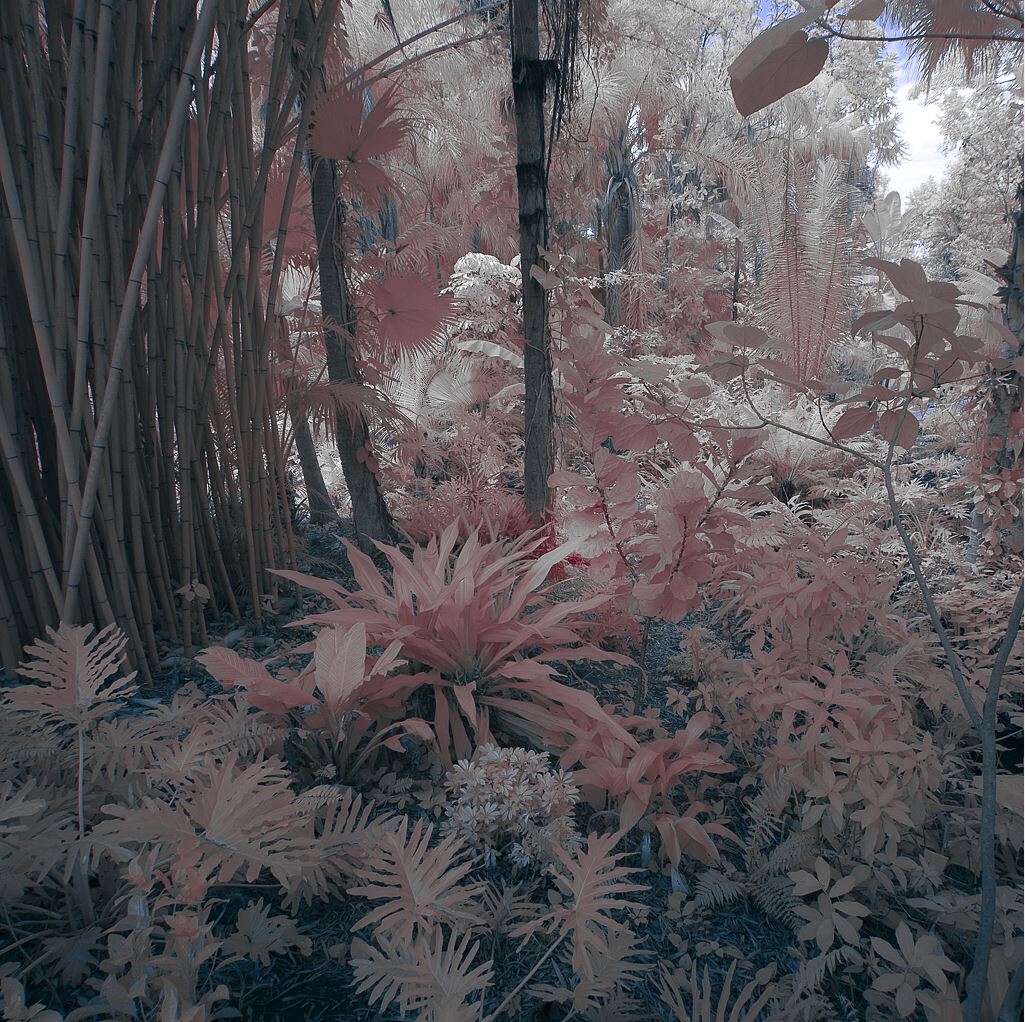
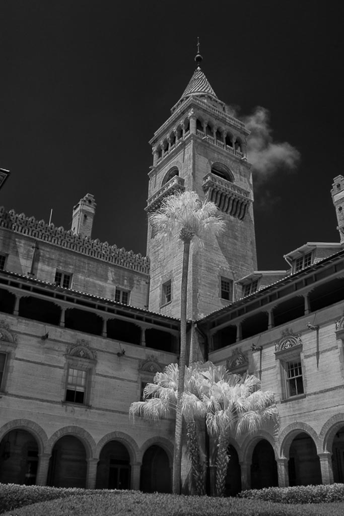
The Infared turned the dark green palm fronds a nice bright white but the tall one almost gets lost in front of the strongly lit tower. In Lightroom I adjusted the upright perspective, added a graduated filter to darken the bright foreground, reduced the highlights on the building and opened up the shadows under the arches to bring out more contrast. |
Jun 11th |
 |
10 comments - 0 replies for Group 70
|
10 comments - 0 replies Total
|