|
| Group |
Round |
C/R |
Comment |
Date |
Image |
| 62 |
May 20 |
Reply |
Hi Bob - I had been playing with overlays and using David Cooke from group 5 as a source for ideas - have not seen his entries for about two months now, but he has some great techniques and has an Internet page (and Facebook). The technology today allows almost anyone to be as creative as they can be - fortunately I have the time to play around. |
May 9th |
| 62 |
May 20 |
Comment |
Hi Leah,
Welcome to the group. If you were joining a military organization you would have been placed in Seal Team 6 - these folks are that good. Judging from your image I think you will hold your own very well. I originally mistook this for a color shot, but I really like that soft, light gold tone and the subject matter - simple and not mind boggling. That little white thingy just to the right of the finial catches my eye somewhat - could be toned down post processing, and easy to do digitally. I also take film images, and if I had one similar, I would probably attempt to burn it in a little. Very nice image and great idea for an entry - see you next month. |
May 9th |
| 62 |
May 20 |
Comment |
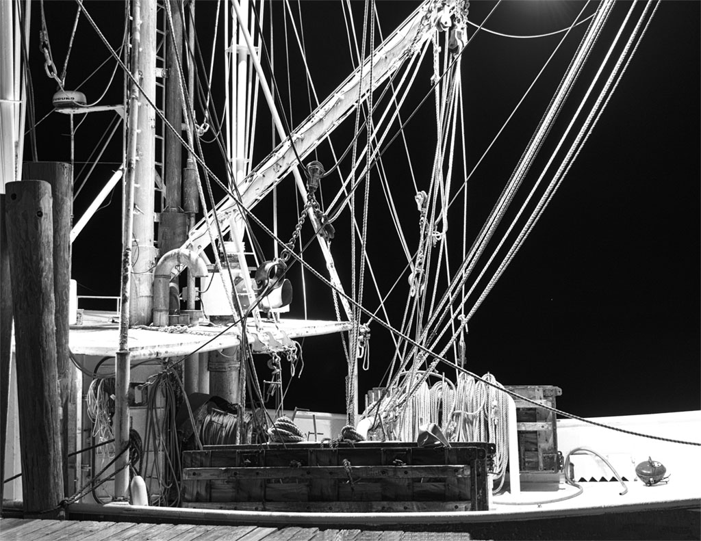
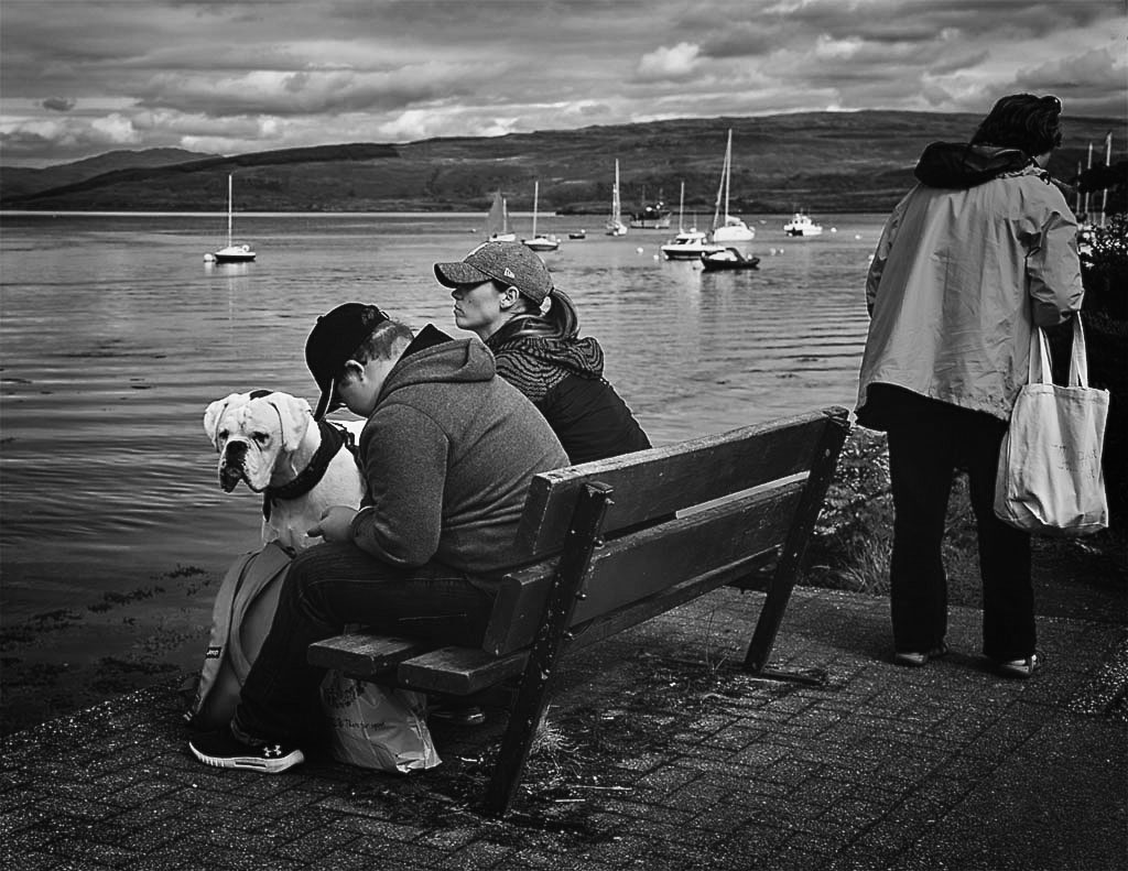
Hi Bob - I like your maritime image and what caught my eye on the original was that sharp red color. Just for experiment I decided to download your original to see what some color filters would do. In Silver Effex Pro I went for the Fine Art Process, ended up with a green filter (which was not much different than what you had), adjusted brightness and structure some, cropped a smidge tighter and put a slight vignette on the lower corners. Not sure your take needed anything, but I do like a slight vignette on a shot like this. Kind of causes the eye to zero in on the subject. Maritime stuff is interesting to play with - nice take and thanks for the opportunity. |
May 5th |
 |
| 62 |
May 20 |
Comment |
From your comment above LuAnn, I know PS can blow your mind. It has blown mine more than once. I have gained a lot of instruction and techniques from Aron Nace of PHLearn, and Matt Kloskowski, I believe with Adobe. They both have great tips and suggestions and both on Youtube with the only drawback being that they are pretty fast paced. I've had to rerun a lot. Your tulip is exceptional but watch out for that new guy. He likes flowers too, and I'm sure he has some tricks of his own. |
May 4th |
| 62 |
May 20 |
Reply |
Certainly an improvement Oliver. I'm thinking you did quite a bit by enhancing contrast and maybe even sharpness, so I will keep that in mind. Thanks for the tune-up. |
May 4th |
| 62 |
May 20 |
Reply |
Yep - Oliver took care of that one below. He done good. |
May 4th |
| 62 |
May 20 |
Comment |
Great mono Emil and very competitive with LuAnn's tulip. I can't add any more accolades than what has already been said by my colleagues. This is a beautiful picture. I was especially impressed with your Fine Art Collections and really get into the mono, old car city, shuttered places, interesting spaces and I'm sure many others that I have only begun to look at. Welcome to the group�� these folks are serious contenders, and obviously you are too. |
May 4th |
| 62 |
May 20 |
Comment |
Unique image Oliver. Water splashes must be akin to snowflakes�� no two alike. Being somewhat of a purist, I personally would not eliminate very much if anything at all. I have done my share of cloning or erasing, but I generally do it where absolutely necessary. I don't see anything objectional here. You have a couple of small star bursts and an electric type glow around the throat of the splash. That to me adds to the uniqueness and interest generated within the image, and I believe it was enhanced by your extensive postprocessing. Personally, I appreciate the artists who go the extra mile�� obviously done here. |
May 4th |
5 comments - 3 replies for Group 62
|
5 comments - 3 replies Total
|