|
| Group |
Round |
C/R |
Comment |
Date |
Image |
| 2 |
Mar 19 |
Comment |
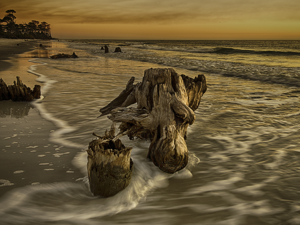
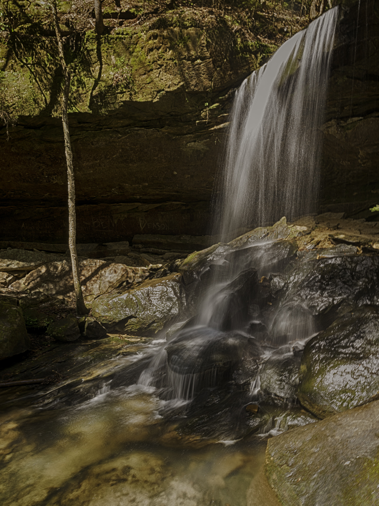
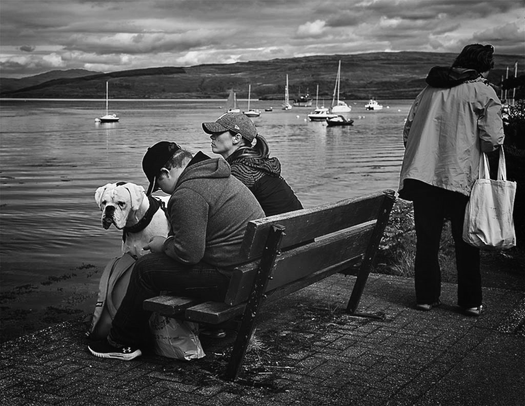
Yeah Lady, you nailed this one. Looks like early morning light and I love the way you captured it on the rocks, background trees and waterfalls - got some diagonals going there too. This is just real good stuff - should go on a wall. |
Mar 13th |
1 comment - 0 replies for Group 2
|
| 62 |
Mar 19 |
Comment |
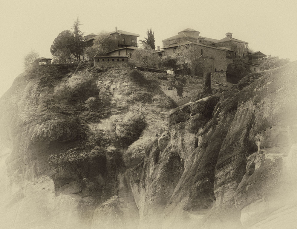
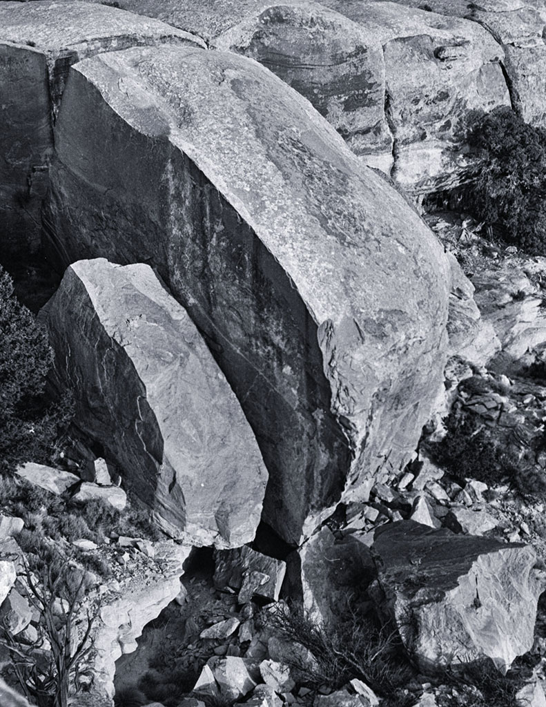
Wow, I inspired someone! - I thought I was the only crazy guy! I really like the tone and texture on the mountains and you nailed that sense of scale. Nice one - I know its a lot of work when you do it right, and this looks like you did it right. |
Mar 13th |
| 62 |
Mar 19 |
Comment |
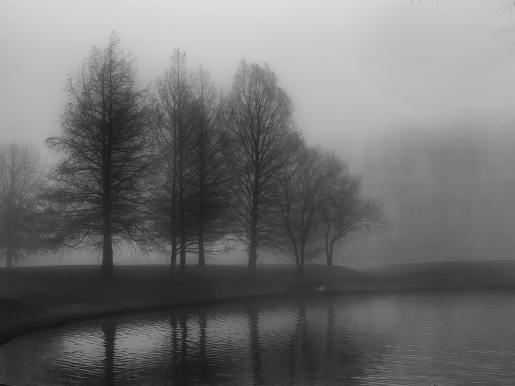
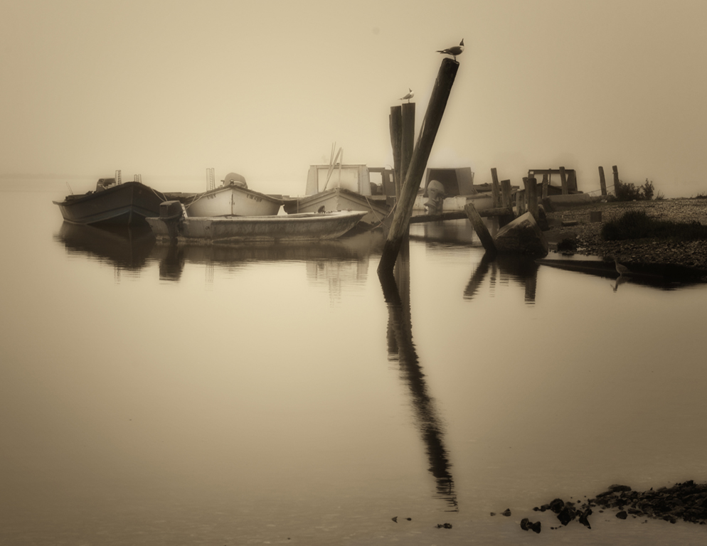
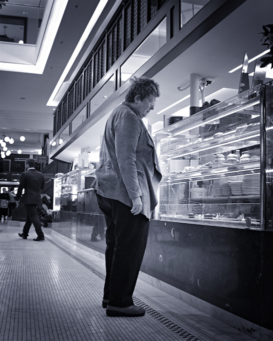
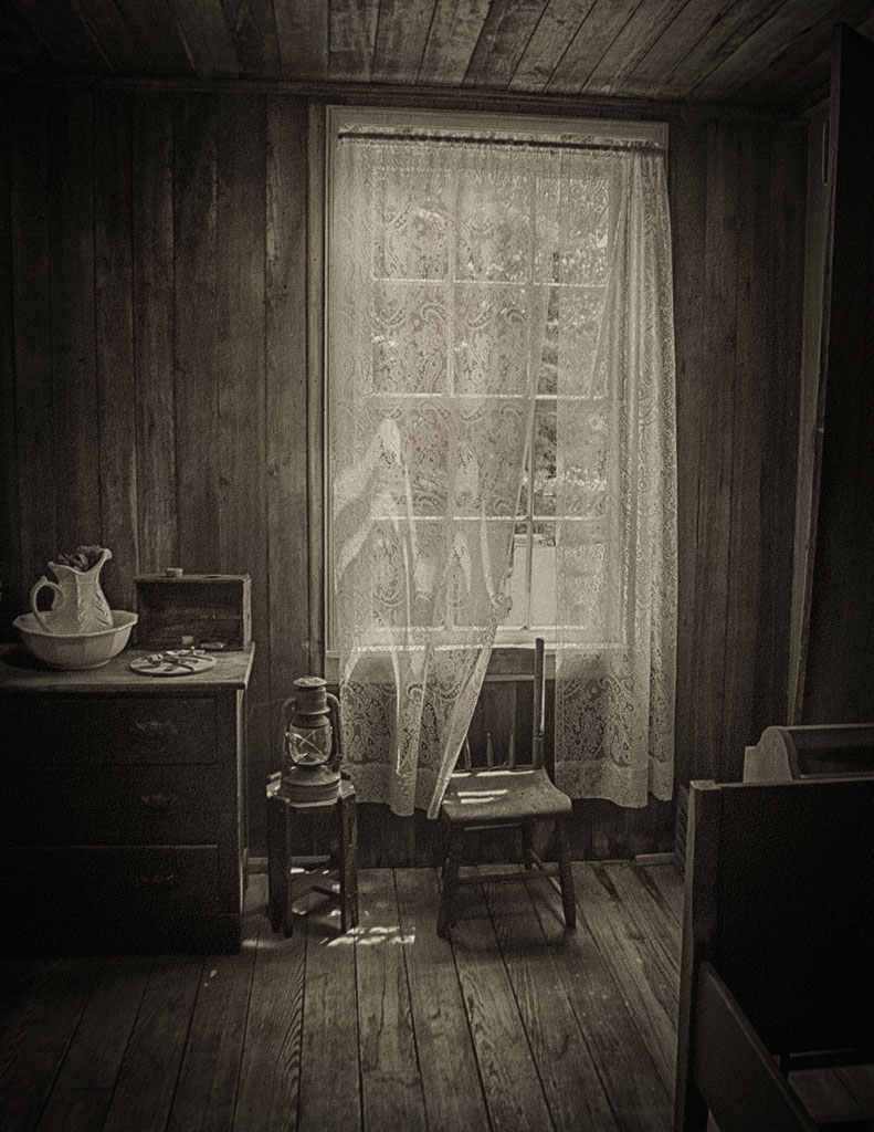
I really like this one David - It looks like something Michael Kenna would have produced - he would probably get around $5K for something like this. In your color image the shadows across the walkway retreat back into the perspective - you seem to have lost some of that effect when converting to B&W. In my view I would want to keep those patterns. Its a real neat image though - good luck with it. |
Mar 13th |
| 62 |
Mar 19 |
Comment |
I kind of like the tonality of your original LuAnn. I don't think my nit-picks are worth mentioning - you are the artist and I think the way you presented it was fine. I too went to Alaska several years back - stunned by its raw beauty and probably the best photo trip I have ever been on. YDG (you done good). |
Mar 13th |
| 62 |
Mar 19 |
Reply |
Thanks LuAnn. I probably like Oliver's take, but maybe should have cropped it a little tighter on the left and eliminated the overhead lights - kind of looks like some bright balloons up there. Good suggestion on darkening up the background somewhat - thanks much - I will give it a try. |
Mar 10th |
| 62 |
Mar 19 |
Comment |
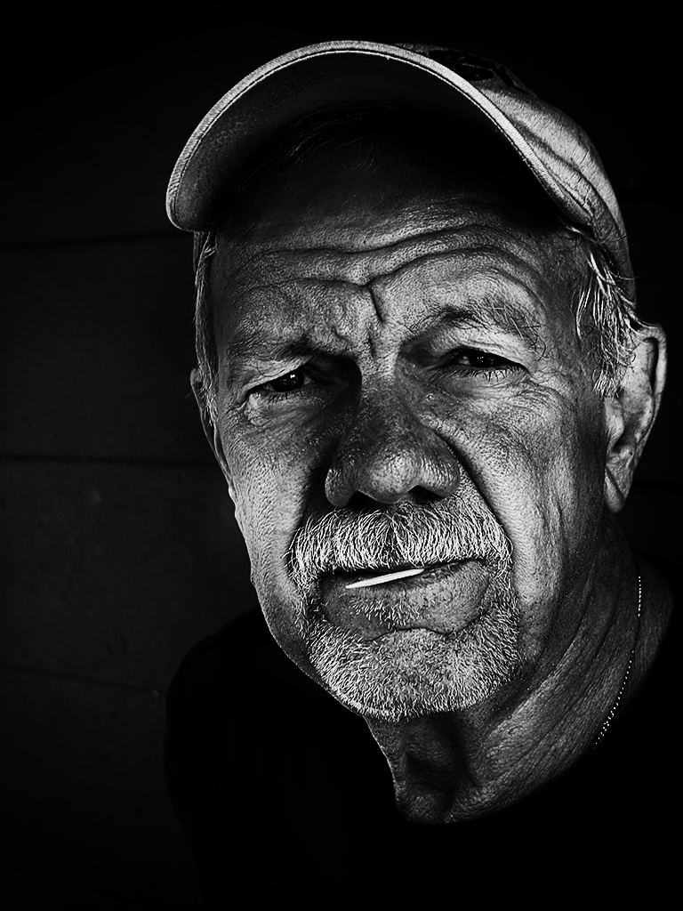
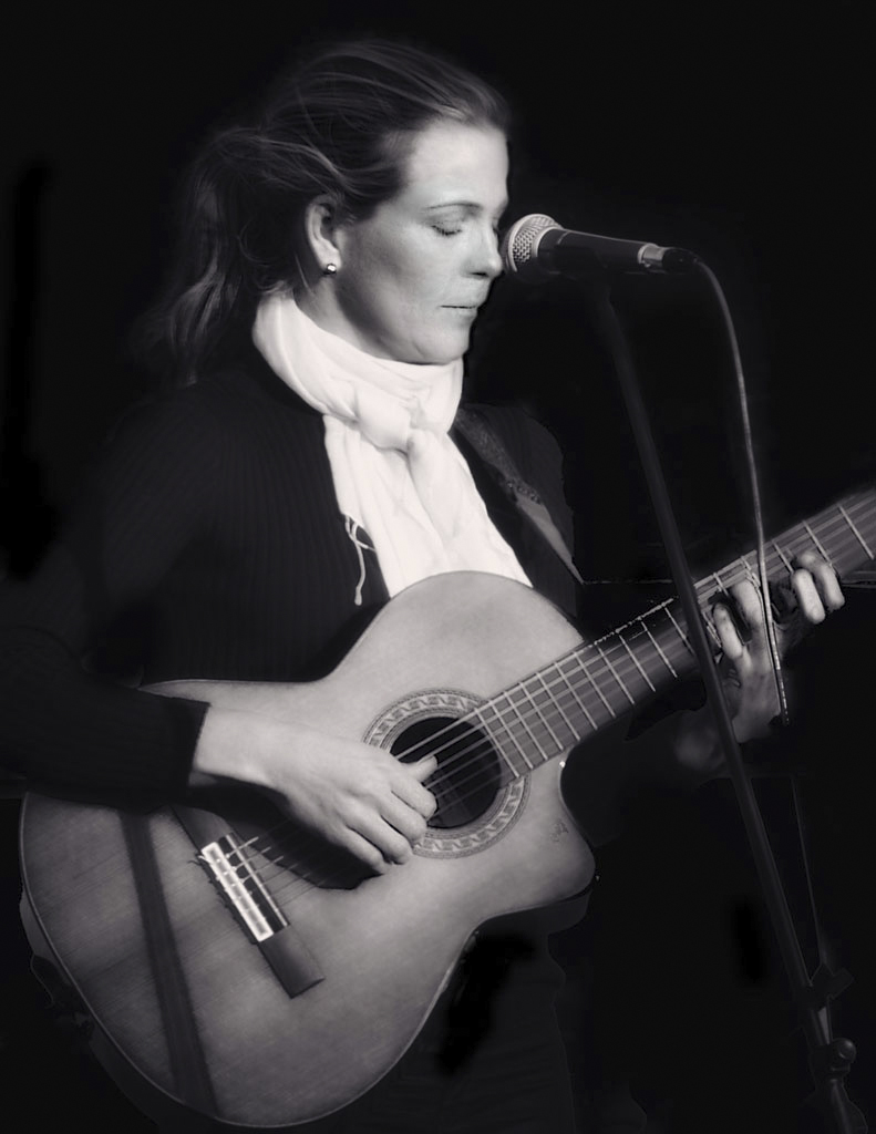
Love the shot Oliver, but have to agree with LuAnn about a little too HDRish on the face - should be an easy adjustment should you choose to do so. But I do like him against that excellent background - horizontal stripes with some vertical opposition - I think it works very well in B&W. |
Mar 10th |
| 62 |
Mar 19 |
Comment |
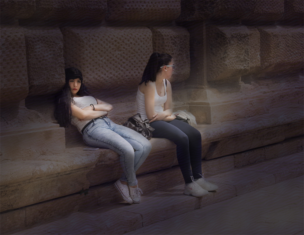
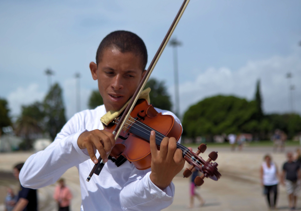
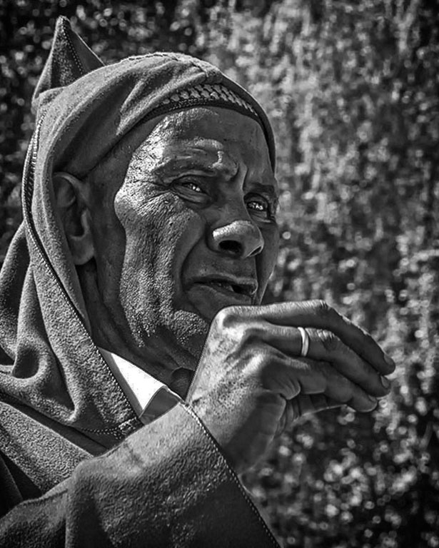
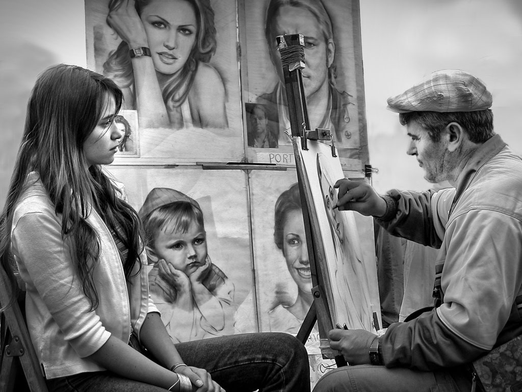
OK Hattie - I accept the challenge. First and foremost, if you are going to spend extensive time and talent with Photoshop, you should probably start with an exceptional shot - which you have. I checked your image dimensions (1024 x 768 and 300 dpi) so at 300 you should be able to make corrections and still produce an acceptable print if you want one. More important, you have captured tension between the artist and his subject - a young lady awaiting the results, hands folded in quiet anticipation, and although he's a picture within a picture, a little boy intently watching the master at work. Could it be better?
Seems to me there are two options here - leave the figures in and make them and the background darker or remove them entirely. As you implied, I eliminated them - not a big problem. I chose to use the Quick Selection tool, Clone Stamp tool and the Paint Brush. I quick selected small areas (which helps to contain the clone tool) such as behind the artists head and cloned the background I desired. I like a mottled look with implied shadows - takes a lot of zooming in and out and adjusting brush sizes (maybe down to a few pixels) to work into tight areas. How accurate you want to be is up to you of course, but it doesn't have to be perfect. I left the pants of the figures behind the artist alone - since this could be indoors, it looks like there may be some cloth draped over something - you need that kind of thing in an art studio. If your desire is to leave the figures in, you can get more attention on the subjects by darkening the background using the same techniques - just takes a lot of picking, quick selecting and painting with a dark but low opacity black. I think this was a great capture and someday I'm going to get one too.
|
Mar 10th |
 |
5 comments - 1 reply for Group 62
|
6 comments - 1 reply Total
|