|
| Group |
Round |
C/R |
Comment |
Date |
Image |
| 62 |
Sep 18 |
Comment |
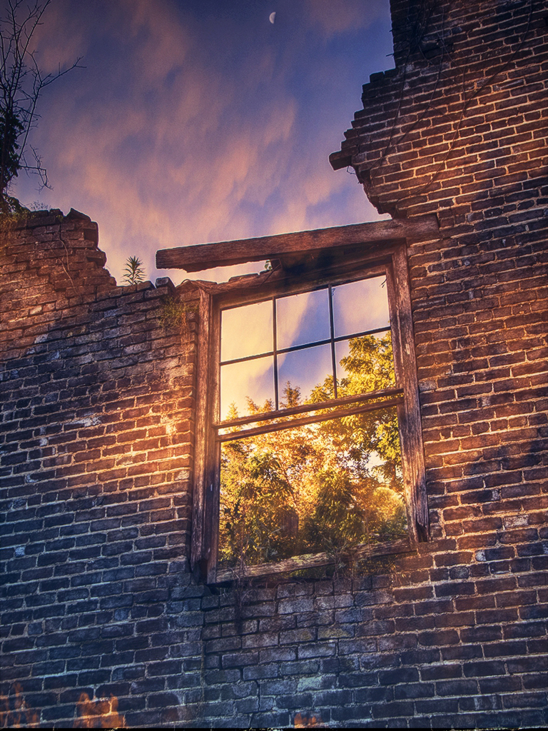
No matter how you slice it, this is a very effective and nicely composed image. Both vines give it that extra accent and contribute to the overall artistic effect - picture what it would look like without them! I like LuAnn's contributions, but I think your original crop gave it more room on the edges - I kind of like that better. I too would have removed the spots (which I think are actually holes in the leaf). If you wanted to be a purist, perhaps burning them in would make them less obtrusive - Ansel would have done it don't you think? |
Sep 13th |
| 62 |
Sep 18 |
Comment |
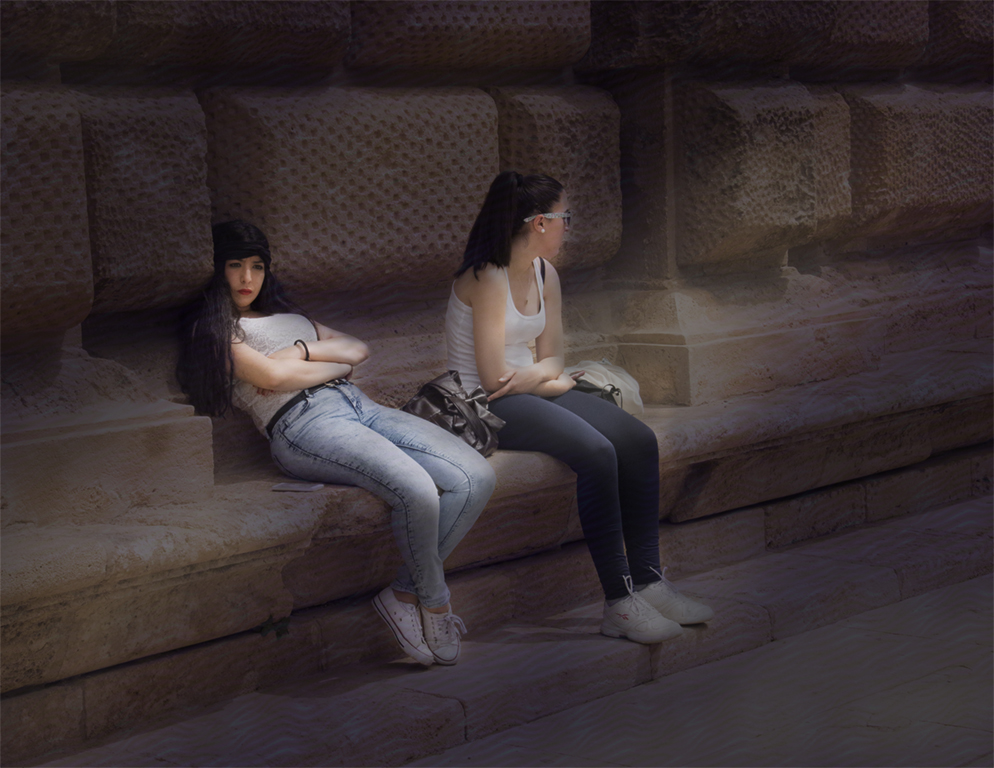
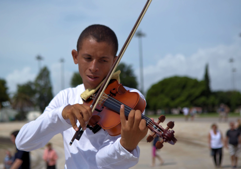
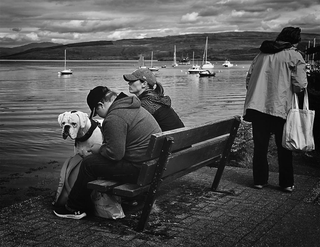
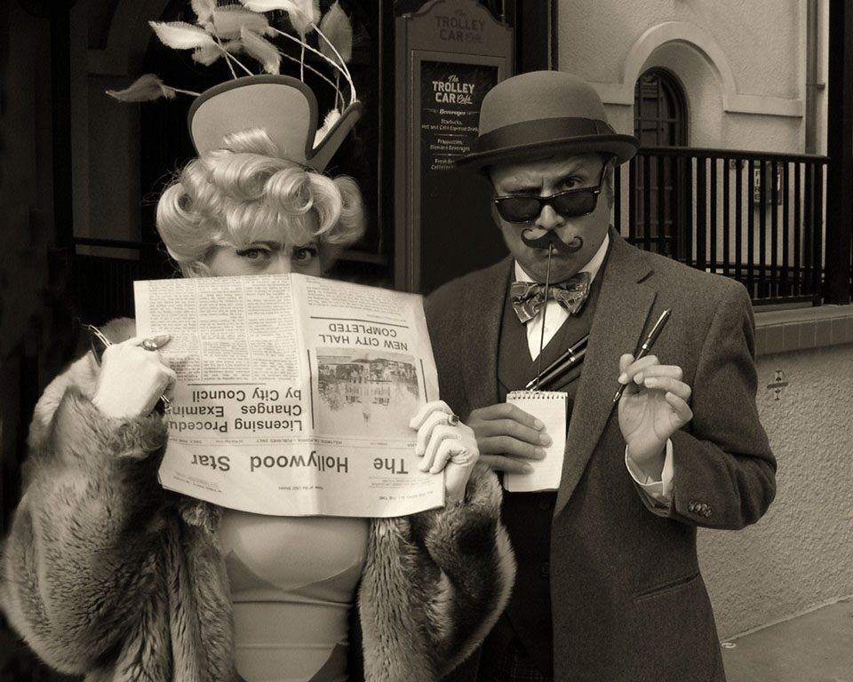
Great take on this one Paul. When people are doing something and not necessarily conscious of a photographer taking their image, that's the time to shoot away - that expression is priceless - a really nice photograph with a happy ending. |
Sep 13th |
| 62 |
Sep 18 |
Comment |
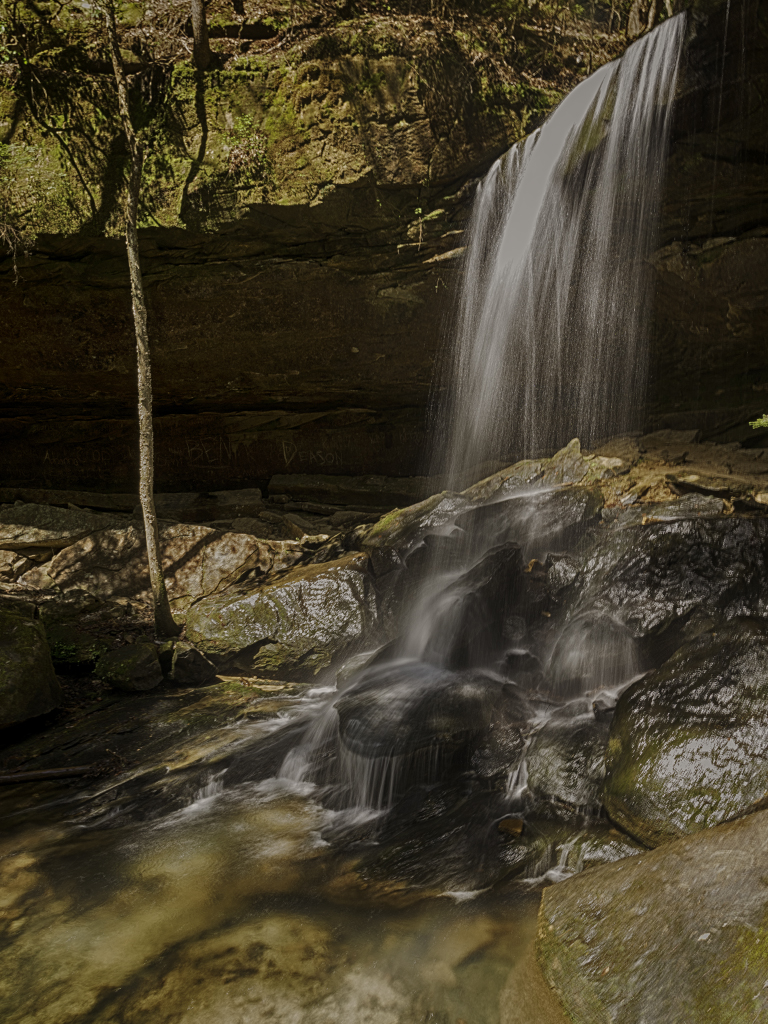
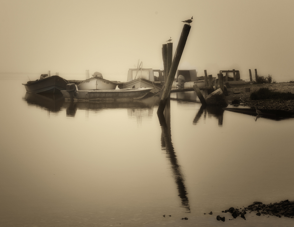
At this late stage the only thing I can do is echo what the others have said - it is a great image and I am in awe by the water effect. Very effective Pandula. |
Sep 13th |
| 62 |
Sep 18 |
Comment |
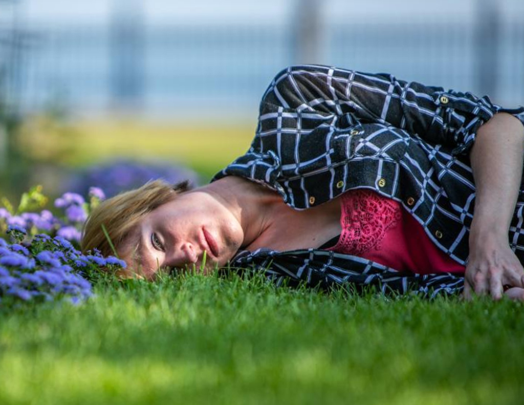
I really like that composition David - that pose is unique - and I like the lead in of the blue flowers trailing to your subject (original). I would have included her arm and hand and cropped tighter from the left (putting her face in the left third). Hands, in my opinion, can often be as expressive as anything you can see in a face - this image was no exception, and I gave it a whack. I think the rest of your entry was presented the way you wanted it - very nicely done. |
Sep 13th |
 |
| 62 |
Sep 18 |
Comment |
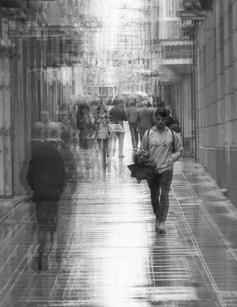
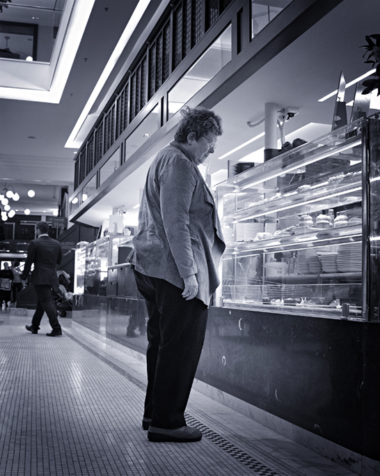
Great street shot Hattie. I cant add anymore to the comments as already mentioned. Other than cropping tight as you did, I would not have changed a thing. Instead of untitled, you might call it Bah Humbug. |
Sep 13th |
| 62 |
Sep 18 |
Comment |
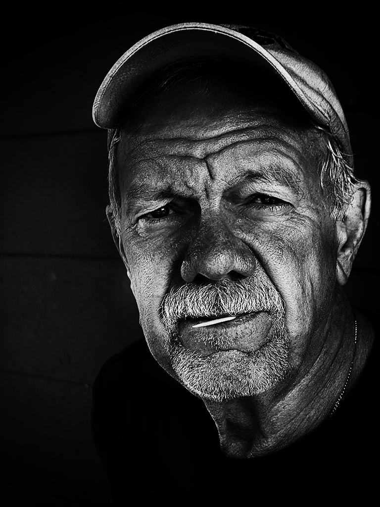
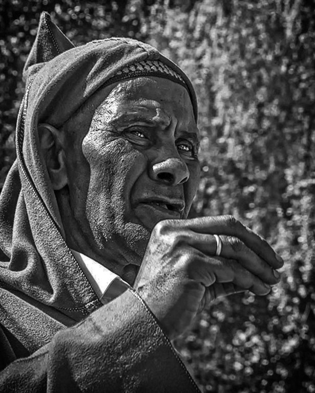
Hi LuAnn - love this image. As mentioned above, this gent looks very fashionable and photogenic - got him in the left third - nice. The halo is a little too noticeable in my estimation, but it is not as obvious when I pulled up the color image - I think it is more prominent as a result of the conversion from color to B&W. Using the burn tool to subdue the halo effect might help tone it down if you so desire. Otherwise, I think you have a winner. Thanks much for your comments on my entry and I will pursue your suggestions for improving the overlay - much obliged. |
Sep 13th |
6 comments - 0 replies for Group 62
|
6 comments - 0 replies Total
|