|
| Group |
Round |
C/R |
Comment |
Date |
Image |
| 2 |
Dec 17 |
Comment |
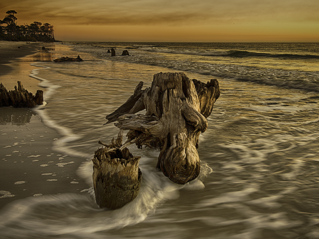
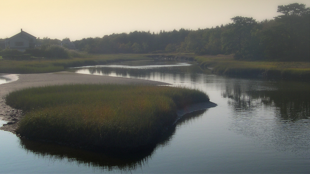
Malabika - I really like that layered tree background slopping down to the water. The orange and reds really stand out on the dark green background. I believe I would have cropped it tighter from the left and bottom, but a colorful and picturesque shot no matter what. |
Dec 11th |
| 2 |
Dec 17 |
Reply |
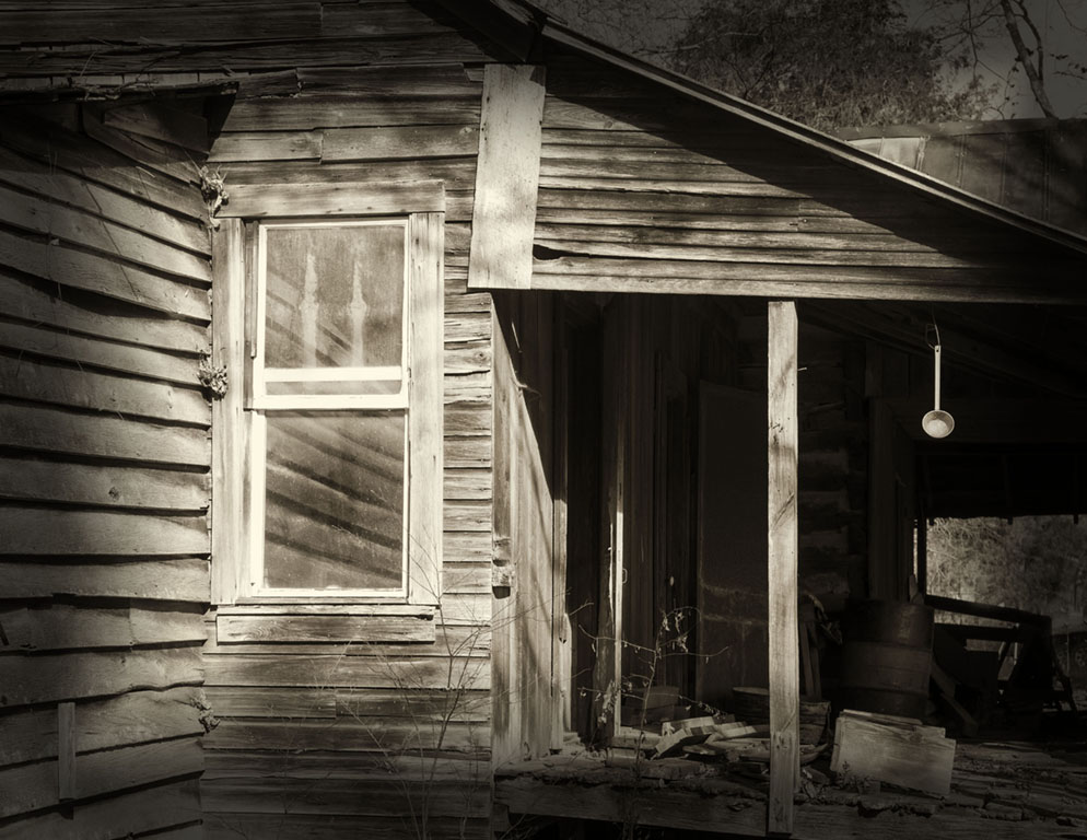
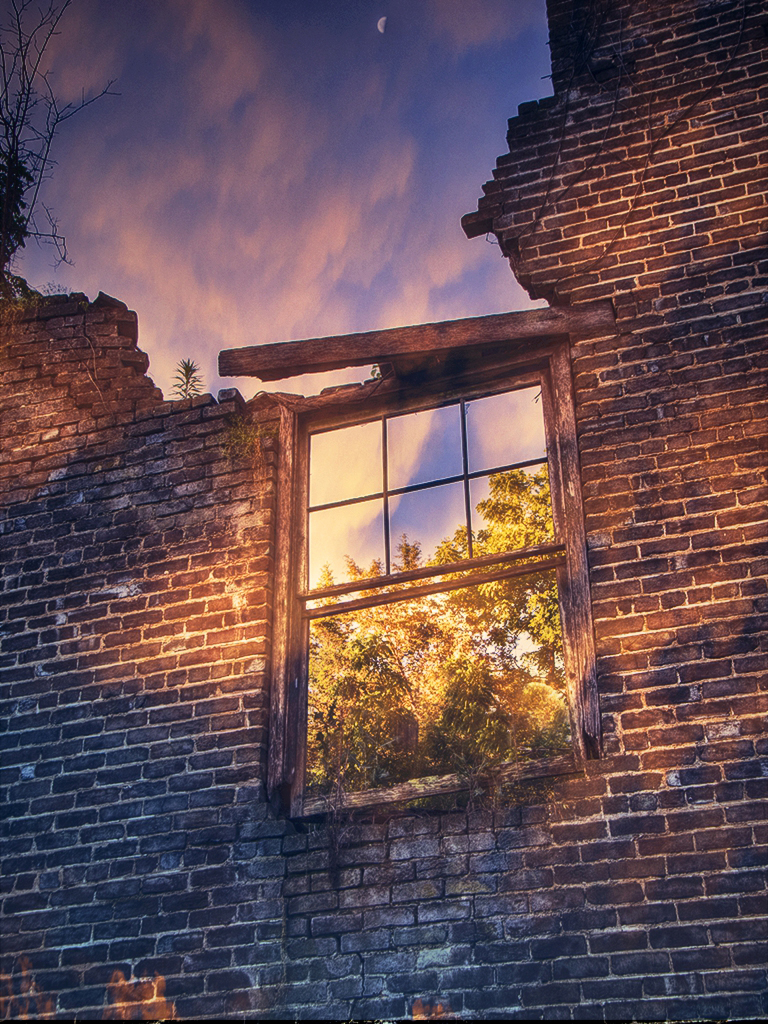
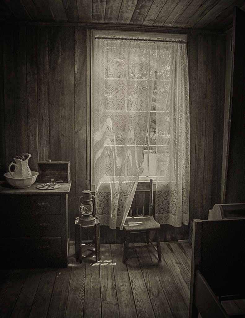
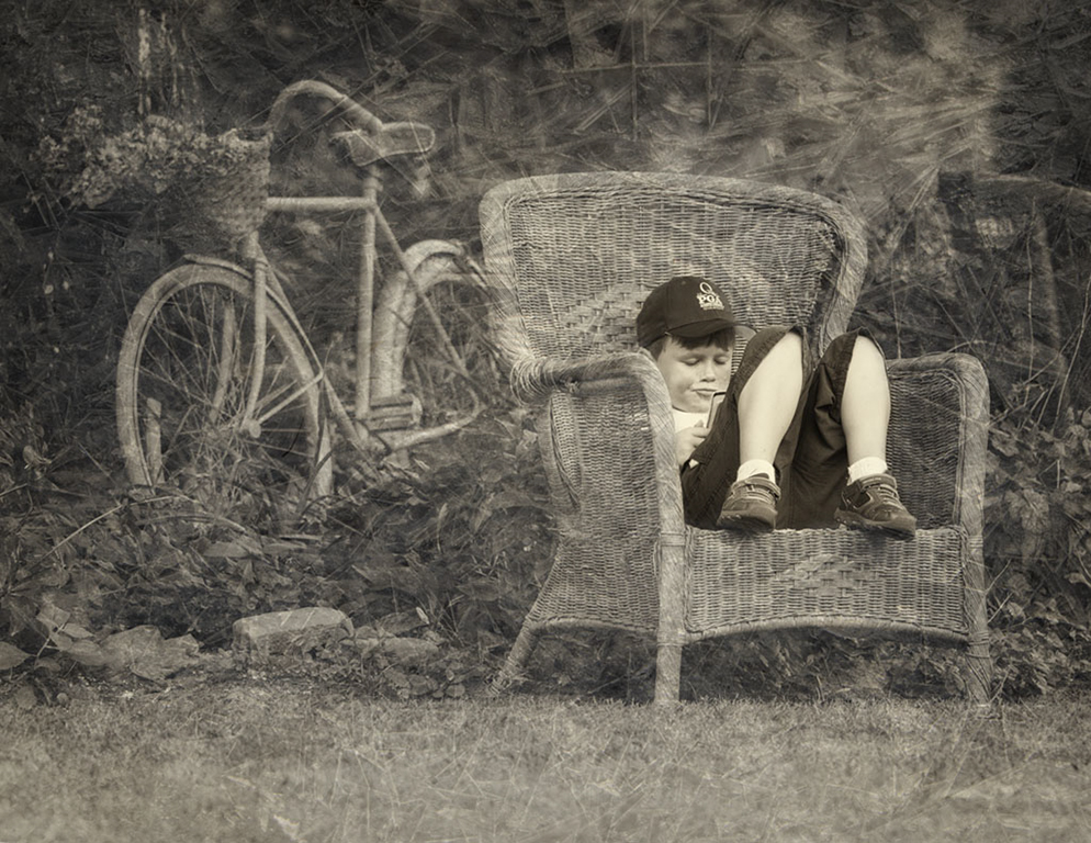
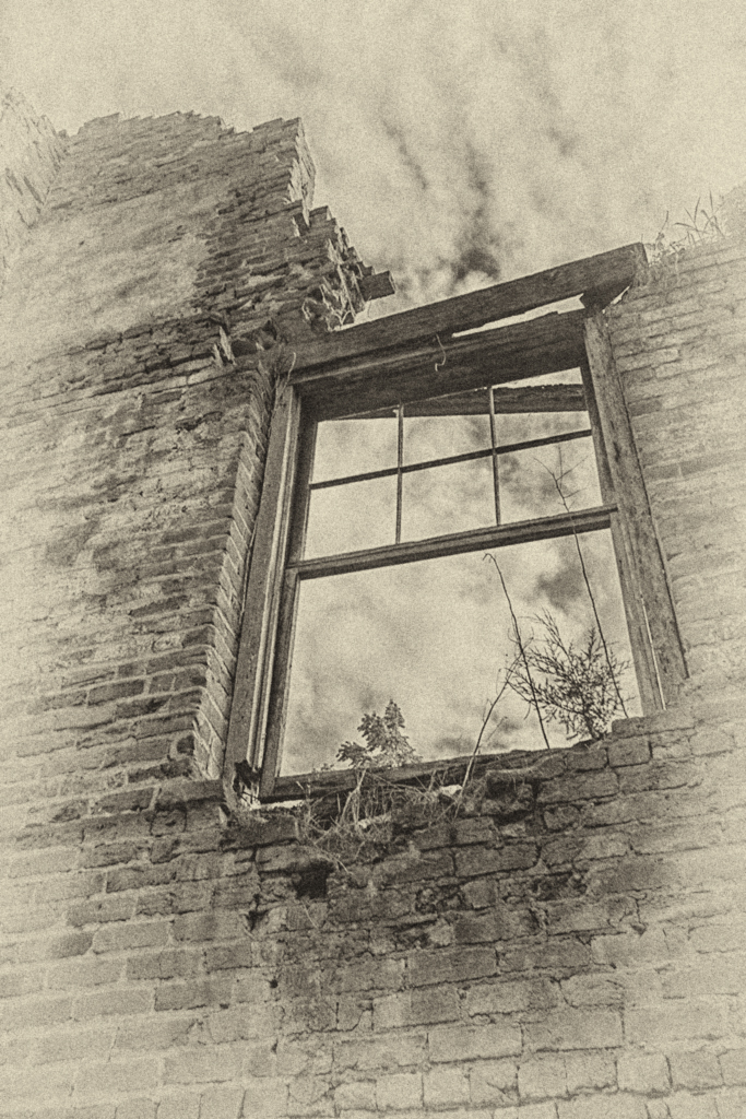
Thanks for the input Al - a vertical format may have been a better way to go on this one. Old, dilapidated stuff has pretty much become my style. I had hoped the viewer would wonder who lived there, when and how - a bygone era in the world of Dollar General, Walmart and cell phones - how did they survive? - or maybe they didn't. |
Dec 11th |
| 2 |
Dec 17 |
Comment |
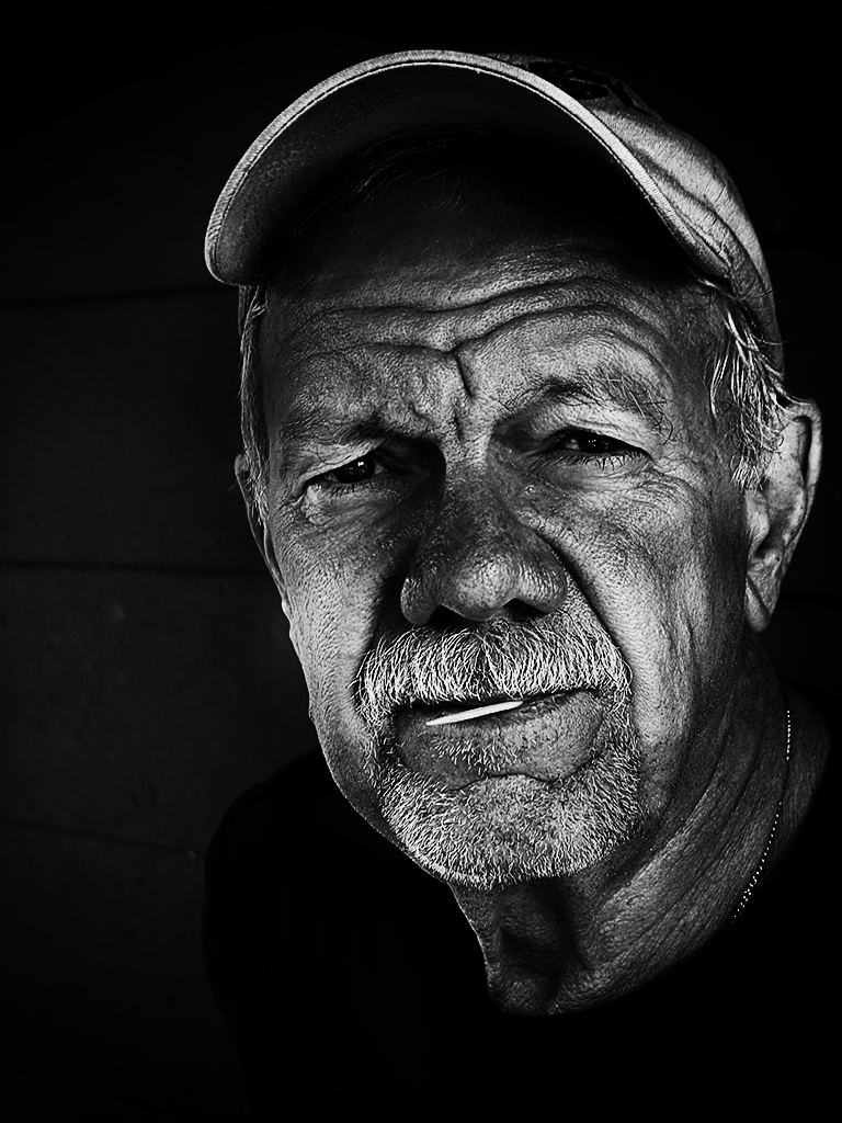
Very effective image Harry - a real "eye-catcher". I need to become better versed with the latest technology - did not know that one can focus stack from wifi and post process with Zerene Stacker - I need to do more homework. One thing about DD, you do learn different techniques - thanks for a very creative example and for the tips. |
Dec 11th |
| 2 |
Dec 17 |
Comment |
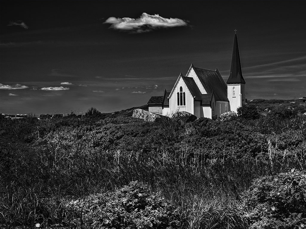
Nice shot Al - I need to ditto Shirley's comments - she made some good points. I almost think you may have oversaturated the highlights slightly - looks almost like an HDR or tone map. In was effective, but left a slight halo around the light tower and house - still a very picturesque image. |
Dec 11th |
| 2 |
Dec 17 |
Comment |
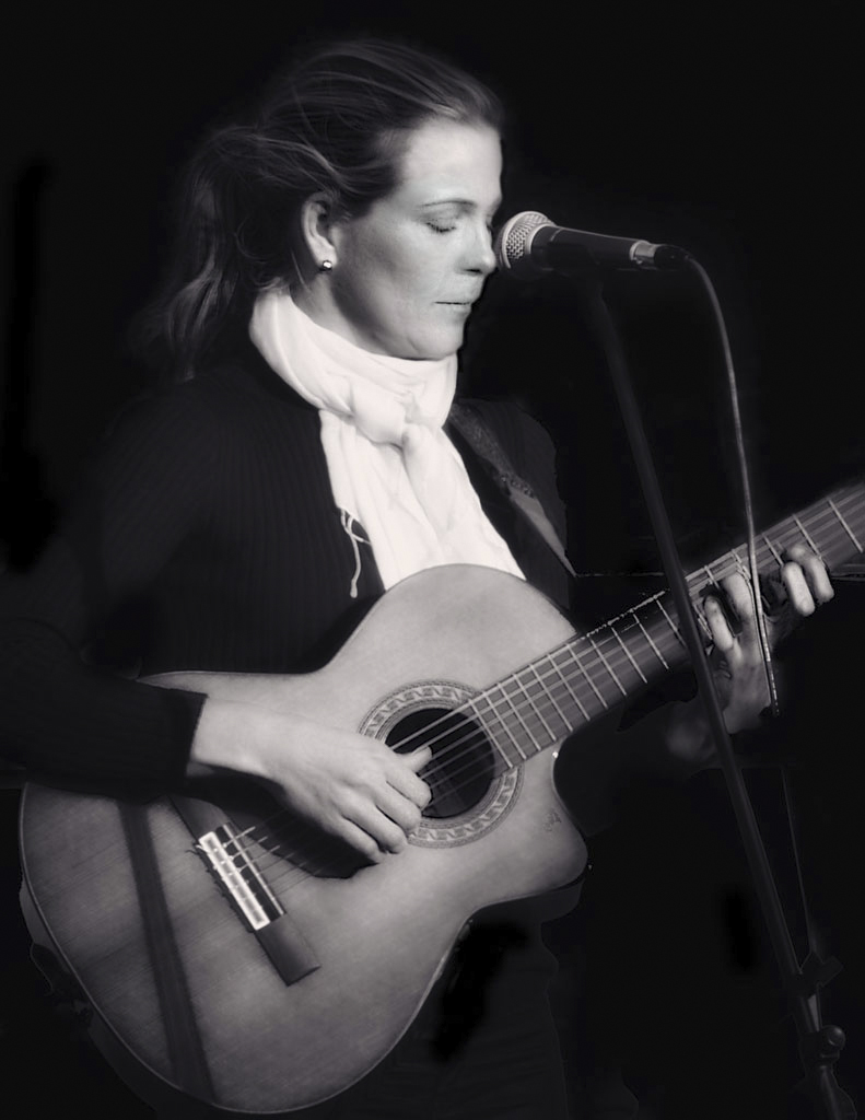
Hey Shirley - you done good. I like the cloud definition and bright colors. I had to think about your comment of a "little more barn and less grape vine" - personally I like it as is. I like your composition (barn in the left third) and in my opinion, you have a very effective HDR shot - picture appears to me to be very contrasty but sharp throughout - would look great in a frame I would think. |
Dec 10th |
| 2 |
Dec 17 |
Comment |
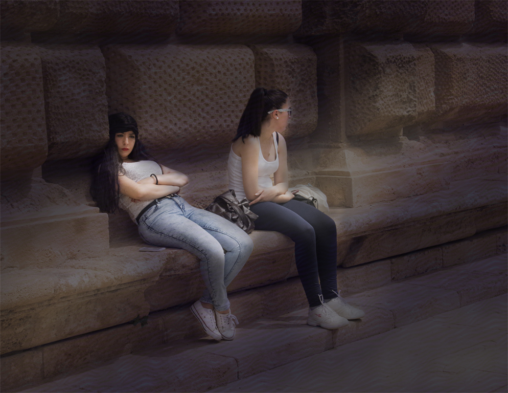
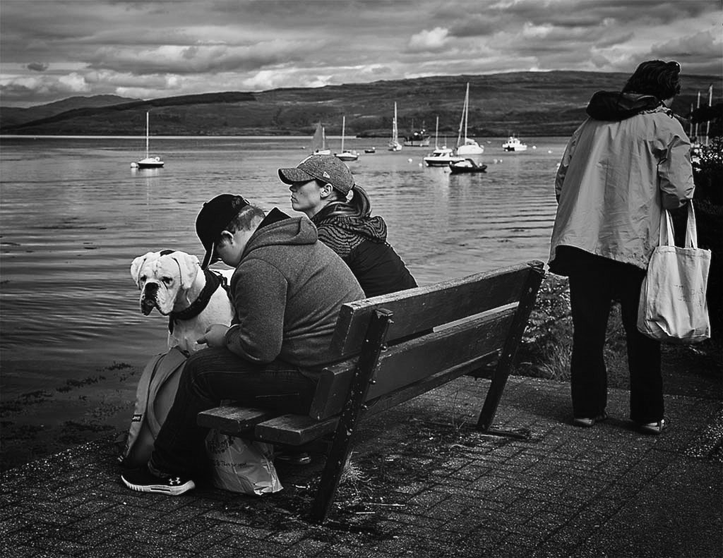
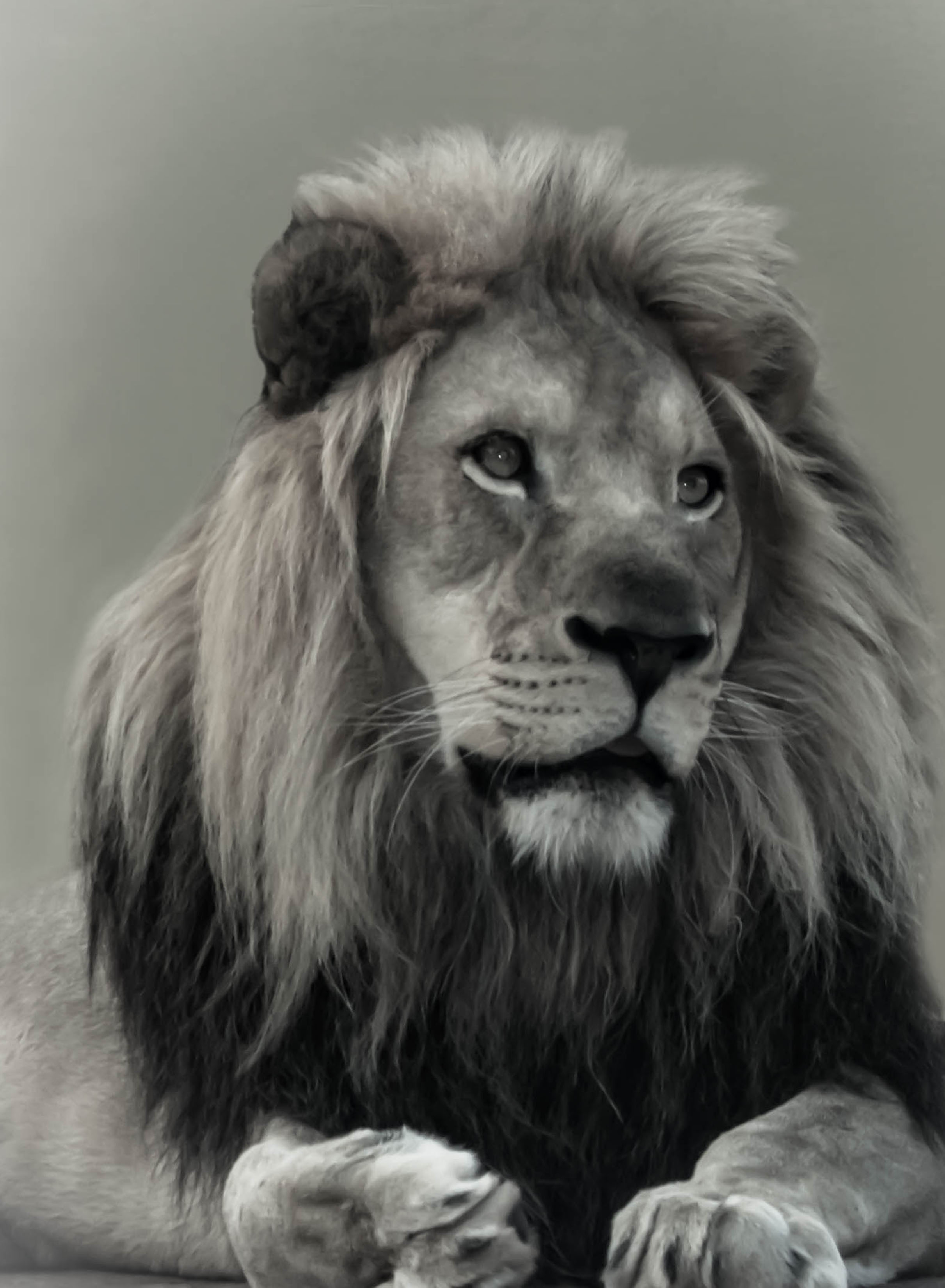
Piers - in my humble opinion, this is one of the best lion shots I have ever seen. The expression, and especially the eyes, come across extremely powerful - his dark lower mane accentuates his face and makes it stand out. This guy comes across as true royalty. I like the way you went with the background, and as mentioned, you might want to work on the masking around the mane - I'm thinking a judge might find fault with it as done. Monochrome is to me certainly the most effective presentation. What does bother me is that he appears to be on a concrete floor. Kings don't lie on concrete. I download the image and tried to crop him tighter, but ended up cutting off his paws - not good. Maybe someone has a better idea. Still a fantastic shot. |
Dec 10th |
 |
5 comments - 1 reply for Group 2
|
5 comments - 1 reply Total
|